10,000 search results
(0.036 seconds)
- Ginuk by Twinletter,
$15.00 Take your message to the next level with this Ginuk font. With its versatile style, this font can be used in a variety of ways in your projects so you can demonstrate your ideas in a captivating way. This font is equipped with the Latin ISO standard so you don’t have to worry about the completeness of the character. of course, your various design projects will be perfect and extraordinary if you use this font because this font is equipped with a font family, both for titles and subtitles and sentence text, start using our fonts for your extraordinary projects.
 - Alethia Pro by Mint Type,
$- Alethia Pro is a grotesque sans-serif typeface with high contrast in all weights. It has been designed to serve as a display typeface in various editorial projects, such as magazines or corporate brochures, as a sans-serif pair to serif types of modern style. Alethia Pro comes in 8 weights + matching italics, each supporting numerous Latin-based languages as well as major Cyrillic languages. It is packed with OpenType features like ligatures, small caps, 6 sets of digits, 3 stylistic sets, superiors and inferiors, fractions, ordinals, respective punctuation varieties including all-cap punctuation, as well as language-specific alternates.
 - Gridlock by I Can Be Your Type,
$10.00A condensed font using constructivism history to convey the cold hearted steel of machinery and progress. Gridlock tries it's best to fit as much info as possible in a small space neatly in line and with the subtle curves and smoothness of bent steel. The inspiration for Gridlock actually came accidentally after designing some lettering for a self-promo project and it needed something that just was condensed with visual appear. So imagining about how condensed fonts feel, I imagined them being squished together just like cars in traffic are forced to work together to make it to their end destination. - Amasis by Monotype,
$40.99 Amasis is a slab serif design which has been drawn with a humanist approach, rather than the traditional geometric construction associated with this style of letter. The result is a typeface that has an affinity with the Ionics, although in character it belongs to the latter decades of the twentieth century. The Amasis italic fonts, rather than being sloped roman or cursive in nature, are related more to the Old Style italics. Amasis works particularly well in small sizes where readability is important. Amasis has proved excellent for use on low resolution printers and for facsimile transmissions.
 - Exelancer by Popskraft,
$19.00 We are proud to present the futuristic Excelancer font. This font was inspired by passion for space stories. The uniqueness of this font lies in the rare combination of a wibrant style of decorative capital letters and perfectly balanced lowercase charachters that read well in any massive text. Thus, you get a universal font kit with which all the tasks of futuristic design are solved. However, this font will become a decoration not only for fantastic stories, but also for everything related to technology, development, progress and even sports. In short, this is the pure energy of the future!
 - Sweetest by Supersemarletter,
$11.00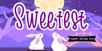 Sweetest is a cute and friendly handwritten font. It embodies playfulness and authenticity and is the perfect choice for any children activity or school project. Provide Ligatures with special character make the design letters looks incredible. Honestly it works perfectly for headlines, logos, posters, packaging, T-shirt and much more. Font Features : . Regular Version . Character set A-Z in Uppercase and Lowercase . Ligatures in lowercase and special . Numerals and Punctuation . Accented Characters . Multiple Languange Supported Recomended to use in Adobe Illustrator or Adobe Photoshop with opentype feature. If you have any questions, just send me a message and I'm glad to help.
 - Lamore by Kaligra.co,
$29.00 The Lamore Collection is a Minimalist Modern Elegant font faired prefect with Signature script font. Full of beautiful ligatures, tons of special alternative glyphs, ornament and multilingual support. It's a very versatile font that works great in large and small sizes. Lamore font is perfect for branding projects, Logo design, Clothing Branding, product packaging, magazine headers, or simply as a stylish text overlay to any background image. HOW TO ACCESS ALTERNATE CHARACTERS Open glyphs panel: In Adobe Photoshop go to Window - glyphs In Adobe Illustrator go to Type - glyphs Get Lamore Script on our website http://kaligra.co/
 - Bukama by Twinletter,
$15.00 BUKAMA font is a faux Japanese font with a distinctive and unusual shape. If you use this font in a special project, it will look straight away and fit into the composition of the visual display that has an Asian design theme. Logotypes, food banners, branding, brochure, posters, movie titles, book titles, quotes, and more may all benefit from this font. Of course, using this font in your various design projects will make them excellent and outstanding; many viewers are drawn to the striking and unusual graphic display. Start utilizing this typeface in your projects to make them stand out.
 - Authority by RetroSupply Co.,
$19.00 Inspired by public fonts in New York in the 1970s. Authority pays tribute to the almost unnoticed but powerful effect type have on our lives. From waiting on a cold morning to catch the 307 to Morton West High School, to the rain and snow worn stencil on a postal box. Public typography is a part of the little spaces in your lives where life actually happens. Government designed fonts were chosen to communicate authority and help grease the gears of the day-to-day grind. Authority beckons back to these days with it's mildly condensed feel, squared corners and weight presence.
 - Artes by Greentrik6789,
$19.00 Proudly present, Artes groovy layered display font. Inspired by bubble letters in graffiti art and retro style design, it produces a display font with a fun style that is perfect for the design needs of posters, flyers, covers, titles, logos, packaging, t-shirts, branding and various needs that require a unique display font. Activate the Contextual Alternates feature so that the shape of the character changes according to the shape of the character in front of it, and Activate the Stylistic Alternates feature to change the number characters into bubbles that you can use as additional elements in your design.
 - Bannock Brae Gothic by Red Rooster Collection,
$45.00 Bannock Brae Gothic is a sans serif typeface. It is an original creation of Steve Jackaman (ITF) and was created for the Red Rooster Collection in 1999. The typeface was loosely inspired by a typeface from an old obscure wood type specimen book from the turn of the 20th century. Due to its turn-of-the-century roots, Bannock Brae Gothic has an informal 1920’s art deco look. It finds an ideal home in lighthearted projects concerning crafts, food, festivals, and music, but its alternates still give it the flexibility to showcase a classic and timeless feel in any project.
 - Maringue by Shaltype Co,
$12.00 MARINGUE is Retro Western Font that is well-produced by hand and generate into a clean form, that will be best when used in any placement like logo, poster, t-shirts, or any display. Build manually, and reform into a clean Typeface. Natural stroke from original hand-lettering. It can be used for just Titles or even writing. In this font, you will get : Over 234 glyphs Ligatures in OpenType features Support for 66 languages. Get MARINGUE now! It will be best used for any design requirement, many fonts will come with a unique concept. Thank you! Best Regards, PUDJI PANGESTOE STUDIOS
 - Tough Talk by Comicraft,
$29.00 What's that, bub? Looking for a whole train full of whupass? A six pack of adamantium shred? Listen, are you talking to me or chewing a brick? Either way you're gonna get all your teeth broken. And if you think that's all just Tough Talk, make your move, bub. (Our new font, ToughTalk, put the words in Wolverine's mouth in the pages of Steve Skroce's WOLVERINE: BLOOD DEBT, but don't tell the short Canadian over there, he's likely to get upset at the mere suggestion that people put words in his --) What? No, I didn't, uh, say you were -- ulp -- short...
 - Linotype Cutter by Linotype,
$29.99Linotype Cutter was designed by Georg John in 1997. As the name suggests, the font looks like it was cut out of black cardboard pieces. Each letter has a irregular rectangle black background and they combine to form heavy rows of letter elements. The strong contrasts of the font make it good for short headlines or initials in larger point sizes and combines well with almost any text font. Georg John made a second version of this theme called Linotype Schere (scissors) it is a companion typeface where the conturs of the letters are even rougher in its form. - Aurlen by Craft Supply Co,
$20.00 Introducing Aurlen – Elegant Serif Font Aurlen Elegant Serif Font is a delicate serif font designed for luxurious and grand themes. Its minimalistic charm adds sophistication to any project. Stylish and Minimalistic Aurlen’s thin serifs exude elegance and refinement. Its minimalistic design exerts a timeless appeal, making it perfect for upscale projects. Luxury in Simplicity With Aurlen, less is more. Its understated elegance elevates luxury branding, invitations, and editorial design. It exudes opulence effortlessly. Versatile Elegance Aurlen adapts seamlessly to diverse design needs. Its versatility shines in both digital and print media, ensuring a touch of luxury in every application.
 - Kuenstler 165 by ParaType,
$30.00 Bitstream typeface based on Koch Antiqua by Rudolph Koch (Klingspor, 1922). Koch Antiqua, also known as Locarno and Eve, is the most popular face of one of the great lettering artists of the 20th century. This delicate display face has a small x-height, very tall ascenders, and main strokes that taper gracefully downward. Koch-Antiqua appeared extensively in advertising between the wars. A refined letterform, it is best used sparingly for a distinctive look in advertising, book, and job work. Two weights of Cyrillic version including alternative lc characters were developed by Isabella Chaeva and released in 2008 by ParaType.
 - Donphan by Shaltype Co,
$12.00 DORPHAN is Retro Font that is well-produced by hand and generate into a clean form, that will be best when used in any placement like logo, poster, t-shirts, or any display. --- Build manually, and reform into a clean Typeface. Natural stroke from original hand-lettering. It can be used for just Titles or even writing. --- In this font, you will get : Over 223 glyphs Ligatures in OpenType features Support for 66 languages. --- Get DORPHAN now! It will be best used for any design requirement, many fonts will come with a unique concept. --- Thank you! Best Regards, PUDJI PANGESTOE STUDIOS
 - Lucida Calligraphy by Monotype,
$40.99 Lucida Calligraphy is a chancery cursive script typeface family designed by Kris Holmes and Charles Bigelow. It is a very legible and readable typeface, designed for use on screen and in print environments. Lucida Calligraphy was originally released in one weight. It is now available in five weights, from Thin to Black. Lucida Calligraphy is part of the Lucida superfamily of fonts from Bigelow & Holmes. Lucida is highly regarded for legibility and its extensive range of type styles. The Lucida Calligraphy typeface family has a Standard character set with 255 glyphs supporting the basic range of Latin languages.
 - Romeo by Latinotype,
$45.00 Romeo is a perfect couple of Julieta , they are a condensed, unicase family full of swashy love. Inspired by romanticism, Romeo is a charming and versatile typeface. By alternating uppercase and lowercase, and mixing them with alternate characters, ligatures, swashes and endings, you obtain endless possibilities of composition, with 810 glyphs available in the Pro font. In case you don’t need all these alternatives, there is also an Essential version consisting of 247 characters. In addition, Romeo has an affordable set of ornaments, connectors and catchwords to complete this attractive display system. Photography by Damien Vignaux (www.elroy.fr)
 - Future Bugler Upright by Breauhare,
$35.00 Future Bugler Upright is a non-slanted version of Future Bugler, a font based on the second logo created by Harry Warren in early 1975 for his sixth grade class newsletter, The Broadwater Bugler, at Broadwater Academy in Exmore, Virginia, on Virginia’s Eastern Shore. This font can convey several perspectives or moods. It can suggest a space-age vision of the future, or an art-deco perspective of the future as in the movie Sky Captain and the World of Tomorrow. It also communicates the idea of high performance, or extreme sports, without the grunge. Digitized by John Bomparte.
 - Lorna by FontaZY,
$30.00 Lorna by Fontazy is a rounded connected script of narrow proportion in both vertical and slanted styles. Lorna consist of six fonts (Light, Regular and Bold and matching italics). All fonts in the family have Latin (West, Central and Baltic) and Cyrillic encoding for multilingual support. Lorna has Contextual Alternates to keep a true connected handwriting look and plenty of Swashes Alternates and a bunch of Ligatures for striking appearance. Ampersand and copyright symbols have Stylistic variants (available from Glyph panel), figures made in Standard and Oldstyle variants. Lorna is perfect for all variety of print design, advertising, packaging, logo making, branding etc.
 - Minoris Variable by Typeskets,
$15.00 Minoris is a Geometric font in the sans serif category with 10 styles or 5 weights with Oblique, this font is also included in the Variable font, so you can adjust the size according to the weight of this font according to a certain variable range using software like Adobe, I made it by drawing geometric shapes in every letter that has a minimalist and simple impression, is perfect for helping you create minimalist-style editorial designs, this font is also suitable for making typography designs, posters, logotypes, and many other designs that you can make with this font
 - Urbana by César Puertas,
$24.00 Urbana is a contemporary, naturally condensed sans-serif typeface inspired by the traditional lettering found in Colombian city buses. A mixture of influences reminiscent of modernism, hand lettering, cluttered spaces and improvisation are the source of its unique forms. Urbana was designed to save space and catch the reader’s attention while keeping a high legibility in virtually all situations. Urbana is recommended for setting headlines and short paragraphs in newspapers and magazines or wherever graphic designers need to save space. Its distinctive shapes also help designers to produce easy-to-recognize logos and work as an ideal companion of visual identity systems.
 - Julieta by Latinotype,
$45.00 Julieta is a perfect couple of Romeo , they are a condensed, unicase family full of swashy love. Inspired by romanticism, Julieta is a charming and versatile typeface. By alternating uppercase and lowercase, and mixing them with alternate characters, ligatures, swashes and endings, you obtain endless possibilities of composition, with 810 glyphs available in the Pro font. In case you don’t need all these alternatives, there is also an Essential version consisting of 247 characters. In addition, Julieta has an affordable set of ornaments, connectors and catchwords to complete this attractive display system. Designed by Paula Nazal Selaive.
 - Editors Note by Jen Wagner Co.,
$17.00 Say hello to the Editor's Note Family, an editorial serif display that includes 16 fonts, regular and italic, from Hairline weight to Bold, and still has all the clean lines, tight curves, and trendy minimalist vibes! I've been loving the clean, editorial type trend happening in design right now (let's be real, there's always a place for timeless editorial type). Editor's Note is a stunningly crisp upper and lowercase typeface that looks incredible in both large settings as a display text (think big headers, pretty quotes, calls to action, etc.). I've been loving combining the regular and italic, especially in big, bold quotes.
 - Malaguena Stencil JNL by Jeff Levine,
$29.00 Malaguena Stencil JNL was derived from hand lettering found on an Art Deco-era piece of vintage sheet music for this familiar tune. According to Wikipedia: “Malagueña is the feminine form of the Spanish language adjective malagueño/ malagueña, ‘pertaining to Málaga’, a Spanish port city.” Additionally: "Malagueña", is a song by Cuban composer Ernesto Lecuona; written in 1928 it was originally the sixth movement of Lecuona's Suite Andalucia, to which he added lyrics in Spanish. The song has since become a popular, jazz, marching band, and drum corps standard and has been provided with lyrics in several languages.
 - Tattooflash Fingers by Otto Maurer,
$15.00 Tattooflash Fingers is a special Font for Finger-Tattooing. The Glyphs come in 3 Sizes for short fingers, normal fingers and long fingers. The Font is made for the little Space on a Human Finger. You can make your own Tattooflash! To Color your Tattooflash take the PART version!. After Install the Fonts you can use the part-version in Photoshop or better in Affinity Photo or Affinity Designer to color your Flash. Use the Swashes to make your tattoo flash better, make your own TattooDesign! You are a Tattooartist? This Fonts are made for YOU!
 - Isento by DSType,
$40.00 We always wanted to design a gothic typeface. Our most similar typefaces are Rude and Firme, but Rude has some very delicate curves especially visible in the vertical strokes and Firme introduces a type family with reasonably big ascenders and descenders. On the other hand, Isento has a much more straightforward approach to the particular genre. Loosely inspired by Times Gothic, introduced in the American Type Founders Specimen Book and Catalogue from 1923, soon followed its very own path. Is our first typeface that clearly shows a distinct weight difference between the uppercase and the lowercase and the spacing is very open to provide a much more mechanical feeling. Isento and Isento Slab ranges from Thin to ExtraBold with perfectly matching italics. Immediately seemed very clear that a slab serif companion would follow the sans, therefore Isento Slab is the perfect companion to Isento, with very strong rectangular serifs, ideal to set short passages of text or to become the key actor in a big headline.
 - Koomerang by Type Associates,
$21.95 I arrived this concept as a means to fulfil a need for a simple yet radical semi-sans with rounded terminals. My concept called for a modular approach so a single weight font family resulted, the monoline stroke weights being one-eighth of the cap height and the x-height five-eights, the descent two units. Within these constraints I found it was simple to devise an alphabet which met my need for quirkiness whilst retaining its legibility. As for the outline, shadow and contour variants - well they just seem to work. If you are wondering - and you don't hail from the "Land Downunder" - Canberra is our nation's capital; Bondi - "water breaking over rocks" a beautiful beach in Sydney; Uluru is the name given to the world's largest pebble, (formerly known as Ayers Rock); Kakadu is a national park in the "Top End" and Koomerang means "hill of clouds" - all place names in their respective Australian indigenous languages. Come on down - the natives are friendly.
 - Placard Next by Monotype,
$50.99 Based on a Monotype 1930s condensed poster typeface, Placard Next is bursting with personality. Unexpected details appear throughout the design, from its wedged diagonals and single storey a to its round tittles – which would more ordinarily be square, and mechanical. The warmth and quirkiness of its character really shines through when set at larger sizes, making this a typeface for posters, headlines, and anywhere else designers need to make a statement. Designer Malou Verlomme has paid particular attention to the typeface's 'word images', further amping up its impact, and added some vintage flavor with Placard Next Round. As well as a striking display typeface, Placard Next's four widths and six weights – hairline to bold - mean it's a versatile design, that can be adapted for use in almost any environment. The complete family contains 48 fonts: 24 in Placard Next and 24 in Placard Next Round. It includes a large multilingual character set.
 - Isento Slab by DSType,
$40.00 We always wanted to design a gothic typeface. Our most similar typefaces are Rude and Firme, but Rude has some very delicate curves especially visible in the vertical strokes and Firme introduces a type family with reasonably big ascenders and descenders. On the other hand, Isento has a much more straightforward approach to the particular genre. Loosely inspired by Times Gothic, introduced in the American Type Founders Specimen Book and Catalogue from 1923, soon followed its very own path. Is our first typeface that clearly shows a distinct weight difference between the uppercase and the lowercase and the spacing is very open to provide a much more mechanical feeling. Isento and Isento Slab ranges from Thin to ExtraBold with perfectly matching italics. Immediately seemed very clear that a slab serif companion would follow the sans, therefore Isento Slab is the perfect companion to Isento, with very strong rectangular serifs, ideal to set short passages of text or to become the key actor in a big headline.
 - Tea Biscuit by Fenotype,
$39.00 Tea Biscuit is a classy upright script family with its roots in the past. It’s inspired by hand lettering of the 1950s, but finished with a modern, smooth appearance. The Tea Biscuit Family contains four weights, each of which contains more than 1200 glyphs, to fulfill the tasks of modern design challenges while retaining a customised look. Tea Biscuit is equipped with plenty of features to achieve a custom-designed look. When the Standard Ligatures function is on, the font automatically chooses different letterforms on the fly, depending on which characters appear first. For a bit of extra flavour, turn on Swash, Stylistic or Titling Alternates in any OpenType-savvy program for even more extra swirls and swashes. The Tea Biscuit family comes with a set of matching Ornaments to support your designs. In addition, Small Caps are included within the fonts: a complete set of frisky block letters that can be used on their own or to support the Script font. Enjoy!
 - Utrecht by Cititype,
$10.00 Utrecht is a handwritten font that is composed from natural and casual handwritten characters so that the shapes are less neat. The hand stroke node becomes the hallmark of this font. It was inspired by environmental posters that were directly handwritten in simple media. We named this font Utrecht, referring to this city in the Netherlands. We choose it because it is a friendly city, caring about the environment, its size is compact and therefore it is very easy to get a broad sense of the city in a short time. Likewise, this font is only handwritten with standard characters but on the other hand this handwriting gives the impression of being more familiar, reflecting natural design and spontaneity. This font is suitable for posters, crafts, writing quotes, unique logos, natural text writing. So this is Utrecht, a quirky handwritten font with a casual feel. It will effortlessly turn any design idea into a statement.
 - ST Remona Neue by Skinny Type,
$18.00 ST Remona Neue is a confident serif. Designed to reflect nature, it creates a sense of softness and natural expression. We pushed the concept in a usability-focused direction, to work as a bold tool and a beautiful communicator. ST Remona Neue allows for fluid designs in 3 styles. Regular, Italic, Outline and Latin based main language. The right slant advances aesthetics, brings energy and makes it suitable for modern design. The type family blends organic curves and soft repetition into strong and harmonious types. At large dot sizes you can appreciate the shape of the letters, while the same control and focus creates an even texture for small dot sizes and long reads. Fonts extend their use by providing a variety of unique language and style supports. The ST Remona Neue character set combines additional symbols, style alternatives, unique binding, and case sensitive punctuation - resulting in a stable, hardworking family ready to tackle projects of any size. Happy Designing
 - Garlic Salt by Adam Ladd,
$19.00 Garlic Salt is a flavorful, hand drawn, serif font family. Drawn with a single marker pen, it has a monoline appearance giving it a distinct mix of whimsical and modern qualities. The semi-condensed propositions are sturdy and space-saving for your layouts. Choose from either the regular weight or a slightly thicker line in the bold weight to suit your needs. It works great set large as a display font to show off the hand drawn texture, but it also is pleasantly readable set in smaller point sizes because of the carefully drawn letterforms. BONUS: Garlic Salt also comes with a free Extras font of matching ornaments and dingbats to complement your designs! Special features include stylistic alternates and swashes to enhance the type to your liking. Those glyphs are also PUA-encoded to make them accessible in software that is not OpenType-savvy. This font has extensive Latin language support.
 - Apparel by Latinotype,
$35.00 Inspired by the MacFarland series in the 1912 ATF catalog, Apparel is a typeface that shares similar functional characteristics with Times New Roman and Caslon fonts yet it has its own personality: A great choice for high-impact design. Apparel is a contemporary, classy and fresh serif typeface with a laid-back attitude that best suits your design needs. Its medium-large x-height makes it ideal for headlines and brand identity design. Apparel also includes a version, with a greater contrast between thick and thin strokes, for use in even larger sizes. The font comes with italic styles which can be used individually or in combination with the upright variant. Moderately slanted italics are also available as OpenType Stylistic Alternates. Each font style supports more than 200 Latin-based languages, as you would expect from Latinotype fonts. Apparel also includes a basic Cyrillic set, old style & lining figures, fractions and alternates, among other OpenType features.
 - Gandur New by Blackletra,
$50.00 Gandur is a display textura in three weights, split into two families: Alte — the German word for old — and New. Gandur was inspired by other geometric texturas, specially Max Bittrof’s Element (1933). The design began by adhering to a strict hexagonal grid, but during its development, slowly moved from a purely geometric to a more pen-based design (this is especially true in the heaviest weights). The differences between Alte and New are essentially morphological, with reflections in the character set and OpenType features. Gandur New has a more humanistic, contemporary structure and is more ‘romanized’ then Alte. Gandur New also features small capitals. Gandur Alte, on the other hand, remains truer to historical forms, most notably: S s X x Z z. Gandur Alte also features the long-s, which can be accessed via a Stylistic Set or the glyph palette. (As is historically accurate, a short-s will be used at the end of words automatically when the historical Stylistic Set has been activated).
 - Trangher by Krafted,
$10.00 If you’re after a font that instantly catches the eye and makes your brand memorable, stylistic fonts are the way to go. Introducing Trangher - A Modern Stylistic Font. Whether you’re working on a magazine cover, a web page, or tackling a full rebranding project, Trangher can take your design to a higher level. Check it out and see the difference that a great font can make! What you’ll get: Multilingual & Ligature Support Full sets of Punctuation and Numerals Compatible with: Adobe Suite Microsoft Office KeyNote Pages Software Requirements: The fonts that you’ll receive in the pack are widely supported by most software. In order to get the full functionality of the selection of standard ligatures (custom created letters) in the script font, any software that can read OpenType fonts will work. We hope you enjoy this font and that it makes your branding sparkle! Feel free to reach out to us if you’d like more information or if you have any concerns.
 - Eurobrush by profonts,
$41.99 Eurobrush Pro is a new handwriting script designed by German type designer Ralph M. Unger. He produced not only the standard Western character complement, but added all of the Eastern European Latin glyphs and, on top of that, even the complete Cyrillic characters. Born and grown up in Th�ringen, former East Germany, Unger has a fair knowledge of Polish and also Russian (Cyrillic). Eurobrush Pro is a very beautiful, casual, informal and modern handwriting in `brush-style of a contemporary type designer. Even though a digitized handwriting, it keeps a very natural and pleasant look, at the same time being generous and well-readable. The individual characters combine quite easily and perfectly with no need for extra variants (although Unger included a number of ligatures). Eurobrush Pro is well-suited for plenty of applications, e.g. personal correspondence, invitations, greeting cards, headlines etc. Eurobrush Pro is supplied in the complete Latin character set (West + East) including ligatures, plus Cyrillic.
 - 57-nao by ILOTT-TYPE,
$49.00 Designed in 1950s Japan by Okanao & Kushiro, the perfect partnership until artistic temperaments drove them apart. The duo spent years crafting the font with the working title “Messenjā”, Okanao bringing technical expertise to craft letterforms, while Kushiro made it his life, obsessively working late into the night to check pages for errors. For him the project was never about making money, it was an artistic endeavor to reprint the great Western works of literature. When he found out Okanao had secretly sold the rights to the font for use as a logo for a major Japanese manufacturer, Kushiro burned all evidence of the designs in a fit of passionate fury. The two reportedly never spoke again. “Messenjā” was thought lost forever until a type specimen was discovered in a vintage typewriter box bought on eBay. Now redrawn and available as 57-nao, a faithful and beautifully crafted monospace characterized by what is considered Okanao’s defining moment, the angular loop on the lowercase ‘a’.