10,000 search results
(0.078 seconds)
- Voluptate by Fontscafe,
$39.00 The "Voluptate Pack" font is a smart sophisticated handwriting pack that includes ‘Voluptate’, ‘Voluptate Classic’ and ‘Voluptate Elements.’ Every single character in our ‘Voluptate’ font distinct and given every letter a unique identity – very much like a person’s handwriting. Of course the characters are similar enough to work hand in hand, but not so similar as to appear as an obviously computer generated type set. The ‘Voluptate Classic’ is very similar in design and ever so slightly informal in its appearance. A thoughtful mix-and-match of both these fonts can give a delightful appearance to your designs. You could use the Voluptate on most areas of the text for example, and the ‘classic’ to emphasize a more personal touch to certain areas, say for example where you may be quoting somebody’s word. When you get the pack you also get a handy ‘Voluptate Elements’ set of designs that can enhance your creations in so many ways. All 3 are available individually, but it's like getting the elements for free when you buy the pack.
 - EraMax Radial by Our House Graphics,
$16.00 EraMax Radial is a geometric sans serif meant to be set BIG, for big statements. It's the perfect face for signage, packaging posters, branding and so on and on, where a strong voice is needed. It has a modern look that will work in a retro setting. Or, should that be a vintage look that will work in a modern setting. This is the first of what is to be a series to typefaces inspired by the original hand painted signage found in the TH&B train station in Hamilton Ontario. This classic Art Deco, Or, more precisely, Art Moderne building designed by the New York architectural firm of Fellheimer and Wagner and completed in 1933. The original lettering included about 75% of the uppercase letters only, so the balance of the uppercase and the lowercase plus all the other glyphs were extrapolated from the look and feel of the existing uppercase letters. Figures are based on the numerals on the station clock, with adjustments made to harmonised with the letters.
 - Strapwork by 2D Typo,
$36.00 The Strapwork is a symbolic font with the ornaments from the 16th century Mannerism era. These type of ornaments are called Strapwork and are combined with the Moreske ornament. Together they create a rich and refine style. As a prototype for this font I took the tables of ornament examples by etcher Balthasar Bos (1554). The font contains high quality vector graphics with a special attention paid to details. This collection consists of many friezes (borders). There are more than ten basic motifs and a great number of combinations. The ribbon elements are easily laid out by typing the combination of letters. The four typefaces help to combine ornaments in various tones and colors. By overlaying plants elements with ribbon elements you can get a multicolor richness and combinations variety. The font comes with a detail documentation and examples in PDF format. The Strapwork ornaments will ideally suit your needs in graphic design, textile industry or various decorations. The Strapwork font can be easily used not only in traditional approach but also in grunge stylistics, which will enrich your compositions.
 - Seuchter Experimental by HiH,
$10.00 Seuchter Experimental is a product of the fertile Jugendstil period in Austria. Drawn by Bruno Seuchter, about whom little biographical information is available, the design first appeared in Seuchter’s publication, Die Fläche, in 1902. Die Fläche means “surface or expanse,” presumably a reference to a “tabula rasa” or clean slate. The implication is one of starting anew, rejecting the past and searching for fresh, different modes of visual expression — which is exactly what Art Nouveau attempted to do. Seuchter Experimental is a quirky and light-hearted font. Ligatures include AT, AV, CH, CK, FJ, LO and ST. Although basically an all-cap font, several of the accented letters in the lower case position represent the oft-seen desire to keep the accents below cap-height. The a-umlaut at 228 and u-umlaut at 252 reflect Seuchter’s original design. For a discussion of the difference between a diaresis and an umlaut, see Appendix B of Bringhurst’s The Elements of Typographical Style. In the meantime, give this font room to breathe.
 - Gorgonzola Gothic by The Ampersand Forest,
$20.00 Gorgonzola Gothic is a geometrically-inspired gothic sans serif family that's robust and versatile. Inspired by the geometric quirkiness of IxD (also by The Ampersand Forest), Gorgonzola Gothic expands into a thirty-style family that works for everything from branding to text. It further mitigates IxD's quirkiness by offering two options in the round and shouldered lowercase glyphs. The standard letterforms, like IxD, have notched joins, giving them an assertive, almost futuristic look. The alternates of those letterforms (housed in Stylistic Set 01, and available as immediate hoverable glyph options in the Adobe Suite) are more conventional (as are the SS01 ampersand, Q, S, a, and s). In this way, Gorgonzola Gothic offers the best of both worlds: a flavorful, slightly futuristic family (in the same world as geometric classics like Eurostile) and a workhorse gothic sans (like the Benton classics Franklin Gothic, News Gothic, etc.). Its three widths: Skinny, Slim, and Standard, give it a wide range of applications, from display to body. Gorgonzola Gothic makes a statement with strength and sureness.
 - Lapidaria by SIAS,
$34.90 Lapidaria is a typeface that may be described as a ‘geometric sans with humanist qualities’. Its mood is smart and sober, its appeal is calm, cool and classical. Though quite well performing even in longer text bodies, a particular strength of Lapidaria lies in display typography. The most peculiar aspect of Lapidaria is its new family concept: for the very first time ever a tricameral alphabet model has been realized as a general-use sans: uppercase, lowercase and middlecase letters blending smoothly into one typographic tone, thus offering entirely new typographic possibilities. – The middlecase (or uncial) sorts being accommodated in the lowercase positions of the Medior fonts. All nine fonts equally offer full character coverage for all Euro-Latin languages – and for Greek. There are a lots of special characters and ligatures. Last but not least, a set of ten ornament characters (in each font) will let you make sparkling designs which will thrill your clients. Each font contains about 500 characters, that makes over 4,500 in total for the complete Lapidaria family package. __________________________________________________________________________________________
 - Luminaire by Muksal Creatives,
$17.00 Luminaire is an intriguing and modern sans serif font. With its clean and minimalist characteristics, Luminaire exudes a professional and contemporary impression when used in designs. One of the captivating features of Luminaire is its alternate style, specifically the display style. This unique feature allows users to combine two different styles within a single word, creating a distinct and eye-catching visual appearance. In display mode, Luminaire offers experimental and striking variations of letterforms. Certain characters exhibit alternative shapes with artistic touches, such as curved lines or changes in the basic structure of the letters. This grants greater design flexibility and makes words written in Luminaire font stand out. Luminaire also maintains the essential aspects of clarity and legibility expected from a sans serif font. When used in longer texts or paragraphs, this font remains easy to read and provides a professional and well-organized appearance.Overall, Luminaire is an appealing sans serif font with a modern style and a unique alternate style feature. It can add artistic touches and uniqueness to your designs while preserving the important aspects of clarity and legibility.
 - Avita by Bykineks,
$13.00 The first version was created in 2022, Avita was again revised and improved in V.2.0 in 2024, reborn with sharper sharpness and a cosmic gaze. This geometric sans serif is not just a font; he is more than that, weaving clean forms into a dance of precision and imagination. The tall x-height and playful ascender ensure it fits perfectly into any design in its 54 styles, whispering a subtle secret or a bold statement as your design demands. Don't be limited by the ordinary. Avita embraces the future, whether it's sleek sci-fi, minimalist style, or the unexpected charm of a skincare brand. Let Avita speak to the world in 103 languages, including Cyrillic and Greek, or reach for the stars with special astrological and astronomical glyphs. Unleash your typographic art with an arsenal of OpenType alternatives, ligatures, fractions, arrows, and more. It's not just a font; this is the sculpting tool for your wildest design dreams. Avita's clean lines and limitless versatility are an invitation to push boundaries, elevate your vision, and let your creativity soar.
 - Chercán by PampaType,
$28.00 Chercán is a spirited typeface created with a delicate sense of how readability doesn't need to be dull. Chercán wears a uniquely friendly voice, and its mature design makes it highly legible in small bodies as well as in the distance. Its balanced rhythm is the result of a slow pairing of qualities found in old classics admired by Gálvez, such as Copperplate by Frederic Goudy (1905) and Antique Olive by Roger Excoffon (1962). Chercán occupies a unique place in the contemporary type design shelf, by exquisitely combining versatility and elegance. Due to the delicate grey colors it gains within long texts, Chercán is good for immersive reading, where one wants to avoid readers’ eyes fatigue. It can be a great choice for setting texts that require a slightly informal atmosphere without losing authority. Chercán is the Chilean name for the melodious little bird Troglodytes aedon usually found all across the Americas. Available in Std and Pro versions with all the usual OT features, Chercán addresses all modern needs of the demanding typographer.
 - FS Jack by Fontsmith,
$80.00 a, g, k and y It was a forensic examination by Jason Smith of his existing designs that laid the groundwork for FS Jack. Jason made a list of unique characteristics that would give the sans serif font its typographic thumbprint, which included an unusually large x-height and slightly off-the-wall letters like the lower-case “a”, “g”, “k” and “y”. “I wanted to make something that was slightly uncomfortable,” says Jason, “and in doing so simplify the quirkiness down to a few letters.” Fernando Mello did “the rest of the cooking”, filling the design out and making the additional weights. Tipos Latinos Upon its release in 2010, FS Jack was submitted by Fernando, who is Brazilian, for the esteemed type design biennial, Tipos Latinos, where it was selected as a winner in the Families category. It went on to be selected for type exhibitions throughout Latin America and around the world. “FS Jack is a workhorse,” says Fernando, “but also very ownable and distinctive, and available in a good range of weights, crafted by Jason and I.” Corporate “FS Jack took a couple of years to get noticed and is still fairly underused,” says Jason, “which is good in a way, for our Brandfont clients that have adopted it.” FS Jack was chosen as the signature font for The Shard in London, from its signage down to business cards. Fontsmith also worked with Lloyds Bank to customise FS Jack into a bespoke font for the bank’s updated brand identity – part of Fontsmith’s Brandfont service, which you can read about here. Fat Jack Included in the FS Jack family – just – is FS Jack Poster, the super-heavy weight of the range. “That was a last minute addition,” says Fernando, “after Jason and I started talking about how much we liked Gill KO, a typeface that is almost comically fat.”
 - Mifelin by Nathatype,
$29.00 Mifelin is a well-defined serif font. Serifs are small ornaments that appear at the ends of the lines of letters, giving them a neater, more structured appearance. The well-defined serifs in this font create an elegant and professional impression. This serif font has a balanced and harmonious proportion of height and width. The proportions ensure that each letter looks proportional and easy to read. The line of letters in this font has a smoothness and clarity that distinguishes each character. Sharp, clear lines give off a professional and organized impression. This clarity also helps strengthen the legibility of the font in a variety of design settings. This serif font with an elegant look has a classic style that remains relevant in modern designs. Despite having strong roots in traditional typographic design, this font is able to adapt to more contemporary design contexts and give it a touch of elegance and class. Even though it has a touch of elegance, this serif font still prioritizes good readability. Each letter is carefully designed to ensure that the text remains easy to read and understand for the reader. Prominent readability is the hallmark of this font. Enjoy the various features available in this font. Features: Stylistic Sets Ligatures Multilingual Supports PUA Encoded Numerals and Punctuations Mifelin is suitable for any designs that require a formal and official impression. This font is can be used in the design of books, magazines, reports, formal invitations, brand identities, and other design projects that require elegance and professionalism. Find out more ways to use this font by taking a look at the font preview. Thanks for purchasing our fonts. Hopefully, you have a great time using our font. Feel free to contact us anytime for further information or when you have trouble with the font. Thanks a lot and happy designing.
 - Address Sans Pro by Sudtipos,
$39.00 History is always in sight; it is constantly being reconsidered and reformulated in the context of now. We see approaches to art, fashion, textiles, homewares, furnishings … not to mention music, graphics and everything else that culturally enriches our daily lives, revisited and made anew for today. Address Sans indulges in the spirit and aesthetics of mid-century Modern – Italian industrial design, sleek coffee makers, stylish cars, seductive jazz pressed on vinyl – with a charm and charisma that defies time. It evokes history but is decisively created for today. Its design, in reality, is rooted in the condensed structure and block modulation of early 1950s German lettering intended for use in street signage, but when we started to work on the various weights and widths, the result was a set of fonts in a style similar to the typographic work developed by Butti and Novarese in the 60s. The multitude of potential applications for Address Sans then became clear. In a range of 3 widths and 8 weights each, Address Sans includes little verses, true italics, small caps and numerous alternative signs for a total of 48 fonts. The result is a functional typeface that is effortlessly seductive, with geometric features and design details that ooze cool, and take it away from mere reinterpretation towards typographic forms that adapt perfectly for contemporary use.
 - Sicero by Konstantine Studio,
$12.00 Back in 1800 - 1900, the Serif fonts or known as Roman styles were very popular. Used in so many media, came from calligraphic technique and refined till it became a solid style even so many sign painters use this letter style back in that era. And today, these kinda style still got their fans who love the elegant yet clean solid style. That's what this came for. Please welcome, Sicero Duo Fonts. Its a dynamic duo fonts that came in Serif and Sans-Serif style which is perfectly fit to each other. Bring the old vibes instantly to your project with them :) Sicero Roman A Serif style font with implementations of old-era style, clean and done in click-by-click to fulfil your perfectionist personal. And it comes in Old Style Numbering too, to make the vibes stronger in the whole vintage design when using it. Sicero Sans A Sans-Serif font to make a good pair with Sicero Roman still holding those old vibes but a little bit modern touch in here to reach wider range of trends. Use it all alone is still good to go if you want something different with not pairing it with Sicero Roman as well. Available in OTF, TTF, and Webfonts. Enjoy it more. Have some fun with it, Oldsport :) Cheers, Konstantine Studio
 - NuOrder by The Northern Block,
$29.00 NuOrder is a modern-day sans-serif typeface with humanist bones. The design incorporates a dynamic structure with minimal contrast and a natural stroke path to promote easy reading—resulting in a warm well-balanced typeface best suited for a wide range of applications in a hi-tech era. Details include nine weights with matching italics and over 550 characters per style. Opentype features consist of five variations of numerals, including inferiors, superiors, fractions, alternate lowercase a and g, and language support covering Western, South, and Central Europe.
 - Greyfriars by Hanoded,
$15.00 Greyfriars Kirkyard is the graveyard surrounding Greyfriars Kirk in Edinburgh, Scotland. I needed a rather ‘English’ name for this hand drawn Baskerville, but I ended up with a Scottish one. Greyfriars font was hand drawn with a Japanese brush pen. It is based on Baskerville, a font I really like. The glyphs are a bit rough and jumpy, which adds to Greyfriars’ unique look. Use it for your titling, book covers and product packaging, or stick it in a website and see what happens! Comes with a jolly bundle of diacritics.
 - Kaleko 205 Round by Talbot Type,
$19.50 Kaleko 205 Round is a rounded variation of Talbot Type font Kaleko 205. It's a well-balanced, versatile, modern sans, highly legible as a text font and with a clean, elegant look as a display font at larger sizes. The rounded terminals give it a friendly, approachable look. The Kaleko 205 Round family comprises of six weights and is closely related to Kaleko 105 Round. The most notable differences between the two variations are the two-storey lower case a and g in Kaleko 205 Round, where they are single-storey in Kaleko 105 Round.
 - Kaleko 105 Round by Talbot Type,
$19.50 Kaleko 105 Round is a rounded variation of Talbot Type font Kaleko 105. It's a well-balanced, versatile, modern sans, highly legible as a text font and with a clean, elegant look as a display font at larger sizes. The rounded terminals give it a friendly, approachable look. The Kaleko 105 Round family comprises of six weights and is closely related to Kaleko 205 Round. The most notable differences between the two variations are the single-storey lower case a and g in Kaleko 105 Round, where they are two-storey in Kaleko 205 Round.
 - Prickly Pear by TYPEHEIST,
$19.00 Here's a font with a special backstory. Prickly Pear is a handwritten font, created in a moving car, on the way to the Simpson Desert. At the mercy of every bump, hump and hole in the road, this font is as rough and realistic as its conception. A unique and messy handwriting font reminiscent of the rugged landscape; it'll be perfect for that design project where you need a little raw authenticity. Prickly Pear has a comprehensive character set of over 160 custom ligature combinations and 56 multi-lingual characters.
 - The Landike by Canden Meutuah,
$15.00 Serif is a modern serif font packaged in a modern and classy style, complete with access to your OpenType feature to access a large selection of alternative letters and ligatures, the choice of letters you like from various uppercase and lowercase letters for a luxurious impression and elegant appearance. A new elegant serif font that will add a touch of luxury and style to your projects. This is a very versatile font that works well in both large and small sizes. this is equipped with full uppercase, lowercase, numbers and punctuation + Multi-language support
 - FairyTale by Comicraft,
$29.00 In its beauty, Comicraft's Fairytale font is without rival in the heavens, the earth, or the stuff of men's dreams! A wee thing it may be, but 'tis like a star pulled from the sky. Luminescent. Radiant. Perfect. Yes! PARADISE can be yours...from the pages of "Captain Stoneheart and the Truth Fairy," comes a font that might very well change your life forever... it's a dream, a myth, a neverending story, it's a FairyTale! Words by Joe Kelly & art by Chris Bachalo from Captain Stoneheart and the Truth Fairy
 - Kinera by Zamjump,
$17.00 Kinera is a display elegant serif . It seduces your eyes with its curves yet still looks serene and classy. Perfect for any kind of creativity you are about to start :). with a binder in it will add a very memorable impression to the writing you want. Note : Ligature can be active in CAPSLOCK File Included : - All Caps - Ligature
 - Shield Classic 2 Letters by MonogramBros,
$12.00 Shield Classic 2 Letters Monogram Font is a perfect shaped monogram font consisting of 52 letters and 1 basic frame. With just a single font file you will be able to create beautiful monograms in just a matter of minutes after the purchase! Shield Classic 2 Letters Monogram Font comes with font file in OTF format.
 - MVB Magnesium by MVB,
$39.00Mark van Bronkhorst's MVB Magnesium is based on his impressions of a style of lettering often seen on early 20th century hand-painted signage. With its thick-thin strokes and angled terminals, MVB Magnesium is a warmer, less common alternative whenever one might use a sans serif in all-caps. It is available in two widths. - Allerton by Jeff Levine,
$29.00 Presenting a condensed Art Deco sans serif font with rounded corners and squared inner lines, based on the hand lettered title on the cover of the sheet music for 1944’s “Just A Little Fond Affection”. Allerton JNL is available in both regular and oblique versions, and was named after a neighborhood in the Bronx, New York.
 - Horsefeathers by Patricia Lillie,
$29.00Play a while with Horsefeathers, and you'll find yourself feeling kind of a combination of giddy and up. a lively, animated font that draws attention in short bursts yet has remarkable balance in longer text blocks, even at smallish point sizes. And that can be said for all three styles: Regular, Bold, and the aptly-named Horsefeathers Buzzsaw. - Ryden by Graphicfresh,
$18.00 Ryden - A Handwriting Display Font In making this font, I spent a lot of time thinking about handwriting with a display style. Each letter is carefully made to look as natural as possible. This font is suitable for use in brands or logos with the theme of handwriting. I hope you like the font we made. Thanks
 - Wood Type Bodoni JNL by Jeff Levine,
$29.00 Wood Type Bodoni JNL is a variant of the popular ultra bold version of the classic Bodoni design, with variants in character widths and shapes. Based on a vintage set of wood type, the "hairline" strokes of the 4 and 8 have been made ever-so-slightly thicker in spots to add a modest amount of additional contrast.
 - HU Malrang by Heummdesign,
$30.00 'HU Malrang' is a font that gives a round and soft feel to its tightly packed modules. This font has a variable function, allowing users to fine-tune the thickness they want. (Available only in Adobe programs.) Six basic weights are provided so that they can be used even in programs that do not apply the variable function.
 - Gyftype Bones by giftype,
$20.00 This font is based on the different bones of an skeleton , it is ideal To make a clear an original text , designed to make a very special gift !. On the other hand it has a multitude of use both in posters and in documents of differents Kind , parties , invitations ...finally , it includes Greek and Cyrilic characters.
 - Caracas Stencil Pro by John Moore Type Foundry,
$25.00 Caracas Stencil Pro is a new family of stencil sans serif fonts, looking friendly, sweet and comfortable to read. Where text flow between straight lines and round by becoming transparent in the interest of readability. Caracas Stencil is ideal for working in small letters and texts of a technical nature. Caracas is a humanistic approach to reading sans forms.
 - Air Corps JNL by Jeff Levine,
$29.00 What started as a small project for Mike Humphrey of Chiltern Image Service in the UK ended up as Air Corps JNL, a typeface featuring retro letters and numbers from military aircraft. Expanded to a full character set with punctuation, foreign accents, monetary figures and the like, Air Corps JNL is also available in an oblique version.
 - CA Coronado by Cape Arcona Type Foundry,
$19.00 CA Coronado is a nice display font for use in titles, logos and headlines. With its used look it creates a friendly and human feeling. Upper- and lower-case characters differ in details and can be mixed to get a vivid look. For the best authentic look, the ‘Regular’ can be used as filling and complements the Shadow-style.
 - Sunbird by Hanoded,
$15.00 Sunbird is a happy, rounded, cartoonish font family. It comes in three weights: regular, medium and black - each with its very own Italic style. Sunbird is quite versatile: it looks good as a display font, but setting a (short) text in it could work as well. Its versatility makes Sunbird an ideal font for product packaging and posters.
 - Burlingame by Monotype,
$50.99 The Burlingame™ typeface family from Carl Crossgrove is a sturdy typeface with open, clear shapes that offer high legibility, even in constrained digital settings, or in challenging print environments such as tiny pharmaceutical labels. The design performs with strength and grace at any size. It’s a multifaceted, multipurpose typeface family – a perfect addition to the Monotype® library.
 - ITC Galliard by ITC,
$41.99 Galliard was originally designed for Mergenthaler Linotype in 1978 as a photocomposition typeface. It is modeled on the work of Robert Granjon, a sixteenth-century punchcutter whose typefaces are renowned for their beauty and legibility. ITC Galliard is a notable typeface for text; the italic is very distinctive in occasional pieces such as invitations and informal announcements.
 - Honey Love by Dhan Studio,
$15.00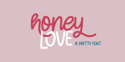 Honey Love is a pretty font that has a unique and attractive style, this font also has a lovely alternatives, which will make your designs even more perfect if you want to mix them in each of your designs. Perfect for logos and quotes or you can use it in any design you want to use.
 - Shannon by Monotype,
$29.99The Book of Kells is a handwritten Irish text which dates back to the 8th century. Kris Holmes and Janice Prescott digitalized some letters from this book and some from a Grotesk font in the style of Frutiger. A computer filled in the blanks and the designers then gave the font its finishing touches by hand. - Yasuragi by Hanoded,
$15.00 Yasuragi means ‘Peace of Mind’ or ‘Tranquility’ in Japanese. It is something I do not have a lot of since the corona lockdown…the ;-) Yasuragi is a handmade script font. It is quite neat, quite elegant and quite useful (in a tranquil, peace-of-mind kinda way). Yasuragi comes with double letter ligatures and all the diacritics you want.
 - Romulo by Tipo Pèpel,
$22.00 Romulo is a Roman typeface, inspired by the shapes and proportions of those used between the 19th and 20th centuries. Its height X is compensated to facilitate reading in blocks of text, providing readability in small bodies. With a crystalline appearance, it has a wide variety of Open Type functionalities that covers all the needs of the demanding designer.
 - Dance and Sing JNL by Jeff Levine,
$29.00 A 1932 fan magazine from Spain entitled “Films Selectos” (“Select Films”) had those words hand lettered in a decorative Art Deco type style that was a cross between the “Futura Black” style of stencil influenced display lettering and “Fiesta” lettering. This hybrid design is now available digitally as Dance and Sing JNL in both regular and oblique versions.