10,000 search results
(0.018 seconds)
- Ingo by Up Up Creative,
$16.00 Introducing Ingo, a sultry display font with smooth curves and high contrast. Featuring an ultra-modern and experimental yet highly readable "deconstructed serif" style, Ingo is perfect for your next editorial, advertising, branding, book, or invitation project. Ingo includes approximately 440 glyphs. OpenType features include multilingual support (including multiple currency symbols - for kicks I even included a Bitcoin symbol in there), standard and discretionary ligatures, and two ampersand variants. The OpenType features can be very easily accessed by using OpenType-savvy programs such as Adobe Illustrator and Adobe InDesign.
 - Ingeo by Blancoletters,
$40.00 Between the most rigid geometric letterforms and the most expressive calligraphy works there are, undoubtedly, countless combinatory possibilities. Ingeo is just one of them. Located very close to a geometric approach it shows, however, a clear willingness to accommodate in its structure the calligraphic traits of our alphabet. In Ingeo geometry grows from the inside, meaning that all its counters are based on geometric shapes. Around them, contours are later defined. The solid mass resulting from that interaction is modulated in specific areas in a way that evokes the way a writing hand finishes a letter and starts the following one. Ingeo seeks to accommodate calligraphic features in its geometric structure without any complexes, in the same way a computer engineer writes a song or a poet admires the orbits of planets and satellites. In this vast and unmapped realm between seemingly opposing concepts is where Ingeo finds its playground. There, that interaction is pushed to its limits and the resulting letterforms are later confronted with typographical conventions to assess whether they survive. Ingeo comes with 695 glyphs in its character set with support for more than 270 languages. Among these glyphs you can find 5 stylistic sets, 19 useful science-related icons as well as 7 different designs for ampersands.
 - Ingots by words+pictures,
$20.00 - Vingo by Poole,
$32.00Vingo is an understated, elegant, sans serif face. This font is among the first in a series of alphabets I am creating that are dignified and sophisticated. I wish these fonts had been available when I was designing wine labels. These fonts are rooted in "old world" tradition, but are more utilitarian. Some of the funky aspects are downplayed, some are enhanced and updated. Any job that requires understated sophistication is perfect for this face. The name comes from the French for wine, "Vin", and "Go" from gothic-wine gothic or Vingo. - Gingo by Mans Greback,
$29.00 Gingo is a wild brush script. The typeface was drawn and created by Måns Grebäck between 2018 and 2020. Its thick strokes are inspired by mid-century advertising, is full of spirit and progressiveness. The handwritten family consists of three weights: Gingo Thin, Gingo Medium and Gingo Bold. Its multiple alternate alphabets gives the font a true handwritten feeling. Use it for a logotype, a greeting card or as a headline. The font contains all characters you'll ever need, including all punctuation and numbers. It has an extensive lingual support, covering all European Latin-based scripts.
 - Bingo by Device,
$29.00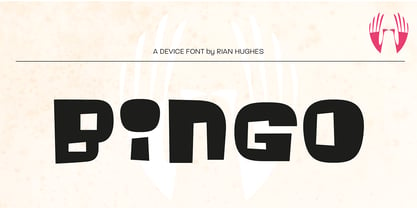
- Ingone by Ingrimayne Type,
$9.95 Ingone is a slightly irregular sans-serif face. It was designed to complement PattyDay and HeyPumpkin, but can be used alone if you need an informal, friendly sans-serif font. It has only one weight, but the family includes a shadowed style. In 2018 the inside of the shadowed version was separated out and made a separate typeface. The letters have the shapes of the regular version but the spacing of the shadowed version and can be layered with the shadowed version to easily produce lettering with two colors.
 - Ingot by AKTF,
$25.00
- Kingo by Omotu,
$18.00 Kingo is fabulous display serif font with retro look. Comes with stylish uppercase alternates and ligatures. Great for logotype, branding, packaging design, poster design, website/display, editorial, headline, advertising, and more. Whats Include? 1. Opentype support 2. Multilingual support 3. PUA encoded 4. Features: Uppercase, lowercase, numerals, punctuations, alternates, ligatures, and swashes. 5. Accessible in the Adobe Illustrator Glyphs panel, or under Stylistic Alternates in the Adobe Photoshop OpenType menu, Adobe InDesign, Corel Draw, even work on Microsoft Word Please message me if you're unsure of any language support. Thanks for looking, and I hope you enjoy it! Please don't hesitate to drop me a message if you have any issues or queries.
 - Ringo by typoland,
$9.00 Whassup y’all! Me and my bros got this li’l gang together: we is Ringo, and we got da bling, yo! We is da typeface family for ya all! We got some real sweet stuff for ya, some nice characters. We got all ’em OpenType features like fractions and proportional figgers, we even got da cubic root, man! And check out da question mark, man, is real sweet. And the ampersand, yeah! I luv ’em ampersands. Now my brothers over here got some light action for ya, and they got some real bold action for ya. We got some nice foxy curves goin’ on, some nice tension, and some nice relaxation. My bro Light over here is kind of like the subtle guy, ya know. He’s in for the female fans, ya know. Heh! Hell, yeah! And man, we speak like 84 languages: we speak the German, and the French, and the Spanish, and we speak the Polish, and the Czech, and the Hungarian, and we even speak Shambala and Swahili and Rundi, and we got some Esperanto thing as well for ya. And check out my bro Black right over here, he’s like the action superhero, man! He’s got impact, man! Yeah yeah, but you know, my bros Regular and Bold are the real deal. Them is like da word of da street, man! Like da word of you, and you. And we got a message for y’all: life is hard, life is real, but you should work your mojo, be smooth, be nice, chill. We got all them kerning pairs, and all them weights, and we got ’em alternate letters. So check us out, yo!
 - Nigo by Linecreative,
$16.00 Nigo is a stylish font It has both modern and retro look - clear, modern and fun, Perfect for make any project like header, quote, layout magazine and other. Even better if you use it on 60s and 70s design project
 - Pingo by Hanoded,
$15.00 Pingo is a nice, happy serif typeface. It is uncomplicated, playful and fun to use. Pingo comes with extensive language support.
 - Jingo by Canada Type,
$39.95 This is the digital makeover and major expansion of a one-of-a-kind melting pot experiment done by VGC and released under the name Mardi Gras in the early 1960s. It is an unexpected jambalaya of Art Nouveau, Tuscan, wedge serifs, curlycues, ball endings, wood type spurs and swashes, geometry and ornamental elements that on the surface seem to be completely unrelated. But the totality works in a surprisingly loud and playful way that really defies categorization. Jingo is really five fonts in one: Over 1000 glyphs, four character sets, ornaments, swashes and ligatures. The forms are interchangeable in uppercase, lowercase and unicase settings. There is nothing low-key about this typeface. It is well suited for use on posters and book covers that require happy weirdness. But most of all it's great for those who like to fiddle with their type setting until amazingly conicidental pleasantnesses ensue. If you're that kind of designer and you know what you're doing, get Jingo, start up that glyph palette, and play away.
 - Dingos by Antipixel,
$18.00 Dingos is a display typeface specially handcrafted for potent usage. It is compact, solid, and dense, with a heavy-built structure, tight internal space, and a versatile touch. Dingos is perfect for large settings due to its precise shapes. The 'Display' and 'Display Outline' styles have sharp and clean paths with angular ink traps, while 'Stamp' and 'Stamp Outline' have round ink traps and irregular, soft, curvy outlines optimized to ensure high-quality contours. Stamp textured styles have three sets of alphabets that slightly differ from one another. Thanks to the Contextual Alternates, these alphabets are automatically alternated to avoid repeating the same curvy textures. Some of Dingos' features are ligatures, discretionary ligatures, stylistic sets, numerators, fractions for any number combinations, arrows, special decorative characters, and a glyph coverage that ensures extended language support.
 - Igoe by Linecreative,
$16.00 Igoe is a monospaced font gives the impression of being clean and modern, It's Perfect forlogos, posters, album covers, and website headers. Igoe, A monospaced font, offers you: Igoe - A monospaced font including Upper & Lowercase characters(ALL CAPS), Stylistic alternates Character Supports Multi linguage (Latin Western Europe), Numbers and Punctuation
 - finitimus iungo - Unknown license

- Singo Sans by Ferry Ardana Putra,
$10.00 Singo Sans is a valiant font family and extraordinary sans serif. Singo itself literally means Lion in Indonesia, which is the the strong and gallant animal just like this typeface. It has proportion of hard lines and smooth curves. Singo works great in any branding, logos, magazines, films, posters, websites, etc. Singo features: A full set of uppercase characters Numbers & punctuation Multilingual language support PUA Encoded Characters 2360 Total glyphs
 - MBF Inno by Moonbandit,
$17.00 Inno font, is a modern take on the futuristic scifi theme, this typeface is clean, sharp, and have plenty of alternative, you can easily access them through uppercase lowercase. This font is great for headlines, sub titles and many attention grabber projects.
 - Battle Bingo by Zeenesia Studio,
$15.00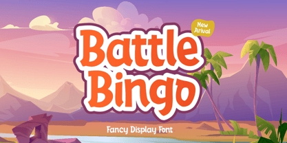 Battle Bingo is Playful and Fancy font. It was created with freehand handwriting style using a marker. It look classy and happiness to all your designs. You can use this font for a logo, kids clothing, invitation, poster, friendly design, fun design, book cover, adventure poster, outbound poster, and any cute and funny typeface needs and more.
 - Tazugane Info by Monotype,
$187.99 Tazugane Info is a screen-ready Japanese font family, that follows on the debut of Monotype's first original Japanese typeface – Tazugane Gothic. It offers a more restrained personality, with calligraphic design details pared back to create a geometric letterform – a good alternative for designers looking for a matter-of-fact alternative to the warmer Tazugane Gothic tone of voice. Tazugane Info was updated to support the “Reiwa” new era symbol. Reiwa can be written as two kanji: 令和. This update to Tazugane Info includes Reiwa designed as a single ligature and is encoded as U+32FF. “While Tazugane Gothic fits perfectly when your job requires an organic and friendly tone of voice, Tazugane Info provides a more solid look,” says Kobayashi. “I hope that having two options will make it easier to choose an appropriate tone of voice to convey information or brand messaging.” Its strokes create a smooth uninterrupted flow that's designed for use on-screen. Although books, newspapers and magazines are traditionally set vertically in Japan, smartphones, information panels and car navigation systems are all set horizontally – and Tazugane Info has been tailored to this environment, featuring a new set of kana phonetic symbols. Tazugane Info is available in 10 weights, and includes the complete set of kanji and latin found in Tazugane Gothic.
 - ITC Lingo by ITC,
$29.99I've been obsessed with type since I was very young, says designer Pelle Piano. “In fact, when I was ten, I used to sneak into stores who sold Letraset sheets, and I actually stole their catalog with all the typefaces. They were perfect good-night stories for me - alphabet after alphabet!” In ITC Lingo, Piano tried out the effect of taking a very rigid underlying letter shape and representing it with “really sloppy outlines.” The underlying form is a condensed Bodoni-like alphabet, with high contrast between thick and thin strokes, but the effect of Lingo is sketchy and informal. - Iago NF by Nick's Fonts,
$10.00Two classics from American Type Founders specimen catalogs of the 1880s—Othello and ATF Black Caps—inspired this powerful headline face with a decidedly menacing quality. Suitable for creepy, eerie and spooky occasions. Both versions of the font include complete Latin 1252, Central European 1250 and Turkish 1524 character sets, with localization for Moldovan, Romanian and Turkish. - Aesthetic Bingo by Absonstype,
$20.00 Aesthetic Bingo is the Unique Serif display typeface with combine uppercase and lowercase looks and feel nice balanced. Provide with alternates and ligatures font in variant style make the design letter looks nice. Honestly it works perfectly for headlines, logos, posters, packaging, T-shirts and much more. Recommended to use in Adobe Illustrator or Adobe Photoshop with opentype feature. Ligatures feature is default setting in Adobe Illustrator or Adobe Photoshop in Uppercase character. So when you want not to use the ligatures. Open glyphs panel : In Adobe Photoshop choose tool Window >> Character and then please click fi symbol In Adobe Illustrator choose tool Window >> Type >> Open Type and then please click fi symbol How to access Alternates Character? Open glyphs panel : In Adobe Photoshop choose tool Window glyphs In Adobe Illustrator choose tool Type glyphs If you have questions, just send me a message and I’m glad to help. Have a great day, Absonstype
 - HGB Info by HGB fonts,
$21.00 HGB Info is a display typeface for my Linotype Nautilus Monoline. This came about while working on the corporate design for the municipality of Weissach im Tal. Shorter ascenders and descenders and a broader letter shape result in more compact word images. The ups and downs are cut vertically. This works particularly well in large degrees. This is the area of application on signage and information systems.
 - Font - Unknown license

- Shadows Into Light - Personal use only

- Tazugane Info Variable by Monotype,
$1,049.99 Tazugane Info is a Japanese typeface family developed by the Monotype Studio, an alternative set of kana designed to match the kanji and Latin alphabet which retains the original form of the Tazugane Gothic. In contrast to the Tazugane Gothic, the kana of Info family is more systematically designed in order to give the text a calm, restraint look.
 - HGB Info OSF by HGB fonts,
$20.00 It's nice when a font provides old style figures, small caps and alternate letters. But what to do if my typesetting program doesn't support Open Type features? The solution may be old-fashioned, but it's effective: the variants are placed in separate font families: Standard, Old Style Figures (OSF), and Small Caps (SC). Any word processor can handle it. As a special feature, my OSF fonts also contain alternative letters such as a looped g or descenders in the italic f.
 - FF Info Pict by FontFont,
$62.99 Erik Spiekermann, working in collaboration with Ole Schäfer, originally designed FF Info® Display for use in the context of wayfinding systems. The variants FF Info™ Text and FF Info™ Correspondence were developed later for text setting and office communication. FF Info Display The sober and clear forms of the sans serif FF Info Display have been deliberately molded to make them perfect for use on wayfinding systems. The font by Ole Schäfer and Erik Spiekermann not only takes the problem of lack of space into account - it is some 15% narrower than comparable typefaces - the characters have also been designed to ensure they remain legible even in adverse conditions for reading. As text on signs often contains words with which readers are unfamiliar and which are thus deciphered letter for letter rather than perceived as whole words, it is essential to provide for a clear differentiation between glyphs. Additional serifs on the lowercase "i" and uppercase "I" and a small arch on the terminal of the lowercase "l" ensure that it is possible to readily discriminate between these particularly problematic letters. Moreover, sharp corners on glyphs can also make it difficult to read signs with backlighting or when driving past. The rounded corners of FF Info Display counteract this effect and make sure that the character forms remain well defined.FF Info Display is available in five carefully coordinated weights, from Regular to Bold. In the corresponding italic variants, the letters appear overall more rounded while the lowercase "a" has a closed form and the "f" has a descender. Also included among the glyphs of FF Info Display are several ligatures and arrow symbols. Pictograms with different themes that complement the typeface are also available in four weights. FF Info Text Thanks to his know-how gained through designing other typefaces, Erik Spiekermann became aware that fonts created for use in problematic environments can be used in many different situations. In smaller point sizes, FF Info Display cuts a fine figure when used to set longer texts. So Spiekermann carefully reworked FF Info Display to produce FF Info Text, a font perfected for use in this context. Not only can the characters be more generously proportioned, certain features, such as additional serifs to aid with the differentiation of problematic letters, are also no longer necessary in textual surroundings. The upright styles have a double-story "g" while Spiekermann has added oldstyle figures and small caps. FF Info Correspondence FF Info Correspondence has also been designed for setting block text although it recalls the style of old typewriter characters and is specifically intended for use in office communication. The characters of this third member of the family are thus more formal, without rounded terminals but with rectangular punctuation marks. The narrower letters are provided with large serifs to give them more space although, at the same time, this reduces the differences in terms of letter width among the alphabet. In contrast with its two siblings, FF Info Correspondence has only three weights, each with corresponding italic.The three styles of the FF Info super family cover an extensive range of potential applications. If the different kerning is adjusted manually, the three styles harmonize happily with each other and can be readily used in combination to set, for example, headlines and texts and also creative display options.
 - Ingy Star Tilings by Ingrimayne Type,
$9.00 IngyStarTilings allows one to create a variety of patterns that have stars. Some of them are quite common and others less so. A sample file is available that shows possible patterns that can be constructed with this typeface, including some non-star repeating patterns. As the posters indicate, some of the patterns constructed with the regular version are intended to be multicolored.
 - FF Info Text by FontFont,
$75.99 German type designers Erik Spiekermann and Ole Schäfer created this sans FontFont between 1996 and 2000. The family has 10 weights, ranging from Regular to Bold (including italics) and is ideally suited for book text, editorial and publishing, small text as well as web and screen design. FF Info Text provides advanced typographical support with features such as ligatures, small capitals, alternate characters, case-sensitive forms, fractions, and super- and subscript characters. It comes with a complete range of figure set options – oldstyle and lining figures, each in tabular and proportional widths. In 1998, FF Info Text received the The Big Crit award. This FontFont is a member of the FF Info super family, which also includes FF Info Correspondence and FF Info Display.
 - HGB Info SC by HGB fonts,
$10.00 It's nice when a font provides old style figures, small caps and alternate letters. But what if my typesetting program doesn't support Open Type features? The solution may be old-fashioned, but it's effective: the variants are placed in separate font families: Standard, Old Style Figures (OSF), and Small Caps (SC). Any word processor can handle it. HGB Info SC adds real Small Caps to HGB Info.
 - Bingo Player JNL by Jeff Levine,
$29.00Bingo Player JNL is a thorough reworking of Jeff Levine's old freeware font - cleanly redrawn with fresh glyphs and a set of "alphabet balls" for creating short headlines. To match the fonts in these dingbats for other text applications, use Shopkeeper JNL, Trade Journal Wide JNL and Market JNL. - FF Info Display by FontFont,
$72.99 German type designers Erik Spiekermann and Ole Schäfer, and German design agency MetaDesign created this sans FontFont between 1996 and 2000. The family has 18 weights, ranging from Regular to Bold (including italics) and is ideally suited for advertising and packaging, book text, editorial and publishing, logo, branding and creative industries, small text, wayfinding and signage as well as web and screen design. FF Info Display provides advanced typographical support with features such as ligatures, alternate characters, case-sensitive forms, fractions, super- and subscript characters, and stylistic alternates. It comes with proportional lining, proportional oldstyle, and tabular lining figures. In 1998, FF Info Display received the The Big Crit award. This FontFont is a member of the FF Info super family, which also includes FF Info Correspondence and FF Info Text.
 - Ingy Ding MCD by Ingrimayne Type,
$21.00 This font began as an attempt of draw alternatives to the images of Microsoft’s Wingdings, but then grew beyond that. This new version from late 2010 has over 1400 characters, including almost all of the geometric shapes in unicode 2500 and 2B00 ranges, almost all of the arrows in the unicode 2100, 2700, 2900, and 2B00 ranges, almost all of the dingbats and symbols in the unicode 2600 and 2700 ranges, many of the pictures, symbols, and emoticons in the 1F300 to 1F600 ranges, and a few of the miscellaneous technical items in the 2300 range. There are also pictures on the standard open type letters, most of which can be accessed from the keyboard. However, most of the characters in this typeface have to be accessed using their unicode designation. In Windows this is done with the alt key and the unicode hex number. On the Macintosh the easiest way (and for the five digit unicode characters, perhaps the only way) is to use the “Special Characters” window under the Edit Menu in the Finder. A unicode index of the font is provided in a pdf file that was generated using FontLab. However, it only has four of the unicode digits for the five-digit elements. Almost all of the unicode numbers starting with F should have a 1 in front of the F.
 - Mingo Gothic SG by Spiece Graphics,
$39.00 This typeface appears to be straight out of a science fiction movie thriller. Mingo is a slightly condensed, somewhat vain gothic with thick vertical strokes proudly tapering downward. Capitals which are normally completely round are now square inside with curving outside corners. Lowercase letters carry the same design traits. And, in the capital A and H, crossbars extend on both sides helping give the face a pronounced retro look. Mingo Gothic is a close cousin to Raleigh Gothic and is an excellent choice for book covers and large display settings. Small caps, fractions, and alternate characters have also been developed for greater layout versatility. Mingo Gothic Bold is now available in the OpenType format. Some new characters have been added to this OpenType version as stylistic alternates, historical forms, small caps, oldstyle figures, ornaments, and f-ligatures. These advanced features work in current versions of Adobe Creative Suite InDesign, Creative Suite Illustrator, and Quark XPress. Check for OpenType advanced feature support in other applications as it gradually becomes available with upgrades.
 - FF Info Correspondence by FontFont,
$72.99 German type designers Erik Spiekermann and Ole Schäfer created this sans FontFont in 1998. The family has 6 weights, ranging from Regular to Bold (including italics) and is ideally suited for advertising and packaging and logo, branding and creative industries. FF Info Correspondence provides advanced typographical support with features such as ligatures, alternate characters, case-sensitive forms, fractions, super- and subscript characters, and stylistic alternates. It comes with proportional lining and tabular lining figures. In 1998, FF Info Correspondence received the The Big Crit award. This FontFont is a member of the FF Info super family, which also includes FF Info Display and FF Info Text.
 - Lifetime Font - Personal use only

- Sucker Font - Personal use only

- Charming Font - Unknown license


Page 1 of 250Next page