10,000 search results
(0.039 seconds)
- Normandia by Canada Type,
$30.00 Designed over three years after the second World War, and published in 1949 by the Nebiolo foundry, Normandia was Alessandro Butti’s take on the fat face. As it usually was with Butti’s designs, this face effectively injected a catchy yet expertly calculated calligraphic spin into its source of inspiration — which was the essentially geometric/deco, thicker model of Bodoni’s very popular aesthetic. The metal Normandia saw some widespread use for a handful of years after its publication, not least because of the multitude of sizes in which it was available. It stepped out of the limelight by the mid-1950s, due to a combination of the popularity of cold type and Nebiolo’s refusal to retool its faces for new technologies. It was copied by a few small film typesetting outfits on both sides of the Atlantic, but never really found its way back to the mainstream. By the time computer type became the norm, Normandia was pretty much relegated to a type historian’s collection of anecdotes. This digital update of the classic series revives and refines the three original metal designs (Tonda/Regular, Corsiva/Italic, and Contornata/Outline) and expands the character set to more than 600 glyphs per font, including small caps, six types of figures, fractions and nut fractions, a full set of f-ligatures, some stylistic alternates, and other fine typography niceties.
 - Studio Neon by LLW Studio,
$22.00 Studio Neon is an all-caps display font constructed with three rounded-end strokes; the lowercase set is included as a repeat of the uppercase to make setting type just that little bit easier. It’s a modern rendition of neon sign lettering, with a decidedly art deco pedigree, and is intended for use in larger sizes of type, upwards of 36 pt. It’s perfect for a design that wants to imitate neon — use Photoshop layer effects to light it up! I originally started this font with only a few letters, since I could not find a neon-style font made with 3 strokes that looked modern. (Once I started, I found out why. It's a LOT of work!) Most traditional neon fonts include a “bent tube” element in the design; however, not all modern neon signage is constructed with the tubes bent. I also wanted to design a fun font that would have more life than just as an imitation of signage — something to inspire designers who love the geometry of art-deco type. So I made all the corners consistent, with no references to bent tubes. Use this font for any application that needs a bold and decorative look. Studio Neon should work well for sign production and even vinyl cut applications at larger sizes.
 - Edcosmic by Colllab Studio,
$14.00 "Hi there, thank you for passing by. Colllab Studio is here. We crafted best collection of typefaces in a variety of styles to keep you covered for any project that comes your way! CALLING ALL CREATIVE PEOPLE and any other creator who wants their work to stand out. Edcosmic is an urban glyphic font that pours unique character into your creation. The traditional way of having graffiti style is to draw every letter manually. For every styles that you want to create, you’ll have to draw each letter by hand. This will take you days and most likely months to finish your project. With technical development, it limits the use of graffiti style in real life because it is so time consuming. Edcosmic is a graffiti font with an elaborate character set that makes creating the new styles easier than ever before. You don’t have to draw every single letter by hand anymore. What took months can now be done within hours if not minutes! You are still limited by your own creativity instead of time consumption. Edcosmic is a font with a new graffiti character set that gives creative freedom to your world. The font has very detailed characters, this will make your design different from all the others. By having a special font you can create a new style and make the world your own! A Million Thanks www.colllabstudio.com
 - Ferguson by Arterfak Project,
$14.00 Ferguson is a geometric slab serif which made with a mono-line concept and versatile style. Inspired by old western and magazine designs. Ferguson has a straight and consistent line to give neat looks. Ferguson is made for editorial and formal purposes. but still flexible to use it in other typographic projects. This font family has 6 weights and 2 widths that gives you many options on your designs projects. - Regular versions: Comes from Light, Normal, Medium, Bold, Black, and Ultra Black. Very recommended for editorial use such as body text, sub-headline, and tagline. The bolder weights are goods for headline too. Strong and geometric! Suitable for sports themes, social movement, masculine and logotypes. - Condensed versions: Available in Light, Normal and Bold. Great choice for a headline, and display. This condensed designed a bit minimalist than regular version to keep the readability. Also, there is Bold Shadow style to complete the vintage movement which happening now. Suitable for a poster, magazines, and clothing project. Ferguson font family has up to 28 accents: Afrikaans, Albanian, Catalan, Croatian, Czech, Danish, Dutch, English, Estonian, Finnish, French, German, Hungarian, Icelandic, Italian, Latvian, Lithuanian, Maltese, Norwegian, Polish, Portuguese, Romanian, Slovak, Spanish, Swedish, Turkish, Zulu. Fonts featured : - Uppercase - Lowercase - Numerals - Some symbols - Diacritics Thank you. Hope you like it and enjoy!
 - Gegor by Balibilly Design,
$17.00 Say Hello to Gegor, an experimental serif display font. Gegor is freedom of our hand when creating the letterform without many references. We try to let the pen tool flow and dancing according to our imagination. The characters of this typeface are adopted from the letter "r". She was born and influence each other. The simple shape on the shoulder are slightly pointy at a thick weight and curves at a thin weight have a big influence on other letters. The unique form of letter "r" takes us to further development to get achieve a distinct harmony as a display typefaces. If you look at the teaser images and get an idea, we are in line. Gegor consists of 14 families from thin to black, and 1 outline style in black weight equipped with discretionary ligatures, case-sensitive forms, ordinals, small capital, and fractions. Consists of multilingual support including Western European, Central European, and Southeastern European. Gegor is perfect for posters, logos, branding, magazines, websites, and more. Gegor will give a unique vibe to your works. Supports languages: Afrikaans, Albanian, Asu, Basque, Bemba, Bena, Bosnian, Catalan, Cebuano, Chiga, Colognian, Cornish, Corsican, Croatian, Czech, Danish, Dutch, English, Estonian, Faroese, Filipino, Finnish, French, Friulian, Galician, Ganda, German, Gusii, Hungarian, Icelandic, Ido, Inari Sami, Indonesian, Interlingua, Irish, Italian, Javanese, Jju, Jola-Fonyi, Kabuverdianu, Kalaallisut, Kalenjin, Kinyarwanda, Kurdish, Latvian, Lithuanian, Lojban, Low German, Lower Sorbian, Luo, Luxembourgish, Luyia, Machame, Makhuwa-Meetto, Makonde, Malagasy, Malay, Maltese, Manx, Maori, Morisyen, North Ndebele, Northern Sami, Northern Sotho, Norwegian Bokmål, Norwegian Nynorsk, Nyanja, Nyankole, Occitan, Oromo, Polish, Portuguese, Romanian, Romansh, Rombo, Rundi, Rwa, Samburu, Sango, Sangu, Sardinian, Scottish Gaelic, Sena, Shambala, Shona, Slovak, Slovenian, Soga, Somali, South Ndebele, Southern Sotho, Spanish, Swahili, Swati, Swedish, Swiss German, Taita, Taroko, Teso, Tsonga, Tswana, Turkish, Turkmen, Upper Sorbian, Vunjo, Walloon, Welsh, Western Frisian, Wolof, Xhosa, Zulu
 - Ma Braille by Echopraxium,
$5.00 The "Ma" in "Ma Braille" is used as a minimalist way to say "Negative Space". "Ma" in japanese arts is an "esthetical usage of emptiness". Thus this font explicits the negative space around visible braille dots in each glyph. A. Font user guide a.1. Lowercase glyphs { A..Z } In these glyphs, dots are represented as "black squares" while the negative space is displayed as 1 or 2 white filled polygons. a.2. Uppercase glyphs { a..z } In these glyphs, dots are represented as "white squares" while the negative space is displayed as 1 or 2 black filled polygons. a.3. Digits: they are just the same than a..j, but the "North US version" is also provided in ascii codes 0xE0..0xE4 (1..5) and 0xE7..0xEB (6..0). a.5. "Dashed Border": a.5.1. "Black dashed" border glyphs; { £, ¥, µ, Â, Ä, Ê, Ë, Î, Ï, Ô } a.5.2. "White dashed" border glyphs; { Ö, Õ, °, ô, ö, î, ï, û, u, õ } B. Posters Poster 1: "Font Logo" version 1, it displays "Ma Braille" text surrounded by the "black dashed border" glyphs. Poster 2: "Font Logo" version 2, it displays "MA" glyphs in big size and smaller "Braille" glyphs within "M" and within "A" as well. Poster 3: the classical pangram to test a font "The Quick Brown Fox jumps over the Lazy dog". Poster 4: Article 1 of the Human Rights: All human beings are born free and equal in dignity and rights. They are endowed with reason and conscience and should act towards one another in a spirit of brotherhood. Poster 5: the "Glyph set" (Border glyphs not included) with A..Z, a..z, digits and special characters.
 - Gravesend Sans by Device,
$39.00 Smart, legible and elegant, Gravesend Sans is a based on the unique typeface used for the iconic grass-green signage for the Southern Railway. In existence from 1923 to 1948, when the network was nationalised, the Southern Railway linked London with the Channel ports, South West England, the South coast resorts and Kent. The same design was also used for the ‘hawkeye’ signs on the London, Midland and Scottish Railway, differentiated by black letters on a yellow background. Reference for each letter was taken from vintage ‘target’ station nameplates and other platform signage. The rarest letters were the Q, seen in Queens Road Battersea, the X, seen in East Brixton, and the Z, used in Maze Hill, site of an infamous train crash in 1958. Being hand-made, the letters often differ in width and thickness. There was no lower case. The Bluebell Railway, a heritage steam line, runs over part of the old Southern Railway network and uses a very similar type. The design of the numbers differed considerably, but here have been taken from the Device 112 Hours font Smokebox. As well identifying platforms, they were used on the front of the steam engine’s smokebox, hence the name, and stylistically are more in keeping with the letters than some of the squarer versions that can be seen in old photographs. William Caslon IV is credited with the first Latin sans-serif type, shown in a 1816 Caslon specimen book. ‘Two Lines English Egyptian’, as it was called, was caps-only, and there are several other correlations between that type design and this one. Includes a selection of authentic arrows and manicules, plus abbreviated ligatures such as ‘St.’ (Saint or Street) ‘Rd.’ (Road) and ‘Jn.’ (Junction). The Cameo version includes many graphic banner elements that can be freely combined.
 - Onamura by Balibilly Design,
$22.00 Initially, letterform was inspired by the gothic style of Romance decorative letters in transitional art in the Middle Ages. The conservative type in the Gothic era, especially in decorative romance, has led to the Victorian style being embedded in several forms as accents related but not forced to be combined. Rounded serif seems conventional combined with historically relevant letterform to create a harmonious blend. The art nouveau style also inspires this typeface. Approach to architectural ornamentation from 1880 to 1915, adopting the dynamic lines and curves typical of the civilization of the time. Continue time travel; we also present a more modern form influenced by the digitalization of art nouveau derivatives, familiarly called the psychedelic style. Paying homage to predecessors, we presented The Onamura font in a Japanese Ukiyo-e style that influenced the fine arts movement that broke old conservative art in Europe. We designed this font carefully with the information about the Middle Ages, Ukiyo-E, & Art Nouveau that greatly influenced art worldwide. In this font family, there are collaboration vibes. Both are the basis of the phenomenal blend of idealism between western and Japanese artists. Consisting of 10 fonts in 10 weights, it features an extended charset of over 850 glyphs, covering multilingual support, including Western European, Central European, and Southeastern European. Complete with advanced open type features like stylistic alternates, discretionary ligatures, ordinals, small caps, fractions, and case-sensitive forms. The elegant and refined details seen in this font provide a new aesthetic input, satisfy contemporary style, and give a range of choices for luxury typographic projects. This font is perfectly suited for high-impact headlines. Advance open-type features are stunning on logos, branding, magazines, website, etc. Supports languages: Afrikaans, Albanian, Asu, Basque, Bemba, Bena, Bosnian, Catalan, Cebuano, Chiga, Colognian, Cornish, Corsican, Croatian, Czech, Danish, Dutch, English, Estonian, Faroese, Filipino, Finnish, French, Friulian, Galician, Ganda, German, Gusii, Hungarian, Icelandic, Ido, Inari Sami, Indonesian, Interlingua, Irish, Italian, Javanese, Jju, Jola-Fonyi, Kabuverdianu, Kalaallisut, Kalenjin, Kinyarwanda, Kurdish, Latvian, Lithuanian, Lojban, Low German, Lower Sorbian, Luo, Luxembourgish, Luyia, Machame, Makhuwa-Meetto, Makonde, Malagasy, Malay, Maltese, Manx, Maori, Morisyen, North Ndebele, Northern Sami, Northern Sotho, Norwegian Bokmål, Norwegian Nynorsk, Nyanja, Nyankole, Occitan, Oromo, Polish, Portuguese, Romanian, Romansh, Rombo, Rundi, Rwa, Samburu, Sango, Sangu, Sardinian, Scottish Gaelic, Sena, Shambala, Shona, Slovak, Slovenian, Soga, Somali, South Ndebele, Southern Sotho, Spanish, Swahili, Swati, Swedish, Swiss German, Taita, Taroko, Teso, Tsonga, Tswana, Turkish, Turkmen, Upper Sorbian, Vunjo, Walloon, Welsh, Western Frisian, Wolof, Xhosa, Zulu
 - Sicero by Konstantine Studio,
$12.00 Back in 1800 - 1900, the Serif fonts or known as Roman styles were very popular. Used in so many media, came from calligraphic technique and refined till it became a solid style even so many sign painters use this letter style back in that era. And today, these kinda style still got their fans who love the elegant yet clean solid style. That's what this came for. Please welcome, Sicero Duo Fonts. Its a dynamic duo fonts that came in Serif and Sans-Serif style which is perfectly fit to each other. Bring the old vibes instantly to your project with them :) Sicero Roman A Serif style font with implementations of old-era style, clean and done in click-by-click to fulfil your perfectionist personal. And it comes in Old Style Numbering too, to make the vibes stronger in the whole vintage design when using it. Sicero Sans A Sans-Serif font to make a good pair with Sicero Roman still holding those old vibes but a little bit modern touch in here to reach wider range of trends. Use it all alone is still good to go if you want something different with not pairing it with Sicero Roman as well. Available in OTF, TTF, and Webfonts. Enjoy it more. Have some fun with it, Oldsport :) Cheers, Konstantine Studio
 - Bfrika by Holland Fonts,
$30.00Bfrika is an 'Africa inspired' typeface and a contribution for the typographic issue 'National Typographica' of I-Juici Magazine, in South Africa. This geometrical decorative design represents bold simplicity, directness and rythm. The name evolved from text for the spread in the magazine. The B replaces the A. Africa be free. Bfrika. The concept behind Bfrika is to generate an unpredictable visual rhythm in an attractive decorative presentation. Filling up the white space around the letters accentuates form over function, thus creating an interference of visual impressions with its legibility. This visual rhythm is amplified by its redundancy in a text, only pausing at a break or a word space. Based on the concept of separate printing forms in letterpress, Bfrika Two Tone and Bfribat Two Tone separate the letter from the outside form in two fonts. Placing two text frames exactly on top of each other and assigning each part of these font to a frame in a different color, offers a quick way to add color. Originally Bfrika was designed for I-Jusi magazine #17, National Typografika, South Afrika 2001. Bfribat and both two tone fonts were created for Building Letters, a fund raiser for orphanages in Kenya and Uganda (www.buildingletters.org) and are also available for Mac and PC at www.hollandfonts.com and will be distributed in 2004 through associated foundries. - Fleischmann Gotisch PT by preussTYPE,
$29.00 Johann Michael Fleischmann was born June 15th, 1707 in Wöhrd near Nuremberg. After attending Latinschool he started an apprenticeship as punchcutter in the crafts enterprise of Konstantin Hartwig in Nuremberg, which ought to last six years. For his extraordinary talent Fleischmann completed his apprenticeship after four and a half years, which was very unusual. 1727 his years of travel (very common in these days) began, during which he perfected his handcraft by working in different enterprises as journeyman. First location was Frankfurt/Main where he worked for nearly a year at the renowned type foundery of Luther and Egenolff. Passing Mainz he continued to Holland, where he arrived in November 1728 and stayed till he died in 1768. In Amsterdam he worked for several type founderies, among others some weeks for Izaak van der Putte; in The Hague for Hermanus Uytwerf. Between 1729 and 1732 he created several exquisite alphabets for Uytwerf, which were published under his own name (after his move to Holland Fleischmann abandoned the second n in his name), apparently following the stream of the time. After the two years with Uytwerf, Fleischmann returned to Amsterdam, where he established his own buiseness as punchcutter; following an advice of the bookkeeper and printer from Basel Rudolf Wetstein he opened his own type foundery 1732, which he sold in 1735 to Wetstein for financial reasons. In the following Fleischmann created several types and matrices exclusively for Wetstein. In 1743 after the type foundery was sold by Wetstein’s son Hendrik Floris to the upcoming enterprise of Izaak and Johannes Enschedé, Fleischmann worked as independent punchcutter mostly for this house in Haarlem. Recognizing his exceptional skills soon Fleischmann was consigned to cutting the difficult small-sized font types. The corresponding titling alphabets were mostly done by Jaques-Francois Rosart, who also cut the main part of the ornaments and borders used in the font examples of Enschedé. Fleischmann created for Enschedé numerous fonts. The font example published 1768 by Enschedé contains 3 titling alphabets, 16 antiquacuts, 14 italic cuts, 13 textura- and 2 scriptcuts, 2 greek typesets (upper cases and ligatures), 1 arabic, 1 malayan and 7 armenian font systems, 5 sets of musicnotes and the poliphonian musicnotesystem by Fleischmann. In total he brought into being about 100 alphabets - the fruits of fourty years of creative work as a punchcutter. Fleischmann died May 27th, 1768 at the age of 61. For a long time he was thought one of the leading punchcutters in Europe. A tragedy, that his creating fell into the turning of baroque to classicism. The following generations could not take much pleasure in his imaginative fonts, which were more connected to the sensuous baroque than to the bare rationalism of the upcoming industrialisation. Unfortunately therefore his masterpieces did not survive the 19th century and person and work of Fleischmann sank into oblivion. The impressive re-interpretation of the Fleischmann Antiqua and the corresponding italics by Erhard Kaiser from Leipzig, which were done for the Dutch Type Library from 1993 to 1997, snatched Fleischmann away from being forgotten by history. Therefore we want to place strong emphasis on this beautiful font. Fleischman Gotisch The other fonts by Fleischmann are only known to a small circle of connoisseurs and enthusiasts. So far they are not available in adequat quality for modern systems. Same applies the "Fleischman Gotisch", which has been made available cross platform to modern typeset-systems as CFF Open Type font through the presented sample. The Fleischman Gotisch has been proved to be one of the fonts, on which Fleischmann spent a good deal of his best effort; this font simply was near to his heart. Between 1744 and 1762 he created 13 different sizes of this font. All follow the same principles of forms, but their richness of details has been adapted to the particular sizes. In later times the font was modified more or less sensitive by various type founderies; letters were added, changed to current taste or replaced by others; so that nowadays a unique and binding mastercopy of this font is missing. Likewise the name of the font underwent several changes. Fleischmann himself probably never named his font, as he did with none of his fonts. By Enschedé this textura was named Nederduits, later on Nederduitsch. When the font was offered by the german type foundery Flinsch in Frankfurt/Main, the more convenient name of Fleischmann-Gotisch was chosen. In his "Masterbook of the font" and his "Abstract about the Et-character" Jan Tschichold refered to it as "Duyts" again. To honour the genious of Johann Michael Fleischmann we decided to name the writing "Fleischmann Gotisch PT" (unhyphenated). Developing the digital Fleischman Gotisch I decided not to use one of the thirteen sizes as binding mastercopy, but corresponding to the typical ductus of the font to re-create an independent use of forms strongly based on Fleischmann´s language of forms. All ascenders and descenders were standardised. Some characters, identified as added later on, were eliminated (especially the round lower case-R and several versions of longs- respectively f-ligatures) and others were adjusted to the principles of Fleischmann. Where indicated the diverse characters were integrated as alternative. They can be selected in the corresponding menu. All for the correct german black letter necessary longs and other ligatures were generated. Through the according integration into the feature-code about 85% of all ligatures in the type can be generated automatically. Problematic combinations (Fl, Fk, Fh, ll, lh, lk, lb) were created as ligatures and are likewise constructed automatically. A historically interesting letter is the "round r", which was already designated by Fleischmann; it is used after preceding round letters. Likewise interesting is the inventive form of the &-character, which is mentioned by Tschichold in his corresponding abstract. Nevertheless despite all interpretation it was very important to me to maintain the utmost fidelity to the original. With this digital version of a phantastic texturfont of the late baroque I hope to contribute to a blossoming of interest for this genious master of his kind: Johann Michel Fleischmann. OpenType features: - Unicode (ISO 10646-2) - contains 520 glyphes - Basic Latin - Latin-1 Supplement - Latin Extended-A - Latin Extended-B - Central European Glyhps - Ornaments - Fractions - Standard ligatures - Discretionary ligatures - Historical ligatures - Kerning-Table
 - Aodaliya by Type Associates,
$30.00 As a practicing graphic designer there have been numerous occasions when I have needed a font that didn’t exist. More often than not the style I was looking for was described as an extra-condensed sans-serif with a contemporary look that was available in a variety of weights. Small caps would be useful, so would a range of numeral styles. And matching italics too, of course. The proportions would consider viewing on hand-held devices, cell phones, remote controllers. And not forgetting that the font would be used in situations which required stacking the lines close. So the overshoots needed to be eliminated – the exaggeration of extremities that are intended to avoid round characters appearing smaller than their more squarish counterparts, often colliding when linespacing is tight. As I refined the design, I tested it on several works-in-progress providing a valuable testing ground and proving popular with my clients.
 - The Youngest by My Creative Land,
$39.00 The Youngest is a unique modern font family that contains a handwritten signature script and a classic mid-contrast elegant classic serif in two styles - Display and Book. Both serif and handwritten script benefit from stylistic alternates and ligatures that give your creativity a wide variety of design options. The Book serif is optimized to be comfortably read on screen in small sizes. The Youngest Script has more than 600 ligatures (100+ unique basic Latin ligatures, their multilingual variations, and 70+ Cyrillic ligatures) to mimic a realistic handwriting. The serif style has a lot to offer too - more than 300 ligatures including 40+ basic latin ligatures, their multilingual variations and 30+ Cyrillic ones. All three styles support most of the Latin based languages as well as have basic (Russian) Cyrillic support. All three styles, as usually, fully unicode mapped and can be used in the majority of applications available on the market.
 - Shock Graffiti by Riasyletter_Studio,
$19.00 Want to add an urban touch to your designs? Try using the Shock Graffiti font! This font offers a distinctive writing style and is very suitable for urban and street-themed designs. With Shock Graffiti, you can bring a strong and bold impression to every design you create. Shock Graffiti comes with a complete set of letters and fine details, so you can customize your design better. This font is also very easy to use and compatible with various design applications. Suitable for use in posters, merchandise, or even in t-shirt and hoodie designs. Get Shock Graffiti now and become a daring design creator! Available at an affordable price and with flexible licensing, so you can use it without limits on your future projects. What’s Included : - More than 200 of glyphs ( include Uppercase, Lowercase, Numerals & Punctuations ) - multilingual support - Works on PC & Mac - Simple installations - Accessible in the Adobe Illustrator, Adobe Photoshop, Adobe InDesign, even work on Microsoft Word. - PUA Encoded Characters (fully accessible without additional design software) Support For Language : Albanian, Basque, Breton, Chamorro, Danish, Dutch, English, Faroese, Finnish, French, Frisian, Galician, Italian, Malagasy, Norwegian, Portuguese, Spanish, Alsatian, Aragonese, Arapaho, Arrernte, Asturian, Aymara, Bislama, Cebuano, Corsican, Fijian, French_creole, Genoese, Gilbertese, Greenlandic, Haitian_creole, Hiligaynon, Hmong, Hopi, Ibanag, Iloko_ilokano, Indonesian, Interglossa_glosa, Interlingua, Irish_gaelic, Jerriais, Lojban, Lombard, Luxembourgeois, Manx, Mohawk, Norfolk_pitcairnese, Occitan, Oromo, Pangasinan, Papiamento, Piedmontese, Potawatomi, Rhaeto-romance, Romansh, Rotokas, Sami_lule, Samoan, Sardinian, Scots_gaelic, Seychelles_creole, Shona, Sicilian, Somali, Southern_ndebele, Swahili, Swati_swazi, Tagalog_filipino_pilipino, Tetum, Tok_pisin, Uyghur_latinized, Volapuk, Walloon, Warlpiri, Xhosa, Yapese, Zulu, Latinbasic, Ubasic, Demo
 - Kiddie Love by Sipanji21,
$15.00 Kiddie Love is a lovely display font that radiates charm. It features gorgeous hearts in each letter which give it an incredibly romantic feel. this font suitable for valentine day poster, logo, t shirt, event banner and etc. you can use this font for any design, apparel, kids logo, logo type, with many swash for make your design awesome. feature : Kiddie Love Uppercase Kiddie Love Number and Punctuation Kiddie Love Multilingual Kiddie Love Swash
 - Sugar Cake by Larin Type Co,
$12.00 Sugar Cake this is a stunning handwritten font duo with hand-drawn illustrations. Script font includes many alternates, ligatures and swash with them you can create a more complete composition and make it more diverse and individual. A hand-drawn sans serif font will perfectly match the script and complement it. Also included in this font are hand drawn fancy illustrations that will be useful for design and decorate your project. Enjoy using!
 - Arrear by Kirill Malykhin,
$15.00 Arrear is a modern sans-serif font family. It includes three weights: regular, medium and bold. Has cut corners for lowercase letters. This is a versatile font that suits any project and is modern and easy to read. With it, you can create websites, logos, use in advertising, packaging, magazines and much more. This font will inspire you to create impressive designs that will amaze everyone! Multilingual support: extended latin and cyrillic.
 - The Beautyline by Putracetol,
$14.00 The Beautyline is a modern monoline typeface. Like the font name, this font is made of beautiful lines with additional lines in some characters which makes this font more beautiful. It’s perfect for branding, logos, wedding designs, social media posts, advertisements, invitations, stationery and any projects. The Beautyline comes with uppercase, lowercase, numerals, punctuation and many variations on each character, including OpenType alternates and common ligatures to let you customize your designs.
 - Blonden by Craft Supply Co,
$15.00 Introducing Blonden: A condensed sans-serif font that fuses modernity with streamlined efficiency. Blending style and compactness, Blonden brings a dynamic edge to any design. Experience the sleek versatility of Blonden's condensed form, perfect for making bold statements in tight spaces. This typeface is ideal for greeting card, packaging, brand identity, poster, or any purpose to make your design project look eye catching and trendy. Feel free to play with this typeface!
 - Javar by Arterfak Project,
$19.00 Javar is an all-caps display font. This font is designed in a colossal Middle Eastern style, with dynamic strokes using a flat pen which produces a magnificent and authoritative letterform. This font has a high historical taste, so it is perfect to be applied to specific themes such as culture, history, religion, kingdom, and battles. Equipped with accented characters, and special characters to boost your design. Thank you for your support!
 - Faubourg by Positype,
$39.00 Faubourg marks the first professional typeface release by Marie Boulanger. As much traditional as it is unconventional in its celebration of letterforms, this typeface dances on the page and screen as it moves from a more conventional appearance to monoline and back again. The flowing silk-like undulation only accentuates this distinguishing feature and produces one opportunity after the next for headline settings where the word is as important as the content supporting it.
 - Marclane by Ironbird Creative,
$10.00 Marclane is a hand drawn slab serif typeface. This item consist of 4 fonts in various styles which you can play around with it and also come with MARCLANE DINGBAT to make better design. This typefaces is perfect for people looking for vintage aesthetic and organic feel or design needs with a touch of classic western. What Will You Get : Marclane Slab Serif Marclane Dingbat If you have any questions, please contact (ironbirdcreative@gmail.com)
 - Sageyl by Sealoung,
$25.00 Proudly present Sageyl Typeface created by Sealoung, A serif modern and classic typeface that his own unique style & modern look. It loops and swoops in a delicate dance that is never boring. Use this dainty serif as a memorable logotype or header and pair it with something contrasting and clean. This typeface is perfect for an elegant & luxury logo, book or movie title design, fashion brand, magazine, clothes, lettering, quotes, and so much more.
 - Light Roast by Invasi Studio,
$19.00 The light Roast font is a fun, friendly, and hand-drawn vintage style. Inspired by the cafeteria and eatery vintage era, this font is available in regular and italic font. It can easily be matched to an incredibly large set of projects, so add it to your creative ideas and notice how it makes them stand out! This font is perfect for headings, flyers, greeting cards, product packaging, book cover, printed quotes, logotype, album covers.
 - My Sister by Fontdroe,
$15.00 My Sister is a new modern calligraphy typeface built in 658 glyphs. It has OpenType features with PUA encode. This is a smart font works with popular design software such as Photoshop, Corel Draw X version, Illustrator, Microsoft Office, etc. This modern calligraphy typeface welcomes you to use it for various purposes such as logo, card, wedding invitation, headings, signatures, t-shirt, letterhead, cutting, hot stamping, signage, labels, posters and more. It's very craft friendly.
 - Have a Nice Day by Cultivated Mind,
$20.00 Have A Nice Day is a handwritten font created by Cindy Kinash. This font features three font styles (Basic/Tall/Wide) and comes in three weights (Light/Regular/Bold). All three font styles can be used together as one unique and fun font! This font also includes a set of fun hand drawn ornaments like smiley faces, flowers, leaves, insects, frames, captions, desserts, food, clouds, and catchwords that will surely brighten your day! Enjoy!
 - Big Hug Weeny by Mvmet,
$12.00 Big Hug Weeny is a playful contemporary handwritten font, inspired by fun good old days cartoon in the late 80s and 90s. It will elevate a wide range of design projects to the highest level. You can use this font for many design ideas such as stickers, t-shirt designs, amazing logo designs, magazine or book covers, comics, cartoon drawings, and many more. This font will add a super cool touch to your designs!
 - Arkarna by Gatra Std,
$10.00 Introducing a cute handwriting "ARKARNA" Simple Sans-Serif Font! If you are needing a touch of casual modern San-Serif for your designs, this font was created for you! What's Included: Uppercase and Lowercase Number and Punctuation Support Language This font works best in a program that supports OpenType features such as Adobe Indesign, Adobe Illustrator CC and CS, or Adobe Photoshop CC and CS also CorelDraw Multilingual Support is included for Western European Languages
 - FF Typestar OCR by FontFont,
$62.99 German type designer Steffen Sauerteig created this slab FontFont in 1999. The font is ideally suited for logo, branding and creative industries and software and gaming. FF Typestar OCR provides advanced typographical support with features such as ligatures, alternate characters, case-sensitive forms, super- and subscript characters, and stylistic alternates. It comes with tabular lining figures. This FontFont is a member of the FF Typestar super family, which also includes FF Typestar.
 - Sterling Park by Olivetype,
$18.00 Meet Sterling Park, this font is perfect for adding a little love and warmth to your writing--in a way that feels authentic and personal. Whether you're writing love notes or cards or designing a tshirt, this hand-drawn font will add a friendly and authentic touch to your creations. So what’s included : Basic Latin Uppercase and Lowercase Numbers, symbols, and punctuations Multilingual Support. Simple Installations works on PC & Mac Thank You.
 - Danviska by Pixesia Studio,
$19.00 Introducing Danviska - An Elegant Modern Serif Font Danviska is a stylish, thick lettered and imposing serif font. This font is PUA encoded which means you can access all of the glyphs and swashes with ease! This font is perfect for branding projects, Logo design, Clothing Branding, packaging, magazine headings, poster, advertising, T-shirts, postcards, wedding invitation and much more. Fall in love with its incredibly versatile style and use it to create spectacular designs!
 - Halena Jordan by Bungletter,
$12.00 Halena Jordan is a beautiful script that's perfect for branding, wedding invitations, and other romantic projects. This love centered look makes it perfect for use in all your design projects be it logos, labels, packaging designs, blog titles, posters, wedding designs, social media posts, Instagram designs, etc. Contains full set: -Uppercase -Lowercase -Alternative -Ligature -Punctuation -Number -Multilingual support. I hope you enjoy this font. If you have any questions, feel free to message me.
 - Inglenook Corner NF by Nick's Fonts,
$10.00This whimsical wonder is based on the lettering of Laurence Schall, as presented in Lewis F. Day's 1910 classic, Alphabets Old and New. The typeface radiates a charm reminiscent of the works of many talented artists (including Howard Pyle and Arthur Rackham) who illustrated children's books around the turn of the twentieth century. The Opentype version of this font supports Unicode 1250 (Central European) languages, as well as Unicode 1252 (Latin) languages. - Tall And Narrow JNL by Jeff Levine,
$29.00 Let Me Call You Sweetheart was one of the most popular songs of the early 20th Century, and a piece of vintage sheet music for this tune had its title hand lettered in a square, narrow block lettering style. With a few adjustments and adaptations, this led to the creation of Tall and Narrow JNL, a digital version of the type design which is a perfect alternate to the more conventional condensed faces.
 - Morthix by Lone Army,
$17.00Introducing our latest font, which features fluid and flowy curves reminiscent of liquid. This font's contemporary style makes it perfect for use in headers and futuristic designs, adding a creative touch that's sure to catch the eye. Its elegant and modern appearance creates a striking impression, making it ideal for designs that need to stand out. With this font, you can create a unique and eye-catching look that's perfect for any project. - Ports Play by Alandya TypeFoundry,
$19.00 Port Play ... Based on Density Slab Serif, now with other styles, Normal and Expand, equipped with alternative letters that are so wide that they give a strong, clear, masculine feel, and have good legibility. Port Play comes in regular, oblique, outline, and outline oblique styles along with regular and oblique variable files. This font is perfect for every project. suitable for branding logo, badge design, or apparel design. This font also comes with multilingual support.
 - Deux Chasses NF by Nick's Fonts,
$10.00American Type Founders released the pattern for this typeface under the name "Thermotype". In the days of cast-metal foundry type, copyfitting headlines could prove problemmatic at times; this typeface, with a wide uppercase and narrower lowercase of exactly the same “color”, allowed stacked lines of type to be composed with uniform width. Clean, crisp and practical. Both versions of the font include 1252 Latin, 1250 CE (with localization for Romanian and Moldovan). - Bigtrack by Nathatype,
$29.00 Bigtrack is an uppercase display font with vintage looks. Their sharp corners and clean lines exude a sense of strength and confidence. With its heavy weight, this font ensures that your message stands out with authority. The generous spacing between characters adds to its legibility and imparts a sense of grandeur to your text. As a special bonus, this font includes ornaments. Bigtrack fits in headlines, logos, branding materials, and many more.
 - Asthetic by Craft Supply Co,
$15.00 Introducing Asthetic: A nostalgic serif font that channels the essence of bygone eras. With its timeless lines and vintage charm, Asthetic evokes a sense of nostalgia in your projects. Infuse your designs with the allure of the past using Asthetic's classic and enduring style. This typeface is ideal for greeting card, packaging, brand identity, poster, or any purpose to make your design project look eye catching and trendy. Feel free to play with this typeface!
 - Lancenia by Digitype Studio,
$16.00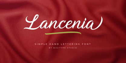 Lancenia - a stylish and simple handletter script typeface. This font will looks awesome and amazing in many ways on your latest design project. Lancenia is perfect for lots of different uses such as logos & branding, invitations, stationery, wedding designs, social media posts, advertisements, product packaging, product designs, labels, photography, watermarks, special events and more. This font has many OpenType features like ligatures, stylistic alternates, contextual alternates, swashes, and has multi-lingual support.