10,000 search results
(0.05 seconds)
- Glypster by Ardyanatypes,
$15.00 Glypster - Bold Aesthetic Serif Fonts is a font that has boldness in every line. This font's robust and bold style conveys a luxurious, elegant, retro, and aggressive feel. The serenity afforded by this font's blend of boldness and subtlety makes Glypster suitable for a wide variety of design choices. Apart from that, the strengths of Glypster are its ability to support multiple languages and additional features that can add interest to every design you make. In terms of marketing, Glypster is very suitable for purposes such as logos, posters, business cards, and many more, so you can explore the potential of this font for various designs. Glypster's simplicity, but still elegant and luxurious, makes it the right choice for all procedures.
 - Ulises by W Type Foundry,
$29.00 Ulises is a modern serif typefamily that comes in 9 weights plus matching italics. Beautiful typefaces such as Shift, Brioni, Skolar and Malaga inspired this project. Our goal was to create an eclectic slab serif with some grotesques features, which provides a wider range where Ulises can be used. Therefore this typefamily is perfectly suited for headlines and small text sizes. Ulises contains alternative glyphs, fraction, superscript, subscripts and special numbers. This project is a classical-modern serif typefamily that is ideal for graphic design, printed publications, web design, motion graphics and branding. We’re proud to introduce: Ulises. Learn about upcoming releases and work in progress, and get to know us better! On Instagram W Foundry On facebook W Foundry wtypefoundry.com
 - Arkham77 by Jvne77 Studio,
$20.00 Inspired by the works of Howard Philips Lovecraft (1890-1936), and the city of Arkham lying abroad the Miskatonic River... witth all those witchcrafts secrecy and the infamous Necronomicon. The Elder Ones and the mighty Cthulhu, who lies and not dies within the dephts of the ocean in R'lyeh he's awaiting... arf, anyway this font will well set for posters, detective stories or horror books, pulps and others... *Full western latin language with most diacritics and numbers* Included in this set: - ARKHAM77 Black (More formal display) 560 glyphes - ARKHAM77 Elegante (for a creepiest rendition) 590 glyphes - ARKHAM77 Titles (as its name do not tells, for credits, or simple text) 560 glyphes - ARKHAM77 Extras (Embellish your work with this cool collection of frames and ornaments) +100 glyphes
 - Yongley by Canden Meutuah,
$15.00 Yongle Serif is a modern serif font packaged in a modern and classy style, complete with access to your OpenType feature to access a large selection of alternative letters and ligatures, the choice of letters you like from various uppercase and lowercase letters for a luxurious impression and elegant appearance. A new elegant serif font that will add a touch of luxury and style to your projects. This is a very versatile font that works well in both large and small sizes. This font is Perfect for branding projects, logo design, clothing branding, packaging, magazine titles, advertisements, t-shirts, postcards, editorials, magazine headlines, product packaging, and displaying masculine and feminine qualities. This is equipped with full uppercase, lowercase, numbers and punctuation + Multi-language support
 - Holy Mordigan by BlackLotus,
$10.00 Holy Mordigan is a modern script font that is inspired by luxury. Holy Mordigan font makes every design created has an elegant aura. so it has its own value for everyone who sees it. Holy Mordigan also has a variety of alternate options that can be used. What's included in this font pack : -- LARGE GLYPH SETS : There are 409 total glyphs in this font pack. Holy Mordigan comes with a large range of glyphs including punctuation, numerals, international language support, ligatures & additional extra glyphs for stylistic sets. It includes 182 Glyphs of Stylistic Sets to make your text looks natural and beautiful. -- NO SPECIAL SOFTWARE REQUIRED -- INTERNATIONAL LANGUAGE SUPPORT : This font supports English, French, Italian, Spanish, Portuguese, German, Swedish, Norweigen, Danish, Dutch, Finnish, Indonesian, Malay.
 - Perspective Sans by Bülent Yüksel,
$29.00 The font primarily had a strong body. Family has a four layered experience. All and in harmony. This font has a strong personality, that makes it perfect for use in headline sizes. Also use for print, motion graphics, logo design, packaging design, t-shirts and more. By using layers, you can design different colors and sizes by repositioning lights and shadows. This will allow you to take your designs to the next level. Using this unique font, you'll have a lot of fun and produce beautiful materials. You can contact me at buyuksel@hotmail.com, pre-purchase and post-purchase with questions and for technical support. There is nothing as satisfying as to do a good quality and properly job. You can enjoy using it.
 - Rocklie by Canden Meutuah,
$20.00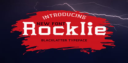 is a modern font packaged in a modern and classy style, complete with access to your OpenType feature to access a large selection of alternative letters and ligatures, the choice of letters you like from various uppercase and lowercase letters for a luxurious impression and elegant appearance. A new elegant serif font that will add a touch of luxury and style to your projects. This is a very versatile font that works well in both large and small sizes. This font is Perfect for branding projects, logo design, clothing branding, packaging, magazine titles, advertisements, t-shirts, postcards, editorials, magazine headlines, product packaging, and displaying masculine and feminine qualities. this is equipped with full uppercase, lowercase, numbers and punctuation + Multi-language support
 - Borest by Flavortype,
$20.00 Borest, a new carefully crafted roman sans serif display font. The ideas for this font has a wide range of reference, from vintage, classic, art deco, until the modern era. So the looks of this font must be in the wide range of the reference above. Borest has a versatile and luxury feel as you can see in our creations on the display, such as Branding, Header, Logotype, Poster, Magazine, Packaging, Wedding Invitation with art deco style, and more. It shows that Borest can accommodate various design style. Borest comes with OpenType Features. such as Stylistic Alternates as an Ascender swash and Descender Swash and Ligatures. Every glyphs for alternates are curated for the best and without eliminating the characteristics of this font.
 - Brandy Keita by Canden Meutuah,
$25.00 Serif is a modern serif font packaged in a modern and classy style, complete with access to your OpenType feature to access a large selection of alternative letters and ligatures, the choice of letters you like from various uppercase and lowercase letters for a luxurious impression and elegant appearance. A new elegant serif font that will add a touch of luxury and style to your projects. This is a very versatile font that works well in both large and small sizes. This font is Perfect for branding projects, logo design, clothing branding, packaging, magazine titles, advertisements, t-shirts, postcards, editorials, magazine headlines, product packaging, and displaying masculine and feminine qualities. this is equipped with full uppercase, lowercase, numbers and punctuation + Multi-language support
 - Geographica Script by Three Islands Press,
$39.00 Time-tested elegance is what you’ll get with Geographica Script, a handwritten typeface steeped in 18th century sophistication. Source materials include the maps of Emanuel Bowen (circa 1694–1767), Geographer to King George II, as well as English and American trade cards from the middle 1700s, including the work of artist and printmaker William Hogarth (1697–1764). A kindred font to our Geographica serif family, Geographica Script is a painstaking replication of the elegant roundhand cursive seen in engravings of the period. Geographica Script has more than 1,100 glyphs, including scores of standard and contextual ligatures, three full uppercase alphabets, historical forms, decorative flourishes, and full Latin support. It’s also got fifty evocative ornaments inspired by map and trade card illustrations, e.g., lion rampant, unicorn rampant, crowns, anchors, sailing ships, whale, dolphin, sun, moon, and many others. Note: To prevent Microsoft Word from cutting off Geographica Script’s extra-long descenders, set line spacing (Format —> Paragraph —> Spacing) to 1.5 lines.
 - Circling Vultures BB by Blambot,
$6.00 Circling Vultures is an old west slab serif font offered in degrees of aging; Circling Vultures BB is clean, with sharp edges and lines, Circling Vultures Decay BB has rounded corners and distressed lines, Circling Vultures Rot BB is the most worn out option in the set, with flecks of missing "ink" apparent. Each option comes with two variants; a standard upper/lowercase, and an option with smaller caps in the lowercase keys for a total of six fonts in the set.
 - Rebnick by Mr Studio,
$29.00 Rebnick is a sans serif typeface where in the early design process, the adjacent stems and bars weren’t weld seamlessly and perfectly. You can actually find glitches which were carefully transformed into a custom language in it’s own and later became the coherent generic rule that keeps everything together. In display sizes, the ink traps give the font’s own character, while in small text sizes they create a good legibility and a well-balanced ratio between the black and white spaces.
 - Mosquito Formal by Monotype,
$29.00Mosquito Formal, by Éric de Berranger, takes the original jaunty design of Mosquito and dresses it in a tuxedo. The stressed character strokes, simple, straightforward shapes, relatively large x-height, open counters and hint of Peignot are still there, but the cursive strokes and lively terminals have been replaced with traditional designs. The result is a more serious-and more sophisticated typeface. The idea," says Éric de Berranger, "was to assuage the drawing of Mosquito. To 'calm' it; and eliminate its idiosyncrasies while preserving character structure and general appearance." Although still distinctive, as Éric de Berranger puts it, "Mosquito Formal is more to be read than seen, it is more invisible and thus, more readable than my earlier design." He does, however, use both typefaces in his graphic design projects: Mosquito for headlines and in applications where the lively design is appropriate, and Mosquito Formal for those instances that require a quieter more sophisticated look. Mosquito Formal is available in three weights with complementary italic designs in addition to a suite of small caps and old style figures. " - Corner by URW Type Foundry,
$35.99 A unique kind of type by Michael Herold: The 14 cuts of Corner are equally distributed to the two style variants A and B. From Thin to Extra Bold, variant A comes with technical and pure forms while B appears with a soft, more personal character. In combination, the two variants add up to a highly versatile family which is very well suited for branding purposes, thanks to its diverse forms of expression. Eine besondere Schriftfamilie von Michael Herold: Die 14 Schnitte der Corner sind auf die beiden Stilvarianten A und B verteilt. Von Thin bis Extra Bold kommt die Corner im Stil A mit technischen, reinen Formen und im Stil B mit weichem, persönlicherem Charakter. Als Kombination ergibt sich eine sehr vielfältige Familie, die sich mit ihren verschiedenen Ausdrucksformen besonders fürs Branding eignet.
 - FS Silas Slab by Fontsmith,
$80.00 Slab-like sibling Why stop at sans? Rather than leave FS Silas Sans as an only child, the team wanted to extend the family, and create a complete system for brands and editorial. Unsure what the result would be, the team started experimenting with a slab serif version. ‘We didn’t know how it would turn out, but we really liked it and wanted to take it further. A fresh angle ‘We stuck with the angular theme of the sans by drawing angled slab serifs,’ says Phil Garnham, ‘as opposed to the square serifs that slab fonts usually have. That created an inner dynamism in words and sentences on the page, and a very distinctive, crafted character, like a Victorian soul in a contemporary body.’ These crafted touches include details such as the angled ascenders on the ‘i’ and ‘l’, while characters such as the ‘y’, with its abruptly-ending descender, add a mark of distinction. A perfect pair Silas Slab, like its sibling, offers a clear-cut range of five weights, from the elegant Thin to the monumental ExtraBold. Put it together with Silas Sans and you have the full complement, capable of performing the full range of tasks, above the line and below, in headlines, body copy and logotypes, B2B and B2C. Keep them together; they don’t like it when they’re apart.
 - Normatica by CarnokyType,
$42.00 Normatica is a neutral typeface inspired by advertising letters used as letterings on shop windows during period of Normalization (the 60s–90s) in former Czechoslovakia. The complete font family consist of 24 styles in 6 weights (Thin–Black) with matching Italics where every style is followed by his Display counterpart. The difference between default and display styles is tighter spacing in Display fonts and different design of punctuation and diacritics accents. Beside the complete set of Latin, Normatica includes Cyrillic characters as well. Each font contains of alternative variation of some characters (j, t, y, Q) and includes a wide range of the Opentype features (for more details see pdf Specimen in Gallery section). Mixture of Normatica and Normatica Display can be effectively used for both text and display usage. It can be used in advertising, signage, corporate identities and various situations of editorial design. You can try two Demo styles in Medium weight fully for free.
 - Tepuy by John Moore Type Foundry,
$20.00 Tepuy is the name given to the ancient plateau-shaped mountains that abound in the Venezuelan Amazon. Tepuy is a display typeface inspired by the symbolic forms of the Venezuelan ethnic roots. It is constructed based on a very precise geometry of open forms that produce a double letter in form and counterform. Tepuy originates as an evolution curve of my Font Makiritare rectilinearly. Was devised for a book of photographs of the ancient mountains of the Venezuelan Amazon, its form and Makiritare are morphologically inspired crafts in the ethnic groups of the region. Tepuy is held in a very precise geometric construction based on rounded forms, each letter is a form envelope enclosing another in counterform, is a letter to display. Tepuy comes in four versions Regular, Light and thin, and there is a double line version enclosed. Tepuy recommended for creative headlines for the label and packaging design aimed at all ages.
 - Metroblack #2 by Linotype,
$29.00American graphic designer William Addison Dwiggins' (W.A.D. for short) first typefaces were the Metro family, designed from 1927 onward. The project grew out of Dwiggins' dissatisfaction with the new European sans serif typefaces of the day, such as Futura, Erbar, and Kabel, a feeling he expressed in his seminal book Layout in Advertising. Urged by Mergenthaler Linotype to create a solution for the problem, Dwiggins began a professional relationship that would span over the next few decades. The first Metro family typeface to be released was Metroblack, brought to market by Linotype in 1929 (Metroblack #2™ the only one of the two versions that Mergenthaler Linotype eventually put into production which is available in digital form). With more of a humanist quality than the geometric styles popular in Europe at the time, Dwiggins drew what he believed to be the ideal sans serif for headlines and advertising copy. Metroblack has a warmer character than the Modernists' achievements, and the type is full of mannered curves and angled terminals (Metroblack also has an astoundingly beautiful Q). The weights of the Metro family, Metromedium #2™ and Metrolite #2™, were each designed by Mergenthaler Linotype's design office under Dwiggins' supervision. In 2012 Toshi Omagari reworked the Metro family as "Metro Nova" with many weights into a modern type family that even contains the alternate characters from the origin Metro family from Dwiggins. Despite having been created more than three-quarters of a century ago, the Metro family types have aged well, and remain a popular sans serif family. Although spec'd less often than other bestsellers, like Futura, Metro continues to find many diverse uses. The typeface has appeared throughout Europe and the North America for decades in newspapers and magazines, and can even help create a great brand image when used in logos and corporate identity. Dwiggins ranks among the most influential graphic designers and typeface designers of the 20th Century. He has several other quality fonts in the Linotype portfolio, including the serif text faces Electra™ and New Caledonia™, as well as Caravan™, a font of typographic ornaments. - Fleur by Lián Types,
$39.00 La vie est une fleur dont l'amour est le miel Fleur is the French for flower and I've chosen this language for a good reason. Over the past 5 years, I've had the opportunity to travel a lot to Paris and I've always tried to catch every moment and detail of this delightful city through the eyes of the designer inside me. Paris is full of surprises, mainly for us, artists. In fact, I believe the city is a museum itself. Every corner of any street has something inspiring. But, there’s something I particularly love and I want to address here: The Palais Garnier. Built between 1861 and 1875, this opera house is a dream made true for many of us, who love somptuosité. Garnier, the architect of this magnificent building, said that the style he proposed was not Grecian nor Roman/baroque, he created something new and called it Napoleonic: Luxurious at its best. Fleur is inspired in this palace which, in fact, has some similar letters inside. Garnier put his name at the ceiling of the Rotonde des Abonnés: Letters are interlacing each other with nicely done art nouveau curves. I thought I could take this idea and achieve something very delicate and imposing at the same time if the font consisted entirely of caps with the logic of a didone and a bit of art-nouveau. This mix of elegance and flamboyance gave birth to Fleur which has a wide range of uses but was mainly intended for perfumes, fashion magazines, storefronts, book covers or logos. Not only you'll find many decorative glyphs, but also a vast amount of unique ligatures will make you really adore this font. Get Fleur and profite de la vie TECHNICAL As suggested above, the font has many open-type coded alternates and a vast amount of unique ligatures. Install the font in applications that support them, like Adobe Illustrator or Photoshop.
 - Benchmark2 by Alphabet Agency,
$30.00 Benchmark2 is a super cool serif font developed from the popular original Benchmark font. This version has been remastered in the latest font developing software and now the new version includes a lot of additional characters that are not available in the original. The original font has been used worldwide, used in Hollywood films and in products in popular clothing lines. The font works well in a variety of themes including tattoo, rebellious, street, western and vintage, to name some. The font was initially designed for use on Baseball jerseys in an effort to developed ways of creating new looks in the field of sports related graphic design.
 - Stay Gladin by IM Studio,
$19.00 Stay Gladin Script Font Trio is a new modern script font with an irregular baseline. Stylish and feminine. Stay Gladin Script looks beautiful in wedding invitations, thank you cards, quotes, greeting cards, logos, business cards and more. Perfect for use in ink or watercolor. Includes start and end letters, alternatives and support for many languages. Thanks You.
 - Hi Margaret by Ws Studio,
$14.00 Hi Margaret is a new modern script font with an irregular base line. Trendy and feminine style. Sweet lady Script looks beautiful on wedding invitations, thank you cards, quotes, greeting cards, logos, business cards and more. Perfect for use in ink or watercolors. Includes initial and final letters, alternatives, binders and multi-language support. To activate the OpenType Stylistic alternative, you need a program that supports OpenType features such as Adobe Illustrator CS, Adobe Indesign & CorelDraw X6-X7, Microsoft Word 2010 or newer versions. There are additional ways to access alternatives / swashes, using Character Map (Windows), Nexus Fonts (Windows), Font Book (Mac) or software programs such as PopChar (for Windows and Mac). How to access all alternative characters: This offer is available without limits. This package is perfect for greeting cards, branding, business cards, quotes, posters, stickers, blogs, logos, weddings, signage, packaging, birth announcements, photo overlays, wall art, quotes, printed matter, bags, t-shirts and many again! thank you for buying.
 - Augmento by R9 Type+Design,
$35.00 Augmento™ is a large contemporary font family from R9 Type+Design. We designed this typeface right smack on the sweet spot between formal and casual. The rounded rectangular structure gives Augmento the corporate, trustworthy look while the quirky stems add the fun, playful feel. This unique, versatile type family is excellent for a variety of applications such as posters, packaging, editorials, and web design. The completed Augmento™ family consists of 3 widths, 6 weights, 36 styles, and over 550 glyphs each, and packs with OpenType features such as stylistic alternates, case-sensitive punctuations, and date vs fraction recognitions. It also comes with 3 sets of figures (Proportional lining, Proportional Oldstyle and Tabular lining), and supports most Latin-based languages. With all these features in your toolbox, you can make your design sing as loud (or soft) as you’d like. To find out more about Augmento™ Opentype features and type specimen, please visit www.r9typedesign.com
 - Beauty Cosneta by Ws Studio,
$14.00 Beauty Cosneta is a new modern script font with an irregular base line. Trendy and feminine style. Sweet lady Script looks beautiful on wedding invitations, thank you cards, quotes, greeting cards, logos, business cards and more. Perfect for use in ink or watercolors. Includes initial and final letters, alternatives, binders and multi-language support. To activate the OpenType Stylistic alternative, you need a program that supports OpenType features such as Adobe Illustrator CS, Adobe Indesign & CorelDraw X6-X7, Microsoft Word 2010 or newer versions. There are additional ways to access alternatives / swashes, using Character Map (Windows), Nexus Fonts (Windows), Font Book (Mac) or software programs such as PopChar (for Windows and Mac). How to access all alternative characters: This offer is available without limits. This package is perfect for greeting cards, branding, business cards, quotes, posters, stickers, blogs, logos, weddings, signage, packaging, birth announcements, photo overlays, wall art, quotes, printed matter, bags, t-shirts and many again! thank you for buying.
 - Maiers Nr. 8 Pro by Ingo,
$27.00 A handwritten ”font for technicians“ from ca. 1900. Very geometrical, rigid forms borrowed from the typical characteristics of Jugendstil / Art Nouveau. This script is found in an old magazine which was issued sometime in the years shortly before WWI. The original copy, produced by means of a galvanized plate, is just 7 centimeters wide. It served as the model for technical professions in which, at that time, the captions of drawings were still done by hand. ingoFonts has not only digitized this beautiful typeface, we have also extended it to a whole family. In »Maier’s Alte Nr. 8« special attention was given to ensure the ”uneven“ edges, typical of handwritten script, remained effectively noticeable even in the digitized form. As a result, this ”technical“ font retains a handmade touch, while »Maier’s Neue Nr. 8« is the clean version with exact contours. The Art Nouveau forms, which are characteristic for the period of origin around the turn of the century around 1900, look especially pretty. The high degree of abstraction also seems strange in Maier's No. 8, especially when the age of the original is known. It is generally assumed that it was not until the Bauhaus in the late 1920s that such "modern" typefaces were created. Maier's No. 8 is a generation older! So many of today's supposedly "ultramodern" typefaces look quite old in comparison. In addition to the original two weights, Light and Bold, the Maiers Neue Nr. 8 got a regular and a extra-bold weight. Furthermore, the Neue is also available in italics. Although this is only a slanted version, unlike common practice, it is inclined to the left. Maier’s Nr. 8 Pro is suitable for all European languages. It includes ”Latin Extended-A,“ for Central and Eastern Europe incl. Turkish, and even Cyrillic and Greek, too. The font includes several stylistic alternates as well as a number of ligatures.
 - Metro Nova by Linotype,
$57.99 Metro Nova comprises seven weights, from ultra thin to extra black in regular proportions, and six weights as condensed designs. Each has an italic counterpart for a total of 26 fonts. The family is available as OpenType® Pro fonts, which provide for the ability to easily insert typographic features such as ligatures, fractions and alternate characters. Pro fonts also offer an extended character set to support most Central European and many Eastern European languages.
 - Neato Serif Rough by Adam Ladd,
$25.00 Neato Serif Rough is a hand drawn, quirky serif font with a textured, letterpress appearance. It features stylistic alternates, standard and discretionary ligatures, and swashes to add options and flair. The typeface has a unique blend of sophistication with its high contrast of thicks and thins and also playfulness with the distinct ball terminal characters—especially evident in the lowercase “e”. It is slightly condensed and great for display headlines, titles, packaging, branding, and more.
 - Espect Retro by Mans Greback,
$59.00 Espect Retro beckons to the discerning eye with its harmonious blend of the modern and the classic. Its wide, yet hairline-thin structure gracefully extends into elongated serifs, giving it a poised and elegant stance. The extended x-height isn't just noticeable; it's a celebration of design that evokes charm and cuteness in every curve and counter. Espect Retro's lightness radiates a fashion-style sophistication, making it a go-to for classy projects.
 - Rasbern by Nasir Udin,
$29.00 Rasbern is a display serif typeface with high contrast and refreshing looks. Ranging from thin to black with italics, Rasbern offers many possibilities to be applied in many graphic or editorial projects. The lighter weights are suitable for short paragraph, and the heavier weights are perfect for headlines, perfectly suitable for display purpose such as branding, book covers, and web heading. Rasbern has extended latin character set that supports 200+ latin-based languages.
 - Rosting Gapertas by Mega Type,
$18.00 Rosting Gapertas is a soft and elegant yet sturdy serif family that mixes retro casual undertones with a modern feel. Designed to convey a sense of tenderness and natural expression with a sense of the present to function as a bold tool and a beautiful communicator. Morning Georgian comes in 9 different weights from Thin to Black with 2 styles (Standard & Italic). Rosting Gapertas is perfect for branding, editorial, packaging or logos and more.
 - Funny Business JNL by Jeff Levine,
$29.00 The hand lettered title on the sheet music for "Gee, But I'd Like to Make You Happy" (from the 1930 MGM motion picture "Good News") presented a conundrum. Some of the lettering was a classic Art Deco "thick and thin" design while the others resembled comic book title lettering. Leaning toward the comic book style, the conflicting letters were revised and the finished result became Funny Business JNL; available in both regular and oblique versions.
 - Archipad Pro by Bejeletter,
$14.00 Archipad Pro is a geometric sans and slab font family, The combination of modern geometric elements make it clean and readable with the form and matching oblique. Archipad Pro Consist of 9 weight sans and 9 weight of slab, makes more free choice in writing with 36 font styles. 9 Weights Sans and Slab (Thin, Extralight, Light, Regular, Medium, Semi Bold, Bold, Extra Bold and Black) Oblique font is available Latin Pro
 - Capitana by Floodfonts,
$49.00 Capitana is a Geometric Sans with humanistic proportions and open apertures. Distinct ascenders and pointed apexes with deep overshoot give it a cool beauty and classic elegance. Capitana is an ultimate allrounder with 9 weights from Thin to Black, well suited for striking headlines and particularly legible in small sizes due to its open forms. Capitana has a powerful opentype engine with small caps, tabular and oldstyle figures, arrows, alternate letters, fractions, subscript and superscript.
 - Kanzaki by Locomotype,
$18.00 Kanzaki is a display typeface sculpted with special curves inspired by old typography combined with semi-reversed contrast. A semi-serif font that has a classic and elegant feel, yet warm and friendly. To beautify your creations, Kanzaki is equipped with various opentype features such as disrectionary ligatures, alternates, swashes and stylistic sets. Available in 5 weights: Thin, Light, Regular, Medium, Bold and its matching italics. Perfect for branding, packaging, logotypes, labels and posters.
 - Contax Pro by Type Innovations,
$39.00 Contax Pro is a contemporary design based on generous proportions and clean, crisp lines. Forget about 'Helvetica'. Look out 'Univers'. Contax Pro is the new geometric sans typeface series for the 21st century. Contax Pro makes for easy reading and is ideal for long lines of copy. Contax Pro includes true drawn small capitals and old style figures. The family comes in 6 weights: ultra light, thin, light, regular, medium and bold.
 - Mithella by Lafontype,
$19.00 Mithella is a sans serif family with a pleasant touch. Some letters, especially linear ones, look normative like other rounded sans serifs, but the difference can be seen clearly in curved letters so that it gives a pleasant impression for each series of words. Mithella comes with eight weights ranging from thin to black to complement your design needs be it branding, blogging, logos, advertising, games, cooking, packaging, editorial and publishing, web and screen design.
 - Breakfast Pastry by Missy Meyer,
$12.00 I’d been thinking for a while about making a serif font with ball terminals: big fun round ends to the letters anywhere I can squeeze them in. So I made Breakfast Pastry! I started with a hand-drawn set of basic letters, then went hog-wild making alternates and ligatures galore with fun swirls, curls, and even more balls! I’ve cleaned the letters up significantly to make them smooth and easy for any cutting or printing you may want to do, but I’ve also left in some of the hand-drawn character so that the letters are warmer and not too formal. Then I took the first font, and made a second solid version without the cutouts. After that I thought: I tend to make plumper fonts ... why not make an even thinner version? So I did! All three versions have the same character set (over 700 glyphs total), which means they all have the same extras and alternates. All three fonts have over 300 extended Latin characters for language support, as well as over 200 bonus items: alternate letters, letters with swashes, two-letter ligatures, small caps, catchwords, and even some bonus ornaments and elements to make the fonts even more flexible. (After all, if one swash on a letter is good, two or three might be great!)
 - Synthica by Volcano Type,
$35.00 Synthica is the advanced version of a geometrically constructed typeface – designed for a thesis project in summer 2010 in Pforzheim. In the context of electronic music and the profound analysis of its parameters, this typeface is primarly based on a strict modular grid. Additionally, the ascender, descender and the x height had slightly been increased in order to even out a visual difference in size between the glyphs. The name „Synthica“ dervives from a basic principle in electronic sound synthesis. Sinus, triangle and square are some of the basic waveforms in the synthesizers’ oscillator section and were thus used as geometric modules for the grid. The modularity and geometry also derive from different structures of electronic music. The strong emphasis on diagonal lines creates a rhythmic typeface that connotates electronic music patterns with highly recognisable glyphs. The contrast between digital and analog is another basic idea of this typeface: while Synthica Outline has a more synthetic and fragile character, the filled version Synthica Black serves as the analog counterpart.
 - Newspoint by Elsner+Flake,
$35.00 The design of the Newspoint typeface is based on the tradition of the American sans serif faces of the last century. This form expression was greatly influenced by the News Gothic type which was created by Morris Fuller Benton in 1908, and has, once again, become very popular. When the development of sans serif types such as Futura and Kabel by Renner and Koch began in 1925, the design of American sans serif types receded somewhat into the background. In the 1950’s, however, they experienced a renaissance which continues to this day. Thanks to its clean design and the relatively large x-height, the Newspoint is well suited for informative texts in newspapers, magazines, and brochures. In packaging design, as well, the Newspoint can display its strength in small print. Newspoint was developed as a customer-specific variation of the News Gothic. In contrast to the News Gothic, however, the face appears to be softer and more appealing thanks to the changed interpunctions. If so desired, the alternative characters give the typeface expanded individuality and a richness of design options.
 - Love Story by Latinotype,
$29.00 Love story is a display hairline typeface for use in big sizes and short texts. It’s inspired by different kinds of love and specially designed for Valentine’s day. Its soft curves and sweet style give it a lovely personality. Designed by Luciano Vergara and his wife Guisela Mendoza who has been studying ornaments since 2007 and has done her best for each project. You can see in her dingbats specially Printa and Abel designed for generate patterns. Now she integrated her passion to the ornament in a clean set which includes dingbats, ornaments and patterns. Luciano Vergara has designed very strong fonts with a particular work in the lines study and close to the geometry since 2005, getting a structure style, you can see in his fonts specially Regia and Kahlo. Now he integrated his study of lines, in a hairline font delicate, continuous and beautiful. In this story both designers have been merged their worlds creating a gorgeous product. This is a romantic type story, a love story.