10,000 search results
(0.091 seconds)
- Capacitor - Unknown license

- Lesser Concern - Unknown license

- Sukothai by Linotype,
$155.99Sukothai is a traditional Thai design based on early metal type. The classic and distinct forms make it excellent for setting text at small sizes or in large passages. Originally released by Linotype for digital photocomposition, now both the Light and Bold weights are available in OpenType format. This makes it possible to dynamically and precisely position the various levels of superscript and subscript vowel signs and tonal marks. In addition to this, the complete Unicode page range for Thai is covered to ensure flawless conversion between other OpenType fonts using Unicode. The accompanying Latin design matches well in scale and texture and supports most Western European languages making it ideal for setting bilingual texts. - Garrigos by Underground,
$- Set of ornaments based on the decorative motifs used by the first typographic workshop in Buenos Aires: “Imprenta de Niños Expósitos”, between 1780 and 1824. This set is the product of an extensive historical research that aims to identify the type that came from Europe to the City during colonial times, and during the first years of Argentina’s independence. This group has a lot of diversity, which fluctuates between organic baroque forms and geometric neoclassical. Its characters can be used in editorial design along with Roman typefaces, they work individually or grouped to form different figures, guards or frames. It was baptized in honor to the first printer who worked in the workshop: the Spanish Agustín Garrigós.
 - Aureata by preussTYPE,
$30.00 Whenever I've stayed in Munich my friend Michael Bundscherer and I go on a typographical expedition. When we talk about that, we remember the bygone world of sign painter. On one of the facades of a furniture shop in Munich, you can discover the lettering of the name in golden letters. This one convinced us because of the simple elegance Art Deco. These letters on the facade are in any case the character set, which forms the basis of this document. The missing (especially the lowercase letters and the numbers) were modeled. The "OPEN" called version tries to replicate the 3-D effect. The font is particularly suitable for shorter texts and headlines.
 - Fempowering by Franziska Herrmann Sustainable graphic design,
$14.00 GENDER DIVERSITY Introducing 'Fempowering' – designed to champion gender diversity in typography, created by a sustainable graphic designer who recognized the need for balance in a predominantly male field. SPACE-SAVING In the world of typography, space is often a precious commodity. 'Fempowering' is designed with this in mind. Its space-saving characteristics make it an ideal choice for print materials, editorial layouts, and any project where readability within confined space is paramount. GLYPH COLLECTION At the core of Fempowering lies an extensive glyph collection. It goes beyond the standard characters and numbers, embracing specialized symbols, mathematical notations, and even phonetic transcription. This comprehensive assortment opens new creative avenues, enabling you to craft unique and captivating designs. Franziska Herrmann
 - Sassoon Joined ENGLISH by Sassoon-Williams,
$66.00 These fonts will join-as-you-type in your OpenType application as shown in the posters above. Choose Use Contextual Alternates option in your app to get basic recommended baseline joins for teaching. Additionally, use can choose from 7 Stylistic Sets of alternative letterforms that are so important for Teachers. Create ‘pen lifts’ anytime too! Fonts display unjoined by default on this website and are delivered that way - joining is controlled by your application. Free to download resources Stylistic Sets and how to access the alternative letters feature in these OpenType fonts Purchasers of this font package may use their Order Number to receive a free Copybook PDF by Rosemary Sassoon recommended for effective teaching
 - Halis Rounded by Ahmet Altun,
$19.00 The Halis Rounded Font Family from Ahmet Altun comes in eight weights. In addition, all weights have small caps for romans. Halis Rounded is the smoother version of the Halis Grotesque family. With rounded corners, this new font seems much softer and eye-pleasing even though it still has geometric and straight borders. Halis Rounded is legible from very small size to very large ones and also suitable for letterpress. Thanks to small caps accommodation, this font family makes their use in web typography even easier. As with the small caps, all fonts can be used to create great works on the web as logos, texts, presentations etc. and in prints as posters, t-shirts, magazines, and notices.
 - LTC Kaatskill by Lanston Type Co.,
$24.95LTC Kaatskill was made specifically for use in an edition of Rip Van Winkle for the Limited Editions Club. "I feel that Kaatskill owes nothing in its design to any existing face, and the type therefore is as truly an American type as anything so hidebound by tradition as type can be."- F. Goudy This face was one of the first digital typefaces released by the Lanston Type Co. Ltd. Jim Rimmer took painstaking measures in his faithful revival. Goudy had never designed a specific Italic to accompany this face. The Italic completed by Rimmer is a variation on Deepdene Italic. The font set was re-mastered in 2006 by Colin Kahn. - Ace Sans by Factory738,
$15.00 Ace Sans is a modern and minimalist sans serif font family. The combination of minimal and geometric elements renders a modern design. Ace Sans family includes 8 fonts, clean and modern caps, thereby creating more variability. This is irreproachable sans serif to diversify your headlines, branding visual identity, poster, logo, magazines and etc. 8 Weights (Thin, Extralight, Light, Regular, Medium, Bold, Extrabold, Black) Oblique font is available Numbers & Punctuation Extensive Language Support Thanks for looking, and I hope you enjoy it.
 - Oddlini by sugargliderz,
$44.00 I have a lot of options to choose from, and it's hard to decide. For example, if I use "Thin" for the body text, I might make the title slightly larger and use "ExLight," and for the headings, I could use "Regular" or something similar. I could also stick to one font weight, like "Light," and differentiate the text using various sizes. This font is designed for enjoying the process of "indecisiveness," so please feel free to wander and deliberate extensively.
 - Misguided by Set Sail Studios,
$14.00 Misguided; "to go astray". This brush font throws out the typography rulebook and breaks away from the mundane letterforms. Thick lines, thin lines, small letters, big letters - it has it all, and thrown into THREE hand-painted character sets which can be mixed up, lowercase or uppercase, giving you a massive amount of customisable layout options for each word. Misguided is guaranteed to add an eye-catching appeal to your logo designs, handwritten quotes, product packaging, merchandise & social media posts.
 - Blitz by Wiescher Design,
$20.00 A very glitzy Blitz! I always wanted to design a typeface that was top heavy, but I never knew how not to make it look like Antique Olive, until recently -- I had an idea. My new family is very readable despite it beeing top heavy, thin on the low end and thick on the upper end. The font gets a special shine because of this effect. And it stays readable despite its special design. Your designer of surprising typefaces, Gert Wiescher
 - Abocat by Grontype,
$14.00 Abocat is an authentic vintage san serif font. It comes with unique shapes bold to thin and rounded edges that will give remarkable touch. The font equipped with more ligature and alternates which is perfect use for Branding, Logo Design, Lettering, Logotype, Clothing, Poster, magazine, packaging, posters, shopping bags, t-shirts, book covers, photography, special events and other design project. Abocat Features: Uppercase glyphs Numeral and Punctuations Currencies Standard Ligatures Stylistic Alternates Thankyou for choosing this font, Enjoy Regard, Grontype
 - Exter by Variable Type Foundry,
$22.99 Exter is a geometric Sans-Serif font inspired by the work of Russian artist Alexandra Exter that combines geometric and angled forms. Exter has been designed for advertising, posters, web, branding, packaging or any place where you need a clean and forceful voice. This personal character of its forms is due to the variety of weights it has (Black, Ultra Bold, Bold, Semi Bold, Regular, Light, Ultra Light, Extra Light and Thin). All are fully The character set is robust, covering extended Latin.
 - Config Rounded by Adam Ladd,
$25.00 Config Rounded is a condensed geometric sans with rounded corners. Config’s sibling, this typeface was influenced by geometric sans with circular forms on the tops and bottoms of characters, but the proportions have been condensed by incorporating straight sides for a design that is efficient yet friendly. Use it for a subtle softness that still looks modern and strong. With 10 weights, there are options to fit the need—black and thin for extreme uses and intermediates for more common needs.
 - Bloery by Runsell Type,
$20.00 Bloery is a neo grotesque font modified with extended proportion. Comes with a modern look, this font suitable for display and body text. Bloery is a good choice for editorial design, branding, app design and web design. Comes with 7 weights from Thin to Bold with each matching Italic. Contain several OpenType features: Stylistic Alternates and Figures Variation (fraction, tabular lining, numerator, denominator). Each style includes 540+ glyphs supporting all western, eastern and central european languages (over 200 languages supported).
 - Afons Infant by Andy Peat,
$9.00 About this font family Afons Infant has been designed for children’s storybooks; using round, single-decker letter forms to create simple, clear and readable stories that children are familiar. Features 5 weights (from thin to bold) Multi language Lowercase Numerals to blend with text Ligatures To be able to access alternative fonts, make sure the software you use can support opentype features such as Microsoft Word, Paint, Adobe, Corel draw and other applications. Designed and published by Andy Peat. Released April 2022
 - Ephemera Kingsford by Ephemera Fonts,
$39.00 A new vintage display typeface by Ilham Herry. Started from the passion of collecting the old tin packaging with classic labels on it, the layout and composition make Ilham pretty inspired and the urge of crafting the letters is getting bigger since that day. That's what comes first as a motivation in making this Ephemera Kingsford typeface.Adapted and referencing from the real physical collectible old tins and cans to a single pack of digital fonts asset. Packed up with 9 layered fonts, 1 font as a pair, and of course ornaments and vintage panels as a vector file.Perfectly fit for display printing, handcrafted product, screen printing industry such as apparel, packaging, labels, and also sign painting, scrapbook, glass gilding, et cetera. Not every visual can go vintage but if you want to, there's no other choice, oldsport. check Ephemera Kingsford type specimen here
 - JetJaneMono by Ingrimayne Type,
$9.00 JetJaneMono is a large family of sans-serif faces which are monospaced. It is very plain (plain=plane=jet). The font family has two widths and three weights, with each upright style paired with an italics style. These twelve fonts are then duplicated with another set in which small caps replace the lower-case letters. The typeface was created in 1994 and in 2021 the condensed widths were added.
 - Arkit by CAST,
$45.00 Arkit is a ‘constructivist’ sans with a humanistic taste. Its geometric look hides an organic soul that can be felt rather than seen, as for instance in the strokes that are slightly tapered. Arkit features a big x-height and is suitable for signage and for many display applications, but it also performs well as a book face both in body copy and in captions and small-size texts.
 - Bodoni Classic Swashes by Wiescher Design,
$39.50 Bodoni Classic Swashes is my personal addition to Bodoni’s family of typefaces. Bodoni did not design a decorative version. His quest was for purity in book design. Even though in his days it was not called design; he thought of himself purely as a printer. But I think, especially after visiting the Bodoni museum in Parma, if Giambattista were alive today he would design a decorative typeface. Yours classico, Gert Wiescher
 - Brushin by Mandarin,
$15.00 Brushin is an handwritten display font inspired by the straightforward rigidness of Grotesque sans-serif fonts. It features two stylistic sets for every glyphs in font so it gives you the choice to not repeat the same glyph design in big titles and/or small statements. The font was designed on paper with a brush and then scanned, vectorised through Photoshop and finally compiled in Glyphs as and OTF font file.
 - Advertising Stencil JNL by Jeff Levine,
$29.00 An ad spotted in a 1964 issue of Billboard magazine with the words “STAND BACK…” introduced the first record album from then-new stand-up comedian Bill Cosby. The lettering of those two words was in a stencil sans serif design that was a perfect candidate for developing into a digital font. The end result is Advertising Stencil JNL, which is available in both regular and oblique versions.
 - Ongunkan Rosetta Stone by Runic World Tamgacı,
$50.00 The Rosetta Stone, or Rashid Stone, was accidentally found by a French soldier during an excavation in the fortification of Egypt. The stone was inscribed in three languages, intended to be sent to three major Egyptian temples. These languages are: Demotic (the language used by the people in Egypt), Hieroglyphic and Ancient Greek. This font contains ancient greek.
 - Gafata by Underground,
$24.00 Gafata is a font designed for small sizes in medium-long text, mixing elegance and readability causing it to have great applicability in books, magazines and web pages. In the process of finding the finest legibility, particular features emerged making this whimsical sans serif different from the rest, creating an original mark to the text its applied to.
 - Best Regardz by Outside the Line,
$19.00 Best Regardz is a casual, quirky handprinted font. A headline font that is kerned to be used at 24 pt or larger. This is the latest font in the Love Letters Series. Others in that series include Dearest John , Yourz Truly and Sincerely Yourz . Best Regardz was in the 2011 Typodarium Page-A-Day Calendar on 10-4-2011.
 - Musical Number JNL by Jeff Levine,
$29.00 In the MGM musical "Broadway Melody of 1940", a new stage production has its gala opening at the fictitious Lafayette Theater on the Great White Way. The front of the theater is resplendent with classic neon signage, and the theater's name is in an interesting Art Deco design. Musical Number JNL recreates this lettering in digital form.
 - Figural by ITC,
$29.99Figural is the work of Michael Gills, developed under the direction of Colin Brignall. It is based on an original 1940 design of Czechoslovakian designer Oldrich Menhart. All original characteristics were carefully retained in this distinguished typeface family. Figural is highly legible, making it perfect for both short pieces in advertising text or larger applications in magazines or books. - Art Magazine JNL by Jeff Levine,
$29.00 A 1920 art magazine from Great Britain entitled “Pan” had its three letter name hand lettered on the cover in a style that had elements of Art Nouveau, Art Deco and what would eventually be called Techno in the 1980s. This inspired the typeface Art Magazine JNL, which is available in both regular and oblique versions.
 - SandraOh by Chank,
$59.00Sandra Oh is a quirky modern take on the classic serif fonts of the 20th century, updated here with a wiggle in her walk and a giggle in her talk. A Chankstore classic from the earlier days of the internet, this font is now available in OpenType format for the first time. Perfect for indie films or youtube videos. - Ambigue by Linotype,
$29.99The original name for Ambigue was “Confidence”. This font family received the first prize at the German Kurt Christians-Foerderpreis in 1997/98. Its interpolated weights offer a subtle differentiation in the grey levels. A special “Small” weight is available that offers better readability in very small sizes. The work was supported by Professor Jovica Veljovic. - Amazed Breath by Almarkha Type,
$29.00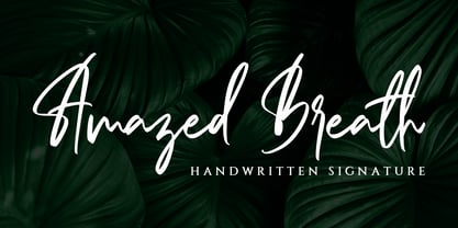 Amazed Breath is a classy script font that comes in Regular and Slant. Inspired by luxury, this font will look classy and awesome in many ways in your latest project. Amazed Breath is perfect for logos and branding, photography, invitations, watermark, advertisements, product designs, stationery, wedding designs, labels, product packaging, special events or anything that needs a handwritten taste.
 - Facility Signage JNL by Jeff Levine,
$29.00 A famous 1971 photo shows boxing champ Muhammad Ali making faces through a window at Joe Frazier at the challenger’s training facility. A small sign sits in the window that says “Joe Frazier Training Headquarters” and is lettered in a simple sans serif condensed typeface. This is now available as Facility Signage JNL in both regular and oblique versions.
 - Movie Producer JNL by Jeff Levine,
$29.00 The Nov. 13, 1915 and Nov. 27, 1915 issues of Moving Picture World carried ads for Jesse L. Lasky Productions in which the titles of the upcoming films were hand lettered in an elegant Art Nouveau spurred serif style. This stylish alphabet is now available digitally as Movie Producer JNL in both regular and oblique versions.
 - Dance Moderne JNL by Jeff Levine,
$29.00 A small book entitled “Portfolio of Alphabet Designs for Artists, Architects, Designers & Craftsmen” [published in 1938 by Irene K. Ames] contained a number of pages displaying hand lettered alphabet examples. One sample in particular stood out for its bold Art Deco look and unusual design. This is now available as Dance Moderne JNL, in both regular and oblique versions.
 - Nouveau Event JNL by Jeff Levine,
$29.00 The 1920s film production company Tiffany-Stahl often used a hand lettered Art Nouveau novelty type design with thick horizontal lines in their various film release ads. One such ad was in the August 11, 1929 of “The Film Daily”. This served as the model for Nouveau Event JNL, and is available in both regular and oblique versions.
 - 2010 Cancellaresca Recens by GLC,
$38.00 This font was inspired by the Cancellaresca pattern (look at our 1491 Cancellaresca and 1610 Cancellaresca), in particular Spanish one, from Francisco Lucas, who was working in the late 1500s. It is a modern variation, including West European accented characters and a lot of initial and final alternates (not in the Mac TT version for technical reasons).
 - AT Move Holborn by André Toet Design,
$39.95 HOLBORN Aptly named after ‘High Holborn’, a high-street in London where the Central School of Art & Design was based. A font, just in capitals, based on the original design and the earlier sketches (1976) by André Toet. The strong optical illusion in this alphabet makes it an outstanding typeface. Concept/Art Direction/Design: André Toet © 2017
 - Modakshar BT by Bitstream,
$50.99Modakshar was inspired by traditional Indic handwriting scripts which ‘hang’ from a common upper horizontal bar. Adapting this motif to Latin letterforms was challenging. The typeface was first conceived in the 1970's as a design project in school. The current digital design was completed in 2002. Basic motif was inspired by traditional Indic script handwriting.

