7,182 search results
(0.022 seconds)
- Linotype Algologfont by Linotype,
$29.99Linotype Algologfont is part of the Take Type Library, chosen from the contestants of Linotype’s International Digital Type Design Contests of 1994 and 1997. Designed by German artist Bjorn Hansen, the font contains exclusively capital letters and the forms of the characters look like branches or driftwood bent to form an alphabet and punctuation. The font is very flexible and can give text either a myterious and strange impression or a free and natural one, dependent on context. Linotype Algologfont is best suited to headlines in larger point sizes. - Glagio by Ergibi Studio,
$19.00 Glagio is a Signature font for handwritten logotype with alternative characters. perfect font for creating photography studios or personal photography logos, best for initial logo or brand signatures. Glagio includes a full set of beautiful handwritten upper and lower case letters, numbers, assorted punctuation marks. All lowercase letters include end strokes, providing a cool handwriting style. What's Included : Standard glyphs Ligatures International Accent Works on PC & Mac Simple installations If there is a problem, question, or anything about my fonts, don't hesitate to ask! Big Thanks ~ Ergibi Studio
 - Ghost Writer by Gian Studio,
$10.00 purt number The Ghost Writer font is a dynamic handcrafted font that also features beautiful open type. great for Branding, Logo Design, Fonts, Logotype, Apparel, Posters, magazines and other design projects. Ghost Writer features OpenType style alternatives, ligatures, and International support for most Western Languages included. To enable the OpenType Stylistic alternative, you need a program that supports OpenType features such as Adobe Illustrator CS, Adobe Indesign & CorelDraw X6-X7, Microsoft Word 2010 or a later version. How to access all alternative characters using Adobe Illustrator: Designer: Afri Giani Publisher: Gian Studio Happy Designing!
 - Muifamoso by TypeClassHeroes,
$17.00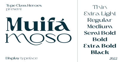 Muifamoso designed to become a elegant, this font has the potential to bring each of your creative ideas to the highest level. Combine with ligatures and special alternative glyphs so you can create a lots with layouts and compositions. Muifamoso brings a touch of luxury and bespoke custom typography to logos, websites, social media quotes, wedding branding, and more. Whats Included? Uppercase & Lowercase Number & Symbol International Glyphs Multilingual support Thank you so much for checking out my shop, and please get in touch if you have any questions!
 - Westack by Almarkha Type,
$35.00 Introducing Westack – Modern Display Serif inspired by the famous minimalist logo, perfect for the purposes of designing templates, brochures, videos, advertising branding, logos and more. What’s Included : Westack (OTF/TTF) Standard glyphs Ligatures Web Font International Accent Works on PC & Mac Simple installations Accessible in the Adobe Illustrator, Adobe Photoshop, Adobe InDesign, even work on Microsoft Word. PUA Encoded Characters – Fully accessible without additional design software. Fonts include multilingual support +Image used : All photographs/pictures/vector used in the preview are not included, they are intended for illustration purpose only. Cheers! Thank You
 - Deflexure by Ony Studio,
$14.00 Features: Characters: Uppercase letters, Lowercase letters, numbers & extended punctuation Ligatures and Stylistic Alternates Non-English support for the international designer Deflexure is a luxury modern script font. This font is perfect for wedding event design, such as wedding invitations, wedding event organizer logo, and any design related to weddings. This font is also perfect for writing quotes, print-on-demand design like t-shirts and mugs. Each lowercase font also has alternates for each letter, so when you type lowercase for each font, the letters will have other style options.
 - Linotype Pide Nashi by Linotype,
$29.99Linotype Pide Nashi is part of the Take Type Library, chosen from the entries of the Linotype-sponsored International Digital Type Design Contests of 1994 and 1997. German artist Verena Gerlach created a typeface which looks almost like Arabic at the first glance, only with the second do the familiar forms become clear. Rounded lower case letters, generous, sweeping capitals and diamond-shaped ornaments give the font its Arabic feel. The exotic Linotype Pide Nashi is best suited for short and middle length texts and headlines and especially for ornamental texts. - Malkone by madeDeduk,
$17.00 Malkone is a modern sans serif, simplistic, high-contrast sans that is at home in high-end fashion and cultural environments comes in nine weights with various width and weight that you can explore and combine. use this font for any branding, product packaging, invitation, quotes, t-shirt, label, poster, logo etc. Feature Uppercase & Lowercase Number & Symbol International Glyphs Multilingual support Feel free to drop us a message any time and follow my shop for upcoming updates Shoot me on email at: dedukvic@gmail.com Hope you enjoy it.
 - Trigly by madeDeduk,
$14.00 Trigly is an elegant sans serif, simplistic, high-contrast sans that is at home in high-end fashion and cultural environments comes in nine weights with various width and weight that you can explore and combine. use this font for any branding, product packaging, invitation, quotes, t-shirt, label, poster, logo etc. Feature Uppercase & Lowercase Number & Symbol International Glyphs Multilingual support Ligature Feel free to drop us a message any time and follow my shop for upcoming updates Shoot me on email at: dedukvic@gmail.com Hope you enjoy it.
 - Parisine Std by Typofonderie,
$59.00 Ultra legible forceful sanserif in 32 fonts Parisine was born as official parisian métro signage typeface. This family of typefaces has become over years one of the symbols of Paris the Johnston for the London Underground or the Helvetica for the New York Subway. The Parisine was created to accompany travelers in their daily use: ultra-readable, friendly, human while the context is a priori hostile. Meanwhile, Parisine is now a workhorse and economical sanserif font family, highly legible, who can be considered as a more human alternative to the industrial-mechanical Din typeface family. More human, but not fancy: No strange “swashy” f, or cursive v, w etc. on the italics, to keep certain expected regularity, important for information design, signages, and any subjects where legibility, sobriety came first. Born as signage typeface family, the various widths and weights permit a wider range of applications. In editorial projects, the Compress version will enhances your headlines, banners, allowing ultra large settings on pages. The Narrow version will be useful as direct compagnon mixed to standard width version when the space is limited. The various Parisine typeface subfamilies Parisine is organised in various widths and subsets, from the original family Parisine, Parisine Gris featuring lighter versions of the usual weights and italics, Parisine Clair featuring extra light styles, to Parisine Sombre with his darker and extremly black weights as we can seen in Frutiger Black or Antique Olive Nord. Many years of adjustments were necessary to refine this complex family. Initially, Parisine was designed by Jean François Porchez in 1996 for Ratp to solely fulfil the unique needs of signage legibility. Parisine remain the official corporate typeface of the public transport in Paris, the worldwide capital for tourism, and now integral part of the French touch. Directly related, Parisine Office was initially created for Ratp’s internal and external communication, Parisine Office is available at Typofonderie too. Not connected with Ratp and public transports, Parisine Plus was created as an informal version of Parisine. Parisine: Introducing narrow and compressed families About Parisine Parisine helps Parisians catch the right bus Observateur du design star of 2007
 - Broker by In-House International,
$5.00 Broker is an angular variable display type family that invites carefree experimentation, but is designed to make a statement. With twelve unique styles and variable controls for thickness, decoration, and shape, Broker is a versatile and expressive shape-shifter that adapts to fit your mood. It can go from slim, square mono-weight to edgy stressed angled styles, and full-on style with chunky serif heels. And because it’s drawn on a rectangular frame, it’s modular, making it particularly easy to lay out and stack. Inspired by DIY, cut paper lettering Broker isn’t delicate, elegant or precious—it’s a rough and tumble typeface to play with and make your own. Use the variable control to try different styles to give shape to your words. It’s perfect for creative projects, posters, funky packaging, flyers, cover art, motion displays, and fearless branding. The font family includes uppercase and lowercase alphabets, numbers, punctuation and latin diacritics—fully adaptable as a variable type (.ttf) for designers using compatible platforms. It’s also available as thirteen unique opentype (.otf) fonts that can be mixed and matched. Broker was designed by Alexander Wright and In-House International for the In-House International foundry and developed by Rodrigo Fuenzalida at FragType.
 - Gallaecia, a font named evocatively to conjure images of historical depth and cultural richness, is one that manages to bridge the gap between the ancient and contemporary with its design. Named afte...
- PF Champion Script Pro by Parachute,
$125.00 PF Champion Script Pro is perhaps the most advanced and powerful calligraphic family ever made. It received an award for Excellence in Type Design from the International Type Design Competition ‘Modern Cyrillic 2009’ which was held in Moscow. Most recently, it received another award from the 3rd International Eastern Type Design Competition - Granshan Awards 2010. This typeface was first presented in June 2007 at the 3rd International Conference on Typography and Visual Communication (ICTVC) and was met with rave reviews. It is based mainly on the manuscripts of the 18th century English calligrapher Joseph Champion. Developed over a period of two and a half years, each one of the 2 weights is loaded with 4300 glyphs(!), offering simultaneous support for all European languages based on the Latin, Greek and Cyrillic scripts. Furthermore, a wide selection of alternate forms and ligatures is included for all languages, in order to accommodate diverse design aesthetics. These alternates are either applied automatically through an advanced programming scheme, or manually through several OpenType features. An attempt was made to design a contemporary script typeface with classic roots, by following certain guidelines, i.e. lowercase characters were designed so they are less inclined, have a higher x-height and are less condensed than the original. Several characters were stripped-off their connecting lines in order to enhance legibility. Four sets of alternate swashed capitals as well as a plethora of ornaments and frames (117) was included. Small caps and their alternate forms were designed to replace the capitals which disrupt the flow of text within a sentence with their extravagant swashes. All characters were carefully designed with the proper weight in order to sustain harsh printing conditions (on special papers), a situation which affects mainly the light connecting parts of calligraphic typefaces. Finally, it was programmed in such a way as to preserve handwriting qualities, by designing an extensive array of ligatures and alternate glyphs in all languages, never before released or incorporated within the same font.
 - Hoxton Samuels by Samuelstype,
$32.00 Hoxton Samuels is your perfect allround font companion. Four weights will help you find your match whichever purpose you are font hunting for. Soft inner and outer corners will help blend your message into any background.
 - Galena Pro SC by Typorium,
$45.00 Galena Pro is an extended version of Galena, a typeface published for Bayer Corporation in 1996. Galena Pro is based on the open and organic forms imagined by the writers of humanist Italy, who designed the first so-called Roman characters. Humanist style fonts have moderate stroke contrast, uneven widths, and a classic, but soft and easy-to-read appearance. Galena Pro gives a new birth to the 15th century incunabula, a typographic drawing where the gestures of this standardized handwriting are not mechanical, but more fluid. The Galena Pro series can provide professional typography with OpenType features such as alternative sets of numbers, fractions and an extended character set to support Central and Eastern European as well as Western European Languages. The different styles of the Galena are enriched with a condensed variant to meet the need for space savings in titles and texts.
 - Galena Pro Condensed by Typorium,
$45.00 Galena Pro is an extended version of Galena, a typeface published for Bayer Corporation in 1996. Galena Pro is based on the open and organic forms imagined by the writers of humanist Italy, who designed the first so-called Roman characters. Humanist style fonts have moderate stroke contrast, uneven widths, and a classic, but soft and easy-to-read appearance. Galena Pro gives a new birth to the 15th century incunabula, a typographic drawing where the gestures of this standardized handwriting are not mechanical, but more fluid. The Galena Pro series can provide professional typography with OpenType features such as alternative sets of numbers, fractions and an extended character set to support Central and Eastern European as well as Western European Languages. The different styles of the Galena are enriched with a condensed variant to meet the need for space savings in titles and texts.
 - Feisty by Fauzistudio,
$20.00 Feisty (2020) is a straight script bold using magic OpenType automatically at mimic real hand lettering. Use it for magazine, fashion, invitations, greeting cards, bussines card, logo, t-shirt, web banner, book cover, campaign and watermark photography. Feature Presents an advanced OpenType to automatically choose the appropriate letter shape as you type based on whether the letter appears at the beginning, middle or end of a word. The width of the bar in the lowercase "t" can be changed as desired. Has two different styles of caps: Normal caps, which are the same style as the lowercase; and a type of Comic font, plain caps for setting acronyms, roman numerals or any other case that calls for all caps. With extended language support for most Latin-based Western and Central European languages. Automatic all fractions. *Requires an application with support for OpenType advanced typography, such as Adobe Creative Suite and QuarkXPress.
 - Diverda Serif by Linotype,
$29.99Diverda Serif is a contemporary typeface that is free from ornament. Created by Swiss designer Daniel Lanz, Diverda Serif is optimized for maximum legibility. In contrast to many other modern typefaces, which try to squeeze the traditional rounder forms of the alphabet into square designs, and which often attempt to equalize the widths of the capital letters, Diverda Serif remains true to the proper proportions of the Roman alphabet. The x-heights of Diverda Serif's characters are low, and the differences between curved, square, and triangular elements are very clear. Like the more calligraphic typefaces of the past, Diverda Serif's strokes exhibit contrast that is inspired by movements of the pen on paper; down strokes are heavier than up strokes. Possible applications for the Diverda Serif include magazine design, as well as advertising for fashion, design, or architectural products. Diverda Serif is also a good fit for Corporate Identity solutions. - 1584 Rinceau by GLC,
$20.00 This set of initial letters is an entirely original creation, inspired by French renaissance patterns used by Bordeaux printers circa 1580-1590. It contains two roman alphabets : the first of decorated letters, the second of single large capitals, all with Garamond style, and a few fleurons using the same background pattern style. Both containing Thorn, Eth, L slash and O slash. It can be used as variously as website titles, posters and flyers design, publishing texts looking like ancient ones, or greeting cards, all various sorts of presentations, as a very decorative, elegant and luxurious additional font... This font is conceived for enlargements, possibly strong ones, remaining very smart and very fine (especially decorated initials). This font may be used with all GLC Foundry blackletter fonts, but preferably with 1543 Humane Jenson, 1557 Italique, 1589 Humane Bordeaux, 1742 Civilite, 1776 Independence without any fear of anachronism.
 - ITC Motter Corpus by ITC,
$40.99ITC Motter Corpus was designed by the Austrian type designer Othmar Motter in 1993 to combine the display advantages of a sans serif extra bold design with the legibility of a roman weight. The Motter Corpus is available in the weights regular and condensed regular. The capitals with their strong strokes display slight irregularities and natural looking outlines. When used in very large point sizes the tiny serifs become noticeable. Distinguishing characteristics of this typeface are the unusual design of the g with its upward reaching ear and that of the capital C, whose curve ends in an angular stroke in its upper third. Almost, but not quite, a sans serif, the typeface has diminutive serifs which, along with its modulated weight contrasts, make ITC Motter Corpus remarkable legible in display applications and will give text a nostalgic feel. A similar typeface is Linotype Bariton. - Fancy Free JNL by Jeff Levine,
$29.00 Up until the late 1920s, it was a popular habit in American songwriting to use African Americans as the topic of compositions using denigrating themes, words and even exaggerated character illustrations on the covers of the published sheet music. One such example of what was considered "entertainment" for its time was a piece entitled "Little Black Me". While this now socially and morally unacceptable piece of forgettable tripe is collected by some only for the historical documentation of the times they reflected, one good "positive" came out of this negative chapter of our country's musical heritage: The beautiful floral ornamented letters in the song's title has yielded Fancy Free JNL. Originally hand-lettered on an arc, these spurred Roman letters have been re-drawn, and are offered in both the regular design and a companion version with the ornamentation removed for lettering that is less ornate.
 - Chamberí by Extratype,
$40.00 Chamberí is designed to be Vogue España's bestpoke typeface. An ambitious typographic branding project made for one of the most iconic magazine headers of the world, it defines the Spanish edition’s personality through a blending of the functionality of XIX Century Modern Romans (also known as “Scotch" typefaces) and the gestural expressiveness of typographic Baroque. Chamberí is a peculiar combination of the rational and the delicate, the sturdy and the feminine. The family is organised in a broad spectrum of 56 variants in which the transition from the restrained text version to the flamboyant, elegant display is modulated by contrast. The family is organised in seven weights: from Extra Light to Black, plus four optical sizes : Text, Headline, Display and Superdisplay. All this with its own Italics, Small Caps and Old Style Figures, besides the due refinement to resolve any editorial and communicative requirement.
 - Keiss Title by DSType,
$50.00 The Keiss type family is our interpretation of the popular nineteen century Scotch Roman typefaces. We intended to keep a very classic approach while introducing a couple of new elements that differentiate this type family from it’s ancestors. This design, with short descenders and ascenders, along with three very distinct optical sizes makes this type family well suited for contemporary newspapers. The Title and Big versions range from Thin to Heavy, with matching italics, in order to be used in big sizes and stand out in the design. The Text ranges from Thin to ExtraBold and is a standalone type family for text usage, with narrow proportions and wider and open italics for improved text setting. The Condensed versions, ranging from Thin to Bold, don’t have italics, although they can be matched with the italics of the Title and Big versions, due to the fact they are very condensed.
 - Cal Uncial Rough by Posterizer KG,
$19.00 Cal Uncial Rough is a calligraphic font based on sketches written with cane calligraphy pen and ink on coarse-textured paper. Because of the fact that the Uncial don't have lowercase letters, there are small capitals instead of the lowercase. As the Latin version of the Uncial was created from the Greek Uncial script (translating the Bible from Greek into Latin), in addition to the standard Latin graphemes, the font contains the Greek alphabet (and also the Cyrillic letters (Ustav), derived from the Greek Uncial too). Regardless of the stylistic connection, there is a difference between the morphology of related Greek, Latin and Cyrillic letters. Most of the graphemes are based on traditional roman and insular uncial calligraphy. Cal Uncial Rough is suitable for the preparation of calligraphic sketches as well as an application in typography that should bring us closer to historical topics (European literature, quotes, history, film ...).
 - Keiss Big by DSType,
$50.00 The Keiss type family is our interpretation of the popular nineteen century Scotch Roman typefaces. We intended to keep a very classic approach while introducing a couple of new elements that differentiate this type family from it’s ancestors. This design, with short descenders and ascenders, along with three very distinct optical sizes makes this type family well suited for contemporary newspapers. The Title and Big versions range from Thin to Heavy, with matching italics, in order to be used in big sizes and stand out in the design. The Text ranges from Thin to ExtraBold and is a standalone type family for text usage, with narrow proportions and wider and open italics for improved text setting. The Condensed versions, ranging from Thin to Bold, don’t have italics, although they can be matched with the italics of the Title and Big versions, due to the fact they are very condensed.
 - Restora Neue by Nasir Udin,
$25.00 Restora Neue is an evolution of its precursor, Restora. While the Restora has an authentic imperfect letterforms, Restora Neue comes with a neater shape and higher contrast. It’s a mix of old-style roman serif styles. Its sharp and longer serif with a bit touch of medieval, makes Restora Neue a versatile type family that can be used in many different themes of design projects, from classic style to modern. It comes in nine weights from thin to black with matching italics. Its mixture of weights provide a wide range of styles that will help you find the best vibe for your projects, for headlines or a short paragraph. The set of special ligatures and stylistic alternates can be perfect mates for your brand. It is well suited for book covers, editorial, branding, advertising and more. To see the complete presentation please visit my Behance profile.
 - Ergonomique by Monotype,
$31.99 Ergonomique is a humanist sans serif typeface that has been designed to be efficient and comfortable to use across all applications. Ergonomique’s personality is defined by its spurless lowercase glyphs – the stems are truncated and blend into their adjoining arcs, as can be seen in the a/b/d/m/n/p/q/r/u characters. Ergonomique is ideal for branding and display purposes, but also performs well as body copy if you’re seeking a unique style for your text. With its nine weights and complementing italics, Ergonomique is highly versatile, especially when you consider that there are small caps and old style figures included, along with a Latin Extended character set. Key Features: • 18 font family – 9 weights in Roman and Italic • Small Caps, Ligatures, with Proportional, Old Style, and Small Cap figures, plus Fractions, Numerators, Denominators, Superiors, and Inferiors • Full European character set (Latin Extended) • 800+ glyphs per font.
 - 1785 GLC Baskerville by GLC,
$42.00 This family was created/inspired from the well-known Baskerville Roman and Italic typefaces created by John Baskerville, the English font designer. We were inspired by the original family sent by Baskerville’s wife after his death. The full Baskerville collection was bought by the French editor and author Pierre-Augustin Caron de Beaumarchais who used it to print - in Switzerland - for the first time the complete works of Voltaire (known as the “Kehl edition” from the "Imprimerie de la société littéraire typographique"). We have used this edition, with copies from 1785, to reconstruct these two genuine historical styles. The font faces, kerning, and spacing are scrupulously identical to the original. This Pro font includes characters for Western, Eastern and Central European languages (including Celtic) and Turkish, with a complete set of small caps, standard and “long s” ligatures in each of the two styles.
 - Garibaldi by Harbor Type,
$50.00 🏆 Selected for Tipos Latinos 6. 🏆 Selected for the 12th Biennial of Brazilian Graphic Design. 🏆 Typographica Favorite Typefaces of 2015. Garibaldi is a text typeface based on humanist calligraphy. It has an organic look and feel, while preserves the traditional construction of roman typography. It all started with a desire to learn more about the origin of the strokes on humanist typefaces. To accomplish that, Garibaldi features a 20° axis, medium contrast based on translation and expansion, asymmetric serifs, and terminals related to the broad nib stroke. Garibaldi Regular was nominated for Tipos Latinos 2014. Since then, the family was expanded with more weights and matching italics, making it a solid choice for setting books, magazines and documents. Among many OpenType features, each font contains small caps, ligatures and contextual alternates, totalling more than 750 glyphs and supporting at least 80 languages.
 - Winner Sans by sportsfonts,
$19.00 Winner Sans™ and Winner™—Classic athletic aesthetics, finally as a versatile contemporary super family. Just when you thought there was nothing left to add to the classic sports design, we lifted it to a whole new level. Whatever you want to set in whatever space, with seven weights in seven widths both with or without serifs, you’ll definitely find the right proportions for it! Winner Sans supports not only most Latin-based languages but also Greek. Its extensive character set also contains currency signs, arrows, as well as a wide range of numerals from small figures to Roman numerals. Furthermore, its sophisticated OpenType layout features give you access to alternative letter shapes, fractions, tabular figures, and contextual alternates. With more than 24,000 glyphs in 49 fonts, Winner Sans leaves nothing to be desired. Grab Condensed Regular for free and give it a spin! (Stadium illustrations by Oskar Strauß)
 - Cavolini by Monotype,
$50.99 The Cavolini™ typeface family, by Carl Crossgrove, is unique to handwriting fonts. It is a family of several designs, and it was developed for imaging on small screens. While drawn for a specific use, the family is also equally at home in many interactive and print applications. Cavolini has all the casual charm and immediacy of handwriting, while maintaining high levels of typographic clarity. Cavolini’s large x-height, open character spacing, clearly defined apertures, and easily differentiated forms enable high levels of legibility and readability at small sizes, while the family’s multiple designs of roman, bold and italic in regular and condensed proportions enable breadth of choice for creating emphasis, hierarchy, and typographic diversity a wide variety of environments. A large character set enables the setting of most Western European and many Eastern European languages, including Cyrillic and Greek – and adds to the family’s broad range of uses.
 - Keiss Condensed by DSType,
$50.00 The Keiss type family is our interpretation of the popular nineteen century Scotch Roman typefaces. We intended to keep a very classic approach while introducing a couple of new elements that differentiate this type family from it’s ancestors. This design, with short descenders and ascenders, along with three very distinct optical sizes makes this type family well suited for contemporary newspapers. The Title and Big versions range from Thin to Heavy, with matching italics, in order to be used in big sizes and stand out in the design. The Text ranges from Thin to ExtraBold and is a standalone type family for text usage, with narrow proportions and wider and open italics for improved text setting. The Condensed versions, ranging from Thin to Bold, don’t have italics, although they can be matched with the italics of the Title and Big versions, due to the fact they are very condensed.
 - Quadrim by Artisticandunique,
$40.00 Quadrim - Serif Font Family - Multilingual -12 Style (2020) On the basis of Quadrim, it is a mix of the old-fashioned Roman serif family. The old style serif combination combines, modern aesthetics with fantasy and Art Nouveau serif fonts, making Quadrim a versatile family that can be used in many different design projects. This font offers a wide variety of styles to help you discover the best mood for your projects, from body text to large titles, from classic styles to modern and bold styles. It is very suitable for book and magazines, magazine covers, editorial, titles, websites, logos, invitations, branding, advertising and more. CHARACTER RANGES : Basic Latin, Latin-1 Supplement, Latin Extended-A, Latin Extended-B, General Punctuation, Currency Symbols, CJK Symbols And Punctuation, Private Use Area (plane 0), With this font you can create your unique designs. If you have a question, please contact me. Have a good time.
 - Keiss Condensed Big by DSType,
$50.00 The Keiss type family is our interpretation of the popular nineteen century Scotch Roman typefaces. We intended to keep a very classic approach while introducing a couple of new elements that differentiate this type family from it’s ancestors. This design, with short descenders and ascenders, along with three very distinct optical sizes makes this type family well suited for contemporary newspapers. The Title and Big versions range from Thin to Heavy, with matching italics, in order to be used in big sizes and stand out in the design. The Text ranges from Thin to ExtraBold and is a standalone type family for text usage, with narrow proportions and wider and open italics for improved text setting. The Condensed versions, ranging from Thin to Bold, don’t have italics, although they can be matched with the italics of the Title and Big versions, due to the fact they are very condensed.
 - Sunshine by Chank,
$49.00 Sunshine is the unlikely alphabet collision of Gobbler and Liquorstore. Chank's napkin scrawl smashed into the letters commonly found on signage at the neighborhood liquor store. Gobbler's blotchy textures fragmented Liquorstore's uniform stroke. It began as a hideous lumpy thing with random vector points everywhere. Chank came to the rescue with his Alphabetician's first aid kit. He smoothed the blunt corners with a few hammer blows. He wrapped the font in extra strokes, in a sans serif Roman style, to increase its contrast. His industrial influence helped stabilize Gobbler's gloppy qualities and his grunge aesthetic softened Liquor store's checkerboard rigidity. The end result is a font with a solid structure and a painterly wiggle that creates a dirty display or a slightly clumsy text face. Because of its many detailed strokes, it tends to look a little better in print than on the web. All organic. Earthy.
 - Galena Pro by Typorium,
$45.00 Galena Pro is an extended version of Galena, a typeface published for Bayer Corporation in 1996. Galena Pro is based on the open and organic forms imagined by the writers of humanist Italy, who designed the first so-called Roman characters. Humanist style fonts have moderate stroke contrast, uneven widths, and a classic, but soft and easy-to-read appearance. Galena Pro gives a new birth to the 15th century incunabula, a typographic drawing where the gestures of this standardized handwriting are not mechanical, but more fluid. The Galena Pro series can provide professional typography with OpenType features such as alternative sets of numbers, fractions and an extended character set to support Central and Eastern European as well as Western European Languages. The different styles of the Galena Pro are enriched with a condensed variant to meet the need for space savings in titles and texts.
 - Keiss Text by DSType,
$50.00 The Keiss type family is our interpretation of the popular nineteen century Scotch Roman typefaces. We intended to keep a very classic approach while introducing a couple of new elements that differentiate this type family from it’s ancestors. This design, with short descenders and ascenders, along with three very distinct optical sizes makes this type family well suited for contemporary newspapers. The Title and Big versions range from Thin to Heavy, with matching italics, in order to be used in big sizes and stand out in the design. The Text ranges from Thin to ExtraBold and is a standalone type family for text usage, with narrow proportions and wider and open italics for improved text setting. The Condensed versions, ranging from Thin to Bold, don’t have italics, although they can be matched with the italics of the Title and Big versions, due to the fact they are very condensed.
 - Medieval Leaves by Kaer,
$19.00 Once I found a pretty H letter initial on an ancient book. The letter was illuminated by beautiful engraved leaves. Based on it, I designed A-Z and 0-9 sets and assembled Medieval Leaves font. Medieval Leaves font family has Regular and Colored styles. It's all you need to precisely imitate medieval style text. Use this font as a decorative element at the beginning of a paragraph or section, other part of the paragraph should be in regular black letter font. You’ll get Drop Caps & Numbers set. --- *You can use color fonts in PS CC 2017+, AI CC 2018+, ID CC 2019+, macOS 10.14 Mojave+ * *Please note that the Canva & Corel doesn't support color fonts!* *Please download this test file with only A letter ( https://www.dropbox.com/s/03e7i78j4bz4mnm/MedievalLeaves-Test.otf?dl=0 ) to check your app & system.* --- Please feel free to request any help you need: kaer.pro@gmail.com Best, Roman.
 - Chapman by James Todd,
$40.00 Chapman is the result of spending too many hours staring at the often all-capital engraver typefaces from long-gone foundries. The wide serifs, high contrast, and various widths seem to have so much character but also remain so neutral. From these references, Chapman began to emerge. It seemed natural that the lowercase would be based on a Scotch Roman model, much like the original all-capital faces. Chapman does not pull directly from any one source but from the genres themselves. It was, from the beginning, the goal to create a typeface that would be relatively neutral but not boring; an adaptable solution that works anywhere and, depending on the chosen width, can be squeezed or stretched to fit anywhere. The idiosyncrasies of the original designs are tamed in some places and turned up in others. The result is something familiar but unique and contemporary.
 - Scripta Pro by John Moore Type Foundry,
$54.00 Scripta is a family of typefaces that leads "Scripta Pro", a commercial script writing similar to those used in ads advertising the decades 40 and 50, with fine lettering combinations of that time, Scripta Pro is ideal for composing headlines and subheads and this is supplied in two weights. This system is complemented by a Roman Sans "Scripta Gothic" an artdeco style typeface to harmonize with the style of that fonts. To add style to set fonts, created "Scripta Icons", one dingbats font based on a series of graphs that help recreate the ornamental fantasies of a postwar generation, a society in transition between the classical world and ornament and promises of a cosmic and atomic world. For those wishing to use words made was created "Scripta Catchwords". "Scripta Pro" is a script typeface inspired by the style works of the american typeface designer LH Copeland.