6,665 search results
(0.015 seconds)
- Bastony Signature by Multype Studio,
$18.00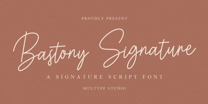 Bastony Signature is is a simple and classy font with unique curves and an elegant inky flow. Features : uppercase, lowercase, symbol, number, ligature, and also support multi language. Bastony Signature is perfect for photography, watermark, social media posts, advertisements, logos & branding, invitation, product designs, label, stationery, wedding designs, product packaging, special events or anything that need handwriting taste.
 - Skittles N Beer NF by Nick's Fonts,
$10.00Handlettering on a 1929 brochure for the P&O British-India Steamship Line inspired this tiddly typeface. Art Deco sensibilities combine with a playful attitude to yield a delightful and amusing headline font. The PC PostScript, TrueType and OpenType versions contain the complete Latin language character set (Unicode 1252) plus support for Central European (Unicode 1250) languages as well. - Buxom by ITC,
$29.00Robert Trogman originally designed Buxom for Fotostar in 1975 with lettering from Herman Spinadel. Trogman’s design is an old-fashioned headline face, whose style feels at home in a number a different periods: the Wild West, the 1960s–70s, and once again today! Buxom is an all caps typeface with a three-dimensional effect: each character looks like it sits atop a trapezoidal shape, whose right side is always shaded. An inline around each letterform enhances this shadowy image. Buxom is best used in large display sizes as a single word, or single line of text. - HGB Santo by HGB fonts,
$16.00 Must a letter always have a symmetrical basic form? What happens when the shape of the letters stretch like an arc in the reading direction? When writing with a broad nib, this is easily achieved. The HGB Santo examines the effect of this formal principle on the readability of a text. First attempts have shown a warm and reader-friendly typeface. Six shades from Light to Black, each with an italic should be sufficient for most applications. Small caps and old-style figures are available via OpenType features as well as some ornamental forms in the italics.
 - Safe Font by Galapagos,
$39.00Some typefaces are more deserving of the reference "original typeface design" than are others. Such a typeface is Steve's Safefont GD. It is indeed safe to say that this design has caused some controversy. However, the management of Galapagos Design Group believes that the message of the typeface, even before its characters are used to form words in print, is important enough-and the design itself compelling enough-to warrant the risk of any unintended offense it might cause. Safefont GD is made up of condoms, in various shapes and sizes. The design originated as a lampoon of contemporary-punk- and -garagefont- designs of the nineties. It soon evolved into the quintessence of socially conscious design. Steve suggests this typeface could be "useful as a public service font aimed at important health and social issues." In addition, Safefont GD lends itself to a wide range of fun uses. - Gina by Tipo Pèpel,
$22.00 Gina is an unbiased humanist sans. The simple skeleton of the characters and the organic strokes are essential features to the design. It is a typeface that looks to the future while keeping an eye on classic letterforms. If we have a closer look, we will notice there is a tendency towards vertical proportions. Ascenders and descenders are long, making for a light texture in small text sizes. The type family includes 8 weights and 8 italics. There is a clear link between styles, both in the structure and shape of the letterforms. The italic counterpart uses a moderate inclination and some letters adopt characteristics of cursive forms. Besides Latin, the character set of Gina includes Cyrillic and essential features for covering current typographic needs. Gina has a wonderful set of ligatures, which indeed will catch the attention of those who love connected letterforms.
 - Basic Bullets by Gerald Gallo,
$20.00 Contains 19 bullet designs in solid, outline, and outline shaded.
 - Black Puma by Gergely Soós,
$20.00 The Black Puma typeface was inspired by the rock beats and the honest spirit of today's indie music scene. Just as evolving garage bands', Black Puma’s strength lies in its fresh and brave approach: to playfully experiment and proudly take its imperfections as long as they are needed to stay real and honest. Black Puma's aim is to entertain, while expressing a strong human touch through its handmade and creatively assembled characters. Black Puma's varying rounded and edgy shapes create a vibrating yet coherent visual, which carries a positive, playful atmosphere. Its irregularities and extra bold characters empower Black Puma to have great and touching visual impact, which make it stand out of the mass flow of information delivered in the information society we live today. Black Puma font - with its 370 glyphs - includes all the accented characters of the Latin alphabet, and also comes with a couple of alternate characters (stylistic and contextual) to play around with. And, above all - as mentioned before - it includes its essence: the young spirit. So come, play around and have fun with Black Puma. Use it to create expressive, passionate posters, flyers and art work full of spirit for the awaiting young-minded public. You can find more artwork using Black Puma under the "Gallery" tab above.
 - Ferryman by Floodfonts,
$49.00 Ferryman is a Blackletter typeface for the contemporary reader. Unfamiliar Blackletter characters have been replaced with adapted common Latin characters (Antiqua) or with letters from other historical scripts that are more legible to a modern audience. Ferryman is the antidote to the overused geometric and neogrotesk styles. An expressive display typeface with a strong character, it is perfectly suited for counterculture projects and progressive concepts e.g. in visual art, indie music, and alternative lifestyles. With nine weights and corresponding italics Ferryman offers a wide range of creative possibilities. Each style offers 590 glyphs supporting all Western-, Eastern- and Central-European languages and comes with four sets of numbers and various currency symbols.
 - Molaka by Maulana Creative,
$12.00 Molaka Modern Script Font consisting of a fashionable sophisticated signature-style script with it's own unique curves and an elegant inky flow. Molaka Modern Script Font is perfect for branding projects, logo, wedding designs, social media posts, advertisements, product packaging, product designs, label, photography, watermark, invitation, stationery and any projects that need handwriting taste. Thanks for use this font, MaulanaCreative
 - Friday Jeans by PizzaDude.dk,
$19.00 Got a favourite pair of jeans? I do, and I wear them every Friday when it's time to PAAAARTYYYY! Well, that was 30-something years ago, but the memory of those jeans lives happily in my mind :) The font, Friday Jeans is a happy-go-lucky sans font with inky edges and lively lines. Playful as a Friday night out!
 - Raavi by Microsoft Corporation,
$49.00Raavi™ is an OpenType font for the Indic script Gurmukhi, used to write Punjabi. Raavi is based on Unicode, contains TrueType outlines and was designed by Raghunath Joshi (Type Design Director) and Apurva Joshi for use as a UI font. Copyright ™ 2001 Microsoft Corporation. All rights reserved. Character Set: Latin-1, Gurmukhi (Punjabi). NOTE: An OpenType-savvy application is required. - Pellegrie Signature by Krakenbox Studio,
$17.00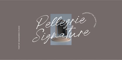 Pellegrie Signature is a fashionable sophisticated signature-style script with its own unique curves and an elegant inky flow.. Its elegant, classy, and modern look makes it a fantastic choice for fashion, signature, album covers logos, branding, magazines, social media posts, advertisement, and many more. Use this display font to add that special cool touch to any design idea you can think of!
 - Sunday Rain by Krakenbox Studio,
$17.00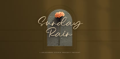 Sunday Rain is a fashionable sophisticated-style script with its own unique curves and an elegant inky flow.. Its elegant, classy, and modern look makes it a fantastic choice for fashion, signature, album covers logos, branding, magazines, social media posts, advertisement, and many more. Use this display font to add that special cool touch to any design idea you can think of!
 - Wkwkwk by Motokiwo,
$15.00 Wkwkwk - a strong and bold typeface with inky brush style. This font is great for headline, specially for adventure or travel projects. It's all caps with multilingual support and textured brush strokes will catch every eyes into your projects. Wkwkwk is a word to express "laugh out loud" for Indonesian millennials. I create this font for adventure purpose, that's fun but still stronger.
 - Magnifique by Joe Hewitt Design,
$14.99 High Society, upper class and very posh indeed! Magnifique is a modern, elegant, stiff upper lipped serif typeface. Classy, luxurious and opulent, Magnifique is ideal for markets such as fashion, jewellery, perfumes and grand events. The typeface contains uppercase and small caps. The glyph set includes all languages covered in Basic Latin, Latin-1 Supplement and Latin Extended-A scripts.
 - Brush With Death by Cyberian Khatru,
$20.00 This font was made possible by creating a custom brush in Illustrator. I started with a flat brush dipped in India ink to create the stroke. From a scan of that stroke I made a vector tracing which I then I altered as necessary to get the desired dimensions. The lower case letters have a thinner stroke than the capitals.
 - Nanquim by PintassilgoPrints,
$18.00 Nanquim is a versatile font, available in three sketchy options. At display sizes the line art is very eye-catching. At smaller sizes it turns out like textured faces. Always with a pleasant handmade feel. Nanquim characters were hand drawn with pen and India ink on film, like we use to do when preparing artwork for screenprint. Hope you enjoy!
 - Gliners by Dumadi,
$25.00 Gliners is a simple stylized font that overlies the center of the glyphs bar in the font. Glyphs font doesn’t have too many, it only offers Uppercase and Multilingual, but don’t worry because its simple shape will make your project look interesting. The Gliners font is very suitable for use as movie titles, movie title poster covers like the review image I shared above. how? are you interested in trying it? Thank You, stay the center of attention and classy!
 - Forestory by Michael Rafailyk,
$9.00 Forestory is a typeface that was born among the trees. Its natural curly shapes are filled with the magic of a forest full of stories. View PDF Specimen: https://michaelrafailyk.com/typeface/specimen/Forestory.pdf Contextual Alternates: FF GG KK MM OO SS TT ZZ cc dd ee hh jj nn oo pp rr ss ww yy zz ГГ ПП бб λλ. Stylistic Alternates: ABDFGKMNOPRSTZabcdefghjmnopqrswz АБВГЖКЛМОПРТФЬЪЫЯабеёорсьъы ΑΒΓΖΚΜΝΟΠΡΤΦΆβδλορϲφ ÀÁÂÃÄÅĄĂĀẢẠẮẰẲẴẶẤẦẨẪẬÆĎĐÐĞĢŘŔŖàáâãäåąăāảạắằẳẵặấầẩẫậæďđèéêëěęēėẻẽẹếềểễệğģ 269. Stylistic Set: Unclosed (ss01). This set reveals the closed letterforms, making the typeface even more curly. Ligatures: VB VD VE VF VP VR WB WD WE WF WP WR YB YD YE YF YP YR ax cs cx es ex gp gr qp qr ux vr wr (+ their stylistic alternates). These ligatures are designed to connect some characters in a more natural way. The typeface includes Latin, Greek, Cyrillic scripts and supports up to 104 languages. The promo images used photos of Andie Venzl and Sarah Chai from Pexels.
 - Rushen by Arterfak Project,
$18.00 Presenting to you Rushen. A vintage display sans serif with 5 styles. Designed with a bold weight that is awesome to be used for many purposes such as headline, branding, logo, apparel, logotype, cards, labels, poster, packaging, and many more. These fonts are all-caps fonts complete with multilingual support. Be Bold with Rushen! What you'll get : Regular: The basic one, with sharp geometrical shapes, formal and elegant look. Good to apply in Books, newspapers, letterhead. Curvy: Inky inspired from the old-school advertising, can be combined with your favorite fonts. Perfect for labels, posters, and short editorial. Stencil: The most explored with some adjustments that look good for a manly theme, urban style, military themes, brave, and youth. Shadow: The complement from all, but still can be stand-alone for western design, old school, and food themes. Distressed: The vintage-inspired with the neat ink effect and minimal anchor points to keep font still ergonomic. Thank you for your support!
 - Ico Phone by Setup,
$19.95 Ico Phone is a set of 115 symbols depicting anything that happens on the screen of a regular mobile phone. To name a few, there are Bluetooth and sync icons, signal bars, battery statuses, media playback icons, USB symbol, lock icon as well as a wifi signal strength indicator. The style of Ico is inspired by the look of symbols used on the classic monochrome LCD displays. The symbols are monolinear with rounded corners, composed of a smallest possible number of elements. In addition, the rounded style is accompanied by a second style with sharp corners and more detailed drawing. All symbols of Ico share the same width, making the font compatible with the LCD typeface ION. Together, they are the perfect sollution for LCD style typography. Ico Phone is a part of a larger set. Have a look at the other available Ico fonts and don't forget to check back soon for even more additions.
 - Ongunkan Camunic Script by Runic World Tamgacı,
$60.00 The Camunic language is an extinct language that was spoken in the 1st millennium BC in the Valcamonica and the Valtellina in Northern Italy, both in the Central Alps. The language is sparsely attested to an extent that makes any classification attempt uncertain - even the discussion of whether it should be considered a pre–Indo-European or an Indo-European language has remained indecisive. Among several suggestions, it has been hypothesized that Camunic is related to the Raetic language from the Tyrsenian language family, or to the Celtic languages. The extant corpus is carved on rock. There are at least 170 known inscriptions, the majority of which are only a few words long. The writing system used is a variant of the north-Etruscan alphabet, known as the Camunian alphabet or alphabet of Sondrio. Longer inscriptions show that Camunic writing used boustrophedon. Its name derives from the people of the Camunni, who lived during the Iron Age in Valcamonica and were the creators of many of the stone carvings in the area. Abecedariums found in Nadro and Piancogno have been dated to between 500 BC and 50 AD. The amount of material is insufficient to fully decipher the language. Some scholars think it may be related to Raetic and to Etruscan, but it is considered premature to make such affiliation. Other scholars suggest that Camunic could be a Celtic or another unknown Indo-European language.
 - Exo Slab Pro by Polimateria,
$35.00 Exo Slab Pro is a slab serif with a technological and futuristic tone. Even though it has a very peculiar look and many distinct shapes that pop out in an headline, it also works well as whole creating a nice shade of text. Large x-height, ink-traps and a modest contrast ensures that this font will work well even on small font sizes. Loaded with opentype features Exo Slab provides a huge versatility. You can use it on rigorous work as well as on more funny projects. From Branding to Editorial, from Paper to Screen, from Today to the Future. Please see our promotional video.
 - Yardbird Numerals by Coniglio Type,
$9.95Yardbird, insinuating prison numerals, was lifted from a wooden block print poster press, that would have indeed besides providing dates for the local carnival would have just as easily ink-chucked them over the backs of those denim blues. Part of Market LTD, a collection of limited faces, mostly alpha-numeric and some just plain numeric, used primarily in retail and display situations and titling. - Kodama Forest by Hanoded,
$15.00 Kodama are spirits in Japanese folklore that inhabit trees. The term is also used for trees in which a kodama houses. Kodama Forest is a rough, spikey and inky font, in the style of the great Ralph Steadman. Kodama Forest comes with a bunch of alternates, some interesting ligatures and a lot of splatter. And, of course, all the diacritics you can throw a tree spirit at.
 - Knockdown by Hanoded,
$15.00 Finding my long-lost inkwell was a lucky moment for me and it resulted in a whole bunch of brushy/inky fonts. The latest font to leak out of this well is Knockdown. It is a bold and wild brushface, but very legible. Use if for your posters, book covers and T-shirts! Or, whatever else you like. Comes with a KO of diacritics.
 - South Pacific by Nicky Laatz,
$26.00 Say hello to South Pacific Marker , a new bold inky font with a casual handwritten feel. South Pacific includes a large selection of natural-looking ligatures and extra alternate characters ( see previews) in it's Opentype Features - make sure you have your stylistic alternates switched on to enjoy all the extras. Four handy swashes are also included in the glyphset - accessible via your glyphs panel.
 - Squeezed by MAC Rhino Fonts,
$59.00 Squeezed is the result of exploring mid 20th Century sans serif typefaces. As the name suggest, the typeface is indeed condensed which is also a solid part of its personal and friendly charactar. It was first designed to fit for custom book cover projects, but now released for the public. Squeezed is best suited for display solutions, but could sometimes work in minor sizes.
 - DF A Bit by Dutchfonts,
$33.00 DF A Bit is made for screen display which is the final form of a lot of information nowadays. But there is more in this BIT... in display sizes it unfolds it’s skin, a beautiful ink on paper structure caused by the letterpress printing of copper lines. Analogue BITS indeed. With all the wealth of the ‘non perfect’, to please the eye and to satisfy the mind.
 - Anarckhie by Ingrimayne Type,
$12.95 Anarckhie is a decorative slab-serifed typeface with a calligraphic origin. The horizontal elements of the upper-case letters are below their midpoint, and the x-height of the lower-case letters is unusually small. There is some variation in the weights of the horizontal, vertical, and diagonal elements. The small x-height makes this typeface appear smaller than its point size would indicate.
 - Skriva by Letradora,
$16.00 Skriva is the handwriting we'd all like to have: neat and legible, still natural looking. It as a super complete character set with support for over 200 latin languages. It includes advanced OpenType features, such as random alternate characters, to make it look even more natural. Skriva has 4 variants: light, regular, bold & inky. Use Skriva wherever you need a personal touch on your texts.
 - Braisetto by Adam Ladd,
$25.00 Braisetto is a handwritten, signature family with five weights, multiple alternates, and natural ligatures. Inky and expressive yet readable and functional, this typeface is designed to look personal and be useful in a variety of applications like branding, packaging, products, cards, and more. Features include multiple stylistic alternates, automatic double-letter ligatures, automatic title-case ligatures, initial stroke alternates, ending flair alternates, five weights, and matching ornaments.
 - Populuxe - Personal use only

- Tabac Mono by Suitcase Type Foundry,
$75.00 A big advantage of the font family is a consistent width of all sixteen styles, so it is possible to switch between them without changing the typesetting. Tabac Mono extends the means of expression of the other fonts in the font superfamily, with which it shares several OpenType functions, including indexes, fractions, several types of numbers and alternative shapes of the most distinctive letters of the Latin alphabet (a, g, Q), which you can use to significantly influence the character of the final composition.
 - ASTYPE Ornaments Accolades B by astype,
$28.00 The astype series Accolades B offers the advanced designer a fine set of calligraphic swashes, swirls and figural ornaments. Accolades B and B2 share most of the base set of ornaments but differ in some of the major shapes. If you're looking for some good companion fonts, give Gracia and Adana a try. Every classic high contrast stroke design like Didot or Bodoni works well. Note: Each package comes with a technical documentation and an InDesign2 sample file with lots of ready made borders.
 - Engria by Eclectotype,
$40.00 Engria is a type family of four weights with corresponding italics that treads the fine line between sans and serif. There are serifs, of a sort, inspired by the brush. Not the marks made by a brush, but the actual splayed shape the bristles make when clamped together. Wedge-like chunks that resemble engraved forms, as the name Engria hints at. But it also has the appearance of a stressed, flared sans. This mixed approach lends a unique voice. Highly legible at text sizes, as indeed it is optimized for, Engria does however shine at display sizes thanks to its characteristic details – flared stems, angular counterforms, rugged ink traps and fluid curves. (I would recommend tracking it a little tighter at larger sizes.) Engria started life way back in 2014, and has been worked and reworked tirelessly to get to this finished product. My intent was to really push the idea of the white shapes being as important, if not more so, than the black. Engria is equipped for typographically demanding applications, boasting as it does an array of OpenType features, including small caps, automatic fractions, stylistic sets, various figure styles, arrows, case sensitive forms and more. It will make a very useful addition to your typographic arsenal, with a flare (ahem) for editorial work, but the individuality for packaging, branding, and logo work.
 - Kufi Mutamathil by Arabetics,
$39.00 Kufi Mutamathil is an Arabetic (extended Arabic) typeface design with heavy Arabic Kufi calligraphy accent, both on a single letter level and in an overall text look and feel. Although Kufi, the earliest Arabic calligraphy style, is often described as “stiff”, it is in fact a very flexible style. The Kufi Mutamathil typeface design underlines this calligraphy style flexibility and openness through visualizing a very legible Mutamathil design with Kufi shapes. The Mutamathil type style utilizes only one isolated glyph per Arabic Unicode character or letter, as defined in Unicode Standards. It is a very light style which does not require any standard glyph substitution or the shaping engine. The Kufi Mutamathil font family employs variable, unrestricted, x-height values. It comes in regular and left-slanted italic styles. Kufi Mutamathil includes all required Lam-Alif ligatures. Soft-vowel diacritic marks, or harakat, are selectively positioned with the majority of them appearing on the same level, over or below, following a letter, to ensure that they would not interfere with individual glyphs appearance. Kashida, or tatweel, (shft-j) is a zero-width character. Keying it before Alif-Lam-Lam-Ha will display the Allah ligature. Kufi Mutamathil includes both Arabic and Arabic-Indic numerals, in addition to all Standard English keyboard punctuations and major currency symbols.
 - Building & Loan by K-Type,
$20.00 A slightly rustic font with horizontal shading, Building & Loan evokes hand-crafted solidity and hands-on reliability.
 - Ravenheart by Hanoded,
$15.00 I like Ravens. In fact, I like them so much that I have a tattoo of a Haida raven! Ravenheart was more or less modelled on my Qilin font, but it is completely different. It is scary and inky, but it has a certain flair as well. A bit mystical, a bit evil, but I am sure you’ll find many uses for it. Comes with a fluttering of diacritics.
