1,499 search results
(0.016 seconds)
- Desk Clerk JNL by Jeff Levine,
$29.00Sometimes a font idea can come from the most unlikely place. While watching a DVD of the 1950's TV Sitcom "My Little Margie", Jeff Levine spotted some unusual deco-styled numbers on the floor indicator of the apartment house elevator. Expanding this into a full character set, Desk Clerk JNL is the result. - Ohara by Allouse Studio,
$16.00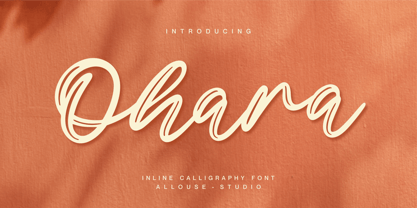 Proudly Presenting, Ohara a Inline Calligraphy Font. Ohara is perfect for any titles, logo, product packaging, branding project, megazine, social media, wedding, or just used to express words above the background. Ohara also come with Multi-Lingual Support. Enjoy the font, feel free to comment or feedback, send me PM or email. Thank You!
 - Lunair by Seventh Imperium,
$22.00 Lunair is a display script layered font. Feature the modern script layered The base layer is regular; add an extrude and extrude shadow to create a dimensional look. the font styles can be mixed and matched together to create different style details. are several fonts with a stand-alone script Base, Emboss And Inline,
 - Simply Marvelous by Comicraft,
$19.00 Darling, you don’t just look GOOD, you look FANTASTIC! IRRESISTIBLE! IMMACULATE! Those soft curves, those sharp lines, those INLINES... that MAGNIFICENT symmetry. This is a face that could launch a thousand spaceships, a face that doesn’t care if you feel good, because Heavens to Betsy, you LOOK good. Just utter those magic words: Simply Marvelous.
 - Stonecut JNL by Jeff Levine,
$29.00 Stonecut JNL is an adaptation of a novelty display face found in one of the Dan X. Solo lettering books. Resembling letters made from cut stone, both the inline and solid black versions are perfect for themes encompassing outdoors, the Stone Age, "macho" events or anything where an unpolished or rustic look can be adapted.
 - Frankfurter by ITC,
$40.99 Frankfurter font is the work of designer Alan Meeks. The most distinctive feature of this informal, sans serif typeface is its curved or rounded terminals. The letters look best when set closely together. Frankfurter Medium is well-suited to a variety of display applications and comes in four weights, regular, medium, highlight and inline.
 - Ring Quad by Ochakov,
$9.00 Ring Quad is brave and confident from thin to black. A cleaner, geometrical and professional aesthetic. Ring Quad is a modern & minimalist font. It’s perfect for branding, logos, quotes, posters, name card, stationary, and every other design that needs a striking typeface. Now, Ring font family prepared for any insane adventure life throws our way!
 - Chocobelly by Allouse Studio,
$16.00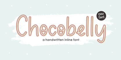 Proudly Presenting, Chocobelly A Handwritten Inline Font. Chocobelly is perfect for any titles, logo, product packaging, branding project, megazine, social media, wedding, or just used to express words above the background. Chocobelly also come with Multi-Lingual Support. Enjoy the font, feel free to comment or feedback, send me PM or email. Thank You!
 - Asturias by insigne,
$21.99Asturias is a contemporary take on script fonts. Its characters are wider than most scripts, and the letterforms are somewhat geometric, giving it a modern and refined feel. The font is well suited for any occasion that calls for a sophisticated air and appearance. As with all insigne releases, Asturias comes with a wide range of OpenType features; a full complement of artistic alternates, ligatures and old style figures to add a touch of sophistication. - Kernig Braille by Echopraxium,
$5.00 This font is the younger sister of HexBraille with which it may be combined to create new patterns. This also explains why their introductory text are similar. Introduction The purpose of this monospace font is to display braille in an original and "steganographic" way. The Kernig prefix means "Robust" in German, this is because of the crank shapes . The core of the glyph design is a flat hexagon which can be read as 3 rows of 2 dots (i.e. regular braille glyph grid). Even if within a glyph, braille dots ("square dots" indeed) are placed on the vertices of a flat hexagon, the difference with HexBraille is that edges connecting vertices are not straight lines but "crank shapes" instead. This can be summarized by saying that the whole glyph is a Hexcrank (a flat hexagon where vertice pairs are connected by a crank shape) NB: The initial design is illustrated by glyphs 'ç' (no dot) and 'û' (6 dots) as shown by poster 6. A. "Kernig Lattice" In KernigBraille, glyphs are connected to each other, thus for each Hexcrank glyph there are 6 connections: 2 on left/right and 4 on top/bottom. In the final design some cranks were removed for esthetical reason (i.e. leave empty space for allowing patterns diversity). In summary, a text using this font won't display a honeycomb but a lattice instead. NB: Please notice that in order to obtain the lattice without vertical gaps, you must set the interline to 0. The lattice is made from 3 kind of shapes: a.1. Hexcrank a.2. Square a.3. Irregular cross (mostly unclosed) The design favored squares over crosses. The whole slightly resembling a PCB. B. Text Frames It's possible to frame the text with 4 sets of frame glyphs (as illustrated by poster 2) b.1. Kernig { € ° £ µ § ¥ ~ ¢ } b.2. Rectangular-High { è é ê ï î à â ä } b.3. Rectangular-Low { Â ù Ä Ê Ë Ô õ ö } b.4. Mixed Kernig+High: a mix of Kernig and Rectangular-High frame glyphs When using frame glyphs, it is advised to show Pilcrow (¶) and Non Breaking Space, which are replaced by empty shapes in this font (e.g. in Microsoft Word, use CTRL+8 or use [¶] button in the ribbon).
 - Film Reel JNL by Jeff Levine,
$29.00 In a World War II training film from the U.S. Signal Corps, the opening title card saying “First Aid” was hand lettered in an extra bold, Art Deco inline style. Those two words (with seven available letters) used as a work model has inspired Film Reel JNL, which is available in both regular and oblique versions.
 - Redsniper by Locomotype,
$15.00 Introducing Redsniper, a brand new font with a vintage look inspired by Victorian typography. Available in three styles with different variations including regular, inline and classic, making it easier to design a variety of typography. Redsniper is suitable for making label designs, posters, logotypes, signage etc. especially when you want a retro and old-fashioned design.
 - Luisa by TipoType,
$34.90 Luisa is a typeface with two weights: regular and inline. Its design responds to the calligraphic principle of pressure. It combines the elegant qualities of the calligraphy with the unstructured and informal layouts of modernity. It is suitable for striking composition in words and short sentences and for shaping dense and deep textures when applied into paragraphs.
 - Deco Template JNL by Jeff Levine,
$29.00 Deco Template JNL is a font made from the inline portion of Stationer JNL, which itself was based on the hand lettered 1938 sheet music title for the official Coast Guard Marching Song "Semper Paratus" "(Always Ready)". Resembling a drafting template with a square, modular look, this type design is available in both regular and oblique versions.
 - Every Cloud by HOHOHtype,
$25.00 ‘Every Cloud’ is a cute hand-drawn type family. The family has 4 different weights and a matching inline style. It has a tall x-height, and the edges are rounded and soft. It was designed with applications such as advertising and packaging, editorial and publishing, logo, branding and creative industries, poster and social media, and marketing in mind.
 - Emeritus by District,
$30.00 Emeritus is born from the carved letters found on buildings and monuments in Washington, DC. Muscular and low contrast but with assymetrical flared serifs that soften its stately presence. Small caps, inline caps, chiseled characters, and multiple weights and numerals offer an array of typographic voices. Notably academia, military, monumental, automotive, logos, signage, and so on.
 - Tequileria by Hanoded,
$15.00 Tequila… I have to admit that I am not a drinker. I do like Tequila, though, even though I can’t remember when I last had a shot. Tequileria is a very recognisable inline display style font. It would look great on posters and book covers, packaging and even bottles (with or without tequila). Comes with an abundance of diacritics.
 - Kartika by Microsoft Corporation,
$49.00Kartika™ is an OpenType TTF font for the Indic script Malayalam. The Karitka font was tuned for high quality display and is used for Malayalam and Konkani. Kartika is based on Unicode, contains TrueType outlines and was designed for use as a UI font. Copyright ™ 2002 Microsoft Corporation. All rights reserved. Character Set: Latin-1, Malayalam - Prospect Park JNL by Jeff Levine,
$29.00 Prospect Park JNL was inspired by inline lettering found on some vintage sheet music from the Art Deco era entitled "By My Side". The font's namesake is located in the Crown Heights section of Brooklyn, NY. Prospect Park is famous for its zoo as well as its tree lined paths, historic carousel and the expansive park area.
 - Olpal by Bunny Dojo,
$16.00 A Display Serif, a Monoweight Sans, and an Inline form combining the two, Olpal is a versatile companion for your next adventure. With surprising vitality for a workhorse font, Olpal embraces any job – and whistles while it works. Neutral – with a hint of pizzazz – the font's strong legibility and compressed footprint make it a brilliant fit in any environment.
 - Asbury Park JNL by Jeff Levine,
$29.00 In the 1930s the WPA (Works Progress Administration) sponsored a Federal art project. Many posters were produced that featured government-sponsored cultural events, health and safety tips and various other topics. One such poster from Pennsylvania has the words “Work with Care” in a hand-lettered inline sans design. This became the basis for Asbury Park JNL.
 - Slinkster by Will Ryan,
$- Big. Bold. Beautiful. Slinkster is an intricately unique display face created by carefully overlapping equally-sized circles. The geometric patterns formed become increasingly mesmerizing the larger the type is set. Slinkster works best for display, headers, logotypes, and any other large-scale applications that allow the viewer to become hypnotized by its complexity. Due to how detailed Slinkster is, you may experience some lagging as it can take a while to render. Like this font? Consider donating to encourage further development and new fonts! Donations accepted through this Paypal address: willryan042@gmail.com
 - Hargalia by Arterfak Project,
$18.00 Hargalia is a beautiful cursive display typeface. Inspired by classic cursive calligraphy from Carolingian Renaissance era (about 8th century) which in that era, the alphabet letterform was perfected for the first time with many curvy strokes with a flat brush. Hargalia is designed with penmanship and carefully digitized with many swashes included. Hargalia is designed for headlines and short body texts. The natural strokes with calligraphic feel that highly recommended for fashion, branding, magazine, editorial, logotype, packaging, historical quotes, and more. This font is PUA Encoded with 430 glyphs in total! Worth every penny! Features included: Uppercase Lowercase Numbers Symbols Punctuation Stylistic alternates Contextual alternates Swashes Ligatures Stylistic set 001 - 003 Best regards, Ramz.
 - Printers Drawer JNL by Jeff Levine,
$29.00 Printers Drawer JNL continues building on a library of letterpress illustrations, cartoons, ad builders, Art Deco ad panels, ornaments, embellishments, and general miscellany. The images are re-drawn from vintage source material, and this font is jam-packed with 89 images spread throughout most all of the standard keyboard positions. This is officially the 1000th release from Jeff Levine Fonts since its inception in January of 2006. Jeff Levine Fonts aims to preserve the almost-lost artwork and lettering styles of the past within a digital type format, and often recreates the designs complete with their evident flaws, idiosyncrasies and eccentricities; allowing for a “real world” and nostalgic look to the computer generated art projects of today.
 - Auster by Resistenza,
$39.00 Auster, A Sans with Flair! Auster packs sensational personality in its fine-tuned forms. Confident and quirky, yet comfortable to read, this distinctive san serif family stands out from the crowd. The curves cinch and strokes flair in unconventional places making Auster an unashamed rebel sure to turn heads. Originally designed during the TipoBrda Workshop in Slovenia. Resistenza spent 3 years developing this 2 style (roman & Italic), 20 weight family. The subtle reverse contrast characters were first painted with a flat brush, then polished in pencil on tracing paper before being carefully digitized, to include language support and all the opentype features you expect in a quality contemporary font. More About Opentype Features: https://bit.ly/opentype-rsz
 - Gertrud by T4 Foundry,
$21.00First place in a spelling-bee competition, a Harvard University diploma or the Nobel Peace Prize? You can't go wrong with this classic Swedish calligraphy font, created by veteran designer Bo Berndal. He named Gertrud after his better half, but was also inspired by old handwritten documents: "Gertrud is a calligraphic letter design from the 16th century. I used it when I engrossed diplomas with a flat-nibbed pen in the 1980's. When I got my Mac I generated the typeface in Fontographer." Gertrud (the typeface) comes in three weights, with roman and italic. It is an OpenType creation, for both PC and Mac. Swedish type foundry T4 premieres new fonts every month. Gertrud is our sixth introduction. - New Comer Sans by ave,
$12.00 New Comer Sans is a combination of two ideas. First is my speed writing with flat acrylic marker on boards. And second is to make new bold font something like puffy «comic sans» font. Unstable stems (vertical main lines) give it some playful unserious character. The result is cute funny font. You can use it in short text blocks in huge and medium sizes. For example, for comic books or kids applications. NewComerSans includes: uppercase lowercase more than 480 glyphs which support Latin, Western European, Central European languages (Cyrillic is also included) Hope you are enjoying using New Comer Sans. Please do not hesitate to ask me any questions about the product. (c) Photo credit - Unsplash
 - Momentum by Baseline Fonts,
$29.00The Momentum family of typefaces is not for the faint of heart. Although difficult to spot at small point sizes, the glyphs are nothing but dot-to-dot letterforms raggedly, haphazardly placed for a chunky appearance. Brazen and bold in its appearance, Momentum may be EXACTLY WHAT YOU ARE NOT LOOKING FOR in a font family, unless you desire a chiseled, flat, cut-out look. Originally developed for package design requiring a grunge appearance, the Momentum family of fonts creates controversy and speculation wherever it is utilized. Momentum is a modern, chiseled typeface designed with a sense of humor. Perfect for large and small display alike, the extended character set allows flexibility on the fly. - Naishila by FadeLine Studio,
$10.00 Introducing Naishila. This new font family includes a caps and script. Naishila is a lovely and sweet font duo with a dancing baseline. You will receive the regular font (not dancing) while the script comes with stylistic sets and ligatures. Like my other fonts, Naishila is made to meet the growing market of design today. This font is suitable for use in design styles such as watercolor, minimalist, flat, modern design, etc. With this font duo, you can very easily combine. Surely you can make something perfect for your design. Naishila will look gorgeous on cards, mugs, quotes, posters, shopping bags, logo's, t-shirts, branding, book covers, birthday invitations, greeting cards, and all your other lovely projects.
 - Konya by 38-lineart,
$12.00 Konya is a signature script-style font with a very luxurious look. It can look very soft and very firm in an elegant frame, high but not too towering, and flat but not too low. Its appearing with a balance like dervish whirling around in ‘Konya town’ with two hands stretched, one hand facing to the sky and the other hand facing to the earth. This font is perfect for branding, as we equipped it with a number of alternatives that allow you to make it a feminine and masculine logo, and some swash to add to the firmness of signature. This font also has ligatures to present a natural handwritten impression.
 - Fragment Pro by (v) design,
$49.00 Fragment Pro is a part of a larger OpenType font family (see also Fragment Pro Inline). It is an elegant, soft and decorative typeface built on classical proportions. Its outlines have been carefuly crafted with a high attention to detail, so it could be used even at very large sizes. Fragment Pro is derived from the separately sold layered Fragment Pro Inline, however it has been significantly optimized for standalone use. Fragment has been conceived to be used as a display typeface in publications, titles, logotypes etc., but it is surprisingly legible even in smaller print sizes. Thanks to its strictly onefold oulines, Fragment can be also used as a stencil typeface. Fragment supports many OpenType features and offers great multilingual support for most of the Latin-based languages. Feel free to download the detailed PDF Specimen.
 - Regave by Wahyu and Sani Co.,
$25.00 Introducing Regave, a typeface inspired by Danish style lettering based off the work of Knud Valdemar Engelhardt (1882–1931) who designed the street signs for the Copenhagen suburb of Gentofte. The Engelhardt's design was loosely based on the lettering of two Danish architects of the time: Thorvald Bindesbøll (designer of the Carlsberg logo) and Anton Rosen. The signs were so successful that they’re still in use today. The most noticeable characteristic of Danish style are: a flat apex of the A the widening of diagonal terminals a double-storey g with its loop terminating before it forms the bottom most stroke (Erik Spiekermann coined this a Danish g) a single-story g with a stumpy tail a K with an almost laterally moved crotch, connected to the stem by an extra horizontal stroke widened diagonal connecting strokes forming flat apex or baseline strokes Regave comes in 11 weights from Thin to ExtraBlack with matching italics and also available in Variable Font format for more flexibility in weight selection. This family also equipped with useful OpenType features such as Ordinals, Superscripts, Subscripts, Stylistic Alternates, Stylistic Sets, Proportional Lining, Standard Ligatures, Fractions, Numerators & Denominators. Each font has 490+ glyphs which covers Western & Eastern Europe, and other Latin based languages – over 200 languages supported! Regave will be suitable for many creative projects. This masculine, strong and unique typeface will be suitable for logos, posters, presentations, headlines, lettering, branding, quotes, titles, magazines, headings, web banners, mobile applications, art quotes, advertising, packaging design, book title, and more!
 - Plinc Goliath by House Industries,
$33.00 Vincent Pacella was a true giant of hand-lettering and typeface design. Of the dozens of styles he designed for Photo-Lettering and International Typeface Corporation, his dominant Goliath towers above the rest. The font is perhaps best known from Herb Lubalin’s American flag that the design legend created for Print magazine’s 40th anniversary cover. Pacella takes “slab” serif to heart with this colossally-proportioned font, using brawny stroke endings and minimal curves to create a powerful figure for maximum visual impact. Take advantage of Goliath’s superior stature to make viewers take notice in industrial settings, sports branding, and oversized outdoor media applications. For comparatively modest musings in accompanying running text, consider partnering it with a comparatively spartan slab serif like Municipal. Or, team up Goliath with a faceted fellow heavyweight like United Sans. Originally drawn in 1970, Goliath was digitized by Ben Kiel with Adam Cruz in 2011. GOLIATH CREDITS: Typeface Design: Vincent Pacella Typeface Digitization: Ben Kiel, Adam Cruz Typeface Production: Ben Kiel Like all good subversives, House Industries hides in plain sight while amplifying the look, feel and style of the world’s most interesting brands, products and people. Based in Delaware, visually influencing the world.
 - Evalfey Variable by insigne,
$99.99 Introducing Evalfey— a script that captivates at first glance. With its refined and polished demeanor, Evalfey invites you into a world of elegance, yet its simplicity makes it incredibly accessible. The elevated x-height, distinctive flag-like terminals, and the fluidity of its sweeping strokes imbue the font with a harmonious and flowing quality, elevating your designs to new heights. Ideal for wedding invitations and more, Evalfey Script exudes a romantic allure with its brushed look and pronounced 'nuptial' ambiance. Whether it's for save-the-date cards, thank-you notes, or any cherished wedding memorabilia, Evalfey is the epitome of sophistication and grace. Stand out from the ordinary with Evalfey— a font that marries simplicity with regality, making it the quintessential choice for weddings that aspire to be remembered. The lofty x-height, elegant terminals, and rhythmic strokes render Evalfey a crown jewel in typographic design. Elevate your special moments with Evalfey, a harmonious blend of elegance and simplicity, making it your go-to font for wedding invitations, announcement cards, and any keepsake that calls for a touch of the extraordinary. Production assistance from Lucas Azevedo.
 - Bowie by Latinotype,
$19.00 The name of this typeface comes from the surname of James (Jim) Bowie, American pioneer and inventor of the famous Bowie knife. This is exactly what inspired English rockstar David Jones to change his stage name to David Bowie. Bowie is thenew font by Bercz and Latinotype Team. The typeface is a type system that reflects a strong personality, an urban feel and an unprejudiced style. Bowieis well-suited for publishing projects, branding and packaging. This font family is composed of three sections: a group of sharp-shaped uppercase fonts (smallcaps and all caps) in 5 weights, each with matching regular/back slant italics,providing users with 15 different styles for multiple combinations; a set of script catchwords and eclectic sets of dingbats and flags that communicate the blue-sky thinking and feel of the project. Bowie —a collaborative project between Bercz and Latinotype Team—was developed by Leonidas Loyola, Valentina Vega, Rodrigo Fuenzalida, César Araya and Bruno Jara, under the supervision of Dany Berczeller, Daniel Hernández y Luciano Vergara.. Bowie consists of 5 weights, ranging from Thin toBlack, and comes with a 439-character set that supports 206 languages.
 - MoDi Khilari 1, although a less commonly known font name and possibly conceptual or specific to certain design applications, suggests an intriguing fusion of typographic style and cultural essence ba...
- Blue Goblet by insigne,
$19.99 Blue Goblet is a script developed for the pending illustrated children’s book from Portland Studios, The Blue Goblet. The font has grown to a comprehensive system, with a wide array of ornaments available. Blue Goblet is usable in a wide range of settings, and includes a full complement of OpenType features and a more playful alternate. Blue Goblet is a collaboration between Portland Studios and insigne. It was designed by Cory Godbey and digitized by Jeremy Dooley.
 - Bold Display Sans JNL by Jeff Levine,
$29.00 Bold Display Sans JNL is loosely based on one of the classic alphabets found within a Speedball Lettering Textbook of the 1940s; itself called "Bold Display". The original featured a stippled texture and inline curves placed in random patterns throughout the letters. This more simplified, all-caps version is for titling requirements where a strong, yet casual design is needed.
 - Ingy Star Tilings by Ingrimayne Type,
$9.00 IngyStarTilings allows one to create a variety of patterns that have stars. Some of them are quite common and others less so. A sample file is available that shows possible patterns that can be constructed with this typeface, including some non-star repeating patterns. As the posters indicate, some of the patterns constructed with the regular version are intended to be multicolored.
 - Raavi by Microsoft Corporation,
$49.00Raavi™ is an OpenType font for the Indic script Gurmukhi, used to write Punjabi. Raavi is based on Unicode, contains TrueType outlines and was designed by Raghunath Joshi (Type Design Director) and Apurva Joshi for use as a UI font. Copyright ™ 2001 Microsoft Corporation. All rights reserved. Character Set: Latin-1, Gurmukhi (Punjabi). NOTE: An OpenType-savvy application is required.