2,364 search results
(0.025 seconds)
- Futhark AOE - Unknown license

- Kumo Sans by EchadType,
$10.00 Kumo Sans is a clear and comprehensible font stylized to mimic marker pen handwriting. The idea was to interpret swift and negligent hand movement in a distinct and easy to read familiar glyph silhouette. Family comes in three weights and italic slant option. Shadow version with outline and shadow effect is perfect for short catchy phrases, brand names and headlines use. Font contains Latin diacritics, Hebrew cursive writing, Bitcoin, Indian Rupee, New Israeli Shekel symbols, fractions etc.
 - Pema by Designpiraten,
$65.00 Pema – a contemporary Tibetan sans serif encoded in the Unicode standard. This is the first Tibetan typeface influenced by western sans serif fonts. It was designed especially to match multilingual purposes. The rather calligraphic Tibetan scripts did not match with the design aesthetics of western and Indian fonts and so I came up with the idea to design a “modern” Tibetan sans serif. Pema comes in two weights, Regular and Bold, each equipped with almost 1.300 glyphs.
 - Ellyshabeth by DLetters Studio,
$13.00 Ellyshabeth Signature Script Font is perfect for Logo, Signature, Social Media Posts, Advertisements, Magazine, Product Packaging, Label, Sticker, Photography, invitation, Business Cards, and any projects that need handwriting taste. Each basic character (“A”) is followed by Unicode variants of the same character (Á, Ä…), then OpenType variants (small caps, alternates, ligatures, Swash…). This way you can see all the variations on a single character in one place. Thanks for your support, please kindly send us a message for any question about our product. Hope you like it.
 - Steelyard by TypeArt Foundry,
$45.00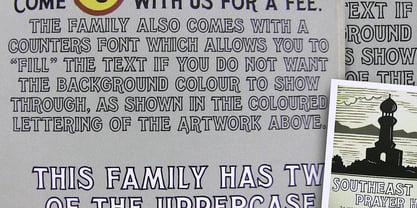 Inline styled after retro Luggage Label.
 - Sutro Initials by Parkinson,
$20.00 A two-font chromatic (or layered) set. The Primary font, which is the old Sutro Inlined Initials. Salvaged from the wreckage of my Type1 font library, the inlined initials have been in the shop for some repairs and detailing. I just added the fill font to support the inlined version. Each font works on it’s own but they work very well together. Caps only. Open Type.
 - Filmland JNL by Jeff Levine,
$29.00 A hand lettered, dual line sans serif type style was used for the title of “Filmland” – a 1931 movie fan magazine from India. This inspired both the digital typeface’s design and name. Filmland JNL is available in both regular and oblique versions.
 - Orchid Key by Missy Meyer,
$12.00 I built the Orchid Key font family from the ground up with the idea that there would be several different styles; the Inline Spurs style was the first to be built, which let me then subtract the spurs, inline slices, or both to make the other styles. I've never made a font quite like this before, which shows in the time it took - it's been over 5 months since I started construction! Each style contains the same character set, with 700 total glyphs. Each has the usual basics: letters, numbers, and punctuation; plus over 300 extended Latin characters for language support, and almost 200 alternates for tons of variety! There's a swash alternate for every uppercase letter, at least 6 alternates for every single lowercase letter, and a set of 10 extra swashes and flourishes so you can customize! Whether you're looking for a western or country look, a retro look, or a modern hipster look for your project, check out Orchid Key!
 - Calligraphica by Monotype,
$49.00Calligraphica was designed because there are very few inline fonts, and even fewer inline calligraphic fonts. The original forms were written with a split pen in a single stroke. The minuscules have a rougher look and the capitals have a smoother shape to imitate hand written calligraphy with more formal, decorative initial caps. The Calligraphica family contains 6 fonts: Calligraphica Regular and Italic are the regular upright roman true italic version of the font. The ascenders on this font are a bit higher than the capital letters--this is standard for most fonts. Calligraphica LX Regular and Italic are similar to the first 2 fonts except their ascenders are longer and reach high above the capital letters--giving these fonts a taller appearance. Calligraphica SX Regular and Italic are similar to the first 2 fonts except their ascenders are shorter and are the same height as the capital letters--giving these fonts a shorter appearance. - Spinosa BT by Bitstream,
$50.99Stephen Chick, of In Your Typeface Productions (IYTP) foundry, has created this rather prickly type design. Although for display, it is surprisingly legible at smaller point sizes. There is an Inline version, and also an Inline Extra version, which has only the inner contours of the Inline itself, which can be combined with the Regular to create cool two-color effects. The extended glyph set supports Central Europe. - Cruise by Funk King,
$5.00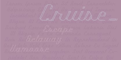 Cruise is an elegant inline modular script font.
 - Michiana Pro by BluHead Studio,
$39.00 Michiana Pro is my new, hand-crafted connecting script! I've been hand lettering cards and envelopes to my wife and family in this type style for years and decided it was time to make a font based on it. I typically start with a single thin stroke for each letter, then build up the weight of the heavy stroke, so there ends up being a lot of charming variations in terms of style and color. The overall finish is rough, yet friendly. Perfect for invitations, place cards, love notes, and with its large x-height, it sets nicely for text. I grew up running around the dunes and beaches along Lake Michigan in northwest Indiana, and I think the shoreline and dune grass has inspired my aesthetic. Michiana Pro takes the name from a small area along the lake between the Indiana and Michigan state lines. There are a lot of nice, modest homes nestled in the duneland forests. Thinking about what it's like back there, it's like having a bowl of steaming hot comfort food. So I hope Michiana Pro feels that way to you too. Michiana Pro features include: + extended character set for Western European language support + 1,205 glyphs + lowercase beginning and ending swashes + contextual initial and final letterforms + alternates for L, R, Z, f, g, p, t and y + 140+ ligatures + superior and inferior figures for unlimited fractions + ordinals (st, nd, rd, th) + 4 ornamental swashes + available in both OTF and TTF formats
 - World Travel JNL by Jeff Levine,
$29.00 Inspired by the hand lettering found on a 1930s travel poster promoting visits to India, this bold sans serif Art Deco type design feature incised lines and a stylized A,E,F and S. World Travel JNL is available in both regular and oblique versions.
 - Loreto by Tipo,
$69.00This font gets its inspiration from the typography of the Manuale ad Usum (1721), printed by Jesuit missionaries who worked at the beginning of the XVIII century with communities of "Guarani" native indians from the Northeast region of Argentina. It is a manual of sacraments published by Paulo Restivo and some collaborators among the native population. This manual features the peculiarity of being the first printed piece where there is a record of the place where it was printed: at the Loreto mission. - Competition by sportsfonts,
$15.00 Competition is a state of the art sports typeface. A large width range, slant angles from –12 to 12, and an adjustable inline make it extremely versatile. It’s devided into 5 subfamilies, from the sizes S, M, L & XL with decreasing inline weights to Solid without an inline at all. (By the way: S doesn’t mean it doesn’t look good in large sizes!) Choose from 105 predefined styles, or 1 variable font with axes for width, slant and inline weight (which is included in the family package). Competition embraces the Latin S character set and therefore supports 400+ Latin-based languages. Go for Gold!
 - Ancoa by RodrigoTypo,
$25.00 Ancoa is a Sans Serif Display typeface, which plays with its rough form and works perfectly on posters, designs of different uses, contains 19 fonts and includes different styles from Inline, Layer Inline, Rough and the different Weights between Regular to Fat.
 - Newspaper Publisher JNL by Jeff Levine,
$29.00 The Logansport, Indiana Pharos-Observer dated June 12, 1917 had the following headline running across its front page: “American Steamer Sunk by German U Boat”. The condensed slab serif typeface used to set that headline has been recreated digitally as Newspaper Publisher JNL, and is available in both regular and oblique versions.
 - Zamenhof by CastleType,
$59.00 Zamenhof is a family of five fonts that can be used singly or in combination to create a variety of bold, yet elegant, display styles. Inspired by Russian hand-lettering that appears to have been based on Jakob Erbar’s Phosphor, Zamenhof is essentially a Latin interpretation (with Cyrillic and Greek) of a Cyrillic interpretation of a Latin type design, with many changes along the way. (For example, all the Latin-only letters are quite different between the two designs: D, F, G, J, K, N, Q, R, S, U, V, W, Y, Z.) The Inline and Inverse styles of Zamenhof are the basic fonts and can be used effectively on their own. The Plain and Outline fonts — which I recommend using only in combination with the main designs — were created specifically to be combined with Inline and Inverse, as underlay and overlay layers, respectively. (You will need an application that supports layers, such as Adobe InDesign or Photoshop.) Zamenhof supports most European languages as well as modern Greek, and of course, Russian and other languages that use the Cyrillic alphabet. Needless to say, as Zamenhof is named after the father of Esperanto, it also supports Esperanto (as do all fonts from CastleType).
 - Chatterbox by Comicraft,
$49.00 Have you seen that new font from Comicraft it's lovely isn't it all soft and spongy it fair warms the cockles of me heart Mrs Robinson at number forty three she has one she got it down at the store on the corner you know the Indian convenience open all night my Albert gets his Heineken down there late of an evening and you know what I saw all manner of strange people down there last week super heroes I think they were Blimey!
 - Ongunkan Greek Ionien by Runic World Tamgacı,
$45.00 It is the Ionian version of the ancient Greek script. Ancient Greek numerals are included. It's not Unicode, it's a Latin based font.
 - Letunical by Ingrimayne Type,
$9.95 Letuncial is a sans-serif typeface in which the shapes of the letters are derived from uncial, a writing style in the early medieval period. Like uncial, it has no true upper-case letters. Rather it has two sets of letters that are interchangeable. Fonts Letunical Inline Overlay-Middle and Letunical Inline Overlay Inside are designed to be layered with Letunical Inline to produce bicolored or tricolored letters and Letunical Shadow Inside is designed to layered with Letunical Shadow to produce bicolored letters.
 - Context Regular by Wilton Foundry,
$19.00 Context Regular is a condensed inline font with a stencil inline glyph - this makes for a smoother visual join of the stems. Context is also mono-case with the most interesting case selected for a pleasing end result. Applications are numerous: Display, Branding, Advertising, Logos, Publications, etc.
 - TT Phobos by TypeType,
$35.00 TT Phobos useful links: Specimen | Graphic presentation | Customization options TT Phobos is a pliable display serif with a soft and gentle character. The features of the typeface are the moderate contrast between bold and thin strokes, pliable visual compensators, and the counter-clockwise bend of internal ovals. In addition to 6 weights and 6 italic, TT Phobos also includes two original decorative fonts, inline and stencil. Despite its pliability and display character, TT Phobos is dynamic enough and is well suited for text arrays even in large text blocks. The serifs of letters are completely asymmetrical and bring in dynamics when reading the text from left to right. Thanks to the harmonious contrast of black and white forms and internal negative spaces of the letters, as well as its broad letter spacing, the typeface is well read in small sizes. In this case, the character of the letters is completely preserved, partially thanks to the exaggerated elegant visual compensators. The ornamental pattern used in TT Phobos Inline varies for capital and lowercase letters. Capital letters implement a more complex double inline with a rhombic element in the middle, and in the lower case features a simplified form of the inline, made in a single movement. Thanks to the original cutting, TT Phobos Stencil stands out for its expression, and the rounded cuts add even more visual style to the font. TT Phobos consists of 14 faces: 6 weights (Light, Regular, DemiBold, Bold, ExtraBold, Black), 6 Italics, inline and stencil. There are 17 ligatures in TT Phobos, including several Cyrillic ones. The typeface has stylistic alternates, which adds an italic effect to the upright fonts, and a little solemnity of the upright version to the italics. In addition, we have not forgotten about the old-style figures and other useful OpenType features, such as ordn, sups, sinf, dnom, numr, onum, tnum, pnum, liga, dlig, salt (ss01), frac, case.
 - Vineta by Bitstream,
$29.99An inline shadowed Clarendon designed in 1973 for VGC by Ernst Volker. - Coo Coo by chicken,
$23.00 So I made five rather odd characters for a logo for a friend… Then I thought I'd fill a couple of spare hours expanding it to a single alphabet… And some considerable time later I ended up with a whole font with full punctuation, a bunch of alternates, pretty broad international support and some OpenType features to keep things varied… There are elements of Art Deco, Art Nouveau, Lego, circuit boards and Ceefax, Memphis lamps and lab clamps, hieroglyphs, googly eyes and who knows what else… Intricate, insane, highly irregular, but somehow it hangs together… Throw down a few letters nice and big when the fancy takes you…
 - Original Absinthe by Vozzy,
$10.00 Introducing a vintage look label font named "Original Absinthe". This family includes seven styles - Regular, Inline, Shadow, Inline FX, Shadow FX, Full and Aged. The posters show the result of combining them. This font will be great for any retro design like poster, t-shirt, label, logo etc.
 - Pontiac by S&C Type,
$15.00 Pontiac is a sans serif OpenType font designed by Fanny Coulez and Julien Saurin in Paris. Pontiac is a functional font with something more, something warm, geometric but human, something distinctive, something French finally. We also designed an inline Art Deco version of this font, Pontiac Inline. Merci beaucoup!
 - SBB Power Grid by Sketchbook B,
$9.00 Powerful and angular. Power Grid comes in four versions: Regular, Stencil, Inline and Rounded. Inspired by 1920s constructivist posters, it's perfect for industrial and bold applications. Power Grid is all caps and includes a handful of alternate glyphs. 8 fonts 4 styles: Regular, Stencil, Inline and Rounded Alternate characters
 - Sales Event JNL by Jeff Levine,
$29.00 Sales Event JNL is an inline sans that was modeled from examples of old wood type. Its casual, cheerful style well suits point-of-sale signage or banners, fun headlines and relaxed themes. The font is available in both the regular inline version and the black (solid) version.
 - Kantata Aksara by IKIIKOWRK,
$17.00 Introducing Kantata Aksara - Ethnic Type, created by ikiiko. Kantata Aksara inspired by indian culture has beautiful gestures, with a touch of tradition. Kantata Aksara is a display typeface with unique shape and stylistic. This typeface is perfect for an cultural logo, ethnic stuff, yoga & meditation stuff, beauty product, packaging product , magazine, quotes, or simply as a stylish text overlay to any background image. What's included? Uppercase & Lowercase Number & Punctuation Alternates Multilingual Support Works on PC & Mac Enjoy our font and if you have any questions, you can contact us by email : ikiikowrk@gmail.com
 - Darjeeling by FaceType,
$30.00 Darjeeling combines British Elegance and Indian Flavor. It is flared like Optima, with a scent of Bodoni. By layering “Regular” and “Ornaments” over each other you will create astounding pieces of colorful typography. Additionally there is “Regnaments” which combines the two other styles. Darjeeling is great as a display font, but also perfectly legible at text sizes. Use the ornaments only to add spice to Your design. Make sure to use applications supporting all these lavish OpenType features like small caps, various sets of figures, fractions and the 102 discretionary ligatures.
 - Slinked - Unknown license

- Bulk Weight JNL by Jeff Levine,
$29.00 Bulk Weight JNL is a stripped down version of Inline Square JNL (based on 1930s sheet music hand lettering) with the inline removed. What is left behind is a thick, bulky, ultra bold lettering style suitable for attention-getting headlines. Bulk Weight JNL is available in both regular and oblique versions.
 - LAKESTER by Decade Typefoundry,
$10.00 Lakester is a layered type family. It comes with 4 font systems that can be layered to create different effect (regular,shadow,inline,inline 2) . Inspired by vintage american west poster, it's loaded with 300 glyphs. This family works best for logotype, gig poster, letterhead, dropcap, titles, and any artworks.
 - Alek Rodchenko by Ayi Studio,
$15.00 Font family based in the russian constructivist with three variants, solid, inline and shadow.
 - Tourist Cabin JNL by Jeff Levine,
$29.00 During the heydey of automobile travel hundreds of motels, motor courts and tourist cabins sprung up along the roadways in order to offer weary drivers (and most often their families) rest with a night's lodging. Tourist Cabin JNL takes the inline portion from the inline font Asbury Park JNL and creates this pleasant monoline design. The original design inspiration (from which the inline portion of the letters was taken) was a 1930s WPA (Works Progress Administration) Federal art project poster with the hand-lettered words “Work with Care”
 - Curtain Up JNL by Jeff Levine,
$29.00 The 1937 sheet music for the tune "Sweet Stranger" has the title hand lettered in a round cornered Art Deco sans with an inline featuring square corners. Now available as Curtain Up JNL, it is available in regular, oblique, solid and solid oblique versions (for those who prefer a version without the inline).
 - The Samarkan font is a true gem for designers and typography enthusiasts looking for something uniquely captivating. Its design is heavily inspired by the classic style of Devanagari scripts, which a...
- Sphinx by Red Rooster Collection,
$45.00 Based on the Deberny & Peignot, circa 1925. Originally the inline was a capitals only font.
 - Ormond JNL by Jeff Levine,
$29.00 Ormond JNL and Ormond Inline JNL are two Deco-inspired Roman typefaces with rounded serifs.

