10,000 search results
(0.02 seconds)
- Fry by omtype,
$25.00 The typeface Fry was developed in 2008 specially for the Sky-Fish company (fish and seafood dealer). Type is designed for small texts, it has friendly and fairytale historic flavor. Fry takes openness and dynamism of humanistic sans serif, simple and softness of lubok's letters (primitive style) and fluidity of shallow marine fry. Despite of funny style, Fry works well even in the 5 point size. In large sizes Fry demonstrates its originality, vivacity and softness, in the small characteristics become less visible, and Fry's readability becomes more important. So this makes the typeface suitable for many tasks of typography. The typeface includes extended set of Latin, old style and lining figures, historical alternates and special local features. The combination of lubok's aesthetics and funny dynamic forms make a nature of Fry. Fry was exhibited at the Svjato Kyrylyci (Kharkov, Ukraine) festival in 2008. It was awarded for excellence in type and graphic design at Modern Cyrillic 2009 competition. Fry was selected among 50 typefaces for the Call for type exhibition in the Gutenberg museum (2013).
 - Newspoint by Elsner+Flake,
$35.00 The design of the Newspoint typeface is based on the tradition of the American sans serif faces of the last century. This form expression was greatly influenced by the News Gothic type which was created by Morris Fuller Benton in 1908, and has, once again, become very popular. When the development of sans serif types such as Futura and Kabel by Renner and Koch began in 1925, the design of American sans serif types receded somewhat into the background. In the 1950’s, however, they experienced a renaissance which continues to this day. Thanks to its clean design and the relatively large x-height, the Newspoint is well suited for informative texts in newspapers, magazines, and brochures. In packaging design, as well, the Newspoint can display its strength in small print. Newspoint was developed as a customer-specific variation of the News Gothic. In contrast to the News Gothic, however, the face appears to be softer and more appealing thanks to the changed interpunctions. If so desired, the alternative characters give the typeface expanded individuality and a richness of design options.
 - Skullbats by Canada Type,
$24.95Patrick Griffin's sister is a really annoying individual sometimes. Not only is she into theater, but she thinks everyone else in the universe is into it as well. So once in a while tickets to local or provincial Shakespearean plays get delivered to the mailbox or dropped off on the living room's table. And once in a while the tickets just cannot be "lost" or ignored. Three or four times a year, Patrick must be subjected to Olde Englishe Speake, umbrella dresses and squeezetops, featherhats and men in leggings, rhyme and treason, mortality and immorality, drama inflicted by some mama, and it never ends. Last June it was Hamlet. Again. Someone's (wink wink) idea of a good time. There he goes, the Prince of Denmark, holding that skull with the tips of his fingers like it's an alien egg. Alas, poor Yorick! Yadda yadda boop-bop-a-loo-bop. And so the idea of a font made of skulls was born. And what can we possibly be but conduits for such abhorring ideas? Where be our gibes, our songs, our flashes of merriment? Skullbats has more skulls than you'll ever see in your lifetime. At least we hope so. Scary skulls, funny skulls, evil skulls, strange skulls, pixel skulls, fiery skulls, surprised skulls, happy skulls, sad skulls, cow skulls, sketched skulls, profiled skulls, light bulb skulls, cartoon skulls, techno skulls, alien skulls, expressionist skulls, pirate skulls, horned skulls, and skulls with whacky headgear. You name it, it's there. There's even a disco skull there for you. We lost count at 90 skulls, but there's a few more in there. For a complete showing of the skulls in the font, consult the image in the MyFonts gallery. Patrick's sister didn't turn out to be so bad after all. After making this font, he couldn't help but notice that her skull was a bit small compared to his. So now he takes every opportunity to remind her that the size of the cranium is relative to what it houses. Her upcoming halloween present will be a shirt with guess-what on it. Shirts, now there's putting Skullbats to good use! - TT Chocolates by TypeType,
$39.00 Introducing the third reincarnation of TT Chocolates! The popular typeface was updated to stay up-to-date with the latest requirements and trends in design! TT Chocolates is an elegant Humanist sans serif with a dense typesetting and well-balanced proportions similar to the classical tradition. This font's nice and friendly nature makes it seem like something close and familiar. It has earned a reputation among designers as the perfect font for confectionery, but the application range of the TypeType's "sweetest" typeface goes well beyond that! In 2023, we decided to do a full-scale font update referring to extensive sans-serif market research. We figured out where the trends are headed and what users want—this information helped us enhance TT Chocolates. Specifically, we introduced a new Condensed font version, a narrow font style with the authentic proportions of the standard version. At the same time, TT Chocolates Condensed boasts a more expressive personality than the base subfamily, which allows designers to solve even more creative tasks using only one typeface. The third version of TT Chocolates has become even more modern and advanced. A large number of characters, various OpenType features, and stylistic sets make the font suitable for multiple purposes and tasks. TT Chocolates is a perfect match for both branding and layouts. The font's dynamic shapes make it easy to read in small point sizes, allowing the eye to move effortlessly across the line. This typeface can also be used in web design due to the TrueType manual hinting option. TT Chocolates 3.000 includes: 29 font styles: 14 roman, 14 italic, and one variable font; Condensed version consisting of 14 new font styles; Carefully crafted contours; Optimized font rhythm and completely new kerning; Enhanced italics in basic subfamily; Variable font with three axes of variation: width, weight, and slant; 32 OpenType features, counting in 13 new ones; 901 characters in each font style—the character set has grown compared to the previous version, which had 629 characters in each font style; 230+ languages support, including the new ones: 35 Cyrillic-based and 16 Latin-based. Elevate your design's appeal with TT Chocolates!
 - Btoxina by FSdesign-Salmina,
$39.00 Btoxina is a free interpretation of the theme pixel font. With its technological feeling, it reflects the spirit of our age. By designing the font Filippo Salmina, the author, has been inspired by the signage used in starships. Btoxina is grid-based but it differs from classical screen fonts by the use of diagonal lines. It is characterized by the renouncement of the use of capital letters in favor of using negative letters and by the automatic generation of ligatures. The typeface is available in two different styles: Atoxina (regular) and Btoxina (italic). Btoxina is especially suited for headlines in cool or experimental typography; be careful though, this font is toxic, we deny any responsibility for its use!
 - Banthani by Nurf Designs,
$25.00 Banthani is a dynamic bold script font. Inspired by its predecessor Raphtalia, it comes with a bold script style and is equipped with Opentype Features (Stylistic Alternate, Contextual Alternate, Ligature, etc.). You can get a different character in almost every glyph, you can choose it according to your design needs. We designed some characters to change “DYNAMICALLY” when they meet other characters, in order to create readability and harmony in each appearance. Banthani is very suitable for the needs of Logotype, Branding, Header and designs that require distinctive features. Works on PC & Mac Simple installations Accessible in the Adobe Illustrator, Adobe Photoshop, Adobe InDesign, even work on Microsoft Word. PUA Encoded Characters – Fully accessible without additional design software.
 - Candy Design by Typophobia,
$20.00 Candy Design is a display font containing 265 glyphs. It was designed during a stay in Tanzania, Zanzibar in 2022. The main idea was to combine a sans-serif modernist, grotesque typeface with the addition of delicate Arabic accents. Its main assumption of use is posters, product design and branding. Unusual, dynamic and unpredictable accents that are found in practically every letter give the character of a very custom font, also completely not intended for typesetting, which, contrary to the features mentioned above, remains legible. Usually all letters are of the same size - however, as we used to when designing, hide small flavors in the whole sequence of numbers / letters and characters.
 - DT Skiart Lexiconic by Dragon Tongue Foundry,
$10.00 Apparently, Lexicon is the most expensive font in the world. ‘Skiart Lexiconic’ has been on a long growing path getting to where it is now. This font family was originally inspired by the san serif font ‘Skia’, by Mathew Carter for Apple. ‘Skiart’ was designed to feel more like a serifed font, but without any actual serifs. It took a small step between sans serif and serif fonts. Next on the path towards a serif font came Skiart Serif Mini, with tiny serifs added. This was a true serif font, although they were subtle. Then came ‘Skiart Serif Leaf’. and now... We present to you... DT Skiart Lexiconic. Having evolved from the Skiart family, we chose to give it the serifed styling of Lexicon. This is no way a copy or clone of Lexicon. It still has the basic bones of the original Skiart font, but the position, shape and size of the serifs were very much influenced by the world famous Lexicon font. DT Skiart Lexiconic is not the most expensive font in the world.
 - Aeroxys by Kulokale,
$17.00 Aeroxys is an condensed sans serif display font, and with a style that is very different from the others. This font comes in four styles, Regular, Oblique, Outline, and Oblique Outline Version. Aeroxys is well-suited for posters, social media, headlines, magazine titles, clothing, large print formats - and wherever you want to be seen. Inspired by the style of design that is currently popular, and this is the answer to all the needs of every idea that you will pour in this modern era. We highly recommend using a program that supports OpenType features and Glyphs panels such as Adobe Illustrator, Adobe Photoshop CC, Adobe InDesign, or CorelDraw, so you can see and access all Glyph variations. This font is encoded with Unicode PUA, which allows full access to all additional characters without having special design software. Mac users can use Font Book, and Windows users can use Character Map to view and copy one of the extra characters to paste into your favorite text editor / application. We hope you enjoy the font. Thank you.
 - Geakosa by Kulokale,
$25.00 Geakosa is an condensed sans serif display font, and with a style that is very different from the others. This font comes in two styles, Regular and Outline Version. Geakosa is well-suited for posters, social media, headlines, magazine titles, clothing, large print formats - and wherever you want to be seen. Inspired by the style of design that is currently popular, and this is the answer to all the needs of every idea that you will pour in this modern era. We highly recommend using a program that supports OpenType features and Glyphs panels such as Adobe Illustrator, Adobe Photoshop CC, Adobe InDesign, or CorelDraw, so you can see and access all Glyph variations. This font is encoded with Unicode PUA, which allows full access to all additional characters without having special design software. Mac users can use Font Book, and Windows users can use Character Map to view and copy one of the extra characters to paste into your favorite text editor / application. We hope you enjoy the font. Thanks for purchasing and have fun!
 - Mi Casa by FontMesa,
$25.00 Mi Casa is a new condensed version of our Home Style font which is a revival of an old 1800's classic ornate French font. This new 2021 condensed version takes this old classic to an all new level by adding small caps, italics and a new black version. Mi Casa is perfect for headlines and logos from advertising to product labels, t-shirt lettering and restaurant menus. Fill fonts are also part of this family, new to this font style is the half fill font for creating a two color effect on the letters, you'll need an application that works in layers to use the fill fonts in Mi Casa. The regular fill font for Mi Casa isn't meant to be used as a stand alone font so we've created a solid black version with thicker serifs on top and adjusted outlines throughout for a better appearance as a solo font. We hope you enjoy Mi Casa as much as we did making it. Mi Casa is a trademark of FontMesa LLC
 - Bebas Neue Pro by Dharma Type,
$14.99 Thank you for waiting. Finally, Bebas Neue has got lowercases! Bebas Neue is a world wide, the most popular font family with all caps released in 2010. Bebas Neue has been used from by big companies to by startup designers for many projects. In spite of the fact that Bebas Neue has only Uppercases, it became very popular font for these 10 years. At the same time, we received many requests for adding lowercases. To be honest, we had been developing whole new Bebas Neue with lowercases secretly for long time. Thinner Uppercase from thin to regular weights were redesigned for Pro. New lowercases were designed to match the Uppercases very carefully. You can access Tabular figures by using OpenType tnum features. Almost all European languages are supported by Pro. One more big thing is... Bebas Neue Pro has Italics! Please don't use sloped Bebas Neue. Pro has proper Italics! Bebas Neue “Pro” can extend your possibilities. Be the first to use this professional and premium Bebas Neue!
 - Rollik by Alit Design,
$19.00 Presenting the ✨Rollik Typeface✨ by alitdesign. Inspired by music posters of the 70s and 80s, the Rollik font was created in a calm and simple style but still gives it a uniquely retro and playful feel. Besides that, combined with a dynamic serif style makes the Rollik font more stylish and retro elegant, especially if the design to be made uses swash on alternative fonts for creativity, for example lettering or logotypes designed to make your design look cool and different. The Rollik font is very suitable for making designs with retro concepts, simple and playful designs, for example making magazine cover designs, music covers, YouTube thumbs, text headers, logotypes and so on with an elegant retort theme. Besides that this font is very easy to use both in design and non-design programs because everything changes and glyphs are supported by Unicode (PUA). The Rollik font has a total of 940 glyphs including symbol, multilingual and alternative glyphs. We really enjoyed the process of making the Rollik font, we hope you are also happy when using the Brolike font.
 - Bauer Bodoni by Bitstream,
$34.99Firmin Didot cut the first modern face about 1784 in Paris; Giambattista Bodoni followed prolifically on his heels; his punches and matrices survive in Parma. Bauer has produced the most faithful and delicate contemporary version of his types. - Mystery Story JNL by Jeff Levine,
$29.00 The opening title card for “Grand Central Murder” (1942) is hand lettered in a stylized, condensed serif type style with strong but elegant appeal. This is now available as Mystery Story JNL in both regular and oblique versions.
 - Pekoe JNL by Jeff Levine,
$29.00 Jeff Levine Fonts offers its interpretation of Tea Chest, an Art Deco serif stencil font originally designed in 1939 by Robert Harling for the Stephenson-Blake type foundry. Pekoe JNL is available in both regular and oblique versions.
 - Egizio by Linotype,
$29.99Italian designer Aldo Novarese first created Egizio in 1955. Egizio is a Clarendon-style typeface, based on type fashions that were especially common in Britain during the 19th Century. This font is a popular choice for newspaper headlines. - Mauritius by Canada Type,
$29.95 Ten years or so after his unique treatment of Garalde design with Trump Mediaeval, Georg Trump took on the transitional genre with Mauritius, which was to be his last typeface. He started working on it in 1965. The Stuttgart-based Weber foundry published a pamphlet previewing it under the name Barock-Antiqua in 1967, then announced the availability of the metal types (a roman, a bold and an italic) a year later. The global printing industry was already in third gear with cold type technology, so there weren't that many takers, and Weber closed its doors after more than 140 years in business. Subsequently, Trump’s swan song was unfairly overlooked by typography historians and practitioners. It never made it to film technology or scalable fonts. Thus, one of the most original text faces ever made, done by one of the most influential German type designers of the 20th century, was buried under decades of multiple technology shifts and fading records. The metal cuts of Mauritius seem to have been rushed in Weber’s desperation to stay afloat. So the only impressions left of the metal type, the sole records remaining of this design, show substantial problems. Some can be attributed to technological limitations, but some issues in colour, precision and fitting are also quite apparent, particularly in Mauritius Kursiv, the italic metal cut. This digital version is the result of obsessing over a great designer’s final type design effort, and trying to understand the reasons behind its vanishing from typography’s collective mind. While that understanding remains for the most part elusive, the creative and technical work done on these fonts produced very concrete results. All the apparent issues in the metal types were resolved, the design was expanded into a larger family of three weights and two widths, and plenty of 21st century bells and whistles were added. For the full background story, design analysis, details, features, specimens and print tests, consult the PDF available in the Gallery section of this page.
 - Alcuin by Linotype,
$29.99Gudrun Zapf von Hesse designed the first sketches of Alcuin in 1986. The namesake of this typeface was an advisor of Charlemagne and was responsible for the writing reform of the Carolingian era. Alcuin was born in 735 in England, became an abbot in Tours and died there in 804. It was the idea of Zapf von Hesse to develop a modern text type based on the forms of the Carolingian minuscule. To create a text type that is excellent for a wide variety of applications, typical handwritten elements had to be discarded while still retaining the flow and character of handwriting. Alcuin with its strong calligraphic expression may be used in books, magazines, and also in the area of printed office communication. - Aire by Lián Types,
$37.00 Aire is what Sproviero would call a < big display family >. We recommend seeing its user’s guide. After his success with Reina, Sproviero comes out with this big family of 7 members: Each of them loaded with lots of sophisticated ligatures, alternates and the entire cyrillic alphabet. The overall impression that the font gives is lightness and delicateness; that’s the reason the designer chose to call it Aire, or Air, in English. "Aire was somehow having a rest from my fat face Reina [...] It started as a really thin style of Reina, but it rapidly migrated from it and grew up alone. And how it grew..." The inspiration came from his own past creations: “The heavy strokes of Reina were shouting for a more delicate thing. Something more feminine. More fragile. Something which had a lot of elegance and fresh air inside”. Aire responds to this: Sproviero found that many of the typefaces of nowadays which are used for headlines (best known as display fonts) have almost always just one, maybe two weight styles. This was his opportunity to try something new. Aire makes it easier for the user to generate different levels/layers of communication thanks to its variety of styles. With this font you can solve entire decorative pieces of design with just one font, and that was the aim of it. Aire was designed to be playful yet formal: While none of its alternates are activated it can be useful for short to medium length texts; and when the user chooses to make use of its open-type decorative glyphs, it can be useful for headlines with dazzling results. On March of 2012, Aire was chosen to be part of the most important exhibition of typography in Latinoamerica: Tipos Latinos 2012. TECHNICAL Aire is a family with many members. In total, the user can choose between almost 6,000 (!) glyphs (1,000 per style). Each member has variants inside, which are open-type programmed: The user decides which glyph to alternate, equalizing the amount of decoration wanted. Every decorative glyph has its weight adjusted to the style it belongs to. Exclusively for decoration, Aire Fleurons Pro is an open-type programmed set of ornaments. And last but not least, remember Aire is delicate. What’s my point? It is not recommended to activate all the alternates at the same time. It is typo-scientifically proved: A maximum of 3 or 4 alternates per word would be more than enough.
 - Bruney by Sensatype Studio,
$15.00 Bruney is a Classy and Unique font for brand and logo design. Based on our experience as a graphic designer who works for a lot of companies, we often are requested to design a logo in a unique style but with an elegant shape. So, we try to brainstorming and create this font to make the idea is going out. This is perfect for BRANDING and LOGO DESIGN. You will get classy, elegant, and certainly unique logos with this font. To make it look more classy and unique, here we prepared some ligatures: KA KI KU KE KO LA LI LU LE LO RA RI RU RE RO EB EH EP ER EK HB HP HK HR TB TD TE TF TP TR TT UB UD UF UK UM UN UP UR VA WA AB AD AR AV AW CK OO OC CA CY EA EB ED ES GB GH GK GB GR HB HP HR HK KB KD KS EY FY LS ME MU MB MD MF MH MK MP MR NN SO RS SB SD SE SF SP SY SR ST SS LL UN CS Bruney is also included full set of: uppercase letters multilingual symbols numerals punctuation Wish you enjoy our font. :)
 - Program by Emigre,
$49.00 Program is a type designer’s typeface. It’s about the craft of typeface design and the particular details and effects that type designers fret over when they design type. It mixes different structures, stem endings, and weight distributions not usually employed in a single family of fonts. It features both rounded edges evoking the effects of reproduction, and ink traps, the technique used to counteract that effect. The idea was to create a series of fonts with strong individualistic features, challenging the constraints of a central theme that is usually imposed on a family of fonts, while still relating to each other in terms of overall look and feel.
 - LTC Camelot by Lanston Type Co.,
$24.95 Camelot was the first of over 100 typefaces designed by Frederic Goudy. The upper case characters were drawn in 1896 for the Dickinson Type Foundry. Goudy was so encouraged by his check for $10 (double what he asked for the drawings), that he spent the next 50 years designing type. The lower case was added by the Dickinson foundry. This Lanston digital release includes a Text version based on the smaller point sizes of the metal type and a Display version based on the larger sizes. The two appear different in size but share the exact same line weight when at the same point size.
 - Stubby Rough by Tipos Pereira,
$10.00 Stubby Rough is a display type family with 4 styles, inspired by the vernacular landscape. It was made for titles, headlines and also packages, posters and everything that provide space for a rude, fat and widish type. Nonetheless it can be a type for text if you are looking for an informal shape, with eleven styles mixing from a narrowed thin to a sloppy ultrabold. Stubby has a tight spacing looking to fit in squeeze places, trying to simulate some real spirit of the botecos from Brazil, always serving very cold beer in stubby brown bottles. Stubby Rough is a distressed version of the original Stubby.
 - Praysire by Letterhend,
$19.00 Praysire is a sophisticated sans serif with beautiful swashes. It has many alternates which you can play around to match your project, whether for a standout headline, or for a tagline, you name it. The unique letterform makes this font one of a kind! Perfectly to be applied to the other various formal forms such as invitations, labels, logos, magazines, books, greeting / wedding cards, packaging, fashion, make up, stationery, novels, labels or any type of advertising purpose. Features : uppercase & lowercase numbers and punctuation multilingual alternates & ligatures PUA encoded We highly recommend using a program that supports OpenType features and Glyphs panels like many of Adobe apps and Corel Draw, so you can see and access all Glyph variations.
 - Born Spirit by Dora Typefoundry,
$17.00 Introducing the Born Spirit font, it is a display typeface that demands attention with a bold vintage look. Sharp hooks and strong lines create a sense of toughness. It's great to tap into designers or product owners who need solutions to make their designs look more uniquely elegant. Features: Uppercase, numbers, punctuations; Multilingual support. PUA Encoded We highly recommend using a program that supports OpenType features and Glyphs panels like Adobe apps and Corel Draw, so you can see and access all Glyph variations. This type of family has become the work of true love, making it as easy and fun as possible.I really hope you enjoy it! Thank you Enjoy the font and go get creative :)
 - Liviatica by Letterhend,
$19.00 Liviatica is a sophisticated serif with unique letterform. This typeface has been made carefully to make sure its premium quality and luxury feel. The letterform makes this typeface unique and stands out rather than the regular serif font. Very suitable for logo, headline, tittle, and the other various formal forms such as invitations, labels, logos, magazines, books, greeting / wedding cards, packaging, fashion, make up, stationery, novels, labels or any type of advertising purpose. Features : numbers and punctuation multilingual ligatures alternates PUA encoded We highly recommend using a program that supports OpenType features and Glyphs panels like many of Adobe apps and Corel Draw, so you can see and access all Glyph variations.
 - The Bradlens by Letterhend,
$17.00 The Bradlens is a sophisticated modern display font. This typeface has been made carefully to make sure its premium quality and luxury feel. This typeface has can be used for modern theme or vintage looks. Very suitable for logo, headline, tittle, and the other various formal forms such as invitations, labels, logos, magazines, books, greeting / wedding cards, packaging, fashion, make up, stationery, novels, labels or any type of advertising purpose. Features : Uppercase and lowercase Numbers and punctuation Multilingual Ligatures Alternates PUA encoded We highly recommend using a program that supports OpenType features and Glyphs panels like many of Adobe apps and Corel Draw, so you can see and access all Glyph variations.
 - Meilia Beauty by Letterhend,
$17.00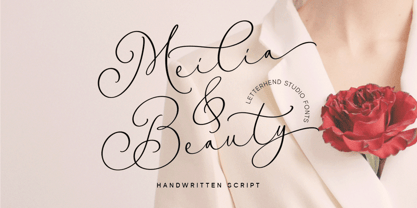 Meilia & Beauty is a gorgeous handwritten script font that embodies the essence of femininity and beauty. Its flowing curves and classy details create a look that is both charm and classy. Perfect for fashion, beauty, and lifestyle brands, this font will add a touch of sophistication and glamour to the other various formal forms such as invitations, labels, logos, magazines, books, greeting / wedding cards, packaging, fashion, make up, stationery, novels, labels or any type of advertising purpose. Features : Uppercase & lowercase Numbers and punctuation Alternates & Ligatures Multilingual PUA encoded We highly recommend using a program that supports OpenType features and Glyphs panels like many of Adobe apps and Corel Draw, so you can see and access all Glyph variations.
 - Stargation by Letterhend,
$19.00 Stargation is a display script that has unique anatomy with thin and condensed glyhps which brings out a casual and playful feel. Works well to be applied to logos and the other various formal forms such as invitations, labels, magazines, books, greeting / wedding cards, packaging, fashion, make up, stationery, novels, labels or any type of advertising purpose. Features : uppercase & lowercase numbers and punctuation multi-lingual support ligatures alternates swashes PUA encoded We highly recommend using a program that supports OpenType features and Glyphs panels like many of Adobe apps and Corel Draw, so you can see and access all Glyph variations. Email us to letterhend@gmail.com if you need something! Happy Designing!
 - Crescent Slim by Letterhend,
$19.00 Introducing, Crescent Slim, A sophisticated ligature serif from us. This typeface has been made carefully to make sure its premium quality and luxury feel. The ligatures makes this typeface unique and stands out rather than the regular serif font, very suitable for logo, headline, tittle, and the other various formal forms such as invitations, labels, logos, magazines, books, greeting / wedding cards, packaging, fashion, make up, stationery, novels, labels or any type of advertising purpose. Features : numbers and punctuation multilingual ligatures alternates PUA encoded We highly recommend using a program that supports OpenType features and Glyphs panels like many of Adobe apps and Corel Draw, so you can see and access all Glyph variations.
 - Novalion by Letterhend,
$17.00 Novalion s a condensed variable sans serif font with with many weight you can choose. It has 8 weight styles which you can play around to match your project, whether for a standout headline, or for a tagline, you name it. Perfect to be applied to the other various formal forms such as invitations, labels, logos, magazines, books, greeting / wedding cards, packaging, fashion, make up, stationery, novels, labels or any type of advertising purpose. Features : variable font with 8 weight style uppercase & lowercase numbers and punctuation multilingual PUA encoded We highly recommend using a program that supports OpenType features and Glyphs panels like many of Adobe apps and Corel Draw, so you can see and access all Glyph variations.
 - Pandora Emotion by Letterhend,
$14.00 Introducing, Pandora Emotion, A stylish serif with classy thin lines. This typeface has been made carefully to make sure its premium quality and luxury feel. The ligatures makes this typeface unique and stands out rather than the regular serif font, very suitable for logo, headline, tittle, and the other various formal forms such as invitations, labels, logos, magazines, books, greeting / wedding cards, packaging, fashion, make up, stationery, novels, labels or any type of advertising purpose. Features : Uppercase & lowercase Numbers and punctuation ALternates & Ligatures Multilingual PUA encoded We highly recommend using a program that supports OpenType features and Glyphs panels like many of Adobe apps and Corel Draw, so you can see and access all Glyph variations.
 - Santorio by Skinny Type,
$15.00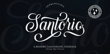 Please welcome our newest script typeface, Santorio Script, a beautiful script typeface with unique alternatives and strokes. This font is very suitable to be applied especially to logos, and various other formal forms such as invitations, labels, logos, magazines, books, greeting / wedding cards, packaging, fashion, make up, stationery, novels, labels or other types of fonts. advertising purposes. Feature : uppercase & lowercase numbers and punctuation multilingual ligature alternative PUA encoded We highly recommend using a program that supports the OpenType feature and the Glyphs panel like many Adobe and Corel Draw applications, so that you can view and access all variations of Glyphs. Email us to skinnyart871@gmail.com if you need anything! Happy Designing! Thank you
 - Breve Title by DSType,
$50.00 Breve was designed for use in editorial projects. Simple but with enough personality to stand by is own, in a quest for a more forceful and contemporary appearance. All the fonts in Breve superfamily, share the same exact structure, both in terms of anatomy and functionality. The Text versions provide a softer and warm feel to the typographic palette and is intended for use in much longer passages of text, while the Title versions are distinguished by non-descending letterforms, making the titles and headlines much more uniform and interesting. The News version is more classic, with ball terminals and classic proportions, while the Display is, somehow, the set of fonts we had to design: extra-black, ultra-contrasted, proud-display fonts.
 - Breve News by DSType,
$50.00 Breve was designed for use in editorial projects. Simple but with enough personality to stand by is own, in a quest for a more forceful and contemporary appearance. All the fonts in Breve superfamily, share the same exact structure, both in terms of anatomy and functionality. The Text versions provide a softer and warm feel to the typographic palette and is intended for use in much longer passages of text, while the Title versions are distinguished by non-descending letterforms, making the titles and headlines much more uniform and interesting. The News version is more classic, with ball terminals and classic proportions, while the Display is, somehow, the set of fonts we had to design: extra-black, ultra-contrasted, proud-display fonts.
 - Breve Text by DSType,
$50.00 Breve was designed for use in editorial projects. Simple but with enough personality to stand by is own, in a quest for a more forceful and contemporary appearance. All the fonts in Breve superfamily, share the same exact structure, both in terms of anatomy and functionality. The Text versions provide a softer and warm feel to the typographic palette and is intended for use in much longer passages of text, while the Title versions are distinguished by non-descending letterforms, making the titles and headlines much more uniform and interesting. The News version is more classic, with ball terminals and classic proportions, while the Display is, somehow, the set of fonts we had to design: extra-black, ultra-contrasted, proud-display fonts.
 - Breve Sans Text by DSType,
$50.00 Breve was designed for use in editorial projects. Simple but with enough personality to stand by is own, in a quest for a more forceful and contemporary appearance. All the fonts in Breve superfamily, share the same exact structure, both in terms of anatomy and functionality. The Text versions provide a softer and warm feel to the typographic palette and is intended for use in much longer passages of text, while the Title versions are distinguished by non-descending letterforms, making the titles and headlines much more uniform and interesting. The News version is more classic, with ball terminals and classic proportions, while the Display is, somehow, the set of fonts we had to design: extra-black, ultra-contrasted, proud-display fonts.
 - Breve Slab Text by DSType,
$50.00 Breve was designed for use in editorial projects. Simple but with enough personality to stand by is own, in a quest for a more forceful and contemporary appearance. All the fonts in Breve superfamily, share the same exact structure, both in terms of anatomy and functionality. The Text versions provide a softer and warm feel to the typographic palette and is intended for use in much longer passages of text, while the Title versions are distinguished by non-descending letterforms, making the titles and headlines much more uniform and interesting. The News version is more classic, with ball terminals and classic proportions, while the Display is, somehow, the set of fonts we had to design: extra-black, ultra-contrasted, proud-display fonts.
 - Vogatron by Konstantine Studio,
$9.00 Get yourself ready to jump on into the future-verse realm with the VOGATRON. A solid-strong futuristic sans-serif display fonts with a wide range of possibilities in usage. We're not joking when we say wide. The variety of styles that comes in 15 weights, from Condensed to Expanded, will make you ask no more for another choice. Fortunately, we're living in the best moment in this era of Retro-Futurism trends, when the retro and futuristic vibes are running side-by-side in terms of visual implementation nowadays. Which makes VOGATRON are easier to play with on every occasion. Perfectly fit for futuristic branding, retro gaming vibes, posters, esport logo, visual branding, social media content, streaming overlay design, animation project, you name it.