10,000 search results
(0.024 seconds)
- Sinah by Linotype,
$29.99Linotype Sinah is part of the Take Type Library, selected from the contestants of Linotype’s International Type Design Contests of 1994 and 1997. Designed by the German artist Peter Huschka, Linotype Sinah is a rounded, ornamental font with many strokes ending in teardrop forms. The letters of this wide-running font do not share a common base line. The capital S and the lower case l both drop under it although neither have descenders. Overall, Linotype Sinah has an almost Asian or Indian feel. The font must be used with generous line spacing and is intended exclusively for headlines or shorter texts in point sizes of 12 or larger. - Valverde by Jehoo Creative,
$20.00 Valverde is a super-serif font family with 2 widths condensed and normal, each width consists of 18 fonts and has a complete weight from thin to black combined with beautiful italic cuts to meet the needs of any design in any format. Inspired by the type of vintage look that has recently become a trend, this letter character has an elegant, sharp impression. Opentype features such as Stylistic Alternate and Ligature on the Valverde family make it look more aesthetic so that it fits in a classy modern look. Stunningly beautiful and modern serifs make them an essential addition to any type of tool kit.
 - Linotype Go Tekk by Linotype,
$29.00Linotype Go Tekk is a part of the Take Type Library, selected from the contestants of Linotype’s International Digital Type Design Contest. The font was designed by the German artist Critzler and is available in three weights, thin, medium and black. Go Tekk is a cool, constructed with unusual cross strokes, appearing in almost every character at exactly the same height. The capital letters do not end on the baseline, rather drop even farther down than the descenders of the lower case letters, making it necessary to allow for generous line spacing. Linotype Go Tekk is a relatively static font designed exclusively for headlines and displays. - Cadmus Pro by Canada Type,
$39.95 Cadmus Pro is the newly remastered and greatly expanded version of a Jim Rimmer design based on a type originally done by hand lettering artist Robert Foster. Foster’s type, named Pericles, was published by ATF in the 1930s, and used in lettering magazines and advertising headings. The design is based closely on early inscriptional Greek. Cadmus Pro comes with over 1130 glyphs, covering pretty much all Latin languages (including Vietnamese) as well as Cyrillic, Greek and Hebrew. OpenType features include stylistic alternates, automatic fractions, ordinals, and small figure ranges for superiors and inferiors. Proceeds from this font will be put towards a variety of Canadian typography education causes.
 - Quinshia Script by Cooldesignlab,
$10.00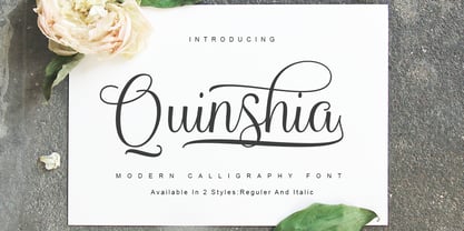 Quinshai Script a new fresh & modern script with a handmade calligraphy style, decorative characters and a dancing baseline! So beautiful on invitation like greeting cards, branding materials, business cards, quotes, posters, and more!! Quinshai Script including alternate glyph and beautiful swirl in a font including stylistic sets, Ligatures etc. The Open Type features can be accessed by using Open Type savvy programs such as Adobe Illustrator CS, Adobe Indesign & CorelDraw X6-X7 and Microsoft Word. And this Font has given PUA unicode (specially coded fonts). so that all the alternate characters can easily be accessed in full by a craftsman or designer. Thanks and happy designing :-)
 - Giomonte by Keristyper Studio,
$14.00 Introducing Giomonte Handwritten Script. Signature script font that feels beautiful classy, elegant, and modern. This type of font is perfectly made to be applied especially in logos, and other various formal forms such as invitations, labels, logos, magazines, books, greeting/wedding cards, packaging, fashion, makeup, stationery, novels, labels, or any type of advertising purpose. Multilingual support: Afrikaans, Albanian, Catalan, Danish, Dutch, English, Estonian, French, Finnish, German, Icelandic, Indonesian, Italian, Malay, Norwegian, Portuguese, Spanish, Swedish, Zulu, and many more. What’s Included : Standard & Multilingual glyphs Ligature Works on PC & Mac Simple installations Accessible in Adobe Illustrator, Adobe Photoshop, Adobe InDesign, and even work on Microsoft Word. Hope you enjoy our font!
 - Railhead by FontMesa,
$25.00Railhead is a revival of an 1870s type style that was originally available from both the Bruce foundry in New York and James Conner's Sons type foundry. The Redux version is the original design but only the uppercase and punctuation were ever created the rest of this font design including numbers, accented characters and lowercase are of my own design. Looking at the original font the inside rails reminded me of a railroad so I created a new version by adding horizontal lines in the lower portion of each letter which resemble railroad ties and Railhead seemed to be the most logical name for this old revival. - Ristaga Script by Gatype,
$10.00 Ristaga Script is an old-school inspired script typeface that pairs perfectly with bold and tough type. Very awesome for labels & logos. I'm starting to create typefaces to use in a branding project and I think Gibson is the missing font from my Type Collection. Perfect for use in everything from Branding, Web, Packaging, Etc. The Ristaga script features OpenType style alternatives, International binders, and support for most Western Languages included. To enable the OpenType Stylistic alternative, you need a program that supports OpenType features such as Adobe Illustrator CS, Adobe Indesign & CorelDraw X6-X7, Microsoft Word 2010 or later. Thank you very much for viewing and Enjoying it.
 - Cithally by Gatype,
$10.00 introducing a new font Cithally Handwritten Font is a handwritten font with a distinctive and sharp brush texture. Cithally was handwritten on paper with a coarse type brush, resulting in a consistent texture. You can customize Cithally to create a unique style when multiple characters of the same letter meet, because Cithally has alternative lowercase letters in different styles. The Cithally handwritten font can also be used for projects such as stationery invitations, social media, logos, weddings, branding, graphic designs with the addition of some binding and strokes. and can be combined with various types of serif fonts to perfect the project you want to work on.
 - Antapani by Monoco Type,
$15.00 Antapani is a grotesk sans style with some stylistic style to some letter. Designed for readability but can also function as a display text. Come with 9 style from Thin to Black so you can choose which style you want. Designed with opentype features in mind. Each weight includes extended language support (+ Cyrillic), fractions, tabular figures, arrows, ligatures and more. Perfectly suited for graphic design and any display use. It could easily work for web, signage, corporate as well as for editorial design. Designed by Abdurrahman Hanif, a young Jakartans Graphic Designer who fell in love into type design after his graduation. Published by Monoco Type
 - Sinah Sans by Linotype,
$29.99Linotype Sinah is part of the Take Type Library, selected from the contestants of Linotype’s International Type Design Contests of 1994 and 1997. Designed by the German artist Peter Huschka, Linotype Sinah is a rounded, ornamental font with many strokes ending in teardrop forms. The letters of this wide-running font do not share a common base line. The capital S and the lower case l both drop under it although neither have descenders. Overall, Linotype Sinah has an almost Asian or Indian feel. The font must be used with generous line spacing and is intended exclusively for headlines or shorter texts in point sizes of 12 or larger. - Linotype Schachtelhalm by Linotype,
$29.99Linotype Schachtelhalm is part of the Take Type Library, chosen from the entries of the Linotype-sponsored International Digital Type Design Contests of 1994 and 1997. The inspiration of German designer Ilka Kwiatkowski is not hard to figure out and the font carries the German name of the plant which was its model. The alphabet consists exclusively of capital letters with clear geometric basic forms. The font is meant for headlines in point sizes of 18 and larger. The details which make Linotype Schachtelhalm unique and true to its inspiration are however best seen in large point sizes, such as on posters, and Schachtelhalm is best combined with neutral fonts. - Android by Type Innovations,
$39.00 Android is an experimental 3D shadow outline font developed by the American type designer Alex Kaczun. The unique lighting created by the beveled edge in combination with an outline font was particularly difficult to create. But the result was worth the effort. Android makes for a powerful headline display that virtually pops off the page. There is a true three dimensional quality to this innovative new typeface. Use the regular Android when setting tight leading for smaller point sizes, and use Android Tall which has taller capitals for larger headlines. By experimenting with Type Effects in Illustrator or PhotoShop you can achieve some spectacular additional 3D effects.
 - DeLouisville - 100% free

- Eutopia by Tipofil,
$- I was inspired by the letters of the mythical “Ideales” tobacco package, designed in 1936 in Barcelona by Carlos Vives, director of the designers studio of the Rieusset graphical industry. We have also studied other geometrical models from the 1920s, to be highlighted among them the alphabet drawn by Cornelis André Vlaanderen at Amsterdam in 1928, which would have been very probably the inspiration for the famous tobacco package. Eutopia has been born with the aim to be useful for the current graphic communications. For that purpose almost 400 glyphs have been designed and more than 2200 kerning pairs have been defined. The multiple diacritic signs have been prepared to allow a multilingual use in most of the languages based on Latin alphabet. The OpenType features have been used to get alternate characters of “A” and “g”, and also ligatures, lowercase numbers and other typographic refinements.
 - CA Spy Royal by Cape Arcona Type Foundry,
$19.00 Spy Royal is a junctionless script typeface and comes in 6 styles. It’s a hybrid between script and so called streamline fonts. The origins are based on an advertising by Japan Airlines, dated around 1954, offering flights to San Francisco, Honolulu and Okinawa in the new DC-6B “Pacific Courier” airplane. Only the letters for the words “JAPAN AIR LINES” were used, so that the creative part was to reimagine a full font out of just a handful of uppercase letters. Originally released in 2004, Spy Royal was now undergoing a major rework and is now republished with additional styles like shadow-lines and 3D-shadow. Its charm is manifold, we think everything related to cars, racing, hot rod, vintage, cocktails, retro, restaurants, gasoline and of course airlines will look great in Spy Royal. Spy Royal includes alternate characters, ligatures and West European diacritics.
 - Harliton by Krafted,
$10.00 Looking to make a statement with your design? Bold, memorable projects deserve bold, memorable fonts. Introducing Harliton - A Condensed Font. Offline or online, Harliton makes your brand noticed. Whether you’re making ads, merch, apps, or websites, this font will fit right in. Give it a go and see how a great font transforms your project. What you’ll get: Multilingual & Ligature Support Full sets of Punctuation and Numerals Compatible with: Adobe Suite Microsoft Office Keynote Pages Software Requirements: The fonts that you’ll receive in the pack are widely supported by most software. In order to get the full functionality of the selection of standard ligatures (custom-created letters) in the script font, any software that can read OpenType fonts will work. We hope you enjoy this font and that it makes your branding sparkle! Feel free to reach out to us if you’d like more information or if you have any concerns.
 - Slantinel by Illunatic,
$9.95 Slantinel is a versatile sans-serif type family with lots of personality! It consists of 9 fonts coming with 3 weights in 3 versions each and supports many international languages. Slantinel works best in small to medium sizes and is useful in a wide variety of settings such as childrens books, packaging designs, greeting cards and much more due to its handwritten feel and its many distinct details.
 - William Jameson by Letterhanna Studio,
$19.00 William Jameson is a monoline signature handwritten font. Its distinct and well rounded letters make this font a masterpiece. Fall in love with its incredibly versatile style and use it to create spectacular designs! William Jameson is made using opentype technology which makes the connection between letters more fluid, there are 3 types of tails in each letter that will automatically change according to the letters in front of it.
 - Uno by Ahmet Altun,
$24.00 Uno font family comes in two weights and two styles. Generally, rounded fonts seem funny and pretty. This feature is valid for also Uno Font Family but although the characters of Uno Font Family are rounded, they seem masculine and serious. It is legible in small type sizes. With its decorative view, you can get matchless products in typographic works, t-shirt prints, posters, logos and every kind of graphic works.
 - Sign Work JNL by Jeff Levine,
$29.00 The 1951 sheet music of "I Like the Wide Open Spaces" has the cover title set in a casual type design that emulates the "one stroke" or "speed letter" style so popular with sign painters in that decade. Taking the lettering on the sheet music and expanding the character set with a new interpretation, the result is Sign Work JNL which is available in both regular and oblique versions.
 - Stylish Title JNL by Jeff Levine,
$29.00 The cover title for the July, 1935 issue of Harper’s Bazaar magazine was hand lettered in a condensed, squared slab serif design with a few stylized characters. This is now available as Stylish Title JNL, in both regular and oblique versions. For many years, each issue of the magazine had its title rendered in different type styles; offering many unique variations to coincide with that month’s cover art.
 - Belgedes by Motokiwo,
$16.00 Belgedes is brush script font in hand lettering style. This font looks cool in any design and is very recommended for logo, poster, branding, quote, or anything else that needs a touch of elegance. Belgedes has a little ligature and stylistic set alternate characters, you can access all alternates from your Open Type panel in your design software. Feature: - Ligature - Stylistic Set Alternates SS01 & SS02 - Standard Latin Multilingual Support - PUA Encoded
 - BOT by fontkingz,
$19.00The BOT font package includes two character sets, BOT-Regular and -Stencil. The futuristic looking characters are designed to work in both large scale and small sizes; it works very well as a comfortable, readable lettering on machines of any kind as much as in print and screen publications. In addition, the BOT-Stencil letters can easily be cut out and work as a template for painting type on any surface. - Lazurski by ParaType,
$30.00 Designed at Polygraphmash type design bureau in 1984 by Vladimir Yefimov, with the addition of demi and demi italic. Based on a hot-metal typeface (1962) by Moscow book designer Vadim Lazurski (1909–1994), inspired by the early 16th century typefaces of Italian Renaissance. The typeface is useful for text and display composition, in fiction and art books. An 'expert set' was added by ParaType (ParaGraph) in 1997.
 - Monotype Goudy Catalogue by Monotype,
$29.99Originally designed for American Type Founders, Goudy drew inspiration from the classical old style faces for Goudy Old Style. Round characters have a strong diagonal stress, ascenders are fairly long but descenders are very short. Goudy bold was introduced in 1920; this was designed by Morris Fuller Benton. This typeface has been particularly popular in America where it is extensively used in advertising, book jackets, for labels and packaging. - Boss Jock JNL by Jeff Levine,
$29.00 The title and credits from the 1965 film “Strange Bedfellows” were hand lettered in a style typical of the early-to-mid 1960s – casual and playful. This brought to mind similar type designs used by many radio stations when advertising their disc jockeys as cool, hip and fashionable in the slang term of the day “boss” jocks. Boss Jock JNL is available in both regular and oblique versions.
 - Papyrus by ITC,
$40.99Papyrus is a roman calligraphic typeface with distinctive human touches like rough edges, irregular curves, and high horizontal strokes in the caps. It imparts a warm and friendly ambience to everything from restaurant menus to book covers. American Chris Costello created the popular font Papyrus in 1983 and counts it as one of his proudest accomplishments. In addition to designing type, Costello is a prolific graphic designer, illustrator, and web designer. - Kazootie by Chank,
$99.00 Kazootie was inspired by cut-paper shapes and named after the hand puppet character Rootie Kazootie in a 1950s children's television show. Kazootie is a light-hearted and fun display font with a big, strong voice and crisp confident stride. Best for headlines and larger text in picture books, Kazootie is all caps, but you can type your letters in uppercase or lowercase to access two different variants of the style.
 - Kaleko 105 Remix by Talbot Type,
$19.50 A remixed variation, available in three weights, of the popular Talbot Type geometric sans Kaleko 105 . The addition of occasional flourishes at the intersections of strokes, in both upper and lower case, adds character charm, making the font a perfect titling font to accompany Kaleko 105, or a display font in its own right. Kaleko 105 Remix features a comprehensive glyph set including accented characters for central European languages.
 - Artigo Display by Nova Type Foundry,
$40.00 Artigo Display is the odd sister of Artigo text typeface. It is a contemporary interpretation of handwriting shapes in a display version of the italic. It is more expressive and it has its own personality. It was renovated with five new weights that bring more flexibility to use the typeface in different mediums. Artigo Display has won a Certificate of Typographic Excellence from the Type Directors Typeface Competition in January 2018.
 - Retrotype by Luxfont,
$18.00 Introducing retro font Retrotype. Family's vintage style will suit both 50s-80s cartoon illustrations and wild west designs. Retro family has 2 types of styles, complete with different curves. Carefully constructed glyph shapes look great in both large amounts of text and single words in headings. Ideal for vintage and retro designs. Features: - Vintage style. - Uppercase and lowercase the same size. - Numbers & basic Punctuation. - 4 fonts in family. - Kerning. ld.luxfont@gmail.com
 - Etienne by ParaType,
$30.00 Designed for ParaType in 2002 by Tagir Safayev. Inspired by the letterforms of Antique No. 8 typeface and other similar fonts of the 19th century (Latin Antique, Wide Latin, Etienne Condensed, Wide Renaissance). A face of so-called Latin type has stout triangular serifs and rather unusual curls on several letters in the lower case. Nevertheless it is eminently suitable for a wide variety of settings in advertising and display typography.
 - San Jose by Graffiti Fonts,
$19.99 The San Jose type family provides an array of variants representing a simplified, bay area slant on traditional Chicano American street scripts. The styles in this set can be used in all caps for the most authentic appearance or in a more typographically traditional small caps format. This set also includes latin supplement support and a robust character set in six styles. 3 Stroke variants: Regular, Rough & Bold each have a leaned back, traditional slant variant.
 - Textbook New by ParaType,
$30.00 Designed for ParaType in 2007 by Isabella Chaeva. The type is based on Bukvarnaya (TextBook) photocomposing version designed in 1987 by Emma Zakharova. The initial Bukvarnaya for metal composition was created at Polygraphmash in 1958 by Elena Tsaregorodtseva. It was developed for primers and the first level school textbooks. An early sans serif ('Grotesque') with half-closed static letterforms. For use in book and magazine typography, advertising and headlines. Also may be useful as screen font.
 - Sightseeing Tour JNL by Jeff Levine,
$29.00 Samuel Welo was a sign painter who had published in the 1920s and again in 1960 his “Studio Handbook – Letter and Design for Artists and Advertisers”, prolifically hand lettering all of the type style examples within the pages of the publication. In 1930 Welo also published “Lettering - Practical and Foreign”. From this book comes a thick-and-thin hand lettered Art Deco alphabet – now available digitally as Sightseeing Tour JNL in both regular and oblique versions.
 - Telingater Display by ParaType,
$30.00 PT Telingater Display™ was designed in 1959 by a well-known Soviet book designer Solomon Telingater (1903-1969) at Polygraphmash type design bureau. The typeface was awarded the Silver Medal at the International Book Art Exhibition (IBA-59) at Leipzig (Germany) in 1959. Light flared sans serif with calligraphic flavor and low contrast between main strokes and hairlines. For use in title and display typography. The digital version was developed for ParaType in 2001 by Lyubov Kuznetsova.
 - Tightwad JNL by Jeff Levine,
$29.00 “I Don't like No Cheap Man” is a piece of early 1900s sheet music featuring its title hand lettered in a condensed slab serif design. The influences of the Art Nouveau era are clearly found in the many eccentric character shapes within the various letters of the original artwork. Recreated in digital type, Tightwad JNL is available in both regular and oblique versions – and its font name is a variant of the “Cheap Man” portion of the song’s title.
 - Manifestor by Stawix,
$40.00 Manifestor is designed to be an urban culture typeface, it can effortlessly fit, blend and be in very situation at any time without taking up too much attention. It has a clean san-serif structure and proportion, kind to the eyes when set in texts while also look reliable when use in big scale. Manifestor has the simple - easy - comfortable feature, therefore it is a type appropriate for a very wide range of occasion. Manifestor also comes in Variable!
 - Evuschka by Petra Sucic Roje,
$33.00 A dramatic contrast between thick and thin strokes, “ball” shapes at stroke terminals, and straight hairline serifs are main Evuschka characteristics. In this font, the x-height is specifically accentuated in relation to body height. In spite of its extreme geometrical shape, Evuschka exudes fairytale romance. Belonging to decorative type fonts, it is best suited for headlines, titles, and small amounts of text in large sizes. Evuschka was selected for TDC Certificate of Typographic Excellence 2017.
