10,000 search results
(0.13 seconds)
- Hachitos by Maulana Creative,
$11.00 Hachitos is a modern casual signature font. Hachitos included opentype features Ligatures and extra swash. Hachitos support multilingual more than 100+ language. This font is good for logo design, Movie Titles, Books Titles, a short text even a long text letter and any awesome project you create. Make a stunning work with Hachitos signature font. Cheers, MaulanaCreative
 - Black Gladiator by Letterara,
$16.00 Black Gladiator is a natural dry brush font. a tough-looking font with natural strong brush touch ready to rock every design you make. this font has a striking look and a good flow font that can add style to your designs. It’s perfect for logos, quotes, posters, clothing, and every other design which needs a strong touch.
 - Purplemonths by Maulana Creative,
$12.00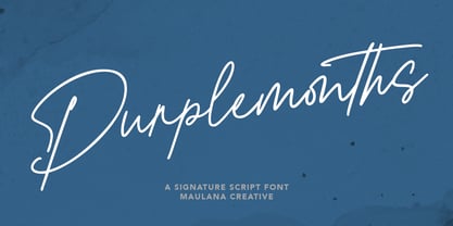 Purplemonths is a Modern Signature script font inspired by modern script nowadays, it is casual and fancy font. Purplemonths includes opentype features Ligatures. It support multilingual more than 100+ language. This font is good for logo design, Movie Titles , Books Titles and any awesome project you create. Make stunning work with Purplemonths Signature font. Cheers, MaulanaCreative
 - Silver Thunder by Olivetype,
$18.00 Looking for a unique and badass font to add some edge to your designs? Look no further than Silver Thunder. This graffiti-inspired font is a good option for apparel, posters, headlines, magazines, and more. With its cool black metal aesthetic, Silver Thunder will give your work a truly one-of-a-kind look. Thank You!
 - Konichiwa by Motokiwo,
$18.00 Brush textured with casual handwritten gesture, say hi to Konichiwa. This is hot and tasty font that very recommended for food branding such as Burger, BBQ, Coffee and Pizza. It's also great for fashion and cosmetic projects that need diversity. Features: Uppercase Lowercase Numbers & Punctuation Standard Latin Multilingual Support Ligatures Easy to use on any devices
 - Peter Marker by Gassstype,
$25.00 Hello Everyone, introduce our new product Peter Marker It Is Simple Marker Font with a natural feel. This handmade font will make your design has a beautiful natural touch for each details. It is perfect for any design project as Invitation,logo, book cover, craft or any design purposes. Peter Marker is Inspired by Food Logo style and combination.
 - Brush King by Subectype,
$17.00 Brush King is a supercharged, street-wise brush font bursting with energy, with extra attention to quick strokes and sharp details. This font is perfect for challenging jobs, titles, t-shirts, websites, hoodies, and various print and digital media with energy. Brush King is ideal for logos, apparel, quotes, product packaging, or anything which needs a typographic turbo-boost.
 - Black Cycle 2 by Vozzy,
$10.00 Introducing vintage label font duo named Black Cycle. These two fonts has an additional characters and multilungual support (check out all available characters on previews). Both of font familes has four styles: Clean, Clean Shadow, Aged and Aged Shadow. This font will look good on any vintage styled designs like a poster, T-shirt, label, logo, etc.
 - TT Tunnels by TypeType,
$29.00 TT Tunnels useful links: Specimen | Graphic presentation | Customization options TT Tunnels is a modular font family with narrow proportions and a large number of pronounced visual compensators. In the basic version of the typeface, all glyphs have simple chopped shapes, created according to the usual geometric principles. In the alternative version of TT Tunnels, which becomes available when you turn on OpenType feature stylistic alternates or stylistic set 1, the typeface comes to life and turns into a stylized ductal gothic grotesque, in which the design of glyph forms is created based on the pen movements. Despite the fact that TT Tunnels was created as a display typeface for use in short inscriptions and titles, it works very interestingly in the body text, adding a small touch of archaics. This is especially evident in the Bold and Black faces, when the rhythm and thickness of the strokes create a dense set, covering the paper with a solid, dense pattern. The density and style of such a set conceptually refers us to the old Gothic texture and the Old Slavonic script. In addition to a larger number of alternates for lowercase letters, the typeface features an alternate for number 2, an alternate slashed zero, many ligatures, and other useful OpenType features (ordn, frac, sinf, sups, numr, dnom, case, tnum, onum, pnum, liga, salt, ss01, zero). The TT Tunnels includes five faces: Thin, Light, Regular, Bold, Black.
 - Leonisa by Yoga Letter,
$14.00 "Leonisa" is a beautiful and elegant monoline script font. This font is perfect for all your work. The embellishments in this font are very easy to use and are also equipped with procedures for using them. This font is suitable for promotion, business, summer, spring, traveling, holiday, quotes, wedding, invitation, greeting card, birthday, potography, logo, poster, branding, banner, print and others.
 - Jazmo by URW Type Foundry,
$49.99 Jazmo is an offspring of an assignment I did for a Dutch architect. A classic building and coincidently the place of my studio in my hometown Zwolle, Netherlands, needed to be renovated. My job was to design the house numbers and signs for this building. This building I refer to was built in 1932 and designed according to the ‘New objectivity’ architecture. Now it accommodates several artist and craftsmen and also houses students. In my design I used elements of the Art Nouveau, which is related to the ‘New Objectivity’. Words as stately, angular, linear, stylish, artful, playful and frolic came to mind. It should be a design with a hint of the past and a flirt with the future. This house numbering is the root wherefrom Jazmo arises. The name Jazmo cites to the Jazz scene, which was a new and very popular artistic influence that time and age and is still a vibrant source of musical renewal. Mo stands for my Name Marit Otto. Together with my intern Arie Blok I created the missing characters and completed the font. Welcome Jazmo!
 - Metromedium #2 by Linotype,
$29.00American graphic designer William Addison Dwiggins' (W.A.D. for short) first typefaces were the Metro family, designed from 1927 onward. The project grew out of Dwiggins' dissatisfaction with the new European sans serif typefaces of the day, such as Futura, Erbar, and Kabel, a feeling he expressed in his seminal book Layout in Advertising. Urged by Mergenthaler Linotype to create a solution for the problem, Dwiggins began a professional relationship that would span over the next few decades. The first Metro family typeface to be released was Metroblack, brought to market by Linotype in 1929 (Metroblack #2™ the only one of the two versions that Mergenthaler Linotype eventually put into production which is available in digital form). With more of a humanist quality than the geometric styles popular in Europe at the time, Dwiggins drew what he believed to be the ideal sans serif for headlines and advertising copy. Metroblack has a warmer character than the Modernists' achievements, and the type is full of mannered curves and angled terminals (Metroblack also has an astoundingly beautiful Q). The other weights of the Metro family, Metromedium #2™ and Metrolite #2™, were designed by Mergenthaler Linotype's design office under Dwiggins' supervision. Despite having been created more than three-quarters of a century ago, the Metro family types have aged well, and remain a popular sans serif family. Although spec'd less often than other bestsellers, like Futura, Metro continues to find many diverse uses. The typeface has appeared throughout Europe and the North America for decades in newspapers and magazines, and can even help create a great brand image when used in logos and corporate identity. Dwiggins ranks among the most influential graphic designers and typeface designers of the 20th Century. He has several other quality fonts in the Linotype Originals, including the serif text faces Electra™ and New Caledonia™, as well as Caravan™, a font of typographic ornaments." - Gentlemens Script by Piñata,
$15.00 Gentlemen’s Script is a dynamic hand-written script in which the sharpness and speed of writing harmoniously coexist with elegance and a serious attitude. The script allows you to simulate fast inscriptions made by hand while keeping them elegant and classy. Working on the project, we wanted to develop a script that would harmoniously complement serifs or traditional sans-serifs and perfectly match them. Gentlemen’s Script is like an accessory in a gentleman’s wardrobe. It dilutes font traditions and adds brightness and dynamics to them. Despite the fact that the script was designed to be used as a complementary font, it has all the prerequisites to become the main character of your design story. It does not matter how you use it—Gentlemen’s Script easily adapts to reality and always works at the maximum level of efficiency. To make the script more harmonious and natural, we have drawn more than 60 ligatures. In order for the ligatures to be substituted automatically, we recommend always keeping the standard ligatures OpenType feature turned on! In addition, there are several alternative characters in the font that are programmed on the OpenType feature contextual alternates and which are used when the letter meets the service characters. To use the script to its maximum power, we recommend that you always keep the standard ligatures and contextual alternates OpenType features turned on. If you do not have access to applications that support OpenType features, it does not matter—even without these features you can use and enjoy our font!
 - Planet Benson 2 - Unknown license

- Carousel by ITC,
$40.99Carousel is a fat faces display type designed by Gary Gillot in 1966. Fat faces were offshoots of the modern, or Didone, typefaces that were de rigueur during the early 1800s. These fat faces were among the first typefaces to be used solely for advertising purposes. Naturally, they were always used in larger point sizes, in display functions. Carousel could be called an optimization of these old advertising typefaces. With high x-heights, ultra contrast between thick and thin strokes, and perfectly engineered drawing techniques, Carousel is a highly crafted typeface. Give it a spin in your next advertising campaign! Carousel's fine thin strokes are very graceful in their appearance, and lend a strong, yet soft, feminine feeling to anything they touch.If you like Carousel check out wearing Annlie, another fat face from 1966." - ITC Goudy Sans by ITC,
$29.99 Frederic W. Goudy designed three weights of this friendly-looking sans serif font from 1922-1929 for Lanston Monotype in the United States. Goudy was attempting to impart freedom and personality to the sans serif form at a time when geometric sans serifs, such as Futura, were gaining rapid world-wide popularity. To achieve this challenging goal, he looked to lapidary inscriptions and manuscript writing for inspiration. He included elements such as slight swellings of terminal strokes, slab serifs on a few of the caps, alternate uncial forms, and a few swash strokes. The result is uniquely Goudy: charming, instinctive, and just right for adding warmth to magazine or advertising layouts. The design staff at ITC updated and filled out the family for a total of eight styles in ITC Goudy Sans. ITC Goudy Sans® font field guide including best practices, font pairings and alternatives.
 - LFT Iro Sans by TypeTogether,
$49.00 Milan-based Leftloft studio developed LFT Iro Sans, an expansive family that solves the significant, wide-ranging challenges of branding, wayfinding, pictographic language, and complex editorial use. LFT Iro Sans began as the clear and welcoming wayfinding project of San Siro stadium in Milan. Over time many other styles and weights have been added. LFT Iro Sans never finds itself outmatched by the task at hand. The primary aim was to design a technical typeface that was readable in any low visibility condition, for instance in a poorly lit area with awkward wall shapes and overhangs. This worked well for stadium and large lettering use, but other problems also needed to be addressed, such as complementary iconography. A location developer was left mixing — clashing, really — one type family with a different family of icons, resulting in a cobbled-together look which diluted the brand and the experience. They set out to radically simplify and clarify each shape and its meaning, accepting uniqueness as part of the final visual language. LFT Iro Sans pictograms answers the need for having a consistent and large group of icons, perfectly suited to the text typeface. As it concerns public spaces, this didn’t exist before. LFT Iro Sans incorporated a branding project too, so they decided to let LFT Iro Sans go out on a limb and created a unicase style that demands attention. Each unicase letter is a combination of the lowercase and capital form, quite noticeable in the ‘i’, ‘m’, ‘t’, and unique ‘d’ and ‘b’, balanced by more restrained forms of ‘a’, ‘s’, ‘c’, and ‘e’. LFT Iro Sans is not only a technical typeface, but, thanks to letters’ proportions, can also be used for editorial purposes. Assertive and economical in stature, the text weights are clear and assured. And a display version for headlines in Ultralight and Heavy (with italics) was developed for stunning headlines. For enthusiasts of every stripe, LFT Iro Sans can be a brand’s rallying cry with its arresting unicase, be a developer’s go-to pictogram choice, or set the most demanding editorial text in digital or print. With its many OpenType features, simplified pictogram commands (even available in Apple’s Pages and Microsoft Word), and a total of 30 targeted family members, LFT Iro Sans is a brilliant, easy choice. As with the rest of the TypeTogether catalogue, the complete LFT Iro Sans family, designed by Lefloft and developed by Octavio Pardo, has been optimised for today’s varied screen uses.
 - Mule Cargo by Menagerie Type,
$20.00 The Mule is a very special mix – it has a donkey father and horse mother, and they often inherit the best qualities of both. "The mule is an example of hybrid vigor, Charles Darwin wrote: The mule always appears to me a most surprising animal. That a hybrid should possess more reason, memory, obstinacy, social affection, powers of muscular endurance, and length of life, than either of its parents, seems to indicate that art has here outdone nature." They are typically very strong for their size compared to horses and are able to cope with bad weather better than donkeys. Mules rarely become ill and their behavior is Intelligent and sensitive. In the right home, they can make great companions for other equines, and wonderful pets. However, if they are unhandled or not correctly trained, mules have the potential to be dangerous. The inner shapes of Mule Cargo are almost identical between the Regular and the Heavy weight. This shared genom make them very powerful pair and a useful design tool for display purposes.
 - Ghimli Sans by Anonymous Typedesigners,
$40.00 Ghimli Sans was created using the ping-pong method, based on the graphic idea of Artem Rulev and the participation of Vladimir Anosov after. Then we sent the font file to each other, adding something of our own and making corrections, and so on many times. Ghimli Sans has already managed to get 2nd place in the Granshan competition in the Cyrillic section. The name was obtained by combining the name of the dwarf Gimli and Studio Ghibli. The font is quite friendly, dense, kind, as if a dwarf is walking around the lawn with a mug of intoxicated ale on a pleasant sunny day. Suitable for short word design, logo creation, menu layout and use in movies about gnomes and anything fantastic.
 - Ongunkan Proto Canaanite by Runic World Tamgacı,
$75.00 Proto-Sinaitic (also referred to as Proto-Canaanite when found in Canaan, or Early Alphabetic) is found in a small corpus of c. 40 inscriptions and fragments, the vast majority from Serabit el-Khadim in the Sinai Peninsula, dating to the Middle Bronze Age. They are considered the earliest trace of alphabetic writing and the common ancestor of both the Ancient South Arabian script and the Phoenician alphabet, which led to many modern alphabets including the Greek alphabet. According to common theory, Canaanites or Hyksos who spoke a Canaanite language repurposed Egyptian hieroglyphs to construct a different script. The earliest Proto-Sinaitic inscriptions are mostly dated to between the mid-19th (early date) and the mid-16th (late date) century BC.
 - Between by Monotype,
$40.99 Akira Kobayashi’s Between™ typeface comes in three main states. While different from each other, they all offer human-centered design to ensure that copy set in them is affable and approachable. An added benefit is the ability to transition “between” font designs, choosing different styles – or even individual characters – to create hierarchy, contrast or emphasis. Kobayashi designed the Between typeface in response to the current popularity of rounded, humanist sans serif designs over the cool grotesques of the 20th century. Between 1 melds industrial and humanist sans ethics. Between 2 represents a sans version of Kobayashi’s Cosmiqua® typeface, striking a balance between crisp and legible, organic and friendly. Between 3 is a freestyle sans with an uplifting sprightly mien. Between has 48 styles; each has eight weights of roman with its own italic counterpart. The family offers a large set of alternative glyphs and OpenType® features. A full interactive type specimen can be viewed here: http://www.monotype.com/fonts/between/ Featured in: Best Fonts for Logos
 - Sgt Peppers by K-Type,
$20.00 SGT PEPPERS LONELY HEARTS CLUB is a typeface inspired by the capital letters on the bass drum in the Beatles' Sgt Pepper album cover. The original lettering was hand painted by fairground artist Joe Ephgrave during March 1967 in an art deco style he called 'futuristic'. The font completes the uppercase, adds a lowercase, and includes a full complement of over 400 characters. SGT PEPPERS OUTLINE and SGT PEPPERS OUTLINE FILL are two fonts with matching spacing and kerning that can be overlapped for creating bicolor/multicolor effects and faux drums. The Outline and Outline Fill fonts do not contain lowercase characters, instead they comprise two weights of outline capitals as painted on the Sgt Pepper drum. The uppercase letters are in the wider style from around the outer edge of the drum, and the lowercase keys deliver the more condensed 'Lonely Hearts' inline style from the middle of the drum. The uppercase Y has been flipped to produce a more conventionally acceptable character with the thicker diagonal arm on the left. However, Joe Ephgrave's reverse Y (with inline) is included in the Outline fonts at the Section keystroke § (Alt-0167 on Windows). A simplified vector image (mono) of the bass drum without lettering is also included within the Outline fonts at the PlusMinus keystroke ± (Alt-0177 on Windows).
 - Rome Ionic by 38-lineart,
$17.00 Rome Ionic is a serif display font inspired by architectural features in ancient Roman building columns. The Ionic columns are taller and slender compared to 'Doric and Corinthian' columns. On the Ionic Capitol column, there is a geometric spiral like a paper roll. We used those elements in this roman style font. The base of this font is serif shaped, more slender and towering, and equipped with 8-18 stylistic set alternates. This is the development of the basic shape on which we added spiral ornaments to the left and right. This serif font's characteristic is soft and simple, not sharp and complicated like Doric and Corinthian. The composition of the softness of the basic and alternate fonts does not reduce the splendor of this font. We complemented this font with support for the Latin extend as an analogy to the Roman region. Rome Ionic is perfect for 'impressive luxury and power' designs. With this font, your branding will show the robustness and refute the splendor of other products.
 - Gothiks Round by Blackletra,
$50.00 Gothiks Round is the rounded version of Gothiks. It is a narrow 6-weight display sans-serif influenced by Texturas. The rhythm and verticality of Texturas can be easily identified on the letters with diagonal strokes like A N M K k V v W w X x Y y Z z: here they are all vertical. This kind of morphology was chosen because it accepts condensation in a very natural way, giving to this sans-serif a very unique personality. The intermediate weights can be used for short texts while extreme weights are excellent for big sizes. It has an extensive character set—with extensive language support—and many OpenType features like fractions, small capitals and different figure sets. Default figures align with lowercase. The typeface’s name refers to the plural of the word Gothic, which in turn can refer to both sans-serifs or Blackletter, depending on geographic location.
 - NO culture no SOUL by TypoGraphicDesign,
$9.00 The typeface No Culture No Soul is designed from 2021–2022 for the font foundry Typo Graphic Design by Luise Herke × Manuel Viergutz as a project for support the culture. Special THX to Michael Rütten of soulpatrol.de The display font with 254 glyphs incl. numbers, punctation, marks & symbols is inspired in the past and present. Extras like OpenType-features and 7 sylistic sets. For use in logos, magazines, posters, advertisement plus as webfont for decorative headlines. The font works best for display size. Have fun with this font & use the DEMO-FONT (with reduced glyph-set) FOR FREE! Font Specifications ■ Font Name: No Culture No Soul ■ Font Styles: 1 (Rough) + DEMO (with reduced glyph-set) ■ Font Category: Display for headline size ■ Glyph Set: 254 glyphs incl. extras like icons (decorative extras like dingbats, emojis, symbols) ■ Design Date: 2021–2022 ■ Type Designer: Luise Herke, Manuel Viergutz, THX to Michael Rütten (Soulpatrol)
 - Bs Landscope by Feliciano,
$37.92That’s what people call ‘an experimental typeface’. Yes it is! It consists in letterforms designed in very strict geometrical parameters. I was not thinking about ‘reading’ when I’ve drawn this typeface — rather on different way of projecting our mental image of the words. Do not try to set a book with this type, please! One single version, one single font designed in 2000. - Earworm by Hanoded,
$15.00 An ‘Earworm’ is a catchy tune that keeps repeating itself in your head. I didn’t know this (in Holland (where I’m from), earworm (oorwurm) means earwig - you know, the animal). Earworm is a happy handmade font. It’s a little jittery, a little quirky, but also a lot of fun to use. Now lets hope this fonts stays in your head!
 - Hustine by Typebae,
$15.00 Hustine Font is a stylish and elegant handwritten signature script font that comes in two variants: light and regular. This font features a flowing and graceful handwritten style, capturing the essence of a personal signature. Both variants maintain the authenticity and natural beauty of handwritten script, making them suitable for various design projects such as logos, branding, invitations, and more.
 - Trump Mediaeval LT by Linotype,
$67.99 Trump Mediaeval is an Old Face font developed by Georg Trump between 1954 and 1962. All cuts have both normal and old style numbers and their robust characters make them suitable even for inferior paper. Light and legible, the open forms of the lower case letters allow this font to be legible in text with as small a point size as 5.
 - Astrologer Symbols by Deniart Systems,
$20.00 Contains over 130 symbols based on the Western astrology system - it features the 12 zodiac signs, the 12 astrology symbols, the 12 corresponding planets, along with the 30 phases of the moon and charting signs. NOTE: this font comes with an interpretation guide in pdf format.
 - Alabama Book by Krafted,
$10.00 Looking for a cute and playful font to delight your guests? If you’re hosting a baby shower, birthday party, or need a versatile font for printed materials - then we’ve got the font that’ll make your branding sparkle! Introducing Alabama Book - A Cute Playful Font This adorable, fun, and stylish font can be used for a host of different content needs and projects. Create gorgeous party invitations, printed quotes, standout packaging, or beautiful t-shirts! You can even use it to create amazing headings, logos, resumes, and social media graphics. Inspire your audience, clients, or guests with this beautiful, statement font. What you’ll get: Multilingual & Ligature Support Full sets of Punctuation and Numerals Compatible with: Adobe Suite Microsoft Office KeyNote Pages Software Requirements: The fonts that you’ll receive in the pack are widely supported by most software. In order to get the full functionality of the selection of standard ligatures (custom created letters) in the script font, any software that can read OpenType fonts will work. We hope you enjoy this font and that it makes your branding sparkle! Feel free to reach out to us if you’d like more information or if you have any concerns.
 - TypeKeys Pro by CheapProFonts,
$10.00 A range of retro initials mimicking the keys of an old style typewriter. Expanded from just a basic ASCII character set to our usual large CheapProFonts selection of glyphs. (I'm not sure all of them appears in the beginning of words, though. ALL fonts from CheapProFonts have very extensive language support: They contain some unusual diacritic letters (some of which are contained in the Latin Extended-B Unicode block) supporting: Cornish, Filipino (Tagalog), Guarani, Luxembourgian, Malagasy, Romanian, Ulithian and Welsh. They also contain all glyphs in the Latin Extended-A Unicode block (which among others cover the Central European and Baltic areas) supporting: Afrikaans, Belarusian (Lacinka), Bosnian, Catalan, Chichewa, Croatian, Czech, Dutch, Esperanto, Greenlandic, Hungarian, Kashubian, Kurdish (Kurmanji), Latvian, Lithuanian, Maltese, Maori, Polish, Saami (Inari), Saami (North), Serbian (latin), Slovak(ian), Slovene, Sorbian (Lower), Sorbian (Upper), Turkish and Turkmen. And they of course contain all the usual "western" glyphs supporting: Albanian, Basque, Breton, Chamorro, Danish, Estonian, Faroese, Finnish, French, Frisian, Galican, German, Icelandic, Indonesian, Irish (Gaelic), Italian, Northern Sotho, Norwegian, Occitan, Portuguese, Rhaeto-Romance, Sami (Lule), Sami (South), Scots (Gaelic), Spanish, Swedish, Tswana, Walloon and Yapese.
 - Soprani by insigne,
$39.00 Soprani is a unique typeface inspired by a plaque found in New Zealand dating from the 1920s. The design was contemporized and brought 100 years into the future. The serifs are dramatically flared at the end of the stems, while in the middle, they contract. This leads to a unique shimmering effect that draws the eye and catches your user's attention. This typeface meets the demand for unique serif types that are both eye-catching and delicate. It’s a display face that's ideal for very contemporary work. This typeface has plenty of alternates and has a full complement of OpenType features. The 1920s inspire the design, with a bit of art nouveau and arts and crafts, yet the typeface is designed to meet contemporary design requirements. It has a unique elegance and the letterforms are condensed more than most. Soprani is suggested for table books, menus, and various promotional materials, newspapers, television, motion pictures and other media. There is a wide range of widths and weights available, from the thin, which is delicate and graceful, to a bold and robust black. Production assistance by Lucas Azevedo and ikern.
 - MultiType Gamer by Cyanotype,
$- MultiType Gamer, an all caps typeface focused in display purposes. 24 styles with retro gaming vibes. This is the second release of an expanding multiverse of mixable fonts. The whole family of typefaces has been designed to work at big sizes and display purposes such as branding, headlines, thumbnails, posters and animations. You can swap between the three additional alternate sets through all the styles to add diversity to your composition, even in Cyrillic. MultiType Gamer is inspired by fonts from video games, arcades and variable fonts. Have fun mixing all the styles in your projects.
 - Wonder Magnolia by Supfonts,
$15.00 Wonder Magnolia is a modern serif with vintage charm, fashionable appearance with a touch of retro Quick access - using the built-in OPEN TYPE functions. Just add "-" or "_" to the letter and instantly get an alternative. This feature works in most applications Font is an open type with clean shapes and precise kerning. It includes ligatures and alternations with a total of 522 characters encoded by the PUA. Also in the package you will find a list of all ligatures and alternatives Language support: All European languages Don't forget to subscribe so you don't miss out on the new awesome fonts Dima
 - Kaarna by LetterMaker,
$28.90 Kaarna is a rough hand drawn sans serif. The underlying shapes and structure are designed in the style of modern sans serifs which are made livelier by the hand drawn look. The condensed proportions make it especially suitable for use in large headlines and to achieve maximum impact. The hand drawn texture becomes clearly visible in big sizes and quiets down when used small. This allows you to use Kaarna for both headlines and short to medium length texts, ensuring visually unified typography. Because of its design and large character set, Kaarna is well suited for branding, advertising, packaging and editorial use.
 - Azuza by Parkinson,
$20.00 In the 1990s I drew a text face for the San Francisco Chronicle. It was based on W. A. Dwiggins’ Electra and incorporated many features of the Linotype Legibility Series: More compact, with a taller lowercase X-height, etc. That type was called Electric and it was the Chronicle’s text face for nearly a decade, surviving several redesigns. From that, I made Azuza, a more detailed and sensitive style. Azuza was recognized in the TDC2 type competition in 2001. Then it went into hibernation as a Type 1 font family. Today it is back. Six fonts. Open Type.
 - Rams by TipografiaRamis,
$30.00 RAMS is a Sans Serif type family of four weights with matching italics. The typeface’s design was influenced by the geometric style of Sans Serif faces of the 30s. The letter shapes – based on geometric forms – have been optically corrected for better legibility, thus enabling geometric concepts to be adapted by typographic tradition. While the typeface is intended for use in display sizes, it is also quite legible in text and is well suited for editorials. Rams is released in OpenType format with extended support for most Latin languages and includes some opentype features – proportional/tabular figures, slashed zero, ligatures, fractions...
 - French Ionic by Solotype,
$19.95This would be a Clarendon if it weren't for the cute serifs, which set it apart. Reads well in copy blocks. - Out Back by chicken,
$17.00 A twice-painted sign in Tobago's back country was the seed for this weird grab-bag of chunky, slightly sleazy letterforms.
