10,000 search results
(0.042 seconds)
- Thole by Twinletter,
$12.00 Introducing the Thole font, a very elegant and clean san serif family, with a characteristic width and graceful impression, for designs with feminine or masculine themes, this font will look strong and strong in your design projects. There is a strong impression in this font, both from the width of the letters, the corners in this font are also equipped with ligatures and alternates to complement your needs. This font is perfect for games, sporting events, branding, banners, posters, movie titles, book titles, quotes, clothing, logotypes, and more. of course, your various design projects will be perfect and extraordinary if you use this font because this font is equipped with a complimentary font family, both for titles and subtitles and sentence text. start using our fonts for your amazing projects.
 - Nahual Claw by Rodrigo Navarro Bolado,
$32.00 From the depths of an antique civilization is born "Nahual" inspired by my ancestral Prehispanic Culture, with traits that allows it to mimetize itself, hours of painstaking dirty work with the only goal to show all it knows we want to see, to finally give the Jaguar "Serifclaw" attack. This is a display fontface, it comes in two types, "Claw" basically the text font, and "Copete" that are the construction pieces for every single glyph of the entire font, this last also has the negative spaces of some glyphs (a, e, o, A, B, O, for example) I include them but I prefer the font without them. Comments are welcome! rodrigonabo@gmail.com
 - Apadana by Naghi Naghachian,
$100.00 Apadana is a new creation of Naghi Naghashian. Apadana design fulfills the following needs: A. Explicitly crafted for use in electronic media fulfills the demands of electronic communication. Apadana is not based on any pre-digital typefaces. It is not a revival. Rather, its forms were created with today's technology in mind. B. Suitability for multiple applications. Gives the widest potential acceptability. C. Extreme legibility not only in small sizes, but also when the type is filtered or skewed, e.g., in Photoshop or Illustrator. Apadana's simplified forms may be artificial obliqued in InDesign or Illustrator, without any loss in quality for the effected text. D. An attractive typographic image. Apadana was developed for multiple languages and writing conventions. Apadana supports Arabic, Persian, and Urdu. It also includes proportional and tabular numerals for the supported languages. E. The highest degree of geometric clarity and the necessary amount of calligraphic references. This typeface offers a fine balance between calligraphic tradition and the contemporary sans serif aesthetic now common in Latin typography.
 - Ekbatana by Naghi Naghachian,
$75.00 Ekbatana is a new creation of Naghi Naghashian. Ekbatan design fulfills the following needs: A. Explicitly crafted for use in electronic media fulfills the demands of electronic communication. Ekbatana is not based on any pre-digital typefaces. It is not a revival. Rather, its forms were created with today's technology in mind. B. Suitability for multiple applications. Gives the widest potential acceptability. C. Extreme legibility not only in small sizes, but also when the type is filtered or skewed, e.g., in Photoshop or Illustrator. Ekbatana's simplified forms may be artificial obliqued in InDesign or Illustrator, without any loss in quality for the effected text. D. An attractive typographic image. Ekbatana was developed for multiple languages and writing conventions. Ekbatana supports Arabic, Persian, and Urdu. It also includes proportional and tabular numerals for the supported languages. E. The highest degree of geometric clarity and the necessary amount of calligraphic references. This typeface offers a fine balance between calligraphic tradition and the contemporary sans serif aesthetic now common in Latin typography.
 - Sync by Peter Huschka,
$28.99 The Sync font family is a layered system for chromatic typesetting. With its stylistic variety it enables a wide range of eye-catching combinations with colors and patterns. The very first sketches were inspired by some hand-painted characters on a weathered beach sign at the French Côte d’Argent and currently the font family comes with a total of 28 single fonts. The primary font »Sync Base« is a powerful, condensed Sans Serif. Sharp cut edges, narrow wedge-shaped counters and low ascenders and descenders make the compact character of the typeface. In perfect sync with the primary font, the family includes the retro styles Lines, Engravings, Stripes and Shadows and the texture styles Invisible and Jungle. Each one of them with multiple fonts. As all Sync fonts have the same metrics, they can easily be layered in different colors to create the desired effects by using graphic applications that allow utilizing layers. Sync fonts work especially well in larger sizes and were designed for large display purposes, covers, branding, packaging, headlines, editorials, advertising, posters and the like. Check the gallery for examples. By the way, the graphics in some of the visuals come from the Linotype »Picture Yourself™« collection designed by Karin Huschka and Peter Huschka. Sync & enjoy!
 - Technique BRK Pro by CheapProFonts,
$10.00 I noticed this font for its versatile techno look - it makes wonderful logotype word images. Every letter combination is perfectly kerned so that the letters fit together nicely... Also includes some alternate letterforms, but only in their basic forms (not made in combinations with diacritics). These alternates are available via your programs' glyph palette or using the OpenType functions "Stylistic Alternates"/"ss02" and "Swash"/"ss01". Technique BRK Pro is the perfect companion for Technique Outline BRK Pro (it exactly fills the "holes") but also a nice techno font in its own right. ALL fonts from CheapProFonts have very extensive language support: They contain some unusual diacritic letters (some of which are contained in the Latin Extended-B Unicode block) supporting: Cornish, Filipino (Tagalog), Guarani, Luxembourgian, Malagasy, Romanian, Ulithian and Welsh. They also contain all glyphs in the Latin Extended-A Unicode block (which among others cover the Central European and Baltic areas) supporting: Afrikaans, Belarusian (Lacinka), Bosnian, Catalan, Chichewa, Croatian, Czech, Dutch, Esperanto, Greenlandic, Hungarian, Kashubian, Kurdish (Kurmanji), Latvian, Lithuanian, Maltese, Maori, Polish, Saami (Inari), Saami (North), Serbian (latin), Slovak(ian), Slovene, Sorbian (Lower), Sorbian (Upper), Turkish and Turkmen. And they of course contain all the usual "western" glyphs supporting: Albanian, Basque, Breton, Chamorro, Danish, Estonian, Faroese, Finnish, French, Frisian, Galican, German, Icelandic, Indonesian, Irish (Gaelic), Italian, Northern Sotho, Norwegian, Occitan, Portuguese, Rhaeto-Romance, Sami (Lule), Sami (South), Scots (Gaelic), Spanish, Swedish, Tswana, Walloon and Yapese.
 - Anabella by RNS Fonts,
$33.00 Anabella is a typeface made for the Master’s Degree in Typography at the University of Buenos Aires. It is inspired by the posters of pizzerias located in Naples, Italy; in order to be used in the pizza franchise Giuseppe in Buenos Aires, Argentina. The font preserves and rescues gestural features of these posters, adding a vertical axis and high contrast, typical of the Italian types that arrived in the city product of the immigration. The stroke with brush provides a more organic quality to the sign and provides connotative features. The family has three variables for the different applications that may be required in a pizza place: Italic for bodies greater than 16 pt, Roman for short texts up to 14 pt, and Stencil for use in brands and titles. Anabella was selected to participate in the eighth typography biennial Tipos Latinos.
 - TA Bankslab Shadow by Tural Alisoy,
$40.00 TA Bankslab Shadow I created the font in 10 styles. 7 weight from Thin to Extra Black, an Outline, Shadow, and Art Nouveau. The Art Nouveau style was inspired by the texture in the background used for the text on the building. The texture I applied to capital letters adds beauty to the font. If you like the font feel free to use it or simply let me know if your current alphabet doesn't support this font.
 - CA Spotnik by Cape Arcona Type Foundry,
$40.00 The initial inspiration for CA Spotnik was the opening title of an early Andrei Tarkovsky movie. There was this very unconventional hand drawn “s” which drew my attention. Despite its strange shape, it felt totally natural in that context. So we made a few screenshots and started to sketch some more letters in order to catch the spirit that attracted us so much. The result is a grotesque typeface with a slight contrast, the proportions are rather wide with a large x-height. The bolder the weight, the wider it gets. In case you find the swirly “s” uncomfortable, there is a standard s included as well. The general atmosphere of the typeface, which could be described as “nerdy but friendly” doesn’t depend on this detail. It’s rather the sum of details derived from the original inspiration.
 - Du by sugargliderz,
$20.00 Du is a self hommage to Uncertain Felttip. Uncertain, made in 2008, is a typeface which reproduced faithfully the style in which I am writing on copy paper, usually using the felt-tip pen. This time, I wrote the new family by the same method but using the tablet PC and the touch pen. Although, as for some characters, Uncertain differs in a form, it is the result of reflecting my hand writing. I wrote all the characters. If it is original, all the characters diverted and composed, for example, characters, such as Aacute and Agrave, are written. Different specification from Uncertain is family composition. Although Uncertain had only 3 weight, 7 weight were designed for Du. This way a user can choose his favorite weight because the variation of weights increased.
 - DST Helfita by Designsation,
$16.00 This first font was made as an experimental work for us. learn a alot of typeform from other typeface in the past, bring us to this grace position. We learn about Variable font and all the thing to do some improvement in our work. such a nice time to present this new font to the world as the ground breaking of our mission to scale up our skill and to step up into the next vision as a font designer. We create this font with variable and Open Type features. Some instances including, from thin to black. and on the variable font has and oblique style.
 - Corpesh by Typotheticals,
$4.00 Corpesh was drawn in Adobe Illustrator during the wee hours of the night. It is a single weight set of fonts, no bold version. As is/was much of what I have done over the last year, it was created purely to pass time. As a self taught amateur in this field, I only do this for the enjoyment it brings me. This typeface is being released early, at the same time as 'Brainstroke', for exactly the same reason that typeface is, that being a health crisis. I know this typeface is not complete, with, as mentioned, no bold version, and probably never will have.
 - Biblia by Hackberry Font Foundry,
$24.95 This all started with a love for Minister. This is a font designed by Carl Albert Fahrenwaldt in 1929. In the specimen booklet there’s a scan from Linotype’s page many years ago. They no longer carry the font. I’ve gone quite a ways from the original. It was dark and a bit heavy. But I loved the look and the readability. This came to a head when I started my first book on all-digital printing written from 1994-1995, and published early in 1996. I needed fonts to show the typography I was talking about. At that point oldstyle figures, true small caps, and discretionary ligatures were rare. More than that text fonts for book design had lining OR oldstyle figures, lowercase OR small caps—never both. So, I designed the Diaconia family (using the Greek word for minister). It was fairly rough. I knew very little. I later redesigned and updated Diaconia into Bergsland Pro —released in 2004. It was still rough (though I impressed myself). In 2006, I found myself needing a readable sans serif. So I went to Bergsland Pro, and eliminated the serifs. I named the font Brinar. I kept a flare in place for the serifs and cupped the ends. I was stunned. People loved it. It’s remained my bestseller until very recently. So, at the end of 2016 I decided that Brinar really needed some help. The flares were basically random. The stem width and modulation variances all needed to be fixed. My old OpenType feature code was quite limited and clumsy. So, I created the 6-font Biblia family. I cleaned up or redesigned all the glyphs. I updated the fonts to the 2017 set of features: small caps, small cap figures, oldstyle figures, fractions, lining figures, ligatures and discretionary ligatures. These are fonts designed for book production and work well for text or heads.
 - Hamlet by Canada Type,
$24.95Based on a specimen of an obscure and uncredited old face called Kitterland, Hamlet is one of those curiosities hardly ever noticed in the world of modern fonts, the kind that infuses a variety of historic Blackletter and calligraphy traits in an otherwise Roman alphabet. Such typefaces, what few of them exist, are almost always classified by typophiles as traditional decorative Roman alphabets. We beg to differ. We think such hybrids are fascinating enough to deserve a classification of their own. And we think today's aspiring letterers and type designers would benefit from paying special attention to this kind of hybrid alphabet, not only because it has much more hand than machine in it, but also because it is a prime example of how to succeed in mixing different lettering techniques into one self-contained and distinctly functional alphabet. As in any efficient mixture of lettering methods, Hamlet ended up with characters that are uniquely its own, such as the cupped A, M, V, W and Y, the very luscious and inviting curves on the arms of E, F, L and T, both single- and double-story forms of the a, and the humblest, friendliest g and y ever. A dozen alternate characters are sprinkled throughout the character set, so check out the map for a few pleasant surprises. We also made the Handtooled and Headstone styles because we thought these friendly forms were just crying out for such treatments. The Handtooled version turned out quite lovely, if we may say so ourselves, perhaps even better than the main font. The Headstone version is available as a free bonus to those who purchase the complete Hamlet package. All Hamlet styles come with lining figures as well as old style ones. Hamlet comes in all popular font formats. The OpenType fonts contain push-button swapping alternates and figures, which come in handy in software programs that support this kind of thing. - london 2012 - Personal use only

- PAG Demokratie by Prop-a-ganda,
$19.99Prop-a-ganda offers retro-flavored fonts inspired by lettering on retro propaganda posters, retro advertising posters, retro packages all the world over. This is perfect font for your retrospective project. When you type in this font, the typography looks like that small guards are marching in the street. This retro font is pretty, but it also has a punctual impression. PAG Demokratie is a perfect font for posters, magazines, product packages and all of your creations. - Newport Classic SG by Spiece Graphics,
$39.00 Willard T. Sniffin designed this extra condensed art deco typeface for American Type Founders in 1932. Low-waisted capital letters curve in stunning geometric fashion next to large, oversized lowercase letters. The heart of this classic design is undeniably 1930s but it also looks just fine in contemporary situations. Many of the original alternate characters plus a few new ones have been included in this complete digital version. Newport Classic with Alternates is also available as an OpenType font. This version now contains small caps, lining and oldstyle figures, prebuilt fractions, stylistic alternates, word ornaments and a wide assortment of f-ligatures. These advanced features currently work in Adobe Creative Suite InDesign and Illustrator. Check for OpenType advanced feature support in other applications as it gradually becomes available with upgrades.
 - Union Telegraph NF by Nick's Fonts,
$10.00Discovered in The Zanerian Manual of Alphabets and Engrossing was this quaint charmer, called simply "Italic Roundhand". The manual touts this face as plain, practical and rapid; it's lovely, luscious and nostalgic, as well. - Bond by 4RM Font,
$10.00 Its very simple form is the hallmark of this font, the bond font is a simple styled font but still has an aesthetic value, this font is suitable for use in simple themed designs.
 - Rotulona Hand - Personal use only

- Nouveau Crayon by Hanoded,
$15.00 Nouveau Crayon is based on Crayon Crumble, a font I made a long time ago. I changed a lot of glyphs and added a whole bunch of new ones. It has become quite a good looking font to be honest: oodles of crayon goodness, heaps of crumbling bits and a lot of expression. Use it for cafe websites, restaurant menus, children’s books, art fair posters and whatever else you fancy. Nouveau Crayon comes with abundant language support.
 - ITC Mudville by ITC,
$29.99ITC Mudville was Christopher Wolff's entry in the 1998 U&lc Type Design Competition, for which he won an Honorable Mention (Display). Mudville evolved from variations on hand-lettering that Wolff had done on a variety of projects over the years. The underlying shapes of the letters are formal roman letterforms, but the actual strokes retain the look of letters sketched casually on a layout. Mudville straddles the line between inline and outline type designs. It recalls some of the styles of popular lettering used in display advertising in the '20s. - TOMO Nara by TOMO Fonts,
$20.00 TOMO Nara adds plenty of joy to any logo, layout or UI. Geometric shapes and a funny look come together in this font – thus, Nara might be the perfect choice for toys, books, packaging, posters or even webapps! Let’s have some fun!
 - Zierfraktur by RMU,
$35.00 This highly stylish, engraved blackletter font was cut by Rudolf Koch between 1919 and 1921 for Klingspor in Offenbach on Main. It was then sold under the name Deutsche Zierschrift. I completely redraw and extended this font and called it Zierfraktur. To take full advantage of this fine headline blackletter font, please use it from, at least, 18 points upward. This font contains a bunch of useful ligatures, and it is recommended to activate both Standard and Discretionary Ligatures. The round s can be reached by typing the # key, and you get the numero sign by typing the combination N-o-period and activating the OT feature Ordinals.
 - Cute Easter by Yoga Letter,
$16.00 "Cute Easter" is a unique and playful display font. The letters in this font are so cute because they have been specially designed. This font is equipped with uppercase, lowercase letters, numerals and punctuations, and multilingual support. Can be used for Easter moments, greeting cards, cartoons, comics, movie titles, and more.
 - PAG Industria by Prop-a-ganda,
$19.99Prop-a-ganda offers retro-flavored fonts inspired by lettering on retro propaganda posters, retro advertising posters, retro packages all the world over. This is perfect font for your retrospective project. PAG Industria is one of the simplest font in Prop-a-ganda series. In spite of its simple letter form, the bold stroke is very powerful and sophisticated. This font leaves an impact even just a few words. - 1906 Fantasio Auriol by GLC,
$38.00 We have created this family inspired from the set of well known Auriol fonts used by the French popular "cheerful" satirical magazine Fantasio (1906-1948). The present version contains Normal, Italic, Bold and Bold Italic styles, in use for texts, plus narrow titlings and normal outlined with upper and lower case, both in use for titles. This family may be used together with 1906 French News, 1906 Titrage and 1890 Notice.
 - Humpty Dumpling NF by Nick's Fonts,
$10.00This rollicking romp through the alphabet is based on an offering from the irrepressible M. Draim, seen in La Lettre dans le Décor & la Publicité Modernes, published by Monrocq Frères of Paris in 1932. Its animated and friendly demeanor will add personality to any headline it graces. Both versions of this font contain the Unicode 1252 (Latin) and Unicode 1250 (Central European) character sets, with localization for Romanian and Moldovan. - Briskly by Hackberry Font Foundry,
$24.95 There were several motivations for this font. It was a font in my style, a left-handed designer. But also, I wanted a script designed to work with ePUBs. This means fancy bullets in place of some of the ASCII characters—since ePUB readers do not support OpenType at all. Basically, I just had fun with it. The heifer for the mu figure cracks me up. What can I say?
 - With Lovely by Yoga Letter,
$15.00 "With Lovely" is a very pretty handwritten font. This font has beautiful decorations in the form of love, birds, and butterflies. This font features uppercase, lowercase, alternative, swashes, titling, binders, numbers, punctuation, and multilingual support as well. The font decoration is very easy to apply, and there are also instructions for use in the preview. Great for weddings, Valentine's Day, invitations, stickers, birthdays, Christmas, winter, Easter, and so on.
 - Mentah 1 by Sulthan Studio,
$10.00 This sketch font Sans serif was born from the lines in the font that we created for the (Rajin) font and we redeveloped it into a different style with a more minimalist and more powerful setting and looks stunning for any smooth and bold writing that can be used anywhere in your work This font has complete uppercase and lowercase letters with 4 thicknesses, numbers, punctuation, and also language support
 - Big Gorilla by Aminmario Studio,
$20.00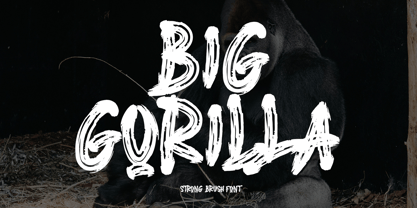 INTRODUCING This is a supercharged font, with natural brush, quick strokes and sharp details. Contains ALL CAPS, numbers, some punctuation and ligature. Perfect for challenging jobs, titles, movie,logos, apparel, t-shirts, hoodies, quotes, product packaging, or anything that needs a typographic turbo-boost and a typographic unique style. Thanks for checking out this font. I hope you enjoy it! AminMario
 - Coquillage by Hanoded,
$15.00 Coquillage is French for seashell or shellfish. Since I’m going to France this year for a camping holiday with my family, I thought it was a good idea to give this charming connected script a ‘holiday name’! Coquillage was handmade with a Japanese pen. It is a lovely connected script and comes with double-letter ligatures and a full range of diacritics.
 - Caturrita Display by Armasen,
$18.00 Caturrita Display is a new version of Caturrita. Better for titles and small pieces, with a large contrast in the heavy weights. It preserves the same structure of Caturrita, but with a more calligraphic touch, in the ligatures and almost all the characters. It comes in five weights, giving more elegance in the light ones, and strongly and expressive in the heavy tones.
 - Dainty by kapitza,
$49.00 Dainty™ is a flower font inspired by the delicate and beautiful structure of the spurge plant Tithymalus. The various sizes of the 52 illustrations in this font make it easy to create stunning compositions.
 - Blau by Wilton Foundry,
$19.00 Designed with a hand-chiseled feel, Blau’s sculpted characters add a refined personality to a wide range of brand, corporate, product and service applications. Highlighting the sculpted theme, inkwell treatment variations are prevalent throughout Blau, with several key glyphs that are stenciled for increased legibility. This sturdy, typographic workhorse shines when a slightly unorthodox typographic approach is required — a prime choice for distinctive and dynamic logotype use. The Blau family is available in Light, Light Italic, Regular, Italic, Bold and Bold Italic. The name Blau was chosen to celebrate the color Blue (or Blau in German, Blaauw in Dutch, Bleu French, Blå in Norwegian, Swedish & Danish, Blua in Esperanto, Blár in Icelandic) Blue is nature’s color for water, sky, mountains and glaciers. Blue is embraced as the color of heaven and authority, denim jeans and corporate logos. Surveys in the US and Europe show that blue is the color most commonly associated with harmony, faithfulness, confidence, distance, infinity, the imagination, and cold. In US and European public opinion polls, it is the most popular color, chosen by both men and women as their favorite color. Another very popular Wilton Foundry font in the “blue” family is “Cyan” and “Cyan Neue”.
 - Ongunkan France Glozel Runic by Runic World Tamgacı,
$100.00 In March 2010, Émile Fradin, a modest peasant farmer from central France, died at the age of 103. To his grave he took the secret behind one of the most controversial archaeological discoveries of the 20th century. A discovery which put into question the very origins of the written word and the paternity of European culture. It was the uncovering of peculiar artefacts would come to be known as the Glozel runes. The discovery of the Glozel runes On the first day of March 1924, a not yet 18-year-old Fradin was ploughing his family’s field in the hamlet of Glozel, when his cow stumbled into a hole. When he and his grandfather, Claude, looked closer, they discovered a mass of broken stone, under which lay an underground chamber. Within, they discovered pottery fragments, carved bones, and a peculiar clay tablet covered in bizarre characters that neither of the two could decipher. The family requested a subsidy for excavation works to be carried out, but were refused by the regional authority. With that disappointment, it seemed as though the discovery would fade into obscurity. However, the following year, news of Fradin’s unusual clay tablet reached the ears of the physician and amateur archeologist, Antonin Morlet. By the end of May 1925, Morlet began the first of his excavations.4 Within the first two years alone, he had amassed some 3,000 finds.
 - Bitner by The Northern Block,
$21.90 Bitner is a contemporary styled sans serif font that takes the name from the process of collecting bitcoins ‘bitcoin mining’. The simple, spur-less letterforms with no adornment are a direct influence from the crypto-currency technology and help to give the font a distinct, modern personality. These compact details combined with open apertures provide good readability across body copy. Bitner is a versatile sans serif with charm and geometric quality aimed at the convergence media markets. Details include over 800 characters with alternative lowercase a, e, g and y. 7 variations of numerals, true small caps with accents, manually edited kerning and Opentype features.
 - Xaloc by Vanarchiv,
$20.50 Xaloc was designed for editorial use in books, magazines and newspapers. This typeface family contains different font versions for different optical sizes; Caption, Text, Subhead and Display, all of them with different x-height proportions and contrast. Its serifs are asymmetrical and its letterforms have geometric modulated strokes that emulate the calligraphic variations. Its design approach enhances text flow and continuous reading. Xaloc was based on Ricado Santos’ Tramuntana, which has the same skeleton, proportions and serifs with a more mechanical design. Xaloc is the Catalonian name from the Mediterranean wind that comes from the Sahara and reaches hurricane speeds in North Africa and Southern Europe.
 - Frontis by Tipo Pèpel,
$24.00 Inspired by the Roman lettershapes that Asensio y Mejorada drew in 1780, Frontis is a text typeface that takes this reference just as a starting point. The delicate appearance of Neoclassical fonts becomes confidence in Frontis. The characters have a solid skeleton, and the text looks classy in the condensed half of the family. A style that shines especially at display sizes. A collection of vegetal motifs and some stylistic uppercase ligatures complete the character set. These extra shapes serve to frame and bring together all the weights and styles in the type family. The lapidary ligatures and the ornaments underline the 18th-century roots of the design. There is a connection between Frontis and those classic letters that were once engraved on stone. And yet, the design is daring enough to make it a perfect choice for contemporary use.

