10,000 search results
(0.042 seconds)
- Schoko by Hubert Jocham Type,
$29.90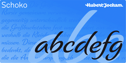 Schoko is a brush script headline typeface. It is elegant and still clear and self-confident. Ideal for food packaging and product branding.
 - OT Puppy by Overtype,
$35.00 OT Puppy is a decorative and fun brush font. Include Latin 2 and Cyrillic 1 language set. Good for postcards, packaging and posters.
 - Elio & Oliver v2 by SilverStag,
$19.00 Embark on a journey of refined typography with the Elio & Oliver Font Family v2, an exquisite upgrade that seamlessly integrates italics into its nine meticulously crafted weights, so you will get 18 fonts, 9 weights - from Thin to Black, and an italics version for each of them. Inspired by the timeless elegance and undeniable allure of Italy, this sans serif typeface captures the essence of sophistication and refinement, now enhanced with a touch of expressive flair. Italic Magnificence - A Symphony of Style The new italics bring a captivating dimension to the Elio & Oliver family, adding a graceful fluidity and dynamic rhythm to your designs. Each italic weight complements its corresponding roman counterpart, creating a cohesive and harmonious visual aesthetic. Unveiling the Full Spectrum of Elegance From the delicate Ultra Light to the bold intensity of Black, Elio & Oliver v2 offers an expansive range of weights, allowing you to tailor your designs to any project or mood. Whether you're crafting elegant editorial layouts, crafting impactful branding materials, or crafting sophisticated digital interfaces, this font family seamlessly adapts to your creative vision. Language Versatility for Global Impact Recognizing the power of language diversity, Elio & Oliver v2 boasts full language support, enabling you to communicate your message effectively to a global audience. With seamless compatibility across English, Italian, French, Spanish, and beyond, this font embraces the richness and cultural nuances of diverse languages. Captivate Attention, Leave a Lasting Impression Elio & Oliver v2 elevates your creative projects to new heights of sophistication, infusing them with an aura of refined elegance. Its graceful curves, captivating italics, and versatile weights will effortlessly capture attention and leave a lasting impression on viewers. Step into the Realm of Timeless Design Immerse yourself in the world of Elio & Oliver v2, where every letter narrates a story and every curve embodies the essence of impeccable design. Let the spirit of Italian chicness and timeless elegance guide your creative endeavors. Unleash the Power of Elio & Oliver v2 and Elevate Your Designs Discover Elio & Oliver v2 and transform your creative projects into masterpieces of timeless elegance. Join the ranks of designers who elevate their work with this exquisite typeface and unleash the power of sophisticated typography. Happy creating everyone!
 - Fonseca by Nasir Udin,
$10.00 Fonseca is a modern sans serif inspired by art deco and typography poster in early 20th century. The key of this all-caps family is simple straight geometric forms and modernized letterforms. This display family is perfect for headlines, posters, logos, branding projects, magazines, and packaging. The modernized retro-look makes this family great to presents any contents related to travel, history & culture in the present/modern way.
 - RMU Edelgotisch by RMU,
$30.00 RMU Edelgotisch is a carefully redrawn revival of the then trend-setting Schelter & Giesecke hot-metal original from the fin-de-siècle period. This fine vintage font elevates all your projects in an Art Nouveau style. To reach the historical long s, either type the integral sign [ ∫ ] or turn the round s into the long s by using the OT feature historical forms. It is also recommended to activate the OT feature discretionary ligatures.
 - LHF Saratoga Panels 4 by Letterhead Fonts,
$53.00The final collection in the series of 4 fonts. Each font contains 37 expertly drawn panels. All you have to do is add your own text and color for a quick and easy design. All 37 of these panels are exclusive to Letterhead Fonts. Typing each letter generates a different panel. Special Note: Due to the large file size of these fonts, they will not convert for use in Gerber Omega. Instead, Omega users may wish to use an alternate program to type the characters and import them into Omega as .eps files. CorelDraw users should use the "Weld" command rather than "Convert to Curves" command to convert these fonts to vector outlines. Otherwise, the program may crash due to the sheer number of points in each panel. - Hebrew Frank Tanach by Samtype,
$189.00 This is The Classic font of XX century. Based in a typeface created by
 - Arcade King by Ditatype,
$29.00 Arcade King is an exciting display font inspired by classic arcade games. Designed in uppercase, this typeface captures the nostalgic essence of retro gaming with its playful style. With consistent letter proportions and high contrast, this font ensures easy readability while immersing you in a world of gaming fun. The consistent letter proportions of Arcade King create a sense of harmony and balance throughout the font. Each uppercase letter is carefully crafted to maintain visual cohesion, ensuring a smooth and enjoyable reading experience. This design choice guarantees that every character complements the others, resulting in a visually appealing and cohesive typographic composition. The stark difference between thick and thin strokes enhances the visibility of each letter, making them easily distinguishable even at smaller sizes. The high contrast design adds a touch of boldness and excitement to the font, capturing the essence of the arcade gaming experience. Enjoy the available features here. Features: Stylistic Sets Multilingual Supports PUA Encoded Numerals and Punctuations Arcade King fits in headlines, logos, posters, product packaging, branding materials, print media, editorial layouts, website headers, and any projects that aim to evoke a sense of fun and adventure. Find out more ways to use this font by taking a look at the font preview. Thanks for purchasing our fonts. Hopefully, you have a great time using our font. Feel free to contact us anytime for further information or when you have trouble with the font. Thanks a lot and happy designing.
 - Arlette by TypeTogether,
$49.00 Pilar and Ferran based Arlette on the fast stroke of one letter from a Roger Excoffon family, but along the way they abandoned that starting point in favour of experimentation. Many sans serifs are like a svelte black dress: functional, beautiful, and the unfussy outfit for a nice evening get together. The Arlette family isn’t like this. It’s a stunner — an incandescent reimagining of what defines a sans and how it can look. Arlette explores the boundaries of the sans serif landscape and returns with forms developed from gestural vigour. Thinking of it as “painterly” may at first seem to fit, but it underestimates Arlette’s ability to master an unseen world of countless emotions and physical applications: magazines, branding, editorial, teen and young adult works, book covers, and a host of products and packaging whose content will be amplified with Arlette’s voice. Not only does Arlette use its eight weights plus italics to speak in Latin-based scripts, it is also fluent in Thai and has six weights (hairline through bold) with which it meets that challenge, whether in text or display. Arlette Thai’s modern nature is seen in two features for the script. One is the decorative Thai characters that are based on original palm leaf manuscripts. Another is a version of the Latin numerals adapted to the height of the script due to their wide use in Thailand. Arlette Thai has been meticulously developed, including contextual kerning to avoid mark clashes. Arlette’s OpenType capabilities include mathematic and scientific figures, positional forms, pointers, arrows, and oldstyle, lining, and tabular lining numerals. In addition to all this, it’s packed with swashes and swash ligatures in both scripts for enthusiastic typesetting. Because it pushes experimentation without compromising readability, both Arlette Thai and Latin are surprisingly legible in small sizes and arrestingly beautiful when their details can be seen.
 - Tang by Suomi,
$19.00 The Tang family came to be, when I started studying fonts made for use in very small point sizes, like Bell Gothic. I studied the use of ink traps and went to town with them. Instead of just using them for their purpose: trapping ink to prevent the type getting blotted; I used them as a design feature. With those features Tang works very well in both headline and text use. I use it as a house type, and I've already seen it in a beer and cider labels.
 - Vianova Serif Pro by Elsner+Flake,
$59.00 The font superfamily Vianova contains each 12 weights of Sans and Slab and 8 weights of the Serif style. The design from Jürgen Adolph dates back into the 1990s, when he studied Communication Design with Werner Schneider as a professor at the Fachhochschule Stuttgart. Adolph started his carrier 1995 at Michael Conrad & Leo Burnett. He was responsible for trade marks as Adidas, BMW, Germanwings and Merz. He has been honored as a member of the Art Directors Club (ADC) with more than 100 awards. On February 26, 2014, Jürgen Adolph wrote the following: “I was already interested in typography, even when I could not yet read. Letterforms, for instance, above storefronts downtown, had an irresistible appeal for me. Therefore, it is probably not a coincidence that, after finishing high school, I began an apprenticeship with a provider of signage and neon-advertising in Saarbrücken, and – in the late 1980s – I placed highest in my field in my state. When I continued my studies in communications design in Wiesbaden, I was introduced to the highest standards in calligraphy and type design. “Typography begins with writing” my revered teacher, Professor Werner Schneider, taught me. Indefatigably, he supported me during the development of my typeface “Vianova” – which began as part of a studies program – and accompanied me on my journey even when its more austere letterforms did not necessarily conform to his own aesthetic ideals. The completely analogue development of the types – designed entirely with ink and opaque white on cardboard – covered several academic semesters. In order to find its appropriate form, writing with a flat nib was used. Once, when I showed some intermediate designs to Günter Gerhard Lange, who occasionally honored our school with a visit, he commented in his own inimitable manner: “Not bad what you are doing there. But if you want to make a living with this, you might as well order your coffin now.” At that time, I was concentrating mainly on the serif version. But things reached a different level of complexity when, during a meeting with Günther Flake which had been arranged by Professor Schneider, he suggested that I enlarge the offering with a sans and slab version of the typeface. So – a few more months went by, but at the same time, Elsner+Flake already began with the digitilization process. In order to avoid the fate predicted by Günter Gerhard Lange, I went into “servitude” in the advertising industry (Michael Conrad & Leo Burnett) and design field (Rempen& Partner, SchömanCorporate, Claus Koch) and worked for several years as the Creative Director at KW43 in Düsseldorf concerned with corporate design development and expansion (among others for A. Lange & Söhne, Deichmann, Germanwings, Langenscheidt, Montblanc.”
 - Vianova Slab Pro by Elsner+Flake,
$59.00 The font superfamily Vianova contains each 12 weights of Sans and Slab and 8 weights of the Serif style. The design from Jürgen Adolph dates back into the 1990s, when he studied Communication Design with Werner Schneider as a professor at the Fachhochschule Stuttgart. Adolph started his carrier 1995 at Michael Conrad & Leo Burnett. He was responsible for trade marks as Adidas, BMW, Germanwings and Merz. He has been honored as a member of the Art Directors Club (ADC) with more than 100 awards. On February 26, 2014, Jürgen Adolph wrote the following: “I was already interested in typography, even when I could not yet read. Letterforms, for instance, above storefronts downtown, had an irresistible appeal for me. Therefore, it is probably not a coincidence that, after finishing high school, I began an apprenticeship with a provider of signage and neon-advertising in Saarbrücken, and – in the late 1980s – I placed highest in my field in my state. When I continued my studies in communications design in Wiesbaden, I was introduced to the highest standards in calligraphy and type design. “Typography begins with writing” my revered teacher, Professor Werner Schneider, taught me. Indefatigably, he supported me during the development of my typeface “Vianova” – which began as part of a studies program – and accompanied me on my journey even when its more austere letterforms did not necessarily conform to his own aesthetic ideals. The completely analogue development of the types – designed entirely with ink and opaque white on cardboard – covered several academic semesters. In order to find its appropriate form, writing with a flat nib was used. Once, when I showed some intermediate designs to Günter Gerhard Lange, who occasionally honored our school with a visit, he commented in his own inimitable manner: “Not bad what you are doing there. But if you want to make a living with this, you might as well order your coffin now.” At that time, I was concentrating mainly on the serif version. But things reached a different level of complexity when, during a meeting with Günther Flake which had been arranged by Professor Schneider, he suggested that I enlarge the offering with a sans and slab version of the typeface. So – a few more months went by, but at the same time, Elsner+Flake already began with the digitilization process. In order to avoid the fate predicted by Günter Gerhard Lange, I went into “servitude” in the advertising industry (Michael Conrad & Leo Burnett) and design field (Rempen& Partner, SchömanCorporate, Claus Koch) and worked for several years as the Creative Director at KW43 in Düsseldorf concerned with corporate design development and expansion (among others for A. Lange & Söhne, Deichmann, Germanwings, Langenscheidt, Montblanc.”
 - Vianova Sans Pro by Elsner+Flake,
$59.00 The font superfamily Vianova contains each 12 weights of Sans and Slab and 8 weights of the Serif style. The design from Jürgen Adolph dates back into the 90th, when he studied Communication Design with Werner Schneider as a professor at the Fachhochschule Stuttgart. Adolph started his carrier 1995 at Michael Conrad & Leo Burnett. He was responsible for trade marks as Adidas, BMW, Germanwings and Merz. He has been honoured as a member of the Art Director Club (ADC) with more than 100 awards. On February 26, 2014, Jürgen Adolph wrote the following: “I was already interested in typography, even when I could not yet read. Letterforms, for instance, above storefronts downtown, had an irresistible appeal for me. Therefore, it is probably not a coincidence that, after finishing high school, I began an apprenticeship with a provider of signage and neon-advertising in Saarbrücken, and – in the late 1980s – I placed highest in my field in my state. When I continued my studies in communications design in Wiesbaden, I was introduced to the highest standards in calligraphy and type design. “Typography begins with writing” my revered teacher, Professor Werner Schneider, taught me. Indefatigably, he supported me during the development of my typeface “Vianova” – which began as part of a studies program – and accompanied me on my journey even when its more austere letterforms did not necessarily conform to his own aesthetic ideals. The completely analogue development of the types – designed entirely with ink and opaque white on cardboard – covered several academic semesters. In order to find its appropriate form, writing with a flat nib was used. Once, when I showed some intermediate designs to Günter Gerhard Lange, who occasionally honored our school with a visit, he commented in his own inimitable manner: “Not bad what you are doing there. But if you want to make a living with this, you might as well order your coffin now.” At that time, I was concentrating mainly on the serif version. But things reached a different level of complexity when, during a meeting with Günther Flake which had been arranged by Professor Schneider, he suggested that I enlarge the offering with a sans and slab version of the typeface. So – a few more months went by, but at the same time, Elsner+Flake already began with the digitilization process. In order to avoid the fate predicted by Günter Gerhard Lange, I went into “servitude” in the advertising industry (Michael Conrad & Leo Burnett) and design field (Rempen& Partner, SchömanCorporate, Claus Koch) and worked for several years as the Creative Director at KW43 in Düsseldorf concerned with corporate design development and expansion (among others for A. Lange & Söhne, Deichmann, Germanwings, Langenscheidt, Montblanc.”
 - 1812 by Apostrof,
$40.00 '1812' type family is a revival and further development of the typeface '1812' by Lehmann Type Foundry (St. Petersburg). It was created for the centenary of the French invasion of Russia, known in Russia as the Patriotic War of 1812 along the lines of decorative engraved inscriptions and ornamented typefaces of that time, presumably by the artist Alexandre Benois. It was used mainly for the decoration of luxurious elegant publications. Later, in 1917, this typeface was used on the Russian Provisional Government banknotes. In the Soviet period of time '1812' appeared to be one of the few typefaces included in the first Soviet type standard OST 1337. It was produced for manual typesetting until the early 1990s. This typeface could be seen on Soviet letterheads, forms, posters and even air tickets. The digital version development was launched in 2010. The original version was supplemented with lowercase letters and alternative symbols, the extended Latin and Cyrillic alphabets were fully supported. The font was evolved into a family of 14 decorative styles which can refine any design giving it a festive and elegant but at the same time strict and nostalgic look. Despite its decorative nature, '1812' is perfectly readable in small emphasized text blocks due to its classic shape and careful spacing.
 - Leo by Canada Type,
$29.95 Leo is an economic magazine and book face meant for use in sizes suitable for immersive reading, with different cuts optimized for different body copy size ranges, like footnotes and legal text. Designed with the explicit intent of relaying information without calling attention to itself, this typeface places itself squarely on the "function" side of the eternal debate about form versus content. The roman Leo fonts were built with as little ornamentation as possible, with wedge serifs, a high x-height and a skeleton somehwat rooted in the designers' reflections on the modern, post-war Dutch archetype. Rather than follow traditional models with entirely different forms, contracted widths and steep slants, the Leo italics deliver naturally subtle emphasis in reading by closely relating to the forms, stance and rhythm of their roman counterparts. The 12 Leo fonts contain over 700 glyphs each, and include support for the vast majority of Latin languages. Included OpenType features are built-in small caps, lining and oldstyle figures in both proportional and tabular sets, superiors, numerators, denominators inferiors, ordinals, automatic fractions, ligatures, and optional long descenders for optimal counterspace management in book and magazine text layout. For more information on Leo's character set, features and some print tests, please consult the PDF in the gallery section of this page.
 - Art Lesson JNL by Jeff Levine,
$29.00The hand-lettered title of a vintage Walter Foster "how to draw" book inspired the Deco-influenced alphabet of Art Lesson JNL. Bold and retro in nature, this typeface gets the message across in a straightforward way, yet still has a bit of a casual feel to it. - Nouveau Stencil JNL by Jeff Levine,
$29.00 The sheet music for the 1917 song "Wake Up Virginia (and Prepare for Your Wedding Day)" features a hand lettered title in a sans serif Art Nouveau design with stencil influences. This was the inspiration for Nouveau Stencil JNL, which is available in both regular and oblique versions.
 - FG Lina by YOFF,
$20.95 FG Lina was inspired by an old handwritten book I found in the library. It contains some alternate caps characters and some rough lowercase characters. I had lots of fun designing the missing characters to fit in the script. I hope you will enjoy this Quill Script font!
 - Ongunkan Gothenburg Futhark Swe by Runic World Tamgacı,
$40.00 Sweden Gothenburg Futhark In Sweden you have another set called the Bohuslän runes, which are used specifically in the west coast area (Bohuslän) north of (and including) Gothenburg city (my hometown, incidentally). Interestingly, this is a string of 26 letters, not 16; 2 more than the original Elder Futhark
 - Ramones by Namistudio,
$15.00 Rebel, Energy, Punk, Power... Ramones, jagged interlock letter with bold line. This font will bring that IN YOUR FACE attitude in your design. No more soft side. It's all about the energy ! Either choosing the auto-generate interlocking letters, or keep it original, Ramones still brings you the power.
 - Regua by Tipos do aCASO,
$2.90Play like a child with letter forms, fill the gaps of a stencil with a ballpoint pen and work this to generate a digital type. Régua (Ruler, in Portuguese) is the result of a typographical joke with the upper cases made by Buggy, a Brazilian typographer, in 1998. - Formal Dance JNL by Jeff Levine,
$29.00 A vintage Canadian-published music book circa the 1940s had the title "Strauss Waltzes" hand lettered in a bold Art Deco sans serif that featured block style letters with rounded corners. This was the working model for Formal Dance JNL, which is available in both regular and oblique versions.
 - Fancy Deco JNL by Jeff Levine,
$29.00 This decorative, scalloped thick-and-thin Art Deco type design is one of the many inspirations found within the pages of the 1934 French lettering book “L'Art du Tracé Rationnel de la Lettre”. Now in digital format, Fancy Deco JNL is available in both regular and oblique versions.
 - Baroniene ML by HiH,
$12.00 Genovaite Baroniene is former school teacher and a native of Lithuania who loves fancy letters. When she writes, she likes to add extra flourishes to her handwriting and printing. It simply appeals to her to do so. While living in the United States a few years ago and working in the health care field, she put pen to paper to provide a specimen of her writing from which a font could be developed. The process has taken longer than either of us expected. Now we are finally able to present Baroniene ML, a stylishly unique example of what we call Lithuanian Folk Baroque. Baroniene ML has a total of 362 glyphs, including the Unicode Latin Extended-A glyphs (0100 to 017F), covering the more widely-used Central European languages. To resolve the cedilla/undercomma conundrum, we have chosen to design a hybrid disconnected accent for use with C, G, K, L, N, R, S & T. We hope this solution is acceptable to users of Albanian, Catalan, French, Latvian, Portuguese, Romanian and Turkish. Baroniene ML also comes with four ligatures: gh, Th, th and Ch (167, 172, 177 and 181). Baroniene ML is certainly not the polished script of a professional calligrapher. It is very personal. The human source is still visible in its form. The letter spacing is uneven. Some of the curves are not quite perfect. In sum, the individuality has not been refined out of it. That is why it is so charming. If you want for a font that has a very different look, perhaps Baroniene ML is what you need.
 - Durango Western by Sharkshock,
$100.00 This all caps display font is defined by its close spacing and thick serifs for a distinct appearance. Inspiration came from old movies set in the Wild West. The characters are tall in stature so works well in spots with limited space. Use Durango Western for a wanted poster, social media, or team logo. Basic/Extended Latin, European accents, punctuation, diacritics, kerning, and Cyrillic characters are included. The eroded version features varying levels of distress between the uppercase/lowercase and contains a few alternates. NOTE: Due to the level of detail in the eroded version temporary computer slowdown may occur.
 - Zirkle by Ingrimayne Type,
$9.00 Zirkle is a monoline font in which the upper-case letters were designed from circles or bits of circles, with interior straight lines. It was the first font I designed in Fontographer when Fontographer was still in version 2 and the most advanced Macintosh was the Macintosh II. I have heard from people who like it, but it was designed not to meet some need but to play with the geometry of circle-based letters. ZirkStressed is a “squared” version that was the result of playing with a font distortion program, which in this case produced a result that seemed interesting.
 - Mramor Pro by Storm Type Foundry,
$52.00 The Mramor family first appeared in the Stormtype catalogue in 1994. The first sketch arose in 1988 through the narrowing of Roman capitals. It has uniform width proportions and, above all, original lower-case letters, unprecedented with Roman Capitals. The text designs are discontinued since they were replaced by the related Amor Serif family (along with its -sans version). Now, Mramor has “only” 10 designs that each include true small caps, Cyrillics and a rich variety of figures, ligatures and alternates. Mramor excels in corporate identity or bottle-label design, also whenever there is a need for a “classic” looking face.
 - Victorina by John Moore Type Foundry,
$35.00 Victorina is a fantasy sans letter or display, inspired by the Victorian letters whose stylistic influence dominated the scene graph of the nineteenth and twentieth century. Victorina has a perfect structure of rigorous geometry. Victorina comes in several versions in both Black and Condensed, in italics with a varied repertoire of styles, besides providing small caps and ornaments. Victorina lets you work fine fantasy headlines when they overlap in layers of different styles. Victorina is a letter designed to recreate, with a contemporary vision, the spirit of those days of the industrial revolution and the early days of modernism.
 - Kalender Serif by Gurup Stüdyo,
$10.00 ∙Kalender is designed as a high-contrast modern serif for display use. Kalender is provides you an elegant and luxurious typographic colour. ∙When Kalender's lines invisible at small sizes you can use Kalender No 2 which have thicker lines and serifs to assist readability. ∙Kalender Blok is arranged for situations which are diacritical marks overflow to leadings of the headline and headline typographical color is affected negatively from this situation. For this purpose, majiscule diacritical letters are resolved within the letter height. However, when this is done, new forms are obtained by integrated diacritical marks with letters instead of directly merging them. The idea behind this approach is to preserve the typographic value of diacritical marks and emphasize the semantic value of diacritical letters. 68 letters have been redesigned in this way. And also Kalender have different meanings in Turkish: large, humble etc. I considered this name appropriate because it described the structure of this font well.
 - Sukothai by Linotype,
$155.99Sukothai is a traditional Thai design based on early metal type. The classic and distinct forms make it excellent for setting text at small sizes or in large passages. Originally released by Linotype for digital photocomposition, now both the Light and Bold weights are available in OpenType format. This makes it possible to dynamically and precisely position the various levels of superscript and subscript vowel signs and tonal marks. In addition to this, the complete Unicode page range for Thai is covered to ensure flawless conversion between other OpenType fonts using Unicode. The accompanying Latin design matches well in scale and texture and supports most Western European languages making it ideal for setting bilingual texts. - Halis Rounded by Ahmet Altun,
$19.00 The Halis Rounded Font Family from Ahmet Altun comes in eight weights. In addition, all weights have small caps for romans. Halis Rounded is the smoother version of the Halis Grotesque family. With rounded corners, this new font seems much softer and eye-pleasing even though it still has geometric and straight borders. Halis Rounded is legible from very small size to very large ones and also suitable for letterpress. Thanks to small caps accommodation, this font family makes their use in web typography even easier. As with the small caps, all fonts can be used to create great works on the web as logos, texts, presentations etc. and in prints as posters, t-shirts, magazines, and notices.
 - Gigasper by Konstantine Studio,
$19.00 Step into the digital realm with Gigasper, where cutting-edge design meets futuristic vibes in a spellbinding dance of pixels and perfection. Immerse yourself in the extraordinary fusion of techno fonts and a dystopian visual concept that redefine the boundaries of creativity. Gigasper is not confined to boundaries; it thrives in breaking them. From sleek tech interfaces to gritty cyberpunk posters, Gigasper adapts effortlessly, ensuring your designs are always ahead of the curve. Its versatility is your canvas, and the possibilities are limitless. Picture a world where pixels pulse with the heartbeat of innovation, and Gigasper is your guide. Embrace the distopian visual concept that weaves a narrative of rebellion and avant-garde aesthetics. This isn’t just a font; it’s a statement – a rebellion against the mundane, an uprising of creativity. Unlock the Future, Embrace Gigasper – Where Techno Meets Tomorrow!
 - Utrecht by Cititype,
$10.00 Utrecht is a handwritten font that is composed from natural and casual handwritten characters so that the shapes are less neat. The hand stroke node becomes the hallmark of this font. It was inspired by environmental posters that were directly handwritten in simple media. We named this font Utrecht, referring to this city in the Netherlands. We choose it because it is a friendly city, caring about the environment, its size is compact and therefore it is very easy to get a broad sense of the city in a short time. Likewise, this font is only handwritten with standard characters but on the other hand this handwriting gives the impression of being more familiar, reflecting natural design and spontaneity. This font is suitable for posters, crafts, writing quotes, unique logos, natural text writing. So this is Utrecht, a quirky handwritten font with a casual feel. It will effortlessly turn any design idea into a statement.
 - Habana Deco ML by HiH,
$12.00 Habana Deco ML was inspired by a hand-lettered sign on the stucco exterior of a small pharmacy in modern-day city of Havana, Cuba. It, in turn, was based on the fat-faced Art Deco lettering of the late 20s and early 30s, especially the Futurismo posters out of Italy, as well as alphabets designed in The Netherlands, France, USA and even the Soviet Union. There are 24 stylistic alternate glyphs (SALT), many inspired by a variety of these sources, including a couple from the sign in the front of the Congress Hotel in South Beach, Miami. The others features of the Habana Deco include 363 glyphs, 184 kerning pairs (KERN), 14 ornaments and shapes (ORNM) and 15 discretionary ligatures (DLIG). This is a font with which you can have fun. The zip package includes two versions of the font at no extra charge. There is an OTF version which is in Open PS (Post Script Type 1) format and a TTF version which is in Open TT (True Type)format. Use whichever works best for your applications.
 - Bonhomme Richard by Three Islands Press,
$39.00 Bonhomme Richard evokes the cursive penmanship of Chevalier John Paul Jones (1747–1792), celebrated Continental Navy commander during the American Revolution, in letters from the late 18th century. The font’s name comes from Jones’s famous frigate, lost during his victorious engagement with the British in the Battle of Flamborough Head in 1779. During this battle Jones is said to have exclaimed, when urged to surrender, “I have not yet begun to fight!” (In fact, his likely words were, “I may sink, but I’ll be damned if I strike!” – i.e., surrender.) A legible script, Bonhomme Richard has an elegance about it while also conjuring the colonial era of its source material. Use to simulate historical handwriting in film props, games, formal invitations, product labels, and the like.
 - Punchado by MyAnvil,
$20.00 This font titled "Punchado" original was designed in light of its sharp angels and bold impact type. This font would theme in the realm of: engineering, technology, science fiction, science, futures, etc... This font could be described as energetic, and motivational.
 - P22 Koch Signs by P22 Type Foundry,
$24.95This set reproduces over 350 of the signs contained in German typographer Rudolf Koch's "The Book of Signs," the symbols include Astrological, Christian, Medieval and Runic iconography. - GR onsoo Script by GORAE Font,
$19.99 The typeface of GR onsoo Script is the handwriting of artist 'onsoo'. This font is designed for use in the text or title of fairy tale books.
 - Andhibath by Sabrcreative,
$17.00 Introducing Andhibath Bold Script Font, a captivating script typeface that exudes elegance and versatility. With its bold strokes and graceful curves, this font is perfect for adding a touch of sophistication to your design projects. Whether you're creating invitations, branding materials, packaging, or any other creative work, Andhibath will elevate your designs with its unique charm. The Andhibath font features both uppercase and lowercase letters, allowing you to mix and match different letterforms for a customized look. It also includes numbers and punctuation, ensuring that your compositions are comprehensive and well-rounded. With multilingual support, you can effortlessly incorporate various languages into your designs, making it suitable for projects with a global reach. One of the standout features of Andhibath is its PUA encoding. This means that accessing the font's special ligatures and glyphs is a breeze, giving you even more creative possibilities. The ligatures add a natural and handcrafted feel to your text, enhancing its visual appeal. With its script style, Andhibath captures the essence of handwritten elegance. It is ideal for a wide range of design applications, from wedding stationery and logos to social media graphics and advertising materials. The versatility of this font allows you to adapt it to different themes and moods, whether you're aiming for a classic, modern, or whimsical look. Experience the beauty and versatility of Andhibath Bold Script Font. Let its graceful curves and bold presence make a lasting impression in your designs.
 - Tomate by Re-Type,
$45.00 Tomate started in 2006 as a brush lettering exercise for a poster and was later used for the ReType identity. In 2008 its author decided to turn it into a super fat typeface suitable for packaging and mass consumption products. The possibilities of ultra heavy forms are explored in this alphabet; trying to solve the design problems that these sort of forms present. Tomate shows influences from the beautiful Goudy Heavyface Italic which is a design the author admires.