10,000 search results
(0.04 seconds)
- Aitos by Monotype,
$29.99Kevin Simpson was five years old when the stylized "E" of the Electrolux vacuum cleaner logo caught his eye. This is his earliest recollection of an interest that ultimately became an obsession. Type remains his major preoccupation, and he admits to attempting to work a good typeface design into any project where he can get away with it. Aitos was inspired by a metal sculpture Simpson saw while driving through the French countryside. "The statue was very strong. It was heavily weathered and had obviously been there for some time, yet it also seemed very delicate and light." Aitos, like the statue, is a rugged design. At first glance, it is chunky and bold, perhaps a little jarring. If you look again, however, you'll see it has refined qualities. Aitos commands attention - yet is still affable. - Nouveau Moderne JNL by Jeff Levine,
$29.00 The cover of the 1904 sheet music from the Tibetan comic opera “The Forbidden Land” had the title hand lettered in an unusual Art Nouveau style. Mostly squared with rounded corners, many of the characters twisted, turned and extended in ways that took on the look of the Far East. This became the design model for Nouveau Moderne JNL, which is available in regular and oblique versions.
 - Labyrindo by URW Type Foundry,
$39.99 Labyrindo is inspired on the classic Labyrinth. The oldest known labyrinth is 3200 years old and is to be found in Greece. The mythological king Minos held the monstrous son of his wife ‘Minotaurus’ prison in a labyrinth. Much later the labyrinth made his appearance in the medieval churches, this time as a pattern on the church floor. During the Italian renaissance the multiple gate labyrinth came in fashion. Paths led trough green hedges in beautiful palace gardens. These hedges where perfectly cut in rectangular shapes. Mainly meant as an aesthetic statement. Besides the origin of the physic labyrinth, it has always been a great source of story-telling and myths. I mention a few personal favourites (film) like, Pan’s Labyrinth (a journey to the underworld), Labyrinth (with David Bowie) and the Shining with Jack Nicholson (where a horrific scene takes place in a labyrinth). Not the most cheerful stories but fascinating and intriguing. A Labyrinth is mind boggling and mysterious but wonderful. I made graphic translation in this typeface.
 - Moore 003 by FSD,
$6.15Moore 003 was inspired by Henryk Tomaszewski's poster lettering for the Moore Exibition (Warsaw, Poland 1959). The headline "Moore" is composed of paper collage. The lettering, in Tomaszewski's vision, contrasts in ways that recall the contrast of Moore's sculptures. It was my intention to continue this research using lettering in the form of a typeface. - Momoiro by Underground,
$29.00 Momoiro is a feminine typeface family, designed for editorial use. "The first case in which appeared a fashion content in a magazine was in 1672 in the magazine Le Mercure Galant, which was a magazine of entertainment and varied content, including fashion. But the first illustrated and specialized magazine was Le Journal Des Dammes Et Des Modes, created in 1797. "(Fashion Trends, 2011). On the basis of this historical period, the creation of typography has characteristics of a Baroque type. "In this category we mainly include the types created in the Netherlands during the seventeenth century and whose protagonists are the punch makers Reinhard Voskens and Christoffel Van Dijck. Baroque typography stands out for its accentuated play of irregular axes and contrasts that permeate the text of great vividness. " Therefore it has contrast in the thick and thin strokes, Roman serifs, humanistic axis. With this typography, we are not looking for a re-reading of the baroque, but rather a current typeface with humanistic characteristics of the handwriting, with a brush as a differential. Momoiro comes in two weights plus italics to cover as much design needs as possible. It compliments from OpenType features such as ligatures, swashes, true fractions, old style numerals and stylistic sets.
 - OL Hebrew Qumran Torah by Dennis Ortiz-Lopez,
$30.00 This font contains every variant found in the Hebrew Bible such as the “mutilated” Waw in Numbers 25: verse 12, the small Heh in Genesis 2: verse 4 and the Nun Inversum before Numbers 10: verse 35 and after verse 36 and elsewhere as well as certain oversized consonants such as the Shin with hireq from the beginning of the Song of Songs.
 - Letraset Romic by ITC,
$40.99Typeface designer and Letraset type director Colin Brignall created the font Romic. The character of the strokes as well as the serif forms give the font its calligraphic look. The placement of the serifs, on the upper left and lower right of a character, also distinguishes this typeface and allows the figures to be set very close to one another. The dots on the i and j do not hang in the air, rather, they are connected to the rest of the letter with a light, serif-like stroke. The elegant and lively Romic font is legible even in smaller point sizes. It is best used in middle length texts and headlines and wherever an individual and sophisticated image is the goal. - Ma Braille by Echopraxium,
$5.00 The "Ma" in "Ma Braille" is used as a minimalist way to say "Negative Space". "Ma" in japanese arts is an "esthetical usage of emptiness". Thus this font explicits the negative space around visible braille dots in each glyph. A. Font user guide a.1. Lowercase glyphs { A..Z } In these glyphs, dots are represented as "black squares" while the negative space is displayed as 1 or 2 white filled polygons. a.2. Uppercase glyphs { a..z } In these glyphs, dots are represented as "white squares" while the negative space is displayed as 1 or 2 black filled polygons. a.3. Digits: they are just the same than a..j, but the "North US version" is also provided in ascii codes 0xE0..0xE4 (1..5) and 0xE7..0xEB (6..0). a.5. "Dashed Border": a.5.1. "Black dashed" border glyphs; { £, ¥, µ, Â, Ä, Ê, Ë, Î, Ï, Ô } a.5.2. "White dashed" border glyphs; { Ö, Õ, °, ô, ö, î, ï, û, u, õ } B. Posters Poster 1: "Font Logo" version 1, it displays "Ma Braille" text surrounded by the "black dashed border" glyphs. Poster 2: "Font Logo" version 2, it displays "MA" glyphs in big size and smaller "Braille" glyphs within "M" and within "A" as well. Poster 3: the classical pangram to test a font "The Quick Brown Fox jumps over the Lazy dog". Poster 4: Article 1 of the Human Rights: All human beings are born free and equal in dignity and rights. They are endowed with reason and conscience and should act towards one another in a spirit of brotherhood. Poster 5: the "Glyph set" (Border glyphs not included) with A..Z, a..z, digits and special characters.
 - Fan Script by Sudtipos,
$99.00 A friend of mine says that sports are the ultimate popular drug. One of his favorite things to say is, “The sun’s always shining on a game somewhere.” It’s hard to argue with that. But that perspective is now the privilege of a society where technology is so high and mighty that it all but shapes such perspectives. These days I can, if I so choose, subscribe to nothing but sports on over a hundred TV channels and a thousand browser bookmarks. But it wasn't always like that. When I was growing up, long before the super-commercialization of the sport, I and other kids spent more than every spare minute of our time memorizing the names and positions of players, collecting team shirts and paraphernalia, making up game scenarios, and just being our generation’s entirely devoted fans. Argentina is one of the nations most obsessed with sports, especially "fútbol" (or soccer to North Americans). The running American joke was that we're all born with a football. When the national team is playing a game, stores actually close their doors, and Buenos Aires looks like a ghost town. Even on the local level, River Plate, my favorite team where I grew up, didn't normally have to worry about empty seats in its home stadium, even though attendance is charged at a high premium. There are things our senses absorb when we are children, yet we don't notice them until much later on in life. A sport’s collage of aesthetics is one of those things. When I was a kid I loved the teams and players that I loved, but I never really stopped to think what solidified them in my memory and made them instantly recognizable to me. Now, thirty-some years later, and after having had the fortune to experience many cultures other than my own, I can safely deduce that a sport’s aesthetic depends on the local or national culture as much as it depends on the sport itself. And the way all that gets molded in a single team’s identity becomes so intricate it is difficult to see where each part comes from to shape the whole. Although “futbol” is still in my blood as an Argentinean, I'm old enough to afford a little cynicism about how extremely corporate most popular sports are. Of course, nothing can now take away the joy I got from football in my childhood and early teens. But over the past few years I've been trying to perceive the sport itself in a global context, even alongside other popular sports in different areas of the world. Being a type designer, I naturally focus in my comparisons on the alphabets used in designing different sports experiences. And from that I've come to a few conclusions about my own taste in sports aesthetic, some of which surprised me. I think I like the baseball and basketball aesthetic better than football, hockey, volleyball, tennis, golf, cricket, rugby, and other sports. This of course is a biased opinion. I'm a lettering guy, and hand lettering is seen much more in baseball and basketball. But there’s a bit more to it than that. Even though all sports can be reduced to a bare-bones series of purposes and goals to reach, the rules and arrangements of baseball and basketball, in spite of their obvious tempo differences, are more suited for overall artistic motion than other sports. So when an application of swashed handlettering is used as part of a team’s identity in baseball or basketball, it becomes a natural fit. The swashes can almost be visual representation of a basketball curving in the air on its way to the hoop, or a baseball on its way out of the park. This expression is invariably backed by and connected to bold, sleak lettering, representing the driving force and precision (arms, bat) behind the artistic motion. It’s a simple and natural connective analysis to a designer, but the normal naked eye still marvels inexplicably at the beauty of such logos and wordmarks. That analytical simplicity was the divining rod behind Fan Script. My own ambitious brief was to build a readable yet very artistic sports script that can be a perfect fit for baseball or basketball identities, but which can also be implemented for other sports. The result turned out to be quite beautiful to my eyes, and I hope you find it satisfactory in your own work. Sports scripts like this one are rooted in showcard lettering models from the late 19th and early 20th century, like Detroit’s lettering teacher C. Strong’s — the same models that continue to influence book designers and sign painters for more than a century now. So as you can see, American turn-of-the-century calligraphy and its long-term influences still remain a subject of fascination to me. This fascination has been the engine of most of my work, and it shows clearly in Fan Script. Fan Script is a lively heavy brush face suitable for sports identities. It includes a variety of swashes of different shapes, both connective and non-connective, and contains a whole range of letter alternates. Users of this font will find a lot of casual freedom in playing with different combinations - a freedom backed by a solid technological undercurrent, where OpenType features provide immediate and logical solutions to problems common to this kind of script. One final thing bears mentioning: After the font design and production were completed, it was surprisingly delightful for me to notice, in the testing stage, that my background as a packaging designer seems to have left a mark on the way the font works overall. The modern improvements I applied to the letter forms have managed to induce a somewhat retro packaging appearance to the totality of the typeface. So I expect Fan Script will be just as useful in packaging as it would be in sports identity, logotype and merchandizing. Ale Paul
 - Smart Casual by Scholtz Fonts,
$21.00 The name "Smart Casual" says it all. This is the font to use when you want to create that smart impression without being too formal. It is based on the font "Black Tie" but it is less formal than "Black Tie". It conveys an impression of relaxed elegance without being either sloppy or too intimate. Smart Casual is ideal for invitations to stylish but relaxed events, for advertisements that are intended to create that special ambience, for posters and for announcements. Smart Casual has a full character set and has been carefully letter-spaced and kerned. It comes in two styles: Baseline and Staggered. In "Baseline" all characters refer to the same baseline (the lower part of the characters are in line), while in "Staggered" the capitals are placed lower than the lower case characters, creating a slightly more dramatic, yet formal and retro look.
 - Ad Words by Outside the Line,
$19.00 Just in time for the sale season. Ad Words is a font of words you would use if you did retail ads. Some words in script, some print, some bold, some not. Plus 2 starbursts. Enlarge the starbursts and then reverse one of the words out of it… like Now! Win! or Free! Other Outside the Line fonts work with this one, check out Architectural Lettering Regular and Bold, Plz Print or Plz Script.
 - Aerle by Hackberry Font Foundry,
$24.95 My first font for 2009 was Aerle. It is a new dark sans serif font in my continuing objective of designing book fonts that I can really use. It made a little ripple in the industry, but more than that I found that I loved it with Aramus and Artimas — my latest book font family with the same proportions. In many ways, Aerle is a very different direction for me built on what I have learned on Aramus and other recent developments in my style. The concept came to me while using Bitstream's Mister Earl on a site online—though there is no direct reference. I wanted a more playful heavy sans with a much smaller x-height than I have been using lately, plus taller ascenders. As I was using Aerle, I constantly needed a light and bold version. The new direction I am taking is a result of a decision that my fonts, though I loved the character shapes, produced an even type color that is too dark or a little dense. Aerle was an attempt to get away from that look even though the letterspacing is quite tight. For Aerle Thin I pushed a little further in that direction and increased the letterspacing. The hand-drawn shapes vary a lot, many pushing the boundaries of the normal character. This gives a little looseness and helps the lightness in feel I am looking for. It will be interesting to see where this all goes. Most new type around the world is far too perfect for my taste. While the shapes are exquisite, the feel is not human but digital mechanical. I find myself wanting to draw fonts that feel human — as if a person crafted them. In most ways this is a normal font for me in that it has caps, lowercase, small caps with the appropriate figures for each case. These small caps were very small (x-height as is proper). So Aerle's small caps are a little oversize because they plugged up too bad at x-height size. The bold is halfway between. These size variations seem important and work well in the text. This font has all the OpenType features in the set for 2009. There are several ligatures for your fun and enjoyment: bb gg sh sp st ch ck ff fi fl ffi ffl ffy fj ft tt ty Wh Th and more. Like all of my fonts, there are: caps, lowercase, & small caps; proportional lining figures, proportional oldstyle figures, & small cap figures; plus numerators, denominators, superiors, inferiors, and a complete set of ordinals 1st through infinity. Enjoy!
 - Paper Cube by Pisto Casero,
$14.00 Paper Cube font family is the first font I've created. I unconciously started to draw letterforms with straight horizontal and vertical lines contained in a square. Soon this experiment became a 3d outlined display family of 3 weights, each one of them gaining depth and articulating into planes. Designed in Cuenca (Spain) in 2011.
 - Music Course by Jeff Levine,
$29.00 The 1927 beginner’s book for Shefte’s Rapid Course in Modern Piano Playing had its title hand lettered in a bold serif typeface that reflected some of the influences of the Art Nouveau era. This became the model for Music Course JNL, which is available in both regular and oblique versions.
 - Nouveau Slab Serif by Jeff Levine,
$29.00 The cover of the 1902 sheet music for "I'll Be Baby in Baby's Place" features the title hand lettered in a wonderful Art Nouveau slab serif style with many eccentric letter forms. This is now available as the digital typeface Nouveau Slab Serif JNL, in both regular and oblique versions.
 - Wilke Kursiv by Canada Type,
$24.95 Martin Wilke’s underrated yet influential deco classic from 1932 has both feet firmly planted in the high traditions of Western European calligraphy while carefully and subtly introducing some traits from the sweeping geometric/minimalist vision of the time. In a way, it was one of the representatives of the European anti-type typefaces of that era, when print media was searching for the elusive aesthetic balance between humanism and geometry. This typeface enjoyed some popularity in Germany for a few years, and went on to influence further type designs in Holland and Italy. After the second World War, the black hole that swallowed a big chunk of Europe’s print culture, new influences and technologies overtook the scene, and selective historical emphasis ensued, highlighting some of the era’s designs and overlooking others. Further selective picking in the digital era all but buried Wilke’s body of work - unfairly so, because he was just as important in German type history as Bernhard, Post, Schneidler, Tiemann and Trump. The original metal Wilke Kursiv came in one weight. This digital version goes a long way in expanding on that original offering. Now Wilke’s masterpiece comes in three weights, and with a full Pro treatment including swash caps, small capitals, five types of figures, automatic fractions, and plenty of other OpenType niceties. Each of the Wilke Kursiv Pro fonts comes with over 700 characters, and contains support for most Latin-based languages. Also available are three non-Pro fonts in each weight.
 - Bluster by Ingrimayne Type,
$5.95 BlusterLeft and BlusterRight are distortions of the font ConcavexCaps. Both are caps only, but some of the shapes on the lower-case keys differ from the corresponding shapes on the upper-case keys. They family was named Bluster because I thought they have a wind-blown, flopping-in-the-breeze look. Others may see them as spooky or eerie, something that could be used for Halloween.
 - Sirba by TypeTogether,
$49.00 Sirba, a serif typeface family with a friendly personality, was conceived especially for the demands in complex text environments like dictionaries, academic texts, annual reports, novels and magazines. It has many design features that were particularly designed with Sirba’s purpose in mind. Because of its open counters, the large x-height and its short ascenders and descenders, this typeface conveys a pleasant reading experience and high legibility even in small sizes. Sirba is a low-contrast typeface, contemporary but with a classical touch, revealing its beauty in design details, such as the asymmetrical bottom serifs, curved bracketing and calligraphically reminiscent terminals. Furthermore, the capitals appear integrated into the text, thanks to the low cap height, and the constant width of all tabular numbers between the weights make this typeface very usable in annual reports and tables. Sirba is available in the four classic styles plus a special heavy (Black) version, which is particular in that its proportions are designed so the counters remain big enough when set in very small text sizes. This means that Sirba Black’s spacing and letter width are rather generous in comparison to other typefaces of that colour. This ensures excellent legibility. During the design of the typeface family, much attention was given to the italic and regular as counterparts of each other. The italic distinguishes itself just enough while reading without creating strange spots within the text when looking at the text as a whole.
 - Helios Antique by W Type Foundry,
$25.00 Helios Antique & Helios Stencil Check our PDF specimen for more details Helios type family is the result of a mixture between the early sans serif and the modern trends of our era. Its rational structure is subtly wider than the majority of the first sans, generating a higher impact in its uses. All the typeface terminals are more open in order to balance better the whites and blacks of Helios, and where the strokes meet it has a deeper contrast giving more legibility to the reader. Furthermore, in some letters it is possible to see some prominent features such as the leg of the "R" and the tail of the "Q", which are particular gestures that identify this type family. Helios Stencil is the tough version of this type family. All the stencil gaps were measured rigorously, thus in small sizes it conveys a neutral aesthetic whereas in big sizes a display logic appears. Helios Antique is composed by 36 styles, 782 glyphs and small caps. Besides, it has powerful OpenType features for each style, including alternates characters, ligatures, fractions, special numbers, arrows, extended language support and many more.
 - Flirt by Canada Type,
$25.00It's a very happy day when we stumble upon beautiful alphabets that were never digitized. It is even a happier day when the beautiful alphabet finds its way to us through friends and people who like our work. Some two months ago, the forms of this gorgeous font were pointed to us by a friend who saw it in an old Dover Publications specimen book showcasing historical alphabets. It was there under the name Vanessa, with nothing else to go by. We looked and researched for further information but found nothing else. So this gem comes to you like a coal that winked its way out of the ashes because it wanted to shine again. Flirt is very authentic art deco with a noticeable element of artistic pride, swashy delicate majuscules and very aristocratic, fashionable and flirty minuscules. The majuscules can be used as every other capitals usually are, or as initial caps. The minuscules can very nicely stand on their own quite independently from the caps whenever desired. These letters are quite similar to the hand lettering used on of the kind of theater posters, specifically burlesque and opera entertainment, which are now considered very retro-chic and fashionable to see hanging on walls in home or office. The initial specimen we worked from showed a single basic art deco alphabet with numerals which seemed as they belonged to another font. That alphabet became the base Flirt font, the numerals were redrawn to fit much better with the minuscules, and the character set was greatly expanded to include punctuation, accented characters, and many many alternates, especially for the majuscules. Majuscules with a descending right vertical stroke were a common artistic touch in the high days of theater posters, so we thought they would be great additions to the character set. These alternates can be found all over the font. So to maximize the design fun, have a character map or glyphs palette handy when you use Flirt. After the base font was finished, we thought it would be a good idea to give it a bold treatment unlike anything seen out there, and the farthest thing from the mechanical bolds seen everywhere now. This bolding treatment consisted of thickening the lowercase's vertical strokes inwards, but leaving the horizontal stroke weight as is, and thickening only the thicker vertical strokes of the uppercase. The result is quite the visual feat. We encourage you to test both the regular and bold weights and see for yourself. - Retroline. Retro Style by Luxfont,
$18.00 Introducing color Retro font family. Modern retro design dictates its own rules and graphic techniques - one of which is fonts with outlines. Retroline font family embodies this. 4 fonts with black stroke and white fill, and 4 fonts with only black stroke are perfect for retro illustrations. Color scheme of colored fonts is convenient and easy to recolor in graphics programs. Retroline fits comic illustrations or designs from the 90s Features: 8 fonts in family: - 4 color fonts with fill & outline - 4 fonts with outline only 2 weights of fonts 2 weight of outline Kerning IMPORTANT: - OTF SVG fonts contain vector letters with gradients and transparency. - Multicolor OTF version of this font will show up only in apps that are compatible with color fonts, like Adobe Photoshop CC 2017.0.1 and above, Illustrator CC 2018. Learn more about color fonts & their support in third-party apps on www.colorfonts.wtf - Don't worry about what you can't see the preview of the font in the tab "Individual Styles" - all fonts are working and have passed technical inspection, but not displayed, they just because the website MyFonts is not yet able to show a preview of colored fonts. Then if you have software with support colored fonts - you can be sure that after installing fonts into the system you will be able to use them like every other classic font. Question/answer: How to install a font? The procedure for installing the font in the system has not changed. Install the font as you would install the classic OTF | TTF fonts. How can I change the font color to my color? · Adobe Illustrator: Convert text to outline and easily change color to your taste as if you were repainting a simple vector shape. · Adobe Photoshop: You can easily repaint text layer with Layer effects and color overlay. ld.luxfont@gmail.com
 - P22 Alpha Roman by IHOF,
$39.95 This font is a slightly calligraphic roman font with one major difference. In place of the upper case characters, there are decorative lower case “Drop Caps” accentuated by a decorative rendering of the alphabet in script form. As enlarged decorative caps—great for beginning paragraphs set in any number of fonts including the lower case included in the font itself.
 - LTC Bixler Ornaments by Lanston Type Co.,
$24.95 LTC Bixler Ornaments One includes all designs found in the metal Bixler Type Handypacks #1–6 from P22 that were created using actual Lanston mats to cast these metal type sets. The 14 designs found in the metal type are presented in this digital version—each rotated and optimized to align easily and tightly for digital layouts.? LTC Bixler Ornaments Two incudes all designs found in the metal Bixler Type Handypacks #7–14 from P22 that were created using actual Lanston mats to cast these metal type sets. The 17 designs found in the metal type are presented in this digital version—each rotated and optimized to align easily and tightly for digital layouts.
 - Egyptian Hieroglyphics – Dendera by Deniart Systems,
$25.00 Cast your stars like the ancient Pharaohs. Commonly known as the Zodiac of Dendera, this series is based on the symbols found on the roof of the temple at Dendera. It is believed that the Egyptians likely borrowed the signs of the zodiac from the Greeks, possibly in the Ptolemaic period. Containing 52 unique characters, the series includes the 12 zodiac signs, the 30 phases of the moon in its equatorial position, the Gods of the four winds, and the Gods of the five planets of Venus, Mercury, Mars, Saturn and Jupiter. NOTE: this font comes with an interpretation guide in pdf format.
 - ITC Serengetti by ITC,
$29.99ITC Serengeti is a font of narrow, high reaching capital letters designed by Bob Alonso in 1996. In the form of small caps, the letters combine to make words. This font is at the same time modern and nostalgic, with letters like N and M being reminiscent of those on posters in the 1920s. One can also interpret this small caps alphabet as one influenced by the Jugendstil. ITC Serengeti should be used only for headlines and display in point sizes of 18 or larger. - Lewis hand - Unknown license

- Primal Scream by Comicraft,
$19.00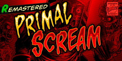 AAAAAAAARRRRRR RAGGGHHHHHHHHH HHHHGRRRRAAAAA GGHHHHHHHHHHAIE EEEEERGHHHHHHHH HHHGRAARGHHGHH HHHHKKKKKAAAAA IIIEEEEEEEEEEEEHHH HHHHHHHHGGGGGG HHHHHHHHRRRARRRRRRRRRGHRRRRR AAAAAAAAAAAARRRRRRR!!!!!!!!!!!!!! Ahhh. That felt good.
 - Mulkshake by PizzaDude.dk,
$20.00Mulkshake is messed up pretty good, and was acutually made on a real bad copymachine! - Chelsnuts by Kimmy Design,
$25.00 Chelsnuts was inspired by old Art Deco typefaces used in poster art back in the 1920s. Yet, in addition it has a playful side that makes it unique to the sharp letterforms typically seen in similar ultra-thick typefaces. Also included are lowercase letters, not typically seen in fonts such as this, and a customized outlined version of the font.
 - Slinces Heart by Nathatype,
$29.00 Slinces Heart is a captivating script font that captures the essence of handwriting with a touch of romance. Each letter in this font is meticulously crafted with fairly high line contrast, adding a dynamic and eye-catching quality to the font. The swinging endings in Slinces Heart add a flourish of creativity and uniqueness. With its smooth and flowing letterforms, this font offers a natural and seamless writing style. For the best legibility you can use this font in the bigger text sizes.
 - Muller by Fontfabric,
$47.00 Muller Specimen: http://bit.ly/mullers Muller Narrow Specimen: http://bit.ly/mullerns The very first sketches of Muller were made about four years ago. In the process they changed to the point where they had nothing in common with the original idea. As it is with most work we do, when we seek perfection, changes are inevitable. It was specifically designed with a wider structure for better appearance in small sizes and the extra attention to the detail was needed for the big sizes. We managed to find the right balance for the perfect universal font family. The family consists of 20 weights, ranging from Thin to Heavy with matching Italics. This font family is suited for everything, ranging from advertising, packaging, editorial and branding, to web and screen projects. Muller comes with a complete range of figure options, including proportional and old style figures, each in its tabular version. It also includes advanced typographic features such as ligatures, fractions, alternate characters, case-sensitive forms, superscripts and subscripts.
 - But by Nicole Fally,
$40.00 Bold, black and square. But was first drawn as a logotype for the magazine "BUT – Bilder und Texte" (pictures and texts) which was published by an experimentally-oriented non-commercial initiative. In consideration of the unusual dimensions of the magazine (6 x 14 cm / 2,4 x 5,5 inch), I decided to fill as much space as possible with the body of type. This formal idea refers to the meaning of the title by blurring the border between legible letters and abstract shapes. Because of its origin, But is ideal for short messages in headline point size. Despite its blocky shapes, But creates a friendly atmosphere. The details are as playful as the restrictions that are given by the concept allow them to be. Punctuation marks and other special characters contrast the boldness of the design since they are matching the thin parts of upper- and lowercase letters. This also avoids gaps when longer texts are set. But is available in open type format and has an extended character set (Latin extended A). Two sets of numerals, one matching the x-height and another one matching the cap-height, are provided.
 - Axeo by Asritype,
$13.00 Axeo is a freeform serif typeface. With more than 500 glyphs for each cut, Axeo supporting wide Latin Base Languages. The font structures is sans-serif typeface. Then, the fonts is made into serif (serifed) using rhombus and adapted/modified rhombus (before remove overlaps) placed on its appropriate positions. This fonts is released first, while the sans-serif is being in process. There are 10 fonts; 5 weight in normal width: Light, Regular, Medium, Bold, and Black; and 4 in semi-condensed: Light, Regular, Medium, Bold and Black, too. The fonts has some minor character variations, all are sets in SS01.There are also standard and discretionary ligatures, arrow, some geometric shapes and ornaments. With its sansserif structure, the Medium, Bold and Black fonts is playful with text effect in various applications such MS Word, CorelDraw or others to enhance the appearance. Its serif form will make unique enhancements. Thus, the fonts is suitable for Branding, logos, cards, advertisements, banners, display and more; for the main texts or its companions. While the light, regular and medium fonts can also be used as description text, card text, note, caption and longer non-formal texts or other usages.
 - Nastarkib by Arabetics,
$39.00 An isolated typeface design with a calligraphic flavor. The Nastarkib font family employs visual features from the Urdu Persian Nastaliq Calligraphy. Visual connectivity is accomplished by overlapping glyphs with downward slopes. This font family has four members including normal and bold weights with two styles each, regular and left-slanted italic styles. This font family design follows the guidelines of Mutamathil Taqlidi type style with one glyph for every basic Arabic Unicode character or letter, as defined in the latest Unicode Standards, and one additional final form glyph, for the freely-connecting letters in traditional Arabic cursive text. Nastarkib employs variable x-height values. It includes only the Lam-Alif ligatures. Soft-vowel diacritic marks, harakat, are selectively positioned. Most of them appear by default on the same level, following a letter, to ensure that they would not interfere visually with letters. Tatweel is a zero-width glyph. Keying the tatweel key before Alif-Lam-Lam-Ha will display the Allah ligature. Nastarkib includes both Arabic and Arabic-Indic numerals, in addition to standard punctuations.
 - Carlino by Pío Pío,
$17.00 Carlino is named after the cutest dog on earth. Why? Because it’s the cutest font ever made. Especially intended for stationery use, it’s loaded with lots of alternates and ligatures, not only in the lowercase but in the uppercase. All of them are Open-Type programmed, so the possibilities of having something unique are endless. Following nowadays trend, Carlino is a multi-layered font: shades, holes and dots were made to work alone or all together with fantastic results! The way it works is so easy that It’s impossible not to enjoy it: Just type a word; then the same one set in another style and voilà! The font has also a lot of sweet ornaments to embellish your projects. Find inside: hearts, fleurons, party icons, flags, and the funniest animals. To accompany Carlino, there’s nothing better than Carlino Capitals. Its cute flavor makes everything more lovely. Have fun with Carlino and oh! don't forget to feed this little pug or it will bark all day long! Special thanks to Maximiliano Sproviero, whose advice helped me make this dream come true.
 - Aureata by preussTYPE,
$30.00 Whenever I've stayed in Munich my friend Michael Bundscherer and I go on a typographical expedition. When we talk about that, we remember the bygone world of sign painter. On one of the facades of a furniture shop in Munich, you can discover the lettering of the name in golden letters. This one convinced us because of the simple elegance Art Deco. These letters on the facade are in any case the character set, which forms the basis of this document. The missing (especially the lowercase letters and the numbers) were modeled. The "OPEN" called version tries to replicate the 3-D effect. The font is particularly suitable for shorter texts and headlines.
 - Down Home JNL by Jeff Levine,
$29.00 In the October 31, 1920 edition of Wid's Daily (the predecessor to The Film Daily), a block of ad copy from a 1920 film called "Down Home" had the text printed in such a fluent pen-lettered style that a bit of a shortcut was used at the beginning of the design process for this typeface. Normally, font inspirations are redrawn [and not by simply using auto-trace] except under specialized circumstances like this one where that feature is a help, rather than a replacement for the creative process. The entire block of text copy was auto-traced, then the necessary letters were selected from the available wording and cleaned up to remove any sharp points and irregular curves in an effort to make the end results as close to the original and unusual hand-drawn text. From there the missing characters needed to produce a finished type font were created utilizing the standard methods of drawing and font construction. The end results turned out very well. Using the film's title as its namesake, this design is now available digitally as Down Home JNL in both regular and oblique versions.
 - Caffe by IHOF,
$24.95 Caffe was originally designed for the Artz Gallery Cafe in Budapest Hungary. The design is a contemporary handwriting style adapted from examples in lettering exercise books. It has been redrawn and expanded into six styles. The four weights were created by drawing the style using different mediums: Cappuccino in pen, Pastry in felt-tip, Lemonade in brush, and Tobacco—the original—in pencil. Poster and Poster Inline round out the family and are well suited for display purposes. This font family is perfect for bistro menus or other European-flavored poster and print design.
 - Farm Doodles by Outside the Line,
$19.00 Farm Doodles... perfect collection of illustrations to be used for everything from the farm to table movement to the current weddings on a farm trend. 30 illustrations of farm animals... beehive, fish, bunny, chickens, cows, goat, sheep, pig and horse. Farm buildings, weather vane, windmill, tractor, milk can, hay bale, trees. And food... tomato, carrots, peas, spinach, apples, beets. Mix and match with other Outside the Line illustration fonts.
 - Boldoni by Forte Type,
$4.90 Boldoni is like a caricature: it brings with itself exaggerated elements of the modern typefaces, that has as main names Giambattista Bodoni and François-Ambroise Didot. Boldoni takes to the limit its width and serifs, causing a ultra fat type feeling, and its styles causes a monochromatic effect that remember the colors Black, Gray and White. Boldoni is good for titles, initials, drop caps, lettering, posters and vertical writing.
