10,000 search results
(0.033 seconds)
- Template Moderne JNL by Jeff Levine,
$29.00 The A.B. Dick Company was a manufacturer of mimeograph duplicating machines which produced copies by the process of transferring ink through an etched wax stencil onto paper. Customers had the option of purchasing various size and style lettering guides in order to create eye-catching headlines or announcements on their print projects. One such guide called ‘Modern Display’ featured a lettering style resembling Futura Black with added serifs. This is now available as Template Moderne JNL, in both regular and oblique versions.
 - Black Starsdust by Genesislab,
$15.00 Black Starsdut is a unique and modern combination serif typeface that is complemented by blend alternatives that give it a luxurious and unique style. This font is perfect for branding, logos, invitations, watermarks and more. The Black Starsdut font comes in a duo font style, thin script, and bold. Full Font including Upper & lower case, Ligature, discretionary, numbers, soup script, super script punctuation, Alternative Swash & Multilingual Support. If you have any questions, don't hesitate to get in touch. thank you
 - Cygnus by JVB Fonts,
$24.95 A font face with cyber, spacial, and aerial connotations that offers a decisive futuristic and techno spirit. Available in two stylish versions, clear and rusty. With one alternate for lowercase /a/ and more diacritics and ligatures and extended range glyphs and more new stylish alternates, Cygnus can be used in titles and display text that require a futuristic and dynamic style. Recommended for games, presentations, or any graphic design pieces that reveal and need futuristic, techno, spacial, aerial and/or Sci-fi style.
 - Corset Pro by DBSV,
$67.00 The Corset Pro is not another font, but not exactly and the same, as the previous two (Khamai Pro, Aeolus Pro) but is simple a different... But it has common elements and is based on two earlier. A new style added is Inlier, has this advantage engagement with Βlack style in the same manner explained in Aeolus Pro. And this series is composed and includes 12 fonts with 625 glyphs each, with true italics and supports Latin, Greek and Cyrillic.
 - Aderyn by Hanoded,
$15.00 Aderyn is a hand drawn, elegant font with a light touch to it. Aderyn is soft and sleek, but also comes in bolder styles to give a little extra oomph to your designs. Aderyn is Welsh for 'bird', a language I meant to master, but never took beyond 'good morning', 'bird' and 'cat'. I know, it's pathetic… Aderyn comes in 12 styles, all of which have kerning, stylistic and contextual alternates for both lower and upper case letters. It even has a smiley!
 - Milenium by FadeLine Studio,
$15.00 This is a new modern calligraphy font in casual and simple style. This font is italic and semibold that is made slowly and thoroughly which aims to convey the character of writing that is elegant, neat, simple, bold and still stylish. With a style like this, this font will be suitable in use for logo's, branding projects, homeware designs, product packaging, mugs, quotes, posters, shopping bags, logo's, t-shirts, book covers, name card, invitation cards, greeting cards, and all your other lovely projects.
 - Adriane Swash by Typefolio,
$59.00 The Swash version of Adriane Text features the best characteristics of this lineage, without losing the strong personality and elegant design featuring in your text styles, Adriane Swash brings a fancy look to this classic style. The family comes with a complete character set in Uppercase, Lowercase and Small Caps, and the Swash option can be activated through the OpenType features panel, including glyphs initial, intermediate and final, plus a wide range of stylistic ligatures, alternate glyphs, ornaments and languages.
 - Ceramika by Santi Rey,
$25.99 Ceramika is a modern tribute to Old Style typefaces. This design is inspired by the letterforms of the serif faces found in history books from the beginning of the 20th-century. Its sturdiness and generous X-Height makes it bold and compact; while the high-contrast strokes and recognisable shapes makes it extremely readable. All this makes Ceramika a really versatile font, perfect for logos, headlines and even body copy. It comes in 6 different weights and 2 styles — Standard and Italic.
 - Skyscraper by Fontop,
$12.00 Introducing the new serif and sans serif typeface SKYSCAPER. Inspired by NY city this elegant, simple, yet distinctive styles look great in posters, leaflets, books, magazines, presentations as well as logos and blog posts. The font also has two additional styles with different design of serifs. What is included in the pack of font family: Skyscraper Condensed Skyscraper Condensed Serif One Skyscraper Condensed Serif Two The font family is Latin multilingual and has uppercase letters, lowercase letters, numbers and basic punctuations.
 - Sultan Ruqah by Sultan Fonts,
$50.00 Sultan Ruqah is a attracting font, Designed by Sultan Maqtari. This is one font of the Sultan Fonts families that supports a variety of scripts including Arabic, Persian, Urdu, Uthmani, and Kurdish. The Sultan Ruqah has its own family with 8 unique fonts varying in weights and width. All characters, punctuation and styling have all been improved keeping in mind the required feel and beauty of the font for a wide corporate use, The 8 fonts include lots of styles.
 - SF Saladin by Sultan Fonts,
$19.99 Saladin font family is designed to be used in broad writing and short sentences. It is an ornate heading font with minimal details. Its domain is stationery, logos, branding, ad design, and posters, and it can be paired with a range of other font styles to create different moods. The font family is available in 4 styles: Saladin, Saladin-bold, Saladin-curl, and Saladin-rolled The Saladin font family supports Arabic, Latin, Persian, and Urdu. Greetings to my brother Saladin
 - Hillstown by Letterhend,
$13.00 Hillstown Font Family is a font collection that contains three different styles that will perfectly complement each other. You will get script, sans, and condensed sans in a clean and aged version for each style. The classic feel is really perfect when you need a typeface for a logotype, apparel, invitation, branding, packaging, advertising, and more. Hillstown comes in uppercase, lowercase, with punctuations, symbols and numerals, 09 stylistic set alternate, ligatures. There is multi-lingual support and Hillstown is already PUA encoded.
 - Warrior by CastleType,
$59.00 Warrior is a chunky typeface design inspired by a Russian Egyptian-style block alphabet (original designer unknown). Now available in seven weights (Hairline, Extra Light, Light, Medium, Regular, Bold, Black) in addition to three decorative styles: Shaded (3-dimensional), Inline, and Open. With its blocky letters and stable slab serifs, Warrior will add a bold, masculine look to your design. All members of the Warrior family support most European languages including modern Greek, and, of course, languages that use the Cyrillic alphabet.
 - Elvian Andreani by Scratch Design,
$9.00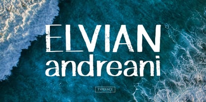 Elvian Andreani is a handwritten font with board marker style, and an authentic texture and casual look and vintage style. This font is useful in various designs such as quotes, menus, logos, branding, clothing and other designs with casual or vintage concept. Elvian Andreani also includes support for multiple languages. Feature: - Uppercase & Lowercase - Numbers - Punctuation - Multilingual Support (ÀÁÂÃÄÅÇDÐEÈÉÊËIÌÍÎÏNÑOØÒÓÔÕÖUÙÜÚÛWYÝŸỲŸÆŒßÞþ) Support in Mac and Windows OS, Easy to install We hope you like it and thank you so much for purchase :) Scratch Design
 - Skratchbook by CozyFonts,
$30.00 Skratchbook is a new handwritten font from the sketch pad of designer Tom Nikosey of CozyFonts. The family exists in 3 versions, Regular, Italic, & Back Italic. This font is a casual, coarse style meant to be used for personality and spontaneity. It's style conjurs anything from quick grocery lists to Halloween Party invites. It maintains amazing legibility in small sizes and it's true personality is revealed the larger it is set! Hoping this font finds your voice! Skratchbook, New from CozyFonts Foundry.
 - Sincerity Stencil by Océane Moutot,
$32.90 Sincerity Stencil is the new extension of the typeface Sincerity. It's a fierce and elegant typeface identified by its high contrast, sharp shapes and triangular. The stencil component of this new version will add originality to your designs. Its large variety of glyphs, including accents, old-style numbers and ligatures will give uniqueness to your designs. It's a great fit for branding, magazines, newspapers, and so on. Sincerity Stencil is available in 16 styles, from thin to black in roman and italic.
 - Aden by Sultan Fonts,
$19.99 Aden is An Arabic typeface for desktop applications. Aden is Modern typeface style. The font comes in two styles: normal and bold. The design is open, calligraphic, and very dynamic. This makes it suitable for large display sizes, especially in the area of advertising, while still functioning well as a text face. The font includes a matching Latin design and support for Arabic. It also includes proportional and tabular numerals for the supported languages. Aden typeface comes with many opentype features.
 - Whitenights by Linotype,
$29.99Whitenights is a contemporary text family, which was developed by the prolific Swedish typographer Lars Bergquist in 2002. Containing five weights (11 different fonts total), this family contains every tool you need to set splendid text. The base font of the family is Whitenights Regular, a reliable face designed in the old style manner. It ships in OpenType format, with old style figures. Whitenights Ligatures Regular is a supplementary font, which contains many extra ligatures (e.g., ffb, ffk, tt, and fj) whose use will improve the color" of a page of text set in Whitenights Regular. Whitenights Regular may be accented by combination with Whitenights Small Caps, Whitenights Italic, Whitenights Bold, and/or Whitenights Bold Italic. The Whitenights Italic, Bold and Bold Italic styles all have supplementary Ligature fonts available for purchase, similar to the Whitenights Ligatures Regular face described above. For larger, headline text, the specially designed Whitenights Titling is quite useful. This titling font has been optically redrawn and respaced for use in large sizes. Naturally, it has its own supplementary Ligature font as well. In books, magazines, and newsletters this font is a great display companion to the rest of the Whitenights family. Its use in conjunction with the text faces will make your typographical compositions more sophisticated. Last but not least in the Whitenights family is Whitenights Math, which contains many additional mathematical and logical glyphs not found in a standard font's character set. Used together, the above 12 styles can set almost any text or math-based document. The entire family is included in the Take Type 5 collection from Linotype GmbH." - Brillig by Scholtz Fonts,
$19.00 Brillig is a loose and informal handwriting font. It comes in four flavors, each of which has a very different feel. Brillig Gimble: more formal in that the characters are interconnected as in cursive script. To further enhance this effect, the characters have been created with a slightly "blobby" pen which provides a suggestion of precision. Brillig Earth: is bold and strong. It is more "down-to-earth" than the other styles, however, the boldness is tempered with quite wispy ends (terminuses) to the characters. It conveys a suggestion of speed and strength. Brillig Aire: is the most delicate and ethereal of the styles. Think of fairies, dandelions and dragonflies and you have an idea of what Brillig Aire conveys. Not only are the characters very light in weight, but they terminate in a wispy, delicate end. In spite of all this, Brillig Aire is very readable and can be used in a variety of contexts. Brillig Brave: is quite like Gimble in its feel with one important difference -- the characters are not connected as in cursive script. Each character stands alone. Brillig Line: is a clean, lightweight style using a mono width line for an informal, handwritten feel. There is a collection of the above four styles that is attractively priced and gives you the ability to use these four fonts in a variety of ways within the same document. The font is particularly useable for the promotion of products aimed at designers of: wedding invitations, party invitations, young clothing ranges, magazines, cosmetic packaging. It has been carefully letterspaced and kerned. All upper and lower case characters, punctuation, numerals and accented characters are present.
 - Hello Molarine by Zeenesia Studio,
$16.00 Hello Molarine is a calligraphic script font that comes with a lovely alternative character. mix of copper calligraphy in a handlettering style. Designed to convey an elegant style. Shocking Script is attractive because it is smooth, clean, feminine, sensual, glamorous, simple and very legible. Its classic style is very suitable to be applied to all types of formal items such as invitations, labels, menus, logos, fashion, make up, stationery, letterpresses, romantic novels, magazines, books, greeting / wedding cards, packaging, labels.
 - Megapolis by Artisticandunique,
$9.00 Megapolis - Sans Serif Font Family - Multilingual support - 16 Styles With its elegant and clean structure with 16 styles and multilingual supports, you can easily use the sans serif font feature in many areas. From body text to big headlines, from classic to modern and bold styles, you can develop your projects. Ideal for books and magazines, magazine covers, editorials, headlines, websites, logos, branding, advertising and more. You can create your unique designs with this font. Have a good time.
 - Ashford by Fenotype,
$20.00 Ashford is a bold serif type and its matching Italic. Ashford packs plenty of timeless charm and elegance. As a display style it works best in headlines, posters and as a logotype. Ashford conveys a message of style and inner knowledge. Ashford is equipped with several OpenType features: Keep Standard Ligatures and Contextual Alternates on to prevent certain characters from colliding and spice up with Swash, Stylistic or Titling Alternates. Both styles come with more than 50 alternate characters.
 - Mangan by Hoftype,
$49.00 Mangan is a new text face which combines classical rationality with contemporary design. Mangan appears dynamic, elegant, vivid and provides a high standard of functionality. The Mangan family comprises 14 styles and is well suited for ambitious typography. It comes in OpenType format with extended language support. All weights contain small caps, ordinals, ligatures, proportional lining figures, tabular lining figures, proportional old style figures, lining old style figures, matching currency symbols, fraction- and scientific numerals, and arrows.
 - Stereonic by Mint Type,
$30.00 Stereonic is a geometric display sans influenced by Art Deco style. Its 38 fonts across 5 weights offer the possibility to convey numerous moods and styles typical for different decades. As the name suggests, the music posters were considered as the perfect application for this typeface, however using it in magazines and other editorial will definitely add more style. A variety of included ligatures and alternatives will also make Stereonic a perfect choice as the base for logotypes.
 - Kasepi Sans by Yukita Creative,
$15.00 Kasepi Sans Display Typeface is a font that combines a modern style with a classic touch. With bold lines and balanced proportions, this font gives off an attractive and classy impression. Great for use in titles, headers and headline designs that need a strong visual appeal. This font style is a font that combines strength, clarity, and elegance. With its modern style and classic touch, it is ready to give your design an attractive and classy impression.
 - Shining Holiday by Zeenesia Studio,
$15.00 Shining Holiday is a calligraphic script font that comes with a lovely alternative character. mix of copper calligraphy in a handlettering style. Designed to convey an elegant style. Shocking Script is attractive because it is smooth, clean, feminine, sensual, glamorous, simple and very legible. Its classic style is very suitable to be applied to all types of formal items such as invitations, labels, menus, logos, fashion, make up, stationery, letterpresses, romantic novels, magazines, books, greeting / wedding cards, packaging, labels.
 - Florensans by Milan Pleva,
$18.00 Florensans is an all caps display sans serif typeface in elegant & modern style with ligatures, special alternative glyphs and old style figures. The Florensans family contains three weights: Light, Regular and Medium. Florensans is ideal for headlines, headers, logos, labels, packaging, postcards, presentations, magazines, invitations, etc. Features: 3 Weights - Light, Regular and Medium Basic latin alphabet A-Z 64 Ligatures & Alternates 56 Accented characters Numbers, Punctuation, Currency, Symbols, Math symbols & Diacritics Old style figures Enjoy Florensans!
 - Krul by Re-Type,
$99.00 ‘Krul’ is a typographic interpretation of the lettering style created by Dutch letter painter Jan Willem Joseph Visser at the end of the 1940s, which decorated the traditional brown bars of Amsterdam. In the beginning, these letters were strongly associated with the pubs connected to the Amstel brewery, given that Visser was the company’s official painter. As the years passed, the style became increasingly popular, and various business owners in Amsterdam and other Dutch and Belgian cities also commissioned its use. In the 1970s and 1980s, Leo Beukeboom, another talented letter painter, continued and expanded this lettering tradition while employed under the Heineken brand. Much of his work can still be found in the Jordaan and De Pijp neighborhoods in Amsterdam. The Amsterdamse Krulletter, or Amsterdam’s curly letter, is strongly inspired by the calligraphic works of the 17th century Dutch writing masters, of which Jan van den Velde was a central figure. However, distinct characteristics of this style, for example, its unusual and beautiful ‘g’, originate from a model that was published by Johannes Heuvelman in 1659, which J. W. J. Visser referenced. Typographic circles have somehow overlooked the Amsterdamse Krulletter and its heritage. The Dutch calligraphic hands preceded and influenced the formal English penmanship which has inspired numerous typefaces in the Copperplate style. In contrast, the models from van den Velde, Heuvelman, and Jean de la Chambre, among others, are a missing chapter in Dutch typographic history, and had never been turned into typefaces until now. Conscious of the cultural and identity issues that arise in reviving a unique style, and concerned about the speed with which the lettering style was disappearing, Ramiro Espinoza focused the project of designing ‘Krul’ on digitally recreating the calligraphic complexity of these beautiful letters. Created through several years of research, ‘Krul’ is not a direct digitization of the Amsterdamse Krulletter, but instead, an interpretation that incorporates numerous alternative characters absent in the original model, and improves upon details where necessary, resulting in an optimal performance on the printed page. The typeface is presented in Open Type format, with an abundance of intricate ligatures, fleurons, and swashes, which permit the creation of numerous calligraphic effects. The very high contrast and rhythm of the strokes in this typeface make it especially suited for media applications conveying a sense of elegance and sophistication. Designers of feminine magazines, advertisements, and corporate identities within the fragrance and fashion industries will find in this typeface to be an extremely useful and appropriate resource.The great Amsterdamse Krulletter is finally back, and we are proud to make it available to you.
 - Castillian by Haksen,
$20.00 Castillian is the family of modern serif style with Uppercase and Lowercase feel nice balanced. Provide alternates font in uppercase and lowercase variant style make the design letter looks incredible. Honestly it works perfectly for headlines, logos, posters, packaging, T-shirts and much more. Recommended to use in Adobe Illustrator or Adobe Photoshop with opentype feature. Ligatures feature is default setting in Adobe Illustrator or Adobe Photoshop in Uppercase character. So when you want not to use the ligatures. Open glyphs panel : In Adobe Photoshop choose tool Window Character and then please klick fi symbol In Adobe Illustrator choose tool Window Type Open Type and then please klick fi symbol How to access Alternates Character? Open glyphs panel : In Adobe Photoshop choose tool Window glyphs In Adobe Illustrator choose tool Type glyphs If you have questions, just send me a message and I’m glad to help. Have a great day, Haksen
 - Alteron by Absonstype,
$17.00 ALTERON is the classic display serif style with uppercase and lowercase look feel nice balanced. Provide alternates and ligatures font in variant style make the design letter looks nice. Honestly it works perfectly for headlines, logos, posters, packaging, T-shirts and much more. Recommended to use in Adobe Illustrator or Adobe Photoshop with opentype feature. Ligatures feature is default setting in Adobe Illustrator or Adobe Photoshop in Uppercase character. So when you want not to use the ligatures. Open glyphs panel : In Adobe Photoshop choose tool Window Character and then please click fi symbol In Adobe Illustrator choose tool Window Type Open Type and then please click fi symbol How to access Alternates Character? Open glyphs panel : In Adobe Photoshop choose tool Window glyphs In Adobe Illustrator choose tool Type glyphs If you have questions, just send me a message and I’m glad to help. Have a great day, Absonstype
 - Kagestone by Absonstype,
$16.00 Kagestone is the classic display serif style with Uppercase and Lowercase feel nice balanced. Provide alternates font in lowercase variant style make the design letter looks nice. Honestly it works perfectly for headlines, logos, posters, packaging, T-shirts and much more. Recommended to use in Adobe Illustrator or Adobe Photoshop with opentype feature. Ligatures feature is default setting in Adobe Illustrator or Adobe Photoshop in Uppercase character. So when you want not to use the ligatures. Open glyphs panel : In Adobe Photoshop choose tool Window Character and then please click fi symbol In Adobe Illustrator choose tool Window Type Open Type and then please click fi symbol How to access Alternates Character? Open glyphs panel : In Adobe Photoshop choose tool Window glyphs In Adobe Illustrator choose tool Type glyphs If you have questions, just send me a message and I’m glad to help. Have a great day, Absonstype
 - Avemone by Absonstype,
$16.00AVEMON is the elegant classic serif style with uppercase and lowercase feel nice balanced. Provide alternates and ligatures font in variant style make the design letter looks nice. Honestly it works perfectly for headlines, logos, posters, packaging, T-shirts and much more. Recommended to use in Adobe Illustrator or Adobe Photoshop with opentype feature. Ligatures feature is default setting in Adobe Illustrator or Adobe Photoshop in Uppercase character. So when you want not to use the ligatures. Open glyphs panel : In Adobe Photoshop choose tool Window Character and then please click fi symbol In Adobe Illustrator choose tool Window Type Open Type and then please click fi symbol How to access Alternates Character? Open glyphs panel : In Adobe Photoshop choose tool Window glyphs In Adobe Illustrator choose tool Type glyphs If you have questions, just send me a message and I’m glad to help. Have a great day, Absonstype - Rottering by Absonstype,
$20.00 Rottering is the elegant modern serif style with uppercase and lowercase feel nice balanced. Provide alternates and ligatures font in variant style make the design letter looks nice. Honestly it works perfectly for headlines, logos, posters, packaging, T-shirts and much more. Recommended to use in Adobe Illustrator or Adobe Photoshop with Open Type feature. Ligatures feature is default setting in Adobe Illustrator or Adobe Photoshop in Uppercase character. So when you want not to use the ligatures. Open glyphs panel : In Adobe Photoshop choose tool Window Character and then please click fi symbol In Adobe Illustrator choose tool Window Type Open Type and then please click fi symbol How to access Alternates Character? Open glyphs panel : In Adobe Photoshop choose tool Window glyphs In Adobe Illustrator choose tool Type glyphs If you have questions, just send me a message and I’m glad to help. Have a great day, Absonstype
 - Rectoba by Absonstype,
$16.00 Rectoba is the sporty sans style with uppercase and lowercase looks and feel nice balanced. Provide alternates and ligatures font in variant style make the design letter looks nice. Honestly it works perfectly for headlines, logos, posters, packaging, T-shirts and much more. Recommended to use in Adobe Illustrator or Adobe Photoshop with Open Type feature. Ligatures feature is default setting in Adobe Illustrator or Adobe Photoshop in Uppercase character. So when you want not to use the ligatures. Open glyphs panel : In Adobe Photoshop choose tool Window Character and then please click fi symbol In Adobe Illustrator choose tool Window Type Open Type and then please click fi symbol How to access Alternates Character? Open glyphs panel : In Adobe Photoshop choose tool Window glyphs In Adobe Illustrator choose tool Type glyphs If you have questions, just send me a message and I’m glad to help. Have a great day, Absonstype
 - Marble by URW Type Foundry,
$59.99 Marble is part of Asterisk Type Collection by URW Type Foundry. Marble is a modern sans serif with a distinct character and comes in 108 styles plus Variable Fonts. It grew from the desire to create full bodied letters in contrast to the economy of most sans serif faces. Designed for corporate and publishing use it is rounded and approachable, its three styles (Condensed, Normal and Wide) range from slender elegance to warmth and playfulness without ever being informal. Designed by Alessia Mazzarella and Vaibhav Singh, Marble derives its character from the generous roundness of the x-heights which is balanced by the striking horizontal or vertical cuts to the terminals. The result is a readable font that encourages the eye to move from one shape to the next and that offers a range of possibilities for digital and print. The Marble family has nine weights in Latin for each variant. Eminently versatile, it’s ideal for establishing hierarchies of information with a wealth of choices for headlines, subheadings, captions and body copy styles that are all in harmony with each other. The Wide style allows headlines to be set with width and presence.
 - Khatt by Arabetics,
$39.00 Khatt tries to mimic the concept behind the meaning of the Arabic word Khatt: a straight horizontal line. The word Khatt is also the word for calligraphy in the Arabic language. Even though Khatt is a cursive style font it offers clearly distinguished and visually unified letter shapes in every position of a word. Khatt supports all Arabetic scripts covered by Unicode 6.1, and the latest Arabic Supplement and Extended-A Unicode blocks, including support for Quranic texts. It comes with five weights, regular, medium, bold, light, and ultra-light. Each weight has normal and left-slanted “italic” styles. The script design of this font family follows the Arabetics Mutamathil Taqlidi style and utilizes varying x-heights. The Mutamathil Taqlidi type style uses one glyph per every basic Arabic Unicode character or letter, as defined by the Unicode Standards, and one additional final form glyph, for each freely-connecting letter in an Arabic text. Khatt includes the required Lam-Alif ligatures in addition to all vowel diacritic ligatures. Katts’s soft-vowel diacritic marks (harakat) are positioned with most of them appearing on similar lower or upper positions to emphasize they are not part of letters.
 - Dilemma by Sudtipos,
$39.00 Dilemma is a sans/sans serif type system with 42 styles; it is inspired by the anonymous Polyphème, Cyclopéen and Extra Condensé designs from the early 1900s at the Peignot Fonderie. From these initial points of reference, Sudtipos went further and reimagined these projects for an actual use by blending them into a unique and complex type system. Dilemma is defined as ‘a situation in which a difficult choice has to be made between two or more alternatives, especially ones that are equally undesirable’ and that is exactly how we designed this font. We created a workhorse system where each style functioned well alone but would be more powerful when working as a team, pairing the sans styles with the serifs. Dilemma comes in 3 different widths and 7 weights in both the sans and the serif, ranging from the more economical yet legible condensed styles, to the opulent bold and expanded weights. Dilemma also contains 2 Variable Fonts. We imagine Dilemma being used in a limitless array of graphic projects including identity systems, digital platforms, public spaces, editorial design and beyond. Now the Dilemma is yours.
 - Galvantur by Ivangard Studios,
$12.00 Galvantur is a sans serif font, suitable for a wide range of applications. The main characteristic of this font is the slightly alien feel it can invoke, allowing it to really appear different and stand out, comparative to what other sans serifs may look like. The multiple styles included can further help customize your designs and projects, whether it's a body of text or an attention grabbing title. For example switching a block of text from regular style to oblique, can drastically change the overall appearance and feel of said text. Comes in 7 different styles - Regular, Oblique, Bold, Bold Oblique, Outlines, Bold Outlines and Oblique Outlines. To get an idea of the various styles, please check out the preview pictures or use the preview field to type in text. A full list of the glyphs included in this font can also be seen in the preview images. Galvantur supports Latin and Cyrillic based languages. The font includes a single alternative character for the letter "h". Because of the lack of ligatures and alternates, the font is rather standardized and will work with any and all software/applications.
 - Refresh by Scholtz Fonts,
$12.00 Refresh was inspired and partly based on handwritten text from advertisements for a popular cola-based soft drink from the 1950s. I designed the missing characters in the handwriting style of the original. The Refresh family comes in three styles: - Lite- possibly the most elegant of the three styles -- use at larger sizes for greater legibility; - Med -of intermediate weight - more legible than Lite; - Blak - for bolder statements and best readabilty. Refresh, with its three styles, is ideal for any display work needing a feminine, handwritten effect. Use it for product branding, book covers, invitations, greeting cards where you're looking for charm and movement. Refresh has not been designed to be used with capital letters placed next to one another: it is not advisable to use text in "ALL CAPS". The best effects for headings and subheads are obtained with an initial upper case letter followed by lower case characters. If you are using upper and lower case then it is not necessary to use kerning. Refresh contains over 250 characters - (upper and lower case characters, punctuation, numerals, symbols and accented characters are present). It has all the accented characters used in the major European languages.
 - Bodrum Sweet by Bülent Yüksel,
$19.00 Bodrum Collection: 1- Bodrum Sans 2- Bodrum Sweet 3- Bodrum Stencil 4- Bodrum Slab 5- Bodrum Styte 6- Bodrum Soft "Bodrum Sweet" is a sans serif type family. Designed by Bülent Yüksel in 2018/19. The font, influenced by style serifs, popular in the 1920s and 30s, is based on optically corrected geometric forms for better readability. "Bodrum Sweet" is not purely geometric; it has vertical strokes that are thicker than the horizontals, an “o” that is not a perfect circle, and shortened ascenders. "Bodrum Sweet" some corner is rounded. These nuances aid in legibility and give "Bodrum Sweet" a harmonious and sensible appearance for both texts and headlines. Bodrum Sweet provides advanced typographical support for Latin-based languages. An extended character set, supporting Central, Western and Eastern European languages, rounds up the family. The designation “Bodrum Sweet 14 Regular” forms the central point. "Bodrum Sweet" is available in 10 weights (Hair, Thin, Extra-Light, Light, Regular, Meduim, Bold, Extra-Bold, Heavy and Black) and 10 matching italics. The family contains a set of 650+ characters. Case-Sensitive Forms, Classes and Features, Small Caps from Letter Cases, Fractions, Superior, Inferior, Denominator, Numerator, Old Style Figures just one touch easy In all graphic programs. Bodrum Sweet is the perfect font for web use. You can enjoy using it.