10,000 search results
(0.03 seconds)
- Grooker by Zanfonts,
$15.00 Grooker is a modern take on sans serif font styles . Perfect for logotypes, signage & branding for apparel, adventure equipment, photography, travel, food & drink, plus so much more. Its timeless semi bold style makes it great for just about any project. Feature: Latin Standard Latin Extension Punctuation Number Symbol Basic Cyrrilic Advance Cyrrilic
 - Fishman by Vozzy,
$10.00 Introducing vintage label font named Fishman. This font has a multilungual characters support (check out all available characters on previews). The font family has six styles: Regular, Shadow, Light, Shadow FX, Light FX, Aged. This font will look good on any vintage styled designs like a poster, T-shirt, label, logo, etc.
 - Klender by Prioritype,
$17.00 Introducing. Klender: The modern and retro styled fonts have some additional alternative characters that make them beautiful. With these 2 styles you can apply them to your branding designs, business cards, posters, social media posts, merchandise and more. Features: Uppercase, Lowercase, Numeral, Punctuation, Multilingual, Alternates & PUA Encoded. Obtained file format: Otf & Ttf. Thanks :)
 - Martian Grotesk by Martian Fonts,
$35.00 Martian Grotesk is a large typeface family originally designed for the screen which consists of a variable font with 2 axes of variation and 63 styles: Condensed to Ultra Wide, Thin to Ultra Black. Aesthetics The font style is characterized by some brutality and assertiveness. Overhanging terminals, a closed aperture, and an almost complete lack of contrast lead to this effect. Additionally, some elements of the letters are especially enlarged. This font gives any text the impression of being a “signature” style. Nevertheless, we still maintain the golden mean between its rebellious nature and readability. Perfect for web development We created Martian Grotesk for the web and digital project world. When laying out web pages, frontend developers are constantly faced with the fact that uneven metrics do not allow text to be evenly placed on some design element, for example, on a button. Instead, they have to compensate in some way, like making the top padding smaller and the bottom padding larger in CSS. This little deal really hurts. Also, if your project adheres to design system principles, you might be unable to stand a lack of systematic approach when working with fonts. We researched and calculated vertical metrics and set them up in a way that guarantees equal space above the cap height and under the baseline. This enables the text labels to be evenly placed on buttons, inputs, lists, and forms. In addition, we found a proper ratio of the letter heights, so, with commonly used font sizes—10, 15, and 20 pixels—the glyph heights stick to the pixel grid. As a result, the letter shapes become sharper, which reduces the load on the reader's eyes and simply looks much better. The typeface also comes equipped with OpenType and TrueType hinting, and Martian Grotesk appears legible on most platforms, even when being rendered in small sizes. When coupled together, all the above features make Martian Grotesk a reasonable choice for any user interface design. Roadmap Martian Grotesk right now is a work-in-progress product. The font is completely ready for professional use, however, many great features are still ahead! For example, support for Extended Cyrillic characters, and italics. Pricing Purchasing an early version of the font presents the opportunity to get it at a very attractive price! That’s because with every new version, costs will go up to reflect the additional value that comes with every release. But after purchasing Martian Grotesk, all its future updates are included for free!
 - Franca by René Bieder,
$29.00 Franca is a neo-grotesk family in nine weights plus matching italics. The inspiration for the design came through the constant interest in new interpretations of the classic grotesk model and a study of "neutral“ typefaces like Helvetica, Univers or Normal Grotesk. During the studies, additional attention was given to the American representatives of the genre, resulting in the initial impetus for a reinterpretation, combining both paths into one contemporary design. This is reflected in the name, blending together the names of the most popular typefaces of each genres, (Fran)klin and Helveti(ca). Due to its large x-height and plain design, the family is perfectly suited for all kinds of text. Its mid-weights are optimized for usage in long paragraphs, while the bolder weights, due to a short descender and ascender, create a compact and confident look in headlines or short copy. In order to create strong and dynamic italics, the oblique glyph shapes come with a faint calligraphic hint, defined by a higher stroke contrast and a steeper connection between stems and arcs in, for example, h n m and u. This is followed by different standard shapes for a and y, supporting the dynamic movement of the lowercase in general. A wide range of OpenType features such as ligatures, old style figures, fractions, case-sensitive shapes and many more, are available for professional and contemporary typesetting. This is completed with eleven alternative glyph sets, enabling a quick customization of the typeface. The family supports up to 92 languages and comes with 500+ glyphs per font.
 - Mid Century Sans by Dharma Type,
$19.99 Mid Century Sans (MCS) is composed of high-geometric shapes. László Moholy-Nagy —professor in the Bauhaus— said “Typography is a tool of communication. It has to be communication in its most intense form. The emphasis must be on absolute clarity since this distinguishes the character of our own writing from that of ancient pictographic forms.” As same as you can see in modern typefaces in the early twentieth century, MCS has very efficient, clear and minima letterforms. There are not any decorative parts in the skeleton of letters. At the same time, Mid Century Sans has one more feature. In the middle of the twentieth century, one big movement which was called Mid-century modern had occurred. The Mid-century modern movement in the U.S. was an American reflection of the International and Bauhaus movements and it was slightly more organic in form and less formal than the International Bauhaus-style. In other words, it was friendly and stylish. We added Mid-century-spices to the Bauhaus-modernism. The basic letter form is geometric yet it has very friendly strokes and human touch. Mid Century Sans consists of 8 weights and their matching Italics for a wide range of usages. Farther, Mid Century Sans is supporting international Latin languages and basic Cyrillic languages including Basic Latin, Western Europe, Central and South-Eastern Europe. Also MCS covers Mac Roman, Windows1252, Adobe1 to 3. This wide range of international characters expands the capability of your works. Lowercase "a" has OpenType stylistic alternates for advanced typography.
 - Verve by Altered Ego,
$65.00Called by some the "Archetype of the millennium", Verve is a seven-weight typeface family. It features a complete Adobe character set with kerning and fit to match. The alternate characters offer some variations on s,f,h,j,k,S,T,Y and others, plus this font has the Euro symbol. Verve is the fourth in an on-going series of condensed typefaces that I’ve been designing since 1989. My concept was to create an elegant condensed typeface that would be a "typeface for the millennium," in style and functionality. At the very core of all my designs is a typographic problem I wanted to solve, or a market niche that I think needs filled. Verve addresses both of those concerns, without copying or borrowing from its predecessors. There’s the challenge of creating a rich and interesting typeface with an austerity of line and elegance of form. I’m a minimalist by nature – but I wanted Verve to have a sensuous feel in certain respects – yet have that sensuality balanced by the uniformity of the uniform character widths. Gottfried Pott always stresses "theme and variation," and "point and counterpoint," and that’s what I’m doing in Verve. What one finds in musical composition is evident in Verve. Perfect for book covers, CD packaging, club flyers, retail packaging (especially bottles!), identity design and multimedia. The adventurous can try it in text, but it will give you a headache. The beauty of Verve is in thesize and weight variations which create a rich typographic texture in this font. - Moon Cresta by Typodermic,
$11.95 Introducing Moon Cresta, a charming typeface with a soft design that’s sure to captivate your audience. The font draws inspiration from the timeless Goudy Sans, while embracing a modern and minimalist style. Moon Cresta’s smooth curves and effortless flow give it a welcoming and friendly vibe, perfect for any design project. Initially, Moon Cresta only came in one style—Regular, which boasts a bold weight that demands attention. However, as designers fell in love with its delicate charm, a lighter weight was later added. To avoid any confusion, the original bold style was still named Regular, and the newer weight became known as Light. So, now you can enjoy the gentle touch of Moon Cresta in two weights—Regular and Light. To take your design to the next level, Moon Cresta also includes discretionary f-ligatures and custom ligatures for KA and RA. Simply use your application’s Discretionary Ligatures feature to access them and enhance the uniqueness of your design. In short, Moon Cresta is the perfect font for those seeking a soft, organic design with a touch of modernity. So why not try it out and see how it can add a touch of warmth to your project? Most Latin-based European writing systems are supported, including the following languages. Afaan Oromo, Afar, Afrikaans, Albanian, Alsatian, Aromanian, Aymara, Bashkir (Latin), Basque, Belarusian (Latin), Bemba, Bikol, Bosnian, Breton, Cape Verdean, Creole, Catalan, Cebuano, Chamorro, Chavacano, Chichewa, Crimean Tatar (Latin), Croatian, Czech, Danish, Dawan, Dholuo, Dutch, English, Estonian, Faroese, Fijian, Filipino, Finnish, French, Frisian, Friulian, Gagauz (Latin), Galician, Ganda, Genoese, German, Greenlandic, Guadeloupean Creole, Haitian Creole, Hawaiian, Hiligaynon, Hungarian, Icelandic, Ilocano, Indonesian, Irish, Italian, Jamaican, Kaqchikel, Karakalpak (Latin), Kashubian, Kikongo, Kinyarwanda, Kirundi, Kurdish (Latin), Latvian, Lithuanian, Lombard, Low Saxon, Luxembourgish, Maasai, Makhuwa, Malay, Maltese, Māori, Moldovan, Montenegrin, Ndebele, Neapolitan, Norwegian, Novial, Occitan, Ossetian (Latin), Papiamento, Piedmontese, Polish, Portuguese, Quechua, Rarotongan, Romanian, Romansh, Sami, Sango, Saramaccan, Sardinian, Scottish Gaelic, Serbian (Latin), Shona, Sicilian, Silesian, Slovak, Slovenian, Somali, Sorbian, Sotho, Spanish, Swahili, Swazi, Swedish, Tagalog, Tahitian, Tetum, Tongan, Tshiluba, Tsonga, Tswana, Tumbuka, Turkish, Turkmen (Latin), Tuvaluan, Uzbek (Latin), Venetian, Vepsian, Võro, Walloon, Waray-Waray, Wayuu, Welsh, Wolof, Xhosa, Yapese, Zapotec Zulu and Zuni.
 - Compiler by Identity Letters,
$39.00 Legible, technical, clear—with a hint of retro: Compiler is a no-frills font family straight from the heart of a microprocessor. Inspired by console typefaces, the humanist sans serif typeface combines a large x-height with striking serifs on certain letters such as i and l. Those serifs evoke the aesthetics of monospace typefaces for programming. Even though Compiler is a proportional typeface, this detail improves glyph recognition and helps differentiate between individual letters. Combined with vertical stroke ends, which allow for particularly even spacing, the serifs make for an extremely legible typeface. (Even in small sizes.) Brand recognition guaranteed: Compiler is ideal for applications that require a mechanical flavor without appearing offish. You can use it for websites, apps, branding, corporate design, annual reports, signage, and many other areas with perfect results. Compiler consists of two font families; the second one is Compiler Plain. In Compiler Plain, the signature letters lose their serifs and the forms of "a" and "g" are simplified. This way, the shapes are neutralized. The technical impression recedes into the background. Both families can be combined smoothly: you might use the standard Compiler fonts for display sizes and Compiler Plain styles for body copy. For total design control, you can toggle each of the defining design elements individually from Compiler to Compiler Plain and vice versa. Just use Stylistic Sets to fine-tune your Compiler fonts. Compiler provides you with 8 weights in 4 variations: Upright, Italics, Plain Upright and Plain Italics. That's a total of 32 fonts. Each style contains more than 860 glyphs, including advanced typographic tools such as proportional and tabular figures (both lining and old-style) or small caps—something you'll rarely find in this genre. Other glyphs are optimized for display sizes, such as circled figures and various arrows. There's also a set of glyphs designed for web use: with symbols for shopping carts, hamburger menus or checkboxes, you can implement your web projects elegantly and consistently without relying on third-party tools (like an external icon font). Powered by highly productive OpenType functions, Compiler is an intermedia workhorse straight from cyberspace.
 - Order by Typodermic,
$11.95 In the world of typography, finding the perfect balance between form and function is the ultimate goal. Enter Order, a condensed, technical plotter-style typeface with Univers proportions that effortlessly marries style and substance. With its contemporary technological aesthetic and octagonal design, Order can blend in seamlessly with the reader’s visual vernacular. But don’t be fooled by its unassuming appearance—this typeface is a powerhouse of precision and consistency. Order’s angular shapes and uniform strokes exude a sense of cold reason that is ideal for technical documents and data-driven content. Its condensed form allows for maximum legibility even at small sizes, making it perfect for charts, graphs, and diagrams. Available in three different weights and italics, Order offers versatility and flexibility that can adapt to any design situation. Whether you’re looking to add a touch of modern sophistication to a branding project or need a reliable font for technical reports, Order is the perfect choice. In a world that demands both style and substance, Order is the typeface that delivers. With its sleek, high-tech look and unparalleled precision, Order will elevate your message and bring a touch of uniformity to your designs. Most Latin-based European writing systems are supported, including the following languages. Afaan Oromo, Afar, Afrikaans, Albanian, Alsatian, Aromanian, Aymara, Bashkir (Latin), Basque, Belarusian (Latin), Bemba, Bikol, Bosnian, Breton, Cape Verdean, Creole, Catalan, Cebuano, Chamorro, Chavacano, Chichewa, Crimean Tatar (Latin), Croatian, Czech, Danish, Dawan, Dholuo, Dutch, English, Estonian, Faroese, Fijian, Filipino, Finnish, French, Frisian, Friulian, Gagauz (Latin), Galician, Ganda, Genoese, German, Greenlandic, Guadeloupean Creole, Haitian Creole, Hawaiian, Hiligaynon, Hungarian, Icelandic, Ilocano, Indonesian, Irish, Italian, Jamaican, Kaqchikel, Karakalpak (Latin), Kashubian, Kikongo, Kinyarwanda, Kirundi, Kurdish (Latin), Latvian, Lithuanian, Lombard, Low Saxon, Luxembourgish, Maasai, Makhuwa, Malay, Maltese, Māori, Moldovan, Montenegrin, Ndebele, Neapolitan, Norwegian, Novial, Occitan, Ossetian (Latin), Papiamento, Piedmontese, Polish, Portuguese, Quechua, Rarotongan, Romanian, Romansh, Sami, Sango, Saramaccan, Sardinian, Scottish Gaelic, Serbian (Latin), Shona, Sicilian, Silesian, Slovak, Slovenian, Somali, Sorbian, Sotho, Spanish, Swahili, Swazi, Swedish, Tagalog, Tahitian, Tetum, Tongan, Tshiluba, Tsonga, Tswana, Tumbuka, Turkish, Turkmen (Latin), Tuvaluan, Uzbek (Latin), Venetian, Vepsian, Võro, Walloon, Waray-Waray, Wayuu, Welsh, Wolof, Xhosa, Yapese, Zapotec Zulu and Zuni.
 - Orliet Pro by Arttype7,
$15.00 Elevate Your Designs with Elegant Luxury Orliet Pro is a meticulously crafted serif font designed to add a touch of elegance and luxury to your visual creations, especially ideal for enhancing the sophistication of logos. This font stands out for its uniqueness, boasting over 50 ligatures and alternative characters with artistic flair. Its well-designed script optimizes your designs, ensuring a seamless integration into your projects. Key Features: Versatile Ligatures and Alternatives: With over 50 ligatures and alternative characters, Orliet Pro provides a wide range of design possibilities. Each character exudes a unique artistic charm, allowing you to customize your text in a myriad of ways. Elegance in Every Detail: The design of Orliet Pro aims for elegance. The serif style adds a touch of class to your projects, making it perfect for creating logos that exude luxury and simplicity simultaneously. Seamless Font Families: Each member of the Orliet Pro font family complements one another effortlessly. Whether you choose the Orliet Pro script or Orliet Pro icons, they work harmoniously to enhance your overall design. Enhanced Design Flexibility: Orliet Pro script and Orliet Pro icons contribute to the ease of design integration. The script is thoughtfully designed to optimize your creative process, while the icons provide additional elements for a professional touch. Cyrillic Alphabet Inclusion: For an added layer of versatility, Orliet Pro includes the Cyrillic alphabet in regular, italic, bold, and bold italic styles. This ensures that your designs can reach a broader audience with diverse language preferences. Optional Details: Design Concept: Orliet Pro was conceptualized to bring an air of sophistication to your designs, with a focus on creating an elegant and timeless serif font. Creation Inspiration: The font draws inspiration from classic design elements, aiming to provide a timeless aesthetic that resonates with a modern audience. Historical Context: While not a revival, Orliet Pro pays homage to the timeless elegance of serif fonts, adding a contemporary twist to meet the demands of today's design trends. Elevate your designs with the timeless elegance of Orliet Pro. Explore the possibilities of serif and script styles, accompanied by convenient font icons, all seamlessly integrated into one versatile font family. Embrace luxury and simplicity in every character.
 - Gymkhana by Typodermic,
$11.95 Introducing Gymkhana, a clean and simple sans-serif typeface that brings a touch of architectural elegance to your design. Inspired by twentieth-century American lettering, Gymkhana is the perfect typeface for your next project. Gymkhana’s clarity is immediately evident in its design. The typeface’s large x-height and generous width make it incredibly easy to read, even at small sizes. With its clear lines and easy-to-read characters, Gymkhana adds a feeling of solemn clarity and friendly professionalism to any message. But Gymkhana isn’t just easy to read; it’s also versatile. With old-style numerals, tabular (monospaced) numerals, and old-style tabular numerals in OpenType-capable applications, you can customize the typeface to suit your needs. Gymkhana comes in six weights and italics, so you can choose the perfect style for your project. Whether you’re designing a logo, a website, or a printed document, Gymkhana has you covered. So why wait? Try Gymkhana today and experience the power of clear, clean typography in your design. Most Latin-based European, Vietnamese, Greek, and most Cyrillic-based writing systems are supported, including the following languages. Afaan Oromo, Afar, Afrikaans, Albanian, Alsatian, Aromanian, Aymara, Azerbaijani, Bashkir, Bashkir (Latin), Basque, Belarusian, Belarusian (Latin), Bemba, Bikol, Bosnian, Breton, Bulgarian, Buryat, Cape Verdean, Creole, Catalan, Cebuano, Chamorro, Chavacano, Chichewa, Crimean Tatar (Latin), Croatian, Czech, Danish, Dawan, Dholuo, Dungan, Dutch, English, Estonian, Faroese, Fijian, Filipino, Finnish, French, Frisian, Friulian, Gagauz (Latin), Galician, Ganda, Genoese, German, Gikuyu, Greenlandic, Guadeloupean Creole, Haitian Creole, Hawaiian, Hiligaynon, Hungarian, Icelandic, Igbo, Ilocano, Indonesian, Irish, Italian, Jamaican, Kaingang, Khalkha, Kalmyk, Kanuri, Kaqchikel, Karakalpak (Latin), Kashubian, Kazakh, Kikongo, Kinyarwanda, Kirundi, Komi-Permyak, Kurdish, Kurdish (Latin), Kyrgyz, Latvian, Lithuanian, Lombard, Low Saxon, Luxembourgish, Maasai, Macedonian, Makhuwa, Malay, Maltese, Māori, Moldovan, Montenegrin, Nahuatl, Ndebele, Neapolitan, Norwegian, Novial, Occitan, Ossetian, Ossetian (Latin), Papiamento, Piedmontese, Polish, Portuguese, Quechua, Rarotongan, Romanian, Romansh, Russian, Rusyn, Sami, Sango, Saramaccan, Sardinian, Scottish Gaelic, Serbian, Serbian (Latin), Shona, Sicilian, Silesian, Slovak, Slovenian, Somali, Sorbian, Sotho, Spanish, Swahili, Swazi, Swedish, Tagalog, Tahitian, Tajik, Tatar, Tetum, Tongan, Tshiluba, Tsonga, Tswana, Tumbuka, Turkish, Turkmen (Latin), Tuvaluan, Ukrainian, Uzbek, Uzbek (Latin), Venda, Venetian, Vepsian, Vietnamese, Võro, Walloon, Waray-Waray, Wayuu, Welsh, Wolof, Xavante, Xhosa, Yapese, Zapotec, Zarma, Zazaki, Zulu and Zuni.
 - Better Faster by Omotu,
$18.00 BETTER FASTER! A handwritten display brush font. Comes with 2 styls, regular & slant. BETTER FASTER font is suitable for branding, logotype, apparel, T-shirt, Hoodie, product packaging, quotes, flyer, poster, book cover, advertising, etc. Whats Include? 1. Opentype support 2. Multilingual support 3. PUA encoded 4. Features: Uppercase, lowercase, numerals, punctuations, alternate, and ligatures 5. Accessible in the Adobe Illustrator Glyphs panel, or under Stylistic Alternates in the Adobe Photoshop OpenType menu, Adobe InDesign, Corel Draw, even work on Microsoft Word 6. Please message me if you’re unsure of any language support.
 - ZT Kloftel by Khaiuns,
$10.00 ZT Kloftel has three variants of handwriting with different auras and also gets one variant of icons with a sketch style, this helps add depth to the art of handwriting. ZT Kloftel Stalle is a well-matched and Beautiful Style with natural lines, with a very large difference between uppercase and lowercase letters, and can produce a very natural writing style. ZT Kloftel Wortugo with a wider groove, with a messier concept, it also has its own uniqueness, such as children's writing which is suitable for branding explanations, or graffiti explaining your designs. ZT Kloftel Zlamora with a small and chubby style exudes a relaxed aura, perfect for vintage branding or your sad sunset caption I hope you have fun using ZT Klotin Thanks for using this font ~ Khaiuns X zelowtype
 - Matchbox Font Collections by Adam Fathony,
$12.00 Matchbox Font Collections Inspired by a vintage book, old style design, a classic casual vintage look fonts. Minimal decoration on the fonts made it more casual look. The fonts are very versatile, even it works also on modern design but still keep the classic look. Created 6 Fonts that can be combined each other. Like on the Preview images, I've been created from the victorian style to the minimalist badges. It's still blend to each other. What's inside : Matchbox Linea - Bold, Sharp, Standout with inline cut. Matchbox Lettre - Popular Vintage Sign Style. Matchbox Deco - As it names, Art Deco Style. Matchbox Scriptura - Casual Script Fonts, Good for Pair or on a small details. Matchbox Ornato - The Only fonts with a touch of vintage decorations. Matchbox Graso - Little touch of a Fat, Fun and Casual.
 - GEOspeed by deFharo,
$22.00 GEOspeed, a typeface that redefines design standards, this typeface goes beyond conventional, fusing robustness with elegance. Ideal for advertising use, posters or banners, GEOspeed is the very essence of modern visual expression. The typography includes 28 geometric icons accessible through the Open Type Functions: smcp and c2sc. Regular and Versalite: Two Styles, One Powerful Visual Identity: GEOspeed features two unique styles to meet all your creative needs. The Regular version provides solidity and clarity, while the Versalite adds a bold and distinctive touch. Together, these styles allow you to explore an unlimited range of visual expressions. 22 degree inclination: Movement and modernity in each letter: With a 22-degree incline, GEOspeed is not just about movement, it also has an avant-garde feel. Each letter is an expression of dynamism, capturing attention and carrying your message into the future. Each letter is a statement of progression and avant-garde. Sans serif geometry. GEOspeed's sans serif geometry sets a new standard for modernity. Each character is a geometric masterpiece, creating a contemporary look that highlights strength and elegance. Readability is guaranteed with meticulous metrics and kerning. Advanced OpenType features. GEOspeed's advanced Open Type features give you precise control over the appearance of your text. From sophisticated ligatures to typographic variations, your creativity is the limit. Explore an infinite range of possibilities with GEOspeed's numbers and letters set. From striking figures to expressive letter combinations, each design is unique. Includes dynamic fractions that maintain readability without sacrificing style. Every detail has been perfected to ensure a flawless typographic experience.
 - Quick Notation by Alphabet Zoo,
$12.00 Quick Notation is an informal handwriting style suitable for a wide variety of creative applications.
 - Fowler by Mr. Typeman,
$16.00 Meet my new font Fowler with its pleasant and charismatic style, wich simulates natural handwriting.
 - Altemus Toolkit by Altemus Creative,
$11.00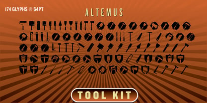 Each style is a collection of 174 home improvement and construction equipment icons and designs.
 - Blocky Shape by Cititype,
$12.00 Blocky Shape is a bold script with attractive features. Get inspired by its unique style!
 - FT Master Of Poster by Fenotype,
$19.95 Master of Poster is an all caps OpenType family. Each style has over 450 ligatures.
 - Agress by Gleb Guralnyk,
$13.00 Hello! Presenting a graffiti style font with multilingual support. Thank you & have a great day!
 - Haircult by Hijinx,
$15.00Fifties-style beauty parlor signage is the main influence of this series of hairstyle silhouettes. - Resalaty Arabic by NamelaType,
$19.00 This is Resalaty added Arabic features with a pen handwriting style, for more fun text
 - Yevida by insigne,
$21.99Yevida includes a number of advanced OpenType features, including alternates, ligatures, and old style figures. - Soul Adventures Cyr by Ira Dvilyuk,
$18.00 Soul Adventures Cyrillic Script adds hand look style to all your design projects: logos, signatures, labels, packaging design, and blog headlines. Also, it will look great in mugs, cards, gorgeous typographic designs, wedding stationery, and much more. An additional font Soul Adventures Symbols Font can help you to make a lot of pretty designs and logos. Soul Adventures script includes a full set of uppercase 2 sets of lowercase letters, numerals, a large range of punctuation, and 70 ligatures, giving a realistic hand-lettered style. The Cyrillic part of the font contains the uppercase letters and lowercase letters and 20 ligatures, giving realistic hand-lettered style. Soul Adventures Symbols is a font with over 36 unique, hand-drawn elements and swashes that can help to make your design more original. A different symbol is assigned to every uppercase or lowercase standard character plus numbers 0-9 so you do not need graphics software just simply type the letter you need. Multilingual Support for 32 languages: Latin glyphs for Afrikaans, Albanian, Basque, Bosnian, Catalan, Danish, Dutch, English, Estonian, Faroese, Filipino, Finnish, French, Galician, Indonesian, Irish, Italian, Malay, Norwegian Bokmål, Portuguese, Slovenian, Spanish, Swahili, Swedish, Turkish, Welsh, Zulu. And Cyrillic glyphs support for Russian, Belorussian, Bulgarian, Ukrainian, and Kazakh languages.
 - Buryland by YdhraStudio,
$26.00 Buryland Font is Handmade Script, Sans, Serif inspired by Retro and Modern hand lettering style, so you can use this font into any style of your design. Buryland Font has three styles for each font, Regular, Stamped, and Outline. Buryland Font also has a standard Multilingual Support. With bonus illustration in this package, this fonts are great for Logotype, Branding Design, Logo Design, Digital Lettering Arts, Instagram Design, T-Shirt/Apparel, Badge, Packaging, Poster, Magazine, Book Cover, Quotes, Signs, Advertising Design, and any design needs. Buryland Font Features : - Upper and Lowercase Standard Characters, Punctuation, Numerals - OpenType Features such as Standard Ligatures, Discretionary Ligatures and Stylistic Set (ss01 – ss10) - PUA Encoded Characters - Fully accessible without additional design software. - Includes a range of multilingual characters. You can access all those alternate characters by using a program that supports OpenType features such as Adobe Illustrator CS, Adobe Indesign & CorelDraw X6-X7 or higher. Guides to access all alternates glyphs : http://adobe.ly/1m1fn4Y Mix and match the alternate characters to add an attractive message to your design. Need help? Please, Feel free to contact me by e-mail yyudhara@gmail.com for any question about my font, Extended License document and more. Good Luck and Have fun ! YdhraStudio
 - Fourth Reign by Mans Greback,
$39.00 Fourth Reign is a royal medieval typeface. With diamonds, borders and ornaments, this decorative typeface brings us to glorious worlds in the golden times of epic knight sagas. Fourth Reign is the typeface of queens and kings. Use it for a Middle Ages game, a fantasy headline, or as a logotype for anything of historical theme. To make heraldic symbols, copy these icons: 🐉 🐎 👑 🗡 🦁 🦅 🦌 + ♖ × ✝ ⚓ * ⚔ † ‡ Alternatively write %A %B %C ... etc to create the heraldry. (Download required.) Dragon, Horse, Crown, Sword, Eagle, Deer, Cross, Anchor are some of the logos. Use [ ] for side borders. Example: [Magic⚔Thrones] The Fourth Reign family consists of four styles: The regular Plain style, and the beautiful Borders, Diamonds and Combo styles. The font is built with advanced OpenType functionality and has a guaranteed top-notch quality, containing stylistic and contextual alternates, ligatures and more features; all to give you full control and customizability. It has extensive lingual support, covering Greek and Cyrillic, as well as all Latin-based languages, from North Europe to South Africa, from America to South-East Asia. It contains all characters and symbols you'll ever need, including all punctuation and numbers.
 - Ornate Initials by Gerald Gallo,
$20.00 Style One is composed of a floral ornament rotated and reflected at 90 degree increments combined with a letter or number to form each ornate initial. The initials are A through Z and 1 through 0 for a total of 36 initials. Each initial is located under its respective key in the character set. Style Two is composed of floral ornaments rotated and reflected at 90 degree increments combined with a letter to form each ornate initial. There are two sets of initials A through Z. Under the character set the initials are negative on a positive floral background. Under the shift + character set the initials are positive on a negative floral background. Each initial is located under its respective key. Style Three is composed of floral ornaments rotated and reflected at 90 degree increments combined with a letter or number to form each ornate initial. There are two sets of initials A through Z and 0 through 9 for a total of 72 characters. Under the character set the initials are negative on a positive floral background. Under the shift + character set the initials are positive on a negative floral background. Each initial is located under its respective key.
 - Camille by Arabetics,
$45.00 Camille was designed with exaggerated emphasis on letter vertical characteristic, by virtually eliminating the typical Arabic horizontal line look. This font glyph weights and look and feel are heavily influenced by early Kufic Quranic calligraphy style. Camille supports all Arabetic scripts covered by Unicode 6.1, and the latest Arabic Supplement and Extended-A Unicode blocks, including support for Quranic texts. This font family includes two letter spacing flavors: isolated for small text and overlapped for large or display text. The two spacing flavors have one weight each with a normal and a left-slanted Italic version. The script design of this font family follows the Arabetics Mutamathil Taqlidi style utilizing varying x-heights. The Mutamathil Taqlidi type style uses one glyph per every basic Arabic Unicode character or letter, as defined by the Unicode Standards, and one additional final form glyph, for each freely-connecting letter of the Arabic cursive text. Camille includes the required Lam-Alif ligatures in addition to all vowel diacritic ligatures. Soft-vowel diacritic marks (harakat) are selectively positioned with most of them appearing on similar high and low levels—top left corner—, to clearly distinguish them from the letters. Tatweel is a zero-width glyph.
 - Adero by Eko Bimantara,
$22.00 Adero is a futuristic and versatile display font family designed to meet the needs of modern design projects. With its wide and minimalist style, Adero offers designers a unique blend of futuristic and functional design elements that make it a perfect choice for a wide range of applications. Featuring nine weights, from Thin to Black, and matching obliques, Adero provides designers with a wide range of options to choose from when creating designs. The font’s letterforms are carefully crafted with attention to detail, resulting in a modern, clean look that is both attractive and easy to read. Adero’s minimalist design makes it ideal for a variety of design applications, including branding and logo design, product design, advertising, web and various digital design. The font’s wide proportions and large x-height make it a great choice for bold and attention-grabbing designs, while its sleek and functional style makes it perfect for more understated design applications. Whether you’re creating a futuristic poster or a sleek website design, Adero is a versatile and powerful tool that can help you achieve your design goals. With its unique blend of wide proportions, minimalist design, and futuristic style, Adero is an excellent choice for any modern design project.
 - Frutiger Serif by Linotype,
$42.99 Frutiger® Serif is a re-envisioning of Meridien,a typeface first released by Deberny & Peignot during the 1950s. Working closely with Adrian Frutiger, Linotype's Type Director Akira Kobayashi expanded the original metal type version of Meridien into a new digital family of 20 variants. Renamed Frutiger Serif, this up-to-date Meridien has new weights, widths, and styles that correspond better with several other of Frutiger's designs. Just as Meridien has always been a fine choice for text settings, Frutiger Serif works brilliantly for large amounts of text & also at small point sizes. With its many weights and styles, this family is strong enough for most typographic projects. However, its added versatility is revealed when used in combination with other fonts. Frutiger Serif works well with the original Frutiger, Frutiger Next, and Univers - just to name a few. Paring these serif and sans serif families together is perfect for creating complex hierarchies and clear information design. Working with complicated typographic systems - involving elements such as headlines, captions, pull quotes, multilingual text, etc - is made easy by selecting Frutiger Serif and another of Frutiger's sans serif families. The designer needs simply to mix and match different weights and styles for the various textual elements to create smart and innovative layouts.
 - World Discovery by Mans Greback,
$69.00 World Discovery is a stunning calligraphy font that exudes a sense of beauty, romance, and exploration. The artistic swirls and slanted serifs come together to create a distinctive, high-quality, and exclusive typeface that will bring an antique charm to your designs. World Discovery has its origin in 15th-century discovery maps. Designer Mans Greback procured maps from the state library, and the exquisite penmanship and intricate details on the map, showcasing the venture of exploration and the grandeur of the Age of Discovery, sparked the unique and evocative letterforms that now make up the World Discovery font. The font offers an impressive array of 19 styles, including six distinctive main styles, their italic versions, as well as light, regular, and bold weights, as well as a Swash style for added flair. Combining the fonts gives you infinite possibilities to create a truly customized typographical artwork. The font is built with advanced OpenType functionality and has a guaranteed top-notch quality, containing stylistic and contextual alternates, ligatures, and more features; all to give you full control and customizability. It has extensive lingual support, covering all Latin-based languages, from Northern Europe to South Africa, from America to South-East Asia. It contains all characters and symbols you'll ever need, including all punctuation and numbers.
 - Clover Font Duo by Pen Culture,
$15.00 Introducing The Clover, a stunning duo font that combines the timeless elegance of a serif typeface with the fluid grace of calligraphy. This versatile font set includes two complementary styles that work together seamlessly to add sophistication and charm to your design projects. The serif font is a classic and refined typeface that exudes elegance and professionalism. Its clean lines and sharp angles create a sense of precision and authority, making it perfect for formal documents, headlines, and branding materials. In contrast, the calligraphy font is a more decorative and ornate style that evokes a sense of fluidity and movement. Its graceful curves and flowing lines create a sense of beauty and grace, making it ideal for invitations, wedding materials, and other special occasions. When used together, the serif and calligraphy fonts complement each other perfectly to create a stunning visual contrast that captures attention and creates a lasting impression. Whether you're designing a logo, brochure, or wedding invitation, The Clover is the perfect choice for adding a touch of sophistication and style. I really hope you enjoy it – please do let me know what you think, comments & likes are always hugely welcomed and appreciated. More importantly, please don’t hesitate to drop me a message if you have any issues or queries. Thank you
 - Maudhia by BBA Key,
$12.00Hello, all. I Want To Introduce New Fonts Maudhia Script Maudhia Script New fresh & modern style with handmade calligraphy, decorative characters and dancing lineage! So wonderful are invitations like greeting cards, branding material, business cards, quotes, posters, and more !! Maudhia Script The comes with 331 glyphs. Alternate characters are divided into several Open Type features such as Swash, Stylistic Sets, Stylistic Alternate, Contextual Alternate. Open Type features are accessible by using Open Type savvy programs such as Adobe Illustrator, Adobe InDesign, Adobe Photoshop Corel Draw X versions, and Microsoft Word. And this font has code PUA unicode (font with special code). So that all alternative characters can be easily accessed by craftsmen or designers. Maudhia Script Uppercase & lowercase International signature & symbol Punctuation Support & PUA number Unicode Style Style Alternative Style Style Range 1-6 Contextual Character Variations. If you do not have programs that support OpenType features like Adobe Illustrator and CorelDraw X Versions, you can access all alternative flying machines using Font Book (Mac) or Character Map (Windows). Thanks and good luck :-) Thank you for buying! - Zawiya by Eyad Al-Samman,
$3.00 The word Zawiya in Arabic language means Angle in English language. "Zawiya" is a Kufic modern square-shaped Arabic typeface. The typeface has only right-angled angles which makes it full of open and closed squares and free from any curves or arches. This font comes in two different weights. I am originally an engineer and I have liked to draw geometric shapes since my early childhood. I decided to design a typeface that embodies both of the technical and artistic human that I have inside me. The main characteristic of "Zawiya" Typeface is in its modern and attractive right-angled and square-shaped styles for its all-Arabic characters. The character "Faa" is one of its most distinguished characters that I myself adore it so much. "Zawiya" Typeface is suitable for books' covers, advertisement light boards, titles in magazines and newspapers, posters, greeting cards, cards, covers, satellite channels, exhibitions' signboards and external or internal walls of malls or metro's exits and entrances, geometric instruments and tools, technical devices, computers and laptops, IT and electric devices and also calculators. It is advisable to use the font in fields related to sciences such as geometry, mathematics, physics, chemistry, astronomy, industry, economy, and other fields. It can also decorate surfaces of calculators, geometric tools, rulers, pens, computers, cars, ships, trucks, and other related electric and electronic devices. It is sharp design qualifies it to be printed in public signs in streets, airports, hospitals, schools, malls, hotels, mosques, and other public places. It can also be used in titles for Arabic news and advertisements appeared in different Arabic and foreign satellite channels.
 - Moskau Pattern by Letter Edit,
$49.00 The design of the typeface Moskau Grotesk and Moskau Pattern is based on the signage created for the Café Moskau in Berlin by the graphic artist Klaus Wittkugel in the beginning of the 1960s. The Café Moskau, across from the Kino International on Karl-Marx-Allee in Berlin Mitte was one of the prestige edifices of the former DDR (German Democratic Republic). Built in the early 1960s, it advanced over the years and changing social developments to a trademark building of the capital. The lettering display on the roof was created by the graphic artist Klaus Wittkugel (October 17, 1910 – September 19, 1985). He had been Professor at the School for Applied Arts in Berlin, and, in addition to the creation of many posters, book covers and postage stamps, he was responsible for the signage of the Kino International as well as for the complete graphic treatment for the Palace of the Republik. The signage for the Café Moskau with the words »RESTAURANT«, »CAFÉ«, »KONZERT« and »MOCKBA« set in capital letters, becomes the basis for the Moskau Grotesk which was developed by Björn Gogalla in 2013. This face should not be seen as an imitation. A few shortcomings were »fixed«. In favor of maintaining the core characteristics some unique features were, however, not relinquished. Lower case letters and the missing capital letters were designed from scratch. It is not surprising that the plain, unassuming geometrical direction of the basic character style forms a bridge to the architecture of the 1960s. Inspired by the then favored, diverse possibilities inherent in the architectural example and wall reliefs, two complimentary pattern fonts emerged.
 - Moskau Grotesk by Letter Edit,
$39.00 The design of the typeface Moskau Grotesk is based on the signage created for the Café Moskau in Berlin by the graphic artist Klaus Wittkugel in the beginning of the 1960s. The Café Moskau, across from the Kino International on Karl-Marx-Allee in Berlin Mitte was one of the prestige edifices of the former DDR (German Democratic Republic). Built in the early 1960s, it advanced over the years and changing social developments to a trademark building of the capital. The lettering display on the roof was created by the graphic artist Klaus Wittkugel (October 17, 1910 – September 19, 1985). He had been Professor at the School for Applied Arts in Berlin, and, in addition to the creation of many posters, book covers and postage stamps, he was responsible for the signage of the Kino International as well as for the complete graphic treatment for the Palace of the Republik. The signage for the Café Moskau with the words »RESTAURANT«, »CAFÉ«, »KONZERT« and »MOCKBA« set in capital letters, becomes the basis for the Moskau Grotesk which was developed by Björn Gogalla in 2013. This face should not be seen as an imitation. A few shortcomings were »fixed«. In favor of maintaining the core characteristics some unique features were, however, not relinquished. Lower case letters and the missing capital letters were designed from scratch. It is not surprising that the plain, unassuming geometrical direction of the basic character style forms a bridge to the architecture of the 1960s. Inspired by the then favored, diverse possibilities inherent in the architectural example and wall reliefs, two complementary pattern fonts emerged.
 - Menhart by Monotype,
$29.99Czech designer Oldrich Menhart (1897-1962) devoted his life to making letters. He was a calligrapher, lettering artist, and typeface designer with over twenty faces to his credit. The Monotype typeface, Menhart, was the second of his designs. Menhart began work on the design in the early 1930s and turned over his final artwork to the Monotype Drawing Office in 1934. The first size cut was 14 Didot (Didot points are the traditional European system of type measure, and are roughly equivalent to the point system commonly used by today's digital fonts). The 14D font was followed by 18D and 24D, indicating that the design was considered most suitable for display work. However, a 10D size was later cut from the same master drawings at the request of a Monotype customer. Menhart's design was light and open, with an even color and a slight squareness" to its round shapes. Because the Czech alphabet has 15 accented letters, Menhart included these diacritics as an integral part of his design, not as an afterthought. As a result, accented copy set in Menhart has a cohesive quality rarely seen in other typefaces. Monotype's new digital release of Menhart is the first revival since the hot metal fonts were cut. Menhart Display is based on the original Monotype drawings, while a slightly heavier, re-spaced version has been created for text sizes. Both versions offer the full capabilities of the OpenType format, such as the automatic insertion of old style figures, ligatures and small caps. In addition to English, the extended character set supports most Central European and many Eastern European languages. One of Menhart's lifelong goals was to share the richness of his Czech culture by drawing typefaces that uniquely served Czechoslovakia literature. In his words: "I believe that a Czech style of type comes above all from the spirit in which it was designed, which gives it its 'signature,' and not so much from decorative composition, and even less from the geographic location of its creation." The typeface Menhart is a tribute to his values. Now, Menhart Pro and Menhart Display Pro capture the unique personality of this timeless design while greatly extending its range of use. " - Noad Sans by Groteskly Yours,
$60.00 Noad Sans is an experimental sans serif typeface with a strong character and some very unique visual features. At the core of Noad Sans is a sturdy sans serif with closed apertures and fairly simple letterforms. The defining feature of Noad Sans, however, is its visualised nodes: all control points of Bézier curves in each of the fonts in the family are intentionally visualised. The effect of this feature is largely defined by the usage: in titles and larger bodies of text, the visualised nodes stand out and create a rhythmic pattern of their own. In smaller sizes, the sans serif base of the font becomes more prominent and the nodes create a visual fuzz. Noad Sans comes in 6 styles and as a Variable Font with two axes–Optical Size and Slant. The size of each node can be changed from the smallest (Mini and Mini Italic) to the largest (Extra and Extra Italic). Variable Font technology allows you to fine tune the size of the nodes and the slant angle, so that your version of Noad Sans can be truly unique. Noad Sans has a large character set of 570+ glyphs, covering the vast majority of Latin based languages. In addition to that there are dozens of special characters, punctuation, numbers, and symbols. Noad Sans is equipped with a number of useful OpenType features, such as Case-Sensitive Punctuation, Stylistic Alternates, Ligatures, Fractions and many more. Noad Sans began as an experimental project, and during its development the spirit of experimentation was at the heart of the project. Thanks to the unique nature of the typeface, it can feel at home in a variety of settings: from web development, graphic and product design to more novel uses like 3D and NFTs. Noad Sans type family includes 6 static fonts (Mini, Mini Italic, Regular, Regular Italic, Extra and Extra Italic) and one variable font. Each style can be purchased separately. There is a free trial version of Noad Sans that can be downloaded free of charge on MyFonts. For more information on the typeface, feel free to download Noad Sans PDF Specimen.