10,000 search results
(0.027 seconds)
- Rocket Queen by Ferry Ardana Putra,
$19.00 Unleash your inner street artist with Rocket Queen! The definitive font for urban self-expression. Inspired by the bold strokes of tagging graffiti markers found on city walls, this font encapsulates the raw energy of the streets. Its uppercase and lowercase characters ensure versatility, while support for foreign languages guarantees global appeal. Graffiti artists worldwide adore its iconic rounded tip marker style for its unique and entertaining aesthetics. Rocket Queen's "Urban Tags" font is more than just a typeface; it's an urban art form. Designed with a nod to the vibrant world of graffiti scenes, this font embodies the spirit of tagging graffiti markers, creating a gritty, authentic experience. With full support for foreign languages and both uppercase and lowercase characters, Rocket Queen empowers your creativity. Its iconic rounded tip marker style, favored by graffiti artists globally, offers a unique and entertaining touch to your designs. Plus, it's enriched with street graffiti ornaments for that added urban flair. Rocket Queen is more than a font; it's the language of rebellion and urban creativity. Drawing inspiration from the bustling streets and tagging graffiti markers, this font captures the raw spirit of street art. Its iconic rounded tip marker style, beloved by graffiti artists worldwide, sets your designs apart with a unique and captivating aesthetic. Supporting foreign languages and featuring a complete set of uppercase and lowercase characters, Rocket Queen is your canvas for bold, edgy statements. Step into the world of street art with Rocket Queen, a font that embodies the raw spirit of urban graffiti. Inspired by the legendary rounded tip marker style, this font captures the essence of tagging in the streets. Its captivating, one-of-a-kind design is favored by graffiti artists across the globe. With support for foreign languages and a full set of uppercase and lowercase characters, Rocket Queen is the ultimate choice for artists who want their work to resonate with the vibrant, rebellious energy of the graffiti scene. And, don't forget to explore the collection of street graffiti ornaments to take your designs to the next level! "Rocket Queen" font is perfect for a wide range of creative and artistic applications. Here are some ideal uses for this unique and edgy font: Graffiti Artwork: Use "Rocket Queen" to create authentic graffiti-style artwork on canvas, walls, or digital platforms. Its street-inspired design will add an urban, edgy vibe to your work. Streetwear Brand Logos: Design logos and branding materials for streetwear clothing lines or urban fashion brands. The font's bold and expressive style is a great match for this niche. Event Posters and Flyers: Create eye-catching event posters and flyers for music concerts, art exhibitions, or street festivals. "Rocket Queen" will help your event materials stand out and evoke a gritty, streetwise feel. Album Covers: Design album covers for music genres like hip-hop, rap, punk, or any style that demands a rebellious and energetic look. The font can give your cover artwork an authentic street vibe. Tattoo Lettering: Tattoo artists and enthusiasts can use "Rocket Queen" for lettering in tattoos. Its unique graffiti-inspired characters can create distinct and personalized tattoos. Skateboard Deck Graphics: Use the font to design custom graphics for skateboard decks, reflecting the rebellious and urban culture of skateboarding. Street Art Installations: If you're creating street art installations, "Rocket Queen" can be used for text elements within the artwork, giving it an authentic urban graffiti feel. Urban Magazine Titles: "Rocket Queen" can be an ideal choice for magazine titles and headlines in publications that focus on urban culture, street art, or graffiti. Video Game Titles and Graphics: Design video game titles, logos, or in-game graphics for games with an urban or street culture theme. The font's distinctive style can enhance the game's visual appeal. YouTube Channel Branding: Content creators with a street art or urban lifestyle focus can use "Rocket Queen" for their channel logos, banners, and thumbnails. Product Packaging: For products targeting a youthful, urban audience, the font can be used in product packaging design, making the brand and product look fresh and exciting. Digital and Print Advertisements: Incorporate "Rocket Queen" in advertising campaigns that aim to connect with a young, rebellious, or urban demographic. The "Rocket Queen" font is versatile and can be adapted to a wide range of applications where a bold, streetwise, and artistic look is desired. It's all about bringing an authentic graffiti vibe to your creative projects. ——— Rocket Queen features: A full set of uppercase and lowercase Numbers and punctuation Multilingual language support PUA Encoded Characters OpenType Features Layered Style +345 Total Glyphs +100 Graffiti Swashes and Ornaments included!
 - Tannen by Rafael Jordan,
$30.00 Tannen is an interpretation of the Emil Meyer’s Tannenberg, the result is a fun and cool blackletter display built without curves and casual look with a lot of personality and expressivity. It has 3 independent styles (regular, inline and shadow) that can be combined with each other, plus a stencil style. Tannen counts with 3 weights per style, OpenType features (ligatures, alternates, fractions and more) and supports dozens of latin languages.
 - Landsknecht by Kaer,
$21.00 Hey! I'm happy to introduce to you my new font. Landsknecht is a blackletter style calligraphy font. Do you need to design perfect alcohol labels, retro style logos, music album covers, circus posters, luxury packaging identity, etc.? If you want dark and strong medieval style concepts, please try it. You’ll get: * Uppercase and lowercase * Multilingual support * Numbers * Symbols * Punctuation * Ligatures Please feel free to request any help you need. Best, Roman.
 - Ambivert by Gassstype,
$23.00 Hello Everyone, introduce our new product Font Ambivert is a Rough Display Font.This is a Textured Natural Style and classy style with a clear style and dramatic movement. This font Ambivert is great for your next creative project such as logos, printed quotes, invitations, cards, product packaging, headers, Logotype, Letterhead, Poster, Design this font is great for your creative projects such as watermark on photography, and perfect for logos & branding.
 - P22 Vincent by P22 Type Foundry,
$24.95 This set is inspired by the work of Vincent van Gogh. The alphabet captures the essence of van Gogh's handwriting style, using his extensive correspondence with his brother Theo as the primary reference. This lettering style presents a bold brush-stroke appearance which bears striking similarities to the painting style of Van Gogh. A full international charcter set is featured. The extras feature selected imagery from van Gogh's drawing and paintings.
 - Jodith Gladyse by FadeLine Studio,
$12.00 Introduce Jodith gladyse! Jodith gladyse a new handwritten font with a style natural, sweet and simple. Made with great care to provide the natural and modern elements. The great thing about this font is you can find some style when you use it, examples such as natural handwriting style, unique, simple, elegant, and luxury. Very suitable to meet your various design needs that are trending now. Please try it!
 - Jiwez by Twinletter,
$15.00 Jiwez Arabic style font is a premium Arabic style font that is a great way to bring a new level of luxury to your designs. The classic, yet modern style of this font is perfect for creating elegant titles and cover pages for your projects. With its classy, yet simple structure and easy-to-read fonts, you can use this font to create the perfect typeface for your projects.
 - Hillray by Sarid Ezra,
$15.00 A NEW STYLISH BOLD FONTS WITH LIGATURE & ALTERNATES, Hillray! Hillray is a stylish bold sans that contains ligatures and alternates each characters! You can make a unique branding with this fonts. This stylish bold fonts also included extrude and outline style that will compliments the regular style! This fonts suitable to use for poster, branding, merchandise, and any street art style! Also support multilingual and already PUA Encoded! Thank You!
 - Belle Story by Creativemedialab,
$19.00 Belle Story is a beauty serif family. This hi-contrast display font Consists of 2 styles Display & Regular and each style has 10 weights from thin to black with fine lines and smooth curves to make this font perfect for luxury, classy, high-end branding, logo, and many more. Belle Story also includes a Variable style as well as multilingual support, numbers, and currency symbols, and dozens of alternates.
 - Jester Script by Paul O'Connell,
$9.95This comical styled Jester Script font was created to suit various design applications within the typeface market and is aimed at people looking for a clown styled brush script typeface that is very unconventional indeed. Designed and produced by Paul O'Connell of POCT, it is a distinct styled font script, loosely drawn with irregular rounded edges and curves to create a free flowing handwritten font that will appeal to everyone. - BB Manual Mono (Pro) by Bold Studio,
$49.00 BB Manual Mono™ (Pro) visualizes the work of painters: Craftsmanship, precision, professionalism and their tools. The special features of the Font emphasize the work process. ● Flow: visible process ● Alignment: contextual monoline ● Accuracy: individual modularity ● 5 Variants (TX (Text), IT (Italic), ST (Standard), HL (Headline), CR (Cover) ● 40 OT-Features/Style ● 60 Styles ● 100 Stylistic-Sets (20/Variant) ● 122 Languages Support (Latin, Greek, Cyrillic) ● 86,100 Glyphs (1,435/Style)
 - Romagna by AlienValley,
$5.00 Romagna is a modern and highly versatile sans-serif typeface designed for readability without sacrificing aesthetics. There are 8 included styles to pick from including regular + bold weights plus italics and 2 different uppercase styles so you can either go with a classic look or a modern futuristic theme. Features Modern design Easy to read characters Great for both headlines & large chunks of text Multilingual support Great versatility 8 Included styles
 - Breviary by Heyfonts,
$18.00 Breviary - Display Typeface "UNIQUE serif modern font" likely refers to a typeface that combines elements of traditional serif design with contemporary and distinctive features. Serif fonts have small lines or strokes attached to the ends of characters, which can contribute to a more formal or traditional appearance. The term "modern" in this context typically implies a contemporary or updated style. Here's an explanation of the characteristics and significance of a UNIQUE serif modern font: -Serif Elements: Serifs are the small lines or strokes at the ends of characters, and they are a hallmark of traditional typography. In a UNIQUE serif modern font, these serif elements are likely to be present but may have a distinctive shape or style that sets them apart from more conventional serif fonts. -Contemporary Design: The "modern" aspect of the font suggests a contemporary or updated design. This may involve a departure from the more classical serif styles seen in traditional typefaces, incorporating modern design principles, cleaner lines, and a more minimalist aesthetic. -Distinctive Characters: A UNIQUE serif modern font is likely to feature characters with unique and individual design elements. This could include unconventional serifs, letter shapes, or other stylistic details that make the font stand out and contribute to its uniqueness. -Versatility: While serif fonts are often associated with formality and readability, a UNIQUE serif modern font may offer versatility suitable for a range of design applications. It could be used in both traditional and modern contexts, providing flexibility for various design projects. -Applicability to Branding: Fonts play a crucial role in branding, and a UNIQUE serif modern font could be an excellent choice for businesses or projects that want to convey a sense of tradition and reliability while maintaining a contemporary and innovative image. -Digital and Print Design: Modern serif fonts are often designed with both digital and print applications in mind. The clarity of the typeface, even at smaller sizes, and its aesthetic appeal make it suitable for a variety of design projects, from websites and apps to print materials like brochures and posters. -Attention to Detail: The uniqueness of the font may be reflected in the careful attention to detail in each character. This could include refined curves, balanced proportions, and other design elements that contribute to the overall visual appeal and readability of the font. -Available Features: Unique serif modern fonts may come with additional features, such as alternative characters, ligatures, or stylistic sets, allowing designers to customize the appearance of the text for specific design needs.
 - Van Den Velde Script Pro by Intellecta Design,
$59.95 Van den Velde Script Pro is the definitive edition of the original Van den Velde Script, by Intellecta Design, a free interpretation of the work of the famous master penman Jan van den Velde, to be found in the “Spieghel der schrijfkonste, in den welcken ghesien worden veelderhande gheschrifften met hare fondementen ende onderrichtinghe. ” (Haarlen, 1605). This font has evocative ancient ligature forms from the XVII Century Dutch master penman Jan van den Velde. Your indescritible writing-book was important not only with regard to the specific period it represents, but also in relationship to the entire history of calligraphy as an art: Van den Velde is rightly credited with having introduced and perfected a new trend in Dutch calligraphy. Our font, Van den Velde Script, merges modern necessities or better legibility without loosing the taste of his archaic origins. This enhanced OpenType version is a complete solution for producing documents and artworks whith an evocative and voluptuous style of calligraphic script: Van den Velde Script PRO has - more glyphs than the original Van den Velde Script. We created hundred of new glyphs, deactivated old non-representative glyphs and redesign the remaining library of original glyphs. Van den Velde Pro is more functional, soft and beauty than the original. - to keep the powerful of this unusual kind of script we make a tour-de-force kerning work: 771 glyphs in this font was adjusted in 5400 kerning pairs handly. - hundreds of contextual alternates combinations, some of them with three or more letters, - historical ornaments and fleurons in the typical style (and motifs) from the XVII century at the Lower Countryes accessed with the glyph palette using the Ornaments feature); - an extensive set of ligatures (100s of contextual alternates plus discretionary ligatures) providing letterform variations that make your designs really special, resembling real handwriting on the page; .... and, much better, Van den Velde Scriopt PRO is plus cheap than the original font !!! In non-OpenType-savvy applications it works well as an unusual and beautiful script style font. Because of its high number of alternate letters and combinations (over 700 glyphs), we suggest the use of the glyph palette to find ideal solutions to specific designs. The sample illustrations will give you an idea of the possibilities. You have full access to this amazing stuff using InDesign, Illustrator, QuarkXpress and similar software. However, we still recommend exploring what this font has to offer using the glyphs palette: principally to get all the power of the Contextual Alternates feature. Van den Velde Script PRO has original letters designed by Iza W and overall creative direction plus core programming by Paulo W.
 - Van den Velde Script by Intellecta Design,
$68.90 Iza and Paulo W (Intellecta Design) are proud to announce Van den Velde Script. A free interpretation of the work of the famous master penman Jan van den Velde, to be found in the “Spieghel der schrijfkonste, in den welcken ghesien worden veelderhande gheschrifften met hare fondementen ende onderrichtinghe. ” (Haarlen, 1605). Van den Velde Script has evocative ancient ligature forms from the XVII Century Dutch master penman Jan van den Velde. Your indescritible writing-book was important not only with regard to the specific period it represents, but also in relationship to the entire history of calligraphy as an art: Van den Velde is rightly credited with having introduced and perfected a new trend in Dutch calligraphy. Our font, Van den Velde Script merges modern necessities o better legibility without loose the taste of his archaic origins. This enhanced OpenType version is a complete solution for producing documents and artworks whith a evocative and voluptuous style of calligraphic script: - dozens of stylistic alternates for each letter (upper- and lowercase), accessed with the glyph palette; - historical ornaments and fleurons in the typical style (and motifs) from the XVII century at the Lower Countryes accessed with the glyph palette using the Ornaments feature); - an extensive set of ligatures (100s of contextual alternates plus discretionary ligatures) providing letterform variations that make your designs really special, resembling real handwriting on the page; - a tour-de-force kerning work: over 700 gliphs in this font was adjusted to your kern pairs handly. In non-OpenType-savvy applications it works well as an unusual and beautiful script style font. Because of its high number of alternate letters and combinations (over 700 glyphs), we suggest the use of the glyph palette to find ideal solutions to specific designs. The sample illustrations will give you an idea of the possibilities. You have full access to this amazing stuff using InDesign, Illustrator, QuarkXpress and similar software. However, we still recommend exploring what this font has to offer using the glyphs palette: principally to get all the power of the Contextual Alternates feature. You can has an idea of the power of this font looking at the “Van den Velde User Guide”, a pdf brochure in the Galçlery section. Two last things: take a special look at the Van den Velde Words (ready words) font and another super script font, Penabico. Van den Velde Script has original letters designed by Iza W and overall creative direction plus core programming by Paulo W.
 - Roller Poster by HiH,
$12.00 Roller Poster is named after Alfred Roller. In 1902, Roller created a poster to advertise the 16th exhibit of Austrian Artists and Sculptures Association, representing the Vienna Secession movement. The exhibit was to take place in Vienna during January & February 1903. The location is not mentioned because everyone in Vienna knew it would be held at the exhibit hall in the Secession Building at Friedrichstraþe 12, a few blocks south of the Opernring, near the Naschmarkt. Designed by Joseph Maria Olbrich in 1897, the buiilding has been restored and stands today as one finest of the many fine examples of Art Nouveau architecture in Vienna (see vienna_secession_bldg.jpg). Because of its dome, it is called “the golden cabbage.” The poster itself is unique. The word “secession” is in one type style and takes up two-thirds of the elongated poster. At the bottom of the poster are the details in a different lettering style. It is this second style at the bottom that is the basis for the font Roller Poster. In keeping with our regular naming conventions, we were going to call it Roller Gezeichnete (hand-drawn), but the wonderful play on both words and the shape of the three S’s in secession was too compelling. In November 1965 there was an exhibit of Jugendstil and Expressionist art at the University of California. Alfred Roller’s Secession Poster was part of that exhibit. Wes Wilson was designing promotional material at Contact Printing in San Francisco. Among their clients was a rock promoter named Bill Graham, staging dance-concerts at Fillmore Auditorium. Wilson saw the catalog from the UC exhibit and Roller’s lettering. Wilson adapted Roller’s letter forms to his own fluid style. The result was the poster for the August 12-13, 1966 Jefferson Airplane/Grateful Dead concert at Fillmore put on by Graham (BG23-1). Wilson continued to use Roller’s letter forms on most of the posters he did for Graham through May 1967, when he stopped working for Graham. The posters were extremely successful and the lettering style along with Roller’s letter forms were picked up by other artists, including Bonnie MacLean, Clifford Charles Seeley, James Gardner, and others. The Secession poster and the Fillmore posters have inspired a number of fonts in addition to ours. Among them are JONAH BLACK (& WHITE) by Rececca Alaccari, LOVE SOLID by Leslie Carbarga and MOJO by Jim Parkinson. Each is different and yet each clearly shows its bloodlines. Our font differs in two ways: 1) the general differences in the interpretation of the letter forms and 2) the modification of the basic letter form to incorporate the diacriticals within the implied frame of the letter, after the manner of the original design by Roller. We borrowed Carbarga’s solution to the slashed O and used it, in a modified form, for other characters as well to accomplish the same purpose. We recommend that you buy ours and at least one of the other three. According to Alaccari, a version called URBAN was released by Franklin Lettering in the 70’s (and is shown on page 51 of The Solotype Catalog). For comparison of our font to original design, see image files roller_poster_2s.jpg of original poster and roller_poster_2sx.jpg showing reconstruction using our font for the lower portion (recontructed area indicated by blue bar). Please note the consistency of character width. In the lower case, 23 of the basic 26 letters are 1/2 EM Square wide. The ‘i’ is an eighth narrower, while the ‘m’& ‘w’ are one quarter wider. All the Upper Case letters are 1/8 EM wider than the lower case. This is to make it easier to fill a geometrical shape like a rectangle, allowing you to capture a little of the flavor of Wes Wilson’s Fillmore West poster using only a word processor. We have also included a number of shapes for use as spacers and endcaps. If you have a drawing program that allows you to edit an ‘envelope’ around the letters to distort their shape, you can really get creative. I used Corel Draw for the gallary images, but there are other programs that can accomplish the same thing. The image file “roller_poster_keys.jpg” shows the complete character set with the keystrokes required for each character (see “HiH_Font_readme.txt” for instruction on inserting the non-keyboard characters). The file “roller_poster_widths.jpg” shows the exact width of each character in EM units (based on 1000 units per EM square). You will notice that the font is set wide for readability. However, most programs will allow you to tighten up on the character spacing after the manner of Roller & Wilson. In MS Word, for example, go to the FORMAT menu > FONT > CHARACTER SPACING. Go to the second Drop-Down Menu, labeled ‘Spacing’ and select "condensed' and then set the amount that you want to condense ‘by’ (key on the little arrows); two points (2.0) is a godd place to start. Let your motto be EXPLORE & EXPERIMENT. Art Nouveau has always been one of my favorite movements in art -- I grew up in a home with a couple of Mucha prints hanging on the living room wall. Perhaps because of that and because I lived through the sixties, I have enjoyed researching and designing this font more than any other I have worked on. Let’s face it (pardon the pun), Roller Poster is a FUN font. You owe it to yourself to have fun using it.
 - Syntax Next Paneuropean by Linotype,
$103.99Syntax was designed by Swiss typographer Hans Eduard Meier, and issued in 1968 by the D. Stempel AG type foundry as their last hot metal type family. Meier used an unusual rationale in the design of this sans serif typeface; it has the shapes of humanist letters or oldstyle types (such as Sabon), but with a modified monoline treatment. The original drawings were done in 1954; first by writing the letters with a brush, then redrawing their essential linear forms, and finally adding balanced amounts of weight to the skeletons to produce optically monoline letterforms. Meier wanted to subtly express the rhythmical dynamism of written letters and at the same time produce a legible sans serif typeface. This theme was supported by using a very slight slope in the roman, tall ascenders, terminals at right angles to stroke direction, caps with classical proportions, and the humanist style a and g. The original foundry metal type was digitized in 1989 to make this family of four romans and one italic. Meier completely reworked Syntax in 2000, completing an expanded and improved font family that is available exclusively from Linotype GmbH as Linotype Syntax. In 2009 the typeface family was renamed into a more logical naming of "Syntax Next" to fit better in the Platinum Collection naming." - Spaza by Scholtz Fonts,
$15.00In parts of Africa, in the poorer, rural and peri-urban areas there are many small shops or convenience stores which are called "Spaza" shops. The owners of these shops often don't have access to commercial signwriting and write their signs themselves. The font "Spaza" is based on these hand-lettered signs. This lettering has a refreshing simplicity and spontaneity, yet retains great legibility. In the font "Spaza", there are three styles: - Spaza Regular - with normal upper and lower case; - Spaza Small Caps - in which the lower case is a true "small caps" and not a shrunken version of the upper case (generated by the operating system); - Spaza Double Caps - in which the lower case characters have been replaced by an alternate set of capital letters. The font thus contains two sets of differing upper case characters. You can use characters from both these sets to give a true feeling of randomness because if the same character occurs twice in a word, different versions of the character can be used. Spaza can be used with great effect in a great variety of applications such as advertisements, flyers, posters and in magazine pages. Spaza contains a full character set and has been carefully spaced and kerned. - Epica Pro by Sudtipos,
$49.00 Epica is a contemporary interpretation of the Venetian Renaissance types. A humanist type family with a contemporary design. This family encompasses different typographic scenarios with emphasis in style and functional equilibrium. Its letterforms show the visual richness of Epica that includes some calligraphic reminiscences perfectly legible in small and display sizes. Its strong personality makes it distinguish, because it perfectly combines the elegance of antique typographies and the forcefulness of contemporary ones. This family has been designed in two different moments. Epica Serif, which have a more classical design, was finished 5 years ago in its first version. The first sketches were drew 8 years ago during the Master of Type Design at the University of Buenos Aires. Through the years was re design in several times to the point of reaching its current version. On the other hand, Epica Sans was completed in 2020 and is the counterpart of Epica Serif. A complementary system designed to enrich the serif version and give new options for hierarchy and composition. This is a versatile type family perfectly fit for books, editorial, and usage in print and on screens. It possesses great legibility in body texts, which makes it ideal for extended reading and supports a variety of languages.
 - Le Monde Sans Std by Typofonderie,
$59.00 Humanist sans in 8 styles Designed by Jean François Porchez, Le Monde Sans is a sanserif based on Le Monde Journal — a practice that become commonplace from early nineties. Designed originally in 1994 for the Le Monde newspapers, it was expended over the years to the large family we know today. Le Monde Sans features a “traditional g” in addition to the usual 1994’s g. Le Monde Sans is offered in numerous weights — in roman, italic to meet all kinds of situations. It will help designers to select the best weights depending their needs, from glossy paper printing to high resolution screen. Superfamily The design of Le Monde Sans continues the basic common structure found in the members of the Le Monde family: its proportions, a relatively narrow width, a fairly oblique axis, etc. The typographer can, at all times, switch between Sans & Journal or Courrier without any disruption in the composition. The verticals metrics and proportions of Le Monde Sans are calibrated to match perfectly others Typofonderie families. This family was designed in 1994 as bespoke typeface family for the French newspaper Le Monde. The family is not used any more by this newspaper from November 2005. Type Directors Club .44 1998 European Design Awards 1998
 - Pantera by Lián Types,
$39.00 ROARRR! THE STYLES -Pantera Pro is the most complete style, and although its default look is mono-rhythmic it gets really playful and crazy like the examples of the posters by just activating the Decorative Ligatures button in the Open-type Panel of Adobe Illustrator. However, I recommend using also the Glyphs Panel because there you'll find much more variants per letter. Pantera Pro is in fact, coded in a way the combination of thicknesses will always look fantastic. -Pantera Black Left, and Pantera Black Right are actually “lite” versions of Pantera Pro: They have very little Open-Type code, so what you see here is what you get. Pantera Black Left has its left strokes thick, while Pantera Black Right has its right strokes thick. -Pantera White is a lovely member in this family that looks lighter and airy, hence its name. With the feature Standard Ligatures activated (liga) the font gets very playful. -Pantera Caps is based on sign painters lettering and since it follows the same pointed brush rules as the other styles, it matches perfectly. -Pantera Claws like its name suggests, is a set of icons that were done by our dear panther. THE STORY It is said that typography can never be as expressive as calligraphy, but sometimes it can get close enough. I tend to think that calligraphic trials, in order to work well as potential fonts, need first to go through very strict filters before going digital: While calligraphy is synonym of freedom (once its rules are mastered), type-design, in the other hand, has its battlefield a little tighter and tougher. When I practice pointed brush lettering, there are so many things happening on the paper. And most of them are delicious. The ones who know my work may see that although many of my fonts are very expressive, my handmade brush trials are much more lively than them. With that in mind, this time I tried to go further and rescue more of those things that are lost in the process of thinking type when first sketches are calligraphic. I wondered if I could create something wild, hence its name Panther, by understanding the randomness that sometimes calligraphy conveys and turning it to something systemic: With Pantera, I created an ordered disorder. Like it happens a lot in many kinds of lettering styles, in order to enrich the written word the scribe mixes the thickness of the strokes and the width of the letters. Like one of my favorite mentors say (1), they make thoughtful gestures Some lively strokes go down with a thick, while some do that with a thin. Some letters are very narrow, meaning some of them will need to be very wide to compensate. Why not?. The calligrapher is always thinking on the following letters, and he/she designs in his head the combination of thicks and thins before he/she executes them. He/she knows the playful rhythm the words will have before writing them. It takes time and skill to master this and achieve graceful results. Going back to the font, in Pantera, this combination of varying thicknesses and widths of letters were Open-Type coded so the user will see satisfactory results by just enabling or disabling some buttons on the glyphs panel. I'm very pleased with the result since it’s not very easy to find fonts which play with the words' rhythm like Pantera does, following of course, a strong calligraphic base. I believe that if you were on the prowl for innovative fonts, this is your chance to go wild and get Pantera! NOTES (1) Phrase by Yves Leterme. In fact, it’s the title of a book by him. EPILOGUE Esta fuente está dedicada a mi panterita
 - Marcellia by Rockboys Studio,
$23.00 The Athallia is a lovely calligraphy font. It comes with amazing alternates and is a mixture from copperplate calligraphy with hand-lettering styles. It was designed to covey elegance and has an attractive, smooth, clean, feminine, sensual style.
 - Retro Lettering by Nirmana Visual,
$19.00 Retro Lettering , Inspired by 70s Design Era with 2 style : Regular & Shadow, Include 4 style ending swash. Retro Lettering offers beautiful typographic harmony for a diversity of design projects, including logos & branding, social media posts, advertisements & product designs.
 - Falange by Vozzy,
$10.00 Introducing a hand-drawn bone-style label font named "Falange". Typeface includes five styles and contains a huge additional and multilingual characters. This font will good viewed on any retro design like poster, t-shirt, label, logo etc.
 - Dead Meal by Fonts of Chaos,
$10.00 Dead Meal is a cute hand made font made for pixel art style. Yes a mix of handmade pixel font style. Say like that is weird but trust me, it's simple useable for print works and web works.
 - Dustine Script by Letterfreshstudio,
$14.00 Dustine script is an extraordinary and bold script, suitable for a large number of designs. This font has two styles, Regular and Italic. With two styles, you can choose according to the project that you are working on.
 - Sereno by Robert Corseanschi,
$19.99 This font family includes six very unique font styles & weights. The font styles are applicable for any type of graphic design - web, print, motion graphics, etc. and perfect for t-shirts and other items like posters and logos.
 - Alibabe by Almarkha Type,
$25.00 Introducing Alibabe Authentic Display Font, Inspired by Food Logo style and combination with Cute Craft style. that will fulfill your design needs for quotes,sporty theme, logotype, wordmark, etc. This has many opentype features and support multi language.
 - Oshawa by Fauzistudio,
$15.00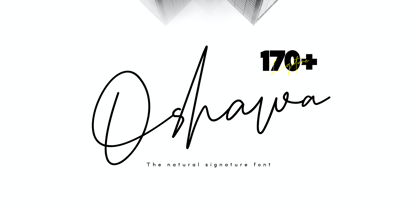 Oshawa is a signature font with a natural and professional style, ideal for creating handwritten style logos, wedding stationery, photographer watermark logos, modern websites, and more. Oshawa is equipped with 177 handwritten ligatures that add a natural angle.
 - Bison by EllenLuff,
$38.00 Bison is a sophisticated and strong family of sans serif fonts. Its sturdy uncompromising style is felt through controlled letterforms and modern touches. A balance of hard lines and smooth curves, each font in the family can stand on its own — dynamic and authoritative in its own right. FEATURES Bison includes ten all-caps fonts: Four weights / Italics / Outlines / Numbers & Punctuation / Extensive Language Support Bison Bold - bold and commanding Bison Demibold - the persuasive middleweight Bison Regular - a sturdy midground between light and bolds Bison Light - quiet but confident Bison Outline (Thick and Thin) - edgy and engaging USE Bison works great in any branding, logos, magazines, films. The different weights give you full range to explore a whole host of applications, while the outlined fonts give a real modern feel to any project.
 - Foretelling Script by Letterhend,
$17.00 Introducing, Foretelling Script. A condensed script typeface. A fun, playful and casual script made by natural hand writing. This type of font perfectly made to be applied especially in logo, and the other various formal forms such as invitations, labels, logos, magazines, books, greeting / wedding cards, packaging, fashion, make up, stationery, novels, labels or any type of advertising purpose. Available in 3 styles : Reguler, Rough and Stamps Features : uppercase & lowercase numbers and punctuation multilingual swashes and ligatures alternates PUA encoded We highly recommend using a program that supports OpenType features and Glyphs panels like many of Adobe apps and Corel Draw, so you can see and access all Glyph variations. How to access opentype feature : letterhend.com/tutorials/using-opentype-feature-in-any-software/ Email us to letterhend@gmail.com if you need something! Happy Designing!
 - Kidros by Alit Design,
$15.00 Introducing KIDROS Typeface The KIDROS font is designed with a sans serif font concept that has a retro display stencil style. Irregular dynamic shapes but impressively regular and unique make the font "KIDROS" different and steal attention. Sans serif typefaces such as "KIDROS" are very easy to apply to any design, especially those with an retro, vintage and strong, besides that this font is very easy to use both in design and non-design programs because everything changes and glyphs are supported by Unicode (PUA). The "KIDROS"contains 540 glyphs with many unique and interesting alternative options. Plus, there's a cool sans serif font family for header and description text from thin to heavy to thin. In the poster preview all the letters are in the KIDROS typeface.
 - Alleyn Pro by AVP,
$25.00 Alleyn Pro is a re-working of the font Alleyn in response to a request to increase the character set and include Vietnamese. The fonts now cover most Latin languages, Greek and many Cyrillic languages – apparently around 275 in total. The letters have been redrawn and re-proportioned and the spacing recalculated to make for better reading at text sizes. Alleyn Pro has been developed to meet the needs of publishers, companies and individuals addressing a wide international market in a range of publishing media. The low contrast, slightly rounded sans-serif letterform with six weights and corresponding obliques provides a friendly and highly legible set of styles which are equally effective on signage, packaging, advertising and editorial. Opentype features include many numeral and positioning options, ligatures, stylistic alternatives and localised variants.
 - Chunkfeeder by Typeco,
$29.00Chunkfeeder was inspired by the many vernacular forms of lettering created for high speed printing and electronic displays found in our modern techie world such as postal packing slips, airline tickets and informational video displays. Many of these type of fonts are designed by engineers and interface designers who presumably do not have a background in letterform design and consequently these glyphs have many quirky idiosyncrasies. In keeping with it's mechanical inspiration, Chunkfeeder is a monospaced font, much like an OCR type font. Chunkfeeder has a rather ridged modularity but it incorporates more typographic nuance into the letterforms than most other fonts of this style, while exploiting some of the visual artefacts of high speed printing. Chunkfeeder is a versatile family of 6 fonts -- 3 weights, each with an accompanying oblique. - Ingrian Euroika by Ingrimayne Type,
$6.95 In the 1990s Adobe’s MultipleMaster technology introduced interpolation into font editing programs. Though the obvious use of interpolation was to create an unlimited number of weights for a font, interpolation could also be used to crossbreed two completely different typefaces. IngrianEuroikaH is a hybrid resulting from such crossbreeding of two very different parents. Euroika is a decorative font with high contrast and thin, square serifs while Ingriana is a relaxed, informal typeface. IngrianEuroikaH was constructed in 1995-6; updates in 2012 and 2020 cleaned up many of the remaining oddities that resulted when parts of the parent fonts clashed. The family retains some peculiarities from the method of its construction but is highly readable as text. The IngrianEuroikaH family has six styles: regular, semibold, bold, italic, semibold italic and bold italic.
 - Jinkay Faux by Twinletter,
$15.00 We’ve created Jinkay, a display typeface with a Japanese style that’s similar to original. Don’t be afraid to use this font in all of your special projects right now; imagine how beautiful and appealing your design will be; your project will instantly captivate all of your audience at first glance; they will easily remember the appearance of your project if you use this font, because it will be unique, different, and stand out from the crowd. Logotypes, food banners, branding, brochure, posters, movie titles, book titles, quotes, and more may all benefit from this font. Of course, using this font in your various design projects will make them excellent and outstanding; many viewers are drawn to the striking and unusual graphic display. Start utilizing this typeface in your projects to make them stand out.
 - Monotype Sabon by Monotype,
$34.99Sabon was designed by Jan Tschichold and released in 1967. Sabon was created in response to the specific needs of a group of German printers who wanted a typeface that would be identical in form when produced by three different metal-casting technologies. Named after Jacques Sabon, a sixteenth century typefounder whose widow married another typefounder, Konrad Berner, who is credited with issuing the first typefounder's specimen sheet. Several types on the sheet were attributed to Claude Garamond, and one of these served Tschichold as the source for Sabon roman. The italic was based on another face on Berner's sheet, cut by Robert Granjon. Tschichold's skillful adaptation of these old style faces has produced an elegant and workmanlike book face. The Sabon font family is a popular choice for setting text. - The Bringhton by Straight.Co,
$20.00 The Bringhton Script This is a Vintage calligraphy script font that comes with beautiful alternative characters. copper plate mixed calligraphy with handttering style. Designed to convey stylish elegance. The Bringhton Script has a smooth, clean, feminine, sensual, glamorous, simple, and easy to read typeface. The Bringhton Script comes with a Clean and Aged version, beautiful upper and lower case, binding and favored by many finishes. It has Multilingual support (West European characters) and works with the following languages: English, Danish, Dutch, Estonian, Finnish, French, German, Hungarian, Icelandic, Italian, Norwegian, Polish, Portuguese, Spanish, Swedish. In my example I show how this script can be used. It's perfect for logos, wedding invitations, alcohol labels, romantic cards and more. Recommended for use in Adobe Illustrator or Photoshop. Custom features don't work in Microsoft Word.
 - Ciutadella by Emtype Foundry,
$69.00 Ciutadella was originally commissioned by Mario Eskenazi’s studio. It is a versatile geometric sans serif, a simple, clean and direct family. Its power resides in an overhaul simplicity that reflects an “open” personality, easily suitable to be used across a wide range of applications, from identity systems to publications. Although it has been conceived to be used as a display typeface, it performs well in intermediate length texts mostly because of some specific characteristics such as the alternate two-story ‘a’. It is available in Open Type format and includes Alternate Characters, Ligatures, Tabular Figures, Fractions, Numerators, Denominators, Superiors and Inferiors. It supports Central and Eastern European languages. The type family consists of 10 styles, 5 weights (Light, Regular, Medium, SemiBold and Bold) plus italics. See also Ciutadella Rounded and Ciutadella Slab. Ciutadella PDF.
 - Louisa by Julia Hanft,
$30.00 Louisa is a monospaced font-family designed and optimized specifically for small font sizes. But even as headline font it looks good. It has a very good distinguishability of letter forms and legibility even in longer text paragraphs. The character of Louisa is a combination of strong elements and warm, friendly forms. The font family is not only designed for coding and tabular layout, but can be used in different fields of communication design. Therefore it provides two stylistic sets with different letter forms: one with the look of serious modern typewriter font, the second with more soft letter forms and elements of a real italic. Additionally it consists oldstyle numbers (and of course tabular numbers) and a set arrows. The font is available in four styles: regular, italic, bold and bold italic.