10,000 search results
(0.025 seconds)
- Bookseller Cp by Cyanotype,
$20.00 Bookseller Cp is a typeface designed for books and legible text at a smaller sizes, with an old book feeling. This typeface is the reinterpretation of a sample found in a French book, published between 1882 and 1893 and its author —Ernest Michel— lived between 1837 and 1896. This sample has influence from Didot, Scotch Roman and Clarendon (typefaces which were in use at that time). This reinterpretation expands the basic set for the contemporary era. Bookseller Cp includes small caps, old style figures, lining figures, fractions and basic Cyrillic alphabet. Everything in 3 different optical widths. You can save some lines with Reduced weight or fill some lines with Ample weight. All of them with italics, bold and bold italics. Bookseller Cp is also available in Book size. 12 fonts for legibility at small sizes. Subhead & Title sizes are now in development. Finally this typeface was the result of the course Digital Reinterpretation of Classic Typography by Oscar Guerrero Cañizares at Domestika. Do you require additional glyphs? Please contact me to consider your request in order to expand Bookseller in further updates.
 - Bousni Ronde by Linotype,
$29.99The Bousni family's six faces display links unexpected by most readers of western alphabets. Inspired by both by Arabic calligraphy, and contemporary bitmap design, Bachir Soussi Chiadmi created this playful series of faces. Letters in each of the six typefaces link together, but not in the ways normally expected from script fonts. Suited for a wide array of fun functions, Bousni Carre and Bousni Ronde (each available in Light, Medium, and Bold weights) bring new a style and flavor to your collection. All six fonts in the Bousni family are included in the Take Type 5 collection from Linotype GmbH. The Bousni family espouses similar construction traits with other fonts from Linotype. Specifically, the straight lines and joints in the three Bousni Carre fonts are based off of a grid system similar to Anlinear, another member of the Take Type 5 collection from Linotype GmbH. The letter connections throughout the Bousni family are similar to Arabic kashidas, a typographic feature found recently in many non-Arabic typefaces, such as Linotype Atomatic." - Tabwa by Scholtz Fonts,
$19.00The design of the Tabwa font was inspired by the font Neuland designed by Rudolf Koch in 1923. Rather than attempting to re-create his font in a digital form as so many others have done, I have tried to capture the "spirit" of his font and merge this with the spirit of Africa. As a result the characters differ markedly from Koch's original styles and have much less of an "Art Deco" look to them. To further modernize the font I have included all the characters missing in Koch's original (a full lower case, as well as all punctuation, diacritics, special characters etc). The result is a thoroughly modern re-interpretation of the original "Neuland". The numbers (0 to 9) bear no relation to Koch's originals but, I believe, are far more in keeping with the alphabetic characters in the font. The triangles that decorate the characters of this African font are typical of the patterns found in the Tabwa culture of central and west Africa (in the Congo region). - Bousni Carre by Linotype,
$29.99The Bousni family's six faces display links unexpected by most readers of western alphabets. Inspired by both by Arabic calligraphy, and contemporary bitmap design, Bachir Soussi Chiadmi created this playful series of faces. Letters in each of the six typefaces link together, but not in the ways normally expected from script fonts. Suited for a wide array of fun functions, Bousni Carre and Bousni Ronde (each available in Light, Medium, and Bold weights) bring new a style and flavor to your collection. All six fonts in the Bousni family are included in the Take Type 5 collection from Linotype GmbH. The Bousni family espouses similar construction traits with other fonts from Linotype. Specifically, the straight lines and joints in the three Bousni Carre fonts are based off of a grid system similar to Anlinear, another member of the Take Type 5 collection from Linotype GmbH. The letter connections throughout the Bousni family are similar to Arabic kashidas, a typographic feature found recently in many non-Arabic typefaces, such as Linotype Atomatic." - Teksi by AdultHumanMale,
$10.00 Teksi Teksi I saw you everywhere, I just had to have you. Teksi is a marker felt style font, I’ve seen various hand drawn styles of this typeface or something similar on taxis and vans all over the island of Penang.This hand drawn style is slowly being replaced with boring Arials and other Serif printed fonts, so I wanted to capture the charm of the original. A heavily weighted font which could work for comic styles and headlines. I hope you like it.
 - Icarus by Artisticandunique,
$20.00 Icarus - Serif Font Family - Multilingual - 4 Style With its modern vintage look, Icarus font offers a wide variety of styles to help you discover the best mood for your projects, from body text to large titles, classic styles to modern and bold styles. It is very suitable for books and magazines, editorials, titles, websites, logos, branding, advertising and more. With this font you can create your unique designs. If you have a question, please contact me. Have a good time.
 - Shecarea by Putracetol,
$24.00 Shecarea is a beautiful script font with 2 style, fill style and line style. This font has a modern and unique font feel, there is more feminine style too. Shecarea is perfect for is perfect for logotype creation, lettering compositions, wedding invitations, fashion projects, book design cover, magazines typography, cards, packagings, posters, branding and more. Come with open type feature like a lot of alternates and also ligatures. Its help you to make beautiful lettering. This font is also support multi language
 - Grafo Graffiti by Bogusky 2,
$15.00Graffiti styled font - Chicken Butt by Throndsen,
$2.00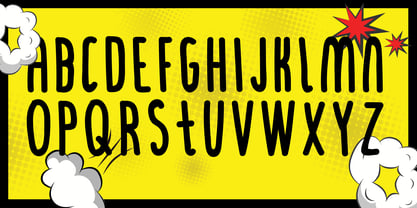 Comic font style
 - Egyptienne75 Black by Wooden Type Fonts,
$15.00 Bold Serif style
 - Chess-7 - Personal use only

- Murray Slab by Tkachev,
$25.00 Murray Slab is a techno-style typeface with four styles. This font family will be the best solution for posters, signage, magazine, product branding, corporate branding, logos and titles.
 - Danken by Etewut,
$30.00 DANKEN is an all caps display typeface that was created to mix font styles and create unlimited variety of effects. Now it has 25 font styles but it’s growing.
 - Ovalive by Heyfonts,
$15.00 ovalive is a versatile, bold and unique serif font. Combination between high contrast and Brutalism style, ovalive has a unique style with stylistic, alternates, ligatures and supports multilingual languages.
 - Bargo by Look Minus Today,
$10.00 Introducing Bargo - Sans Serif 3 Styles by Look Minus Today. Behind these 3 styles, we want to combine a typeface that can provide a different perspective. Regular which gives
 - Lemans by Heyfonts,
$13.00 Lemans is a versatile, bold and unique serif font. Combination between high contrast and Brutalism style, Lemans has a unique style with stylistic, alternates, ligatures and supports multilingual languages.
 - Corbby by Heyfonts,
$15.00 Corbby is a versatile, bold and unique serif font. Combination between high contrast and Brutalism style, Corbby has a unique style with stylistic, alternates, ligatures and supports multilingual languages.
 - Bunday Clean by Buntype,
$22.50 Bunday Clean is a minimalist and friendly font family with different moods. It drops everything unnecessary like spurs and ears and appears crisp and contemporary with a slightly squarish touch. Like the other members of the superfamily (Bunday™ Sans and Bunday™ Slab), Bunday Clean provides uprights, a second set of styles with characters that reference handwritten cursive. These curvy styles give words a distinct look and are especially attractive for use in display applications and logotype design. Bunday™ Clean is space-saving and creates a homogenous text color with good legibility. The font was manually hinted and contains extensive handcrafted kerning tables to ensure perfect appearance in all media. It ships with 9 standard, 9 upright, and the corresponding italic styles from a considerably thin hairline to a quite thick heavy. It supports at least 99 languages and provides OpenType® features for ligatures, alternative glyphs, localized forms, and much more. Feature Summary*: -4 Moods: Normal, Upright, Italic and Upright Italic -9 weights: Hair, Light, Thin, SemiLight, Regular, SemiBold, Bold, ExtraBold and Heavy -Supports at least 99 Languages incl. eastern european -Overall width: Narrow or Space-Saving -Advanced f- ligature set including fb -Discretionary s- and c- ligatures -Alternative Characters: a, e, f, g, l, t, y, A, E, F, L, and more -Capital German Eszett -Extra characters with Polish Kreska -Catalan Punt Volat -More than 570 characters per font * Some features may only be available in OpenType®-savvy applications Please, take a look at the other Bunday superfamily members: Bunday™ Sans Bunday™ Slab
 - Arabetics Harfi by Arabetics,
$59.00 Arabetics Harfi is a Latin Serif typeface with a comprehensive support for the Arabetic scripts, including Quranic texts. Careful spacing and kerning was used to enhance resulting text legibility both scripts. Arabetics Harfi fully supports MS 1252 Western and 1256 Arabic code pages, in addition to all transliteration characters required by the ALA-LC Romanization tables. Users can either select an accented character directly or form it by keying the desired combining diacritic mark following an unaccented character. For Arabic, it fully supports Unicode 6.1, and the latest Arabic Supplement and Extended-A Unicode blocks. The Arabic design of this font family follows the Mutamathil Taqlidi type style with connected glyphs, but it emphasizes a horizontal look and feel rather than verticalone, utilizing slightly varying x-heights. The Mutamathil Taqlidi type style uses one glyph per every basic Arabic Unicode character or letter, as defined by the Unicode Standards, and one additional final form glyph, for each freely-connecting letter of the Arabic cursive text. Arabetics Harfi includes the required Lam-Alif ligatures in addition to all vowel diacritic ligatures. Soft-vowel diacritic marks (harakat) are selectively positioned with most of them appearing on similar high and low levels—top left corner—, to clearly distinguish them from the letters. Tatweel is a zero-width glyph. Arabetics Harfi includes both Arabic and Arabic-Indic numerals, in addition to generous number of punctuation and mathematical symbols. It includes two weights, regular and bold, each of which has normal, right slanted Italic, and left-slanted styles.
 - Ricardo by Bureau Roffa,
$19.00 Rather than confining itself to a single style, Ricardo combines the best of two worlds: the conceptual clarity of a geometric design with the legibility and warmth of a humanist design. Its open counters, crisp joints, and even texture allow for effective use in long-form text settings, while its simple geometric shapes combined with some unexpected details make it highly suitable for display settings such as branding and marketing. Ricardo contains seven carefully chosen weights, ranging from ExtraLight to ExtraBold. The Medium weight functions as a slightly darker alternative to the Regular. Ricardo’s 812 glyphs per style support over a hundred languages, and also include arrows and case-sensitive punctuation. The Ricardo family consists of three subfamilies: Ricardo, Ricardo ALT, and Ricardo ITA. Ricardo contains the most conventional forms, and is the most suitable option for long-form text. Ricardo ALT contains simplified shapes for the a, j, u, and t, which are also accessible through Stylistic Set 2 within Ricardo (in opentype-savvy applications). The cursive-like italics of Ricardo ITA provide a slightly more eccentric alternative to the standard italics. Furthermore, all styles contain stylistic alternates that swap the blunt apexes in A, M, N, V, W, v, w, y, and 1 for pointier ones. These are also accessible through Stylistic Set 1. Other opentype goodness includes: (discretionary) ligatures, smallcaps, case-sensitive forms, fractions, nine sets of numerals, and more. David Ricardo (1772-1823) is considered the first of the classical economists, and combined ground-breaking mathematical abstractions with an understandable down-to-earth way of explaining his ideas.
 - European Soft Pro Variable by Bülent Yüksel,
$99.00 EUROPEAN SOFT PRO VARIABLE ABOUT FAMILY: What makes "European Soft Pro Variable" elegant, friendly and contemporary is its very rounded curves with very open terminals. "European Soft Pro Variable" has been designed with a higher "x-height" than other fonts in its class to make tiny readability more obvious in any use situation. It will be ideal for use in small sizes such as business cards or mobile applications. This typeface is also equipped with powerful OpenType features to satisfy the most demanding professionals. It has solid features like case sensitivity, small, true capitals, full ligatures, tabular figures for tables, old style figures to elegantly insert numbers into your sentences and more alternative characters to give personality to your projects. The extended, "European Soft Pro Variable" supports around 85 languages in the Latin, Cyrillic and Greek scripts, and its non-Latin components were developed with native consultants. With over 1200+ glyphs per style, "European Soft Pro" cares about localised letterforms and has the OpenType features to match. FEATURE SUMMARY: - 9 weights: Thin, ExtraLight, Light, Book, Regular, Medium, Bold, ExtraBold, and Black. - 4 widths: Normal, Narrow, Condensed, and Extra Condensed. - Matching italics (12º) for all weights and widths . - Matching small caps for all weights and widths. - Lining and old style figures (proportional and tabular). - Alternate characters (A, G, M, N, R, U, a, g, l, m, n, u, y). - Unlimited fractions. - Automatic ordinals (1st, 2nd, 3rd, etc.). - 24 Dingbats + 19 Social Media and Block Chain icons. - Extended language support: Most Latin-based scripts (including Vietnamese), Cyrillic, and Greek. - Extended currency support. You can contact me at buyuksel@hotmail.com, pre-purchase and post-purchase with questions and for technical support. You can enjoy using it.
 - Neonline by Ditatype,
$29.00 Neonline is a captivating display font that combines rounded letterforms with a subtle neon-inspired style. With its elegant uppercase characters and unique design, this typeface adds a touch of sophistication and modernity to your projects. The defining feature of Neonline lies in its rounded shapes, which exude a sense of softness and approachability. Each letter is meticulously crafted with smooth curves, creating a harmonious and pleasing aesthetic. The rounded forms give the font a friendly and inviting appearance, while the subtle neon style adds a hint of excitement and vibrancy. Neonline infuses a sense of allure and intrigue into each character. The font captures the essence of neon signs, casting a subtle glow that evokes a contemporary atmosphere. The neon style adds a touch of modernity and visual interest without overwhelming the design. The uppercase letterforms of Neonline are refined and sophisticated, commanding attention with their rounded shapes. The moderate boldness of the letters strikes a balance between impact and legibility. Enjoy the various features available in this font. Features: Alternates Multilingual Supports PUA Encoded Numerals and Punctuations Neonline perfect for headlines, branding materials, titles, and designs that call for a touch of elegance with a hint of neon inspiration. Whether you're creating posters, logos, packaging, or anything in between, this font will elevate your projects with its unique charm. It particularly shines in applications related to fashion, beauty, technology, and modern lifestyle themes. Find out more ways to use this font by taking a look at the font preview. Thanks for purchasing our fonts. Hopefully, you have a great time using our font. Feel free to contact us anytime for further information or when you have trouble with the font. Thanks a lot and happy designing.
 - Mirantz by insigne,
$32.00 Y’all ready for this? Now starting for Insigne: the new serif Mirantz. This rookie all-star plays a precise game every game, cutting at all the right angles to leave your reader impressed and ready to see more. You can always count on Mirantz to lead with solid mechanics and a clean style, but don’t be surprised when the face keeps it real with a little individual flare and creativity. This personal touch is nothing short of elegance in every appearance. So what makes us love this rookie above the other great players in the field? Contrast, for one. Mirantz brings more contrast to the game than most serifs out there. The serifs on this face have a crisp, sharp wedge that naturally draws the reader’s eye. You can’t help but fall in love with its clean, natural style. Mirantz also features a tall x-height and regular proportions that can play a number of positions on the page and still stay strong through the last half of the copy or even the final period. Mirantz is a solid powerhouse player, containing a complete set of small capitals and nine weights from thin to bold. It can play well both down low and up top with its subscripts and superscripts and can move your reader’s eye easily across the copy with its titling capitals, condensed and extended variants, and open style figures. With its options covering more than 72 Latin-based languages, look for this newcomer to have international success in the near future. It you haven’t set your draft picks for this next round of projects, think hard before passing up Mirantz. A capable serif like this one is a guaranteed asset to any team of fonts. Production assistance from Lucas Azevedo.
 - Gaz by Typodermic,
$11.95 Introducing Gaz, the square display typeface inspired by the gasoline station signs of the twentieth century. Sign painters used to refer to this type of lettering as “stovepipe”, due to its sharp angles and rounded corners. Gaz’s unique squareness exudes a vintage industrial charm, while still maintaining a friendly, almost organic feel. Gaz is available in seven weights and italics, giving you the flexibility to create a wide range of designs. But that’s not all. Gaz also comes in five greasy effect styles, perfect for creating that worn, grungy look. The ligatures contained in these styles are automatically substituted in most applications, projecting a more natural and authentic tone. Whether you’re creating a bold poster, an eye-catching logo, or a sleek website design, Gaz is the perfect choice for adding a touch of vintage industrial style. Try Gaz today and bring a piece of the past into your designs. Most Latin-based European writing systems are supported, including the following languages. Afaan Oromo, Afar, Afrikaans, Albanian, Alsatian, Aromanian, Aymara, Bashkir (Latin), Basque, Belarusian (Latin), Bemba, Bikol, Bosnian, Breton, Cape Verdean, Creole, Catalan, Cebuano, Chamorro, Chavacano, Chichewa, Crimean Tatar (Latin), Croatian, Czech, Danish, Dawan, Dholuo, Dutch, English, Estonian, Faroese, Fijian, Filipino, Finnish, French, Frisian, Friulian, Gagauz (Latin), Galician, Ganda, Genoese, German, Greenlandic, Guadeloupean Creole, Haitian Creole, Hawaiian, Hiligaynon, Hungarian, Icelandic, Ilocano, Indonesian, Irish, Italian, Jamaican, Kaqchikel, Karakalpak (Latin), Kashubian, Kikongo, Kinyarwanda, Kirundi, Kurdish (Latin), Latvian, Lithuanian, Lombard, Low Saxon, Luxembourgish, Maasai, Makhuwa, Malay, Maltese, Māori, Moldovan, Montenegrin, Ndebele, Neapolitan, Norwegian, Novial, Occitan, Ossetian (Latin), Papiamento, Piedmontese, Polish, Portuguese, Quechua, Rarotongan, Romanian, Romansh, Sami, Sango, Saramaccan, Sardinian, Scottish Gaelic, Serbian (Latin), Shona, Sicilian, Silesian, Slovak, Slovenian, Somali, Sorbian, Sotho, Spanish, Swahili, Swazi, Swedish, Tagalog, Tahitian, Tetum, Tongan, Tshiluba, Tsonga, Tswana, Tumbuka, Turkish, Turkmen (Latin), Tuvaluan, Uzbek (Latin), Venetian, Vepsian, Võro, Walloon, Waray-Waray, Wayuu, Welsh, Wolof, Xhosa, Yapese, Zapotec Zulu and Zuni.
 - European Sans Pro Variable by Bülent Yüksel,
$99.00 EUROPEAN SANS PRO VARIABLE ABOUT FAMILY: What makes "European Sans Pro Variable" elegant, friendly and contemporary is its very rounded curves with very open terminals. "European Sans Pro Variable" has been designed with a higher "x-height" than other fonts in its class to make tiny readability more obvious in any use situation. It will be ideal for use in small sizes such as business cards or mobile applications. This typeface is also equipped with powerful OpenType features to satisfy the most demanding professionals. It has solid features like case sensitivity, small, true capitals, full ligatures, tabular figures for tables, old style figures to elegantly insert numbers into your sentences and more alternative characters to give personality to your projects. The extended, "European Sans Pro Variable" supports around 85 languages in the Latin, Cyrillic and Greek scripts, and its non-Latin components were developed with native consultants. With over 1200+ glyphs per style, "European Sans Pro" cares about localised letterforms and has the OpenType features to match. FEATURE SUMMARY: - 9 weights: Thin, ExtraLight, Light, Book, Regular, Medium, Bold, ExtraBold, and Black. - 4 widths: Normal, Narrow, Condensed, and Extra Condensed. - Matching italics (12º) for all weights and widths . - Matching small caps for all weights and widths. - Lining and old style figures (proportional and tabular). - Alternate characters (A, G, M, N, R, U, a, g, l, m, n, u, y). - Unlimeted fractions. - Automatic ordinals (1st, 2nd, 3rd, etc.). - 24 Dingbats + 19 Social Media and Block Chain icons. - Extended language support: Most Latin-based scripts (including Vietnamese), Cyrillic, and Greek. - Extended currency support. You can contact me at buyuksel@hotmail.com, pre-purchase and post-purchase with questions and for technical support. You can enjoy using it.
 - Adelle Sans by TypeTogether,
$45.00 The Adelle Sans font family by José Scaglione and Veronika Burian provides a more clean and spirited take on the traditional grotesque sans. As is typical with TypeTogether typefaces, the most demanding editorial design problems were taken into consideration during its creation. The combination of lively character and unobtrusive appearance inherent to grotesque sans serifs make it an utterly versatile tool for every imaginable situation. Whether for global branding, screens, signage and advertising, or UI, the keyword behind Adelle Sans’s use is flexibility. To save space and keep legibility high, Adelle Sans is available in eight weights with matching italics and includes a condensed width of seven weights with their matching italics. Each of these 30 styles hits the perfect tone as a headline punch or subdued background hum, and the condensed widths are adept at setting short texts while retaining the expected personality. Rooted in the belief that broad language support is crucial to modern global type design, the Latin-matching variants are yet another push in TypeTogether’s ongoing multilingual efforts. The Latin script may have been first, but Adelle Sans has thus far been expanded into an exhaustive nine script family with extensive language support. Careful research and close collaboration with type experts yielded typographic consistency, legibility, and cultural awareness among all scripts, as well as filling the need for quality editorial typefaces in Arabic, Armenian, Chinese, Cyrillic, Devanagari, Latin Extended, Greek, and Thai, with more planned for the future. In addition to the 30 Latin styles, all other scripts have between seven and fourteen styles, each of which has been engineered to optically match the proportions of its counterparts. And each script comes bundled with the Latin script to ensure an harmonious fit amongst any two or more Adelle Sans families in the same block of text. The full Adelle Sans family delivers consistent, flexible, and personable results in multilingual documents, in apps, and multicultural branding worldwide. Its wide character set includes typographic niceties, small caps, several sets of figures, icons, and support for over 245 Latin-based languages. Be sure to check out the companions for Adelle Sans: Adelle, for a versatile and authoritative slab serif with no shortage of personality; and Adelle Mono, a two-width family flexible enough for developers and graphic designers alike.
 - ITC Bodoni Seventytwo by ITC,
$29.99Giambattista Bodoni (1740-1813) was called the King of Printers; he was a prolific type designer, a masterful engraver of punches and the most widely admired printer of his time. His books and typefaces were created during the 45 years he was the director of the fine press and publishing house of the Duke of Parma in Italy. He produced the best of what are known as modern" style types, basing them on the finest writing of his time. Modern types represented the ultimate typographic development of the late eighteenth and early nineteenth centuries. They have characteristics quite different from the types that preceded them; such as extreme vertical stress, fine hairlines contrasted by bold main strokes, and very subtle, almost non-existent bracketing of sharply defined hairline serifs. Bodoni saw this style as beautiful and harmonious-the natural result of writing done with a well-cut pen, and the look was fashionable and admired. Other punchcutters, such as the Didot family (1689-1853) in France, and J. E. Walbaum (1768-1839) in Germany made their own versions of the modern faces. Even though some nineteenth century critics turned up their noses and called such types shattering and chilly, today the Bodoni moderns are seen in much the same light as they were in his own time. When used with care, the Bodoni types are both romantic and elegant, with a presence that adds tasteful sparkle to headlines and advertising. ITC Bodoni™ was designed by a team of four Americans, after studying Bodoni's steel punches at the Museo Bodoniana in Parma, Italy. They also referred to specimens from the "Manuale Tipografico," a monumental collection of Bodoni's work published by his widow in 1818. The designers sought to do a revival that reflected the subtleties of Bodoni's actual work. They produced three size-specific versions; ITC Bodoni Six for captions and footnotes, ITC Bodoni Twelve for text settings, and ITC Bodoni Seventytwo - a display design modeled on Bodoni's 72-point Papale design. ITC Bodoni includes regular, bold, italics, Old style Figures, small caps, and italic swash fonts. Sumner Stone created the ornaments based on those found in the "Manuale Tipografico." These lovely dingbats can be used as Bodoni did, to separate sections of text or simply accent a page layout or graphic design." - ITC Bodoni Twelve by ITC,
$29.99Giambattista Bodoni (1740-1813) was called the King of Printers; he was a prolific type designer, a masterful engraver of punches and the most widely admired printer of his time. His books and typefaces were created during the 45 years he was the director of the fine press and publishing house of the Duke of Parma in Italy. He produced the best of what are known as modern" style types, basing them on the finest writing of his time. Modern types represented the ultimate typographic development of the late eighteenth and early nineteenth centuries. They have characteristics quite different from the types that preceded them; such as extreme vertical stress, fine hairlines contrasted by bold main strokes, and very subtle, almost non-existent bracketing of sharply defined hairline serifs. Bodoni saw this style as beautiful and harmonious-the natural result of writing done with a well-cut pen, and the look was fashionable and admired. Other punchcutters, such as the Didot family (1689-1853) in France, and J. E. Walbaum (1768-1839) in Germany made their own versions of the modern faces. Even though some nineteenth century critics turned up their noses and called such types shattering and chilly, today the Bodoni moderns are seen in much the same light as they were in his own time. When used with care, the Bodoni types are both romantic and elegant, with a presence that adds tasteful sparkle to headlines and advertising. ITC Bodoni™ was designed by a team of four Americans, after studying Bodoni's steel punches at the Museo Bodoniana in Parma, Italy. They also referred to specimens from the "Manuale Tipografico," a monumental collection of Bodoni's work published by his widow in 1818. The designers sought to do a revival that reflected the subtleties of Bodoni's actual work. They produced three size-specific versions; ITC Bodoni Six for captions and footnotes, ITC Bodoni Twelve for text settings, and ITC Bodoni Seventytwo - a display design modeled on Bodoni's 72-point Papale design. ITC Bodoni includes regular, bold, italics, Old style Figures, small caps, and italic swash fonts. Sumner Stone created the ornaments based on those found in the "Manuale Tipografico." These lovely dingbats can be used as Bodoni did, to separate sections of text or simply accent a page layout or graphic design." - ITC Bodoni Ornaments by ITC,
$29.99Giambattista Bodoni (1740-1813) was called the King of Printers; he was a prolific type designer, a masterful engraver of punches and the most widely admired printer of his time. His books and typefaces were created during the 45 years he was the director of the fine press and publishing house of the Duke of Parma in Italy. He produced the best of what are known as modern" style types, basing them on the finest writing of his time. Modern types represented the ultimate typographic development of the late eighteenth and early nineteenth centuries. They have characteristics quite different from the types that preceded them; such as extreme vertical stress, fine hairlines contrasted by bold main strokes, and very subtle, almost non-existent bracketing of sharply defined hairline serifs. Bodoni saw this style as beautiful and harmonious-the natural result of writing done with a well-cut pen, and the look was fashionable and admired. Other punchcutters, such as the Didot family (1689-1853) in France, and J. E. Walbaum (1768-1839) in Germany made their own versions of the modern faces. Even though some nineteenth century critics turned up their noses and called such types shattering and chilly, today the Bodoni moderns are seen in much the same light as they were in his own time. When used with care, the Bodoni types are both romantic and elegant, with a presence that adds tasteful sparkle to headlines and advertising. ITC Bodoni™ was designed by a team of four Americans, after studying Bodoni's steel punches at the Museo Bodoniana in Parma, Italy. They also referred to specimens from the "Manuale Tipografico," a monumental collection of Bodoni's work published by his widow in 1818. The designers sought to do a revival that reflected the subtleties of Bodoni's actual work. They produced three size-specific versions; ITC Bodoni Six for captions and footnotes, ITC Bodoni Twelve for text settings, and ITC Bodoni Seventytwo - a display design modeled on Bodoni's 72-point Papale design. ITC Bodoni includes regular, bold, italics, Old style Figures, small caps, and italic swash fonts. Sumner Stone created the ornaments based on those found in the "Manuale Tipografico." These lovely dingbats can be used as Bodoni did, to separate sections of text or simply accent a page layout or graphic design." - ITC Bodoni Brush by ITC,
$29.99Giambattista Bodoni (1740-1813) was called the King of Printers; he was a prolific type designer, a masterful engraver of punches and the most widely admired printer of his time. His books and typefaces were created during the 45 years he was the director of the fine press and publishing house of the Duke of Parma in Italy. He produced the best of what are known as modern" style types, basing them on the finest writing of his time. Modern types represented the ultimate typographic development of the late eighteenth and early nineteenth centuries. They have characteristics quite different from the types that preceded them; such as extreme vertical stress, fine hairlines contrasted by bold main strokes, and very subtle, almost non-existent bracketing of sharply defined hairline serifs. Bodoni saw this style as beautiful and harmonious-the natural result of writing done with a well-cut pen, and the look was fashionable and admired. Other punchcutters, such as the Didot family (1689-1853) in France, and J. E. Walbaum (1768-1839) in Germany made their own versions of the modern faces. Even though some nineteenth century critics turned up their noses and called such types shattering and chilly, today the Bodoni moderns are seen in much the same light as they were in his own time. When used with care, the Bodoni types are both romantic and elegant, with a presence that adds tasteful sparkle to headlines and advertising. ITC Bodoni™ was designed by a team of four Americans, after studying Bodoni's steel punches at the Museo Bodoniana in Parma, Italy. They also referred to specimens from the "Manuale Tipografico," a monumental collection of Bodoni's work published by his widow in 1818. The designers sought to do a revival that reflected the subtleties of Bodoni's actual work. They produced three size-specific versions; ITC Bodoni Six for captions and footnotes, ITC Bodoni Twelve for text settings, and ITC Bodoni Seventytwo - a display design modeled on Bodoni's 72-point Papale design. ITC Bodoni includes regular, bold, italics, Old style Figures, small caps, and italic swash fonts. Sumner Stone created the ornaments based on those found in the "Manuale Tipografico." These lovely dingbats can be used as Bodoni did, to separate sections of text or simply accent a page layout or graphic design." - ITC Bodoni Six by ITC,
$40.99Giambattista Bodoni (1740-1813) was called the King of Printers; he was a prolific type designer, a masterful engraver of punches and the most widely admired printer of his time. His books and typefaces were created during the 45 years he was the director of the fine press and publishing house of the Duke of Parma in Italy. He produced the best of what are known as modern" style types, basing them on the finest writing of his time. Modern types represented the ultimate typographic development of the late eighteenth and early nineteenth centuries. They have characteristics quite different from the types that preceded them; such as extreme vertical stress, fine hairlines contrasted by bold main strokes, and very subtle, almost non-existent bracketing of sharply defined hairline serifs. Bodoni saw this style as beautiful and harmonious-the natural result of writing done with a well-cut pen, and the look was fashionable and admired. Other punchcutters, such as the Didot family (1689-1853) in France, and J. E. Walbaum (1768-1839) in Germany made their own versions of the modern faces. Even though some nineteenth century critics turned up their noses and called such types shattering and chilly, today the Bodoni moderns are seen in much the same light as they were in his own time. When used with care, the Bodoni types are both romantic and elegant, with a presence that adds tasteful sparkle to headlines and advertising. ITC Bodoni™ was designed by a team of four Americans, after studying Bodoni's steel punches at the Museo Bodoniana in Parma, Italy. They also referred to specimens from the "Manuale Tipografico," a monumental collection of Bodoni's work published by his widow in 1818. The designers sought to do a revival that reflected the subtleties of Bodoni's actual work. They produced three size-specific versions; ITC Bodoni Six for captions and footnotes, ITC Bodoni Twelve for text settings, and ITC Bodoni Seventytwo - a display design modeled on Bodoni's 72-point Papale design. ITC Bodoni includes regular, bold, italics, Old style Figures, small caps, and italic swash fonts. Sumner Stone created the ornaments based on those found in the "Manuale Tipografico." These lovely dingbats can be used as Bodoni did, to separate sections of text or simply accent a page layout or graphic design." - FM Bolyar TypeCraft by The Fontmaker,
$29.00 A super font family mastered to an unparalleled level of precision, Bolyar TypeCraft is a collection multiple textured styles that represent historical printing techniques. A proud member of our successful Bolyar lineage this unique type family provides unlimited options for your creativity and is quite able to satisfy every typographic taste. If you are addicted to classic vintage style, then you could easily use Bolyar TypeCraft for almost any project of desire - from letterheads, logos and catchy headlines to elegant packaging, book covers and wine labels. Alternates, Swashes and Ligatures will help you customize almost every single letter and fit perfectly to your artwork. Bolyar TypeCraft provides a broad range of advanced typographical features: Multiple subfamilies each packing the two classic Bolyar styles - Regular (N) and Ornate (O). Five weights per style ranging from thin (100) to black (900) with full multilingual support for all Latin based languages as well as Cyrillic. A 1000+ glyphs per weight including three multilingual stylistic sets, swash designs and useful discretionary ligatures. Sub- and superscript basic Latin and Cyrillic glyphs as well as figures. Two positional models for lowercase accessed as OpenType case sensitive forms - baseline (default) or vertical centering. Contextual alternates and special stylistic set with different contour roughness exclusively developed for Bolyar Rough subfamily. A multifunctional Bolyar Shadow family witch can be flawlessly paired with any of the sub-family styles provided. Check out some great examples of Bolyar TypeCraft in use by the Labelmaker
 - Christmas Cove by Factory738,
$15.00 When the air becomes crisply chilly and we start thinking of festive projects in time for Christmas, it's time to celebrate. Christmas Cove, A classic Christmas typeface for sleigh rides and carol singing. Included are all of the necessary elements, such as numbers, punctuation, and multilingual letters. These ligatures will come in useful no matter what your imagination conjures up. 10 Styles Basic Latin A-Z and a-z Numerals & Punctuation Stylistic Ligatures Multilingual Support for ä ö ü Ä Ö Ü ... Free updates and feature additions Thanks for looking, and I hope you enjoy it.
 - Hempa Sans by Yukita Creative,
$9.00 Hempa Sans is a modern sans serif font family with a geometric touch. Consists of 16 Styles 8 upright and 8 inclined to match. Thin Weight - Black Designed with strong open-type features in mind. This font has alternate characters in Letters (G, M, R, g, k, r, t, u, y). Each weight includes extended language support for numbers, arrows, binders, and more. Great for graphic design and any display use. It can easily work for Web, Print, and more. This typeface comes with a standard 445 character set that supports more than 80 Latin-based languages.
 - Adoreline by Raditya Type,
$19.00 Adoreline is a stunning modern handwritten font. This extraordinary collection comes in a luxurious and elegant handwritten style. with the added support of ligatures and swashes to make it even more impressive, to give your designs the perfect look. Adoreline contains opentype features like swashes & ligatures. Perfect for logos, printed quotes, badges, badges, packaging, titles, posters, t-shirts / clothing, greeting cards and wedding invitations, & more. To use swash, you need a program that supports OpenType features such as Adobe Illustrator CS, Adobe Photoshop CC, Adobe Indesign, and Corel Draw. No special software is required to use fonts in their basic form.
 - Storybook by ArtyType,
$29.00 Storybook is a friendly informal script with rounded features and a generous x-height for enhanced legibility. This distinctive italic typeface comes in three weights and bridges the gap between traditional scripts and contemporary hand-written styling; it adapts to a nostalgic or classic purpose whilst retaining a modern feel at the same time. The design lends itself to subject matters like childrens' books, various literature projects and even speech bubbles in equal measure. The Storybook glyph palette boasts an extended European character set and a well considered series of swash alternates which instantly transform the appearance of any texts when activated.
 - Randolph by Jukebox Collection,
$32.99 Randolph is a popular font family from Jukebox done in an old fashioned copperplate etching style that harkens back to the days of old leather-bound shop ledgers and hand painted window signs. The large and wide letterforms of Randolph make a bold statement that will add solidity and impact to any design. Jukebox fonts are available in OpenType format and downloadable packages contain both .otf and .ttf versions of the font. They are compatible on both Mac and Windows. All fonts contain basic OpenType features as well as support for Latin-based and most Eastern European languages.
 - Almonet Ronded by Gian Studio,
$16.00 About Product Almonet Ronded is a modern script font with a bold rounded style with a bold and modern look. This font is suitable for logos, branding, product design, product packaging, photography, watermarks, social media posts, advertisements, invitations, stationery, labels, logos, magazines, books, greeting/wedding cards, fashion, makeup, and more. other. What's Included: - Uppercase & lowercase - Numbers and punctuation marks - Multilingual support - Ligature - Alternative - Washing - Works on PC & Mac - Simple installation Accessible in Adobe Illustrator, Adobe Photoshop, Adobe InDesign, even works in Microsoft Word. PUA Coded Characters – Fully accessible without additional design software. Thank you for your purchase! Hope you enjoy with our fonts!
 - Almalik by Arterfak Project,
$29.00 Salaam. Introducing Almalik, an Arabic style font, created in monoline shape and based on original Arabic letters adapted into Latin typography. Almalik represents the middle-east feel in a modern touch, with fewer calligraphy shapes, and dynamic swashes. Perfect for many purposes such as fashion, food, packaging, label, logo, logotype, quotes, headline, branding, and more! This font provides 400+ glyphs including lots of alternates characters that you can apply to get your design looks more attractive! What you'll get : Uppercase Lowercase Numbers & symbols Stylistic alternates Stylistic sets 01-03 Ligatures Multilingual support. PUA encoded. Thank you for your support!
 - Rothest by Taznix Creative,
$7.00 Rothest is an elegant and classic blackletter font. Fall in love with its incredibly versatile style and use it to create spectacular designs! Rothest Typeface includes a full set of character A-Z, as well as multi-lingual support, currency figures, numerals, and punctuation. What's Included : Standard glyphs Ligature Works on PC & Mac Simple installations Accessible in the Adobe Illustrator, Adobe Photoshop, Adobe InDesign, even work on Microsoft Word. PUA Encoded Characters - Fully accessible without additional design software. Fonts include multilingual support for; ä ö ü Ä Ö Ü ß ¿ ¡ Hope you enjoy with our font! Taznix
