10,000 search results
(0.021 seconds)
- Snoop City by Supersemarletter,
$10.00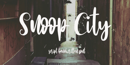 Snoop City is a flowing handwritten font, described by an elegant touch, perfect for your favorite projects. Fall in love with its incredibly distinct and timeless style and use it to create spectacular designs!. Honestly it works perfectly for headlines, logos, posters, packaging, T-shirts and much more. Font Features : • Regular version • Character set A-Z in uppercase and lowercase • Numerals & Punctuation • Accented Characters • Multiple Languages Supported Recommended to use in Adobe Illustrator or Adobe Photoshop with opentype feature. If you have questions, just send me a message and I'm glad to help.
 - Geometrico Sans by FSdesign-Salmina,
$39.00 Are you looking for a modern typeface? Geometrico. Round without Compromises. Now 12 Italic Styles added. Even more futuristic than the classical Bauhaus typeface Futura, “Geometrico” is a geometric typeface based on round shapes as suggested by its name. Designed without compromises, neither in form nor in function: Geometrico is ideal for logotypes, headlines and other modern typographic purposes. Would Paul Renner be delighted? Or would he turn around in the grave? Make your own opinion. Try Geometrico for free. Download a free trial version of Geometrico with a reduced character set. Check it out!
 - Egon Sans by TipografiaRamis,
$29.00 Egon Sans is a geometric sans serif typeface family built in ten styles (extra-light, light, regular, bold and black weights all in roman and italic). Egon Sans is an extension to the Egon (Slab Serif) family, designed in 2008. The typeface is designed with industrial and architectural flavor, as homage to Egon Eiermann, one of Germany’s great architects of 20th century. Egon Sans is ideal as text and display font for publication use. Egon Sans is released as OpenType single master with a Western CP1252 character set.
 - Munika by Gravitype,
$24.90 Munika is a modern sans serif born from the equilibrium between geometric shapes and humanist details. Its lines were forged with the concept of clarity in mind, to make it the perfectly accessible typeface. This global family comes in 9 weights plus matching italics, with ligatures that facilitate readability and the alternative letter “a” in both versions. These features were conceived to further expand the range of use of the type system, to offer multiple aesthetic and technical options. Munika’s unique personality and fresh style make it perfect for a rebrand. Multilingual support is available.
 - Ruttels by Creative17studio,
$9.00 Introducing A new typeface, “Ruttels“. “Ruttels” is a unique and powerful display font. Inspired by the unique and popular Motter Ombra font designed by Othmar Motter. Ruttels is a custom font, which this font can be applied in various types of design and web-print. the form of a character that seems strong, makes this font can give a prominent impression in every design. Features: – Complete basic characters – Numbers and punctuation marks -Multilingual support -Alternative letters Available in regular, italic, and outline styles Any question? just ask. Free update.
 - Bonnycastle by Three Islands Press,
$39.00 Sir Richard Henry Bonnycastle (1791–1847) was an English officer and military engineer who served in the War of 1812 and ultimately settled in Canada. I stumbled upon copies of some of his charts and maps, became infatuated with the hand-lettered titles—and the result is the eponymous Bonnycastle. The font has a bold weight and an italic style but is intended as an eye-catching standalone, evocative of its period in history. Use as a titling face on branding materials, event posters, book covers, presentation graphics, historical illustrations, and the like.
 - MVB Hotsy Totsy by MVB,
$39.00MVB Hotsy Totsy is Akemi Aoki’s first typeface design. Aoki created the letters in cut paper. Once digitized, the design was expanded to offer several weights and styles. Exaggerating the triangular serifs and tapering strokes of “Latin” typefaces, MVB Hotsy Totsy is the perfect party face, appearing frequently on board games, product packaging, and in children’s books. It is named for (what was at the time) a dive bar in Albany, California. The bar has since been renovated but its neon sign was preserved, a local landmark of San Francisco’s East Bay. - Salda by Hurufatfont,
$19.00 Salda; It is a modern sans serif family that blends old and new generation sans serif fonts in the same body. It has a wide usage area with its light narrow structure, sharp and clean lines, humanist touches. It provides clean and smooth visuals in vertical screens, mobile applications and block texts. With two different x heights (xL-xS), the body offers richness in text and headings. It consists of a total of 40 styles. Ideal for all kinds of editorial design, packaging, corporate identity, brand, application, web and desktop.
 - Magistral by ParaType,
$30.00The first three weights of the family were designed at ParaType (ParaGraph) in 1997 by Dmitry Kirsanov . They were based on the artworks of Moscow graphic designer Andrey Kryukov (1923-1997). The original version was developed by Kryukov at the end of the sixties for Russian railways. The proportions and elements of construction were inspired by Eurostile (1962) by Aldo Novarese. It is intended for use in advertising and display typography. In 2009, Dmitry added the new styles, corrected the old ones, and enhanced them with extended character sets. - Amaral by Oliveira 37,
$26.00 Amaral is a family of 12 fonts with a contemporary design style, based on different historical models. The calligraphic influences are subtle, best noticed in italics. The result is a set of fonts that look more "constructed" than "written". Available in six weights of the Roman and Italic types, Amaral has a wide palette of glyphs. In addition to offering extensive support for Latin sets, among many OpenType resources, each font contains small caps and contextual ligatures, totaling more than 728 glyphs. Amaral is an option for editorial design projects and other related applications.
 - Antiquarian Scribe by Three Islands Press,
$39.00 Henri Abraham Chatelain was a cartographer and publisher of the famous Atlas Historique, ou Nouvelle Introduction a L'Histoire, a world atlas released between 1705 and 1732 in Amsterdam. A few years ago, at an antique book shop in London, I bought a page from Chatelain's atlas—a page covering the Near East, India, the Indian Ocean—that had a particularly alluring, oblique handlettering style. The text is in French, which gave me plenty of samples of diacritics and accented characters. The overall effect is neat and legible, with a distinctly historical flair.
 - Chivertta by Eurotypo,
$38.00 Chivertta combines elements of casual and modern aesthetics. The font is inspired by a logo discovered on the streets of Buenos Aires. One of Chivertta’s distinctive features lies in its careful design and its wide repertoire of ligatures and stylistic alternatives. This extensive collection offers a wealth of options, allowing designers to enhance their creative output, imbuing their designs with a greater sense of authenticity and realism. In essence, Chivertta transcends convention, offering a powerful tool for designers and resulting in designs that come out with authenticity and contemporary style.
 - Dalglish by Tanziladd,
$10.00 Dalglish is a serif family with clean curves that gives the typeface a refined touch that give any headline an elegant appearance, with both modern and vintage curves. Dalglish represents luxury, glamour, exuberance, and faith in social and technological progress. Dalglish is inspired by the art deco design style and poster design at France in the 19th Century. Dalglish has pretty alternatives glyphs choice in the pack as well. Beside those alternatives, the pack also includes three different stylistic alternatives which are Regular, Italic, Bold annd multilingual support.
 - BachelorScript by Fontforecast,
$39.00 BachelorScript is the preliminary design for GraduateScript, released in june 2013. You can clearly see the resemblance between the two, but while Bachelor is frisky and authentic, Graduate is more polished and staged. GraduateOrnaments was originally designed to complement GraduateScript, but it can be used just as well in combination with BachelorScript. BachelorScript has a casual look and feel and comes in two weights: regular and bold. It offers multiple language support, five numeral styles, real fractions and ligatures for double letters. Various glyphs to mark, underline, circle or cross-out words are also included.
 - Clonoid by Dharma Type,
$19.99 Inspired by and tribute to arcade game logos in 80s and 90s. Clonoid can give futuristic, sci-fi and mechanical impression by its geometric framework but its rounded bowls and semi-rounded edges can make natural and soft impression too. And its orthodox letterform make it possible to use this font for all uses. Clonoid family consists of 12 styles, 6 weights (ExtraLight, Light, Regular, SemiBold, Bold and Black) & italics and it’s available in OpenType format. We released 4 big Sci-Fi families in 2013. Check it out! Clonoid Controller Geom Graphic Space Colony
 - Nacho Script Pro by Vástago Studio,
$19.99 Nacho Script is a classic and casual typeface ideal for give to your design a confortable touch of traditional feeling, casual style and luxury looks. Is a script system of glyphs with a subtle modulations in it strokes, because it's inspired on the classic advertising from the golden age of ads in 1950; promptly in 1957. Was so amazing design it and create it for multiple uses like ads for food, drinks, traveling, commercial products, and personal things, and thats it. Enjoy it like we enjoy it creating it. Thanks for your buy.
 - URW Geometric by URW Type Foundry,
$35.99 URW Geometric® is a sans serif typeface inspired by the German geometric typefaces of the 1920s but designed for modern usability. The character shapes have optimized proportions and an improved balance, the x-height is increased, ascenders and descenders are decreased. Special glyphs, which are often designed afterwards for the original geometric typefaces from the 1920s, are perfectly integrated in the URW Geometric® . These design characteristics increase the usability and legibility tremendously. With its 10 weights ranging from Thin to Black, plus 10 additional oblique styles, it has a great versatility in mind. The extreme light styles shine bright in large sizes, the middle weights are perfect for body copy and the bolder variants for the use of emphasis information or bring a strong impact to headlines and information. The optically balanced styles are designed to work in perfect harmony together. URW Geometric® is functional, strong, simple and harmonized in form, and at a glance appears as a modern variant of its predecessors. Apart from the basic characters the design has an extra focus on the special glyphs. These are designed for todays needs. For example: the email glyph looks modern and unique, including a perfectly balanced spacing. The numero sign, in modern use called “hashtag”, is space saving and optically balanced for body text. Additionally, various extra and alternate glyphs are designed to provide a friendly usability. Including a wide Latin language support and character sets, URW Geometric® is perfectly designed for today’s requirements. Please have a look at the URW Geometric® Type Specimen (PDF) for further information.
 - Lafleur by Resistenza,
$45.00 Inspired by the iconic Fenoglio-Lafleur Liberty building in the city of Turin, in an area with significant Stile Liberty buildings and New Gothic architecture. Lafleur is a decorative face with a remarkable art nouveau flair from 19th century. Perfect for creative contemporary uses in print and on screen. We recommend it for book covers, packaging, branding, editorial, web, advertising, apparel, purposes are endless.
 - Arta by Olivier Blanc,
$34.00 ARTA is an ArtDeco style font, inspired by classic font like Newport Classic with elongated typeface with high waisted uppercase letters which curve in an geometric and elegant way. It consisted of really condensed lettering which had little space available. It's a well complet font with 315 Glyphs for most latin languages as "English, French, Spanish, German, Icelandic, Afrikaans, Catalan, Czech, Esperanto, Hungarian, Latin, Latvian, Lithuanian, Maltese, Northern Sami, Polish, Serbo-Croatian, Slovak, Slovene, Sorbian, Turkish and Welsh". ARTA will give to your design an chic presentation, you will be able to generate beautiful writings,thanks to 3 differents type "Light, Regular & Bold". It can be used for Shop, Restaurant, Jewelry, Cosmetic, Press identity & more. I started to work on this typeface at the creation of a logo in 2017 for the butcher shop of my uncle in Luchon in France named "Le Louchébem". I always had in mind to complete & share it. So after some years, I decided that it was time to finish it. This was my first Typography creation and I wanted to make it as an Art Deco typeface. I really love this elegant, high & classy lettering style. I want to bring this 1910's vibes back to be more use in our days.
 - LC Tejuela by Compañía Tipográfica de Chile,
$29.00 Tejuela (Spanish for “Wood Shingle”) is a neoclassical type inspired by the wooden architecture of the ancient churches of Chiloé, an archipelago in southern Chile; which are World Heritage Sites. This typeface has rough and broken forms but with soft strokes. The neoclassical characteristic of Tejuela is due to the architecture of these temples, which belong to this style but adapted to wood with excellent quality and ingenuity by Chiloé builders using a material available in the area. Therefore, this typeface reflects the tradition of the fonts of that period, but adapted to the coarseness and warmth of the southern wood of the world. Tejuela is useful for extensive texts in literature, history, art and heritage; as also for short and large phrases in headlines according to the occasion. Tejuela has eight variants in Roman and Italic versions, with small caps, Old Style and Lining numbers, ligatures, alternative glyphs, fractions, among other OpenType features; special mention to the capital letters Swash of the italic versions, which serve to generate delicate compositions. In addition, it has two stylistic sets to compose border ornaments inspired by the Chilota Architecture: colonnades and corners, only using the numbers on the keyboard; it is important that the line spacing has the same value as the font.
 - Chipen by 38-lineart,
$14.00 I am pleased to present you an excellent futuristic font "Chipen" in unique graphic style! This font consists of regular, expanded, regular italic and expanded italic, these 4 fonts are encapsulated in one variable. With one font variable, this will cover 4 styles and cover all the weights between regular and expanded. If you are used to working with variable fonts it will give you more weight options, if you have never tried this variable font it will be an amazing new experience for you, take a look at this video snippet: https://youtu.be/jgqNPGeoVjc Chipen comes in bold and with a “RoundCube” cut, this is perfect for modern, Sci-Fi, and technology themes. Coupled with the stripe in the middle of the makes it appear more sporty. Not only that, this stripe can also display "Eighties" if you package it in a retro concept. Another strength of this font is the lowercase ligature, we present a lot of ligatures and one of them might be suitable for your logo brand. Finally, this font is a dynamic font with a variable concept capable of covering more 'weight', unique to appearing in various eras, exploring the world of retro and even science and fiction.
 - Fab Figures by Letterwerk,
$10.00 Fab Figures is a numbers-only font. This high contrast display font family with curly terminals is a great choice for infographics and posters. The entire font family consists of 10 styles: 2 styles for big usage, 2 styles for normal usage, 2 styles for small usage and 3 patterned styles (fitting to the big styles). Character Set: 1 2 3 4 5 6 7 8 9 0 | % # • ~ { $ £ € } . , : ; + - = ÷ / ° * ' ’ (Arrows) (No-Symbol) (Nr-Symbol)
 - Serling Galleria by Mans Greback,
$39.00 Serling Galleria is a classy, classic serif font that exudes an air of fine art and high-end creativity. With its clear, legible letterforms and modernist inventiveness, Serling Galleria brings a touch of strict creativity to your designs, making them stand out in sophistication. This versatile font family is perfect for projects that require a refined, elegant aesthetic. With its variable font feature, you have the flexibility to fine-tune the font to your specific needs and create a truly bespoke typographical experience, or use the pre-defined font styles: Thin, Thin Italic, Extra Light, Extra Light Italic, Light, Light Italic, Regular, Regular Italic, Medium, Medium Italic, SemiBold, SemiBold Italic, Bold, Bold Italic, Extra Bold, Extra Bold Italic, Black, Black Italic The diverse styles in the Serling Galleria font family provide unmatched versatility, allowing you to adapt your typography to various design contexts and moods seamlessly. With this array of weights and styles at your fingertips, you can effortlessly create a visual hierarchy, emphasize key elements, and establish a cohesive, engaging design language across your creative projects. Also includes a variable font! Only one font file, but the file contains multiple styles. Use the sliders in Illustrator, Photoshop or InDesign to manually set any weight and width. This gives you not only the predefined styles, but instead more than a thousand ways to customize the type to the exact look your project requires. Built with advanced OpenType functionality, Serling Galleria ensures top-notch quality and provides you with full control and customizability. It includes stylistic and contextual alternates, ligatures, and other features to make your designs truly unique and tailored to your needs. Serling Galleria offers extensive lingual support, covering all Latin-based languages, from Northern Europe to South Africa, from America to South-East Asia. It contains all the characters and symbols you'll ever need, including all punctuation and numbers.
 - Collogue by Heyfonts,
$25.00 Collogue - Variable Font is a cutting-edge and versatile typeface that brings a new level of adaptability to display typography. Unlike traditional fonts with fixed styles, a variable font allows designers to manipulate various aspects of the typeface, such as weight, width, and slant, along a continuous spectrum. Here's a comprehensive explanation of the features and functions of the Display Variable Font: Key Features: -Adaptive Design Elements: The primary feature of the Display Variable Font is its adaptability. -Designers can seamlessly vary specific attributes of the font, including weight, width, slant, and more. -This flexibility empowers designers to fine-tune the typography to suit the visual aesthetics of their projects. -Single Font File, Multiple Styles: Display Variable Fonts consolidate multiple styles into a single font file. This eliminates the need for separate files for different styles, providing a streamlined and efficient solution for designers. -Smooth Transitions: Changes in the font attributes occur smoothly and continuously. Unlike traditional fonts that switch abruptly between styles, a Display Variable Font ensures a fluid transition, allowing for a more harmonious and visually pleasing typographic experience. -Precision Control: Designers have precise control over the variation axis, enabling them to adjust the font's appearance with granular precision. This level of control enhances the typographic customization possibilities and allows for fine-tuning based on specific design requirements. -Responsive Typography: Display Variable Fonts excel in responsive design. They adapt gracefully to various screen sizes and resolutions, ensuring optimal readability and aesthetics across different devices. Functions: -Dynamic Branding: For brands looking to establish a dynamic and adaptable visual identity, Display Variable Fonts offer the perfect solution. The font's ability to adjust seamlessly allows for a versatile and cohesive branding experience across diverse applications. -Editorial Freedom: In editorial design, Display Variable Fonts provide editorial teams with the freedom to experiment with typography. The font can be adjusted to suit different sections or emphasis points within publications, enhancing the overall visual appeal. -Web Design Innovation: Display Variable Fonts are at the forefront of innovation in web design. They enable designers to create dynamic and interactive typographic elements that respond to user interactions, contributing to a modern and engaging web experience. -Attention-Grabbing Displays: Whether used in signage, banners, or large-scale displays, Display Variable Fonts stand out with their adaptability. Designers can experiment with different styles within a single font to create attention-grabbing and visually dynamic displays. -Customizable Interfaces: In digital interfaces, Display Variable Fonts provide a customizable typographic experience. Designers can optimize text elements for different device sizes and orientations, ensuring a seamless and visually pleasing user interface. -Innovative Advertising: Display Variable Fonts offer a fresh approach to advertising typography. Brands and advertisers can leverage the font's adaptability to create visually striking and memorable campaigns across various media channels. In summary, Display Variable Fonts represent a groundbreaking evolution in typographic design, providing designers with unprecedented flexibility and control
 - Kulturista by Suitcase Type Foundry,
$39.00 Kulturista is an unmistakeable linear slab serif typeface with pronounced rectangular serifs. The drawings are based on the sans-serif Nudista typeface, and Kulturista also inherits Nudista’s distinctive narrowed character proportions, range of weights and glyph sets. The italics are inclined sufficiently, and have the same width and colouring as the plain styles. They aren’t just a mechanically-slanted version of the basic styles, as is often the case for typefaces derived from geometrical images — a whole range of characters have their own drawn variants, which greatly strengthens their highlight function. The italics are therefore an equal partner for the roman styles. Kulturista is definitely a good choice for a headline typeface for magazines and book covers. The range of boldness can come in handy when editing sections, headlines and supplements. The typeface understandably proves itself as a healthy foundation for a unified visual style, and holds up at display sizes as well as on shorter texts.
 - Fragrance by Scholtz Fonts,
$15.00 Fragrance was inspired by script styles of the twentieth century, and brought into the early 21st century with extravagant, sweeping, upper-case letters and smaller "x" height. Fragrance Antique is a new style for the delicate, feminine Fragrance font. Fragrance Antique retains its elegance, but has a deconstructed, grunged appearance, making it perfect for "ancient" manuscripts, medieval wedding stationery, greeting cards and graffiti style advertising material. The font has a delicate, feminine style reminiscent of elusive perfumes, its elegance emphasized by the contrast between upper and lower case characters. Upper case swashes extend outwards, slashing across or underlining more demure lower case letters. Fragrance is perfect for wedding stationery, greeting cards, lingerie, flowers, perfume and cosmetic advertising, book covers and magazine pages. The font contains over 272 characters - (upper and lower case characters, punctuation, numerals, symbols and accented characters are present). It also includes "open-type"characters to enhance the flow of the text. It has all the accented characters used in the major European languages.
 - Orchid Key by Missy Meyer,
$12.00 I built the Orchid Key font family from the ground up with the idea that there would be several different styles; the Inline Spurs style was the first to be built, which let me then subtract the spurs, inline slices, or both to make the other styles. I've never made a font quite like this before, which shows in the time it took - it's been over 5 months since I started construction! Each style contains the same character set, with 700 total glyphs. Each has the usual basics: letters, numbers, and punctuation; plus over 300 extended Latin characters for language support, and almost 200 alternates for tons of variety! There's a swash alternate for every uppercase letter, at least 6 alternates for every single lowercase letter, and a set of 10 extra swashes and flourishes so you can customize! Whether you're looking for a western or country look, a retro look, or a modern hipster look for your project, check out Orchid Key!
 - Diabolus by Artisticandunique,
$36.00 Diabolus - Serif Font Family - Multilingual - 3 Style On the basis of Diabolus, it is a mix of the old-fashioned Gothic serif family. The old-style serif combination combines modern aesthetics with fantasy and Gothic serif fonts, making Diabolus a versatile family that can be used in many different design projects. This font offers a wide variety of styles to help you discover the best mood for your projects, from body text to big headlines, from classic to modern and bold styles. Well suited for books and magazines, magazine and album covers, editorial, headlines, websites, logos, invitations, branding, advertising, and more. CHARACTER RANGES : Basic Latin, Latin-1 Supplement, Latin Extended-A, Latin Extended-B, General Punctuation, Currency Symbols, Letterlike symbols, Arrows, Mathematical Operators, Miscellaneous Technical, Geometric Shapes, Miscellaneous Symbols CJK Symbols And Punctuation, Private Use Area (plane 0), Alphabetic Presentation Forms With this font you can create your unique designs. If you have a question, please contact me. Have a good time.
 - Normerif by Invasi Studio,
$19.00 Introducing the Normerif Font, the perfect typeface for those seeking a touch of elegance and vintage style in their designs. With its display serif style and elegant alternates, Normerif provides a fashionable and sophisticated look to any project. This font is specially designed for classic-themed projects and is perfect for creating simple, clean, and stylish designs. Whether you're looking to create logos, titles, magazines, or any other design project, Normerif is a perfect choice. Its elegant and refined serif style makes it suitable for a wide range of design applications, including print materials, websites, and more. The font features stylish alternates, which add a touch of sophistication and elegance to your designs. So if you're looking to add a touch of class and sophistication to your next project, look no further than Normerif Font. With its elegant and fashionable style, this font is perfect for creating simple, clean, and stylish designs that will make your projects stand out.
 - Ico Phone by Setup,
$19.95 Ico Phone is a set of 115 symbols depicting anything that happens on the screen of a regular mobile phone. To name a few, there are Bluetooth and sync icons, signal bars, battery statuses, media playback icons, USB symbol, lock icon as well as a wifi signal strength indicator. The style of Ico is inspired by the look of symbols used on the classic monochrome LCD displays. The symbols are monolinear with rounded corners, composed of a smallest possible number of elements. In addition, the rounded style is accompanied by a second style with sharp corners and more detailed drawing. All symbols of Ico share the same width, making the font compatible with the LCD typeface ION. Together, they are the perfect sollution for LCD style typography. Ico Phone is a part of a larger set. Have a look at the other available Ico fonts and don't forget to check back soon for even more additions.
 - Garlandia Script by Lettersams,
$10.00 Garlandia was inspired by Retro style in combination with a Handwriting style. Garlandia Script has many alternative swash and features like stylistic alternates, stylistic set, ligature and swashes so you can mix and match as you wish. Garlandia comes with open type features such as alternative styles, style sets and great features for logos, posters, badges, book covers, t-shirt designs, handwritten quotes, product packaging, headers, posters, merchandise, social media & greeting cards. To activate the OpenType Stylistic alternative, you need a program that supports OpenType features such as Adobe Illustrator CS, Adobe Indesign & CorelDraw X6-X7, Microsoft Word 2010 or newer versions. Garlandia is coded with PUA Unicode, which allows full access to all additional characters without having special design software. Mac users can use Font Book, and Windows to attach to your favorite text editor / application. If you need help or have questions, let me know or via email "lettersams@gmail.com" I am happy to help :) Thank you!
 - TT Rationalist by TypeType,
$39.00 Please note! If you need OTF versions of the fonts, just email us at commercial@typetype.org TT Rationalist useful links: Specimen | Graphic presentation | Customization options We thought, "What if we provide the user with a collection of matching fonts, each of which would still be unique?"—and so we started developing TT Rationalist. For those familiar with the bestsellers TT Norms® Pro and TT Commons Pro, the new font will be intuitive to use. It has similar proportions, characteristics and functionality, but yet it is an independent and original font family. Unlike the geometric sans serifs TT Norms® Pro and TT Commons Pro, TT Rationalist is a slab serif typeface. It is functional and original. Slabs are characterized by massive rectangular serifs, but in TT Rationalist they are trapezoidal and refined, which makes them look modern. Speaking of modernity, when creating the typeface, we wanted to avoid the excessive historicism that can be seen in many slab serif fonts. We have been particularly careful working on the Black style, which in the first sketches had something in common with the Wild West posters. When we balanced out the excessive contrast caused by visual compensation, the font stopped evoking retro associations. Now TT Rationalist Black is perfect for headlines, especially on posters and posters, and works great with Light styles in TT Norms® Pro and TT Commons Pro. The new typeface works well for both headings and text arrays. It looks especially aesthetically pleasing in printed production (books, magazines, brochures). The TT Rationalist typeface consists of 22 two styles: 10 upright, 10 real Italics and two variable fonts, each with over 950 glyphs. It supports over 200 languages and contains 27 OpenType features. In addition to the standard ones, there are Small Capitals for Latin and Cyrillic languages, alternative versions of the ampersand and the letter g. The italics have two stylistic sets allowing to switch the design of style-forming characters (k, v, w, y, z) between italic and classical forms. TT Rationalist font field guide including best practices, font pairings and alternatives. FOLLOW US: Instagram | Facebook | Website
 - Cabo Soft by Design A Lot,
$15.00 Cabo Soft is the 2.0 version of our original Cabo Rounded Typeface, created back in 2015. With this new version, Cabo Soft, we have brought multiple upgrades and updates compared with the original version. Some of those consist in the addition of more glyphs and accents, alternate designs for many of the glyphs (including an alternate for @, #, some of the numbers and more), and most importantly, we have done a slight update in the design of the letters, which we'll give more details in the following paragraphs. The main style and thought behind our Cabo fonts has always been the rounded corners and the soft and welcoming vibe that it gives. It's friendly and familiar, but also modern and slightly elegant, especially the Thin and Light styles. With Cabo Soft we have worked on adding an extra touch to the design of the letters by working on the termination edges of each letter. If Cabo Rounded had an exact round termination for each letter, with Cabo Soft we have developed a unique non-equally rounded shape that is applied to all types of terminations for each letter. This new design approach makes it have a more clean style, a more modern and unique look, but it also gives stylish, exclusivist and elegant vibes, while still being friendly and familiar. Thanks to it's variety in weights and styles, you can use Cabo Soft in almost any design project. It works well with headlines and paragraphs, it's a perfect match for logo design and branding, but can also do wonders in videos, signage and many other elements. The typeface covers most likely the entire Latin Alphabet, it comes with multiple design alternates for many of the letters, glyphs and numbers, with accents applied for all of the available alternates. As a finishing note, with the help of our Cabo Soft typeface you can create an friendly and welcoming designs, as well as stylish, elegant and exclusivist. It has all the necessary glyphs and accents for any Latin Alphabet projects, and you can play around with all of the alternates to create unique designs right from the start.
 - Oktah Neue by Groteskly Yours,
$25.00 Oktah Neue is an extended version of a more limited Oktah family. Since its release in 2019, Oktah Neue received two major updates, the most recent in June 2022. The latest version of Oktah Neue is comes in 22 styles as well as one variable font. Oktah Neue inherits the best traits of Oktah—great legibility, simple geometric letters shapes, low contrast across all styles—but also introduces what Oktah fell short of: extensive language support and enhanced OpenType features. While working on Oktah Neue, we strove to create a neutral typeface that would be a workhorse for designers, typographers and other font users alike. Building onto the familiar shapes of Oktah, we tried to make them more neutral, at the same time preserving the unique character of the typeface. Certain characters remained the same, others have undergone a complete transformation, which left them better tailored for the wide implementation range of Oktah Neue. Over the past years the size of the character set in Oktah Neue was significantly expanded (currently standing at 2500+ characters). In addition to Extended Latin, new language systems (Extended Cyrillic, Greek — both Basic and Polytonic — and Hebrew) were introduced. The already vast Cyrillic set also includes localised forms for such languages as Bulgarian, Serbian and many others. Oktah Neue is OpenType friendly: it knows how to do alternatives, contextual alternatives, switch various between stylistic sets and adjust the height of punctuation and symbols as you type. Small Caps include all listed languages as well as numerals and symbols. Oktah Neue comes equipped with various styles of numerals — from standard Proportional Lining figures to Oldstyle, Tabular Oldstyle. Sub- and Superscript, Fractions and two sets of circled numbers. Oktah Neue is well-kerned with more than 3000 kerning pairs and automatically hinted. Oktah Neue comes in 22 styles (11 uprights and 11 italics), two of which — Ultra Light and Black Italic — can be downloaded free of charge to get a firsthand experience of what Oktah Neue is ready to offer. The latest update of Oktah Neue introduced a fully variable option: now, both axes (Slant and Weight) can be accessed in the same file for utmost convenience.
 - 1470 Sorbonne by GLC,
$21.00 This family was created inspired from the first font carved and cast in France, for the Sorbonne University’s printing workshop (Paris). The characters were drawn by Jean Heynlin, rector of the university - inspired from Pannartz’s - and in all probability was carved by Adolf Rusch. It has only one style, in one size (about 14 Didots points). We have added the U, J, W and Y, some accented characters and others not in use in the original, but the standard and historical ligatures and the numerous Latins abbreviations are these of the original font. The font is proposed in two choices : Basic Latin, MacTT & TTF, free for a private use, and “Pro”, TTF/OTF, available for standard basic Latin plus Central Europe, Baltic, Turkish, Croatian, Romanian, Celtic.
 - Sparko by Locomotype,
$19.00 Sparko is a display sans serif typeface with a distinctive geometric shape. Lowercase have a small x-height and tall ascenders make the font look great in titles and short paragraphs. While capital letters has a unique character that reminds us of the old typographic style but has been modernized. But don't worry, alternative caps are already prepared in case you want a different look in your creations. This font is available in 7 weights, from Thin to Black. In addition to standard characters that support multi-language, it also provides stylistic sets for more exploration in your design projects. Sparko is suitable for big headlines, promotional posters, movie titles, games, logotypes, packaging designs, aesthetic typography, personal quotes and more.
 - Deliscript by Alphabet Soup,
$29.00 Although initially inspired by the neon sign in front of Canter’s Delicatessen in Los Angeles, the design of Deliscript Upright and Deliscript Slant soon took on a life of its own–and its own distinctive look. Like its sibling Metroscript, Deliscript has many features that expand its usability such as the the variable length tails which can be accessed in 6 different styles, and the never before seen crossbars which can be extended outward in either direction from the lower case “t”. Throw in the special “WordLogos”, tons of ligatures and foreign accented characters, and you have a recipe for typesetting that approaches the look of hand-lettering. For a better understanding of its unique features please download The Deliscript User Manual—available in the Gallery section.
 - Cervo Neue Condensed by Typoforge Studio,
$29.00 Cervo Neue Condensed is the new perfected and Condensed version of Cervo Neue, containing 18 variants. It differs from the previous version of Cervo with the higher accents over glyphs, enlarged punctuation, old-style numerals and the newly added varieties Semi Bold, Bold, Extra Bold and Black. Additionally, there is the variety of grotesque. Font Cervo is inspired by a “You And Me Monthly” published by National Magazines Publisher RSW „Prasa” that appeared from Mai 1960 till December 1973 in Poland. Recently, Cervo Neue Condensed has started being used as a display text in „Przekrój Magazine” which was published in years 1945–2013 in Krakow (2002–2009 in Warsaw) as a weekly and again from 2016 as a quarterly journal in Warsaw.
 - Good Bad Man by Chank,
$29.00 This historic revival font was created especially for use in the preservation and restoration of the 1916 silent film “The Good Bad Man,” starring Douglas Fairbanks. There is only one copy of the original film print in existence, and when the film was restored for a screening at the San Francisco Film Festival in 2014 the new font was created to best recreate the intent of the original lettering in the film. It is a smooth and pleasant vintage lettering style, originally designed for use on silver screens, now fully rendered in OpenType and ready for you to use in your designs or web pages today. There’s a neat story about this historic silent film font from The Atlantic magazine here: here.
 - Minnak by Esintype,
$18.00 Minnak, as a whole geometric display type is our take on Square Kufic (Makili) style Latin script fonts, comes in eleven weights with linear progression. It is an Uniwidth typeface at the core. From Hairline to Black, all multiplexed weights take up the same space in width and can be used interchangeably. Supports wide range of Open Type features, with many stylistic alternates in 12 context. Minnak is also have a close relation with pixel fonts, because in spite of its based on Makili forms, it all started as a pixel font in the drawing stage before further steps came into play. The key difference between Minnak and Makili style is that the latter must have the exact square counters with no diagonal strokes, and any other components of a letterform must conform to be proportional. Such style-specific requirements determine the overall dimensions of the glyphs and therefore, there can be only minor differences between the typefaces. In Minnak, counters are rectangular because of its narrow and condensed proportions, but the Makili form influence is still manifest. This impression is best confirmed with Medium weight where negative spaces and stem thickness are equal. Contrast and virtually no optical correction were presented, as characteristic of its genre had to have equal horizontal and vertical line thicknesses. As per the minimal and authentic look of the type, all glyphs are drawn as straight or only as 45-degree diagonal strokes. The representation of the ‘diagonalless’ approach is preserved by stylistic alternatives, making its similarity in visual aesthetics clearly visible. Marks and punctuation is another feature that doesn’t follow the strict rules of the origin style. Although not a pixel font, all building parts of the glyphs in Minnak share the same unit precision as they are designed with pixel equivalents in mind. Even space characters are designed to match glyph widths, meeting the demands of certain typesetting or multi-line lettering compositions. With its Pseudo Ancient and Runic alternates, extention parts and ornaments included in all weights, Minnak is suitable for branding, logo and monogram designs, the screen titles and headlines, packaging, posters, book covers and more, where it shines at big sizes. Its pixel font-like appearance makes it a significant choice for the modern compositions. Thanks to mostly uniform width design, it is possible to use Minnak also as a system for lettering. This feature can be used as vertical fitting of the letters between the lines. As a casual expression in Turkish, “Minnak” is one of the seven typeface designs in Esintype's ancient scripts of Anatolia project, Tituli Anatolian series — representing Seljuk period in the medieval Anatolia and their tradition of architectural stone ornamentation.