10,000 search results
(0.037 seconds)
- Cyan by Wilton Foundry,
$29.00The design of Cyan was inspired by features found in classic Roman and styles like Trajan and Bodebeck. It shows the designer's personal preference for geometric Roman proportions while incorporating open centers (B,P,R) and compact serifs. Unlike Trajan, Cyan has lowercase characters in the regular version. The characters stay true to the same features as the capitals, resulting in an unusually distinctive style. The Regular Capitals version contains Roman numerals. Cyan's weight is similar to Trajan's but the horizontal strokes are slightly bolder resulting in better legibility for small sizes, especially for lowercase characters. There are many subtle details in Cyan that become more interesting in larger sizes, for instance the subtle curves in the serifs and the overall smoothness as a result of the mostly rounded angles. Cyan is a robust font that will exceed expectations in areas never explored before. The name is inspired by the Greek word cyan, meaning "blue". The color cyan can have many different variations. One definition is a color made by mixing equal amounts of green and blue light (it also is a pure spectral color). As such, cyan is the complement of red: cyan pigments absorb red light. Cyan is sometimes called blue-green or turquoise and often goes undistinguished from light blue. Obviously the Cyan family is a perfect companion to the Cyan Sans family. - Saskya by Dear Alison,
$29.00 While I was in Boston in 2014, I visited the Museum of Fine Arts and to my good fortune there was an exhibit of etchings by Rembrandt, one of my favorite artists. As to be expected, many were simply gorgeous, but one especially caught my eye. It was an etching of a priest (Jan Cornelis Sylvius, Preacher) with an extensive amount of writing in Latin. While I'm not certain that it was Rembrandt's own hand, the script was beautiful and I was fascinated by it because it had to be written on the etching plate in reverse. I snapped a few photos using my phone and later found other editions on line. I was so taken by the script that it begged me to create a modern typeface from it. The result is Saskya, named after Rembrandt's wife Saskia. There were many ligatures and glyph variants in the print, of which I captured many of them and made them accessible via OpenType features. The complete alphabet was not present in the sample, however, I discovered some other source material to sensitively fill in those gaps, with a remaining last few that I created myself. A truly romantic hand, Saskya will work well for invitations of many sorts, and when you're looking for that 'old thyme' scripty feeling in your graphics.
 - Galeb Texture by Tour De Force,
$15.00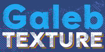 Galeb Texture is textured version of our Galeb font family.
 - Beautiful Every Time by Kimberly Geswein,
$5.00 Bubbly, authentic teen girl handwriting. Loopy and cute but legible.
 - CTM Sans by Gspr one,
$- CTM Sans is a typeface of the grotesk category, it is designed based on a previous Herokid typeface, but with greater freedom to creative tastes and at the same time with more rebellion and errors (quite a few, but well-intentioned) than its predecessor. This makes Bellavista a somewhat messy clone, for the grotesk style. This font does not seek to be a correct typography, but rather fun and useful for the designer. I hope you like it
 - Vinyle by Lián Types,
$37.00 Bold, rounded and super cool. Those are the attributes of my latest font “Vinyle”, french for vinyl. In this epoque where all fields of Design are giving a lot of importance and attention to Typography and Lettering, I felt it was my duty to contribute with something that could really stand alone and ‘say something else’ that just words to be read. I've found that lately in the world, regarding a finished piece of design, the role of Typography (and of letters in general) went from being secondary, (like a minor player or a supporting actor) to the most important one. People are starting to understand the beauty of a well-done letter: they want their storefronts with unique scripts, they want to drink coffee surrounded by lettered blackboards, they want to buy books with astonishing covers with swashes ‘por doquier’. I'm more than happy to be alive in a present where even the most unimaginable friends of mine, (who couldn't spot differences between comic sans and helvetica before) are now conscious of the importance of a letter, or let’s say: Of the ‘voice’ of Typography. With Vinyle I tried to make a font with power. Following the nowadays trend of, let me say, “the vintage sans renaissance”. This time I put my brushes and nibs aside and experimented with something new. It wasn't easy, if you will pardon, for me to see swashes all over the place withouth the classic calligraphic ‘thick and thins’, but with after some weeks of work I started to love them. Like I already showed you in other creations (1) let me finish with the phrase: GEOMETRY IS SEXY! TIPS Vinyle has a lot of attitude, it shouts “here I am!” it really can ‘design an entire piece’ for you with just a word or two: It was designed with a 10 degree slant on purpose so the user may rotate it (like on the posters) that amount of degrees in order to see better results. Use Vinyle with the ‘fi’ standard ligatures activates for better kerning and ligatures! NOTES (1) See my font Selfie , the ‘little sister’ of Vinyle.
 - ITC Ellipse Script by Typorium,
$30.00 The Typorium presents a new optimized and enriched version of ITC Ellipse which first appeared in 1996 in the International Typeface Corporation typeface library. ITC Ellipse Script is a complementary typeface to ITC Ellipse Neo, designed a very legible handwriting style. ITC Ellipse Script is both modern and classic. Modern in the unusual shape based on the geometric ellipse form. And classic in the structure of some letters like the lower cases c, e, g, o, s. These letters alone could come from a traditional typeface, but they fit perfectly with the atypical rest of the alphabet giving it a present-day and traditional mix. Furthermore, the ellipse shape fits naturally in the italic styles, giving the font an organic and fluid feeling. ITC Ellipse Script offers OpenType features such as alternate characters for upper and lower case, and an extended accented character set to support many languages. Five weights have been created for each style to offer a wide range of graphic possibilities in a tidy digital footprint. Designer: Jean-Renaud Cuaz Publisher: Typorium MyFonts debut: Nov 1, 2020 Le Typorium présente une nouvelle version optimisée et enrichie d'ITC Ellipse qui est apparue pour la première fois en 1996 dans la bibliothèque de caractères de l'International Typeface Corporation. ITC Ellipse Script est une police complémentaire à ITC Ellipse Neo, conçue dans un style d'écriture très lisible. ITC Ellipse Script est à la fois moderne et classique. Moderne dans le dessin inhabituel basé sur la forme géométrique de l’ellipse. Et classique dans la structure de certaines lettres comme les minuscules c, e, g, o, s. Ces lettres pourraient provenir d'une police de caractères traditionnelle, mais elles s'intègrent parfaitement avec le reste de l'alphabet plus insolite en lui donnant un mélange de modernité et de tradition. De plus, la forme de l'ellipse s'intègre naturellement dans les styles italiques, donnant à la police une sensation organique et fluide. ITC Ellipse Script offre des fonctionnalités OpenType telles que des caractères alternatifs pour les capitales et les bas de casse, et un jeu de caractères accentués étendu pour prendre en charge de nombreuses langues. Cinq graisses ont été créés pour chaque style afin d'offrir un large éventail de possibilités graphiques pour une empreinte numérique rigoureuse.
 - Back to the Futurex - Unknown license

- Lens Grotesk by Typedepot,
$39.99 Lens Grotesk is a Neo-grotesque type family of 16 fonts born as a result of a very conscious research in the field of the neutral Swiss aesthetic. There's a reason for all the prominent examples of this design like Helvetica and Univers to be used on a daily basis for more than 70 years and it's a simple one - they just work. The closed terminals, the low contrast, uniform widths and proportions makes the Neo-grotesques feel just right. Although very often branded as stiff, the neutral Neo grotesques are here to stay and Lens Grotesk is our own reading of the popular style. Lens Grotesk takes the Neo-grotesk model one step further adding a pinch of Geometric sans-serif to the mix thus creating a way more modern and contemporary looking design. Characterized with more generous oval proportions and slightly more open terminals, Lens Grotesk keeps the modulation and rhythm needed for a slightly longer texts while visibly keeping everything in order. Zooming in you'll find traces of the Geometric aesthetic - the robust almost right angled approach of the arches and tails (look t, f, j, y) and the way more circular rounded shapes. Like all our fonts, Lens Grotesk is equipped with a range of OpenType features, stylistic alternatives and of course Cyrillic support. It comes in a pack of 16 fonts with 8 styles and their matching italics or one variable font file available with all full family purchases. Live Tester | Download Demo Fonts | Subscribe
 - Neue Haas Grotesk Text by Linotype,
$33.99The original metal Neue Haas Grotesk™ would, in the late 1950s become Helvetica®. But, over the years, Helvetica would move away from its roots. Some of the features that made Neue Haas Grotesk so good were expunged or altered owing to comprimises dictated by technological changes. Christian Schwartz says Neue Haas Grotesk was originally produced for typesetting by hand in a range of sizes from 5 to 72 points, but digital Helvetica has always been one-size-fits-all, which leads to unfortunate compromises."""" Schwartz's digital revival sets the record straight, so to speak. What was lost in Neue Haas Grotesk's transition to the digital Helvetica of today, has been resurrected in this faithful digital revival. The Regular and Bold weights of Helvetica were redesigned for the Linotype machine; those alterations remained when Helvetica was adapted for phototypesetting. During the 1980s, the family was redrawn and released as Neue Helvetica. Schwartz's revival of the original Helvetica, his new Neue Haas Grotesk, comes complete with a number of Max Miedinger's alternates, including a flat-legged R. Eight display weights, from Thin to Black, plus a further three weights drawn specifically for text make this much more than a revival - it's a versatile, well-drawn grot with all the right ingredients. The Thin weight (originally requested by Bloomberg Businessweek) is very fine, very thin indeed, and reveals the true skeleton of these iconic letterforms. Available as a family of OpenType fonts with a very large Pro character set, Neue Haas Grotesk supports most Central European and many Eastern European languages. - East by Tarallo Design,
$22.99 East is a simple and confident typeface. It is timeless and current, but with a subtle nostalgia of vintage Jazz albums, film credits, newspapers, and signage. The light weight has excellent legibility at small sizes. The Extra Bold weight will capture attention. Its condensed width allows a lot of text in little space. East is versatile, but would be a good choice for film titles, labels + packages, posters, publications or any design where space is limited. It has six weights between Light and Extra Bold. A variable font with weight and slant axes is available and included in a full family purchase. The OpenType features include; stylistic sets, a one story ‘a’, hooked letters, seriffed uppercase I and 1, a slashed zero, raised colon and punctuation (Spanish), several German eszetts, ligatures, diverse bullets, and vertically stacked pre-built fractions. It will support western and central European languages as well as other Latin-based written languages. Read on if you are not familiar with variable fonts. What makes a variable font special is that all font weights are inside of one file and you can incrementally control the width and italic slant between Light (300) and ExtraBold (800). These changes are commonly made with slide controls in the font/type palette of the software. Variable fonts are also smaller in file size, which benefit both web and software performance. Currently variable fonts are supported by Adobe, Sketch, Corel Draw, and most web browsers. Check for your software support here: www.v-fonts.com/support.
 - Haunted House by HiH,
$8.00 Halloween lends itself to graphic images: witches, ghosts, bats, jack-o'lanterns and haunted houses. When we think of a haunted house, we generally think of a large, abandoned, derelict Victorian wood-frame house. The style is usually Second Empire or Queen Anne. There tends to be a lot of decoration. There is usually a porch or two with decorative spindle work. There is probably a tower, either square with a mansard roof such as one might see in Paris or round with a conical roof borrowed from a Loire Valley chateau. These houses were generally built in the United States between 1860 and 1900, products of the exuberance of a time before income tax. It took at least three servants to maintain such a house and was very expensive. Few can afford them today. That is why so many were converted to professional offices, multi-family dwellings or simply abandoned. HAUNTED HOUSE is our typographical contribution to Halloween. Based on our font PETRARKA ML, it features decorative capitol letters that utilize the silhouette of a Second Empire style house complete with a dead tree and a full moon. The font includes 8 ornaments suitable for flyers and party invitations. Revision 2.000 eliminates dual encoding, harmonizes metrics, adds new glyphs, and adds open type features. The zip package includes two versions of the font at no extra charge. There is an OTF version which is in Open PS (Post Script Type 1) format and a TTF version which is in Open TT (True Type)format. Use whichever works best for your applications.
 - Transport New by K-Type,
$20.00 Transport New is a redrawing of the typeface designed for British road signs. In addition to the familiar Heavy and Medium weights, Transport New extrapolates and adds a previously unreleased Light weight font originally planned for back-lit signage but never actually applied. Version 3.0 of Transport New features significant improvements including numerous outline and spacing refinements, and a full complement of Latin Extended-A characters. Also, to align Transport New with the 2015 release of Motorway, the other typeface used for UK road signage, Italic fonts for all three weights have been added. Originally designed by Jock Kinneir and Margaret Calvert beginning in 1957 and first published on the Preston bypass in 1958, the original Transport font has subtle eccentricities which add to its distinctiveness, and drawing the New version involved walking a tightrope between impertinently eliminating awkwardness and maintaining idiosyncrasy. The Grotesk roots of the glyphs were investigated and cheekily fine-tuned – uncomfortably close terminals of characters such as 5, 6, C, G, and e were shortened, the S and s were given a more upright aspect and their protruding lower terminals tucked in, overly wide glyphs like the number 4 were narrowed, and some claustrophobic counters were slightly opened up. The question mark was redesigned and parentheses given some stroke contrast. The x height was edged fractionally even taller. The Heavy font is actually more of a Bold, and the Light is pretty much a regular weight, but the original nomenclature has been retained for old times’ sake.
 - Adhesive Serif Letters JNL by Jeff Levine,
$29.00 A few scant examples of die cut gummed letters (R, C, Y and &) provided the design inspiration for Adhesive Serif Letters JNL. Influenced by the Caslon style, this typeface offers clean, legible titling. The sample letters were once manufactured by the Tablet and Ticket Company of Chicago and sold under their brand name of Willson's [named for the founder of the company]. Gummed letter sets were available in a variety of styles and sizes for various sign, merchandising and marking needs.
 - Powlina Theater by Attype Studio,
$16.00 Powlina Theater is a Modern Calligraphy Font. Perfect font for your wedding ceremony. Combine Powlina Theater stylistic set to create amazing script font for wedding! Fall in love with its incredibly versatile style and use it to create spectacular designs! Powlina Theater is perfect for branding, logo, invitation, quotes, wedding invitation, cricut font, silhouette font, product packaging, merchandise, game titles, cute style design, Book/Cover Title and more. What's Included : - Ligatures - Multilingual Support Hope you enjoy with our font! Attype Studio
 - Yakitori Alley by Kitchen Table Type Foundry,
$16.00 My son Sam saved all his pennies for a trip to Japan with me. Hi dream came true this year and we traveled around Honshu for 10 days. One of the things on his ‘to do’ list was eating yakitori, so I took him to famous Yakitori Alley in Tokyo. The setting was legendary, the smell was great, but the yakitori, unfortuntely, was so-so.. Yakitori Alley is a fun, scribbly script font with language support and a set of contextual alternates.
 - Gentona by René Bieder,
$25.00 Designed for a wide range of applications, Gentona was intended to support the goals of contemporary design paired with a mostly swiss oriented demand on typography – neutrality. The result is a nine-weight neo-grotesque family ranging from sharp and fine thin cuts to muscle-bound and strong heavy weights. Gentona’s confident and open shapes support legibility especially in small sizes while its alternative shapes and letterforms create flexibility. A wide range of typographic features round up the whole family.
 - Behrensmeyer Vigesimals by Dharma Type,
$14.99 This 8-bit pixel font is designed with respect for 80s game designers and the pixel font pioneers in middle 90s. And for the calligrapher H.P. Behrensmeyer & Charles Paxton Zaner. Use at size 20 pixels or multiples of 20 and anti-alias off is recommended. List of our Pixel Font Project. ·Flat10 Antique ·Flat10 Artdeco ·Flat10 Arts&Crafts ·Flat10 fraktur ·Flat10 Holy ·Flat10 Holly ·Flat10 Segments ·Flat10 Stencil ·Flat20 Gothic ·Flat20 Headline ·Flat20 Hippies ·Flat20 Streamer ·Behrensmeyer Vigesimals ·Civilite Vigesimals
 - Royal Stencil JNL by Jeff Levine,
$29.00 An image spotted on the internet of a brass shipping stencil for the Royal Quality Brand (for the John H. Fitch Company of Youngstown, Ohio – a coffee and spice merchant). The lettering style for “Royal Quality” was a hand-cut, condensed, slightly flared sans serif with various character flourishes, giving the letters a stylish, somewhat regal look. Expanding on this idea, a full character set was developed and redrawn digitally as Royal Stencil JNL, which is available in both regular and oblique versions.
 - Hokitika by Hanoded,
$15.00 Hokitika is a township in the West Coast Region of New Zealand's South Island. It has some amazing beaches, stunning scenery, but above all, it has Pounamu (greenstone or jade). This is THE place to buy a beautiful Maori greenstone pendant. Don't buy it for yourself, as it is supposed to bring bad luck. Hokitika font is a tall and thin all caps Art Deco typeface. It is classy, elegant and very legible. Comes with a full range of diacritics.
 - Jokelyn Display by FoxType,
$35.00 Introducing Jokelyn Display new generation Decorative Typeface. Jokelyn Typeface created with the vision of to attract the audience to your brand. The finest details of this typeface are methodically and mathematically created. Jokelyn is created with all the tasks of a corporate font and also for the usage in a variety of projects, including branding, logos, titles, headlines, posters, screens, display, digital ads, and everything else. We are putting a lot of effort on this font as a long-term project.
 - BeneCryptine by Ingrimayne Type,
$10.00 BeneCryptine is not based on any particular calligraphic type style. It has exaggerated upper-case letters and hyperactive lower-case letters that give it a wild and undisciplined look. It comes in four styles: the base style, a decayed variant, a shadowed style, and a final style that looks much like the base style but which has the spacing of the shadowed style. This last style can be layered with the shadowed style to easily create lettering with two colors.
 - Sovett by Twinletter,
$12.00 Introduces our new "Sovett" handwriting script font which is flexible in every typeface. This beautiful font you should use to create your perfect design work This font is designed with a natural touch of handwriting which is refined to create a portion and composition that suits your needs. So this font is suitable for craft, children's writing, adventure posters, food banner titles, wedding invitations, product packaging logos, quotes, social media page covers, furniture banner headlines, book covers, and much more.
 - Chamelton by Alex Khoroshok,
$9.99 Chamelton, a vast layered font family, provides a creative spectrum through layers, colors, and weights, including 109 Sans Serifs, 3 script weights, + 198 extras. You can use the family as a complete design kit or a component of your work. Most styles are stand-alone fonts, but some layers work only in combination. Creating a multi-colored layered font is simple and compatible with any layer-supporting graphic software, including Adobe Suite, Sketch, Figma, etc. See Specimen PDF for more details.
 - MM Agrafa by MM Fonts,
$19.00 A paper-clip-inspired typeface with character. Agrafa is a technical but versatile display face that works well in both large and small sizes. Most of the glyphs are made from one continuous line and shows the constraints of bending a paperclip/wire. The family consist of four weights, Hairline, Thin, Light and Book, last three also comes with an oblique companion. While Hairline works best for setting large headlines/words, the Book weight can be used even for small size texts.
 - Sangor by Grontype,
$12.00 Sangor is an unique vintage condensed font. This font designed all round corners that makes it look more soft and charm. Sangor is regular and outline all-caps font that is great for short headlines and titles, but it looks great in print design, vintage mood board, branding, logotypes, titles, editorial design and modern and vintage design. Sangor Features: Single weight Punctuation & Characters Ligatures Glyphs included superscript & Symbol Currencies Multilinguals Thankyou for picking up this font, Happy creating. Regard, Grontype
 - Super Discount by Mozatype,
$17.00 Hello there, Proudly presenting SUPER DISCOUNT. It is stylish marker font. It’s in two styles: Regular and Bold. SUPER DISCOUNT was designed to make logotype and lettering for your brands. And it’s would perfect for t-shirts/ apparel, promotional materials, sports, music festival, quotes, special events, or anything. What’s Included : Works on PC & Mac Easy to use ( Installations ) Easy Convert to Webfont Compatibility Windows, Apple, Linux, Cricut, Silhouette, and Other cutting machines Thanks for downloading, and I hope you enjoy it!
 - Kitchen Stink by Bogstav,
$15.00 Just like a nice breakfast, Kitchen Stink is a great way to start the day! :) You may already have guessed that the fontname is the result of a wordplay. Sometimes it's funny how a single letter can completely change the meaning of a word. In this case! With this font, you are dealing with a gentle mixture of a basic handwritten font, a comic font and oldschool grafitti! The result is this steady, sometimes a bit off, but legible crunchy handwritten font!
 - Eldridge by Greater Albion Typefounders,
$10.95 Eldridge is reminiscent of the sort of clear functional slab serif that was often to be seen in the 19th century. It is the plainer cousin of our Bamberforth family and the two partner together very well—Bamberforth for the eye-catching headines and Eldridge for the essential support. It is another new face, which harks straight back to Victorian times and, as such, is ideal for giving anything a 19th century feel-especially posters, book headings, dust jackets and invitations.
 - Rectory by Kavoon,
$15.00 Introducing our new typeface, Rectory - a contemporary, Art Deco-inspired display typeface full of character, quirky ligatures, and glyphs to keep your designs fresh. This is a display font that we recommend using in the following types of work; magazines (titles and layouts), logos and branding, invitations, quotes, blog headers, posters, and advertising. Language Support: Afrikaans, Albanian, Catalan, Danish, Dutch, English, French, German, Italian Norwegian, Portuguese, Spanish, Swedish and Zulu. What's included: Uppercase and lowercase glyphs Punctuation Numbers Multilingual support Unique ligatures glyphs
 - Tropen by Ahmet Altun,
$12.00 Tropen Font Family comes in one weight with six different types of styles but compatible at the same time with each other. All fonts are hand-made. It can be accessed to the extras with the standard keyboard codes which makes the use of font files very practical and easy. Tropen Font Family was designed carefully to create elegant works. It would be a perfect choice to design posters, affiches, logos, t-shirt and magazine prints, eye-pleasing typographic designs and more.
 - PF Baseline Pro by Parachute,
$79.00 An ultra modern typeface which combined with the proper text font can revive any dull-looking document. The wide simple forms combined with the selective application of a few distinct characteristics has resulted a stylish typeface which shines in the top 10 of our most wanted list. The powerful new “Pro” version comes complete with Greek and Cyrillic and includes a number of stylistic alternates as well as 2 groups of stylistic alternate sets, the last group being unicase characters.
 - Koons by SAMUEL DESIGN,
$19.00 The name of this font is KOONS, which is inspired by an artist we respect very much. The font style is optimistic and positive, with pop art features. The lines of the font are highly geometric, preserving the original combination of strokes. In terms of details, on the basis of sans serif fonts, it is equipped with detailed and fun serif details. All treatments are done to ensure that this typeface remains highly recognizable, but also has attractive details and taste.
 - Shake by Comicraft,
$29.00 Shake it DOWN! Shake it UP! Shake it OFF! Shake a LEG! You can even shake it like a polaroid picture now that Comicraft has the font that allows you to do just that, in comic book form! Shake is the ideal partner to our font, SHIVER, and yet it does not preclude rattling OR rolling if you're getting ready to RUMBLE! CAUTION: This font may cause you to move to and fro with jerky movements. See the families related to Shake: Shiver.
 - Andreash by Rometheme,
$25.00 Andreash – Sans Serif Font. It has a elegant, classy look and beauty. It’s a great font for fashion, apparel projects, signature, album cover, logo, branding, magazine, social media, & advertisements, but also works great for other projects. Highlight: - Easy instalation - Work on PC or Mac - PUA Encoded Support - Basic Latin A-Z and a-z - Numbers - Symbols - No special software is required, The fonts can be opened and used in Adobe Illustrator, Adobe Photoshop, Adobe InDesign, even work on Microsoft Word.
 - Cortese by Hanoded,
$15.00 As usual, I stumbled upon a great 1971 Italian movie poster when looking for something else. The poster for “La Morte Cammina Con I Tacchi Alti” (directed by Luciano Ercoli), was made by an unknown artist and comes with a great font. Cortese was based on this movie poster font, but as I started working on the glyphs, I figured they would even look better in ligatures. So here it is: Cortese font - complete with 135 ligatures, accents and even Greek and Cyrillic!
 - Clasica by Latinotype,
$26.00 The font family "Clasica" is ideal to cover every design need. Excellent for titles, paragraphs, magazines, books, editorials and logos. The particularity and identity of this font is found in the thinness of its vertical strokes and symmetrical serif. Inspired by the "Optima" font but with a serif that gives a different and new feel. "Clasica" counts with glyphs for the letters: a, e, f, g, r and y. This font family comes with 9 different weights with their respective italics.
 - Dancing Rose by FoxType,
$50.00 Introducing Dancing Rose new generation Display Typeface. Dancing Rose Typeface created with the vision of to attract the audience to your brand. The finest details of this typeface are methodically and mathematically created. Dancing Rose is created with all the tasks of a corporate font and also for the usage in a variety of projects, including branding, logos, titles, headlines, posters, screens, display, digital ads, and everything else. We are putting a lot of effort on this font as a long-term project.
 - Minute by PintassilgoPrints,
$24.31 Minute is a handwritten font with 2 glyphs for each upper and lower– case letters as well as 2 glyphs for each digit, for a natural hand-done look. There are yet clever stylistic alternates that can instantly surround the word with lines that look somewhat like a shining or blinking effect: just put the desired word between parenthesis and turn on the Stylistic Alternates feature. Or manually pick the glyphs, if you prefer. Everything will look great in this Minute! You bet!
 - Nogoom by Abjad,
$5.00 Nogoom was inspired by the titles of Egyptian Magazine ALOSTUDIO, which used to be published during the 50s-60s. The typeface is part of Arsheef Alkhatt Project, a platform that revives and tributes classical Arabic lettering from different resources and presents them as affordable, digital fonts for independent designers. Nogoom means stars in Arabic, hence the name. Note: The font uses an Opentype feature for the connections that are not supported by MyFonts tester, but it works properly with all Adobe CS softwares.
