10,000 search results
(0.028 seconds)
- RoglianoPro by Untype,
$25.00 RoglianoPro is a 70-font humanist slab serif super family (7 weights on 5 styles each plus matching italics) that while maintaining a strong and direct backbone, sustains a warm undertone that nods to the lettering and lithographic posters of the Victorian era when you take into account its multiple stylistic alternates, borders and decorative ornaments. Extremely legible for small text as well as finely-detailed enough to be very attractive when used in large settings, RoglianoPro is a versatile typeface that offers a wide range of voices that can move from mechanical to humanistic with absolute ease, and perform efficiently from branding to editorial design. Its Slab serif letterforms are strong, but gregarious and approachable – it’s friendly, but its solid presence is still a typographic force to be reckoned with. Rogliano includes a large set of over 900 glyphs, support for more than 200 latin script languages, a full complement of ligatures, small caps, swashes, William Morris-influenced borders and many Opentype features. In summary, a great addition to any multi-purpose type library.
 - Belwe Mono by ITC,
$29.99 The typeface Belwe, created in 1926 by German typographer and teacher Georg Belwe, has an uncommon style that is difficult to describe. It is a synthesis of many different genres: it is a slab serif with Art Nouveau style but also with many blackletter influences. The angled serifs on the ascenders and the calligraphic flourishes on the the upper and lowercase V, W, and Ys reference marks made by pens. There are also many other special characters that are unlike any other designs. Have a look at the fun lowercase a, the quirky lowercase f and g, and the unique C, F, L, and R for the uppercase. This design works especially well for display sizes, but is also good for short amounts of text. The mood and image suggested by this typeface is great for menus, invitations, and signs when you want to send a personal and friendly message. It's Art Nouveau roots also give it a place in history for designs from the Victorian period up through the 1920's and 30's
 - Kolbano by Jehoo Creative,
$19.00 Kolbano is a visually captivating typeface that is renowned for its distinctive and expressive letterforms. Designed with meticulous attention to detail, each character in Kolbano Font possesses a unique shape, making it an exceptional choice for creative and artistic projects. The font's design philosophy centers around providing a harmonious balance between elegance and personality. The letters in Kolbano are meticulously crafted with fluid curves, sharp angles, resulting in an eye-catching and memorable visual experience. Every character stands out on its own, showcasing its own individuality and artistic flair. Whether used in headlines, logos, or other design applications, Kolbano is sure to make a lasting impression. In addition to its regular upright variant, Kolbano also offers a captivating italic style. The italics add a dynamic touch to the typeface, imbuing the text with a sense of movement and energy. The slanted letterforms maintain the unique shape of each character, preserving the font's distinctiveness while introducing a sense of flow and elegance. The italics are perfect for emphasizing words, creating emphasis, or adding a touch of sophistication to any design. Kolbano s versatile and adaptable, suitable for a wide range of creative projects. Its aesthetic appeal makes it ideal for editorial design, branding, packaging, posters, and any application where typography plays a central role. The font's versatility allows it to effortlessly adapt to various design themes and concepts, whether it be modern and sleek or vintage and nostalgic.
 - Orto by LetterPalette,
$20.00 Orto is a type family of sans serif fonts in eight weights. It's a humanist typeface with real cursive, containing both Roman and Italic styles. The letters are designed to look good on screen, they have a bit narrower proportions and simple shapes. Their structure is based on flat horizontal and vertical strokes, which are emphasized wherever possible. That’s where the name comes from: Orto is an abbreviation of the word orthogonal. Thanks to its narrow width, the typeface is less space-consuming and adapts well to the screens of smaller devices. It is legible in small sizes, thanks to the larger x-height. The characteristic details, like bent ends of diagonal strokes, stand out when used in larger sizes. Orto can be used equally good in print and its overall neutral look fits different contexts. However, its character is pretty recognizable. Orto contains Latin and Cyrillic script and covers six codepages: Latin 1, Latin 2, Cyrillic, Turkish, Windows Baltic and MacOS Roman. It has basic OpenType features like ligatures, oldstyle numerals, proportional and tabular lining figures, fractions, superiors, etc. Capital German sharp S shows up when the lowercase is typed between two uppercase letters, and the Contextual Alternates feature is turned on. The Stylistic Set 01 changes the shape of the Cyrillic b. The Stylistic Set 02 is a shortcut for using Serban Cyrillic alternatives that differ from Russian in cursive.
 - Karlo by The Northern Block,
$28.95 Karlo is a super family of several branches, originating in the same lightweight skeleton. The lightweights are based on a pen of an even stroke-width. Inspired by the writings of calligrapher Edward Johnston, the family moves on in two directions in the heavier weights. Johnston demonstrated that the broad nib pen can produce different writing styles. Following this, one heavy weight has a humanistic low stroke contrast (KarloSerifBold and KarloSansBold), and another has a high stroke contrast of vertical axis with references to the 19th century jobbing typefaces (KarloOpen). The latter is inspired by Johnston’s demonstration of the broad nib pen, where he suggested fastening two pencils together. With each pencil representing an edge of the pen, it becomes more evident how the pen works in writing. The friendly informal look makes KarloSans and KarloSerif usable for both running text and for display sizes. KarloOpen, on the other hand, is solely designed for display purpose showing few words at a time. In Denmark, a guy named Karlo would typically be an old fellow with a slick hairstyle that makes an effort with his appearance. He is a handyman who can do a bit of this and that when needed. He is a happy go lucky kind of guy that takes one day at a time. To me, the typeface family has some of the same qualities. Check out Pyke which is a great pair for Karlo.
 - Zapfino Extra Paneuropean by Linotype,
$103.99ZapfinoExtra is an OpenType format typeface available in two versions. The Contextual version contains a treasure-trove of extra contextual features. When created in 2004, this was the most advanced OpenType font released to date. By purchasing the Contextual version, users of OpenType-supporting applications, such as Adobe InDesign, may access all of the features available in the entire Zapfino family through just two fonts, Zapfino Extra LT Pro (Contextual), and Zapfino Forte LT Pro! Unfortunately, most non-Adobe applications currently do not support the contextual features made possible by recent OpenType developments. Users of Quark XPress and Microsoft Office should instead purchase all of the non-contextual fonts of Zapfino Extra Pro family, in order to access all of the Zapfino family's 1676 glyphs. The Zapfino family's character set supports 48 western and central European languages. More Zapfino History: Today's digital font technology allowed the world-renowned typeface designer/calligrapher Hermann Zapf to finally realize a vision he first had more than fifty years ago: creating a typeface that could capture the freedom and liveliness of beautiful handwriting. The basic Zapfino™ font family, released in 1998, consists of four alphabets with many additional stylistic alternates that can be freely mixed together to emulate the variations in handwritten text. In 2003, Herman Zapf completely reworked the Zapfino design, creating Zapfino™ Extra. This large expansion of the Zapfino family was designed in close collaboration with Akira Kobayashi. Zapfino™ Extra includes a cornucopia of new characters. It features exuberant hyper-flourishes, elegant small caps, dozens of ornaments, more alternates and ligatures, index characters, and a very useful bold version-named Zapfino™ Forte. Use Zapfino to produce unusual and graceful advertisements, packaging, and invitations. Zapfino Extra is so joyously abundant that it's tempting to over-indulge, so be sure to check out the tips for working well with the possibilities!" - Postea by TypeTogether,
$47.00 The Postea font family is Veronika Burian and José Scaglione’s take on German geometric typefaces, reshaped with the right attributes for setting paragraphs and headings, and perfect for branding and text use. Some typefaces are a rough tool, like a pumice rock: abrasive to the senses, unforgiving, and unhelpful for most reading situations. Postea is an obsidian: smooth and classy, with attractive nuances in any light. The classic curves and purposeful details keep its individuality intact while allowing it to fit an incredible range of geometric font needs. Because of these qualities, Postea makes normal reading in paragraphs a cinch and your branding memorable. Compared to midcentury attributes of restraint and a sparse appearance, Postea’s deliberate play between character widths injects life and distinctiveness into its personality. The default ‘t, f’ have lyrical doses akin to a robust evening drink and are rounded out with a serpentine ‘s’ and rotund ‘o, g, b’. Another nice surprise awaits: spacing for the Hairline weight is tighter for optimal use in large headings and titles, while the regular weights have the expected, slightly looser spacing for text. Setting the test word ‘bogarts’ brings all this together nicely, invoking a balance between a constructed and human feel while brushing away the dust from a century of derivatives. Postea is opinionated and its modern stylistic sets allow it to be accommodating with softer, specially-designed alternative characters. SS01 replaces ‘b, f, M, m, t’, while SS02 changes only the lowercase ‘a’ to the round style, and SS03 swaps out the angled ‘y’ for a straight version. The fourth and sixth stylistic sets are packed with wallpaper-worthy geometric patterns, ornaments, arrows, and symbols aplenty. Postea’s 14 styles (seven upright and italic) and two variable fonts are accompanied by an all-new family of icons in three weights, which we developed a new, easy way to activate. Simply bookend the desired icon name with colons (:arrowUp: :chargingStation: :aid: :firstAid:), making sure to capitalise each word after the first word, then highlight and activate SS05. Icons include wayfinding, social interface, sanitary precautions like face masks, thermometers, and hand washing, and much more. Postea is resilient in the number of ways the family can be used, and its recognisable characters make it a prime selection for branding, signage, corporate typefaces, and magazines. Beginning with midcentury virtues, Postea is the rational response for text — a lyrical take on geometric sans serifs.
 - Lust Script by Positype,
$49.00 Boom. You asked for more, um, well just ‘more’—more swashes, more options, more weights, more of everything. I cannot give you more weights. The design just won’t allow it and anything else would be a compromise or a bastardization of the exemplars just to make money that I am unwilling to do. But, I did give you an overly indulgent, 90% cacao bar and espresso, Lust Script Fine. The ending strokes on these glyphs will literally draw blood. Enjoy it as much as I have. The Lust Collection is the culmination of 5 years of exploration and development, and I am very excited to share it with everyone. When the original Lust was first conceived in 2010 and released a year and half later, I had planned for a Script and a Sans to accompany it. The Script was released about a year later, but I paused the Sans. The primary reason was the amount of feedback and requests I was receiving for alternate versions, expansions, and ‘hey, have you considered making?’ and so on. I listen to my customers and what they are needing… and besides, I was stalling with the Sans. Like Optima and other earlier high-contrast sans, they are difficult to deliver responsibly without suffering from ill-conceived excess or timidity. The new Lust Collection aggregates all of that past customer feedback and distills it into 6 separate families, each adhering to the original Lust precept of exercises in indulgence and each based in large part on the original 2010 exemplars produced for Lust. I just hate that it took so long to deliver, but better right, than rushed, I imagine.
 - ITC Tactile by ITC,
$29.99ITC Tactile is a puzzle of subtle typographic contradictions. Capitals have traditional epigraphic proportions, but the lowercase has a uniform optical width. Light weights are stately and elegant, but bold designs are almost jolly. This paradoxical alphabet even combines two distinctively different serif designs. Designer Joe Stitzlein says, “I wanted to create a modern and dynamic serif face that draws its forms from antiquity. I also wanted to have as much fun as possible with the drawing and architecture of each letter. Hopefully I've created a very legible typeface that grabs the reader's eye in a nice, 'tactile' way.” The apparent inconsistencies of the design are the result of careful consideration. Of the seemingly odd serif design, Stitzlein explains, “The transitional serif is an entry point for the eye into the letterform, and the long slab is an exit, leading to the next letter.” The result is a typeface that's easy to read at text sizes but offers surprising details when enlarged to display sizes, setting ITC Tactile apart from more traditional designs. While this is his first commercial typeface design, Stitzlein has ample experience creating custom typefaces for corporate branding, including companies such as Silicon Graphics and Sempra Energy. His graphic design business has served a wide range of clients, including Apple Computer and the 2002 Salt Lake City Olympics. The ITC Tactile family is available in three weights, with complementary italic designs and a suite of small caps for each of the roman designs. Stitzlein drew the small caps to match the height of the lowercase x-height, which enables “bi-form” or “unicase” setting in display copy. - RMU Siegfried Pro by RMU,
$35.00 RMU Siegfried Pro is another breathtaking Art Nouveau font from the fin-de-siècle period which underlines your stylish projects in a remarkable way. The font was carefully redesigned, some oddieties abolished, and the font was extended to make it usable for Central European languages too. Three embedded graphic elements let you make a fitting frame. The letter k has an alternative form, so look for all OT features in this font.
 - Goudy Text by Monotype,
$29.99The word Text" in Goudy Text™ is short for Textura, and textura is the style of blackletter or gothic writing developed in Northern Europe in the middle ages. The use of space in blackletter is quite different from what we know about Roman letterforms. Lowercase forms in blackletter writing and typefaces must be evenly textured with black and white elements, like the texture of weaving or fabric. Capital letters can provide either an integration of the even texture (by the use of decoration in their construction) or, if they are wide and open and filled with white, they provide bright spots of visual emphasis. Goudy, despite being an American in the twentieth century, understood well the fundamental texture of medieval blackletter and the importance of both density and light. He designed Goudy Text in 1928 for Lanston Monotype after studying the type in Gutenberg's 42-line bible; still one of the best models for designers of blackletter typefaces. The lowercase of Goudy Text has impact and medieval authenticity. The standard caps have some Victorian eccentricities but are mostly well drawn. The alternate, or "Lombardic" caps are spectacular - they set beautifully with the lowercase letters, providing the proverbial shafts of light through the Gothic cathedral's stained glass windows. Use this potent font in sizes 14 point or larger, for Christmas greetings, certificates, wedding invitations, advertising, or music collateral pieces." - Ingy Ding MCD by Ingrimayne Type,
$21.00 This font began as an attempt of draw alternatives to the images of Microsoft’s Wingdings, but then grew beyond that. This new version from late 2010 has over 1400 characters, including almost all of the geometric shapes in unicode 2500 and 2B00 ranges, almost all of the arrows in the unicode 2100, 2700, 2900, and 2B00 ranges, almost all of the dingbats and symbols in the unicode 2600 and 2700 ranges, many of the pictures, symbols, and emoticons in the 1F300 to 1F600 ranges, and a few of the miscellaneous technical items in the 2300 range. There are also pictures on the standard open type letters, most of which can be accessed from the keyboard. However, most of the characters in this typeface have to be accessed using their unicode designation. In Windows this is done with the alt key and the unicode hex number. On the Macintosh the easiest way (and for the five digit unicode characters, perhaps the only way) is to use the “Special Characters” window under the Edit Menu in the Finder. A unicode index of the font is provided in a pdf file that was generated using FontLab. However, it only has four of the unicode digits for the five-digit elements. Almost all of the unicode numbers starting with F should have a 1 in front of the F.
 - The Subway Types by HVD Fonts,
$30.00 The idea was to create a package containing prominent tag styles of graffiti strongholds like New York, Berlin and Paris. Shik (New York), Deon (Paris) and Etan (Berlin) came together to show the typical tag styles of their respective metropolitan areas. The fonts were digitized, spaced, kerned and programmed by Hannes von Döhren. The Subway Types are highly equipped. Each one consists of 4 alphabets (Uppercase, Lowercase, Small Caps & Swash). They also include ligatures and some specials like underlines and a huge range of accents for a wide language support. With the OpenType technology these features can be applied easily. For those who never used the OpenType features, we created the Std (Standard) and the SC (Small Caps) versions of the fonts. They contain the same basic characters like the OT versions but are split in two fonts. Hence you don’t need any OpenType knowledge to use the Std and SC fonts.
 - Dramaminex by Emboss,
$12.40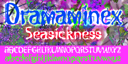 Designed after a bout with seasickness.
 - Beanstalker by Hanoded,
$15.00 I’m not particularly fond of beans. I do eat them, but they’re not my idea of a delicacy… But this font has ‘fairy tale’ feeling to it, and I liked the name Beanstalker. Beanstalker is a hand made font (I used a fineliner to draw the glyphs). It is quite neat and organized, but does come with some rough edges and a bit of texture.
 - TF Sadistic by Teenage Foundry,
$19.00 TF Sadistic is our display font, carefully crafted to bring a sharp and charming look to your designs. With its distinct style and versatile nature, our fonts are the perfect choice for creating attention-grabbing metallics, horror posters, and other impactful visual materials. Our sharp display fonts are designed to make a statement. Its sharp edges and unique letter shapes exude strength and power.
 - Fontropolis by Comicraft,
$49.00 When you're ready to leave your cozy picket fence life in Typeville, make the move to the hustle and bustle of Fontropolis! FONTROPOLIS is populated by friendly-faced characters you can always count on to help you through the thick and thin of everyday life in the Capital. Why not take a day to admire the classic arches of the ascenders, descenders and horizontals featured in Fontropolis's architecture? Indulge in a little idle chitchat with your fellow Fontropolitans! Fear not! The People of Fontropolis will stand firm beside you when the unavoidable Supervillains and Crackpots descend on the capitals, spouting Arrogant Expositions of their Nefarious Plans as they seek to usurp our great country’s democracy! FONTROPOLIS will always prevail! The Fontropolis font family includes four weights (Regular, Italic, Bold & Bold Italic) with alternate uppercase characters, Western & Central European & Vietnamese support, Manga characters and Crossbar I Technology™
 - Marvelan by Mega Type,
$15.00 Marvelan is a display font with a touch of style that's cheerful, elegant and strong. So it is suitable for use in product design and appearance, both in modern or vintage designs. OpenType feature with several alternative characters that allow you to mix and match letter pairs to suit your design. Marvelan also includes 3 different styles, namely Regular, Outline and Extrude which are made with different styles but still have the same characters. Marvelan is included in a display font so it is very suitable for use in titles, poster products, logos, book menus, websites, books, t-shirts, posters, book covers, labels, business cards, branding, print templates and many other designs according to your needs. Marvelan includes a complete set of upper and lowercase letters, as well as multi-language support, punctuation, ligatures and alternatives. Thank you very much for looking and Enjoying it!
 - Valentina SG by Spiece Graphics,
$39.00 Here’s what happens when your trusty felt tip marker takes a trip to cartoonland. Each of Valentina’s plump characters has a rough and splotchy texture. Some letters even bounce up and down like a 3-year old. As cartoon faces go, Valentina is a bit on the imperfect side. But that’s normal for a funny face. Use it in a variety of comical situations. Make convincing captions under your own artwork or design greeting cards with it. You can even blow it up to huge sizes to create a wild and crazy look. Valentina Medium is now available in the OpenType Std format. Some new characters have been added to this OpenType version as stylistic alternates. This advanced feature works in current versions of Adobe Creative Suite InDesign, Creative Suite Illustrator, and Quark XPress. Check for OpenType advanced feature support in other applications as it gradually becomes available with upgrades.
 - FranklinGothicHandLight by Wiescher Design,
$39.50 FranklinGothicHandLight is part of a series of hand-drawn fonts from way back in time – before computers changed the way we worked. When I was in advertising – before computers – a very time consuming part of my daily work was sketching headlines. I used to be able to sketch headlines in Franklin Gothic, Times, Futura, Helvetica and several scripts. We had a kind of huge inverted camera – which we called Lucy. We projected the alphabet onto a sheet of transparent paper, outlined the letters with a fineliner and then filled them in. It was very tedious work, but the resulting headline had its own charm and we had a permanent race going on who was best and fastest. I won most of the time! They used to call me the fastest "Magic Marker" this side of the Atlantic. Great days, just like today! Your sentimental type designer from the past Gert Wiescher
 - FranklinGothicHandDemi by Wiescher Design,
$39.50 FranklinGothicHandDemi is part of a series of hand-drawn fonts from way back in time – before computers changed the way we worked. When I was in advertising – before computers – a very time consuming part of my daily work was sketching headlines. I used to be able to sketch headlines in Franklin Gothic, Times, Futura, Helvetica and several scripts. We had a kind of huge inverted camera – which we called Lucy. We projected the alphabet onto a sheet of transparent paper, outlined the letters with a fineliner and then filled them in. It was very tedious work, but the resulting headline had its own charm and we had a permanent race going on who was best and fastest. I won most of the time! They used to call me the fastest "Magic Marker" this side of the Atlantic. Great days, just like today! Your sentimental type designer from the past Gert Wiescher
 - Duckie by Eclectotype,
$40.00 Eclectotype's continuing battle against whitespace continues full cream ahead with Duckie, and fat-bottomed script that packs a whole lotta weight into the softest of punches. The forms feel familiar, like they're straight from funky disco album covers, but this is a 100% original face. Don't let its retro charm dissuade you from taking it for a spin in more contemporary settings; it might just surprise you! Now for the features bit: OpenType features include ligatures, swashes, contextual alternates and stylistic sets. The stylistic sets are 1. swap the script r swap to a normal r, 2. swap the script upper case i to a more familiar seriffed version, 3. the number four changes to an open form, and lastly, 4. loopy ascenders in the lower case close in and lose the hole. You should not use this in all caps settings. Pretty please.
 - Chonky by Typesenses,
$39.00 Chonky is a bold script font based on English calligraphy but with touches of the vitality that the commercial lettering of 1950s had, and it is mostly inspired in the work of the master Doyald Young and his lessons. Its rounded terminals, friendly look and heavy weight make Chonky a perfect option for advertising, packaging and visual identities. In the Regular font, the ascenders, descenders and capitals are the shorter they could be; while in Poster, they are larger, in order to achieve more graceful forms. Both options include stylistic sets and ligatures to embellish the words. Use professional software that widely support Open Type features. Otherwise, you may not have access to some glyphs. Keep the Standard Ligatures and Contextual Alternates features always active. For further information about features and alternates, see the User Guide Chonky has extensive Western, Central and Eastern European language support. Enjoy!
 - Fenomen Slab by Signature Type Foundry,
$35.00 The geometrical drawing of Fenomen Slab follows the guidelines set by our other font family Fenomen Sans. It is a perfect companion of Fenomen Sans, as well as being a standalone font family capable of delivering its own expression and aesthetics. The set contains four width proportions – Normal, SemiCondensed, Condensed and ExtraCondensed in eight weights ranging from Hairline to Black. Every font of the family contains four types of numerals, small caps, ligatures and contextual alternates. The typeface was developed between the years 2014–2017 and was subjected to a series of tests for the fluent legibility of all fonts even in extreme conditions. Narrow fonts provide this set with the maximum use including newspaper typesetting. The typeface has an elegant, delicate design in thin fonts and sufficient legibility in bold. Mutual contrast produces great creative tension. Font name acronyms described: SCN = SemiCondensed CN = Condensed XCN = ExtraCondensed
 - Lectio by Eurotypo,
$14.00 Lectio is a Roman font based on a Venetian Renaissance early typefaces, but with a modern and expressive design. His obvious calligraphic influence favors continuous text reading. The generous internal "eye" gives Lectio an appropriate legibility, its soft and organic modulation avoids fatigue, its robust character is attractive and stimulating in large bodies, especially for use in headlines. Lectio comes in two versions: Lectio and Lectio B. Lectio has seven weight and their corresponding slanted variables (true italics). Lectio B is composed only of Italics in six weight. The ascenders are slightly lower, the descending are more regular and the oblique trace of some letters have a more constant rhythm. Each of these faces has the optimum amount of contrast agains the background and clear and open internal letter shape. These fonts include diacritics for CE languages, Old Style figures, standard and discretional ligatures.
 - Nobody Home JNL by Jeff Levine,
$29.00 Nobody Home JNL is unusual in nature as it combines two vintage typestyles into one font. Both have been used for home and property identification for decades and still remain popular. Over the years the letters and numbers have been made of cast steel, aluminum, brass and plastic. The alphabet is in a distinctly bold, asymmetrical style, while the numbers almost take on a calligraphic feel. There is just a basic character set - alphabet, numerals and simple punctuation. While the font has been reasonably spaced and kerned, it's best to remember that neither type design was made with digital technology in mind, so it's suggested to adjust your layout manually for optimum results. Nobody Home JNL is best-suited for replicating street addresses, apartment numbers on doors, and homeowner (or apartment house) names on buildings - whether in print design or as plotter-cut vinyl graphics.
 - Kontrast Grotesk by DizajnDesign,
$55.00 Kontrast Grotesk represents a contrast in type design based on a different principle. It was inspired by W. A. Dwiggins and his experiments with the stroke variations. Contrast in this typeface is created not only with the influence of the writing tool (the thickness of horizontal strokes in relation to vertical), but by setting the primary and secondary construction strokes of the characters (e.g. glyph “E”). The grotesque types are usually with no or minimal contrast. Having the contrast has created a new and original look of this typeface without compromising the legibility. The fonts are designed for fluent reading on the screen. A little wider proportions are specially welcome with no need for saving a space as it is in printed media. Kontrast Grotesk family consists of five weights, with italics, small caps and italic small caps. Fonts contains a range of opentype features.
 - Chaloops by Chank,
$99.00 Where the heck does a name like Chaloops come from? You know that Chihuahua that used to sell the tacos? Chank's mother-in-law calls him Chalupa. And the American pluralization for that must be Chaloops, because that's her nickname for her two little spoiled fuzzball dogs. Another comic variation on Chank's whimsical handwriting, Chaloops is bouncy, quirky, and light-hearted like the Chauncy fonts. But Chaloops has more squiggles and its stroke terminals are mostly square. Just like you. Chaloops the font comes with a few alternate characters to give your designs a more authentic hand-drawn look. Happy and playful like a pair of frolicsome puppies, this font is perfect for kids’ products and marketing. Advanced OpenType features include "Stylistic Set #1: Decaf" which gets you a calmer, more legible variation. The fonts in this family come in 3 weights in cross-platform OpenType format for both Mac & Windows.
 - Metro New Two by JAB'M,
$15.00The main inspiration is from Art Nouveau which flourished in Europe at the end of the 19th and beginning of the 20th centuries. This design included furniture (Majorelle, Lalique) and architecture (Victor Horta, Henry Van de Velde, Gaudi, Alfons Mucha). But Hector Guimard remains the favorite for all aspects of its art and, of course, its typefaces used on the Parisian Metropolitan posters. In particular, the various kerning of the various letters he used to make the poster a whole design from singular designs, leading to numerous variations. As a designer, I initially worked a first version, called Metro New One, which is more geometric and traditional. This design "Two" has more flexible shapes and long vertical hooks. It can be used to enhance specific parts in letters and books in the context of Art, specially Art Nouveau and Art Deco of course, posters of any kind. - P22 Curwen by IHOF,
$24.95 P22 Curwen was originally designed by an unknown designer. This version was created by Colin Kahn. P22 Curwen Poster is a digitized version of a rare wood type used by the Curwen Press in England in the early 20th Century for poster work. The font was known to have been cut in 6 sizes—from 3-line (3/4 inch) to 16-line (3 inch) in height. The font was based from impressions made of the 6-line type. P22 Curwen Maxima is a hyper-stylized re-interpretation of Curwen Poster by Colin Kahn. As a post-modern poster type, it evokes an organic nature within a novel maximalist framework. It is reminiscent of early phototype display faces with an illogical three-dimensionality which serves to give the font continuity. The capitals are buried beneath stylistic wood shavings complementing the sculpture like quality of the lowercase. Perfect for (almost) any project.
 - Comforter by TypeSETit,
$49.95 Comforter promises to be a favorite among professional designers and people who love quality hand lettered forms. It’s a bouncy, upright brush style script. It’s look is appealing for many various usages. It’s contemporary, and non- traditional. It’s sophisticated, yet fun and funky. The Brush style of Comforter adds another touch to its “brushy” look. Comforter Pro versions come complete with multiple language options including Rob’s interpretation of a script style of Cyrillic. Unlike a “cursive” style, the script Cyrillic uses both traditional and cursive forms. In addition, the PRO versions are programmed with numerous OpenType features plus a few ornamental and word art glyphs not found in the Regular flavors. The regular versions are properly kerned, but contain none of the OpenType features found in the PRO versions. The Alternate flavors contain a few of the alternate forms found in the PRO versions of the typeface, including Cyrillic.
 - Aptifer Sans by Linotype,
$29.00 Aptifer Sans and Aptifer Slab are two 21st century typeface families created by Mårten Thavenius. Each family has seven weights, in roman and italic respectively, making 28 font styles in total. A heritage from two design traditions can be seen in Aptifer. One is the robust American gothic typefaces, like M. F. Benton’s, from around 1900. This is combined with the openness and legibility that comes from the humanist tradition. The sans serif part of the family, Aptifer Sans, is designed without excessive details disturbing the reading. Its sibling, Aptifer Slab, with its wedge slab serifs is more eye-catching but still suited for text settings. The italics fit well into the text flow of the roman. They are a bit narrower than the roman and have cursive characteristics. Both Aptifer Sans and Aptifer Slab are highly legible typefaces and can be used both in print and on screen.
 - Sunrise Till Sunset by Comicraft,
$19.00 Between twilight and daybreak it is said that the dark side of the human psyche eclipses the sun that shines from the depths of our souls. Certainty turns to doubt, clarity becomes confusion, man turns into wolf, the dead wake, vampires seduce the young are restless and milk boils over on the stove. Those that seek only to bathe in the light of a romantic new moon often end their tragic lives soaked in nothing other than their own blood, and the milk spilt on the stovetop has no one left to cry over it. There are fifty shades of grey during those hours after sunset and I think just as many in my porridge this morning. Yes, okay, I admit it, I spoiled the milk! This porridge tastes like it was left in a graveyard overnight. Death warmed over. Gothic and lumpy. Just like the Buried weights of this font.
 - Clarks by PintassilgoPrints,
$45.00 Clarks is a modular typeface built from a work by Lygia Clark, one of the giants of Brazilian postwar art. Packed in a font equipped with clever OpenType programming, there are at least 7 different designs for each letter, thus allowing, or rather, proposing, boldly unconventional compositions. The font is programmed to cycle all these different lettershapes, avoiding repetition. The user can also manually pick up preferred forms in a glyph palette. There are choices to both keep and to defy readability and it's almost hypnotic to play with these. Lygia Clark used to invite viewers to touch her works and so we did with her 'Planes in Modulated Surface no. 4', from 1957: we fragment it and turned and inverted and recombined it. Now we return it as audacious typography and invite you to put it to work in your designs. Keep it bold and have fun! Cheers!
 - Mogila Display by Letterfreshstudio,
$15.00 Mogila is a display font with a touch of style that's cheerful, elegant and strong. So it is suitable for use in product design and appearance, both in modern or vintage designs. OpenType feature with several alternative characters that allow you to mix and match letter pairs to suit your design. Mogila also includes 4 different styles, namely Regular,Italic, Bold and Outline which are made with different styles but still have the same characters. Mogila is included in a display font so it is very suitable for use in titles, poster products, logos, book menus, websites, books, t-shirts, posters, book covers, labels, business cards, branding, print templates and many other designs according to your needs. Mogila includes a complete set of upper and lowercase letters, as well as multi-language support, punctuation, ligatures and alternatives. Thank you very much for looking and Enjoying it!
 - Privilege Sign Two JNL by Jeff Levine,
$29.00 Unique and decorative signage for many drive-ins, motels, food stores and other businesses of the 1940s had what was referred to as “privilege signs” provided by one of the major cola brands. Consisting of the brand’s emblem on a decorative panel, the remainder of the sign would carry the desired message of the storekeeper (such as “Drive-In”) in prismatic, embossed metal letters. Inspired by the Art Deco sans serif style of those vintage signs, Privilege Sign Two JNL recreates the type design in both regular and oblique versions. The typefaces are solid black, but adding a selected color and a prismatic effect from your favorite graphics program can reproduce the look and feel of those old businesses. This is a companion font to Privilege Sign JNL, which recreates the condensed sans serif lettering of other privilege signs from the 1950s and early 1960s.
 - FM Bolyar TypeCraft by The Fontmaker,
$29.00 A super font family mastered to an unparalleled level of precision, Bolyar TypeCraft is a collection multiple textured styles that represent historical printing techniques. A proud member of our successful Bolyar lineage this unique type family provides unlimited options for your creativity and is quite able to satisfy every typographic taste. If you are addicted to classic vintage style, then you could easily use Bolyar TypeCraft for almost any project of desire - from letterheads, logos and catchy headlines to elegant packaging, book covers and wine labels. Alternates, Swashes and Ligatures will help you customize almost every single letter and fit perfectly to your artwork. Bolyar TypeCraft provides a broad range of advanced typographical features: Multiple subfamilies each packing the two classic Bolyar styles - Regular (N) and Ornate (O). Five weights per style ranging from thin (100) to black (900) with full multilingual support for all Latin based languages as well as Cyrillic. A 1000+ glyphs per weight including three multilingual stylistic sets, swash designs and useful discretionary ligatures. Sub- and superscript basic Latin and Cyrillic glyphs as well as figures. Two positional models for lowercase accessed as OpenType case sensitive forms - baseline (default) or vertical centering. Contextual alternates and special stylistic set with different contour roughness exclusively developed for Bolyar Rough subfamily. A multifunctional Bolyar Shadow family witch can be flawlessly paired with any of the sub-family styles provided. Check out some great examples of Bolyar TypeCraft in use by the Labelmaker
 - Neuro X by Sawdust,
$35.00 Neuro X is a narrow sans serif typeface consisting of three weights with additional rounded versions and matching italics. It was first drawn as an exploration for a headline font and later expanded on to become a full typeface family. Neuro X explores the extremities of narrow proportions whilst also allowing for eccentric cuts. The typeface has been tightly monospaced and intended for use at larger sizes as a display but can also work at smaller scales for the more courageous among us. This 339 glyph font has language support for 26 languages: Afrikaans, Albanian, Catalan, Croatian, Czech, Danish, Dutch, English, Estonian, Finnish, French, German, Hungarian, Icelandic, Italian, Lithuanian, Maltese, Norwegian, Polish, Portuguese, Slovak, Slovenian, Spanish, Swedish, Turkish, Zulu.
 - Layfort by Identity Letters,
$29.00 What do you get when you cross Industrial Revolution with Art Déco? The raw force of steam-powered vessels with the panache of dashing streamliners? A sturdy industrial grotesque with a swanky stylized sans? We don't know, but our Layfort is a strong contender. It's a contrasted sans-serif typeface with old-style proportions: varying letter widths create a more vivid texture than your usual contemporary sans, and the true italics are narrower than the uprights. Layfort is elegant enough for fashion, art, and luxury; yet sufficiently sincere for serious business. And at 16 styles & 750 glyphs, it's ready for complex typographic demands (try the round dots at SS09). Let your designs fly!
 - White Space by Din Studio,
$29.00 Hello, Everybody! Imagine a world filled with white matters? Are you trying to make an elegant, calm, but stylish projects? Then grab this font immediately. Introducing White Space- A Display Serif Font This gorgeous, stylish and modern font can be used for a host of different content needs and projects. Ideal for social media banners; posts, and ads, printed quotes, t-shirt designs, packaging, or even as a modern text overlay to any background image. Our font always includes Multilingual option to make your branding globally accepted. Features: Standard Ligatures Alternate Stylistic Set Swash Multilingual Support (91 languages) PUA Encoded Numerals and Punctuation Thank you for downloading premium fonts from Din Studio