10,000 search results
(0.058 seconds)
- Stripy Matey by Gleb Guralnyk,
$14.00 Hello! Introducing a geometric style font — Stripy Matey. It's a vintage look smooth typeface built of dashed flowing lines. Stripy Matey font has multilingual support (check out a screenshot with available letters and signs). Thank you and wish you a peaceful sky!
 - Wetty Penny by Gleb Guralnyk,
$14.00 Hello! Introducing a decorative font — Wetty Penny. It's a smooth shape bold typeface with vector wated drops effect. This font includes lots of multilingual characters (check out a screenshot with available letters and signs). Thank you and wish you a peaceful sky!
 - Vetto Cosellza by Graphicfresh,
$8.00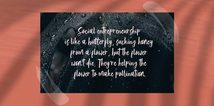 Vetto Cosellza - Handwritting Font Introducing Vetto Cosellza Handwritten Font. It comes with an elegant and feminine style which is perfect to make any design stand out! This font is perfect for branding, wedding invites, magazines, mugs, business cards, quotes, posters, and more.
 - Revitale by FallenGraphic,
$17.00 Revitale is stands out as a diverse selection of typefaces, beautiful alternates character that maintain a coherent look and feel throughout. font is perfect for branding, headings, signatures, logos, blog, wedding invitations, t-shirts, letterhead, merchandise, signage, lable, news, posters, badges etc.
 - Valerio by Stefano Giliberti,
$15.00 Valerio is the font family to use if you wish to convey your ideas with elegance and a pinch of eccentricity without being out of touch with modernity. Valerio supports 117 languages, features a total of 504 glyphs and includes an italicized version.
 - Valuable Time by Bogstav,
$14.00 Sometimes you need a slim, elegant good old fashioned serif font. And, voila! Here you are - Valuable Time fits all those needs. I didn't spend much time cleaning up the letters, so they stand out just the way they are: organic and handmade!
 - Flower Park by AEN Creative Studio,
$15.00 Flower Park is a sweet and playful display font. This font is perfect for the autumn theme, floral design, and nature theme, fitting a wide range of contexts. Add it to your creative ideas and notice how it makes them stand out!
 - Hallo Witch by Sakha Design,
$12.00 Hallo Witch is a cool and spooky decorative font. Add it to each of your Halloween related designs and notice how easily they stand out. This font is PUA encoded which means you can access all of the glyphs and swashes with ease!
 - Dash Grid by Gleb Guralnyk,
$13.00 Hi there, introducing an abstract font named Dash Grid. At's a geometric display typeface made of square dashed blocks. Dash Grid font supports most of the european latin languages and includes ukrainian cyrillic alphabet (check out all available characters on the last screenshot).
 - Bellas Artes by Sudtipos,
$59.00 Bellas Artes is what happens when the brush of Angel Koziupa and the technical expertise of Alejandro Paul go face to face with the Art Deco aesthetic. The recognizable Koziupa curves become players of a game of halves, where there is no such thing as a better half, but both sides complete each other like in that perfect romance you will never forget. Bellas Artes is an excellent choice not only for packaging design, but also for book and music covers meant for the feminine demographic, collateral of classical taste, and of course pre-WWII visuals.
 - Nixon Script by Barnbrook Fonts,
$30.00 NixonScript is a display typeface inspired by the typographic emancipation given voice by 1950s and '60s north American vernacular type. NixonScript's starting point was lettering found on a 1960s camera found in a Chicago junk shop, but its development saw it transformed from a punchy sans-serif to a more thoughtful serif, with a lowered x-height and a vibe of almost priestly piousness. Rather than a simple regular italic, a bold italic is offered. During its development, the regular version seemed almost placid but with the double emphasis of bold and italic, NixonScript gained an energetic, self-congratulatory form.
 - Breadcrumbs by Hanoded,
$15.00 Every morning, after the kids have gone to school, I vacuum the floor and remove about half a kilo of breadcrumbs… No, not really have a kilo, but any given bird could probably survive on the leftovers. When it was time to name this font, Breadcrumbs was all I could think of! Breadcrumbs and children seem to go together well, as they are featured in Hansel & Gretel and Hop-o'-My-Thumb. Breadcrumbs font is a happy, sloppy fairytale font, which you can use for your book covers, your party posters and maybe crumbly bread packaging. But that is entirely up to you.
 - Zzzap by Comicraft,
$19.00 Run your hand under the tap and then thrust your fingers in the electrical outlet nearest to you* and you'll get the same effect that our latest release, ZZZAP will have on comic book readers everywhere when Electro, The Shocker, Black Lightning, Storm and Darth Sidious turn the dark side of the force on them. *The management accepts no responsibility for any adverse effects experienced by comic book font users who stick moistened digits into the power supply after installing this font for the purposes of comparison (it's probably best to just take our word for it). Batteries not included, void where prohibited.
 - Ginger Style by Sensatype Studio,
$15.00 Ginger is a Modern Stylish Font. In a new generations, we analyze that any designer or brand owner need to make their brand standout. As our focus that analyze any typeface that helps to leverage any logo design to look more modern and unique. We prepared this font with any unique characters to help you create unlimited variations for your creative needs. Ginger font ready with: Any options to get creative variations with unique letters Preview as a inspirations that you can do with Ginger font Ready with Lowercase and Uppercase characters Wish you enjoy our font. :)
 - American Scribe by Three Islands Press,
$39.00 The Declaration of Independence was authored by Thomas Jefferson, but his is not the classic handwriting on the engrossed copies familiar to most Americans. That belonged to Timothy Matlack, an early patriot who fought in the Revolution, sat as prosecutor at Benedict Arnold’s court martial, and also penned copies of a number of documents for then-General George Washington. Matlack’s script was compact but legible, perfect for the first and most famous of American documents. Now you, too, can write that way. Please note: The font does not include any of the signatures from the Declaration of Independence.
 - Prixaled by Keristyper Studio,
$14.00 Introducing Prixaled display font to make your typography design more futuristic. This font is good for logo design, social media, movie titles, book titles, short and even long text. It will also look great when combined with any other sans serif, serif or handwritten typeface. Featured: Standard Uppercase & Lowercase Numeral & Punctuation Multilingual : ä ö ü Ä Ö Ü ß ¿ ¡ Alternate characters & ligatures PUA encoded We recommend using applications which support OpenType features and have a Glyphs panel like e.g. Adobe applications or Corel Draw to allow full access to all the glyph variations included in our fonts. Hope you enjoy our fonts!
 - Kinn by Stawix,
$30.00 Kinn is an industrial san-serif typeface with an essence of squared structure inspired by a futuristic look. Kinn is robust but portray a friendly touch with a little roundness to its shape, it can also be very formal when it needs to but it is flexible and fun to use at the same time. Its wide proportion makes it ideally suited a wide range of modern applications and variety of usage from heavy display, headlines or even text. Kinn comes in 9 consecutive weights, each weight accompany with italics. Equipped with Alternates, Ligatures and 10 Cryptocurrency signs.
 - Tropicalismo by IKIIKOWRK,
$17.00 Introducing Tropicalismo Typeface, created by ikiiko. A festive handwriting typeface with holiday vibes, fun and joy. You will feel the freshness and pleasure in expression. This typeface is perfect for an holiday season stuff like poster, flyer, or email blast. And also good for beauty product, packaging product, quotes, or simply as a stylish text overlay to any background image. What's included? Uppercase & Lowercase Number & Punctuation Ligatures & Swashes Multilingual Support Get also a good offer & FREEBIE at our site : www.ikiiko.com Enjoy our font and if you have any questions, you can contact us by email : ikiikowrk@gmail.com
 - Blueberry Jam by Hanoded,
$15.00 I love blueberries. When my brother and I were young, we used to pick them in the forest by the bucket. Afterwards, we’d always look like victims of a serial killer, but it was all worth it, as nothing quite tastes likes homemade blueberry jam. I don’t know why I named this cute little font Blueberry Jam. Maybe I was craving some… Blueberry Jam is a highly legible, extremely cute and very handmade font. It would look good on just anything, but book covers, product packaging and homemade jam labels come to mind. Blueberry Jam comes with a bucketload of diacritics.
 - Farrerons Serif by Tipo Pèpel,
$39.00 Specially designed for text size, Farrerons is a full-working Open-type Font. Looking superbly readible but providing a distinctive formal character for immediate impact due to its sudden strokes, mixing delightfully the ancient Roman Trajan inspired uppercase characters with lowercase characters inspired in XV´s humanistic types. A contemporary design that evokes the past but also embraces the future. The font features a full set of small caps, aligning, proportional, oldstyle and proportional oldstyle figures, plus stylistic sets for initial and finishing decorative characters. The font also contains an extended character set supporting Central Europe and Cyrillic languages.
 - Chimphand by One Fonty Day,
$6.00 Chimphand is an organic, natural and contemporary handwritten typeface with their tall x-height. Weights of light, regular and bold for both normal width and condensed allow you to play with the typeface more. In addition, you will have an access to their style sets ( Gap ) to add stencil-ish character to every weights. This gap style is much more subtle than normal stencils, but unique and nicely fit to the typeface. Gaps are more visible on larger fonts and bolder weights. Chimphand is good for any purpose, but works more on shorter text. Thanks and enjoy!
 - Denise Beauty by Keristyper Studio,
$14.00 Meet our new modern signature font - Denise Beauty. This beautiful script is for those who are needing of elegance and stylish character for their designs and is particularly well suited for wedding invitations, save the date cards, and feminine branding. Denise Beauty Font multilingual support: Afrikaans, Albanian, Catalan, Danish, Dutch, English, Estonian, French, Finnish, German, Icelandic, Indonesian, Italian, Malay, Norwegian, Portuguese, Spanish, Swedish, Zulu, and many more. What’s Included : Standard & Multilingual glyphs Ligature Works on PC & Mac Simple installations Accessible in Adobe Illustrator, Adobe Photoshop, Adobe InDesign, and even work on Microsoft Word. Hope you enjoy our font!
 - Laxory by PizzaDude.dk,
$20.00 My handwriting with a speedmarker turned into a font - well, not really, to be honest! Personally I did do all the writing of letters, but in order for the letters to fit perfectly together, I manipulated them - just a tad! But the result is a hasty set of letters! When I say I wrote all the letters, I mean it literally!!! All letters are unique, meaning all the accented characters are unique! On top of that, Laxory comes with ligatures for both double lowercase letters and numbers! You will need to use OpenType supporting applications to use the autoligatures.
 - Holkent by Keristyper Studio,
$14.00 Proudly presenting Holkent, a unique fancy, modern, vintage & decorative font. This font is good for logo design, social media, movie titles, book titles, short text even long text. It will also look great when combined with any other sans serif, serif or handwritten typeface. Featured: Standard Uppercase & Lowercase Numeral & Punctuation Multilingual : ä ö ü Ä Ö Ü ß ¿ ¡ Alternate characters & ligatures PUA encoded We recommend using applications which support OpenType features and have a Glyphs panel like e.g. Adobe applications or Corel Draw to allow full access to all the glyph variations included in our fonts. Hope you enjoy our fonts!
 - Dahyu by Twinletter,
$12.00 Dahyu, our newest sanserif typeface, is now available. Dahyu is a one-of-a-kind sanserif font. This flexible typeface has a unique and harmonious personality that works well in headlines and paragraphs. It has a professional design with powerful, strong, and clean letterforms that offer uniqueness to even prolonged messages and deliver great branding impact. of course, your various design projects will be perfect and extraordinary if you use this font because this font is equipped with a font family, both for titles and subtitles and sentence text, start using our fonts for your extraordinary projects.
 - Sing Along by Hanoded,
$15.00 We just had the Eurovision Song Contest here in Holland. I quite like to watch it, as it is usually a freak show of kitsch, political incorrectness and often really bad music. But it is a laugh and this year was no different. It inspired me to create this particular font with this particular name. Sing Along is a happy, wobbly, kitschy font that comes with a bit of ‘over-the-topness’, a few personality issues and an unsteady gait. Needless to say, it is politically incorrect, but that, my friends, is not necessarily a bad thing.
 - Audela by Fontfabric,
$40.00 Surpassing traditional Antiqua, our new collaborative font family Audela emerges after overcoming time, national borders, language differences, cultural gaps, and professional challenges. Starting off as an exercise project of our very first intern Léa Bruneau in 2018, Audela slowly shaped into a full-fledged elegant serif typeface of 14 styles under the watchful eye of Plamen Motev, Fontfabric’s Type Director. Three years later, Audela is internally regarded as a breaker of limits earning its name from the French “au-delà,” meaning “beyond.” This new rising star features sharp serifs, flowing letterforms, advanced OpenType features, Extended Latin and Cyrillic support, to name a few.
 - Olivera by Artisan Studio,
$15.00 Olivera has Stylistic standard, Stylistic Initial, Stylistic Teminal and ligatures and includes uppercase and lowercase letters, numbers and punctuation marks. Multilingual Support OpenType smart programs such as Adobe Photo Shop, Adobe Illustrator, Adobe Indesign, Corel Draw and Microsoft Office. A total of 462 Glyphs: Ligatures: Ju Ct ff Cl all gh of ck tt ut nt ak ll pp il rt it ot st at rr om mm ar ss as or ox ow on tt ut ut Ct st at ot rt it Cl Swashes access: A B C D E F G H I J K L M N O P Q R S T U V W X Y Z 7 alternative sets access: a b c d e f g h i j k l m n o p q r s t u v w x y z
 - Breve Title by DSType,
$50.00 Breve was designed for use in editorial projects. Simple but with enough personality to stand by is own, in a quest for a more forceful and contemporary appearance. All the fonts in Breve superfamily, share the same exact structure, both in terms of anatomy and functionality. The Text versions provide a softer and warm feel to the typographic palette and is intended for use in much longer passages of text, while the Title versions are distinguished by non-descending letterforms, making the titles and headlines much more uniform and interesting. The News version is more classic, with ball terminals and classic proportions, while the Display is, somehow, the set of fonts we had to design: extra-black, ultra-contrasted, proud-display fonts.
 - Breve News by DSType,
$50.00 Breve was designed for use in editorial projects. Simple but with enough personality to stand by is own, in a quest for a more forceful and contemporary appearance. All the fonts in Breve superfamily, share the same exact structure, both in terms of anatomy and functionality. The Text versions provide a softer and warm feel to the typographic palette and is intended for use in much longer passages of text, while the Title versions are distinguished by non-descending letterforms, making the titles and headlines much more uniform and interesting. The News version is more classic, with ball terminals and classic proportions, while the Display is, somehow, the set of fonts we had to design: extra-black, ultra-contrasted, proud-display fonts.
 - Bonhomme Richard by Three Islands Press,
$39.00 Bonhomme Richard evokes the cursive penmanship of Chevalier John Paul Jones (1747–1792), celebrated Continental Navy commander during the American Revolution, in letters from the late 18th century. The font’s name comes from Jones’s famous frigate, lost during his victorious engagement with the British in the Battle of Flamborough Head in 1779. During this battle Jones is said to have exclaimed, when urged to surrender, “I have not yet begun to fight!” (In fact, his likely words were, “I may sink, but I’ll be damned if I strike!” – i.e., surrender.) A legible script, Bonhomme Richard has an elegance about it while also conjuring the colonial era of its source material. Use to simulate historical handwriting in film props, games, formal invitations, product labels, and the like.
 - Pacific Script by Scholtz Fonts,
$19.95 Pacific Script is a font inspired by an alphabet created by Howard Trafton in the 1930s. However, I felt it needed some changes to bring it to the cutting edge of 21st century font design. Though designed as a display font, it works very successfully in longer passages of text, however, it should not be used in font sizes less than about 15 point. Small x height in contrast to extravagant caps gives the font a very dramatic feel. Though it has cursive qualities, the characters in this font do not connect, making it slightly more legible and less like handwriting. The inclusion of 26 alternate upper case characters give the user the freedom to create a hand crafted design. Language support includes all European character sets.
 - Breve Text by DSType,
$50.00 Breve was designed for use in editorial projects. Simple but with enough personality to stand by is own, in a quest for a more forceful and contemporary appearance. All the fonts in Breve superfamily, share the same exact structure, both in terms of anatomy and functionality. The Text versions provide a softer and warm feel to the typographic palette and is intended for use in much longer passages of text, while the Title versions are distinguished by non-descending letterforms, making the titles and headlines much more uniform and interesting. The News version is more classic, with ball terminals and classic proportions, while the Display is, somehow, the set of fonts we had to design: extra-black, ultra-contrasted, proud-display fonts.
 - Breve Sans Text by DSType,
$50.00 Breve was designed for use in editorial projects. Simple but with enough personality to stand by is own, in a quest for a more forceful and contemporary appearance. All the fonts in Breve superfamily, share the same exact structure, both in terms of anatomy and functionality. The Text versions provide a softer and warm feel to the typographic palette and is intended for use in much longer passages of text, while the Title versions are distinguished by non-descending letterforms, making the titles and headlines much more uniform and interesting. The News version is more classic, with ball terminals and classic proportions, while the Display is, somehow, the set of fonts we had to design: extra-black, ultra-contrasted, proud-display fonts.
 - Breve Slab Text by DSType,
$50.00 Breve was designed for use in editorial projects. Simple but with enough personality to stand by is own, in a quest for a more forceful and contemporary appearance. All the fonts in Breve superfamily, share the same exact structure, both in terms of anatomy and functionality. The Text versions provide a softer and warm feel to the typographic palette and is intended for use in much longer passages of text, while the Title versions are distinguished by non-descending letterforms, making the titles and headlines much more uniform and interesting. The News version is more classic, with ball terminals and classic proportions, while the Display is, somehow, the set of fonts we had to design: extra-black, ultra-contrasted, proud-display fonts.
 - Alexander Quill by Canada Type,
$24.95 Alexander Quill was originally designed in the early 1980s to be cut in 14 point for casting into foundry type for the setting and printing of limited edition books at Pie Tree Press, Jim Rimmer's private sanctum. This alphabet exhibits traditional calligraphic tension, which helps its simple, somewhat octagonal forms play well together for an easy read. Its setting expresses a dramatic sense of history or fantasy. Alexander Quill was updated and remastered for the latest technologies in 2012. It comes with plenty of built-in alternates, a glyphset of over 410 characters, and supports the majority of Latin-based languges. 20% of this font's revenues will be donated to the GDC Scholarship Fund, supporting higher typography education in Canada.
 - Breve Sans Title by DSType,
$50.00 Breve was designed for use in editorial projects. Simple but with enough personality to stand by is own, in a quest for a more forceful and contemporary appearance. All the fonts in Breve superfamily, share the same exact structure, both in terms of anatomy and functionality. The Text versions provide a softer and warm feel to the typographic palette and is intended for use in much longer passages of text, while the Title versions are distinguished by non-descending letterforms, making the titles and headlines much more uniform and interesting. The News version is more classic, with ball terminals and classic proportions, while the Display is, somehow, the set of fonts we had to design: extra-black, ultra-contrasted, proud-display fonts.
 - Humana by Linotype,
$29.99The story of Humana begins with an exclusive volume about some manuscripts in Biblioteca Palatina in Parma, Italy. The title page uses the characters upon which I designed Humana. I suppose they were drawn for that volume. Examining the reproductions in the book I found that the characters on the title page immitate the lettering in a manuscript from the 15th century with Petrarca's Rime volgari". Not bad as origin! But I cannot free myself from the thought that there may be a typeface with that looks, not just a few characters drawn for that volume. My reference books could not give me any answer about that. The name Humana refers to the humanistic era from which the characters originate. Humana was released in 1994. - Vinque by Typodermic,
$- Vinque is an interpretation of a nineteenth century Arts & Crafts revival of medieval lettering. British type designer William Morris completed Troy in 1891—a splendid blackletter typeface in the medieval style. It’s beautiful but some modern uses like UI and video game text require a less ornate gothic appearance. Vinque is simple. It avoids strong vertical blackletter strokes which can present problems for contemporary readers. The end result is an uncomplicated, crisp typeface that successfully conveys medievalness to the reader. Vinque was released in 2002 in one style: Regular. In 2019, Vinque was expanded to seven weights and italics. Language support was bolstered to support most current Latin based languages as well as Greek and Cyrillic. OpenType fractions, f-ligatures and old-style numerals are supported.
 - Breve Display by DSType,
$50.00 Breve was designed for use in editorial projects. Simple but with enough personality to stand by is own, in a quest for a more forceful and contemporary appearance. All the fonts in Breve superfamily, share the same exact structure, both in terms of anatomy and functionality. The Text versions provide a softer and warm feel to the typographic palette and is intended for use in much longer passages of text, while the Title versions are distinguished by non-descending letterforms, making the titles and headlines much more uniform and interesting. The News version is more classic, with ball terminals and classic proportions, while the Display is, somehow, the set of fonts we had to design: extra-black, ultra-contrasted, proud-display fonts.