8,107 search results
(0.012 seconds)
- Chintzy CPU (BRK) - Unknown license

- VTC SubwaySlam Caps - Unknown license

- Real Caps Two by Intellecta Design,
$20.90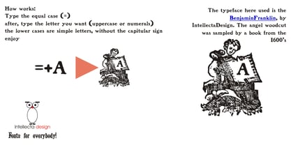
- MC Giant Caps by Maulana Creative,
$15.00 Giant Caps is a graffiti display font. With slanted medium low contrast stroke, fun character with a bit of ligatures and alternates. To give you an extra creative work. Giant Caps font support multilingual more than 100+ language. This font is good for logo design, Social media, Movie Titles, Books Titles, a short text even a long text letter and good for your secondary text font with script or serif. Make a stunning work with Giant Caps font.
 - Karins Lombardy Caps by New Renaissance Fonts,
$10.00Karin's free reinterpretation of the early Renaissance Lombardic tradition, in two different versions. In the upper case the fill is blacker and has a straight pattern with diamond elements; in the lower case the fill is thinner with more white space and has a wavy pattern with rounded elements. - Noble Line Caps by URW Type Foundry,
$28.00 The basic idea for this headline typeface is to create strictly geometric letters, similar to a script typeface, as far as possible in a single sweep, without setting them down. And similar to a typeface written with a quill, there is a thin and a thicker stroke. The uppercase letters can also be used with the lowercase keys. The varied and unusual variety of forms in this typeface gives headlines, keywords and even short texts the attention they are looking for.
 - Like Gutemberg Caps by Intellecta Design,
$22.90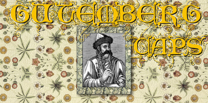
- Franciscan Caps NF by Nick's Fonts,
$10.00The majority of the letterforms in this mono-case font are based on a little-seen titling typeface designed by Frederic Goudy. The lowercase positions contain alternate letterforms, so you can mix and match to obtain just the right look. Both the OpenType and Truetype versions of this font contain the complete Latin language character set (Unicode 1252) plus support for Central European (Unicode 1250) languages as well. - Antoine Drop Caps by Kaer,
$19.00 These initials set I collected from “Tristan of the Round Table”, published approximately in 1513, by Antoine Verard. Antoine drop caps font family has Regular, Light and Colored styles. It's all you need to precisely imitate medieval style text. Use this font as a decorative element at the beginning of a paragraph or section, other part of the paragraph should be in regular black letter font. You’ll get Drop Caps & Numbers set. --- *You can use color fonts in PS CC 2017+, AI CC 2018+, ID CC 2019+, macOS 10.14 Mojave+ * *Please note that the Canva & Corel & Affinity doesn't support color fonts!* *Please download this test file with only A letter ( https://www.dropbox.com/s/lpzmdikw0ewxozx/AntoineDropCaps-Test.otf?dl=0 ) to check your app & system.* --- Please feel free to request any help you need: kaer.pro@gmail.com Best, Roman.
 - Drop Cap One by Outside the Line,
$19.00 Drop Cap One is a drop cap or an initial cap font. Even though it has all the letters of the alphabet it is not an alphabet font to be used for headlines or body copy. It has no kerning or punctuation except a period. It does not have accent marks. There are basically 2 alphabets in this font. The lighter letters are lower case and the darker letters are upper case. The light and dark letters are interchangeable. While a fun desktop font the real inspiration for this font was my need for a webfont for initial caps for blogging. It could also make a great scrapbooking font too. Lots of uses for this quirky little font.
 - Partager Caps NF by Nick's Fonts,
$10.00This typeface takes its inspiration from Will Bradley's Ultra Modern Initials, released by American Type Founders in 1934. Unlike the caps-only original version, both versions of this font contain complete Unicode 1252 (Latin) and Unicode 1250 (Central European) character sets, with localization for Romanian and Moldovan, and the Macintosh Roman character set, as well. - Intellecta Monogram Caps by Intellecta Design,
$28.90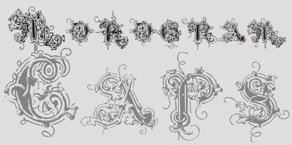
- Newsreel Caps JNL by Jeff Levine,
$29.00 Newsreel Caps JNL is a novelty caps-only outline letter with cast shadow set inside film frames. Although the design idea itself is not new, this version is based on lettering from a vintage piece of sheet music for a song featured in the movie "Fox Movietone Follies". The font is a wink and nod to Fox's long-running newsreel series called "Fox Movietone News". The upper case keys have black letters on a white frame, while the lower case keys have white letters on a black frame. A blank white frame is on the period key; a blank black frame is on the comma key. Use this font for individual initials, set the characters loose for effect or set them tight (as provided) for a continuous film strip.
 - Opa-locka JNL by Jeff Levine,
$29.00 Opa-locka JNL is named for a city in Miami-Dade County, Florida and is based on an Art Nouveau-era bit of hand lettering found on vintage sheet music. Legendary aviation pioneer Glenn Curtiss (who successfully developed the city of Miami Springs and the city of Hialeah with James Bright) began the development of Opa-locka around 1925 as a planned community with a "1001 Arabian Nights" theme. Plans for this exclusive community included a country club and a small private airfield, but the hurricane of 1926 derailed Curtiss' original vision of the city. Opa-locka gradually took shape as a residential area for middle-class families, but the closing of a long-established Marine base, changing demographics and a reputation for being a hot-spot for crime, drug abuse and corruption tarnished this once-grand community (which boasts the largest collection of Moorish Revival architecture in the Western hemisphere). Old-time Miamians bristle when the city's name (an abbreviation of a Seminole place name, spelled Opa-tisha-wocka-locka) is mis-spelled as "Opa-Locka", "Opa Locka" or "Opalocka". The correct name is hyphenated, and the second part is in lower case.
 - Isometric Initial Caps by Gerald Gallo,
$20.00 Contains characters A-z, 0-9, and ampersand in two variations totaling 74 characters.
 - Mr Richmond Caps by Intellecta Design,
$11.90 a classic decoative caps from wood types era
 - Berengard Caps Two by Intellecta Design,
$12.00 a classical wood type era box ornament using blackletter... a beautiful arrangement for publishing edition and other jobs
 - Flowery Drop Caps by Celebrity Fontz,
$15.99The Flowery Drop Caps font is a set of highly ornate block letters with rich embedded flowery designs, perfect for Spring and holiday themes and publications or any text where you want to add some texture, pizzazz, and depth to make your message stand out. This one-of-a-kind font has the feel of a homemade embroidered or quilted design and comes with both upper and lower case letters to give you more design flexibility. (Numbers, special characters, and punctuation are a neutral sans serif typeface and are included for convenience only.) - Speedball Metropolitan Caps by Intellecta Design,
$6.00 a decorative caps font based in designs of old Speedball booklets
 - Renaissance Caps BA by Bannigan Artworks,
$19.95This is a revival font of a sixteenth century typeface. I kept this font as close as possible to the original letters, including the imperfections and irregularities, to preserve the look of antiquity. Some of the letters of the original sample were missing and had to be created from the available letters. - LTC Circled Caps by Lanston Type Co.,
$24.95 This handy font allows designers of commercial products to add basic circled letters that are uniform in appearance. For example, on music CDs, the Copyright and Publish (AKA Phonogram) symbols often do not match. While most fonts include a circled 'c' for Copyright, they seldom contain a circle 'p' for Publish (note that all P22 fonts include the circle 'p' and 'c'). The circle 'U' and 'K' for Kosher foods are rarely included in fonts and have to be made as needed. This single font contains both a serif and sans serif style caps A-Z as well as figures assigned to regular keys and also mapped to standard Unicode for "Enclosed Alphanumerics".
 - P22 Durer Caps by IHOF,
$24.95 Durer Caps is three fonts in one. Based on master artist Albrecht Dürer’s 1525 geometric construction of Roman capitals, this font features A to Z as caps only. But there are three variations included: filled construction, unfilled construction, and the solid fill letters by themselves.The user can layer the unfilled and the solid fill letters to do two-color overlay effects.
 - Medieval Caps BA by Bannigan Artworks,
$19.95This is a revival font from an Image of a plate made from Eleventh Century initial letters. The "numerals" are Roman numbers done as ligatures. - Albeit Grotesk Caps by Cloud9 Type Dept,
$40.00 Albeit Grotesk Caps is a graphic geometric all caps display font family of four weights (Light, Regular, Medium and Bold) with slightly exaggarated diacritics for better readability making it ideal for headlines.
 - Snowflake Drop Caps by Celebrity Fontz,
$15.99The Snowflake Drop Caps font is a set of highly ornate block letters with rich embedded snowflake designs, perfect for winter and holiday themes and publications or any text where you want to add some texture, pizzazz, and depth to make your message stand out. This one-of-a-kind font has the feel of a homemade embroidered or quilted design and comes with both upper and lower case letters to give you more design flexibility. (Numbers, special characters, and punctuation are a neutral sans serif typeface and are included for convenience only.) - LP Horizont Caps by URW Type Foundry,
$19.99 LP Horizont Caps is another new font creation from German designer Peter Langpeter (lp-design.de). LP has been running his own design studio since 1995, working as a typeface and logo designer, as a calligrapher, cartographer and illustrator. During this time LP created a large number of excellent new typeface designs. LP Horizont Caps is a very futuristic looking, sharp and elegant sans serif.
 - Tighten Caps Light - Personal use only

- Stoutface SC - Personal use only

- Kaput Black - Personal use only

- Geoplace SC - Personal use only

- Kaput Black Black - Personal use only

- CA Trasher by Cape Arcona Type Foundry,
$19.00 A great UGLY font. Beauty lies in the eye of whoever. Maybe the beholder is a beast or a Swiss artist. The SHIFT key will give you alternative character shapes. Remember: beauty doesn’t lie in the eye of the beholder – it lies in yours!
 - CA Sensuell by Cape Arcona Type Foundry,
$37.00 Stefan Claudius developed this font while he was sitting in a small chalet in Denmark with a hot wood-oven and nothing but snow outside. Probably the amount of white led him to make it so thin and to have as much space between the lines as possible. If you have that in mind, it looks best in large sizes.
 - Domani CP by CounterPoint Type Studio,
$29.99 Domani from CounterPoint is a faithful digital revival of an old photo-typositing face called ITC Didi. Originally designed by Herb Lubalin and Tom Carnase, Domani brings to life a font that has been somewhat neglected by the digital era until now. Brought to the attention of Jason Walcott by graphic designer Rob King, this font immediately captured Jason with its 1970s high contrast Didone style, typical of that time period. It has some unique design details that set it apart from other didone style typefaces. “Domani” is the Italian word for “tomorrow”. The name was suggested by Rob King, and Jason felt it was perfect for this revitalized design. Walcott has created a professional quality digital version that is both faithful to the original design while expanding the character set to make use of OpenType features. A full set of swash capitals and several swash lowercase, designed by Walcott, has been added, as well as support for Latin-based and Eastern European languages.
 - Sadina CA by NumidiaType,
$20.00 Sadina™ CA is a small caps version of Sadina™ font family, designed separately to minimize the font incompatibility for applications that cannot support this feature. Generally, some applications support this feature, but not exactly with the right stems. For example, in some apps, all glyphs applied with this feature are scaled only, which makes characters not have the approximative proportional thickness with capital characters. Specimen
 - CA Coronado by Cape Arcona Type Foundry,
$19.00 CA Coronado is a nice display font for use in titles, logos and headlines. With its used look it creates a friendly and human feeling. Upper- and lower-case characters differ in details and can be mixed to get a vivid look. For the best authentic look, the ‘Regular’ can be used as filling and complements the Shadow-style.
 - CA 12c13c by Cape Arcona Type Foundry,
$28.00 CA 12C13C was designed by sticking letters together with tape. Use it when right angles are strictly forbidden!
 - CA Texteron by Cape Arcona Type Foundry,
$40.00 CA Texteron is a modern text font family to cover the most common typographical needs with a minimum of weights. It is aiming for a serious but unconventional look, which is achieved by combining round and edgy forms in the same font, often in the same glyph, and by using Humanist and modern form-principles at the same time. It merges classical type-design with an experimental spirit. CA Texteron combines elements of the dynamic renaissance principle with the static neo-classic style, which makes it hard to classify. The result is a post-modern hybridization. The Regular weight works best in text size, and with more letter-space also for footnotes. The low contrast makes it robust and legible even in very small sizes. Bold, Italic and Small Caps are intended for emphasis. Bold, Bold Italic and Heavy make good headlines, that reveal the unconventional details. The Italic is not just a slanted version of the Regular weight but has individual forms and typical italic characteristics.
 - CP Company by FSD,
$23.37 C.P. Company is a group of types including 4 different forms and it is a complementary sign of communication for the C.P. Company clothes maker. C.P. Company communication makes use of media such as the press and the web and that’s the reason why we have always felt the need for a font that would not show incongruities through the monitor. Therefore we have decided to change the structure of glyphs like a, e, g, s… in the most contrasted versions to prevent the serifs from touching the internal parts of the letters and in this manner we have made a really unusual stylistic choice for a group of types. The difference between the height of caps and smalls is very low (about 20%) so that the smalls are easy to read even when their dimensions are on a very small scale. Moreover this stylistic solution gives the possibility to avoid using the small capitals in case of charts and catalogue codes (i.e. Tricot M5) and provides more vertical compactness between the lines. Even a sentence written in capital letters next to another one written in smalls does not look so much contrasted from a typographical point of view and then it is not unpleasant. The limits due to different constructive principles have been overcome by means of a grid based on the automatic division of EM square of 9-point type and in this manner the letters have a wider face. The font is even more unusual owing to the style chosen that belongs to the classical tradition of hair-lined types for glyphs like e and also thanks to ligatures like ? in the characters set. CP Company is a geometrical font whose alphabet makes use of the style of types that preceded the Helvetica, matched with more experimental and updated solutions. Numbering is monospaced. The bending of number 2, the slight raising of the oblique serif of number 4 and the presence of a hair-line in number 7 are the solutions adopted to make the types match in a more balanced manner.
 - CA Negroni by Cape Arcona Type Foundry,
$29.00 A dinner is not complete without a fine appetizer. Whatever you dinner will be, CA Negroni is the perfect introduction. Delivered in three flavors, Normal (Light + Black + Fill), Inline and Round. Versatility is proved by the extensive language support, covering whole Central Europe. CA Negroni is the well aged and improved version of a typographic classic: in the beginning of the 20th century, type in advertising was mostly drawn by hand. A master of this art and pioneer in logo-design was Wilhelm Deffke (1187–1950). CA Negroni is inspired by his kind of bold and solid letterings, picking up some of the charming details while leaving away other that might have a disturbing effect on the general look. Two stylistic sets let you choose between a more serious or a more playful look.


