10,000 search results
(0.059 seconds)
- Delauney by Arterfak Project,
$17.00 Delauney is a display font, inspired by the Art Deco style from the 1920s. Delauney visualizes luxurious looks, elegance, and wealth. This font is an all-caps font designed with geometric shapes and firm strokes that gives a clear look and minimalist. Delauney also has some OpenType features and accented characters to give you many alternatives in your creative process. A great choice for your headline, title, label, editorial, logotype, quotes, typography, and more! Delauney provides three styles : Regular: The main style for display or headline Shadow: Secondary style that you can use to beautify the Regular one. Catchwords: Available in three languages; English, Spain & Bahasa. Complete your words to look more decorative. Thank you for visiting Happy designing!
 - ED Muskrat by Emyself Design,
$9.00 ED Muskrat is a display font family that looks elegant classic and modern, this font is designed from a combination of serif and semi blackletter fonts that add a unique feel to the font. ED Muskrat has 9 styles: Thin, ExtraLight, Light, Regular, Medium, SemiBold, Bold, ExtraBold, and Black. ED Muskrat is equipped with ligatures, alternative characters, and supports multiple languages. and also this font is perfect for your design needs such as branding, poster design, books, fashion, social media design, logos, etc. Features: Stylistic alternates ( C, E, F, I, J, N, Q, S, Z ) Ligatures ( fi , fj , tt ) 9 Styles ( Thin, ExtraLight, Light, Regular, Medium, SemiBold, Bold, ExtraBold, and Black ) Multi Language Support 373 Glyphs
 - ITC Goudy Sans by ITC,
$29.99 Frederic W. Goudy designed three weights of this friendly-looking sans serif font from 1922-1929 for Lanston Monotype in the United States. Goudy was attempting to impart freedom and personality to the sans serif form at a time when geometric sans serifs, such as Futura, were gaining rapid world-wide popularity. To achieve this challenging goal, he looked to lapidary inscriptions and manuscript writing for inspiration. He included elements such as slight swellings of terminal strokes, slab serifs on a few of the caps, alternate uncial forms, and a few swash strokes. The result is uniquely Goudy: charming, instinctive, and just right for adding warmth to magazine or advertising layouts. The design staff at ITC updated and filled out the family for a total of eight styles in ITC Goudy Sans. ITC Goudy Sans® font field guide including best practices, font pairings and alternatives.
 - ITC Flora by ITC,
$40.99ITC Flora is the work of Dutch designer Gerard Unger, and is named for his daughter. He started by doing calligraphy experiments with felt-tip and ballpoint pens, and developed these drawings into a formalized script typeface. Swiss typographer Max Caflisch advised the Dr.-Ing Rudolf Hell GmbH technology firm to add a new round-nibbed script face to their Digiset type library, and in 1984, Flora was released by Hell. Unger used a chancery cursive skeleton in this design, which imparts grace and movement. Flora was also intentionally designed to be simple and sturdy, and with its minimal variation in thick/thin stroke ratio, it worked well on the early digital typesetting machines. In 1989, the International Typeface Corporation released the font. ITC Flora continues to work well on current printers and typesetters, and it has an enduring popularity for uses that range from short text passages to display headlines. - Wedding by HiH,
$10.00 Wedding Regular was originally designed by Morris Fuller Benton for ATF and released as Wedding Text in 1901. It is a lighter version of his ENGRAVER'S OLD ENGLISH of the same period. Wedding Regular is based on the Textura style of blackletter that continued in popularity in England into the 16th century, long after the Dutch, French and Italians had moved to a Roman model that expressed the Renaissance humanism of the period. Wedding Headline is a still lighter version of the regular text face, suitable for setting larger sizes while still preserving the delicacy of the decorative hairlines. Textura continues in use in England and the United States for newspaper mastheads, gift shop signs, wedding invitations and programs and other applications where a feeling of tradition is desired. I recently saw an 1980ish photo of a “Tubby Isaac” sign in London using textura. I believe Benton’s design captures that feeling without being heavy-handed and still remaining quite readable for eyes accustomed to Roman lettering. Both Wedding Regular and Wedding Headline convey a comfortable familiarity. These two fonts may be purchased together at an attractive discount or they may be purchased separately. The full character set may be found in the pdf file that you can download from the gallery section. The two monks (alt-0172 and alt-0177) are from a set of sixteenth century decorative initial letters by Gering and Renbolt. Please note that there are two different eszetts, the blackletter style at alt-0126 and the antiqua style at the alt-0223.
 - Xtra Sans by Typolar,
$58.00 In its characteristics Xtra Sans is a combination of modern grotesks/grotesques and traditional calligraphy. Its upright and compact letterforms generate a sturdy effect as in the early 20th century grotesks Nobel, Kabel or Erbar. On the contrary, dynamic inside forms (counters) give the characters a fluent appearance. As a result, Xtra Sans stands out in large size, while remaining highly legible in small and long text. In 2007 Xtra Sans received a Certificate of Excellence in Type Design from Type Directors Club, New York. In 2002, still unpublished, it was awarded a bronze prize at the Morisawa Awards, Tokyo.
 - Remaid Typeface by Gatype,
$13.00 The Remaid Typeface font is an elegant serif typeface with subtle details. This neat font can add modern and fashionable brand appeal. This versatile display typeface has enough character for logos and branding, as well as headlines, apparel, bridal and more. Keep it classic, or decorate it with ornate alternatives to uppercase and lowercase glyphs! Important information: To access the alternatives, you must have access to an older version of Photoshop to copy/paste the glyphs from the included PSD, OR the Glyphs Panel, which can be found in Photoshop CC or any Version of Adobe Illustrator.
 - NoweAteny by Linotype,
$29.99Linotype Nowe Ateny is part of the Take Type Library, which features the winners of Linotype’s International Digital Type Design Contest from 1994 to 1997. Designed by Dariusz Nowak-Nova, Nowe Ateny is a frantic handwriting font whose capital letters include technical-looking grid lines and end points. These seem to anchor the letters without reducing their volatility. The font consciously lacks elements which increase legibility, sacrificing them for the sake of more design oriented ideals. Nowe Ateny is thus good for headlines in larger point sizes, especially when the look of the text is as important as its content. - Emily Austin by Three Islands Press,
$39.00 An indomitable woman who traveled a lot, Emily Austin (Bryan) Perry was one of the children of Moses Austin, of Austinville, Virginia. Like her famous brother, Stephen F. Austin, she settled in Texas as one of that region's earliest colonists. While traveling about seeking treatment for a sickly daughter, she wrote many letters home -- letters that show a distinctively compact, legible hand. The challenge for me in designing the face: resisting the temptation to read and re-read her bossy directives and urgent appeals, all packed tightly together on a page. Emily Austin has a complete character set, and then some.
 - dT Ampla by dooType,
$35.00 dT Ampla shares many characteristics of the versatile sans typefaces of today: nice range of five weights with matching italics, 40+ supported languages, contemporary upper-to-lowercase proportions and impeccable performance in big and text sizes. However, all these features are designed with distinct shapes and details. Notice the angled terminals – the cut at the end of the strokes – or how the vertical strokes in the italics seem to 'bend' a little, for instance. The sum of these and many more design decisions result in a typeface capable of delivering a strong presence to sites, interfaces, apps, magazines and corporate graphic language.
 - American Scribe by Three Islands Press,
$39.00 The Declaration of Independence was authored by Thomas Jefferson, but his is not the classic handwriting on the engrossed copies familiar to most Americans. That belonged to Timothy Matlack, an early patriot who fought in the Revolution, sat as prosecutor at Benedict Arnold’s court martial, and also penned copies of a number of documents for then-General George Washington. Matlack’s script was compact but legible, perfect for the first and most famous of American documents. Now you, too, can write that way. Please note: The font does not include any of the signatures from the Declaration of Independence.
 - Kurstiva by Typogama,
$19.00 Kurstiva is a narrow, sans serif typeface family available in ten weights ranging from a hairline, thin weight to a dark, black style. Conceived as a contemporary text face, this typeface aims to convey a strong personality while remaining very legible. Functional and compact in smaller sizes, Kurstiva reveals it’s finer details and character in larger sizes found in titles or logos. With an extended character set covering most Latin based languages, a wide range of monetary symbols and a complete arrow collection, this family was designed to adapt to a variety of a settings or tasks.
 - Sumply by Martin Gnadt,
$14.99 Sumply is a multi-layered type family based on geometric forms. A monospace display typeface which comes as a family of four. It is equipped with OpenType features and contextual alternatives to create a versatile and fresh output. Sumply initially was designed to be used in personalization processes in digital printing. By choosing the basic geometric cut (FOUR), patterns and various graphic elements can be created just by importing text variables into the indesign data merge. If combined with the other cuts the possibilities are sheer endless. Sumply was selected to be in the 2016 edition of Typodarium.
 - Nipok by Gravitype,
$14.90 Nipok is a single weight display typeface, inspired by the aesthetics of different decades. Rounded terminals and playful intersections from the 60’s and 70’s, joined with straight and compact lines from the 80’s and 90’s. The particular style is given by the alternation of upper and lower case letters, chosen to fill the empty spaces greatly and create harmony. In addition, alternates are included to give you more stylistic options. While by default this font is a semi unicase, the alternative glyphs extend the Ascent and Descent metrics. Multilingual support is available.
 - Calle 26 by Christian Gamba Pardo,
$9.90 This group of icons has graffiti as central theme, based on the most representative images and styles of the artists; Guache, Toxicomano and DjLu. In addition, the 26th Street corridor (also known as El Dorado Avenue) was taken as the main reference because it brings together the work of many important exponents in this type of art; at least locally and nationally. Some icons are characterized by have a similar appearance with the Stencil technique or by have a loose stroke with high contrast. This font can be used in projects and works related to street art.
 - Radenes by Gian Studio,
$16.00 Radenes is my new elegant serif font that will give your projects a touch of luxury and style. It's perfect for logotypes, branding, monograms and wedding invitations, blog headlines, and more. Browse through all the previews and get as inspired as I was when creating this font. What did you get? -Uppercase Letters, Numbers, Punctuation & Symbols. Multilingual Support Important information: To access the alternatives, you must have access to an older version of Photoshop to copy/paste the glyphs from the included PSD, OR the Glyphs Panel, which can be found in Photoshop CC or any Version of Adobe Illustrator. Thanks.
 - Cresing by Gatype,
$14.00 Introducing the newest font Cresing is perfect for branding, poster design, t-shirts, invitations, designs for kids, and editorial designs. It comes with many styles, including fasteners. OpenType features include style sets, character variants, initial and final forms, and multilingual support. Important information: To access the alternative, you must have access to an older version of Photoshop to copy/paste the glyph from the included PSD, OR the Glyph Panel, which can be found in Photoshop CC or any Version of Adobe Illustrator. Thank you More about this source text Source text is needed to get additional translation information Send feedback Side panel
 - Baskerville by Bitstream,
$29.99 John Baskerville spared no effort to create the ultimate typographic book. He prepared deep black inks and smoothed paper to show to full effect the letters that he had John Handy cut from his own brilliant designs, based on a lifetime of calligraphy and stonecutting. Punches and matrices survive at the Cambridge University Press. The present design is an accurate recutting, with particular attention to George W. Jones’ revision from the metal of Baskerville’s English (14pt) roman and italic in 1929 for Linotype & Machinery Ltd; Mergenthaler Linotype imported this design to the USA two years later.
 - Supra Mezzo by Wiescher Design,
$29.00 »Supra Mezzo« – designed by Gert Wiescher in 2012/13 – is an unusual addition to the Supra family, a weight in between the normal and the condensed width. This cut comes in very handy if you need to put lots of text into a relatively small space without loosing readability. The compactness with great legibility makes Supra Mezzo absolutely unique. The light and normal weights and the dominant x-height with its high ascenders make for easy reading of long copy. The heavy and x-light weights are great for elegant headlines. Supra is an OpenType family.
 - Marlina Garden by Kotak Kuning Studio,
$17.00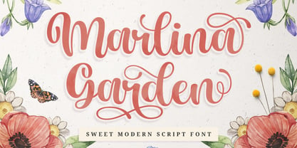 Marlina Garden is a sweet modern script font with a contemporary atmosphere and impeccable form, inspired by timeless classic calligraphy. This font was designed to enhance the beauty of your projects. Marlina Garden is perfect for many different projects such as logos & branding, invitation, stationery, wedding designs, social media posts, advertisements, product packaging, product designs, label, photography, watermark, special events, or anything. We highly recommend using a program that supports OpenType features and Glyphs panels such as Adobe Illustrator, Adobe Photoshop CC, Adobe InDesign, or CorelDraw, so you can see and access all Glyph variations. Thanks and have fun!
 - Amasis by Monotype,
$40.99 Amasis is a slab serif design which has been drawn with a humanist approach, rather than the traditional geometric construction associated with this style of letter. The result is a typeface that has an affinity with the Ionics, although in character it belongs to the latter decades of the twentieth century. The Amasis italic fonts, rather than being sloped roman or cursive in nature, are related more to the Old Style italics. Amasis works particularly well in small sizes where readability is important. Amasis has proved excellent for use on low resolution printers and for facsimile transmissions.
 - Bosento by Gatype,
$12.00 Hi everyone, come back from us The Bosento font is perfect for Your projects today are branding, poster design, t-shirts, invitations, designs for children, and editorial design. You will find a lot of glyphs, including ligatures, to look elegant in this bold serif. OpenType features include style sets, character variants, starting and ending forms, and multilingual support. Important information: To access the alternatives, you must have access to an older version of Photoshop to copy/paste the glyphs from the included PSD, OR the Glyphs Panel, which can be found in Photoshop CC or any Version of Adobe Illustrator. Cheer!
 - Gramma by CAST,
$45.00 Gramma is a compact sans with big x-height, a robust and balanced typeface that work well both for headlines and main bodies of text. The initial constructions, assembled from a few well-defined geometric modules, were later polished into more organic forms; the letters’ arches are quite squared, and the counters and other internal negative spaces push outward, creating a tension that balances the forms’ compression. Gramma’s most evident characteristic is its “bird-beak” terminals (present in many letters, including the c, e, f, s...) that replicate the unconnected junctures between stem and curve, visible in the a,b,d,g,h.
 - Azuza by Parkinson,
$20.00 In the 1990s I drew a text face for the San Francisco Chronicle. It was based on W. A. Dwiggins’ Electra and incorporated many features of the Linotype Legibility Series: More compact, with a taller lowercase X-height, etc. That type was called Electric and it was the Chronicle’s text face for nearly a decade, surviving several redesigns. From that, I made Azuza, a more detailed and sensitive style. Azuza was recognized in the TDC2 type competition in 2001. Then it went into hibernation as a Type 1 font family. Today it is back. Six fonts. Open Type.
 - Biographer by Sudtipos,
$79.00 Biographer is a mild upright script drawn by Angel Koziupa, with Alejandro Paul art directing and producing. Elegant but quite reminiscent of roman forms and proportions, Biographer keeps the calligraphy mostly toned down, but its ascenders and descenders occasionally flare out in final swashy confidence. As usual with Sudtipos fonts, alternates are plenty and the personal touch is never amiss. Biographer is great for women's lit and poetry book covers, as well as tame packaging of products where conveying comfort and peace of mind is of importance. An extensive range of languages are covered (Western and Eastern European, Baltic, Turkish, Maltese and Celtic).
 - Flanela by Gatype,
$12.00 Flanela is my new elegant serif font that will give your projects a touch of luxury and style. It's perfect for logotypes, branding, monograms and wedding invitations, blog headlines, and more. Browse through all the previews and get as inspired as I was when creating this font. What do you get? - Flanella (OTF,) -Uppercase Letters, Numbers, Punctuation & Symbols. Multilingual Support Important information: To access the alternatives, you must have access to an older version of Photoshop to copy/paste the glyphs from the included PSD, OR the Glyphs Panel, which can be found in Photoshop CC or any Version of Adobe Illustrator.
 - Duran by The Northern Block,
$- Duran is a strong, versatile geometric sans with industrial quality. Inspired by technical style letterforms with simple construction, the typeface is useful in both large format and body text. Its compact lateral shape helps save space across layouts and is good to go across a wide range of modern applications. Details include seven weights with matching italics and over 670 characters per style. Opentype features consist of eight variations of numerals, including inferiors, superiors, fractions, case figures and circled figures. Additional features include case-sensitive forms, stylistic alternates, ligatures, game symbols, arrows and language support covering Western, South and Central Europe.
 - Letter Gothic 12 Pitch by ParaType,
$30.00 The Bitstream version of Letter Gothic designed by Roger Robertson in 1956-62 for IBM electric typewriter. It is a condensed, monospaced font resembling a typewriter face, suitable for tabular material. Primarily used for slide presentations and for word processing applications, Letter Gothic is very helpful for printing out software source listing, for informal office communications and for tabular charts where alignment of columns is important. Besides, being a clear and easy-to-read font, Letter Gothic is popular now for display and advertising matters. Cyrillic version was developed for ParaType in 2000 by Gayaneh Bagdasaryan.
 - LHF Broadway Panels 3 by Letterhead Fonts,
$53.0036 expertly-crafted and unique panels from Golden Era Studios. Typing each letter generates a different design. Special Note: Due to the large file size of these fonts, they will not convert for use in Gerber Omega. Instead, Omega users may wish to use an alternate program to type the characters and import them into Omega as .eps files. CorelDraw users should use the "Weld" command rather than "Convert to Curves" command to convert these fonts to vector outlines. Otherwise, the program may crash due to the sheer number of points in some of the panels. - KillSwitch by Comicraft,
$19.00 Not all our font releases come with an emergency full stop triggered by a BIG RED BUTTON. And not all font releases come with a Caution: NEVER TOUCH THAT SWITCH! Even if you really want to. You're going to touch it, aren't you? Be advised: even an untrained user with impaired executive function can operate KILLSWITCH, so we've hidden the BIG RED BUTTON where it can NEVER BE FOUND. This Comicraft mechanism may cause injury or death; please study all literature regarding the safe handling of Comicraft fonts posted in your workplace or adjacent cyberspace. KillSwitch
 - Brave love by Gatype,
$10.00 The Brave love font is an elegant serif typeface with subtle details. This neat font can add modern and fashionable brand appeal. This versatile display typeface has enough character for logos and branding, as well as headlines, apparel, bridal and more. Keep it classic, or decorate it with ornate alternatives to uppercase and lowercase glyphs! Important information: To access the alternatives, you must have access to an older version of Photoshop to copy/paste the glyphs from the included PSD, OR the Glyphs Panel, which can be found in Photoshop CC or any Version of Adobe Illustrator.
 - VLNL Brokken by VetteLetters,
$35.00 'Brokken’ is the Dutch word for ‘chunks’. They are the hearty specialty of the house, prepared by the ship’s cook Donald DBXL Beekman. Nice'n'greasy and monospaced, you'll always find a decent way to cram the letters in. Brokken is straightforward, straight-lined with beveled corners, and all caps. For the ones who have to watch their weight, or who simple don’t like their fonts to be too fatty, DBXL designed a diet version called Brokken Light. With their big contrast, both weights combine very well and are great for making ultra-compact ribbon headlines or stacking vertically.
 - Silken by Scholtz Fonts,
$19.92 Silken is a stylish and contemporary handwriting font that combines the elegance of fonts such as Zapfino with the immediacy of handwriting fonts such as Affable. There are many handwriting fonts out there, but many of them border on being grungy and irregular. This font combines beauty with individuality and spontaneity. Silken comes in a number of styles, the primary style of which is Silken Scarf. This style has a strength and sophistication that is particularly appropriate for headlines and short passages of text (such as invitations, certificates, greeting cards etc.) Silken Thread is a variant of the font family that is even more delicate and polished than Silken Scarf. The third style, Silken Book, with a greater x-height and less dramatic capitals, is more readable and less extreme than the other two styles. It should be used for longer passages or where readability is of primary importance. Suggestions for use: - wedding stationery - greeting cards - valentines day mediaa - beauty product media - lingerie tags - women's magazine pages - classical music media - award certificates The font is fully professional: carefully letterspaced and kerned. It contains over 235 characters - (upper and lower case characters, punctuation, numerals, symbols and accented characters are present). It includes all the accented characters used in the major European languages.
 - Klatter by Scholtz Fonts,
$19.00Klatter is a font that is "in your face". It can't be ignored, and draws attention to itself no matter how noisy the environment. It is available in three styles: - Klatter Regular is a clean, spunky, non-grunge font that uses a combination of straight lines and sharp angles to make a strong, no-nonsense statement; - Klatter SmallCaps, in which the lower case is a true "small caps" and not a shrunken version of the upper case (generated by the operating system); - Klatter Grunge is based on Klatter Regular but is "dirty" and messy, giving the impression of printing problems and wet ink being smudged. Unlike many other grunge fonts, Klatter Grunge is a font that is full of character. Both styles have a full character set with upper and lower case, numerals and mathematical symbols, as well as a full set of accented and special characters. The font has been carefully letter-spaced and kerned and the vertical spacing has been appropriately set. Klatter Grunge and Regular are appropriately purchased together since they complement one another when used in the same graphic design job. - Standard CT by CastleType,
$59.00 CastleType was commissioned in 1991 by San Francisco Focus magazine to digitize three members of the Standard family. This is a Continental lineale that was popular in Switzerland in the 1950s and later in the United States. A cousin to the classic sans serifs, Standard is an alternative that is considerably warmer and a bit more idiosyncratic. In 2008, CastleType released additional members of the Standard CT family to make it a complete typographic solution with three widths (normal, condensed, extended) of four weights each (Regular, Medium, Bold, and Extra Bold). Some of the original Standard fonts, particularly Standard Regular, appear to have been hastily designed (or perhaps too closely imitated Helvetica); these have been greatly improved in the CastleType versions with more harmonious proportions and other refinements. The three lighter weights of the Extended subfamily were designed from scratch based on the new Standard CT Regular and Standard CT Extended Extra Bold. More recently, four light weights (Light, Extra Light, Ultra Light, and Hairline) have been added to each of the three widths. The entire Standard CT family includes support for most European languages, OpenType features, arbitrary fractions, and a collection of geometrics, dingbats & fleurons.
 - Axeo by Asritype,
$13.00 Axeo is a freeform serif typeface. With more than 500 glyphs for each cut, Axeo supporting wide Latin Base Languages. The font structures is sans-serif typeface. Then, the fonts is made into serif (serifed) using rhombus and adapted/modified rhombus (before remove overlaps) placed on its appropriate positions. This fonts is released first, while the sans-serif is being in process. There are 10 fonts; 5 weight in normal width: Light, Regular, Medium, Bold, and Black; and 4 in semi-condensed: Light, Regular, Medium, Bold and Black, too. The fonts has some minor character variations, all are sets in SS01.There are also standard and discretionary ligatures, arrow, some geometric shapes and ornaments. With its sansserif structure, the Medium, Bold and Black fonts is playful with text effect in various applications such MS Word, CorelDraw or others to enhance the appearance. Its serif form will make unique enhancements. Thus, the fonts is suitable for Branding, logos, cards, advertisements, banners, display and more; for the main texts or its companions. While the light, regular and medium fonts can also be used as description text, card text, note, caption and longer non-formal texts or other usages.
 - LunchBox by Kimmy Design,
$25.00 LunchBox is a uniquely hand-drawn typeface that gives infinite customizable options and a fully authentic look. Using Lunchbox’s OpenType features gives access to over 1,500 different characters. Contextual alternatives give each letter 4 different character styles, all cycling through each other to ensure that no two letters ever show up together. There is also a custom set of small caps, each with 4 style variations as well. Stylistic alternatives give an extra hand-drawn flourish, loop and slight variation, also with 4 different styles per letter. Discretionary ligatures pertain to both regular all caps Lunchbox as well as stylistic alternatives. It takes special letters and gives a unique interaction with the characters around them, giving your design a unique and personalized look. Swashes also have four style variations to both the regular and stylistic alternatives, as well as lowercase letters with ascenders and descenders. All of these options are available in Light, Regular and Bold and can be purchased with Lunchbox Ornaments for an extra element. If you do not use Opentype but are using a program that includes a full glyph panel, you will be able to access each of the style variations you want. Enjoy!
 - Espial by VP Creative Shop,
$10.00 Introducing Espial typeface - 36 fonts Espial is modern and yet vintage, timeless typeface loaded with 36 font styles (display, regular, italics) 87 languages support and ligature glyphs to make you typography truly unique! Language Support : Afrikaans, Albanian, Asu, Basque, Bemba, Bena, Breton, Chiga, Colognian, Cornish, Czech, Danish, Dutch, Embu, English, Estonian, Faroese, Filipino, Finnish, French, Friulian, Galician, Ganda, German, Gusi,i Hungarian, Indonesian, Irish, Italian, Jola-Fonyi, Kabuverdianu, Kalenjin, Kamba, Kikuyu, Kinyarwanda, Latvian, Lithuanian, Lower Sorbian, Luo, Luxembourgish, Luyia, Machame, Makhuwa-Meetto, Makonde, Malagasy, Maltese, Manx, Meru, Morisyen, North Ndebele, Norwegian, Bokmål, Norwegian, Nynorsk, Nyankole, Oromo, Polish, Portuguese, Quechua, Romanian, Romansh, Rombo, Rundi, Rwa, Samburu, Sango, Sangu, Scottish, Gaelic, Sena, Shambala, Shona, Slovak, Soga, Somali, Spanish, Swahili, Swedish, Swiss, German, Taita, Teso, Turkish, Upper, Sorbian, Uzbek (Latin), Volapük, Vunjo, Walser, Welsh, Western Frisian, Zulu FEATURES Uppercase, lowercase, numeral, punctuation & Symbol ligature glyphs Display font - regular and italic 17 sans serif weights - regular and italics No special software is required to type out the standard characters of the Typeface. Feel free to contact me if you have any questions! Mock ups and backgrounds used are not included. Thank you! Enjoy!
 - Sabio by Greater Albion Typefounders,
$11.95 I regard Sabio as an evolutionary face. By this I mean that it merges elements of script and Roman design into one elegant whole. The design was 'evolved' somewhere between these two classic approaches. The resulting family of faces makes an excellent display family, but is also clear and legible at small sizes and can be used as a text face with a distinctive flair. Sabio is a wonderfully flexible face that can sit happily alongside artwork that owes its inspiration to any era from the Art Deco onwards. The regular form is gently and subtly oblique, and the glyphs have a slight hint of swash about them. Alternate and perpendicular forms are also offered. The regular, alternate and perpendicular forms are all in turn offered in regular, and bold weights as well as in a condensed form. All in all Sabio is a humanist face with which almost anything can be done offering flair and elegance for almost any project. Whether it's a distinctive way of setting paragraph text, or poster work that's eye catching yet flowing and clearly legible, Sabio offers the answer.
 - Abraham by Sabrcreative,
$15.00 Discover the versatile and stylish Abraham Font Family at MyFont. With 8 unique styles, including Regular, Italic, Rough, Stamp, Shadow, Outline, and Rounded, this modern sans-serif modular family offers endless creative possibilities. Perfect for a wide range of design projects, Abraham is suitable for logos, greeting cards, quotes, posters, branding, business cards, stationary, blog headers, and more. Each style of the Abraham Font Family features both uppercase and lowercase letters, ensuring flexibility in your designs. Additionally, it includes stylistic alternates, standard ligatures, and numerals & punctuations in OpenType format for seamless typography. Enhance your artwork with the multilingual support of the Abraham Font Family, which includes a wide range of accents and characters to accommodate various languages. The font family is PUA encoded, allowing for easy access and usage across different platforms and software. With the Abraham Font Family, you'll receive the following fonts: Abraham Regular, Abraham Regular Italic, Abraham Outline, Abraham Outline Italic, Abraham Rough, Abraham Stamp, Abraham Shadow, and Abraham Rounded. Whether you're designing greeting cards, package designs, brand identities, or art projects, Abraham Font Family will add a touch of sophistication and creativity to your work.