10,000 search results
(0.043 seconds)
- St37k - 100% free

- Enamela by K-Type,
$20.00 Enamela (rhymes with Pamela) is a monoline square sans that is available in normal width and condensed versions. Although rooted in the early years of sans serif type, the Enamela fonts have a timeless quality that is practical and unpretentious. The letterforms derive from vitreous enamel signage dating from the Victorian era and widely used in Britain for street nameplates, Post Office signs, the plates on James Ludlow wall postboxes, railway signs and direction signs, as well as for circular Automobile Association wayfinding plaques throughout the first half of the twentieth century. The quirky terminals, stemming from the compression of geometric type, invite comparison with the Charles Wright fonts used for UK vehicle registration plates. Enamela and Enamela Condensed are both available in three weights – regular, medium and bold – and as italics (optically corrected obliques). A commonly used alternative M with a vertex that touches the baseline is provided at the Alt-M (µ) keystroke on a Mac, or Alt-0181 on Windows. A commonly used G with a plain vertical throat, no crosspiece, is assigned Unicode FF27 (full width capital G).
 - 3D Blocky by Okaycat,
$29.50 3D Blocky is a hand-drawn 3-D font. Composed of friendly & fun letters, this font is sure to become a favorite for you. There is a sprinkling of dingbats scattered around the alternates, just there to make this font extra fun and useful . Check it out! 3D Blocky is extended, containing West European diacritics & ligatures, making it suitable for multilingual environments & publications.
 - CASU Aérospatiale by Okaycat,
$24.50 CASU aérospatiale is an extruded 3-D font supported by equivalent "flat" styles. CASU aérospatiale is relaxed in character yet smooth in details. With the full family, you get many options for playing with text: add juxtaposition, depth, and texture to your work! CASU aérospatiale is extended, containing West European diacritics and ligatures, making it suitable for multilingual environments and publications.
 - Junge Holiday Cuts NF by Nick's Fonts,
$10.00A charming series of 26 holiday “type warmers” based on the works of Carl S. Junge for the Barnhart Brothers & Spindler type foundry in the 1920s. Single-color cuts are in the uppercase positions, while 13 of the cuts suitable for two-color usage occupy the lowercase in adjacent pairs; e.g., a and b, c and d, and so on. - Arabescos ND by Neufville Digital,
$29.60 Arabescos ND is part of Neufville Digital's GRAFÍA LATINA Collection. The original name of this collection of typographic decorations is 'FUGUE D´ARABESQUES'. These elements can spice up texts and give them a significance beyond their words. Unlike other typographic decorum these symbols inspired by sea and air have numerous matching points to join them with letters, words and texts.
 - Dee by Chantra,
$18.00The Dee font family started from letter "d" and "e" followed by the rest of the letters. "Dee" is Thai word mean "Good" in English that is the source of this font name. The Dee XTS style has alternate stroke ends relative to the Dee XT style. It is included as a bonus style in the Dee Regular Set and Dee Complete packages. - Zanderley by Greater Albion Typefounders,
$15.00 Zanderley was inspired by a small, almost random sample from a turn-of-the-last- century calligrapher’s instructional manual. It’s a bit Roman, mixed with a little blackletter and a lot of random decorative fun.The family consists of two typefaces- Zanderley regular is a heavy, friendly an d fun display face. They are well complimented by Zanderley initials. Try them out soon!
 - Eurydome by Emboss,
$30.00 Eurydome is one of Jupiter's many moons, and was named after Eurydome, the mother of the Graces in Greek mythology. Eurydome was inspired by the Grotesque face Venus, with an additional flair added to the lowercase a, b, d and g. Eurydome was designed to complement any display face that may be used in your project. Add grace to your layout, with Eurydome.
 - Havely by Slide Shoot,
$12.00 Havely Condensed Sans Serif is a balanced, smooth, elegant and stylish sans serif font. He has a beautiful character. It fits perfectly with invitation card designs, company logos, movie titles, movie names, business cards, book titles, brand names and various other designs. Havely Condensed Sans Serif is a subtle sans serif font that exudes sophistication and elegance. Its stylish alternations and ligatures make this font the perfect partner for any project.
 - Not So Grotesk JNL by Jeff Levine,
$29.00 A circa-1920s book on lettering entitled "Book of Alphabets" by Regan Publishing displayed an example of a Grotesk typeface (a popular style of sans serif of the time). This design was re-drawn digitally as Not So Grotesk JNL and is available in four varieties - regular, oblique, condensed and condensed oblique. Not So Grotesk JNL is the perfect companion font family to use alongside Simply Grotesk JNL.
 - Bosgema by Zaki Creative,
$12.00 Bosgema is a modern classy ligature serif typeface comes with joining ligatures that give it a fancy and unique style. This awesome font is perfect for branding, logos, invitation, watermark and so much more. Basgem typeface comes with regular, Condensed and Condensed italic font styles. Uppercase & lowercase letters, numbers, punctuation, ligatures, alternates and multilingual support. If you have any questions, please feel free to get in touch. Thank you
 - Charm Mirage by Issam Type,
$22.00 CHARM Mirage is a serif typeface comes with joining ligatures that give it a fancy and unique style. This awesome font is perfect for branding, logos, invitation, watermark and so much more. CHARM Mirage typeface comes with regular, italic, Condensed and Condensed italic font styles. Uppercase & lowercase letters, numbers, punctuation, ligatures, alternates and multilingual support. If you have any questions, please feel free to get in touch. Thank you
 - PH Font by Fontfabric,
$29.00 PH from Fontfabric Type Foundry is a multifaceted font system consisting of different font weights and type of condensation. Every one of these font weights contains a number of extension types - Condensed, Narrow, Regular, Extended and Wide. Along with all of this, you will also discover added groups of extras which could serve as a foundation or add that extra "cherry on the cake" to each unique design.
 - Vulcant by Slide Shoot,
$17.00 Vulcant condensed serif is a balanced, smooth, elegant and stylish serif font. He has a beautiful character. It fits perfectly with invitation card designs, company logos, movie titles, movie names, business cards, book titles, brand names and various other designs. Vulcant is a condensed serif is a subtle serif font that exudes sophistication and elegance. Its stylish alternations and ligatures make this font the perfect partner for any project.
 - Quebra Expa by Vanarchiv,
$55.00 Quebra Expa (Expanded) is an extend display sans-serif font family, available with four widths (Extra Condensed, Condensed, Normal and Expanded) and ten weights, italics versions are available. The main strokes contain small breaks simulating modulated variations on the letterforms, these details are more present on large body sizes. All font versions contain Latin and Cyrillic encoding characters and also ligatures, case-sensitive forms, fractions, oldstyle and finally tabular figures.
 - Basgem by Issam Type,
$23.00 Basgem is a modern classy ligature serif typeface comes with joining ligatures that give it a fancy and unique style. This awesome font is perfect for branding, logos, invitation, watermark and so much more. Basgem typeface comes with regular, italic, Condensed and Condensed italic font styles. Uppercase & lowercase letters, numbers, punctuation, ligatures, alternates and multilingual support. If you have any questions, please feel free to get in touch. Thank you
 - Neutro by Durotype,
$49.00 Neutro is a neutral, multi-purpose font family. It is Aspira made more neutral, by removing angled terminals. Neutro’s subtle, fresh geometric personality, makes it ideal for any use where the content is more important than the font used to display this content. As neutral as it may be, its presence is always pleasant in an inconspicuous way. Neutro is well suited for both text and display use — for graphic design, corporate identity design, magazines, newspapers, books, reports, editorials, web, advertising, signage, etc. Neutro includes eight uprights and matching italics. Neutro includes nine numerical styles: lining and oldstyle figures (proportional and tabular), small cap figures, superiors, inferiors, numerators, and denominators. Neutro includes small caps, arbitrary fractions, and extensive language support. Free demo font available. Neutro in use: 1. For more information about Neutro, download the PDF Specimen Manual.
 - Concasse by Lillan Team,
$9.90 The family comes in five weights from Thin to Black, all with true italics; and a variable file in weight and slant. Concasse is multi-purpose and reads well in body copy, the open shapes ensure excellent legibility in even the smallest text sizes, while the lightest and boldest weights deliver impact to headlines and other display uses.
 - Phunky Ella NF by Nick's Fonts,
$10.00Shake things up with this rough and ready typeface, based another offering from "Schriftatlas: Alphabete von A bis Z" named Implode. Its funky letterforms and subtle immediacy will add undeniable impact to your headlines. Both versions include the complete Latin 1252, Central European 1250 and Turkish 1254 character sets, as well as localization for Moldovan and Romanian. - Punchado Punch by MyAnvil,
$20.00 This font was inspired by the original "Punchado" font; and this evolved font is named the "Punchado Punch". The "Punchado Punch" font features similar sharp edges and measured right angles with a greater impact of design . The theme of this font is perhaps best suited for: science, science fiction, engineering, mathematics, future, video games, gaming, computers, etc.
 - Rose jane script by Sipanji21,
$15.00 "Rose Jane" is a vintage-themed script font enriched with stylistic alternates and swashes to elevate your designs' impact. With its timeless and graceful style, this font adds a nostalgic touch of elegance to your projects. Additionally, the font offers two distinct styles: regular and shadow effects, providing options for depth and dimension in your designs. .
 - Karlout by Raditya Type,
$16.00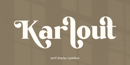 Karlout - elegant retro serif display with an artistic touch. Specially designed for vintage, retro, elegant projects, perfectly suitable for creating simple, lifestyle designs such as logos, title, packaging, and more. It is ideal for high impact headlines. The available style alternatives offer a number of different characters that give your logo or business card a unique look.
 - Blacker Strokes by Letterara,
$19.00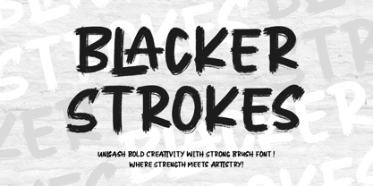 Dive into creativity with Blacker Strokes, a font embodying the wild beauty of natural brush strokes. Elevate logos, branding, and more with its mesmerizing design. Versatile and impactful, it adds character to any project. With PUA code for easy access to captivating glyphs, Blacker Strokes is your artistic ally for limitless design possibilities and lasting impressions.
 - Qolling by Dora Typefoundry,
$17.00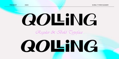 Introducing Qolling is a modern display font, designed for maximum visual and emotional impact. It has a classy and elegant look, Qolling gives your words a powerful sound and is fun to use in your graphic design and screen use projects such as branding, magazines, editorials. , wedding invitations, logo designs, posters, social media and more! Thank you
 - ASTRALYS by Cerri Antonio,
$37.00 Astralys is a linear decorative font, works very well as a type of identity logo, poster and 3d works. It continues the tradition of precedent Xova but with a hard linear impact. Its interesting to note that with it its possible to play with straight corners to create endless couplings geometric styles and beyond. Caps only fonts.
 - Lyps by hgo,
$15.00 Lyps is a contemporary headline family designed by Heiko Hoos. There are 4 font styles: Lyps Regular, Lyps Small, Lyps Extra Small and Lyps Wide. Each font file has OpenType features for ligatures, caps and some alternative Type variations. The Lyps family is suitable for high impact situations like posters, headlines, titles, magazines, packaging and many others.
 - Beaumont by Studio Buchanan,
$12.00 Beaumont is a modern take on classic 1920's type, playing with stroke contrast and art deco forms. The result is a 10 font family, providing options for setting readable body copy or high impact display headings. With full multilingual character support, stylistic alternates and a range of open type features, Beaumont is perfect for a variety of situations.
 - Procerus by Artegra,
$29.00 Procerus was designed to achieve maximum impact on a narrow ground with ultra compressed letterforms. The idea was to explore the beauty in perfectly integrated straight shapes to maximize the use of space while keeping the empty space to a minimum. The result was a stunning display family that makes the type interesting, engaging while still being readable.
 - Grim by Rekord,
$23.90 Grim is a display family with a lot of room for application, most obvious being the tightly fitted headlines with impact. It works especially well as a counterpart to a serious, refined serif font. Each family member comes with a set of useful pictograms: arrows, triangles, hands, smilies and a heart. Best suited for poster and editorial usage.
 - Cloudia by PHDesign,
$30.00 Cloudia is a versatile, modern font with an attention-grabbing angularity. It has a thoroughly mechanical, science fiction look; but with slightly unconventional vowel shapes to give it a dynamic edge. Its precisely cut letters need to be displayed as large as possible for maximum impact. Perfect for book titles, magazines, band logos, movie titles, stencils and video games.
 - Grim Stencil by Rekord,
$23.90 Grim is a display family with a lot of room for application, most obvious being the tightly fitted headlines with impact. It works especially well as a counterpart to a serious, refined serif font. Each family member comes with a set of useful pictograms: arrows, triangles, hands, smilies and a heart. Best suited for poster and editorial usage.
 - Pragnea by Hazztype,
$20.00 Introducing Pragnea, a modern sans serif font with a unique touch. It had many unique quirks such as its distinctive e, curved stroke on R, K, V, W, and many others. The type family consists of three weights plus matching italics. Packed with 300+ glyphs, it works well both for impactful headlines and for reading sizes.
 - Magnox Display by Eliezer Grawe,
$9.00 Magnox Display is a family of geometric and expanded display fonts. It brings impact and strength to titles and can be combined with many other sans serif types. It has smallcaps glyphs, alternates and rounded variation and their oblique versions. In 1.1 version you now have a variable version that has two axes: inclination and rounded edges.
 - Young Days by Olivetype,
$18.00 Young Days is a font for the confident. It's big and loud, suitable for when you're looking to create a statement. Whether you're creating a poster or packaging your product, this font can help you make an impact. Young Days font includes : Young Days OTF & TTF Standard Latin Uppercase and Lowercase Numbers, symbols, and punctuations Multilingual Support. Thank You.
 - Grim Counter by Rekord,
$23.90 Grim is a display family with a lot of room for application, most obvious being the tightly fitted headlines with impact. It works especially well as a counterpart to a serious, refined serif font. Each family member comes with a set of useful pictograms: arrows, triangles, hands, smilies and a heart. Best suited for poster and editorial usage.
 - Ondine by Linotype,
$29.99 Ondine is one of the early typefaces of Adrian Frutiger. It looks as though it were written with a broad tipped pen, however, Frutiger actually cut the forms out of a piece of paper with scissors. The forms of Ondine are reminiscent of the humanist period, the high point of the Italian Renaissance text typefaces of the 15th century. This movement was centered in Florence, the base of the Humanist movement overall, and the home of a famous type school of the time. The main goal of the educated writers was to faithfully recreate the writing of the admired literary works, whose aesthetic was as important as their content. Ondine displays a regular and open character. Texts set in this typeface give the impression of being hundreds of years old. Ondine should be used in point sizes of 12 and larger and is best for short texts and headlines.
 - RePublic by Suitcase Type Foundry,
$75.00In 1955 the Czech State Department of Culture, which was then in charge of all the publishing houses, organised a competition amongst printing houses and generally all book businesses for the design of a newspaper typeface. The motivation for this contest was obvious: the situation in the printing presses was appalling, with very little quality fonts existing and financial resources being too scarce to permit the purchase of type abroad. The conditions to be met by the typeface were strictly defined, and far more constrained than the ones applied to regular typefaces designed for books. A number of parameters needed to be considered, including the pressure of the printing presses and the quality of the thin newspaper ink that would have smothered any delicate strokes. Rough drafts of type designs for the competition were submitted by Vratislav Hejzl, Stanislav Marso, Frantisek Novak, Frantisek Panek, Jiri Petr, Jindrich Posekany, and the team of Stanislav Duda, Karel Misek and Josef Tyfa. The committee published its comments and corrections of the designs, and asked the designers to draw the final drafts. The winner was unambiguous — the members of the committee unanimously agreed to award Stanislav Marso’s design the first prize. His typeface was cast by Grafotechna (a state-owned enterprise) for setting with line-composing machines and also in larger sizes for hand-setting. Regular, bold, and bold condensed cuts were produced, and the face was named Public. In 2003 we decided to digitise the typeface. Drawings of the regular and italic cuts at the size of approximatively 3,5 cicero (43 pt) were used as templates for scanning. Those originals covered the complete set of caps except for the U, the lowercase, numerals, and sloped ampersand. The bold and condensed bold cuts were found in an original specimen book of the Rude Pravo newspaper printing press. These specimens included a dot, acute, colon, semicolon, hyphens, exclamation and question marks, asterisk, parentheses, square brackets, cross, section sign, and ampersand. After the regular cut was drafted, we began to modify it. All the uppercase letters were fine-tuned, the crossbar of the A was raised, E, F, and H were narrowed, L and R were significantly broadened, and the angle of the leg and arm of the K were adjusted. The vertex of the M now rests on the baseline, making the glyph broader. The apex of the N is narrower, resulting in a more regular glyph. The tail of Q was made more decorative; the uppercase S lost its implied serifs. The lowercase ascenders and descenders were slightly extended. Corrections on the lower case a were more significant, its waist being lowered in order to improve its colour and light. The top of the f was redrawn, the loop of lowercase g now has a squarer character. The diagonals of the lowercase k were harmonised with the uppercase K. The t has a more open and longer terminal, and the tail of the y matches its overall construction. Numerals are generally better proportioned. Italics have been thoroughly redrawn, and in general their slope is lessened by approximatively 2–3 degrees. The italic upper case is more consistent with the regular cut. Unlike the original, the tail of the K is not curved, and the Z is not calligraphic. The italic lower case is even further removed from the original. This concerns specifically the bottom finials of the c and e, the top of the f, the descender of the j, the serif of the k, a heavier ear on the r, a more open t, a broader v and w, a different x, and, again, a non-calligraphic z. Originally the bold cut conformed even more to the superellipse shape than the regular one, since all the glyphs had to be fitted to the same width. We have redrawn the bold cut to provide a better match with the regular. This means its shapes have become generally broader, also noticeably darker. Medium and Semibold weights were also interpolated, with a colour similar to the original bold cut. The condensed variants’ width is 85 percent of the original. The design of the Bold Condensed weights was optimised for the setting of headlines, while the lighter ones are suited for normal condensed settings. All the OpenType fonts include small caps, numerals, fractions, ligatures, and expert glyphs, conforming to the Suitcase Standard set. Over half a century of consistent quality ensures perfect legibility even in adverse printing conditions and on poor quality paper. RePublic is an exquisite newspaper and magazine type, which is equally well suited as a contemporary book face. - Drefar by Craft Supply Co,
$20.00 Introducing Drefar – Slab Serif Font The Masculine Casual Blend Drefar – Slab Serif Font is a striking fusion of masculinity and casualness, making it a perfect choice for displays. Bold and Rugged Drefar’s bold and rugged appearance conveys strength and resilience, making it ideal for projects that require a robust presence. Informal Versatility This font’s informal nature lends itself to versatile applications, from posters to headlines and more, without sacrificing its bold character. Confident Typography Drefar is a font that exudes confidence. Its slab serifs and well-defined lines provide a sense of clarity and determination. In Conclusion In summary, Drefar – Slab Serif Font is the font that marries masculine and casual elements, offering bold, confident typography for your display needs. Its versatile and rugged nature ensures that your content carries a commanding presence, engaging a wide range of readers and viewers. Whether it’s posters, headlines, or other design projects, Drefar ensures your message is delivered with strength and determination.
 - Concave Extended by Solotype,
$19.95Many foundries had versions of Concave ‹ wide, narrow, extra condensed, some with lowercase, some without. A good general utility style for Victorian typography.
