10,000 search results
(0.205 seconds)
- Sommerwerk Ink by Sommerwerk,
$29.00 This font is inspired by typography found on old German shop windows. It is a script font, but instead of imitating human handwriting and the gestures connected to it, the goal was to come up with a new writing flow and stroke order. As opposed to handwriting Latin script letters, which normally means drawing each character and then connecting it to the next one, the strokes of this font run across multiple glyphs. Intentionally, the design aims to achieve a flowing transition between each glyph without making use of contextual alternates, taking the limitations of classic machine lettering as a challenge.
 - Dot To Dot by A New Machine,
$9.00 This font is for parents and educators that want to easily be able to print out the alphabet in order to have their child or student then trace them. This eliminates the need for creating the dotted lines by hand and lets the user type out exactly what letters they need instead of relying on pre-made charts. The font is upper and lowercase letters and numbers only - no punctuation. Comes in Regular and Guides (get both for the same price as one) which draws guidelines with the letters. Best when used at a large point size.
 - Hustle Actlife by Letterena Studios,
$10.00 Hi, Everyone! If you’re looking for a cute but elegant font to captivate your audiences or customers then we’ve got the font for you! Introducing Hustle Actlife - A Serif Font This typeface with elegant style looks very interesting for loads of different projects and promotions. It is perfect to be used on your website, for your social media branding, Pinterest banners, printed products, and more! This font is inspired by the classy style of women who are very luxury so it is perfect for a high-class business. Includes: Hustle Actlife (OTF) Features: Ligatures Alternates Multilingual Support PUA Encoded Numerals and Punctuation
 - Mordis by HansCo,
$15.00 Mordis Font is a lettering retro vintage font. You will get alternate characters such as swash on some characters. Equipped with all complete characters ranging from uppercase letters, lowercase letters, numbers, punctuation marks and multi-lingual support, this font is ready to be used in any project. Very suitable for logotype, Stickers, Packaging design, Cricut Project, Headlines, Brand identity, T shirt or Apparel industry, Posters, Magazines, Books, YouTube, Instagram, Websites, Canva, Corjl or any of your creative design projects. Use this Mordis font to add that special modern retro touch to any design idea you can think of! Enjoy!
 - Hocklyn by HansCo,
$15.00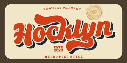 Hocklyn Font is a lettering retro vintage font. You will get alternate characters such as swash on some characters. Equipped with all complete characters ranging from uppercase letters, lowercase letters, numbers, punctuation marks and multi-lingual support, this font is ready to be used in any project. Very suitable for logotype, Stickers, Packaging design, Cricut Project, Headlines, Brand identity, T shirt or Apparel industry, Posters, Magazines, Books, YouTube, Instagram, Websites, Canva, Corjl or any of your creative design projects. Use this Hocklyn Font to add that special modern retro touch to any design idea you can think of! Enjoy!
 - Magnolia Rainflower by Mevstory Studio,
$30.00 Magnolia Rainflower Font This modern serif typeface features serif. The name of this font is taken from one type of tulip. Perfect for gorgeous logos & titles, Magnolia Rainflower will pair beautifully with many fonts and work well with whatever project you're working on. A full set of punctuation and numerals Some instructions consist of NOTE about using alternative style fonts and glyphs after you download it Include Alternate, Swash & stylistic set Typeface. That's it! If you have any questions at all, feel free to pop me a private message, I'm always more than happy to help you along :) Happy creating!
 - Skarpa by Aga Silva,
$23.99 This is long awaited thorough revision to Skarpa family. The revision has inculded both another look at letter shapes as well as kerning and metrics of the files. The shapes encapsulated in this font stem from old time architectural drawings hand executed at drawing board with tracing paper and rapidographs. Think of lettering stencils sliding across the tracing paper and craftily exectuted drawing descriptions. The font is based on geometric forms devoid of excessive flourishing. Would suit modern designs either in fashion, technology or laboratory setting. Would look good on door plaques in pharmacy or simple drawer plaques - especially Medium or Bold specimen.
 - LTC Jenson by Lanston Type Co.,
$24.95 Jenson Oldstyle was designed by J. W. Phinney of the Dickinson Type Foundry in 1893. Jenson is based on the 'Golden Type' designed by William Morris in 1890 for his private press editions under the imprint of the Kelmscott Press. The original digital Lanston version of this face included a companion Oblique. This remastered set instead features a true italic based on the 1893 ATF italic version as well as a newly digitized Jenson Heavyface based on Phinney's design of 1899. Jenson Italic Pro features alternate lowercase forms based on ATFs then contemporary Cushing Oldstyle Italic.
 - Glow Better by Ergibi Studio,
$22.00 Glow Better Modern Duo, these fonts are of two types serif and script. Display Serif inspired by famous logo, This typeface has been made carefully to make sure its premium quality and luxury feel. The ligatures on serif makes this typeface unique and stands out rather than the regular serif font, perfectly for headlines, wedding, social media, logos, posters, packaging, T-shirts, coffee shops, restaurants, magazine’s headers, signs or gift/post cards, cafe’s and weddings or any type of advertising purpose. What's Included : Standard glyphs Web Font Ligatures International Accent Works on PC & Mac Simple installations
 - Softie by Tail Spin Studio,
$20.00This typeface was designed to be used as the page heading font for MyFonts. Originally only the letters needed to make up the required phrases were drawn. Then amazingly enough, people started asking where they could get the font, so I decided to complete the character set, and named it Softie. This name was chosen because the round and rather bulbous shapes that make up the letters reminded me of marshmallows. Softie, almost good enough to eat. The Bold version, called Softie Bloated, was added in late 2003. Rumor has it that the name came to Steve after Thanksgiving dinner. - Rushton by HansCo,
$15.00 Rushton is a lettering retro vintage font. You will get alternate characters such as swash on some characters. Equipped with all complete characters ranging from uppercase letters, lowercase letters, numbers, punctuation marks and multi-lingual support, this font is ready to be used in any project. Very suitable for logotype, Stickers, Packaging design, Cricut Project, Headlines, Brand identity, T shirt or Apparel industry, Posters, Magazines, Books, YouTube, Instagram, Websites, Canva, Corjl or any of your creative design projects. Use this Rushton font to add that special modern retro touch to any design idea you can think of! Enjoy!
 - Line Art Eclectrice Aligned by DJ THINK,
$95.00 Thanks for checking out LineArt ECLECTRICE (pronounced EHCK-LEHCK-TREES) Light Aligned font by Rene Toussaint (otherwise known as DJ THINK) of LineArt Foundry and Brand. This font is designed in the vein of graffiti art with stylings of hip-hop and hieroglyphic appearance. Try it in a preview window and check out if it will meet your needs for something cool and hip for your next flyer design or other type of graphic art image. Keep in mind that this is a light design and may require extra thickening in your vector program of choice with outline thickness options.
 - High Table by SAMUEL DESIGN,
$39.00 The key words for this font are taste, elegance, storytelling, and a little bit of dynamism. HIGH TABLE family have exquisite details and great quality. We believe that only high quality and unique details can move people more than exaggerated shapes. Fonts are so powerful, they tell a moving story. The PACE typeface was chosen to tell a story quietly but with dynamism. Readers are delighted and relaxed when they see this font family, and colleagues read the story with respect. A brand needs a story, and a brand’s story needs the most appropriate font to carry it.
 - Diskanila by Ekahermawan,
$12.00 Diskanila is a romantic swirly script font. This beautiful script including with more than 300+ alternative characters (PUA Encoded) that gives you a wide variety of romantic typography design results. Diskanila comes with bold and light swirly alternatives to make your many different projects such as logo, feminine branding, poster, magazine, label, merchandise, presentation, advertising, and invitation card more beautiful ! FEATURES: OpenType support Playful to use (with ligatures options and alternatives options) Multilingual support PUA Encoded If you need support or more information about this item please kindly contact me : ekahermawanputu@gmail.com Thank you so much I really hope you enjoy using it!
 - Bomanda Signature by Febri Creative,
$12.00 Bomanda Signature is a handwritten signature font. This font has 2 stylistic forms, namely regular and italic. Also added is a bonus 1 font, a floral element font that can be used for: logos, writing ornaments, making frames, and much more. You can create the perfect signature or logo with this font. What's Included? - Bomanda Signature Regular OTF - Bomanda Signature Italic OTF - Bomanda Floral Elements OTF - More than 598 of glyphs - Works on PC & Mac Simple Installations Accessible in the Adobe Illustrator, Adobe Photoshop, Adobe InDesign, CorelDraw, even work on Microsoft Word. Multilingual Support Thanks and have a wonderful day.
 - Dear Penpal Script by Giaimefontz,
$6.00 This is a fully connected script font, not calligraphic, but entirely designed to follow handwritten cursive ligatures rules as teached in schools. In order to correctly visualize it, you have to enable OpenType features (Contextual Alternates, Discretionary Ligatures, Standard Ligatues and Kerning). Trying to write All Capitals will generate Block Letters writings, since cursive style doesn't allow more than the first uppercase per word, however this font is not meant to be a Block Letters font. Using specific type combinations will generate special glyphs. All of these features are intended to reproduce a classic schoolboy or schoolgirl notebook.
 - Bolster by Denis Masharov,
$25.00 The font extra bold slab serif with reverse contrast, he refers to the “Italian” or “wood types”. This decorative display font is designed for use in large sizes, suitable for the lettering, the major labels, headers, logotypes. Ideal for embedding images. It's an all-caps font, but there are biform variants of a, e, m, n and u, so you can mix things up to create more interesting headlines. This font contains the complete Latin language character set (Unicode 1252) plus support for Cyrillic (Unicode 1251), Central/Eastern Europe (Unicode 1250), Baltic (Unicode 1257) and Turkish (Unicode 1254) languages as well.
 - MY WAY by Posterizer KG,
$18.00 MY WAY belongs to a genre of fonts which contain the “aesthetic of ugly”. This is a font with a good balance of rhythm and contrast. Its aim is casual, wild and anarchic. Because of the spontaneity this font contains, there are plenty of Standard and Discretionary Ligatures to avoid frequent repetition of letters. If you find single repeating glyphs, you can change that by toggling between Stylistic Alternates. There are ligatures created for Cyrillic too. MY WAY is the perfect choice for all dirty, natural and wild, yet authentically beautiful things such as Blues, Jazz, Punk...
 - Hadenut by HansCo,
$15.00 Hadenut Font is a lettering retro vintage font. You will get alternate characters such as swash on some characters. Equipped with all complete characters ranging from uppercase letters, lowercase letters, numbers, punctuation marks and multi-lingual support, this font is ready to be used in any project. Very suitable for logotype, Stickers, Packaging design, Cricut Project, Headlines, Brand identity, T shirt or Apparel industry, Posters, Magazines, Books, YouTube, Instagram, Websites, Canva, Corjl or any of your creative design projects. Use this Hadenut font to add that special modern retro touch to any design idea you can think of! Enjoy!
 - Nacho Rough by RodrigoTypo,
$25.00 Nacho Rough! A dirty version accompanied by a Thin version, including a set of dingbats.
 - FG Caroline by YOFF,
$14.95FG Caroline is a thin handwriting font. It's charming and looks like real notebook scrawls. - Weg by Huerta Tipográfica,
$18.00 WEG* font is an experimental type system where legibility isn’t the focus. This project studies how glyphs are constructed and how their ductus can be modified. I explored how far I can move the limits if I don’t worry about the legibility. In Weg, letters are built by a single line that connects them, along with words and paragraphs. When weight decreases, the legibility of the signs increases. This is the first stage. It’s a project in expansion. The set contains uppercase, lining figures and basic punctuation in three weights: Regular, Light and Thin. The current supported languages are Spanish, Guaraní and English. If you need any other language, please let me know. I would like to expand the character set. Second stage project WEG is an experimental in-expansion font family. Here I present to you the second stage. I’m planning the first upgrade for middle 2021. I’m preparing a pattern set for July 2021. Here you can see the first four patterns. If you buy the font before July 2021, you’ll get this upgrade! • Second stage April - July 2021: pattern set (first four ready). • This upgrade will be available on August 2021.
 - Mir by Juliasys,
$22.00 Мир is Mir. The Russian word Мир (Mir) means both World and Peace. The rendezvous of the two terms seems quite unique and utopistic today, but it is comforting to see that it was natural at some time deep down in Russian history. Bits of both meanings were going through my mind while I was designing this typeface. Mir’s character set is multiscript – Latin, Cyrillic and Greek – and extends to many parts of the linguistic world. In fact it covers more than 100 languages. Stylistic consistency between the language systems make typographic border crossings painless even where national borders are still closely guarded. And in regions where mathematics, physics or chemistry are to be expressed, a rich set of OpenType features lets Mir master also these situations. Serious things are best be said in a relaxed, unpretentious way. So Mir doesn’t put on a show. Mir has authority without being authoritarian, it is serious but not stern. It can explain difficult things and stay calm and down to earth at the same time. Mir Medium has another useful feature: It can be freely downloaded and used by anybody anywhere. You can test the Mir Family with free Mir Medium and get more styles when you need them. @juliasys
 - Gorod.Volgograd by FontCity,
$15.00The general idea: Can You imagine to yourself, what the hydroelectric power station is? The building of this electricity production foundry is half hidden under the water, but the visible above-water part astonishes your sense. It is a construction almost 1,5 km length dammed out the powerful river stream. Besides thousand of electricity conduction lines supports it bears also the highway and the railroad. From a faraway distance the train seems like a caterpillar that has climbed up the stout tree. There are also the navigable sluices, the flood channels and other erections. The idea of this typeface outlines arrived to the authors exactly on the viewing platform, under the impression of the waterfalls, which are escaping from the dam womb, falling from almost 50 meters altitude and becoming white-haired during this flight. Release: in the form of "gorod.Volgograd" font with the one style. We work with other styles now and sometime we will be very glad to introduce the Bold and Italic styles to You. We should explain the font name meaning. "Gorod" is "city of" in Russian and Volgograd is the old, big and famous Russian city. The Volga hydroelectric power station of a name of XXII congress of the CPSU caused the Volgograd sea formation. It expands of 14 km width and more than 600 km along the Volga river-bed. But HEPS isn't the sole Volgograd sight. There are many interesting places here. The most known tourist sight, the visit card of Volgograd is the Mamaev Hill. Being here You can see almost all 100 kilometers of city length. Due to its geographical position, Mamaev Hill has got a great importance during the Great Patriotic War (1941-1945). It became and still is the Main Height of Russia. Soviet people have built the huge stately memorial ensemble here. There are many other witnesses of the heroic past of Volgograd: the Alley of Heroes, the Perished Fighters Square, the Soldiers Field and others. The line of tank turrets is stretched out along all town not far from Volga bank. It marks the line, where fascist troops was stopped in 1943. It is very amazingly when You dive under the ground on a usual tram. Volgograders have built a few underground station for the high-speed tramway. The river tram need a quarter of an hour to get an island in the Volga. And You need the same time to walk across the river station. The Volga-Don navigable channel starts from Volgograd. There are planetarium, circus, some theatres, many museums in Volgograd. One of football matches of Euro-2004 qualifying round took a place in the "Rotor" stadium in Volgograd. Volgograd holds the longest - above 50 km - park in the world. Its avenues, squares, embankments are beautiful, Volgograd central districts are built in unique architecture style called the Stalin Empire. You can enjoy fountains, parks, attractions, water-pools and other Volgograd sights. If You visit Volgograd once You'll never forget it. You can read about the ancient history of Volgograd city on the Tsaritsyn font page. Also we plan to create the Stalingrad font and give You a short story about another period in Tsaritsyn-Stalingrad-Volgograd history. - Griston by Rhd Studio,
$20.00 Introducing the newest product, Griston font, this font is perfect for creating signature logos and watermarks for photography studios or photography logos, best for initial logos or brand signatures. Made with elegant, professional and unique taste, You can try it first by typing what you want below made simple but has a very luxurious feel, this font has a lowercase alternative that is very similar to handwriting using a pen so it is suitable for signatures, logos, watermarks and more. again. can create custom personalized signatures, create custom logos, so this awesome signature is for all. maybe next time I will make an italic or slant version if this font is in great demand and can help with many things you want for signatures, logo branding, or watermarks. If you have any questions about the latest fonts, please send a short message thank you
 - 1462 Bamberg by GLC,
$38.00 Font designed from that used in Bamberg by Albrecht Pfister, in early years of printing, exactly for a book titled "Ackermann Von Böhmen" writen in old German by Johannes Von Tepl, and decorated by a lot of splendid colored carved woods. This font include "long s", naturelly, as typically medieval, but any abbreviated characters, and, curiously no german "ß", no more than "W". (The only one I did found where a hand drawn one.) In addition, the "k" have not a German gothic form. Added, the accented characters, no longer existing on this time, and capitals when was a lack. A render sheet, in the font file, makes all easy to identify on a keyboard. This font is used as variously as web-site titles, posters and fliers design, editing ancient texts... This font supports as easily enlargement as small size, remaining readable, original and beautiful, especially in capitals.
 - ITC Founder's Caslon by ITC,
$40.99The Englishman William Caslon punchcut many roman, italic, and non-Latin typefaces from 1720 until his death in 1766. At that time most types were being imported to England from Dutch sources, so Caslon was influenced by the characteristics of Dutch types. He did, however, achieve a level of craft that enabled his recognition as the first great English punchcutter. Caslon's roman became so popular that it was known as the script of kings, although on the other side of the political spectrum (and the ocean), the Americans used it for their Declaration of Independence in 1776. The original Caslon specimen sheets and punches have long provided a fertile source for the range of types bearing his name. Identifying characteristics of most Caslons include a cap A with a scooped-out apex; a cap C with two full serifs; and in the italic, a swashed lowercase v and w. Caslon's types have achieved legendary status among printers and typographers, and are considered safe, solid, and dependable. ITC Founder's Caslon® was created in 1998 by Justin Howes, an English designer who used the resources of the St. Bride Printing Library in London to thoroughly research William Caslon and his types. As was common in the eighteenth century, Caslon had punchcut several different sizes of his types, and each size had a slightly different design. Howes digitized every size of type that Caslon cast, keeping their peculiarities and irregularities and reproducing them as they appeared on the printed page. This family has the 12 point, 30 point, 42 point, and Poster styles, as well as a full set of bona fide ornaments. In keeping with the original Caslon types, none of the sizes have bold weights, the numerals are all old style figures, and a full set of ligatures (some with quaint forms) are included. ITC Founder's Caslon® is a remarkable revival in the true sense of the word, and works beautifully in graphic designs or texts that require an authentic English or historical flavor. - Computechnodigitronic by Typodermic,
$11.95 Attention all tech enthusiasts! Introducing Computechnodigitronic—the futuristic typeface you never knew you needed. This segmented LED/LCD display font is the epitome of 1980s sci-fi style, and it’s here to take your designs to the next level. With its sleek, modern design and perfectly spaced letters, Computechnodigitronic prioritizes legibility while still conveying the concept of a digital readout. And, for those of you who need to create vertical numeric columns, we’ve got you covered. Our monospaced numerals make it easy to create stunning displays that look straight out of a sci-fi movie. Imagine your designs, lit up like a spaceship dashboard, communicating important information to your audience with ease. Whether you’re working on a website, an app, or a print design, Computechnodigitronic will help you stand out from the crowd. So, what are you waiting for? Upgrade your designs today with Computechnodigitronic—the perfect blend of style and function. Most Latin-based European writing systems are supported, including the following languages. Afaan Oromo, Afar, Afrikaans, Albanian, Alsatian, Aromanian, Aymara, Bashkir (Latin), Basque, Belarusian (Latin), Bemba, Bikol, Bosnian, Breton, Cape Verdean, Creole, Catalan, Cebuano, Chamorro, Chavacano, Chichewa, Crimean Tatar (Latin), Croatian, Czech, Danish, Dawan, Dholuo, Dutch, English, Estonian, Faroese, Fijian, Filipino, Finnish, French, Frisian, Friulian, Gagauz (Latin), Galician, Ganda, Genoese, German, Greenlandic, Guadeloupean Creole, Haitian Creole, Hawaiian, Hiligaynon, Hungarian, Icelandic, Ilocano, Indonesian, Irish, Italian, Jamaican, Kaqchikel, Karakalpak (Latin), Kashubian, Kikongo, Kinyarwanda, Kirundi, Kurdish (Latin), Latvian, Lithuanian, Lombard, Low Saxon, Luxembourgish, Maasai, Makhuwa, Malay, Maltese, Māori, Moldovan, Montenegrin, Ndebele, Neapolitan, Norwegian, Novial, Occitan, Ossetian (Latin), Papiamento, Piedmontese, Polish, Portuguese, Quechua, Rarotongan, Romanian, Romansh, Sami, Sango, Saramaccan, Sardinian, Scottish Gaelic, Serbian (Latin), Shona, Sicilian, Silesian, Slovak, Slovenian, Somali, Sorbian, Sotho, Spanish, Swahili, Swazi, Swedish, Tagalog, Tahitian, Tetum, Tongan, Tshiluba, Tsonga, Tswana, Tumbuka, Turkish, Turkmen (Latin), Tuvaluan, Uzbek (Latin), Venetian, Vepsian, Võro, Walloon, Waray-Waray, Wayuu, Welsh, Wolof, Xhosa, Yapese, Zapotec Zulu and Zuni.
 - Garamond Premier by Adobe,
$35.00Claude Garamond (ca. 1480-1561) cut types for the Parisian scholar-printer Robert Estienne in the first part of the sixteenth century, basing his romans on the types cut by Francesco Griffo for Venetian printer Aldus Manutius in 1495. Garamond refined his romans in later versions, adding his own concepts as he developed his skills as a punchcutter. After his death in 1561, the Garamond punches made their way to the printing office of Christoph Plantin in Antwerp, where they were used by Plantin for many decades, and still exist in the Plantin-Moretus museum. Other Garamond punches went to the Frankfurt foundry of Egenolff-Berner, who issued a specimen in 1592 that became an important source of information about the Garamond types for later scholars and designers. In 1621, sixty years after Garamond's death, the French printer Jean Jannon (1580-1635) issued a specimen of typefaces that had some characteristics similar to the Garamond designs, though his letters were more asymmetrical and irregular in slope and axis. Jannon's types disappeared from use for about two hundred years, but were re-discovered in the French national printing office in 1825, when they were wrongly attributed to Claude Garamond. Their true origin was not to be revealed until the 1927 research of Beatrice Warde. In the early 1900s, Jannon's types were used to print a history of printing in France, which brought new attention to French typography and the Garamond" types. This sparked the beginning of modern revivals; some based on the mistaken model from Jannon's types, and others on the original Garamond types. Italics for Garamond fonts have sometimes been based on those cut by Robert Granjon (1513-1589), who worked for Plantin and whose types are also on the Egenolff-Berner specimen. Linotype has several versions of the Garamond typefaces. Though they vary in design and model of origin, they are all considered to be distinctive representations of French Renaissance style; easily recognizable by their elegance and readability. Garamond Pemiere Pro was designed by Robert Slimbach, and released in 2005." - Novera by René Bieder,
$29.00 The Novera family is a sharp geometric sans in ten weights plus matching italics, available in two versions – Modern and Classic. It has a contemporary, approachable and multifunctional yet characteristic design, that comes with an extensive glyphs set of 1000+ glyphs per font, meeting all typographic demands. The Design Vertical terminals, circular shapes and angular apexes – Novera truely breathes geometry! But the concept goes beyond the application of rational geometry. The intension was to create a highly legible family suitable for every day usage inspired by the work of Paul Renner, Eric Gill or Jakob Erbar, combining the geometric with the human and the functional with the unconventional. Although Novera is inspired by the past, its appearance is unmistakingly modern. Modern vs Classic Novera is available in two versions - Modern and Classic - born from the same source file but with different characters set as default. This creates subtle but effective distinctions such as the double-storey a (Novera Modern) which is optimized for legibility in longer text paragraphs, as opposed to the single-storey a (Novera Classic) which allows a purely geometric appearance. Another distinguishing feature are the ascenders on Novera Mondern, which extend above the cap height for an elegant presence, compared to the ascenders on Novera Classic, ending at the cap height, for a compact and helvetica-flavored look. Novera Modern was intended for usage in body copy, whereas Novera Classic was planned for headlines, short paragraphs or logos, but both versions can be used vice versa too, of course. Alternate Characters To maintain neutrality and a modern appearance, the standard character set largely dispenses with idiosyncratic forms. This is in contrast to the alternative forms with the gill-like lowercase letters g and t as well as a traditional shape of S and the German ligature t/z, which traces back to old German spellings. Also inspired by German poster designs from the early 20th century are the elongated i-dots and dieresis-dots that can create eye-catchers in headlines or logos. By the way, both versions, Novera Modern and Classic, can be created via stylistic set 1, 17 and 18. Opentype Features and Symbols The family comes with many opentype features to support modern typesetting. This includes ligatures, different number sets or alternative shapes for texts set in all caps. If you like arrows and other shapes, you will love Novera! The family has a built-in extensive symbols-set including 48 different arrows and various geometric shapes or icons. Weights With its 40 styles and 1000+ glyphs per font, the Novera family covers all thinkable design scenarios from branding to web, app or editorial usage. It blends in perfectly in text heavy paragraphs with its mid-weights like Light, Regular, Medium or Bold or stands out like a monument in headlines and posters with its extreme weights like Thin, ExtraLight, Black or Ultra. Testfonts If you like to test the fonts before buying the full version, please follow the link below. Please note, all test fonts are available for evaluation purposes only and contain a limited character set! A commercial license for the full version must be purchased separately. Please send a mail to contact@renebieder.com for more information. Download the test fonts here: https://www.renebieder.com/test-fonts
 - Grenale Slab by insigne,
$- Grenale Slab adds to the new standard of elegance within the Grenale family. Not your typical slab, Grenale has some unique forms that give it a look all its own. This glamourous slab still draws much inspiration from Grenale’s Didone sans and its haute couture influence. Independently attractive, it’s balanced and poised, with well formed strokes. Grenale Slab’s thin weights are simple but vibrant--elegant forms that naturally lend themselves to designer journals and high-end branding along with upscale applications. With added energy and power, the thicker weights give your work a firmer, statlier look. Grenale Slab’s upright versions are also matched by optically adjusted italics. The fashionable typeface includes a multitude of alternates that may be accessed in any OpenType-enabled application. The stylish features include a large group of alternates, swashes, and meticulously refined details with ball terminals and alternate titling caps to accessorize the font. Also included are capital swash alternates, old style figures, and small caps. Peruse the PDF brochure to see these features in action. OpenType enabled applications such as the Adobe suite or Quark can take full advantage of the automatic replacing ligatures and alternates. This family also offers the glyphs to support a wide range of languages. Any of Slab’s weights also provide a well-matched companion to its original counterparts, Grenale #2 and the original Grenale. It’s time to think high-class. Graceful and assured, the carefully crafted forms of Grenale Slab step pleasantly onto each page with elegant charm. Include its range of alternate glyphs, and this chic font is a superb choice for bringing a far more refined look to your copy.
 - Grenale #2 by insigne,
$24.00 Grenale #2 shapes the new standard of elegance within the Grenale family. Not your typical sans, this pure, geometric structure with its glamorous sensitivity draws much inspiration still from Grenale's didone sans and the haute couture influence. Independently attractive, though, the form abandons the original's high contrast for its own minimal stroke variation, achieving proper balance through its graceful strokes. Grenale's thin weights are simple but vibrant--elegant forms that naturally lend themselves to designer journals and high-end branding along with upscale applications. With added energy and power, the thicker weights give your work a firmer, statlier look. Grenale #2's upright versions are also matched by optically adjusted italics. While unique in appearance, any of #2's weight also provide a well-matched companion to its original counterpart. The fashionable typeface includes a multitude of alternates that may be accessed in any OpenType-enabled application. The stylish features include a large group of alternates, swashes, and meticulously refined details with ball terminals and alternate titling caps to accessorize the font. Also included are capital swash alternates, old style figures, and small caps. Peruse the PDF brochure to see these features in action. OpenType enabled applications such as the Adobe suite or Quark can take full advantage of the automatic replacing ligatures and alternates. This family also offers the glyphs to support a wide range of languages. It's time to think high-class. Graceful and assured, the carefully crafted forms of Grenale #2 step pleasantly onto each page with elegant charm. Include its range of alternate glyphs, and this chic font is a superb choice for bringing a far more refined look to your projects.
 - Belle Epoque Stencil JNL by Jeff Levine,
$29.00 An old ad for Cointreau Triple Sec Liquor featured a bolder variant of the lettering style found in a set of vintage tin stencils that were the model for French Stencil JNL. This is now available as Belle Epoque Stencil JNL, in both regular and oblique versions. “Belle Epoque” means “beautiful era” in French.
 - JENKINE by Gatype,
$14.00 Jenkine casual and natural written handwritten brush strokes. Letters are made with brush on paper then scanned carefully drawn into vector format. This typeface is ideal for use in any professional project, such as blog titles, posters, wedding elements, t-shirts, clothing, book covers, business cards, greeting cards, branding, merchandise etc. Enjoy Jenkine fonts with passion and love for your awesome projects to make your projects quality!
 - Tobi Greek Cyrillic by RodrigoTypo,
$40.00 Tobi Greek Cyrillic is a typography based on Tobi (2015), now much improved with alternative ligatures and better than containing the Greek in capital letters and also in Cyrillic. Tobi Greek Cyrillic is a very cheerful typography, especially fun for children’s titles, juvenile children’s clothing comics, this typography was designed with a lot of love. Authors: Rodrigo Araya https://www.behance.net/Rodrigotypo and Andrey Kudryavtsev.
 - Bring Me The Horizon by Struggle Studio,
$20.00 BringMeTheHorizon is a modern handwritten display font. With Brush strokes, scribbled characters. To give you extra creative work. BringMeTheHorizon font supports multilingualism of more than 100+ languages. This font is great for logo designs, social media, Movie Titles, Book Titles, short text even long text letters and great for your secondary text font in sans or serif. Create stunning works with the BringMeTheHorizon font.
 - Byra by Mariana Sousa,
$28.31 Meet Byra! A new approach to a decorative typeface. This typeface has asymmetrical terminals (round), which means than has serifs, but not in every side of the letterforms. The mix between both classic and modern elements, as terminals and the inverted contrast, gives the typeface a strong personality. Byra contains two weights, regular and bold, it’s a display typeface and great for headlines, branding and editorial proposes
 - Suncos by HansCo,
$15.00 Suncos is a retro funk fonts that feels casual and clean an incredible modern retro aesthetic. Use this display font to add that special retro funk vintage touch to any design idea you can think of! Very suitable for Logotype, Stickers, Packaging design, Cricut Project, Headlines, Brand identity, T Shirt or Apparel industry, Posters, Magazines, Books, YouTube, Instagram, Websites, or any of your creative design projects. Enjoy!
 - Micro Manager NF by Nick's Fonts,
$10.00This font features a complete uppercase alphabet, including accented characters, as well as numbers and standard punctation. Lowercase characters are an assortment of useful dings and things. To create very low-load GIFs, compose your type in Photoshop (or equivalent) at 8 point (or multiples thereof), with anti-aliasing turned off. Both versions of the font include 1252 Latin, 1250 CE (with localization for Romanian and Moldovan). - Angry&Hungry by Haksen,
$12.00 Hello Everybody, I just want to introduce my new twin cute fonts in one. These are "Angry & Hungry". As the preview images, This font comes with funny, cute taste. These fonts can be used in everything your requirement. What's include : - Angry & Hungry otf - Angry &Hungry Shadow otf - Angry & Hungry Script otf - Angry & Hungry Script Shadow otf If any question, please contact me. Happy Designs, Haksen