10,000 search results
(0.042 seconds)
- LAS VALLES by Kaligra.co,
$29.00 Introducing Las Valles a tall Ultra condensed sans serif font coming in 4 styles. If you are looking for Strong letters with a ton of unique Ligatures and style to choose, Las Valles is the perfect fit. This fonts is perfect for headlines, quotes, Logo, Web, magazine covers, editorial design, print posters, signage, window shop design, and much more. HOW TO ACCESS ALTERNATE CHARACTERS & LIGATURES Open glyphs panel: In Adobe Photoshop go to Window - glyphs In Adobe Illustrator go to Type - glyphs
 - Vin Slab Pro by Mint Type,
$35.00 Vin (translated from Ukrainian as “he”) is a superfamily consisting of three robust typefaces with pronounced vertical stems and rounded corners. All three typefaces feature very large x-height for even more expression and assertiveness. Vin Slab Pro is a condensed rigid slab-serif with extra-large x-height and rounded corners. It is designed specifically for short texts to add significance and emphasis. Be sure to check other two typefaces of Vin superfamily: Vin Sans Pro and Vin Mono Pro .
 - Plasto by Eko Bimantara,
$19.00 Plasto is a complete grotesk sans serif family. The quirky letterforms and its slight width variation characterized the typeface as fun and playful as "plastic" in a graphic layout, fit for various design spaces, fit for both informal or functional purposes, fit for large display and also small text. Plasto complete family contains 54 styles with two axes; Weight and Width. The weight consists of 18 styles from Thin to Black, and the width consists of 3 styles, condensed, normal and expanded.
 - Haymer by Greater Albion Typefounders,
$9.50 Haymer stands at the apogee of legibility and clarity. Its design embodies symmetry, even stroke widths and a subtle rounded quality to give an instinctive appeal to the reader and to the designer. Haymer is modern yet characterful and is ideal for use as a text family, online and wherever instant easy readability is required. An extensive family is offered, in four weights, regular and condensed widths, lower case and capital (small and petite) forms as well as display inline faces.
 - Bluenote Demi by Wiescher Design,
$39.50 Bluenote is a font based on Franklin Gothic condensed. In the 60s and 70s the record label Blue Note published all those classic jazz records of my youth. Someone at their arts department cut letters to ribbons and designed wonderful record covers with those fragmented glyphs. I recently had a look at my music collection and rediscovered these letters. Being a hard-working type designer I couldn't resist the challenge, here is the result from your dilligent designer Gert Wiescher
 - Poster Sans by K-Type,
$20.00 The Poster Sans display fonts have the enduring functionality of vintage condensed grotesques. They are loosely based on Ludlow 6-EC, and perfect for signs and posters. The Basic Package includes the Regular and Bold weights, and also a useful Outline version. Poster Sans Extreme may hold the record for the slimmest usable font available. The latest versions of the Regular, Bold and Extreme weights offer improved outlines and now include a full compliment of Latin Extended-A European accented characters.
 - Dress Rehearsal JNL by Jeff Levine,
$29.00 In a career spanning the early 1900s through 1940, George M. Cohan wrote and produced over 50 plays, 300 songs and was also an actor, singer and dancer. Many of his works honored his Irish roots, and the cover of one piece of sheet music called “The Irish American” (1905) had its title hand lettered in a condensed Art Nouveau type design with tiny spurred serifs. This is now available digitally as Dress Rehearsal JNL, in both regular and oblique versions.
 - Corsham by Greater Albion Typefounders,
$14.00 Corsham was inspired by traditional stonemason's engraved lettering designs. Designed to be used alone, or in combination with our Corton family, it has wonderfully lively air, with distinctive lively serifs and beautifully swashed downstrokes. Four faces are offered-regular bold and black weights as well as a condensed form. All faces include a range of Opentype features, including ligatures and old-style numerals. The Corsham faces merge 'olde-worlde' charm with fun character, yet remaining clear and legible for text use.
 - Flowy by Typesketchbook,
$49.00 Flowy is a romantic and delicate type, made up of four sub-families. Brush, Script, and Condensed imitate freehand writing using different tools. In these families, you can choose the original version which embodies freehand styles, the Clean option which offers a clean-cut edge and is more suitable for corporate assignments, or Rust which changes the texture. Meanwhile, two options, Clean and Ink, come with the Sans type. The complete family has 29 individual typefaces that serve your projects every purpose.
 - Farloxy by Maulana Creative,
$14.00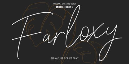 Farloxy is a Casual Signature script font. With light mono-line stroke, slant, Condensed and fun character with a bit of ligatures and lowercase alternate. To give you an extra creative work. Farloxy font support multilingual more than 100+ language. This font is good for logo design, Social media, Movie Titles, Books Titles, a short text even a long text letter and good for your secondary text font with sans or serif. Make a stunning work with Farloxy font. Cheers, MaulanaCreative
 - Matricule 59 by designdefontes,
$24.00 Matricule 59 is a typeface whose design is inspired by license plates and by the deformations due to the stamping in the metal plates. These deformations give a very specific style, especially concerning the hairlines. It is the Ultra Condensed version of Matricule, a Typeface designed by Loïc Choquet. It consists of 4 fonts : Light, regular, bold and black. For Mac or PC. Well-suited for edition, logotypes, posters, etc. Each font contains 359 glyphs and supports up to 89 different languages.
 - Mangan Nova by Hoftype,
$49.00 Mangan Nova is the semi-condensed version of Mangan. Designed for strong headlines but with slender and economical proportions, it fosters space saving text applications while permitting very pleasant reading. Mangan Nova, as does also Mangan, comprises 14 styles and is well suited for ambitious typography. It comes in OpenType format with extended language support. All weights contain small caps, ordinals, ligatures, proportional lining figures, tabular lining figures, proportional old style figures, lining old style figures, matching currency symbols, fraction- and scientific numerals.
 - Quenta by Zetafonts,
$39.00 Canovaro was inspired by the hand-lettered masthead of Queenslander, a weekly magazine published during the first half of XIX century. The condensed serif letterforms of the magazine title, with the warm, human touch gave the shapes of Quenta a lively personality and a literary charme. To let you experiment with his vintage decorative layers, it comes in 4 styles including discretionary ligatures to allow you to use script elements to enrich its expressive range for editorial and logo design.
 - Promethium by Mysterylab,
$17.00 Promethium is an elegant vintage-style condensed font with lots of ornate detailing. Ideal for western, cowboy and rodeo graphics, as well as circus & carnival themes. Additionally, Promethium can trace some of its design roots to the well established Argentine graphic style known as Fileteado, as well as to Victorian poster and book arts. The stacking & layering of the 4 different versions of the font can yield a great range of eye-catching diverse looks and color schemes that can fit many purposes.
 - Hillstown by Letterhend,
$13.00 Hillstown Font Family is a font collection that contains three different styles that will perfectly complement each other. You will get script, sans, and condensed sans in a clean and aged version for each style. The classic feel is really perfect when you need a typeface for a logotype, apparel, invitation, branding, packaging, advertising, and more. Hillstown comes in uppercase, lowercase, with punctuations, symbols and numerals, 09 stylistic set alternate, ligatures. There is multi-lingual support and Hillstown is already PUA encoded.
 - Matricule 57 by designdefontes,
$24.00 Matricule 57 is a typeface whose design is inspired by license plates and by the deformations due to the stamping in the metal plates. These deformations give a very specific style, especially concerning the hairlines. It is the Condensed version of Matricule, a Typeface designed by Loïc Choquet. It consists of 4 fonts : Light, regular, bold and black. For Mac or PC. Well-suited for edition, logotypes, posters, etc. Each font contains 359 glyphs and supports up to 89 different languages.
 - Beauty Snowy by Maulana Creative,
$14.00 Beauty Snowy is an expressive super slanted signature script font. With high contrast contrast stroke, condensed and fun character with a bit of ligatures. To give you an extra creative work. Beauty Snowy font support multilingual more than 100+ language. This font is good for logo design, Social media, Movie Titles, Books Titles, a short text even a long text letter and good for your secondary text font with sans or serif. Make a stunning work with Beauty Snowy font. Cheers, MaulanaCreative
 - ITC Stepp by ITC,
$29.99When Hal Taylor saw the 1930 logo for the Stetson Shoe Company of Weymouth, Massachusetts, he didn't run out and buy a pair of loafers. Instead, he seized on this striking example of an Art Deco logotype as the basis for a new typeface design. “I was impressed with the delicate and sophisticated letter forms,” Taylor recalls, “particularly the enlarged cap S -- in any other case it would have seemed unbalanced, but in the context of this logo, it worked perfectly.” All the letters in the original all-caps Stetson Shoe logo were rendered with condensed proportions except the O, which was a perfect circle. While the prominent O added visual interest to the logo, Taylor knew that such a character would limit his typeface to display applications. For versatility's sake, he drew his O for ITC Stepp with the same proportions as the rest of the alphabet. Taylor also gave the logotype's inverted S a more traditional design, but kept the original as an alternate character in the OpenType font. Taylor's toughest challenge during the design process was creating a lowercase. “A good type design tells you what it wants to be,” he says, “and after a little while the Stepp caps began to tell me what the lowercase should look like.” Taylor's lowercase is slightly more conventional than the caps. The jaunty g" and almost upside-down "s" add subtle charm, while the capital letters provide the broader gestures of Stepp's personality. Together, they create a versatile and distinctive typeface design. One of Hal Taylor's first jobs was as a photo-lettering typographer in Philadelphia, setting headlines and creating custom lettering. This was followed by a stint doing finished lettering for John Langdon, whose ambigrams appear in Dan Brown's best-selling novel, Angels & Demons. Today, Taylor works as a graphic designer in the publishing industry, but he still finds time to create an occasional hand-lettered book jacket, and draw handsome typeface designs. ITC Stepp is available in four weights, ranging from Light to Ultra Bold. All four weights have companion italics, and the lightest three weights also offer a suite of small caps." - Times Eighteen by Linotype,
$29.00In 1931, The Times of London commissioned a new text type design from Stanley Morison and the Monotype Corporation, after Morison had written an article criticizing The Times for being badly printed and typographically behind the times. The new design was supervised by Stanley Morison and drawn by Victor Lardent, an artist from the advertising department of The Times. Morison used an older typeface, Plantin, as the basis for his design, but made revisions for legibility and economy of space (always important concerns for newspapers). As the old type used by the newspaper had been called Times Old Roman," Morison's revision became "Times New Roman." The Times of London debuted the new typeface in October 1932, and after one year the design was released for commercial sale. The Linotype version, called simply "Times," was optimized for line-casting technology, though the differences in the basic design are subtle. The typeface was very successful for the Times of London, which used a higher grade of newsprint than most newspapers. The better, whiter paper enhanced the new typeface's high degree of contrast and sharp serifs, and created a sparkling, modern look. In 1972, Walter Tracy designed Times Europa for The Times of London. This was a sturdier version, and it was needed to hold up to the newest demands of newspaper printing: faster presses and cheaper paper. In the United States, the Times font family has enjoyed popularity as a magazine and book type since the 1940s. Times continues to be very popular around the world because of its versatility and readability. And because it is a standard font on most computers and digital printers, it has become universally familiar as the office workhorse. Times™, Times™ Europa, and Times New Roman™ are sure bets for proposals, annual reports, office correspondence, magazines, and newspapers. Linotype offers many versions of this font: Times™ is the universal version of Times, used formerly as the matrices for the Linotype hot metal line-casting machines. The basic four weights of roman, italic, bold and bold italic are standard fonts on most printers. There are also small caps, Old style Figures, phonetic characters, and Central European characters. Times™ Ten is the version specially designed for smaller text (12 point and below); its characters are wider and the hairlines are a little stronger. Times Ten has many weights for Latin typography, as well as several weights for Central European, Cyrillic, and Greek typesetting. Times™ Eighteen is the headline version, ideal for point sizes of 18 and larger. The characters are subtly condensed and the hairlines are finer. Times™ Europa is the Walter Tracy re-design of 1972, its sturdier characters and open counterspaces maintain readability in rougher printing conditions. Times New Roman™ is the historic font version first drawn by Victor Lardent and Stanley Morison for the Monotype hot metal caster." - Times Europa LT by Linotype,
$29.99In 1931, The Times of London commissioned a new text type design from Stanley Morison and the Monotype Corporation, after Morison had written an article criticizing The Times for being badly printed and typographically behind the times. The new design was supervised by Stanley Morison and drawn by Victor Lardent, an artist from the advertising department of The Times. Morison used an older typeface, Plantin, as the basis for his design, but made revisions for legibility and economy of space (always important concerns for newspapers). As the old type used by the newspaper had been called Times Old Roman," Morison's revision became "Times New Roman." The Times of London debuted the new typeface in October 1932, and after one year the design was released for commercial sale. The Linotype version, called simply "Times," was optimized for line-casting technology, though the differences in the basic design are subtle. The typeface was very successful for the Times of London, which used a higher grade of newsprint than most newspapers. The better, whiter paper enhanced the new typeface's high degree of contrast and sharp serifs, and created a sparkling, modern look. In 1972, Walter Tracy designed Times Europa for The Times of London. This was a sturdier version, and it was needed to hold up to the newest demands of newspaper printing: faster presses and cheaper paper. In the United States, the Times font family has enjoyed popularity as a magazine and book type since the 1940s. Times continues to be very popular around the world because of its versatility and readability. And because it is a standard font on most computers and digital printers, it has become universally familiar as the office workhorse. Times™, Times™ Europa, and Times New Roman™ are sure bets for proposals, annual reports, office correspondence, magazines, and newspapers. Linotype offers many versions of this font: Times™ is the universal version of Times, used formerly as the matrices for the Linotype hot metal line-casting machines. The basic four weights of roman, italic, bold and bold italic are standard fonts on most printers. There are also small caps, Old style Figures, phonetic characters, and Central European characters. Times™ Ten is the version specially designed for smaller text (12 point and below); its characters are wider and the hairlines are a little stronger. Times Ten has many weights for Latin typography, as well as several weights for Central European, Cyrillic, and Greek typesetting. Times™ Eighteen is the headline version, ideal for point sizes of 18 and larger. The characters are subtly condensed and the hairlines are finer. Times™ Europa is the Walter Tracy re-design of 1972, its sturdier characters and open counterspaces maintain readability in rougher printing conditions. Times New Roman™ is the historic font version first drawn by Victor Lardent and Stanley Morison for the Monotype hot metal caster." - Times Ten by Linotype,
$40.99In 1931, The Times of London commissioned a new text type design from Stanley Morison and the Monotype Corporation, after Morison had written an article criticizing The Times for being badly printed and typographically behind the times. The new design was supervised by Stanley Morison and drawn by Victor Lardent, an artist from the advertising department of The Times. Morison used an older typeface, Plantin, as the basis for his design, but made revisions for legibility and economy of space (always important concerns for newspapers). As the old type used by the newspaper had been called Times Old Roman," Morison's revision became "Times New Roman." The Times of London debuted the new typeface in October 1932, and after one year the design was released for commercial sale. The Linotype version, called simply "Times," was optimized for line-casting technology, though the differences in the basic design are subtle. The typeface was very successful for the Times of London, which used a higher grade of newsprint than most newspapers. The better, whiter paper enhanced the new typeface's high degree of contrast and sharp serifs, and created a sparkling, modern look. In 1972, Walter Tracy designed Times Europa for The Times of London. This was a sturdier version, and it was needed to hold up to the newest demands of newspaper printing: faster presses and cheaper paper. In the United States, the Times font family has enjoyed popularity as a magazine and book type since the 1940s. Times continues to be very popular around the world because of its versatility and readability. And because it is a standard font on most computers and digital printers, it has become universally familiar as the office workhorse. Times™, Times™ Europa, and Times New Roman™ are sure bets for proposals, annual reports, office correspondence, magazines, and newspapers. Linotype offers many versions of this font: Times™ is the universal version of Times, used formerly as the matrices for the Linotype hot metal line-casting machines. The basic four weights of roman, italic, bold and bold italic are standard fonts on most printers. There are also small caps, Old style Figures, phonetic characters, and Central European characters. Times™ Ten is the version specially designed for smaller text (12 point and below); its characters are wider and the hairlines are a little stronger. Times Ten has many weights for Latin typography, as well as several weights for Central European, Cyrillic, and Greek typesetting. Times™ Eighteen is the headline version, ideal for point sizes of 18 and larger. The characters are subtly condensed and the hairlines are finer. Times™ Europa is the Walter Tracy re-design of 1972, its sturdier characters and open counterspaces maintain readability in rougher printing conditions. Times New Roman™ is the historic font version first drawn by Victor Lardent and Stanley Morison for the Monotype hot metal caster." - Times Ten Paneuropean by Linotype,
$92.99In 1931, The Times of London commissioned a new text type design from Stanley Morison and the Monotype Corporation, after Morison had written an article criticizing The Times for being badly printed and typographically behind the times. The new design was supervised by Stanley Morison and drawn by Victor Lardent, an artist from the advertising department of The Times. Morison used an older typeface, Plantin, as the basis for his design, but made revisions for legibility and economy of space (always important concerns for newspapers). As the old type used by the newspaper had been called Times Old Roman," Morison's revision became "Times New Roman." The Times of London debuted the new typeface in October 1932, and after one year the design was released for commercial sale. The Linotype version, called simply "Times," was optimized for line-casting technology, though the differences in the basic design are subtle. The typeface was very successful for the Times of London, which used a higher grade of newsprint than most newspapers. The better, whiter paper enhanced the new typeface's high degree of contrast and sharp serifs, and created a sparkling, modern look. In 1972, Walter Tracy designed Times Europa for The Times of London. This was a sturdier version, and it was needed to hold up to the newest demands of newspaper printing: faster presses and cheaper paper. In the United States, the Times font family has enjoyed popularity as a magazine and book type since the 1940s. Times continues to be very popular around the world because of its versatility and readability. And because it is a standard font on most computers and digital printers, it has become universally familiar as the office workhorse. Times™, Times™ Europa, and Times New Roman™ are sure bets for proposals, annual reports, office correspondence, magazines, and newspapers. Linotype offers many versions of this font: Times™ is the universal version of Times, used formerly as the matrices for the Linotype hot metal line-casting machines. The basic four weights of roman, italic, bold and bold italic are standard fonts on most printers. There are also small caps, Old style Figures, phonetic characters, and Central European characters. Times™ Ten is the version specially designed for smaller text (12 point and below); its characters are wider and the hairlines are a little stronger. Times Ten has many weights for Latin typography, as well as several weights for Central European, Cyrillic, and Greek typesetting. Times™ Eighteen is the headline version, ideal for point sizes of 18 and larger. The characters are subtly condensed and the hairlines are finer. Times™ Europa is the Walter Tracy re-design of 1972, its sturdier characters and open counterspaces maintain readability in rougher printing conditions. Times New Roman™ is the historic font version first drawn by Victor Lardent and Stanley Morison for the Monotype hot metal caster." - Times by Linotype,
$40.99In 1931, The Times of London commissioned a new text type design from Stanley Morison and the Monotype Corporation, after Morison had written an article criticizing The Times for being badly printed and typographically behind the times. The new design was supervised by Stanley Morison and drawn by Victor Lardent, an artist from the advertising department of The Times. Morison used an older typeface, Plantin, as the basis for his design, but made revisions for legibility and economy of space (always important concerns for newspapers). As the old type used by the newspaper had been called Times Old Roman," Morison's revision became "Times New Roman." The Times of London debuted the new typeface in October 1932, and after one year the design was released for commercial sale. The Linotype version, called simply "Times," was optimized for line-casting technology, though the differences in the basic design are subtle. The typeface was very successful for the Times of London, which used a higher grade of newsprint than most newspapers. The better, whiter paper enhanced the new typeface's high degree of contrast and sharp serifs, and created a sparkling, modern look. In 1972, Walter Tracy designed Times Europa for The Times of London. This was a sturdier version, and it was needed to hold up to the newest demands of newspaper printing: faster presses and cheaper paper. In the United States, the Times font family has enjoyed popularity as a magazine and book type since the 1940s. Times continues to be very popular around the world because of its versatility and readability. And because it is a standard font on most computers and digital printers, it has become universally familiar as the office workhorse. Times™, Times™ Europa, and Times New Roman™ are sure bets for proposals, annual reports, office correspondence, magazines, and newspapers. Linotype offers many versions of this font: Times™ is the universal version of Times, used formerly as the matrices for the Linotype hot metal line-casting machines. The basic four weights of roman, italic, bold and bold italic are standard fonts on most printers. There are also small caps, Old style Figures, phonetic characters, and Central European characters. Times™ Ten is the version specially designed for smaller text (12 point and below); its characters are wider and the hairlines are a little stronger. Times Ten has many weights for Latin typography, as well as several weights for Central European, Cyrillic, and Greek typesetting. Times™ Eighteen is the headline version, ideal for point sizes of 18 and larger. The characters are subtly condensed and the hairlines are finer. Times™ Europa is the Walter Tracy re-design of 1972, its sturdier characters and open counterspaces maintain readability in rougher printing conditions. Times New Roman™ is the historic font version first drawn by Victor Lardent and Stanley Morison for the Monotype hot metal caster." - Address Sans Pro by Sudtipos,
$39.00 History is always in sight; it is constantly being reconsidered and reformulated in the context of now. We see approaches to art, fashion, textiles, homewares, furnishings … not to mention music, graphics and everything else that culturally enriches our daily lives, revisited and made anew for today. Address Sans indulges in the spirit and aesthetics of mid-century Modern – Italian industrial design, sleek coffee makers, stylish cars, seductive jazz pressed on vinyl – with a charm and charisma that defies time. It evokes history but is decisively created for today. Its design, in reality, is rooted in the condensed structure and block modulation of early 1950s German lettering intended for use in street signage, but when we started to work on the various weights and widths, the result was a set of fonts in a style similar to the typographic work developed by Butti and Novarese in the 60s. The multitude of potential applications for Address Sans then became clear. In a range of 3 widths and 8 weights each, Address Sans includes little verses, true italics, small caps and numerous alternative signs for a total of 48 fonts. The result is a functional typeface that is effortlessly seductive, with geometric features and design details that ooze cool, and take it away from mere reinterpretation towards typographic forms that adapt perfectly for contemporary use.
 - Fnord by Monotype,
$23.99 Fnord is a contemporary humanist serif typeface, it is ideally suited for display purposes, titling, headline copy and branding. The family has been designed to be highly versatile, containing a total of 23 fonts. Each font features discretionary ligatures, swash alternates and true small caps. The overall design is clean and simple with a little bit of rebelliousness thrown in for good measure – Fnord does not conform to the traditional serif blueprint. Fnord’s design has been strongly influenced by the complex, thought-provoking and mischievous works of authors Robert Anton Wilson and Robert Shea from the 1970s. I was re-reading their work while sketching the initial letterforms and realised that some of the proportions and angles were coinciding with some themes that run through the books – particularly the numbers 5, 17, 23, 40 and 93, which are key to this font family’s spacing and geometry. I found it both very interesting and enjoyable to play with a specific theme and purpose for creating this typeface. I am sure you will enjoy working with it in your own design projects. Key features: • 5 Weights in 4 Styles – Roman, Italic, Condensed and Extended • 3 Additional Display Styles in 1 Weight – Engraved, Inline and Woodcut • Small Caps, Alternates, Swashes and Discretionary Ligatures • Full European character set • 680 glyphs per font.
 - Cabrito Contrast by insigne,
$29.99 The Cabrito family is back again to make a statement. Released as a complement to the children's book, The Clothes Letters Wear, the original Cabrito is light-hearted, fun, and easy to read. Now, balancing this friendliness with a new elegance, Cabrito Contrast steps forward--a handsome typeface with an extra-sophisticated sensibility injected into the design. Still bright and playful in its Cabrito ancestry, this new Cabrito member approaches the field with a cleaner, more reductionist form, ensuring that its polished look retains the readability. Regular features and Italic forms of the 54 fonts include upright alternates, ligatures, and old figures. A range of weights include extended and condensed variants. To preview any of these interactive features, see the PDF manual. The family also includes language support for 72 Latin-based languages, and there are over 600 glyphs for further refining your work. Cabrito Contrast is best used for logos and packaging as well as flyers and websites, though its readability makes it a great option across a wide variety of works. In short, it’s well-designed just for you. Take a stroll with Cabrito Contrast, and see how much fun refinement can be. Along the way, take a look at a few other members of Cabrito, too and see how well the likes of Original, Inverto or Didone can pair with the new Contrast.
 - Parisi by Eurotypo,
$34.00 The Parisii was a small Gallic people settled in the current Paris region, which gave its name to the city of Paris. According to Caesar (53 BC.), their main town (oppidum) was Lutetia (Paris). Parisii was born of inspiration to be leafing through some old magazines on the terrace of a cafe in the beautiful city that is Paris. Parisi is like the city: casual, youth, romantic, free spirited and, at the same time, sophisticated, elegant and classic. The Parisi family font is a lovely and casual handlettering script, which is based on gestual calligraphy. Parisi has a slight bounce and intentional irregularity giving your words a wonderful flow. Fat and thin stroke in this font impresses the harmony. Parisi consists of 3 subfamilies: Regular, Italic and Condensed. This font includes Parisi font has OpenType features such as Stylistics and Contextual alternates, swashes, Standard and Discretional Ligatures, stylistic sets and ornaments that allow you to mix and match pairs of letters to fit your design. This will help your creativity and make it easier to make the impressive and elegant typographic work. This OpenType features may only be accessible via OpenType-aware applications, a Central European language support. Parisi looks lovely on wedding invitations, greeting cards, logos, business-cards and is perfect for using in ink or watercolour based designs, fashion, magazines, food packaging and menus, book covers and more!
 - Haiku by AcidType,
$12.00 Haiku is a very modern old-style typeface. Inspired by late Renaissance-era typography, and carefully optimised for both display and text, digital and print. Featuring ligatures, old-style numerals, wide language support, and true italics.
 - Nema by Hurufatfont,
$29.00 Nema is a sans serif family built in calligraphic structure. It consists of 14 styles including 7 weights and italics. Even if the character structure is constructed in classical geometric proportions, some letters were treated flexibly.
 - Krete by BluHead Studio,
$29.00 BluHead Studio continues its collaboration with British designer Roy Preston by producing Krete, Roy’s latest text family. This first release of 12 weights includes Light, Book, Regular, Medium, Bold, and Black, each with a drawn italic.
 - Dandy JY by JY&A,
$29.00 Danielle Smith describes her friendly, hand-drawn typeface family, available in roman and italic, as ‘non-élitist and accessible’. Originally created for a theatre project at Massey University, Dandy is reminiscent of Pablo Ferro’s hand-lettering.
 - PF Diplomat Sans by Parachute,
$45.00 A clean humanistic sans-serif typeface which complements its serif version Diplomat Serif. It has preserved several of its original characteristics and comes complete with true-italics with a distinct flowing structure. Supports Latin and Greek.
 - Spring#7 by Joey Maul,
$12.00 Spring#7 is a 1900s-style font based on text on postcards found after the turn of the century. Italic in nature, it works nicely for text and graphics that need a humble old-timey look.
 - Sunskin by Teweka,
$15.00 Sunskin is a fresh new font, Made in its own style,Sunskin Has 2 types of fonts namely Regular font and Italic font. Sunskin fonts are suitable for : Branding, Logotype, Posters, Social Media and many more.
 - Muirne by Typomancer,
$20.00 Muirne, a cheerful semi-serif inspired by a Celtic calligraphy and figure. Font family contains from Light to Black weights and suitable Italic. With a dozen of alternates to enhance your typesetting with a Celtic touch.
 - Wind Factor by Thaddeus Typographic Center,
$25.00Wind Factor is a display typeface with rough features and roman italic essences. This type features elements of crafting and design along with a bold elegance. Ideal for brochure design, menus, invitations, package design, and advertising. - Eu Alonira by Hishand Studio,
$15.00 Eu Alonira is elegant serif font that look aesthetic Perfect for Logo brand, advertisement, product packaging, social media post, clothing brand, magazine headers and many more complete with ligatures alternates regular italic icon kerning multilingual support
 - New Horizon by Aboutype,
$24.99Inscriptional capital titling face drawn for a magazine. Suitable for a variety of media if used at 30 point and above. New Horizon requires subjective display kerning and compensation. - Everett Mill by Aboutype,
$24.99Outline brush script originally designed for embroidery application. Everett was designed for all media and works best at 24 point and above. Everett requires subjective display kerning and compensation. - RF Takt by Russian Fonts,
$34.00 RF Takt is a condensed geometric grotesque with closed forms of signs. 14 fonts from Ultralight to Black. 878 glyphs and 3738 kerning pairs. 16 opentype features. Multilingual support: Latin, latin extended, cyrillic and cyrillic extended (more than 91+ languages) We have tried to make RF Takt feel as good as possible in the field of graphic design and became a versatile tool for solving a wide range of graphic tasks. The specific feature of the font is that having condensed forms of characters allows you to place a large amount of information in a limited space. RF Takt will be a bright accent in a large size and will keep the readability in a small size. A large amount of opentype features opens up a wide range of options for experiments and original solutions. RF Takt is ideal for poster design, web design, newspaper design, magazine layout and covers, video titles, infographics, logos and branding, packaging, navigation solutions. Opentype features: ligatures, alternative symbols, ordinary and tabular numbers, old-style and old-style tabular numbers, tabular currency signs, fractions and automatic fraction, arrows and alternative arrows, case sensitive forms, upper and lower case numbers, small capitals.