10,000 search results
(0.039 seconds)
- MC Cartinz by Maulana Creative,
$16.00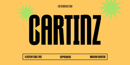 Cartinz is a modern sharp condensed sans display font. With bold consist stroke, fun character with a bit of ligatures and alternates. To give you an extra creative work. Cartinz font support multilingual more than 100+ language. This font is good for logo design, Social media, Movie Titles, Books Titles, a short text even a long text letter and good for your secondary text font with sans or serif. Make a stunning work with Cartinz font. Cheers, Maulana Creative
 - Avelia by Fatih Güneş,
$16.00 Avelia is a high contrast typeface with multilingual applications. Slender lines and great legibility make it perfect as a display font. With curves in all the right places, it is great for editorials and other commercial use. Avelia decorative font consists of 426 characters, including uppercase, lowercase, numbers, small caps, ligatures and accents. With its condense character, Avelia is very effective and useful for uses in works such as Packaging, Logo design, Headlines and derivatives of modern Art Deco.
 - Mellnik by ParaType,
$25.00Mellnik is a sans serif of humanist style (in a way) that was developed by Oleg Karpinsky for ParaType in 2006. The type family contains nine styles with a number of alternate characters in each ones. For use as a text font in long text passages of advertising booklets, catalogues or magazines, as well as for accident setting. Mellnik may be also applied as a corporate typeface. Five condensed styles were added in 2007 by the same designer. - Cobya by Creativemedialab,
$20.00 Cobya is inspired by the waves and the ocean. Some letter like A,W,V reflects the dynamic and beautiful shape of the waves. Try All Capitals and play with the spacing for a modern and fashionable look. Cobya consists of three widths condensed, normal and expanded. Each width has 9 weights, also a variable format. Cobya has distinctive and unique characteristics, so it is very suitable when used as a branding logo or fashion design concept.
 - Tightwad JNL by Jeff Levine,
$29.00 “I Don't like No Cheap Man” is a piece of early 1900s sheet music featuring its title hand lettered in a condensed slab serif design. The influences of the Art Nouveau era are clearly found in the many eccentric character shapes within the various letters of the original artwork. Recreated in digital type, Tightwad JNL is available in both regular and oblique versions – and its font name is a variant of the “Cheap Man” portion of the song’s title.
 - Config by Adam Ladd,
$25.00 Config was influenced by geometric sans with circular forms but the proportions have been condensed by incorporating straight sides for a design that is sturdy and efficient yet friendly. The neutral design with subtle details makes it functional for type setting in small and large sizes. Its clean nature makes it readable at small sizes but the touch of character—as seen in the notched joints, rounded details, and horizontal/vertical terminals—make it interesting at large sizes.
 - Upside by Little Fonts,
$15.00 Upside is an all caps font. The design of the font is tied to historic golden ages gone by, but with a modern flair giving it a contemporary edge. It is a tall and condensed geometric sans serif, with four unique styles and appearances. Upside is a distinctive display font, perfect for headlines and headings across a range of formats such as graphic design posters, editorial pieces, or anything that needs that extra eye-catching touch.
 - MC Magtons by Maulana Creative,
$15.00 Magtons is a classic condensed strong bold sans display font. Bold stroke, fun character with a bit of ligatures and alternates. To give you an extra creative work. Magtons font support multilingual more than 100+ language. This font is good for logo design, Social media, Movie Titles, Books Titles, a short text even a long text letter and good for your secondary text font with script or serif. Make a stunning work with Magtons font. Cheers, Maulana Creative
 - MC Bigfutz by Maulana Creative,
$15.00 Bigfutz is a modern Decorative sans serif condensed font. Medium stroke, fun character with a bit of ligatures and alternates. To give you an extra creative work. Bigfutz font support multilingual more than 100+ language. This font is good for logo design, Social media, Movie Titles, Books Titles, a short text even a long text letter and good for your secondary text font with script or serif. Make a stunning work with Bigfutz font. Cheers, Maulana Creative
 - Thealiens by Almarkha Type,
$25.00 Hello Everyone, introduce our new product Thealiens - Ligature Condensed Sans, inspired by the title of the sports poster and We make it very energetically, taking into account the thickness and density of each gliph, along with a ligature that makes this font look unique. Thealiens font with strong and challenging nuances. very suitable for the title, typography, clothes, Poster, magazines, brochures, packaging,Websites and much more for your design needs, making your designs more modern and professional.
 - MC Alysse by Maulana Creative,
$16.00 Alysse is a tech industrial genre sans display font. With regular condensed stroke, fun character with a bit of ligatures and alternates. To give you an extra creative work. Alysse font support multilingual more than 100+ language. This font is good for logo design, Social media, Movie Titles, Books Titles, a short text even a long text letter and good for your secondary text font with script or serif. Make a stunning work with Alysse font. Cheers, Maulana Creative
 - Thurkle by Grontype,
$15.00 Thurkle is bold new serif font, look tough and playable. Comes with sharp edges, inspired by sword making dynasty in British History. This display typeface is semi condensed and included some extra unique ligatures. Thurkle is perfect for any project such as magazine header, flyer header, logotype, invitation card name, and some any other design. Features: All Caps and Small Caps Character Numbers and Punctuation Special Characters Ligatures. Multilingual Support Thankyou For Picking The Font, Enjoy. Grontype
 - Malto by Maulana Creative,
$15.00 Malto is a condensed sans serif font. With semi bold soft edge stroke, fun character with a bit of ligatures and alternates. To give you an extra creative work. Malto font support multilingual more than 100+ language. This font is good for logo design, Social media, Movie Titles, Books Titles, a short text even a long text letter and good for your secondary text font with sans or serif. Make a stunning work with Malto font. Cheers, Maulana Creative
 - MC Granko by Maulana Creative,
$17.00 Granko is a a retro vibes condensed sans serif font. Bold stroke, fun character with a bit of ligatures and alternates. To give you an extra creative work. Granko font support multilingual more than 100+ language. This font is good for logo design, Social media, Movie Titles, Books Titles, a short text even a long text letter and good for your secondary text font with script or serif. Make a stunning work with Granko font. Cheers, Maulana Creative
 - Vidocq by Typogama,
$19.00 Vidocq is a single weight typeface designed for use in headlines and titles, inspired by the woodcut styles of the 19th century. Its rounded forms and dark stroke translate into a bold yet friendly appearance coupled with a narrow proportion that let’s it set well in condensed settings. Thanks to an extended character set and wide range of Opentype features that includes arrows and fleurons, Vidocq was created to allow designers to play with various styles while composing layouts.
 - Berndal by Linotype,
$29.99Bo Berndal, the master Swedish typographer, is the eponymous designer of Berndal, a contemporary text family with five different styles. This family represents a new achievement for Bo Berndal, who has spent many years working to optimize text legibility in the printed media. Several small tricks make the Berndal family an interesting milestone in legibility. Berndal's letterforms contain large x-heights. Large x-heights open up the counterforms of letters, making text appear lighter on a page, but their correspondingly shorter ascenders and descenders can hinder legibility. This does not occur in Berndal at all! Coupled with this experiment, Berndal's various font weights display a certain softness and roundness. The letterforms themselves are relatively wide, with an overall consistency in width. The calligraphic nature of the strokes has been minimized, yet a contrast stroke-thickness is still to be noticed within the alphabet. Berndal's five styles offer almost everything that one could want from a good text family. The Regular weight may be paired with Small Caps, Italic, Bold, and Bold Italic. All styles ship in the OpenType format, and include tabular and old style figures. The two italic weights are made up of true italics, not obliques. The Berndal family is a part of the Take Type 5 collection from Linotype GmbH." - ZonoToon - Unknown license

- ZonoPlanet - Unknown license

- TecoSans by Gaslight,
$20.00 Another techno-sans with interesting compensators, inspirit by Alexander Rodchenko works. Clean, strong, ultra here and there. Plus free symbol typeface for supporting in various situation.
 - Bloque by Corradine Fonts,
$19.95 Bloque is a heavy slab font family which contains six fonts. It has three layers for both roman and italic styles, including an inline and a shadow versions to make different color combinations
 - Roz by Gaslight,
$25.00 Roz is clean geometric sans round by one side and sharp on the other side. It has three weights and corresponding italics. Roz is ideal for package design, headlines and other typographic mediums.
 - Spantaran by Nurf Designs,
$25.00 Spantaran is a sporty display typeface which is very suitable for logos, titles, player names on the jersey, and more. It was made with italic & bold characters which give it a strong feel.
 - Evander by Punchform,
$29.00 Evander allows graphic designers to create advanced typographical layouts by offering 64 alternative glyphs and 3 stylistic sets. The family has 18 weights — 9 uprights and 9 italics — ranging from Thin to Black.
 - Magnel Display by Eimantas Paškonis,
$15.00 A display Didone of four weights plus italics. The defining stylistic features are large x-height and asymmetric legs that give feminine, oriental, floral look. Includes accented swashes, decorative ligatures and oldstyle numerals.
 - Bockhold by Stereo Type Haus,
$25.00 Influenced by the classic German industrial typeface DIN, Bockhold strays from the grid system and into humanist nuances. The family consists of two weights with matching italics, making a total of four fonts.
 - ALS Mirta by Art. Lebedev Studio,
$63.00 ALS Mirta is a clean text type well-suited for use in typesetting of smart volumes and kids’ books. A fine and well-balanced antiqua face is complemented by surprisingly vigorous sophisticated italics.
 - Tenika by Eaver Studio,
$12.00 Minimal & squarish techno style type for your graphic design project. Designed based off a modified square for the small letters and developed to have the capital letters. Available in upright and oblique (italic).
 - P22 Mayflower by IHOF,
$39.95 P22 Mayflower is a classical Roman font taken from a Bible of 1610, the edition likely carried to America by the pilgrims on the Mayflower. Good for period reproductions, with its companion italic.
 - LinkeHand Pro by Oliver Linke Type Foundry,
$12.50 LinkeHand Pro was based on the handwriting of Oliver Linke. Due to its rather compact appearance with short ascenders and descenders LinkeHand can be used with rather tight line spacing. Both Regular and Bold come with Small Caps and a multitude of special ligatures to make LinkeHand look really manually written.
 - Maleys by Luxfont,
$48.00 Welcome to the world of Maleys color fonts - where trendiness and playfulness meet in dynamic harmony. These fonts give your designs a breath of fresh air, adding originality and inspiration. Features: - Real Golden effect - Extras - Kerning - Multilingual IMPORTANT: - Check the glyphs in the font before buying! - SVG fonts contain raster letters.
 - Troglodyte NF by Nick's Fonts,
$10.00Here is a faithful rendering of Albert Auspurg's a 1927 expressionistic masterpiece, Messe Grotesk Licht. Its raw power and compact letterforms make for commanding and engaging headlines. Both versions of the font include complete Latin 1252, Central European 1250 and Turkish 1524 character sets, with localization for Moldovan, Romanian and Turkish. - Educator JNL by Jeff Levine,
$29.00Educator JNL joins the large library of Jeff Levine's stencil fonts and was re-drawn from a set of individual letter stencils with the distinctive look of Franklin Gothic. All of the irregularities of the original die-cut letter forms were left intact, giving a "real world" look to the font. - Brutal Milk No 1 by Casloop Studio,
$9.00 Introducing Brutal Milk Font Collection where prominence, trustworthiness, and sophistication converge. Brutal Milk is a captivating grotesque typeface that seamlessly blends the robust aesthetics of brutalism with the sleek sophistication of Swiss Design and the nostalgia of Y2K. This collection featuring three distinctive variants – Brutal Milk No1, Brutal Milk No2, and Brutal Milk No3 – offers a unique typographic journey for extraordinary design. Let's break down what we present in this work - Brutal Milk No.1 | Modern Elegance with a Brutal Twist Aims for body text with the perfect balance of elegance and modernity. Brutal Milk No.1 is meticulously crafted for optimal readability, making it an ideal choice for a wide range of applications. - Brutal Milk No.2 | Softened Brutalism for Approachable Headers Aims for display/header text with a gentle and approachable impression. Brutal Milk No.2 is crafted to add a touch of warmth to your designs, making it perfect for conveying a friendly and inviting tone. - Brutal Milk No.3 | Rigid Rebellion for Prominent Headers Make a bold statement with headers that exude firmness. Brutal Milk No.3 is designed to capture attention with its rigid impression, injecting a sense of prominence and confidence into a visual identity. The Features The Brutal Milk Font Collection comes loaded with features such as case-sensitive forms, discretionary ligatures, ordinals, fractions, denominators, numerators, superscripts, and scientific inferiors – ensuring flexibility in design needs. Language Support From Western and Central European languages to South Eastern European, South American, Oceanian, and even Esperanto, Brutal Milk Collections caters to a diverse range of linguistic needs. Brutal Milk stands as a testament to versatility and innovation. Whether you're crafting a sleek logo, establishing a brand identity, adorning decor, creating impactful posters, delivering compelling presentations, designing dynamic websites, refining UI/UX experiences, or engaging in graphic design endeavour. The impressions it imparts—modern, minimal, youthful, funky, groovy, trendy, hip, fly, and undeniably cool—speak volumes about its adaptability to contemporary design trends. Redefine the boundaries of creativity and immerse yourself in the dynamic world of Brutal.
 - Youth Heritage by Heyfonts,
$15.00 Youth Heritage Font is a vintage bold script font that pays homage to the rich visual heritage associated with youthful exuberance and retro aesthetics , This typeface combines bold, expressive strokes with a script style reminiscent of classic hand-lettering from bygone eras, capturing the spirit of vintage design. Here's a detailed explanation of the key features and characteristics of the Youth Heritage Font: Features: Vintage Aesthetics: The Youth Heritage Font is designed to evoke a sense of nostalgia, drawing inspiration from vintage typography prevalent during the mid-20th century, Its design elements reflect the bold and charismatic lettering styles associated with retro signage and advertising. Bold and Expressive Strokes: One of the defining features of this font is its bold and expressive strokes. Each letter is crafted with confidence, making a strong visual impact. This characteristic contributes to the font's ability to command attention and stand out in various design applications. Script Style: The script style of the font imparts a handwritten and personalized feel. The cursive letterforms flow seamlessly, creating a sense of dynamism and adding a touch of informality to the overall design. Distinctive Lettering: Each letter in the font is crafted with attention to detail, featuring unique and distinctive characteristics. This ensures that the font maintains its individuality and offers a distinct typographic personality. Applications: Vintage Branding: The Youth Heritage Font is well-suited for vintage branding projects. Apparel Design: Designers in the fashion industry can leverage this font for apparel branding and graphic designs. Its bold script style adds a retro flair to T-shirts, hoodies, and other clothing items, giving them a timeless and stylish appeal. Retro Signage: The bold and expressive nature of the font makes it a perfect choice for retro signage and display purposes. Event Posters and Flyers: When designing promotional materials for events, concerts, or parties with a vintage theme, the Youth Heritage Font can contribute to a cohesive and visually appealing poster or flyer design. Social Media Graphics: Its bold and expressive script style can make posts and announcements more engaging and shareable.
 - Brutal Milk No 2 by Casloop Studio,
$9.00 Introducing Brutal Milk Font Collection where prominence, trustworthiness, and sophistication converge. Brutal Milk is a captivating grotesque typeface that seamlessly blends the robust aesthetics of brutalism with the sleek sophistication of Swiss Design and the nostalgia of Y2K. This collection featuring three distinctive variants – Brutal Milk No1, Brutal Milk No2, and Brutal Milk No3 – offers a unique typographic journey for extraordinary design. Let's break down what we present in this work - Brutal Milk No.1 | Modern Elegance with a Brutal Twist Aims for body text with the perfect balance of elegance and modernity. Brutal Milk No.1 is meticulously crafted for optimal readability, making it an ideal choice for a wide range of applications. - Brutal Milk No.2 | Softened Brutalism for Approachable Headers Aims for display/header text with a gentle and approachable impression. Brutal Milk No.2 is crafted to add a touch of warmth to your designs, making it perfect for conveying a friendly and inviting tone. - Brutal Milk No.3 | Rigid Rebellion for Prominent Headers Make a bold statement with headers that exude firmness. Brutal Milk No.3 is designed to capture attention with its rigid impression, injecting a sense of prominence and confidence into a visual identity. The Features The Brutal Milk Font Collection comes loaded with features such as case-sensitive forms, discretionary ligatures, ordinals, fractions, denominators, numerators, superscripts, and scientific inferiors – ensuring flexibility in design needs. Language Support From Western and Central European languages to South Eastern European, South American, Oceanian, and even Esperanto, Brutal Milk Collections caters to a diverse range of linguistic needs. Brutal Milk stands as a testament to versatility and innovation. Whether you're crafting a sleek logo, establishing a brand identity, adorning decor, creating impactful posters, delivering compelling presentations, designing dynamic websites, refining UI/UX experiences, or engaging in graphic design endeavour. The impressions it imparts—modern, minimal, youthful, funky, groovy, trendy, hip, fly, and undeniably cool—speak volumes about its adaptability to contemporary design trends. Redefine the boundaries of creativity and immerse yourself in the dynamic world of Brutal.
 - Levato by Linotype,
$29.99 Levato, the first font designed by Felix Bonge, is an Antiqua that is full of character and is refined but by no means sterile. This typeface provides for a wide range of options for creating individual designs. It was not really Felix Bonge's intention to create a whole font family when, as a second year student, he began several exercises in contrast and proportion as part of the typeface design course of Professor Veljovi? at Hamburg University of Applied Sciences. However, these initial studies developed into a project that Bonge persisted with over the following years while working towards his degree. He continually had new insights and ideas that he was able to exploit for his font. Of particular importance, he claims, was a calligraphy seminar, which prompted him to completely rework his concept. It took him several years before his extensive font Levato™ was ready. Although the forms of Levato are ultimately derived from Renaissance Antiqua, Bonge has slightly increased the relative contrast in his version. This gives the font a graceful appearance that is further emphasized by the reduced x-height and the associated prominence of the ascenders. And, in addition, the relatively fine serifs, which are almost linear at their ends, infuse Levato with a hint of classical Antiqua á la Bodoni. At the same time, Bonge cleverly compensates for the sterilising tendency of this font form. Soft and rounded serif attachments and rounded line apexes offset the severe nature of the font and provide it with an aura of vivacity. This effect is promoted by the calligraphic-like foot of the lowercase h, n and m and the not quite horizontal bars of the uppercase E and F. Overall, Bonge has succeeded in creating a refined and yet very dynamic typeface. Levato is available in five weights; Light, Regular, Medium, Bold and Black, in each case with the corresponding italic versions. Bonge treats Levato Italic as a genuine cursive typeface. Its letters are thus slightly narrower than the analogous upright letters and their forms are considerably more curvilinear. All the versions of Levato boast an enormous range of characters to meet all possible requirements. In addition to four sets of minuscule and majuscule numerals for tabular and proportional typesetting, there are also small caps, numerous ligatures, ornamental characters and even swash variants of letters. With their generous, sweeping curves, the swash variants (available as OpenType versions) can be used for striking titling effects or as initials.
 - Classic Roots Personal Use - Personal use only

- Bauer - Unknown license

- Photonica - Unknown license

- HansHand - Unknown license


