10,000 search results
(0.162 seconds)
- Hatrok by Maulana Creative,
$17.00 Hatrok is a modern bold serif display font. With bold contrast stroke, fun character with a bit of ligatures and alternates. To give you an extra creative work. Hatrok font support multilingual more than 100+ language. This font is good for logo design, Social media, Movie Titles, Books Titles, a short text even a long text letter and good for your secondary text font with sans or serif. Make a stunning work with Hatrok font. Cheers, Maulana Creative
 - Enjoying Typeface by Putracetol,
$24.00 The Enjoying Typeface - Modern Display Font is a bold and contemporary font with a unique twist, offering two distinctive versions for added versatility. Its bold and playful characters make it an excellent choice for logos, quotes, posters, titles, headlines, magazines, business branding, product names, stickers, and invitation cards. With its thick, distinctive design, this font is sure to stand out and leave a lasting impression, making it quickly recognizable and perfect for a wide range of creative projects.
 - Pontiff Wide by Jehoo Creative,
$19.00 Designed to stand out is perfect for giving bold impressions, Pontiff Wide is a display typeface with sharp edges and has a wide shape referring to the neo vintage trend. Equipped with italic style and outline increasingly make this font striking and prominent in all its shapes and styles, bold format provides a great personality type in the title. Characters that are well-suited for a wide variety of applications from editorial design to branding, advertising, publicity and digital.
 - Leira by WildOnes,
$10.00 Leira hand drawn typeface is drawn by hand with a thick brush, resulting in really bold characters with some shakiness in line to get that personal touch feel. This typeface will suit for headlines, logo, titles, identities, packaging, posters, cards, quotes, etc. With the uniqueness of the shapes, Leira can definitely attract attention of anyone and be an eye catching font. The bold letters and playfulness of this font makes it stand out from the crowd.
 - Riot Funky by Beary,
$10.00 Get ready to make a bold statement with our revolutionary font that combines various styles into one. This eclectic, rebellious font is perfect for anyone looking to add an unpredictable touch to their designs. Whether you're creating posters, templates, or any other type of design, this font will help your work stand out and leave a lasting impression. Don't settle for ordinary, upgrade to this bold and daring font today and let your designs do the talking.
 - Girona by Narrow Type,
$35.00 Girona is a contrasting sans serif typeface which comes in 5 weights from light to bold. Large inktraps and many playful details create a modern typeface with a distinctive look. Girona offers many discretionary and standard ligatures. With different stylistic sets you can change the feel of your design from more delicate to more bold. It’s a perfect typeface for branding, editorial design, logo design and many others. Girona works best in larger sizes or headlines.
 - Palfour by Maulana Creative,
$18.00 Palfour is a classic bold serif display font. With bold stroke, fun character with a bit of ligatures and alternates. To give you an extra creative work. Palfour font support multilingual more than 100+ language. This font is good for logo design, Social media, Movie Titles, Books Titles, a short text even a long text letter and good for your secondary text font with sans or serif. Make a stunning work with Palfour font. Cheers, Maulana Creative
 - Phonk by Slava Antipov,
$39.00 Phonk is a bold and wide sans serif. It's great for logos, packaging, posters, advertising and other tasks requiring strong and bold typography. The font family contains the following 4 styles: Regular, Regular Italic, Contrast, Contrast Italic. Contrast styles are characterized by increased readability in small font sizes. Phonk has very wide language support (80+ languages). The font includes Latin and Cyrillic scripts. I recommend you check out the new and improved version of this font! Phonk Sans
 - Belle Jardin by Greater Albion Typefounders,
$18.00 Belle Jardin is an Art Deco inspired display family of three typefaces, offered in in-line engraved regular and demi bold forms as well as a solid bold form. It offers upper and lower case solid slab-built forms that create an immediate atmosphere of the streamline era of the thirties and are also at home in post-war revival inspired design work. The letterforms are solidly legible and ideal for cover and poster inspired design work.
 - MC Magtons by Maulana Creative,
$15.00 Magtons is a classic condensed strong bold sans display font. Bold stroke, fun character with a bit of ligatures and alternates. To give you an extra creative work. Magtons font support multilingual more than 100+ language. This font is good for logo design, Social media, Movie Titles, Books Titles, a short text even a long text letter and good for your secondary text font with script or serif. Make a stunning work with Magtons font. Cheers, Maulana Creative
 - Boulevard Sans by takoliko,
$16.00 Boulevard Sans typeface designed by Takoliko Studio. This Sans Serif font inspired by retro geometric style especially the radio and vhs era.The simplicity and geometric style is a timeless choice for your design. It comes with reguler and Bold, also oblique style for a different feel. Its bold characteristics makes it suitable for attention grabbing design projects such as headlines, posters, social media displays and editorials. And You can combine the family to make a larger design concept.
 - Bitgros by Maulana Creative,
$12.00 Bitgros is a classic bold sans serif Display font. Bold stroke, fun character with a bit of ligatures and alternates. To give you an extra creative work. Bitgros font support multilingual more than 100+ language. This font is good for logo design, Social media, Movie Titles, Books Titles, a short text even a long text letter and good for your secondary text font with script or serif. Make a stunning work with Bitgros font. Cheers, Maulana Creative
 - Big George NF by Nick's Fonts,
$10.00Here’s another gem by Ross F. George from the Speedball Text Book. It was originally entitled simply Bold Display (Modern Alphabets on Parade) and had a graduated spatter pattern. This version omits the pattern, but keeps the bold, brassy lines. Use it whenever you need an unusual and dynamic headline with a strong retro vibe. Both versions include the complete Unicode Latin 1252, Central European 1250 and Turkish 1254 character sets, with localization for Moldovan and Romanian. - Highills by Grontype,
$14.00 Highills is awesome bold decorative font. created in rounded corner that give this font a tough and calm feel. this font has s good looking as header and as text both. Highills is fit perfectly for branding projects, movies, logos, social media posts, posters, books, and many more. Features: Basic Latin Glyphs Bold Uppercase and Lowercase Letters Alternates & Ligatures Numeral and Punctuation Multilingual Support Thankyou for picking up this font, hope you enjoy it. Regard. Grontype
 - Times New Roman PS Cyrillic by Monotype,
$67.99In 1931, The Times of London commissioned a new text type design from Stanley Morison and the Monotype Corporation, after Morison had written an article criticizing The Times for being badly printed and typographically behind the times. The new design was supervised by Stanley Morison and drawn by Victor Lardent, an artist from the advertising department of The Times. Morison used an older typeface, Plantin, as the basis for his design, but made revisions for legibility and economy of space (always important concerns for newspapers). As the old type used by the newspaper had been called Times Old Roman," Morison's revision became "Times New Roman." The Times of London debuted the new typeface in October 1932, and after one year the design was released for commercial sale. The Linotype version, called simply "Times," was optimized for line-casting technology, though the differences in the basic design are subtle. The typeface was very successful for the Times of London, which used a higher grade of newsprint than most newspapers. The better, whiter paper enhanced the new typeface's high degree of contrast and sharp serifs, and created a sparkling, modern look. In 1972, Walter Tracy designed Times Europa for The Times of London. This was a sturdier version, and it was needed to hold up to the newest demands of newspaper printing: faster presses and cheaper paper. In the United States, the Times font family has enjoyed popularity as a magazine and book type since the 1940s. Times continues to be very popular around the world because of its versatility and readability. And because it is a standard font on most computers and digital printers, it has become universally familiar as the office workhorse. Times?, Times? Europa, and Times New Roman? are sure bets for proposals, annual reports, office correspondence, magazines, and newspapers. Linotype offers many versions of this font: Times? is the universal version of Times, used formerly as the matrices for the Linotype hot metal line-casting machines. The basic four weights of roman, italic, bold and bold italic are standard fonts on most printers. There are also small caps, Old style Figures, phonetic characters, and Central European characters. Times? Ten is the version specially designed for smaller text (12 point and below); its characters are wider and the hairlines are a little stronger. Times Ten has many weights for Latin typography, as well as several weights for Central European, Cyrillic, and Greek typesetting. Times? Eighteen is the headline version, ideal for point sizes of 18 and larger. The characters are subtly condensed and the hairlines are finer." - Times New Roman Seven by Monotype,
$67.99In 1931, The Times of London commissioned a new text type design from Stanley Morison and the Monotype Corporation, after Morison had written an article criticizing The Times for being badly printed and typographically behind the times. The new design was supervised by Stanley Morison and drawn by Victor Lardent, an artist from the advertising department of The Times. Morison used an older typeface, Plantin, as the basis for his design, but made revisions for legibility and economy of space (always important concerns for newspapers). As the old type used by the newspaper had been called Times Old Roman," Morison's revision became "Times New Roman." The Times of London debuted the new typeface in October 1932, and after one year the design was released for commercial sale. The Linotype version, called simply "Times," was optimized for line-casting technology, though the differences in the basic design are subtle. The typeface was very successful for the Times of London, which used a higher grade of newsprint than most newspapers. The better, whiter paper enhanced the new typeface's high degree of contrast and sharp serifs, and created a sparkling, modern look. In 1972, Walter Tracy designed Times Europa for The Times of London. This was a sturdier version, and it was needed to hold up to the newest demands of newspaper printing: faster presses and cheaper paper. In the United States, the Times font family has enjoyed popularity as a magazine and book type since the 1940s. Times continues to be very popular around the world because of its versatility and readability. And because it is a standard font on most computers and digital printers, it has become universally familiar as the office workhorse. Times?, Times? Europa, and Times New Roman? are sure bets for proposals, annual reports, office correspondence, magazines, and newspapers. Linotype offers many versions of this font: Times? is the universal version of Times, used formerly as the matrices for the Linotype hot metal line-casting machines. The basic four weights of roman, italic, bold and bold italic are standard fonts on most printers. There are also small caps, Old style Figures, phonetic characters, and Central European characters. Times? Ten is the version specially designed for smaller text (12 point and below); its characters are wider and the hairlines are a little stronger. Times Ten has many weights for Latin typography, as well as several weights for Central European, Cyrillic, and Greek typesetting. Times? Eighteen is the headline version, ideal for point sizes of 18 and larger. The characters are subtly condensed and the hairlines are finer." - Times New Roman WGL by Monotype,
$67.99 In 1931, The Times of London commissioned a new text type design from Stanley Morison and the Monotype Corporation, after Morison had written an article criticizing The Times for being badly printed and typographically behind the times. The new design was supervised by Stanley Morison and drawn by Victor Lardent, an artist from the advertising department of The Times. Morison used an older typeface, Plantin, as the basis for his design, but made revisions for legibility and economy of space (always important concerns for newspapers). As the old type used by the newspaper had been called Times Old Roman," Morison's revision became "Times New Roman." The Times of London debuted the new typeface in October 1932, and after one year the design was released for commercial sale. The Linotype version, called simply "Times," was optimized for line-casting technology, though the differences in the basic design are subtle. The typeface was very successful for the Times of London, which used a higher grade of newsprint than most newspapers. The better, whiter paper enhanced the new typeface's high degree of contrast and sharp serifs, and created a sparkling, modern look. In 1972, Walter Tracy designed Times Europa for The Times of London. This was a sturdier version, and it was needed to hold up to the newest demands of newspaper printing: faster presses and cheaper paper. In the United States, the Times font family has enjoyed popularity as a magazine and book type since the 1940s. Times continues to be very popular around the world because of its versatility and readability. And because it is a standard font on most computers and digital printers, it has become universally familiar as the office workhorse. Times?, Times? Europa, and Times New Roman? are sure bets for proposals, annual reports, office correspondence, magazines, and newspapers. Linotype offers many versions of this font: Times? is the universal version of Times, used formerly as the matrices for the Linotype hot metal line-casting machines. The basic four weights of roman, italic, bold and bold italic are standard fonts on most printers. There are also small caps, Old style Figures, phonetic characters, and Central European characters. Times? Ten is the version specially designed for smaller text (12 point and below); its characters are wider and the hairlines are a little stronger. Times Ten has many weights for Latin typography, as well as several weights for Central European, Cyrillic, and Greek typesetting. Times? Eighteen is the headline version, ideal for point sizes of 18 and larger. The characters are subtly condensed and the hairlines are finer."
 - Times New Roman by Monotype,
$67.99 In 1931, The Times of London commissioned a new text type design from Stanley Morison and the Monotype Corporation, after Morison had written an article criticizing The Times for being badly printed and typographically behind the times. The new design was supervised by Stanley Morison and drawn by Victor Lardent, an artist from the advertising department of The Times. Morison used an older typeface, Plantin, as the basis for his design, but made revisions for legibility and economy of space (always important concerns for newspapers). As the old type used by the newspaper had been called Times Old Roman," Morison's revision became "Times New Roman." The Times of London debuted the new typeface in October 1932, and after one year the design was released for commercial sale. The Linotype version, called simply "Times," was optimized for line-casting technology, though the differences in the basic design are subtle. The typeface was very successful for the Times of London, which used a higher grade of newsprint than most newspapers. The better, whiter paper enhanced the new typeface's high degree of contrast and sharp serifs, and created a sparkling, modern look. In 1972, Walter Tracy designed Times Europa for The Times of London. This was a sturdier version, and it was needed to hold up to the newest demands of newspaper printing: faster presses and cheaper paper. In the United States, the Times font family has enjoyed popularity as a magazine and book type since the 1940s. Times continues to be very popular around the world because of its versatility and readability. And because it is a standard font on most computers and digital printers, it has become universally familiar as the office workhorse. Times?, Times? Europa, and Times New Roman? are sure bets for proposals, annual reports, office correspondence, magazines, and newspapers. Linotype offers many versions of this font: Times? is the universal version of Times, used formerly as the matrices for the Linotype hot metal line-casting machines. The basic four weights of roman, italic, bold and bold italic are standard fonts on most printers. There are also small caps, Old style Figures, phonetic characters, and Central European characters. Times? Ten is the version specially designed for smaller text (12 point and below); its characters are wider and the hairlines are a little stronger. Times Ten has many weights for Latin typography, as well as several weights for Central European, Cyrillic, and Greek typesetting. Times? Eighteen is the headline version, ideal for point sizes of 18 and larger. The characters are subtly condensed and the hairlines are finer."
 - Times New Roman Small Text by Monotype,
$67.99In 1931, The Times of London commissioned a new text type design from Stanley Morison and the Monotype Corporation, after Morison had written an article criticizing The Times for being badly printed and typographically behind the times. The new design was supervised by Stanley Morison and drawn by Victor Lardent, an artist from the advertising department of The Times. Morison used an older typeface, Plantin, as the basis for his design, but made revisions for legibility and economy of space (always important concerns for newspapers). As the old type used by the newspaper had been called Times Old Roman," Morison's revision became "Times New Roman." The Times of London debuted the new typeface in October 1932, and after one year the design was released for commercial sale. The Linotype version, called simply "Times," was optimized for line-casting technology, though the differences in the basic design are subtle. The typeface was very successful for the Times of London, which used a higher grade of newsprint than most newspapers. The better, whiter paper enhanced the new typeface's high degree of contrast and sharp serifs, and created a sparkling, modern look. In 1972, Walter Tracy designed Times Europa for The Times of London. This was a sturdier version, and it was needed to hold up to the newest demands of newspaper printing: faster presses and cheaper paper. In the United States, the Times font family has enjoyed popularity as a magazine and book type since the 1940s. Times continues to be very popular around the world because of its versatility and readability. And because it is a standard font on most computers and digital printers, it has become universally familiar as the office workhorse. Times?, Times? Europa, and Times New Roman? are sure bets for proposals, annual reports, office correspondence, magazines, and newspapers. Linotype offers many versions of this font: Times? is the universal version of Times, used formerly as the matrices for the Linotype hot metal line-casting machines. The basic four weights of roman, italic, bold and bold italic are standard fonts on most printers. There are also small caps, Old style Figures, phonetic characters, and Central European characters. Times? Ten is the version specially designed for smaller text (12 point and below); its characters are wider and the hairlines are a little stronger. Times Ten has many weights for Latin typography, as well as several weights for Central European, Cyrillic, and Greek typesetting. Times? Eighteen is the headline version, ideal for point sizes of 18 and larger. The characters are subtly condensed and the hairlines are finer." - Times New Roman PS Greek by Monotype,
$67.99In 1931, The Times of London commissioned a new text type design from Stanley Morison and the Monotype Corporation, after Morison had written an article criticizing The Times for being badly printed and typographically behind the times. The new design was supervised by Stanley Morison and drawn by Victor Lardent, an artist from the advertising department of The Times. Morison used an older typeface, Plantin, as the basis for his design, but made revisions for legibility and economy of space (always important concerns for newspapers). As the old type used by the newspaper had been called Times Old Roman," Morison's revision became "Times New Roman." The Times of London debuted the new typeface in October 1932, and after one year the design was released for commercial sale. The Linotype version, called simply "Times," was optimized for line-casting technology, though the differences in the basic design are subtle. The typeface was very successful for the Times of London, which used a higher grade of newsprint than most newspapers. The better, whiter paper enhanced the new typeface's high degree of contrast and sharp serifs, and created a sparkling, modern look. In 1972, Walter Tracy designed Times Europa for The Times of London. This was a sturdier version, and it was needed to hold up to the newest demands of newspaper printing: faster presses and cheaper paper. In the United States, the Times font family has enjoyed popularity as a magazine and book type since the 1940s. Times continues to be very popular around the world because of its versatility and readability. And because it is a standard font on most computers and digital printers, it has become universally familiar as the office workhorse. Times?, Times? Europa, and Times New Roman? are sure bets for proposals, annual reports, office correspondence, magazines, and newspapers. Linotype offers many versions of this font: Times? is the universal version of Times, used formerly as the matrices for the Linotype hot metal line-casting machines. The basic four weights of roman, italic, bold and bold italic are standard fonts on most printers. There are also small caps, Old style Figures, phonetic characters, and Central European characters. Times? Ten is the version specially designed for smaller text (12 point and below); its characters are wider and the hairlines are a little stronger. Times Ten has many weights for Latin typography, as well as several weights for Central European, Cyrillic, and Greek typesetting. Times? Eighteen is the headline version, ideal for point sizes of 18 and larger. The characters are subtly condensed and the hairlines are finer." - Times New Roman PS by Monotype,
$67.99In 1931, The Times of London commissioned a new text type design from Stanley Morison and the Monotype Corporation, after Morison had written an article criticizing The Times for being badly printed and typographically behind the times. The new design was supervised by Stanley Morison and drawn by Victor Lardent, an artist from the advertising department of The Times. Morison used an older typeface, Plantin, as the basis for his design, but made revisions for legibility and economy of space (always important concerns for newspapers). As the old type used by the newspaper had been called Times Old Roman," Morison's revision became "Times New Roman." The Times of London debuted the new typeface in October 1932, and after one year the design was released for commercial sale. The Linotype version, called simply "Times," was optimized for line-casting technology, though the differences in the basic design are subtle. The typeface was very successful for the Times of London, which used a higher grade of newsprint than most newspapers. The better, whiter paper enhanced the new typeface's high degree of contrast and sharp serifs, and created a sparkling, modern look. In 1972, Walter Tracy designed Times Europa for The Times of London. This was a sturdier version, and it was needed to hold up to the newest demands of newspaper printing: faster presses and cheaper paper. In the United States, the Times font family has enjoyed popularity as a magazine and book type since the 1940s. Times continues to be very popular around the world because of its versatility and readability. And because it is a standard font on most computers and digital printers, it has become universally familiar as the office workhorse. Times?, Times? Europa, and Times New Roman? are sure bets for proposals, annual reports, office correspondence, magazines, and newspapers. Linotype offers many versions of this font: Times? is the universal version of Times, used formerly as the matrices for the Linotype hot metal line-casting machines. The basic four weights of roman, italic, bold and bold italic are standard fonts on most printers. There are also small caps, Old style Figures, phonetic characters, and Central European characters. Times? Ten is the version specially designed for smaller text (12 point and below); its characters are wider and the hairlines are a little stronger. Times Ten has many weights for Latin typography, as well as several weights for Central European, Cyrillic, and Greek typesetting. Times? Eighteen is the headline version, ideal for point sizes of 18 and larger. The characters are subtly condensed and the hairlines are finer." - KG Fractions by Kimberly Geswein,
$5.00 This font was created with math teachers in mind. It is hard to represent fractions in a way that can print easily in black and white on worksheets or tests. The extra outlines on these shapes are created just for that purpose- so your student can easily identify how many parts are shaded in the image. Blanks are also included so students can color in parts of a whole.
 - Savattera by Prioritype,
$18.00 Introducing a new script font with a beautiful, uniquely elegant and very charming look, you can click it and can be used in your projects such as wedding invitations, quotes, creative posts, clothing product packaging, promotions, video preview images, logos and much more to explore. because it has many cool variations. As a picture you can see the preview above. Features: -Uppercase -Lowercase -Numeral -Punctuation -Multilingual -Alternate -Ligature -Swash Thanks.
 - WestWarp by EVCco,
$20.00 Thick horizontals reminiscent of certain Egyptian or western-themed display faces warp into stretched-out glyphs and strange elliptical forms in this haphazard, page-filling font. Sure to evoke images of saturday morning cartoons, zany retro advertisements, and various other expressions of mid-20th century whimsy . Comes packaged in both TrueType and OpenType formats with standard complement of alpha-numeric glyphs, punctuation marks, mathematical symbols, and European diacritics.
 - Negara Serif by Monoco Type,
$15.00 Negara Serif is typeface that have classic and elegant vibe, designed for any headline and short paragraph use. Featured with Latin Plus that have include 219 Language support so it will usable in wide range country, Beside latin there is Cyrillic Support in Negara Serif. You can see more about this font usage and feature in the preview image. [New Update with Variable Font File available to purchase]
 - Brushwell by Hendra Pratama,
$15.00 Brushwell was made by Hendra Pratama with a real brushpen. This font delivers a dry brush effect to create the natural looks of beautiful handwriting brush calligraphy. µ¸ÀÁÂÃÄÅÆÇÈÉÊËÌÍÎÏÑÒÓÔÕÖ×ØÙÚÛÜÝßàáâãäåæçèéêëìíîïñòóôõöøùúûüýÿ ĀāĂ㥹ĆćĈĉĊċČčĎďĐđĒēĔĕĖėĘęĚěĜĝĞğĠġĢĤĥĨĩĪĬĭĮįİĴĵĶ Ĺ弾ŃńŇňŌōŎŏŐőŒœŔŕŖŘřŚśŜŝŞşŠšŢŤťŨũŪūŬŭŮůŰűŲų ŴŵŶŷŸŹźŻżŽžǼǽǾǿȘˆˇ˘˙˚˛˜˝ẀẁẂẃẄẅỲỳ ÷†‡‰~¢£¥§¨©®¯±´€™ Brushwell is also equipped with a standard OpenType Features such as Ligatures and Stylistic Set Alternates. Please check all the preview images for details. Hope this font will help you to create great projects.
 - Manganese by Comicraft,
$29.00The entire Headquarters Building of Active Image Comicraft has been ripped from the ground by a giant lizard monster which has unexpectedly risen from the sea! It has the power of bodily transformation! By merely willing it, it can transform its atomic structure into any form and shape. It is completely hostile. It regards our entire island nation as its enemy. Run! RUN! Run from the Giant Monster! - Goga Zhane by Piece of Cake Typework,
$15.00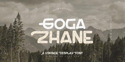 Hello World, Introducing, Goga Zhane is a textured display font suitable for your design project needs, such as; social media posts, quotes, overlays on images, taglines, logos, posters, print needs, website banners, and more. Features A set of uppercase and lowercase glyphs Number, symbol, and punctuation Multilingual Support Solid version Thank you a million times for downloading and using this font for your projects. Enjoy this font and happy creating!
 - School Activities JNL by Jeff Levine,
$29.00 An image spotted in an online auction online of a 1940 Milton Bradley child's activity set consisting of wooden letters formed the basis for School Activities JNL, which is available in both regular and oblique versions. Although the basic characters feature chamfered corners, the nature of bending the steel rule dies to form the letters to be cut from the wood provided rounded edges as well, creating their unique look.
 - Romi by Scholtz Fonts,
$15.00Romi is a legible, feminine, script font, suitable for wedding invitations, valentine cards, beauty products, or wherever a soft, romantic image is sought. Suggestions for use: - wedding stationery - greeting cards - valentines day media - beauty product media - lingerie tags - women's magazine pages - classical music media The font is fully professional: carefully letterspaced and kerned. It contains over 235 characters - (upper and lower case characters, punctuation, numerals, symbols and accented characters are present). - Morgini by Gatype,
$14.00 Introducing new Morgini Serif Typefaces with lots of alternative characters, SWASH and unique ligatures. It appears regularly and boldly with lower and uppercase letters, numbers, punctuation marks plus multilingual letters. A must have for every modern graphic designer now! Morgini is a very versatile font. Perfect for branding projects, logos, magazine imagery, wedding invitations, posters, apparel, packaging, website headers, or simply as a stylish text overlay onto any background image.
 - Caseopia by Letteralle,
$29.00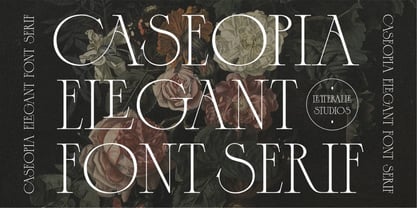 Caseopia is a modern font that takes a classic style. Designed to give the impression of elegance and luxury with a classic feel. Contains uppercase-only characters, all punctuation & numerals. There are also ligatures that will bring a unique style. Perfect for editorial projects, Logo design, Wedding, Clothing Branding, product packaging, magazine headers, or simply as a stylish text overlay to any background image. Enjoy the font, Thank You!
 - Roaring Jungle by Ergibi Studio,
$20.00 "Roaring Jungle - Retro Font" attractive curved style with inspired box edges from stone-style writing that is guaranteed to add traction because this unique shape is perfect for vintage and poster designs as well as for your logo design, brand image, retro poster, handwritten quote, product packaging , merchandise and more equipped with 2 forms, namely regular and rough and multilinguang support don't hesitate to give me a message thank you
 - Eckhardt Poster Board JNL by Jeff Levine,
$29.00 Eckhardt Poster Board JNL further continues Jeff Levine's series of sign painter-oriented fonts, named in honor of his good friend Albert Eckhardt, Jr. (who ran Allied signs in Miami, Florida from 1959 until his passing). The typeface is a casual brush style, modeled from an image of a do-it-yourself sign making kit comprised of stencils, paint and brush spotted for sale through an online auction.
 - Forest Trophy Textured by Sronstudio,
$10.00 Forest Trophy - Classic Display Font comes with a rough texture that gives a natural and vintage impression, suitable for the needs of outdoor apparel, merchandise, event posters, movies, etc Features: Uppercase and lowercase letters Multilingual, numerals, and punctuation Available in 3 styles: Clean, Rounded & Textured Style Note: the design in the preview images is not included If you have any questions feel free to drop me a message Thank You!
 - Bon Ami by Fontop,
$12.00 Bon Ami is a hand lettered condensed font perfect to add a fun feel and individual look to everything you create including cards & invites, logos, souvenirs, stationary, and so on. It also works perfectly when pairing with other fonts, f.e. with my Paramaribo font (as in the image with the cupcake). The font consists of Latin multilingual support as well as uppercase letters, lowercase letters, numbers and basic punctuations.
 - Dans Le Toilette by Latinotype,
$25.00 Dans le toilette is a fun dingbat inspired by things that happen fast in the bathroom every morning. You can use them on posters, covers, patterns, brands and all kind of image with a vintage touch. Dans le toilette is part of the dingbats series designed by Coto Mendoza including Dans le cuisine, Dans le jardin and Dans le Noël. Make your day with a fun morning Dans le toilette!
 - Trivenia by Azzam Ridhamalik,
$10.00 Introducing Trivenia, a display typeface inspired by such an amazing *Baldur Type Specimen". It has a modern shape with a classic touch on its curves. Comes with 2 styles, regular and inked for you to be more creative in your project. Perfect for most any aspect of graphic design, from logo to layout designs. Check the display images for the list of included glyphs and how this font can be used.
 - Pendleton JNL by Jeff Levine,
$29.00 Pendleton JNL was created from some scant images found on military machinery housed at the Marine Corps Mechanized Museum at Camp Pendleton, California. The photos were provided by Brian Platzer, a volunteer at the base who specializes in equipment restoration. Having used other stencil fonts by Jeff Levine, Brian thought the design of these hand-crafted markings might make another addition to Jeff's vast library of vintage stencil alphabets.
 - Jericho by Kavoon,
$14.00 Introducing Jericho! A rustic, dapper handwritten font with a personal charm. With quick dry strokes and a signature style, Jericho is perfect for branding projects, homeware designs, product packaging - or simply as a stylish text overlay to any background image. You can activate Ligature and Alternates in the OpenType panel to make these two styles. It also has many alternatives and underlines that make your text and design more interesting.