10,000 search results
(0.048 seconds)
- Geyalu by Twinletter,
$15.00 Geyalu is a playful display font, relaxed but still elegant, a beautiful font made with natural handwriting, making your project look natural and charming, in its application this font is really fun you can use it as a text sentence or title and it still looks beautiful, very fitting for your project that requires writing Hands that are natural and pleasing to the eye of course. This typeface is ideal for usage in a variety of unusual graphic projects, including games, book titles, outdoor activities, posters, banners, quotes, branding, and other unique projects. So, what are you waiting for? Get this font right now!
 - Pristinia Duo by Prestige Artsy Studio,
$15.00 Pristinia Duo is a powerful fancy and impactful bold mono-lined script font that comes in with a clean all-caps sans serif font that makes a great harmonious pair. The monolined script comes in with a large number of ligatures providing you with several options for your designs. Pristinia Duo is supporting western, southern, southern american and south eastern european. Pristinia Duo is perfect for branding, web headings, logos, quotes, movie titles and more... Promote your next project today with this great duo and set your message apart from others. I am eager and elated to see what you can do with Pristinia Duo!
 - Rifleman by Open Window,
$19.95 What a nice tranquil feeling you get from the wide forms of this font. The air of spontaneity was the most important thing about developing Rifleman. The forms were carefully and slowly constructed and then loosely traced with a paintbrush. Maybe the original drawings will become a font someday but i like to think that they won't for some reason. Surprisingly Rifleman is left to only the bare essential elements, anything that wasn't necessary was left out or removed. The goal was to make it as lightweight as possible to make up for the intricate detail. Rifleman is a surprisingly lightweight font offering lends itself to speedy typesetting!
 - Calera by Gian Studio,
$16.00 Elegant, graceful and timeless. Calera is a versatile font with timeless classic appeal, more than a dozen alternatives & ligatures, multilingual support and great precision for you to incorporate into your designs! Each letter has been hand drawn and crafted with great care. The various weights provide a variety of options that will help you find the best typographical character for your project. Perfect for logos, notes, posters, t-shirts, stickers, posters, mugs, labels, etc. To access alternative glyphs, you'll need a program that supports OpenType features such as Adobe Illustrator CS and Adobe Indesign. How to use the open type feature https://helpx.adobe.com/illustrator/using/special-characters.html
 - Abigral by Arterfak Project,
$18.00 Abigral is a minimalist sans serif font, created with geometric shapes and fancy double-strokes letterforms. Abigral is designed in normal letterspacing that looks versatile to be used as a display, logotype, or body-text. This font is compliment with the beauty alternates characters and stylish ligatures that make your design more conceptual. This font is flexible for many styles of graphic design. You can use Abigral for minimalist themes, feminine, masculine, or luxurious. Perfect for logo, headline, magazine, body text, quotes, and more. Here's what you'll get : Uppercase Lowercase Numbers & punctuation Accented characters Stylistic set 01-04 Ligatures Thank you for your support and happy designing!
 - Sweynheym Pannartz by Proportional Lime,
$19.99 The font SweynheymPannartz is strongly modeled after an example Conrad Sweynheym and Arnold Pannartz used in their early printing venture in Subiaco, Italy which began around 1465. Their efforts were supported by Pope Sixtus the IV after they enthusiastically printed more books than they could sell. They not only brought printing to Italy, but also developed the first Roman style type. This font has over 600 defined glyphs to cope with modern needs, and also the ability to use several abbreviations common to that period. It also has an alternate minuscule “k” more modern in appearance for those that find the original too unusual.
 - Tulip by ArtyType,
$29.00 I've had an interest in typography ever since my college days, even submitting my NDD thesis on the subject. The basic concept for this typeface stems from that early creative period, hence the obvious 60’s retro feel. It’s only recently that I've have had the chance to carry through fully some of my dormant typographic ideas, but ‘better late than never’ as they say! The font’s characteristic style is based on repeating or rotating templates of a half and a quarter circle, the geometric, modular building blocks used here. The name was simply influenced by the letter ‘u’, which visually describes a stylized ‘tulip’ flower.
 - Qilky by Khaiuns,
$18.00 I'm present to you, new retro serif called Qilky! Qilky is a stylish font It has both modern and retro look - clear, modern and fun. Helps to create layout design in 60s or 70s design projects. Perfect for branding, weddings, social media, product design, stationery and advertising - Qilky is versatile enough to add that classic element to just about any project where a special touch of class is required. This font have more than 50 unique alternate and ligature that to give your logo,business card and another project to a unique vintage look. I hope you have a blast using Qilky. Thanks for use this font ~ Khaiuns
 - Gilliany by Pen Culture,
$17.00 Gilliany is modern signature font that with a neat handwriting style, the shape of each letter and ligature has its own characteristics that are suitable for a variety of needs. Gilliany come with full set of uppercase and lowercase letters, multilingual symbols, numerals, punctuation and 71 ligatures. I really hope you enjoy it - please do let me know what you think, comments & likes are always hugely welcomed and appreciated. More importantly, please don't hesitate to drop me a message if you have any issues or queries. Guides to access all alternates glyphs : http://adobe.ly/1m1fn4Y Please fell free to contact me if you have any question Thank you
 - Revival 565 by ParaType,
$30.00 Revival 565 is the Bitstream version of type Berling. The face was created by Karl-Erik Forsberg for the Swedish Berling foundry in 1951, with other weights added in 1958. The design is an old style roman, particularly useful for books, journals, and other text applications. Despite the fact that it has higher contrast than most old style typefaces, Berling has the classic features of old style romans with its small x-height, and ascenders that exceed the height of the capital letters. Berling is good for text settings as well as display work. Cyrillic version was developed for ParaType by Manvel Shmavonyan in 2008.
 - Ouders by Garisman Studio,
$10.00 Introducing Ouders - Stencil & Regular Font A display font that has a strong and bold look. This font is made by hand so it looks natural and very suitable for vintage and rustic theme. Perfectly made to be applied especially in logos, and the other various formal forms such as invitations, labels, magazines, books, greeting/wedding cards, packaging, stationery, novels, labels or any type of advertising purpose. By combining both styles (stencil and regular) you will create a single design with an old style that is perfect! That's why you have to use this font. If you like the previous styles, you are right to use this font!
 - Clay Handwriting Pro by SoftMaker,
$7.99 Digitized handwriting fonts are a perfect way to give documents the “very special touch”. Invitations look simply better when handwritten than when printed in bland Arial or Times New Roman. Short handwritten notes look authentic and appealing. There are numerous occasions where handwritten text makes a better impression. Clay Handwriting Pro is a beautiful typeface that mimics true handwriting closely. Use Clay Handwriting Pro to create stunningly beautiful designs easily. This typeface comes with alternative characters for sophisticated typography – all easily accessible as OpenType features. A “random” feature even allows for automated random switching between variations of the same character, resulting in type that looks authentically handwritten.
 - Belphebe by Scriptorium,
$18.00Someone recently pointed out that May and June are the wedding season months, and that while we have some excellent fonts for non-traditional weddings (celtic and renaissance styles work well), we don't have a straightforward, elegant engraver style font. That's the kind of shortcoming we can remedy, hence our Belphebe font, which is in the tradition of popular wedding invitation fonts like Rook, but has some antique characteristics which are in the Scriptorium tradition. The kerning on this font was a real challenge, because we wanted all the characters to fit together for a flowing, hand-lettered look, but the results are worth it. - Moon Child by Angele Kamp,
$28.00 Introducing Moon Child, an elegant collection of two fonts that pair perfectly together. This collection will make designing Instagram quotes, websites & invitations effortless. What's Included Moon Child Script An elegant script font that includes ligatures that give you that gorgeous hand-lettered look. Moon Child Caps This is an all caps font that pairs perfectly with the script font
 - Angella White by Din Studio,
$29.00 Looking for a font that’ll make your branding radiate elegance? Something that’s versatile, stylish, and eternal? Get ready to transcend to a world of magic, laughter, and butterflies. Your branding will spark delight and engage everyone who sees it! Introducing Angella White-A Brush Font A beautifully handcrafted font combined with brush style that’ll make your guests sing and elevate your projects! Every stroke, and curve was created to entice happiness and elegance. Use it to create standout headings, promote your online sales, Instagram quotes, and even printed materials like business cards, t-shirts, or invitations. Angella White includes Multilingual Options to make your branding globally acceptable. Features: Standard Ligatures Stylistic Sets Multilingual Support PUA Encoded Numerals and Punctuation Thank you for downloading premium fonts from Din Studio
 - Gradl Initialen ML by HiH,
$12.00 Max Joseph Gradl designed Art Nouveau jewelry in Germany. At least some of his designs were produced by Theodor Fahrner of Pforzheim, Germany -- one of the leading manufacturers of fine art jewelry on the Continent from 1855 to 1979. I don't know if he designed for Fahrner exclusively, but every example I found was produced by that firm. I assume it was also the same M.J, who edited a book, Authentic Art Nouveau Stained Glass which was reissued by Dover and is still available. For an artist as accomplished as Gradl was, he is very tough to research. There just does not seem to have been much written about him. The jeweler is visible in most of his typeface designs. They exhibit a sculptural quality as if they were modeled in clay (or gold) rather than drawn on paper. His monograms, especially, reflect that quality. Those shown in plates 112 through 116 in Petzendorfer actually appear to have been designed specifically for fabricating in the form of gold or silver pendents. Of the initial letters that came out of Germany during this period, these by Gradl seem unusually open and lyrical. They seem to be dancing on the page, rather than sitting. Please note that Gradl designed only the decorated initials. All other characters supplied were extrapolated by HiH, including the accented initials. Orn.1 (unicode E004) is based on a jeweled gold clasp designed by Gradl (please check out Gallery Image on Myfonts.com). Also included are an art nouveau girl’s face, a swan and the face from Munch’s “Scream”, from scans of old printer’s ornaments. Gradl Initialen M represents a major extension of the original release, with the following changes: 1. Added glyphs for the 1250 Central Europe, the 1252 Turkish and the 1257 Baltic Code Pages. Added glyphs to complete standard 1252 Western Europe Code Page. Special glyphs relocated and assigned Unicode codepoints, some in Private Use area. Total of 341 glyphs. Both upper & lower case provided with appropriate accents. 2. 558 Kerning Pairs. 3. Added OpenType GSUB layout features: salt, dlig, ornm and kern. 4. Revised vertical metrics for improved cross-platform line spacing. 5. Refined various glyph outlines. 6. Alternative characters: 16 upper case letters (with gaps in surrounding decorations for accents above letter). 8. Four Ornaments: face1, face2, swan and orn1 (silhouette of Gradl clasp) The zip package includes two versions of the font at no extra charge. There is an OTF version which is in Open PS (Post Script Type 1) format and a TTF version which is in Open TT (True Type)format. Use whichever works best for your applications.
 - P22 Morris by P22 Type Foundry,
$24.95 William Morris (1834-1896) was probably the most influential figure in the decorative arts and private press movements of the late 19th and early 20th century. In reaction to the increasing lack of quality that the industrial revolution brought on, Morris sought a return to the ideals of the medieval craftsman. Dissatisfied with the commercially available typefaces of the day, he undertook the design of the fonts for his books himself. The P22 Morris font set features new versions of Morris's famous type designs for his Kelmscott Press. The two main fonts include full international character sets for Western European languages. P22 created MORRIS GOLDEN with a rough edge to simulate the look of printing on handmade paper. There is a more "refined" recent version of Golden, but its sterile digitization does not approach the effect that Morris achieved in his Kelmscott books. You'll notice the handmade effect less in the smaller sizes but will find it quite decorative in the larger sizes. (Morris cut his Golden type in only one size for the Kelmscott Press, approximately equal to 14 points.) P22's version of MORRIS TROY is more smooth than Morris Golden and is true to the original Morris design. It is based on the Kelmscott Troy type (an 18 point font) and its smaller counterpart, the Chaucer type (a 12 point font). American Type Founders made an unauthorized version of Troy, "Satanick," 189?, contrary to Morris's wish that it not be made available commercially.(Legend has it that the naming of Satanick comes from William Morris telling the agent inquiring about making copies of his fonts available to go to hell) Several digital versions of Troy (and Satanick) have appeared over the years. The P22 version offers a much more accurate rendering than any previous version. Morris designed the original Troy font to be spaced very tightly; our version reflects and honors his intention. The MORRIS ORNAMENTS are based on those Morris designed and used in his Kelmscott Press books. Characters in the positions of the letters A to Z are decorative drop cap initials. Characters in the number key positions reproduce other Morris embellishments. (See the accompanying key chart.) As with all headline fonts and complex dingbats characters, this font is best used at larger point sizes (e.g., 48, 72, 120). Use in body text or at small point sizes on-screen may not achieve desired results. P22 is grateful to William S. Peterson, Steven O. Saxe and the Lightsey-Offutt Library who gave invaluable research assistance to this project.
 - Jetworld by Nelson Borhek Press,
$12.00 Jetworld is the space-age typeface with the retro-forward look. Jetworld’s tapered and weighted parabolic-arch curves interplay with its rigid, straight verticals and horizontals to create an unexpected but pleasing motion and a rhythm that is constantly changing. Jetworld is an OpenType font that speaks of clean space-age design, midcentury optimism, and the promise of new frontiers. Jetworld gives a midcentury-modern or retro-futuristic look to book covers, magazine layouts, posters, and album covers. But Jetworld is adaptable, too. With hints of ancient cuneiform writings mixed with the look of markings on an alien spaceship, Jetworld spans eons. And Jetworld’s large character set includes multi-lingual support and many other special characters. That means Jetworld can be used for more than just headlines and more than just English. Jetworld combines a distinctive personality with surprising readability. Jetworld is unusual in that it is not descended from handwriting or calligraphy. Instead, Jetworld was inspired by midcentury modern architecture and consumer goods. Think of the parabolic arches seen in midcentury masterpieces like the Theme Building at Los Angeles International Airport, the TWA terminal at JFK Airport in New York, and even the cartoon architecture of “The Jetsons” television show. Think of boomerang-patterned Formica countertops and tabletops, or arch-shaped “hairpin” legs on midcentury furniture. Jetworld’s character shapes were inspired by all of these. Jetworld—direct from the world of the future to you.
 - Storyville by Canada Type,
$29.95 This is the redrawn and expanded version of an alphabet Rebecca Alaccari made back in 2009 as a bespoke font for a tourism agency looking to recapture the appeal of New Orleans after the hurricane Katrina disaster robbed it of its core industries. The brief back then was to "revive the unique spirit of what always made Nola great for new adults, which is the excellent combination of history, romance, food and music." No word of a lie, the brief actually contained "new adults." Storyville contains two interchangeable sets of forms drawn in the doodly, loose and organic way now conspicuously popular with today's young designers, almost every one of whom thinks they will get to design something for a boutique coffee bar somewhere. Well, this whole thing perhaps means freedom, youth, fun, happiness, good stuff like that. But just in case, a little caution doesn't hurt: Use this font only if you know what you're doing. We don't want to go back to the 1990s. Please. We were nearly done for by that exposure the first time around. The ligatures feature in this font does some pseudo-randomization, so the forms in doubled letters don't repeat. Serious fun can be had by also applying the stylistic alternates feature, or picking a letter in the middle of a setting and disabling the ligatures feature. Or various sequences of all that. If you don't like any of that stuff, just forget about it. Uh, wutever.
 - Yorkten by insigne,
$- Clean and welcoming, the distinct look of Yorkten is remarkably satisfying to the eye. Straight to the point, Yorkton features a fashionable, geometric composition with angled main stems. There are no fewer than fifty-four fonts in the family, all of which are characterized by one of three widths – extended, normal or condensed. Each individual subfamily is equipped with eight weights from Thin to Black with respective Italics, giving Yorkten a breathtaking range of fonts to boast. The greater value for you, though, is its members’ ability to work well together. With a deep toolbox of weights and widths to choose from, this family provides you with significant value and a broad number of design solutions, making sure you have the tools you need for each challenge. So where should you use the font? Jeremy Dooley designed Yorkten’s underpinning structure to be compact. Combined with its superior features and terrific legibility, this versatile font can be used effectively for many jobs, whether in print or on screen. Use it freely for e-books and apps. Yorkten is particularly great for headlines, banners, posters, and websites. As with all insigne fonts, fonts that are well received by the market are expanded into future variants such as rounded or slab serif types. Yorkten’s later expansions will increase the versatility and functionality of the family. There’s no need to wait for these future releases, though. This new face already complements a number of other insigne faces, such as Grayfel, Look, or the Cabrito Superfamily. So what are you waiting for? Get Yorkten today and bask in the rich potential it offers! Get Yorkten and luxuriate in its straightforward multifunctionality!
 - Center Screen by Peterland,
$44.00 Center Screen is a universal font dedicated to making office documents in popular text editors. Due to the interesting disign it is also used for making websites and advertising for films and posters. Center Screen font also allows to create images of work in many forms of marketing due to its versatility and adaptability to many languages of the world. Creating images and text with Center Font Screen allows you to gain competitive edge by highlighting your brand and by bringing attention to the originality of the presentation and the readability of the message.
 - HWT Konop by Hamilton Wood Type Collection,
$24.95 HWT Konop is a monospaced (fixed-width) typeface that is also square! Designed by Mark Simonson (Proxima Nova) as square characters that can be arranged vertically or horizontally and in any orientation. To a traditional letterpress job printer, a font like this wouldn’t make much sense. But to a modern letterpress printer it is an unusual and creative design toolkit. The bold gothic style is reminiscent of gothic wood types but more geometric. Since the characters are meant to be used in any orientation, the usual optical adjustments, such as making verticals thicker than horizontals and making tops smaller than bottoms are set aside. This results in a quirky but charming design. To provide more design options, Simonson came up with a modular system consisting of three sizes: 12-line, 8-line, and 6-line. These three sizes can be used together like Lego® bricks, with endless arrangements possible. And the sidebearing match so that characters always align when different sizes are used together. The digital version of Konop replicates the wood type version as much as possible, including the three different size designs. It includes OpenType stylistic sets that allow most characters to be rotated in place, 90° left, 90° right, or 180°, just like the wood type version. Extra characters not available in the wood type version are included with the digital fonts. The set of 3 is priced just $5 more than one single font, so order via "Package Options" HWT Konop is named for Don Konop, a retired Hamilton Manufacturing employee, who worked from 1959 to 2003. In addition to serving on the Two Rivers Historical Society Board from 2004 to present-day, he was also instrumental as a volunteer in helping with the museum’s move to its current home in 2013.
 - Favio by Anastasia Kuznetsova,
$17.00 I present to you an elegant, playful and very harmonious duo of serif fonts "Favio", inspired by ancient printed texts. It looks great on its own as part of a minimalist design. Play with letters to get different effects. The font "Favio" is guaranteed to give your text an individual and very attractive look. Great for branding, wedding invitations, packaging, quotes and labels. And it is also a bold choice of typography for the design of logos, album covers, illustrations, children's books, posters and much more. Font Features: - A-Z; a-z character set; - 1 language (English); - numbers and punctuation marks, symbols. Fonts can be opened and used in any software that can read standard fonts, even in MS Word. No special software is required to get started. It is recommended to use it in Adobe Illustrator or Adobe Photoshop. Made with love and magic ♡ Thank you for reading it, and do not hesitate to send me a message if you have any questions! ~ Anastasia
 - BD Gitalona Moxa by Balibilly Design,
$19.00 This is an Experimental typeface, a direct descendant of the BD Gitalona font family, which has a supermassive family with Variable technology. However, this version is more on the aesthetic aspect, which is experimental and exploratory. It complements the beauty of the primary typeface that we released separately. If you are a fan of Effectiveness and flexibility, please learn more about BD Gitalona and BD Gitalona Variable! Inspiration The world of entertainment moves non-stop. One by one, figures appeared and left. We expect to create something to entertain previous trends with packaging more relevant to the present. More specifically, we admire and are inspired by some of the world's leading and top singers with a segmented nature. We imagine so many figures that can affect every viewer. However, each artist or singer has a segment because almost all of them have characteristics. The Design The basic design of this typeface begins with a transitional serif shape with sharp, shapeless corners. Then in the middle of the invention, there was an opportunity to explore it further from the readability side by adding an optical variable that can adjust the serif thickness when used together between large, medium to paragraph text sizes for editorials. The shift from serif to sans-serif with the contrast initiated by the shift of the serif family form as a different variable also makes this font richer in terms of the features it contains. Parts are expected to add to the user satisfaction with the complexity of this font. The Features BD Gitalona consists of one sub-family intended for body text with nine weights from Thin(100) to Black(900) and four other display sub-families such as Display serif, Flick, Harmony Sans and Contrast Sans. Each consists of four weights Thin(100), Regular Weight(400), Bold(700), and Black(900). And again, there are also retailed separately; the BD Gitalona Variable font, which is designed to accommodate all Subfamily in 1 font file, and BD Gitalona Moxa, an experimental typeface. A total of 700+ glyphs in each style. Advanced OpenType features functionally and aesthetically, such as Case-sensitive forms, small caps, standard and discretionary ligatures, stylistic alternates, ordinals, fractions, numerator, denominator, superscript, subscript, circled number, slashed zero, old-style figure, tabular and lining figure. Supports multi-languages including Western Europe, Central Europe, Southeast Europe, South America, and Oceania.
 - Linefeed by Typodermic,
$11.95 Introducing Linefeed, the retro-inspired monospaced typeface that transports you back to the 1960s and 1970s era of computer band printers. Drawing inspiration from the revolutionary technology of the time, Linefeed captures the essence of the clunky yet iconic machines that were responsible for producing some of the most important documents of the time. Imagine a row of hammers, one for each column, smacking the paper against the ribbon and raised characters embossed on a constantly revolving steel band. This is the heart of the Linefeed font, paying homage to the technology that paved the way for the digital age. Most band printers of the time were restricted to uppercase, digits, and a little punctuation to ensure maximum efficiency, but Linefeed brings this beloved typeface to life with added lowercase letters, extra punctuation, and accents. Linefeed was once one of the most widely used computer fonts during the 1960s and 1970s. It could be found on a plethora of documents, including driver’s licenses, magazine subscription labels, report cards, invoices, and auto dealership window stickers, among other things. In a world where sleek and modern designs dominate, Linefeed offers a refreshing throwback to the golden age of computing. Its technical design, inspired by the machines of yesteryear, is a testament to the ingenuity and creativity of early computer designers. With its monospaced layout and vintage charm, Linefeed is sure to bring a touch of nostalgia to any design project. Most Latin-based European writing systems are supported, including the following languages. Afaan Oromo, Afar, Afrikaans, Albanian, Alsatian, Aromanian, Aymara, Bashkir (Latin), Basque, Belarusian (Latin), Bemba, Bikol, Bosnian, Breton, Cape Verdean, Creole, Catalan, Cebuano, Chamorro, Chavacano, Chichewa, Crimean Tatar (Latin), Croatian, Czech, Danish, Dawan, Dholuo, Dutch, English, Estonian, Faroese, Fijian, Filipino, Finnish, French, Frisian, Friulian, Gagauz (Latin), Galician, Ganda, Genoese, German, Greenlandic, Guadeloupean Creole, Haitian Creole, Hawaiian, Hiligaynon, Hungarian, Icelandic, Ilocano, Indonesian, Irish, Italian, Jamaican, Kaqchikel, Karakalpak (Latin), Kashubian, Kikongo, Kinyarwanda, Kirundi, Kurdish (Latin), Latvian, Lithuanian, Lombard, Low Saxon, Luxembourgish, Maasai, Makhuwa, Malay, Maltese, Māori, Moldovan, Montenegrin, Ndebele, Neapolitan, Norwegian, Novial, Occitan, Ossetian (Latin), Papiamento, Piedmontese, Polish, Portuguese, Quechua, Rarotongan, Romanian, Romansh, Sami, Sango, Saramaccan, Sardinian, Scottish Gaelic, Serbian (Latin), Shona, Sicilian, Silesian, Slovak, Slovenian, Somali, Sorbian, Sotho, Spanish, Swahili, Swazi, Swedish, Tagalog, Tahitian, Tetum, Tongan, Tshiluba, Tsonga, Tswana, Tumbuka, Turkish, Turkmen (Latin), Tuvaluan, Uzbek (Latin), Venetian, Vepsian, Võro, Walloon, Waray-Waray, Wayuu, Welsh, Wolof, Xhosa, Yapese, Zapotec Zulu and Zuni.
 - Bu Global by Butlerfontforge,
$18.00 While throned before your keys, under your drumming fingers awaits the most astounding standard computer typeface ever devised: BuGlobal. In addition to all the usual alphanumeric characters and symbols, this lone font lets you type more than 400 accented letters appearing in more than 80 English-variant languages worldwide, 70 common math and science symbols, and dozens of other useful characters —more than half a thousand all told— all within the digital parameters of one standard computer typeface, without needing any alternate keyboards or other clumsy digital luggage. Here is a sample: You can add any accent appearing in more than 80 English-variant languages used around the world to any letter appearing in all these languages simply by typing ANY letter then the accent. This includes more than 400 diacritic-laden letters in all —without needing to remember several keystrokes to type any of these letters as a few of them appear in standard computer typefaces. You can type more than 50 math/science symbols that do not appear in standard computer typefaces. These new symbols include several kinds of arrows plus constants, centerlines, dimensions, and graphs and scales that when retyped create continuous scales and graphs. Common symbols such as ballot boxes, rating stars, checkboxes, hearts, fancy fleurons, and similar motifs that do not appear in standard computer typefaces. Dozens of flashy arabesques like ========= [in BuGlobal these equal signs are kerned together so when you type them you create a continuous double line]. In this typeface more than 30 symbols that never appear twice in a row are kerned together so when you continuously type them you create all kinds of flashy arabesques that will make your typing more attractive. No other standard compute typeface allows you to do this. As for Beauty, BuGlobal’s characters are designed according to several axioms of ocular perception until each profile is as iconically simple as Shaker furniture. These axioms make BuGlobal’s letters easier to read compared to other typefaces, and a few of them are: Each letter should look much like the others but for one defining detail. The letters should be as similarly wide as possible. The letters’ midbars should be the same height and thickness. The higher the lowercase letters are compared to capital letters, the more legible and easily readable are their texts. BuGlobal has a typeface user’s guide, titled A Lovely Face, in which a description of each ocular axiom compares BuGlobal with Baskerville, Georgia, Palatino, and other commonly-used standard computer typefaces so you can quickly see why the other typefaces are inferior. You can download a pdf file of this typeface user’s guide, for free, at BuGlobal’s website, butlerfontforge.com, at any time so you can learn all about BuGlobal’s many amazingly new features before possibly buying it. BuGlobal’s plain letters are perfect for texts, its italics are gracefully emphatic, its bolds are ideal for titles and headers, and its arabesques are a fancy way to make your texts look dressy —all of which will add more shimmer to your semantic plumage. One good typeface is more useful than an infinity of poor ones. Robert Bringhurst
 - Clover Font Duo by Pen Culture,
$15.00 Introducing The Clover, a stunning duo font that combines the timeless elegance of a serif typeface with the fluid grace of calligraphy. This versatile font set includes two complementary styles that work together seamlessly to add sophistication and charm to your design projects. The serif font is a classic and refined typeface that exudes elegance and professionalism. Its clean lines and sharp angles create a sense of precision and authority, making it perfect for formal documents, headlines, and branding materials. In contrast, the calligraphy font is a more decorative and ornate style that evokes a sense of fluidity and movement. Its graceful curves and flowing lines create a sense of beauty and grace, making it ideal for invitations, wedding materials, and other special occasions. When used together, the serif and calligraphy fonts complement each other perfectly to create a stunning visual contrast that captures attention and creates a lasting impression. Whether you're designing a logo, brochure, or wedding invitation, The Clover is the perfect choice for adding a touch of sophistication and style. I really hope you enjoy it – please do let me know what you think, comments & likes are always hugely welcomed and appreciated. More importantly, please don’t hesitate to drop me a message if you have any issues or queries. Thank you
 - KR Birthday Cake! Dings - Unknown license

- Sunmood by Seemly Fonts,
$12.00 A distinctive display font is called Sunmood. This font looks great on stationary, logos, t-shirts, papers, print designs, website headers, picture frames, flyers, album covers, posters, and image sliders, among other things.
 - Leader Santa by Seemly Fonts,
$12.00 Leader Santa is a brand new display font. Leader Santa is perfectly suited for stationery, t-shirt, paper, print design, website header, photo frame, flyer, music cover, poster, image slider, and much more.
 - Autumn Leaves by Matthias Luh,
$15.00 These modern, handwritten letters can be used for fancy headings or images. The characters aren't oriented straight or orderly, but a bit random. So they look like they were written by a human.
 - Darkening by Seemly Fonts,
$12.00 Darkening is a brush display font. This font works well for many different things, including stationary, logos, t-shirts, papers, print designs, website headers, picture frames, flyers, album covers, posters, and image sliders.
 - Lovesome by Seemly Fonts,
$14.00 Lovesome is a brand-new, brushed display font. Lovesome is perfectly suited for stationery, logos, t-shirts, paper, print designs, website headers, photo frames, flyers, music covers, posters, image sliders, and much more.
 - Ingenue by Seemly Fonts,
$14.00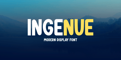 Ingenue is a friendly and simple display font. It is perfectly suited for stationery, logos, t-shirt, paper, print design, website headers, photo frames, flyers, music covers, posters, image sliders, and much more.
 - Vataga by ParaType,
$25.00Non-alphabetic typeface based on Yana Kutyina drawings. It includes 82 images of human faces as well as several typical interjections. Designed by Yana Kutyina and Andrey Belonogov. Released by ParaType in 2008. - Vacation Mexicana JNL by Jeff Levine,
$29.00 An image for a travel poster for the resort of Tulum, Mexico with its 1970s-era highly stylized semi-stencil type design inspired Vacation Mexicana JNL; available in both regular and oblique versions.
 - Conscious Valentine by Seemly Fonts,
$14.00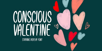 Conscious Valentine is a brushed display font. Conscious Valentine is perfectly suited for stationery, logos, t-shirt, paper, print designs, website headers, photo frames, flyers, music covers, posters, image sliders, and much more.
 - Keep Me by Seemly Fonts,
$12.00 Keep Me is a brand new display font. Keep Me is perfectly suited for stationery, t-shirt, paper, print design, website header, photo frame, flyer, music cover, poster, image slider, and much more.
 - Dreamland by Comicraft,
$19.00Ring-bearers across Middle Earth will be kissing their Sorceror's Stones, when they hear the news of the debut of this magickal collection of fonts, suitable for Incantations, Faerie talk, Books of Magic and fantastickal Arias. Coincidentally the official font of Scott Sava's DREAMLAND CHRONICLES (how didja guess?), Dreamland is also suitable for any chronicles you may have of your own. - Mysteries by Balpirick,
$15.00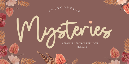 Mysteries is a Modern Monoline Font. Mysteries is a magical and whimsical handwritten font. It is the best choice for creating eye catching logos, branding and quotes. Every letter has a unique and beautiful touch, which will make your design come alive! Mysteries also multilingual support. Enjoy the font, feel free to comment or feedback, send me PM or email. Thank you!
