10,000 search results
(0.044 seconds)
- Hoax by More Etc,
$18.00 Introducing Hoax – a pre-worn sans serif with spirit, personality and distinction. This bold and semi-condensed sans serif is inspired by old copy machines and vintage prints. It is lively and eye-catching, ideal for where and when you want to make a lasting impression. Hoax is a celebration of character, a tribute to curiosity. Use this typeface and let everyone know that you mean business. OPENTYPE FEATURES: This font includes over 40 discretionary ligatures of prepositions and common words in English. These OpenType features can be accessed using OpenType friendly applications that allow the use of discretionary ligatures and stylistic sets. MULTILINGUAL SUPPORT: With over 700 glyphs, it has support for more than 150 languages, including Cyrillic script. List of discretionary ligatures: AND, ARE, AT, BY, FOR, EST, FEAT., FROM, IN, IS, OF, ON, OR, OUR, THAN, THAT, THE, TO, WITH, YOUR, CO. Each word is available in both upright and slanted versions. How to use: Activate the discretionary ligatures as you normally do in your OpenType friendly application. When activated, the words are in upright versions. To access the slanted versions, activate the first stylistic set (“Slanted Ligatures”). Happy typing!
 - C-Nation by URW Type Foundry,
$39.99 Marit Otto about C-Nation: The building typeface. Although the 70ties were very liberating and progressive, still girls played mainly with dolls and sweet things and boys with all kinds of challenging stuff. They did all sorts of basic scientific experiments in mini labs and of course built cool things with Meccano building sets. As a girl I was perfectly happy with the toys I had access to. But at the same time I was very curious about all the adventure toys and discoveries my brother did. It also made me wonder why the grown up people thought that our world could be separated so easily by separating our toys in pink and blue sections. At this day of age Meccano is probably hopelessly old fashioned and far to manual. Children of today are fed by fast images and cool animations on screen, they learn, play, communicate and relax in the same space, the digital space. The special feature of Meccano was that even though it was very basic there was the promise you could create anything. It might even contribute to a logical mind. The typeface I designed refers to the Meccano feel. It is a creative typeface. A bit masculine and bold looking perhaps but after the first impression a subtle and refined female touch is revealed. It has links to architecture and associations with metal constructions like ‘The Eiffel Tower’ and (old railway) bridges. I am convinced that we all think of that as very charming man-made objects.
 - Mantika Informal Paneuropean by Linotype,
$67.99Jürgen Weltin's Mantika Informal is pretty difficult to categorize, but very easy to like. This particularly reader-friendly typeface in regular and bold weights, brings to the table the informal fluidity of a script, the consistency of an inclined italic, and the open and airy forms and contrast of a humanist sans. The result is a warm, approachable, and very legible typeface that is never static and staid, but rather invites an attentive, reading eye. The original idea behind Mantika Informal lay in the challenge to create a typeface for setting children's books. German designer Jürgen Weltin aimed to create a reading typeface for those just starting to learn how to read. On the one hand, it should help create clear word-images; on the other, its letterforms should remain uncomplicated but resist mechanical and industrial sterility. Mantika?s subtle cursive lines stress the printed word's connection with handwriting, in addition to making the transition from school writing exercises to printed texts seamless and effortless. The resulting slightly organic and cursive forms that developed during the design process are so captivating that Mantika Informal may be used for a multitude of unintended applications - anywhere a friendly and informal yet sophisticated character could lend a helping hand, Mantika is there, giving a fresh accent to anything from packaging design to food products. With a broad character set encompassing support for Cyrillic and Green, Mantika Informal's two fonts make for a versatile and dynamic typeface that surely will find its place in a broad range of applications. - Mantika Informal by Linotype,
$50.99 Jürgen Weltin's Mantika Informal is pretty difficult to categorize, but very easy to like. This particularly reader-friendly typeface in regular and bold weights, brings to the table the informal fluidity of a script, the consistency of an inclined italic, and the open and airy forms and contrast of a humanist sans. The result is a warm, approachable, and very legible typeface that is never static and staid, but rather invites an attentive, reading eye. The original idea behind Mantika Informal lay in the challenge to create a typeface for setting children's books. German designer Jürgen Weltin aimed to create a reading typeface for those just starting to learn how to read. On the one hand, it should help create clear word-images; on the other, its letterforms should remain uncomplicated but resist mechanical and industrial sterility. Mantika?s subtle cursive lines stress the printed word's connection with handwriting, in addition to making the transition from school writing exercises to printed texts seamless and effortless. The resulting slightly organic and cursive forms that developed during the design process are so captivating that Mantika Informal may be used for a multitude of unintended applications - anywhere a friendly and informal yet sophisticated character could lend a helping hand, Mantika is there, giving a fresh accent to anything from packaging design to food products. With a broad character set encompassing support for Cyrillic and Green, Mantika Informal's two fonts make for a versatile and dynamic typeface that surely will find its place in a broad range of applications.
 - This Notes by Afkari Studio,
$13.00 Introducing This Notes - Handwritten Marker Note Font is a delightful testament to the artistry of handwriting, meticulously crafted to infuse your designs with an authentic, hand-drawn aesthetic. With a distinctive yet versatile style, This Note is poised to enhance a diverse array of design projects, serving as a conduit for creativity and expression. At its core, This Note embodies the charm of handwritten notes, capturing the nuances and imperfections that make each stroke unique. It's a natural flow and effortless elegance make it an ideal choice for a multitude of graphic endeavors, ensuring its relevance across various platforms and applications. Highlighted Features: - Complete set of uppercase and lowercase letters, numerals, and punctuation marks - Unique alternates and ligatures for added character variation - Compatible with both PC and Mac platforms - Hassle-free installation process - Seamless integration with Adobe Illustrator, Adobe Photoshop, Adobe InDesign, and Microsoft Word - No additional design software is required for full accessibility - Multilingual support encompassing characters such as ä, ö, ü, Ä, Ö, Ü, ß, ¿, and ¡ This Note transcends mere functionality; it becomes a catalyst for innovation and inspiration. Its versatility knows no bounds, seamlessly integrating into digital notes, quote designs, book covers, logos, posters, menu layouts, apparel designs, scrapbooks, comic illustrations, magazine headers, and numerous other creative avenues. The font’s adaptability is matched only by its ability to breathe life into every project it graces. Whether adorning a playful children's illustration or adding a touch of personality to a sophisticated magazine title, This Note lends an air of authenticity that captivates audiences. In conclusion, This Note Handwritten Marker Note Font isn’t merely a font; it's a conduit for creativity, a bridge between imagination and realization, poised to elevate your projects to new heights. Embrace its charm, leverage its versatility, and allow it to become the catalyst for your creative journey. Unlock the boundless potential of This Note, where each stroke tells a story and every design bears the mark of authenticity.
 - Blipzoid by Typodermic,
$11.95 Discover Blipzoid: a one-of-a-kind typeface that fuses the elegance of art deco with the futuristic allure of 1960s sci-fi. This compact display font offers a captivating blend of sleek geometric shapes, striking contrast, and magnetic ink-inspired characters, creating a truly unique visual experience. Step into a world where high-fashion meets pulp sci-fi, where the luxurious essence of art deco converges with the daring imagination of vintage science fiction. Blipzoid's distinct letterforms effortlessly adapt to your project's context, delivering an otherworldly ambiance or an air of sophistication reminiscent of haute-couture fashion. Embrace the dual nature of Blipzoid in your next project, and let it transport your message to a realm of opulence and enigmatic futurism. Elevate your designs with this extraordinary typeface that seamlessly melds Carnaby Street's 1960s mod aesthetic with the mysterious allure of uncharted galaxies. Most Latin-based European writing systems are supported, including the following languages. Afaan Oromo, Afar, Afrikaans, Albanian, Alsatian, Aromanian, Aymara, Azerbaijani, Bashkir (Latin), Basque, Belarusian (Latin), Bemba, Bikol, Bosnian, Breton, Cape Verdean, Creole, Catalan, Cebuano, Chamorro, Chavacano, Chichewa, Crimean Tatar (Latin), Croatian, Czech, Danish, Dawan, Dholuo, Dutch, English, Estonian, Faroese, Fijian, Filipino, Finnish, French, Frisian, Friulian, Gagauz (Latin), Galician, Ganda, Genoese, German, Gikuyu, Greenlandic, Guadeloupean Creole, Haitian Creole, Hawaiian, Hiligaynon, Hungarian, Icelandic, Igbo, Ilocano, Indonesian, Irish, Italian, Jamaican, Kaingang, Kanuri, Kaqchikel, Karakalpak (Latin), Kashubian, Kikongo, Kinyarwanda, Kirundi, Kurdish (Latin), Latvian, Lithuanian, Lombard, Low Saxon, Luxembourgish, Maasai, Makhuwa, Malay, Maltese, Maori, Moldovan, Montenegrin, Nahuatl, Ndebele, Neapolitan, Norwegian, Novial, Occitan, Ossetian (Latin), Papiamento, Piedmontese, Polish, Portuguese, Quechua, Rarotongan, Romanian, Romansh, Sami, Sango, Saramaccan, Sardinian, Scottish Gaelic, Serbian (Latin), Shona, Sicilian, Silesian, Slovak, Slovenian, Somali, Sorbian, Sotho, Spanish, Swahili, Swazi, Swedish, Tagalog, Tahitian, Tetum, Tongan, Tshiluba, Tsonga, Tswana, Tumbuka, Turkish, Turkmen (Latin), Tuvaluan, Uzbek (Latin), Venda, Venetian, Vepsian, Võro, Walloon, Waray-Waray, Wayuu, Welsh, Wolof, Xavante, Xhosa, Yapese, Zapotec, Zarma, Zazaki, Zulu and Zuni.
 - Strata by Just My Type,
$25.00 Big, expansive and flat on top; that’s a land formation called a mesa. “Mesa” was the first name for Strata Bold Rounded Serif, but it turns out it’s someone else’s registered trademark; in any case, if you need a bold, extended mono-height font that’s great for logotype, you could, as we used to say in the Mid-West, do a whole lot worse. SBRS is the final generation of an evolution that started with Mesa begating Mesa Bold which begat Mesa Bold Rounded which culminated in this evolutionary superior product. Use it!
 - Apex Brush by Hanoded,
$15.00 I like playing around with brushes and Chinese ink. I always have some kind of idea of what the final design should look like, but once it’s done, it never ever looks like what I had in mind. Apex Brush is one of those designs: it started off as a few brush strokes, but before I knew it, I had a really nice set of matching brush fonts! Use it for any design that needs a bit of rough, a splash of ink and a pinch of rebel.
 - Pretty Songs by PizzaDude.dk,
$16.00 What exactly is a pretty song? To tell you the truth, I have no idea! My taste of music ranges from classical music to heavy metal, from hip hop to jazz - and even soundtracks like Flash Gordon, Merry X-mas Mr Lawrence and Tommy. But font-wise, I know what a Pretty Song is! It's this organic looking, handmade text font - suitable for many things, such as books for kids, organic products, posters ... whatever design that needs a fresh and jumpy boost! BTW, the names was inspired by another favourite artist, Nirvana!
 - Saxo Grammaticus by Jonas Stensgaard,
$8.00 Saxo Grammaticus is a beautiful and friendly family that works great with family themes, elegant & classy material and professional settings. It's so versatile you'll find yourself coming back to it over and over for your projects, and that's whether you're looking to create logos, quotes, poster designs, brochures, packaging, anything with big letters like headlines, wedding invitations, holiday cards, advertisements, signs and on and on and on... There is a total of 107 ligatures and 76 alternates! That's plenty of options for any designer wanting to give those big letters a little extra wham bam!
 - Amaral by Oliveira 37,
$26.00 Amaral is a family of 12 fonts with a contemporary design style, based on different historical models. The calligraphic influences are subtle, best noticed in italics. The result is a set of fonts that look more "constructed" than "written". Available in six weights of the Roman and Italic types, Amaral has a wide palette of glyphs. In addition to offering extensive support for Latin sets, among many OpenType resources, each font contains small caps and contextual ligatures, totaling more than 728 glyphs. Amaral is an option for editorial design projects and other related applications.
 - Carafia by Khoir,
$15.00 Carafia is a bold sans serif font. It has its own uniqueness in its small, bound letters, Supported by several alternative and ligature fonts that make it cute, unique, suitable for all types of projects such as branding, logo design, cover design, web design, packaging, social media, and many more what are you waiting for! What's included? Uppercase Characters Lowercase Characters Support 75+ Language So what are you waiting for? immediately purchase this font, feel free to comment, or send me my PM or email at khoirtypework@gmail.com Thank you for seeing
 - Qulio by Khoir,
$15.00 Qulio is a bold serif style font. lifting a groovy style with a touch of modern serif so that it becomes a unique font. Qulio fits perfectly into modern vintage style. like logos, quotes, greeting cards, posters, branding. They all come with unique shapes and alternative fonts when combined, so what are you waiting for ! What's included? Uppercase Characters Lowercase Characters Support 75+ Language So what are you waiting for? immediately purchase this font, feel free to comment, or send me my PM or email at khoirtypework@gmail.com Thank you for seeing
 - KR Flower Frame - Unknown license

- KR Angel Bear - Unknown license

- Gans Blasones by Intellecta Design,
$27.00 GansBlasones images were selected from the vignettes catalog from Fundicion Gans published in 1920. Represents heraldry devices, Spanish city seals, world nations seals, coats of arms, helms, crowns, crests etc.
 - Always Good by Seemly Fonts,
$12.00 Always Good is a brand new handwritten font perfectly suited for stationery, logos, t-shirts, paper, print design, website headers, photo frames, flyers, music covers, posters, image sliders, and more.
 - How Lovely by Seemly Fonts,
$14.00 How Lovely is a brand new handwritten font perfectly suited for stationery, logos, t-shirt, paper, print design, website header, photo frame, flyer, music cover, poster, image slider, and more.
 - Quado by Tadiar,
$13.00 Quado is friendly style font designed for such areas as Entertainment, Techno, Games & Applications etc. with Multilingual support (Latin Extended). Please see the preview images to see how it works.
 - TT Tsars by TypeType,
$39.00 TT Tsars useful links: Specimen | Graphic presentation | Customization options The TT Tsars font family is a collection of serif display titling fonts that are stylized to resemble the fonts of the beginning, the middle and the end of the XVIII century. The project is based on title fonts, that is, the fonts that were used to design book title pages. The idea for the project TT Tsars was born after a small study of the historical development of the Cyrillic type and is also based on Abram Shchitsgal’s book "Russian Civil Type". At the very beginning of the project, we had developed a basic universal skeleton for the forms of all characters in all subfamilies of the family, and later on, we added styles, visual features, artifacts and other nuances typical of the given period onto the skeleton. Yes, from the historical accuracy point of view it might be that such an approach is not always justified, but we have achieved our goal and as a result, we have created perfectly combinable serifs that can be used to style an inscription for a certain time period. The TT Tsars font family consists of 20 fonts: 5 separate subfamilies, each of which consists of 4 fonts. Each font contains 580 glyphs, except for the TT Tsars E subfamily, in which each font consists of 464 characters. Instead of lowercase characters in the typeface, small capitals are used, which also suggests that the typeface is rather a display than text one. In TT Tsars you can find a large number of ligatures (for Latin and Cyrillic alphabets), arrows and many useful OpenType features, such as: frac, ordn, sinf, sups, numr, dnom, case, onum, tnum, pnum, lnum, salt (ss01), dlig. Time-related characteristics of the subfamilies are distributed as follows: • TT Tsars A—the beginning of the 18th century (Latin and Cyrillic) • TT Tsars B—the beginning of the 18th century (Latin and Cyrillic) • TT Tsars C—the middle of the 18th century (Latin and Cyrillic) • TT Tsars D—the end of the 18th century (Latin and Cyrillic) • TT Tsars E—conditionally the beginning of the 18th century (only Latin) TT Tsars A and TT Tsars B families (both the beginning of the 18th century) have different starting points: for TT Tsars A it is Latin, for TT Tsars B it is Cyrillic. The development of the TT Tsars A family began in Latin, the font is based on the royal serif Romain du Roi. The Cyrillic alphabet is harmoniously matched to the Latin. The development of the TT Tsars B family began in Cyrillic, which is based on a Russian civil type. Characteristic elements are the curved one-sided serifs of triangular characters (A, X, Y), drops appear in the letter ?, the middle strokes ? and P are adjacent to the main stroke. Latin was drawn to pair with Cyrillic. It is still based on the royal serif, but somewhat changed: the letters B and P are closed and the upper bar of the letter A rose. This was done for the visual combination of Cyrillic and Latin and at the same time to make a distinction between TT Tsars A and TT Tsars B. TT Tsars C is now the middle of the 18th century. Cyrillic alphabet itself did not stand still and evolved, and by the middle of the 18th century, its forms have changed and become to look the way they are shown in this font family. Latin forms are following the Cyrillic. The figures are also slightly modified and adapted to the type design. In TT Tsars C, Cyrillic and Latin characters are created in parallel. A distinctive feature of the Cyrillic alphabet in TT Tsars C is the residual influence of the flat pen. This is noticeable in such signs as ?, ?, K. The shape of the letters ?, ?, ?, ? is very characteristic of the period. In the Latin alphabet, a characteristic leg appears at the letter R. For both languages, there is a typical C characterized by an upper serif and the appearance of large, even somewhat bolding serifs on horizontals (T, E, ?, L). TT Tsars D is already the end of the 18th century when with the development of printing, the forms of some Cyrillic characters had changed and turned into new skeletons of letters that we transposed into Latin. The figures were also stylized. In this font, both Cyrillic and Latin are stylistically executed with different serifs and are thus logically separated. The end of the century is characterized by the reduction of decorative elements. Straight, blueprint-like legs of the letters ?, R, K, ?. Serifs are very pronounced and triangular. E and ? are one-sided on the middle horizontal line. A very characteristic C with two serifs appears in the Latin alphabet. TT Tsars E is a steampunk fantasy typeface, its theme is a Latinized Russian ?ivil type (also referred to as Grazhdansky type which emerged after Peter the Great’s language reform), which includes only the Latin alphabet. There is no historical analog to this typeface, it is exclusively our reflections on the topic of what would have happened if the civil font had developed further and received a Latin counterpart. We imagined such a situation in which the civil type was exported to Europe and began to live its own life.
 - Lovelica by PandAE86,
$10.00 Lovelica is a magical handwritten font carefully created with a touch of elegance. It will elevate a wide range of design projects to the highest level, be it branding, headings, wedding designs, invitations, signatures, logos, labels, and much more! Uppercase Lowercase Numeral Punctuation Ligatures Multilingual characters support Thank you and have a nice day ! Dedi T A
 - Villena by Carpiola Studio,
$12.00 Villena is a magical script font carefully created with a touch of elegance. Whether you’re looking for fonts for Instagram or calligraphy scripts for DIY projects, this font will turn any creative idea into a true piece of art! Villena is PUA encoded which means you can access all of the glyphs and swashes with ease!
 - Fox Journey by Fox7,
$12.00 Fox Journey is your versatile companion, ready to enhance a wide range of projects. Whether you’re working on blog posts, branding materials, advertisements, invitations, greeting cards, planners, photo albums, decorations, or anything else your creative heart desires, this font has you covered. Try Fox Journey today and experience the magic of handwritten simplicity, sans serif style.
 - Maginia by Digitype Studio,
$20.00 Maginia font can make your project look more unique, beautiful, and awesome like magic. Maginia has many alternatives and ligatures making this font very suitable to be applied to various formal forms such as invitations, labels, logos, magazines, books, greeting/wedding cards, packaging, fashion, make-up, stationery, novels, labels, or any kind of purpose. Thank you very much
 - ND Bimbo by NeueDeutsche,
$9.00 The power of ND Bimbo is here now. If you like deep-fried candy bars you will like ND Bimbo. This playful design integrates art deco influences into a contemporary display style. As usual, it covers Latin, Cyrillic and Greek. Respect ND Bimbo now! Get ND Bimbo now! You want ND Bimbo now! Create Magic with ND Bimbo now!
 - Americana Bakery by Almarkha Type,
$35.00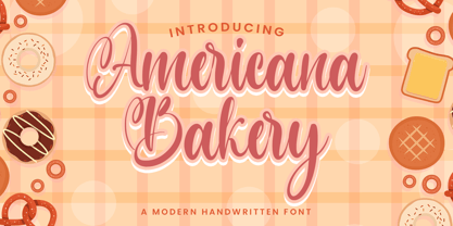 Americana Bakery font with a Modern Script perfect for any creative design. This handmade font will make your design has a beautiful natural touch for each details. This font is PUA encoded which means you can access all of the magical glyphs and swashes with ease! It also features a wealth of special features including alternate glyphs and ligatures.
 - PM Endora by Paper Moon Type & Graphic Supply,
$17.00 A new magical, mystical font family from Paper Moon Type & Graphic Supply. PM Endora was inspired by hand-lettered Mid-Century Modern movie titles and posters. Its mystical side makes it perfect for halloween and winter holiday marketing. Its casual side makes it a go to choice for weddings, specialty packaging, cosmetics, and modern lifestyle branding.
 - Gratia Singer by Burntilldead,
$15.00 Such an honor to introduce our new font family Gratia Singer, a serif font with modern ligature style. Highly recommended font for you who need glamour and stylish looks, perfect choice to make your design projects; logo, branding, invitation, social media ads & website have classy looks, just type and add this font....abra ca da bra! it's magic
 - Dark Blades by Tadiar,
$19.00 Dark Blades is an authentic gothic vintage font family of 4 fonts created for headers and text. Multilingual support (Latin Extended). Designed for: - Vintage branding (Clothes, Alcohol, Bikes, Games) - Horror - Music branding - Myth: Vampires, Zombie, Halloween, Werevolves, Magic, Fantasy - Medieval style Well use in vintage labels, headers & titles, Posters, Street Signs and other Outdoor, Package Design.
 - LT Hakuna Matata by Latam Type Foundry,
$15.00 Introducing "LT Hakuna Matata" font collection, inspired by The Classic Movie Lion King. Styles: Normal, Outline, Shadow, Ink. Captures Timon and Pumbaa's essence. Normal exudes joy, Outline adds an artistic touch. Shadow creates depth, Ink offers handcrafted charm. Experience African savannah's energy in typography.- Where typography meets the magic of The Lion King. Enjoy! Thank's for Support!
 - Brighting Lovelyta by Letterena Studios,
$9.00 Brighting Lovelyta is a magical script font carefully created with a touch of elegance. Whether you’re looking for fonts for Instagram or calligraphy scripts for DIY projects, this font will turn any creative idea into a true piece of art! This font is PUA encoded which means you can access all of the glyphs and swashes with ease!
 - Utily Sans by Latinotype,
$39.00 Utily Sans emerges from the question: "What would the world be like if Paul Renner had had greater inclination towards humanism rather than geometry?" Utily Sans glyph proportions and shapes make it suitable for long-form text. This typeface shows geometric simplicity with humanist shapes. It looks like Futura, but has a feel closer to Garamond. Utily Sans is composed of 6 weights with their matching italics, an alternate character set that brings it back to its geometric origin, uppercase discretionary ligatures for expressive titles, as well as small caps, lining figures and old style numbers. These features make the font well-suited for large and small sized compositions, for short or long text. Utily Sans is the first Latinotype font with Cyrillic support, additional to the usual support for over 200 Latin-based languages.
 - Demogen Sans Condensed Font by Azzam Ridhamalik,
$19.00 Sans Condensed Font Demogen, A bold and strong condensed font that’s here to make a statement. Drawing inspiration from the sleek modern designs of the 2000s, Demogen brings back that iconic vibe with a fresh twist. This font is your go-to choice for creating stunning posters, captivating website headlines, and sleek interface designs. Demogen typeface has a strong presence and is perfect for display sizes, making it an excellent candidate for impressive logo design with its contemporary sans serif design. It has OpenType features and an Extended Latin character set boasting over 370+ glyphs covering more than 88 languages. Sans Condensed Font Demogen will ensure your design communicates effortlessly to a global audience. Features: Uppercase, Lowercase, Numbers, Punctuation Ligatures Opentype Feature PUA Encoded Characters Extended Latin Multilanguage
 - Bodoni Classic Ad by Wiescher Design,
$55.00 I became interested in designing Bodoni Classic because of a lazy graphic designer at Jacques Damase publishing house. He had to change a single letter on a bookcover about J. B. BODONI. The French call him Jean Baptiste instead of Giambattista! And that unknown graphic designer just took any old “J” from some newly cut Bodoni. All the new Bodoni cuts have square serifs, whereas the originals had rounded serifs and slightly concave feet. The single letter “J” with the squared off serif was for me like a road sign to start redesigning the entire Bodoni family. That’s exactly what I started in 1993 and a dozen years later I am finished. Okay, I am still adding new Bodoni Classics, but those are my personal additions. Yours very retro, Gert Wiescher
 - Bodoni Classic Initials by Wiescher Design,
$55.00 I became interested in designing Bodoni Classic because of a lazy graphic designer at Jacques Damase publishing house. He had to change a single letter on a bookcover about J. B. BODONI. The French call him Jean Baptiste instead of Giambattista! And that unknown graphic designer just took any old “J” from some newly cut Bodoni. All the new Bodoni cuts have square serifs, whereas the originals had rounded serifs and slightly concave feet. The single letter “J” with the squared off serif was for me like a road sign to start redesigning the entire Bodoni family. That’s exactly what I started in 1993 and a dozen years later I am finished. Okay, I am still adding new Bodoni Classics, but those are my personal additions. Yours very retro, Gert Wiescher
 - XXII AwesomeScript by Doubletwo Studios,
$59.99 Doubletwo Studios - XXII AwesomeScript – the brush lettering font. Lettering is quite popular these days. And one thing is for sure… you are nothing without cool lettering. Here is one possibility to easily get a cool brush lettering result without calligraphic skills or any knowledge of using a brush. XXII AwesomeScript, that’s more than 1k wonderfully designed letters, ligatures and alternates which may bring a cool and individual handwritten look to your creation. This font is designed to easily create logos, headlines and text phrases within a blink of an eye. Just open your glyphs-palette* and simply chose, from up to 13 different alternates per glyph, the one that fits best for your needs. *For further information visit the Behance-Projectsite or download the pdf in the gallery.
 - Soliloquous by Comicraft,
$49.00 Talking to yourself out loud? Jabbering? Muttering? Wittering away on some flight of fancy? Why not? Why wait to get compliments from someone else? If you deserve them, pat yourself on the back, give yourself a good pep talk! Create a dialogue with yourself so that you can hear what you're thinking! Whether you’re living on your own or living with others, you’re always living with yourself and you can always be there FOR yourself with a cheerful word of wisdom or two hundred. So, help yourself yourself with Soliloquous! You won't feel alone without it. But please, remember to be respectful and try not to hurt your own feelings. And shut up when you hear yourself tell yourself that’s enough. See the families related to Soliloquous: Monologous .
 - Bodoni Classic Chancery by Wiescher Design,
$55.00 I became interested in designing Bodoni Classic because of a lazy graphic designer at Jacques Damase publishing house. He had to change a single letter on a bookcover about J. B. BODONI. The French call him Jean Baptiste instead of Giambattista! And that unknown graphic designer just took any old “J” from some newly cut Bodoni. All the new Bodoni cuts have square serifs, whereas the originals had rounded serifs and slightly concave feet. The single letter “J” with the squared off serif was for me like a road sign to start redesigning the entire Bodoni family. That’s exactly what I started in 1993 and a dozen years later I am finished. Okay, I am still adding new Bodoni Classics, but those are my personal additions. Yours very retro, Gert Wiescher
 - Bodoni Classic Text by Wiescher Design,
$55.00 I became interested in designing Bodoni Classic because of a lazy graphic designer at Jacques Damase publishing house. He had to change a single letter on a bookcover about J. B. BODONI. The French call him Jean Baptiste instead of Giambattista! And that unknown graphic designer just took any old “J” from some newly cut Bodoni. All the new Bodoni cuts have square serifs, whereas the originals had rounded serifs and slightly concave feet. The single letter “J” with the squared off serif was for me like a road sign to start redesigning the entire Bodoni family. That’s exactly what I started in 1993 and a dozen years later I am finished. Okay, I am still adding new Bodoni Classics, but those are my personal additions. Yours very retro, Gert Wiescher
 - Hella Instegra by Skypia,
$17.00 Start good day for new font! present to you, Hella Instegra! Hella Instegra is a stylish font It has both modern and retro look - clear, modern and fun. Helps to create layout design in 60s or 70s design projects. This font have more than 150 unique alternate and 59 ligature that to give your logo,business card and another project to a unique vintage look. It has Italic and Outline version too so what a perfect vintage font! Hella Instegra is also included full set of: uppercase and lowercase letters multilingual symbols numerals punctuation Alternates PUA Encoded Unique letterforms I really hope you'll get pleasure using Hella Instegra font and it will be perfect addition to your font collection! If you have some questions, please write me a letter! Thank You Skypia.

