10,000 search results
(0.027 seconds)
- Hillentone by Rockboys Studio,
$15.00 Hillentone is a magical script font carefully created with a touch of elegance. Whether you’re looking for fonts for Instagram or calligraphy scripts for DIY projects, this font will turn any creative idea into a true piece of art!
 - Geostar by Rockboys Studio,
$23.00 Geostar is a magical script font carefully created with a touch of elegance. Whether you’re looking for fonts for Instagram or calligraphy scripts for DIY projects, this font will turn any creative idea into a true piece of art!
 - Linear Fraktu by TeGeType,
$19.00 The basic idea of this type family was to keep the "ductus" of the fraktur calligraphy only. And to adapt it to draw a sans serif typography which still keep the magic rhythm and colour of the original letters.
 - Battelione by Rockboys Studio,
$17.00 Battelione is a magical script font carefully created with a touch of elegance. Whether you’re looking for fonts for Instagram or calligraphy scripts for DIY projects, this font will turn any creative idea into a true piece of art!
 - Artifex Regina by Adorae Types,
$29.00 Created for designs that require a handcrafted and handwritten look with a majestic touch. Artifex Regina is a blend of fantasy, wizardry, and charming delight. What's even better? IT'S VARIABLE! Designed to be a fun variable font, it allows Artifex Regina to be used as an animated typography adding a hint of magic through styles & transitions. Need a brighter inline? Need a softer shade? We got you! As an extra feature, you might want to try and play with its sliders and navigate throughout its 2 axes plus a swirly style handler to get a fully customized style! FEATURES: · Alternates: With an easy access at hand and through various stylistic sets that may contain many or a few alternates, leaving the choice to the designer for the right combination of sets and alternate characters. This includes a set of swirly ends available for static fonts as well as an axis for the variable font. · Contextual alternates: a few characters that provide some variety when used together. · Ligatures: Common used connectors with a playful twist. · Swashes: Accesible through OpenType Swashes feature there's a set of initial, final and middle swashes with passionate, elegant, and expressive strokes. Also, through stylistic sets, there's a set of monoline swashes for a cleaner look or limited spaces.
 - LD Lanky by Illustration Ink,
$3.00Long, tall and fun, that's what this cool font is. Download "Lanky" for scrapbook and greeting card journaling, captions, titles, and sentiments. - MarkerMoe by JOEBOB graphics,
$- What happens when you write small characters with a huge marker? The answer is MarkerMoe; very irregular handwriting that's only just readable.
 - XStarsAndStripes by Ingrimayne Type,
$14.95 These two typefaces contain elaborate star patterns. XSarsAndStripesOne and XStarsAndStripesTwo are mirror images of each other.
 - FT Forest by Fenotype,
$29.95 With Forest Dingbats you can easily create fast nature patterns or use the images as such.
 - Grandhappy by Journey's End,
$18.00 Have you ever searched for a font that looked like it was really someone's handwriting, only to find that it was too feminine or too hard to read? I used to want a font like that, too, until I discovered that a font like that had been residing in my attic, in letters to me from my late grandfather. Not only was I thrilled to have a font like this at hand, but also one that would be a memory of my grandfather every time I used it. He was a hard-working man, raising a family during the Depression, yet was still fun-loving, kind, and generous. We called him Grandhappy. As a wedding present, I received from him rolling pins and a cutting board made of 8 different kinds of wood that he pieced together. In this font, the bullet is a rolling pin in honor of that! Other than the fact that this is a font from the hand of one greatly loved, my favorite thing is that although a True Type Font, it has some features of an Open Type font. There are many alternative letter choices available through the use of little-used keys on the keyboard and alt codes. This font was chosen to portray Jay Gatsby's handwriting in The Great Gatsby (2013).
 - Saluzzo by Wilton Foundry,
$29.00 The name Saluzzo is given to this font in honor of Giambattista Bodoni (1740–1813). Bodoni was born in the town of Saluzzo, Cuneo, Italy, and died at the age of 30. Saluzzo is a contemporary interpretation of Bodoni, retaining its elegant thin serifs and contrasted with heavy downstrokes. What makes Saluzzo unique is that it was approached from a calligraphic point of view. Also unique in this interpretation is the fact that it is a stencil. Saluzzo is a great choice when you need a font that is contemporary, timeless, and distinctive. Perfect for Advertising, Corporate identities and Packaging design, Fashion, Technology, Hospitality, Travel, and Retail applications. Saluzzo Regular Opentype is a Stencil font that is Contemporary, Distinctive, and Timeless.
 - Quadratique by Eurotypo,
$32.00 Quadratique is the first font of a large family that was originated in geometric patterns. We developed a system through a square of 6 modules of side, which are transformed and combined to give up 104 originals glyphs. As a result, each letter is a subfamily that may be combined by overlapping (A, a, a.salt and a.swsh) and thus generate more than 365 glyphs, or thousands if we combine different letters. Quadratique is so easy to use, that user does not need guidance. You just must typeset [aaaa, bbbb, etc.] and start to play, try to make that each module overlapping with others and repeat [(a + A) (a + A) (a + A), etc.] You may create thousands of new patterns and creative frames just combining different modules.
 - Weaving by Ingrimayne Type,
$9.00 Weaving is a family in which the letters fit together so that wavy lines separate them both horizontally and vertically. It creates this effect by alternating letters on upper-case keys with those on lower-case letters and this alternating is done automatically in applications that support the OpenType feature of contextual alternatives (calt). (The upper-case can be used alone but it unlikely that the lower-case characters could be used by themselves.) The family is a thinner and condensed version of the typeface Woven, but in condensing it, the tessellation properties that a were in Woven are lost. It is a decorative display face but because there are few typefaces similar to it, it is hard to predict what uses it may have. Be creative!
 - GOBAH by Product Type,
$15.00 Welcome to Gobah, a font that presents the future atmosphere in an amazingly modern and futuristic style. Are you looking for the perfect solution for modern, futuristic, sci-fi, and future-themed projects? Gobah is the right choice. Gobah is a font that transports you to an extraordinary world with a unique look that reflects a sophisticated future feel. Each letter is uniquely designed, giving your project a modern, innovative, and charming look. With Gobah, you can steal the show and create an unforgettable impression. The main benefit of Gobah is its ability to deliver stunning styles. Each letter has an exclusive design, creating an eye-catching futuristic look. This font will give your projects a strong visual appeal, reinforcing the message you want to convey. Gobah also supports multilingualism, allowing you to display text in multiple languages without a hitch. This flexibility ensures that you can easily reach a global audience and convey your message with consistent clarity across cultural contexts. Take a step forward in your design with Gobah. This font will give a stunning modern and futuristic twist, creating a memorable impression on your logos, posters, and web presence. Let Gobah be the right choice for your vibrant, modern, futuristic, sci-fi, and future projects.
 - Zamenhof by CastleType,
$59.00 Zamenhof is a family of five fonts that can be used singly or in combination to create a variety of bold, yet elegant, display styles. Inspired by Russian hand-lettering that appears to have been based on Jakob Erbar’s Phosphor, Zamenhof is essentially a Latin interpretation (with Cyrillic and Greek) of a Cyrillic interpretation of a Latin type design, with many changes along the way. (For example, all the Latin-only letters are quite different between the two designs: D, F, G, J, K, N, Q, R, S, U, V, W, Y, Z.) The Inline and Inverse styles of Zamenhof are the basic fonts and can be used effectively on their own. The Plain and Outline fonts — which I recommend using only in combination with the main designs — were created specifically to be combined with Inline and Inverse, as underlay and overlay layers, respectively. (You will need an application that supports layers, such as Adobe InDesign or Photoshop.) Zamenhof supports most European languages as well as modern Greek, and of course, Russian and other languages that use the Cyrillic alphabet. Needless to say, as Zamenhof is named after the father of Esperanto, it also supports Esperanto (as do all fonts from CastleType).
 - Tescellations by Ingrimayne Type,
$9.95 Though there are many thousands of digital typefaces available, none seem to be made exclusively of letters that tessellate, a complete tessellating alphabet. This void is now filled with not one typeface, but a group of typefaces, the Tescellations kinship group. Even though I am aware of only one use for this typeface--writing about tessellations--that does not mean there are not hundreds or perhaps thousands of other uses. These typefaces are a byproduct of two maze books I designed, Puzzling Typography and Puzzling Typography A Sequel. I found the challenge of making mazes from tessellations, including letter tessellations, intriguing and these typefaces are a byproduct that endeavor. There are seven members of this typeface kinship group. I tried to select the the glyphs that fit together best to form Tescellations; it is the most readable of the lot. The reason for an Italics version is that I needed one for the maze project. In constructing it, I tried to include as many different lower-case glyphs as I could rather than just skew the regular version. A purist might insist that the tessellation deal with the counters. My approach was to worry only about the exterior of any letter that has an interior, but for anyone who who might object to the counters, versions with filled counters are included. What did not fit into Tescellations was dumped into Tescellations Two, which is somewhat of a ransom-note type of face. It comes in two styles, a regular version and a version in which the counters are removed. TescellationPatterns shows how many of the characters in these typefaces tessellate. It has over 100 tessellation patterns, each on only one character. Simply type several lines with any character and make sure the leading is the same as the font size, and you have an instant tessellation pattern of a letter.
 - Lucky Spark by Letterhend,
$19.00 Introducing, Lucky Spark Script - an enchanting script. What makes this font unique than the other is its beautiful swashes which will make the lettering looks customized. This type of font perfectly made to be applied especially in logo, and the other various formal forms such as invitations, labels, logos, magazines, books, greeting / wedding cards, packaging, fashion, make up, stationery, novels, labels or any type of advertising purpose. Features : uppercase & lowercase numbers and punctuation multilingual alternates and ligatures swashes PUA encoded We highly recommend using a program that supports OpenType features and Glyphs panels like many of Adobe apps and Corel Draw, so you can see and access all Glyph variations.
 - Refita by Hanzel Space,
$25.00 Refita, is a wedge serif font that is sure to stand out! A little bit retro and a bit modern, Refita. is great for logos, editorial or web design. The unique sharp serifs mixed with thin strokes give off a bold mid century architectural vibe. This modern serif typeface features serifs. Perfect for gorgeous logos & titles, The Refita will pair beautifully with many fonts and work well with whatever project you're working on. Uppercase Lowercase Numbers & Punctuation That's it! If you have any questions at all , feel free to pop me a private message , I'm always more than happy to help you along :) Happy creating! Hanief Studio
 - Brovile by Hanzel Space,
$25.00 Brovile, is a wedge serif font that is sure to stand out! A little bit retro and a bit modern, Brovile. is great for logos, editorial or web design. The unique sharp serifs mixed with thin strokes give off a bold mid century architectural vibe. This modern serif typeface features serifs. Perfect for gorgeous logos & titles, The Brovile. will pair beautifully with many fonts and work well with whatever project you're working on. Web font Uppercase Lowercase Numbers & Punctuation That's it! If you have any questions at all , feel free to pop me a private message , I'm always more than happy to help you along :) Happy creating! Hanzel Studio
 - Lazarrous by LetterStock,
$17.00 Lazarrous Font This pair was inspired by the haloween poster design that i saw at some coffee shop, It was crafted by hand specially to add natural handmade feeling in its brand identity than i make it clean with pentool. Opentype features Lazarrous font has 171 character set included Lazarrous Font is very good looking in logo, labels, t-shirt prints, product packaging, invitations, advertising and others. What includes Multilingual support (Western European characters). This fonts works with following languages: English, Danish, Dutch, Estonian, Faroese, Filipino, Finnish, French, German, Hungarian, Icelandic, Irish, Italian, Norwegian, Polish, Portuguese, Spanish, Swedish. Thank you for using this font. LS
 - Background Echo by Hanoded,
$15.00 I don’t live in the mountains, so when we go on holiday and visit the mountains, we always like to hear the echo! A bit childish, I know, but that’s how it is. Background Echo is a very nice, handmade, all caps font. It’s not exactly a laser-cut design; glyphs are a bit uneven, wobbly in places and have their own idea of what they should look like. That, my dear potential customers, is the charm of a hand made font! Background Echo comes with a vast array of diacritics, regular and bold styles and a selection of interesting swashes for the upper case glyphs
 - Elsain by Maculinc,
$15.00 Elsain is a serif family font that is very unique on the edges with different angular styles, the spacing between these fonts is made very tight to deepen the character of this font. This font is great in layout design for quotes or body copy, best used as a display for headings, logos, branding, magazines, product packaging, invitations or anything else. Elsain Serif Family has many features such as Multilingual support, has 14 font families from thin to thick and also 2 variables. This font is also available in Cyrillic to complement many other languages. Not to forget it is also available in Greek form, and some other accessories. This completeness can be used in various letters from various countries such as English, Indonesian, Afrikaans, Basque, Breton, Catalan, Danish, Dutch, Finnish, French, Gaelic, German, Icelandic, Irish, Italian, Norwegian, Portuguese, Saami, Spanish, Swahili , SwedenCroatia, Czech, Estonian, Hungarian, Latvian, Lithuanian, Polish, Romanian, Serbian, Slovak, Slovenian, Turkish, Avar, Balkar, Belarusian, Bulgarian, Chechen, Erzya, Ingush, Lezgian, Macedonian, Moldavian, Ossetian, Russian, Serbian, Ukrainian, Greek and others. What do you get: Elsain Serif Regular and Italic Elsain Variable Regular and Variable Italic TTF. Accessible in Adobe Illustrator, Adobe Photoshop, and Adobe InDesign, it even works in Microsoft Word. Fully Encoded Characters are accessible without additional design software. Images used: All photos/images/vectors used in the preview are excluded, for illustration purposes only. Feel free to follow, like and share. thank you very much for checking my store!
 - Telephoto by Typodermic,
$11.95 In the world of graphic design, the right typeface can make or break a project. It’s not just about choosing a font that’s legible, but one that speaks to the essence of your brand or message. If you’re looking for a typeface that embodies classic charm and warmth, then look no further than Telephoto. Telephoto is a sans-serif typeface that harkens back to the twentieth century when analog was king. Its gentle, analog feel sets it apart from other typefaces on the market. When you use Telephoto, you’ll notice that it has a smooth personality that immediately injects classic ambience into your projects. But what really sets Telephoto apart are the subtle letter pair ligatures. These ligatures are a true testament to the attention to detail that went into creating this typeface. They break up the monotony of plainly repeating letters, creating a soft and organic feel that’s hard to find in today’s digital world. OpenType-savvy programs are where Telephoto truly shines, so make sure to turn off your application’s “standard ligatures” function to fully appreciate this effect. Telephoto is perfect for photographers, designers, and anyone who wants to bring a soft, analog feel to their work. Its delicate rendering is truly one-of-a-kind and adds a level of sophistication to any project. So why settle for a run-of-the-mill typeface when you can use Telephoto to make your work stand out? Give it a try and see the difference it can make. Most Latin-based European writing systems are supported, including the following languages. Afaan Oromo, Afar, Afrikaans, Albanian, Alsatian, Aromanian, Aymara, Bashkir (Latin), Basque, Belarusian (Latin), Bemba, Bikol, Bosnian, Breton, Cape Verdean, Creole, Catalan, Cebuano, Chamorro, Chavacano, Chichewa, Crimean Tatar (Latin), Croatian, Czech, Danish, Dawan, Dholuo, Dutch, English, Estonian, Faroese, Fijian, Filipino, Finnish, French, Frisian, Friulian, Gagauz (Latin), Galician, Ganda, Genoese, German, Greenlandic, Guadeloupean Creole, Haitian Creole, Hawaiian, Hiligaynon, Hungarian, Icelandic, Ilocano, Indonesian, Irish, Italian, Jamaican, Kaqchikel, Karakalpak (Latin), Kashubian, Kikongo, Kinyarwanda, Kirundi, Kurdish (Latin), Latvian, Lithuanian, Lombard, Low Saxon, Luxembourgish, Maasai, Makhuwa, Malay, Maltese, Māori, Moldovan, Montenegrin, Ndebele, Neapolitan, Norwegian, Novial, Occitan, Ossetian (Latin), Papiamento, Piedmontese, Polish, Portuguese, Quechua, Rarotongan, Romanian, Romansh, Sami, Sango, Saramaccan, Sardinian, Scottish Gaelic, Serbian (Latin), Shona, Sicilian, Silesian, Slovak, Slovenian, Somali, Sorbian, Sotho, Spanish, Swahili, Swazi, Swedish, Tagalog, Tahitian, Tetum, Tongan, Tshiluba, Tsonga, Tswana, Tumbuka, Turkish, Turkmen (Latin), Tuvaluan, Uzbek (Latin), Venetian, Vepsian, Võro, Walloon, Waray-Waray, Wayuu, Welsh, Wolof, Xhosa, Yapese, Zapotec Zulu and Zuni.
 - ITC New Rennie Mackintosh by ITC,
$50.99 Looking to add a little Arts & Crafts flavor to your next project? Perhaps you just need a distinctive, new sans serif design? And one with a large international character set. In either case, ITC New Rennie Mackintosh™ may be the typeface for you. Its narrow proportions saves space, and the design shines at large sizes. While it can be an excellent typeface for Art Nouveau flavored labels, name tags and chapter call-outs, this is a suite of fonts that you can also turn to for a bevy of print and on screen uses. Games and apps, as well as print headlines and menus all benefit from ITC New Rennie Mackintosh’s vintage vibe. Based on Phill Grimshaw’s original 1996 design, Monotype Studio designers reimagined the iconic family, added lowercase characters, a new weight structure of light, regular and a more robust bold design; each with an italic counterpart. In addition, a large international character set that include support for many Western and Eastern European languages – including Cyrillic and Greek – give the family a deep typographic bench. An added benefit: the new designs can also be combined with Grimshaw’s original ornament and initial character fonts.
 - Brostone by Rockboys Studio,
$17.00 Brostone Brush is a magical script font carefully created with a touch of elegance. Whether you’re looking for fonts for Instagram or calligraphy scripts for DIY projects, this font will turn any creative idea into a true piece of art!
 - Christmas Peachy by Yoga Letter,
$20.00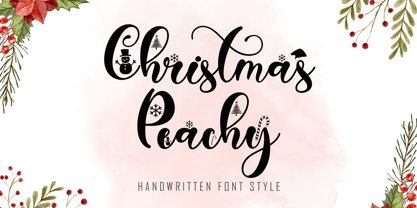 Christmas Peachy is a charming and festive handwritten font adorned with delightful Christmas ornaments. Its elegant strokes and decorative accents bring a touch of holiday magic to your design projects, making it perfect for creating warm and inviting Christmas-themed materials.
 - Holland Gateway by Stringlabs Creative Studio,
$25.00 Holland Gateway is a magical handwritten font carefully created with a touch of elegance. It will elevate a wide range of design projects to the highest level, be it branding, headings, wedding designs, invitations, signatures, logos, labels, and much more!
 - American Bulldog by Letterara,
$12.00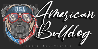 American Bulldog is a magical handwritten font carefully created with a touch of elegance. This enchanting font will turn any creative idea into a true standout. Get creative with its unique look, and use it to brighten up any crafting project.
 - Argentile by Scrowleyfonts,
$14.00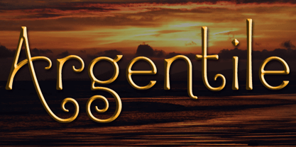 Argentile is a stylish, swirling, magical font with an organic, fairytale feel. Argentile is ideal for any project involving elves, goblins, wizards or suchlike. It includes contextual alternates for characters with swash elements or extravagant ascenders and descenders to avoid overlap.
 - Hvala by Etewut,
$35.00 Hvala is a display typeface based on slab serif. All european languages are included. 'Hvala' means praise. Remember it when you design your graphics using my font. It's a pure magic to express your respects or/and expect them back.
 - Floral Decay by Mircea Boboc,
$22.00 This is Floral Decay, your seasonal autumn font with jaded, weathered, and earthy contours of rustic lettering. As they blend into words, the characters evoke floral arrangements of a decaying beauty. It is versatile, playful, and perfect for Graphic Design decorations! This font is unique because, in order to create it, I had to answer some tricky questions: What makes autumn… autumn? Capturing the essence of the other seasons into your letters comes easier. For instance, in order to suggest summer, you only need to draw a few flowers. How about autumn? You could garnish your letters with a few grapes, you might think, but it would only result in a grape-themed font. The notion that is more directly associated with autumn is the image of falling and withering leaves, which brought me to the second question. How exactly are you going to create something beautiful out of a somewhat morbid premise, like wilted leaves? Well, I soon realized that by creating a handwritten font and preserving the right imperfections, you can actually portray collateral beauty. In this context, asymmetry is important because it suggests decay. Further on, the design concept required the letters to come very close together, so that every typed word can be regarded as a floral arrangement. How close together, though? As much as possible without confusing one with the other, risking a lack of legibility. Therefore, in contrast with the demo version of this font, this actual version provides the ideal kerning.
 - Klainy by Identity Letters,
$29.00 An unadorned Grotesque with a refreshingly personal touch. If “Grotesque” mainly means “industrial, mechanical, anonymous typeface” to you, Klainy might redefine your image of the genre. Yes, it’s a Grotesque—but with a contemporary look and a lot of personality. Klainy’s apertures are more closed at the top and more open at the bottom, creating an informal rhythm that sets Klainy apart: a confident, optimistic voice with a clean appearance. Terminals are subtly back-bent: these quaint “hooks” make Klainy a bit more personal, a bit friendlier. (You can find them in the a, c, f, and r.) Just like its old-style Grotesque ancestors, Klainy is optimized for display sizes and short texts. There, its unobtrusive quirks can be wholly appreciated. However, the familiar Grotesque appearance makes sure that the typeface is comfortable to read in smaller sizes, as well. Use Klainy whenever a basically classic sans-serif typeface with a modern and individual twist is called for. This font family comes in eight weights ranging from Thin to Black, each with a matching italic style. More than 500 glyphs and a bunch of Open Type Features make it a reliable companion for all of your projects. You can fine-tune the flavor of Klainy with Stylistic Alternates such as a one-story a and a two-story g. Their simple construction blends perfectly with the design concept of this typeface. Klainy is a seasoned blue-collar worker that surprises you with wit and team spirit. It’ll be a great addition to your font library.
 - Apricot by Canada Type,
$24.95 A. R. Bosco made Romany for ATF in 1934, when there was much demand for script types in advertising and publishing. It was the high times of Speedball lettering, and a casual script in that fashion was naturally very welcome. It became an instant hit and was used widely for a good part of the 1930s and 1940s. Apricot is not only a revival of Bosco's work, but also a major expansion of it. It contains very effective solutions to the many problems presented by the original metal type, which had to always be tracked too wide because of the forms of some of its letters. Solving these problems was not an easy task. A comprehensive set of alternates was designed to give the user the ability to replace some forms in certain uses, and a large set of two-, three-, and even four-letter ligatures was added to solve the awkwardness of some of the more common letter pairings. The resulting work is quite delightful, especially for those who like to take advantage of OpenType technology. Apricot is the rarest kind of script in digital type these days, the kind that is upright, round, bold, feminine, and distinctly young in appearance. A birthday cake for a teenage girl can certainly benefit from these letters. So can greeting cards, family show posters, diary covers, party invitations, women's shirts, toy packaging, celebration literature, and almost anything that needs that special touch of shiny happy youth. Apricot is available in all common font formats. The Postscript and True Type versions come in 4 fonts, which include one for alternates and two for ligatures alongside the main font. The OpenType version is one font that contains more than 380 glyphs and all the necessary programming for the palettes of OpenType-supporting applications. If you liked Canada Type's hugely popular font Dominique, you will love Apricot.
 - Smart Casual by Scholtz Fonts,
$21.00 The name "Smart Casual" says it all. This is the font to use when you want to create that smart impression without being too formal. It is based on the font "Black Tie" but it is less formal than "Black Tie". It conveys an impression of relaxed elegance without being either sloppy or too intimate. Smart Casual is ideal for invitations to stylish but relaxed events, for advertisements that are intended to create that special ambience, for posters and for announcements. Smart Casual has a full character set and has been carefully letter-spaced and kerned. It comes in two styles: Baseline and Staggered. In "Baseline" all characters refer to the same baseline (the lower part of the characters are in line), while in "Staggered" the capitals are placed lower than the lower case characters, creating a slightly more dramatic, yet formal and retro look.
 - Only You Pro by LeType,
$49.90 Only You is handmade, and specially romantic. It was made to brighten your projects, turning everything more beautiful. The special encounter between uppercase letters and lowercase letters is perfect. Only You is unicase, with 888 glyphs, and what’s better: it has one special alternative for all letters as uppercase, and that creates an infinity of combinations. Only You is brilliant, gorgeous, and multilingual - it also includes the Cyrillic version! It has more than 200 ligatures, several alternates and swashes. You can also obtain an unlimited number of possibilities in your layout - there are several possibilities for starting and finishing a word. Do you want some more? You should take a look at Only You Icons with more than 300 options between icons, ribbons and frames that will make your project very attractive and romantic. The font doesn't have PDF and works better in softwares that support the complete OpenType function.
 - Draghord by Alit Design,
$19.00 Introducing Draghord, a bold and dynamic typeface that embodies the essence of superheroic power and adventure. This font is a visual journey into the realm of fire, swords, skulls, and wings, capturing the spirit of mighty heroes and formidable villains alike. Characteristics: Flaming Elements: Each letter of Draghord is adorned with fiery accents, reminiscent of a blazing inferno. The flames dance around the characters, conveying a sense of untamed power and intensity. Sword-Inspired Strokes: The letterforms draw inspiration from the sleek and sharp edges of legendary swords. The angular and precise strokes give the font a cutting-edge aesthetic, symbolizing strength and precision. Skull Motifs: Intricately integrated skull motifs within the font add an element of danger and mystery. The skulls serve as a visual reminder of the challenges faced by our superheroic characters, embodying both mortality and defiance. Dynamic Winged Elements: The font incorporates dynamic winged elements that soar across certain letters, emphasizing the theme of flight and freedom. These wings symbolize the superhero's ability to rise above adversity and transcend limitations. Usage Scenarios: Comic Books: Draghord is perfect for comic book titles, captions, and speech bubbles, adding a dramatic and visually striking element to the narrative. Movie Posters: Use Draghord to create attention-grabbing titles and taglines for superhero movies. Its bold and adventurous design will set the tone for epic storytelling. Gaming Graphics: Ideal for in-game text, Draghord adds a heroic touch to video game interfaces, especially in fantasy or superhero-themed games. Event Promotion: For superhero-themed events, Draghord can be utilized in promotional materials, posters, and banners to convey a sense of excitement and power. In Conclusion: Draghord is not just a font; it's a visual experience that transports you into the heart of superheroic tales. With its fiery, sword-inspired design, skull motifs, and dynamic wings, Draghord is the perfect typographic companion for any project seeking to channel the thrilling energy of the superhero genre. Unleash the power of Draghord and let your words ignite the imagination!
 - Campeno by Craft Supply Co,
$20.00 Geometric Precision Let’s step into the world of Campeno, a Geometric Sans Serif font that embodies precision and order. This font is the epitome of geometric perfection, making it an ideal choice for various editorial applications. Editorial Excellence Campeno’s geometric form is what sets it apart and makes it a top choice for editorial needs. Whether you’re working on magazines, long-form text, or other editorial projects, its geometric precision enhances readability and offers editorial excellence. Versatile Typography What makes Campeno even more exceptional is its versatility. It seamlessly adapts to diverse design contexts, ensuring that it can be used for a wide range of projects, from magazines to websites and beyond. Engaging Readability Beyond its geometric aesthetics, Campeno excels in providing engaging readability. It guides the reader through the content, focusing on the message while maintaining a visually appealing design. In Conclusion In summary, Campeno – Geometric Sans Serif is the font that brings precision and clarity to your editorial projects. Its geometric form ensures that your content is not only engaging but also visually appealing, catering to a broad readership while maintaining a high standard of clarity. Whether you’re working on magazines, websites, or other editorial endeavors, Campeno stands out as a font that combines aesthetics with functionality, offering editorial excellence for your projects.
 - LOLO Animals by Okaycat,
$24.50Ready for the wild & wooly world of LOLO Animals? These animals are happy to explore new habitats with you. There are more than 50 different animals residing in here, its a full out ecosystem. Looking for specific animals? Check out the keyword list above, for an idea of what kind of animals are included, or see the full character map to meet them up close & personal. Each vector illustration was developed by Luke Turvey, a professional artist, who's nature-themed art has appeared in exhibitions in Montreal, Tokyo, & N.Y.C. LOLO Animals are a great help, whenever you need some cool looking animals. LOLO Animals is a fully extended character set, with animals stampeding all over the alternate spots that are typically reserved for the West European diacritics & ligatures. You never know what you might find stomping around in there. - Stickwithu by Redy Studio,
$19.00 the name Stickwithu was inspired by the title song Stickwitu sung by The Pussycat Dolls which was very popular in the early 2000s. Stickwithu has been designed to make any project look like it was handwritten by hand. a simple yet modern handwritten typeface that’s perfect for adding personality to your typographic design. With its intersecting lines and decorative shapes, Stickwithu gives you the perfect look for use in logos, branding, wedding invitations and stationery, social media posts, and even handwritten quotes. That’s what we’ve done with Stickwithu and want to share with you. We hope you find something unique that will add personality and character to your designs. Feel free to give me a message if you have a problem or question. Thank you so much for taking the time to look at one of our products. ~Redy
 - Franklin Gothic Raw by Wiescher Design,
$19.50 When drawing a new font, there is a time when the final form is found – almost – but the curves are not slick and clean yet, that's what I call the "raw" form. Raw – no sweeteners added! In this family I tried to redefine this moment in type development for the eternally beautiful "Franklin Gothic". I call the design "Franklin Gothic Raw", not to be confounded with "rough". The family can be used like any good normal typeface, you hardly see any difference to a conventionally cut "Franklin Gothic" in small sizes. The charm of the design becomes obvious the bigger it becomes, then it enhances your design with its imperfections in the outline. "Franklin Gothic Raw" is therefore an extremely versatile family. I created the cuts, that I considered necessary for the seasoned designer who knows what he's doing. Enjoy!