10,000 search results
(0.026 seconds)
- Marker Aid by PintassilgoPrints,
$24.00 This expressive face was drawn with a dry chisel felt-tip marker, resulting in two striking, detail-rich fonts. Beyond its remarkable face, Marker Aid is a generous one, packed with 4 alternates for each letter, 2 for each number and yet some handy ornaments for creating a convincing - and rather cool - organic look. It is also equipped with OpenType features to instantly cycle the alternate glyphs and access stylistic alternates and ornaments. Marker Aid is available in two cuts, upright and oblique, for added flexibility. Make your mark! * Please note that these fonts have complex outlines and quite a load of glyphs, which may slow down some applications.
 - Lubeck by FoxType,
$15.00 Introducing Lubeck Display, new generation Typeface with 3 Weights. Lubeck Typeface created with the vision of to attract the audience to your brand . The finest details of this typeface are methodically and mathematically created. Lubeck is created with all the tasks of a corporate font and also for the usage in a variety of projects, including branding, logos, titles, headlines, servers, screens, display, digital ads, and everything else. We are putting a lot of effort on this font as a long-term project. The Typeface includes Three Weights. Light, Regular and Medium Features: Numerals, extended punctuation & Basic Symbols(200+ Glyphs). Expert kerning and quality crafting. Uppercase Letters & Lowercase Letters.
 - Norwich Aldine ML by HiH,
$12.00 Norwich Aldine ML is a all-cap typeface with enlarged serifs, designed and produced in wood by William Hamilton Page of Norwich, Connecticut in 1872. Norwich Aldine ML is a fine example of the strength of decorative wood types: large, simple type forms that provide the visual boldness sought by advertisers of the Victorian period. While our marketing has gotten so very sophisticated, there is always a place for a simple, visually strong typeface. Although about 14 miles inland, Norwich, Connecticut lies at the head of the Thames River. The river is both wide and deep, and therefore was not bridged in the early 20th century. Until then, if you wanted to get from Groton on the west bank to the whaling port of New London on the east bank by land, you had to go by way of Norwich. Because of its size, the Thames is navigable all the way from Norwich to New London. Docks were built in Norwich around 1685 and the city became Connecticut’s 2nd largest port by 1800. With the construction of the Norwich & Worcester Railroad in 1835, Page could easily ship his wood type north by rail or south by coastal schooner. Included with our font, Norwich Aldine ML, are two 19th century printer’s ornaments of sailing ships similar to those that sailed up the Thames to Norwich. Reference: Moon’s Handbooks, Connecticut 2nd Edition (Emeryville CA 2004) The family has expanded from one to four fonts: 1. Norwich Aldine ML: the concept font, computer-sharp corners and smooth curves, as we imagine it was designed. 336 Glyphs including some reduced-width alternatives for better letter spacing. 2. Norwich Aldine Worn ML: the way actual wooden type would look after have been used for a while. 332 Glyphs 3. Norwich Aldine Distressed ML: the way the wooden type would look after it had really been used, perhaps abused. Alternatives to the more popular letters reflect the damage that typically occurs on a well-wormn font, with nicks, cuts and scratches and the overall wear that reduces the overall height and leads to uneven inking due to varying heights in the chase. A couple of bullets look like bullet holes. 345 glyphs. 4. Norwich Aldine Cyrillic: Cyrillic includes alll English and Cyrillic letters for MS Windows Code Page 1251, ISO 8859-5 and MacOS Cyrillic. 235 glyphs. We did Cyrillic because is was fun and we felt the basic design cried out for Cyrillic. While obviously subjective, we hope you will agree.
 - Transcend by Monotype,
$31.99 Transcend has been designed specifically for titling and branding purposes. This 8-font, all caps typeface is packed with OpenType features including discretionary ligatures and alternates that – when used subtly – help you to create distinctive headline typography. Transcend aims to be “The Ultimate Titling Typeface”. This typeface is an exploration of my own “Carrig” from 2014. I have evolved its core personality and embellished it by means of crisp, sharp lines and serifs, adding stylised ink traps/notches, as well as carefully considered swashes, flourishes, and ligatures that add a touch of class and refinement to every word you type. Key features: • 8 weights – Thin to Ultra • Alternates, Discretionary Ligatures, and Old Style Figures • European Character Set – Latin Only • 600+ glyphs per font.
 - 1864 GLC Monogram by GLC,
$20.00 This family of two character monograms and initial letters was inspired from a French portfolio containing about two hundred examples of "Chiffres - deux lettres", destinated to engravers and jewelers, published in Paris in 1864, drawn by French engraver, C. Demengeot. Unfortunately, a large part of the pages were lost, so we have had to redraw about two thirds of the complete monogram family. Each package contains numerals and two complete sets of two-letter monograms, for example the A-B set, containing AA AB AC... corresponding to caps keys alphabet and BA, BB, BC... corresponding to lower case keys alphabet. We have added an Initial set, with two choices of single characters. Warning: I and J have strictly identical monograms.
 - Xants by Adobe,
$29.00In 1932, Xanti Schawinsky (1904?1979) designed an alphabet that combines two styles: a neo-classic stroke contrast paired with characteristics of stencil lettering. This mix is a child of its time and seems to reflect the Swiss and Italian biography of Schawinski. Luca Pellegrini took on the modern look and re-drew the letterforms, interrupted by subtle spaces where thick and thin strokes meet. Although Schawinsky had already designed a complete alphabet and figures in the early 1930s, Pellegrini took the character set to another level, adding currency signs, mathematical symbols and all kinds of punctuation ? anything needed to set more than just headlines. Xants is a blend of Swiss elegance and exclusiveness with Italian charm and imperfection, a combination that never gets old. - Gambit Nouveau SG by Spiece Graphics,
$39.00 Sinuous but sturdy; ornate but legible - Gambit Nouveau is modern-day design created in the spirit of Art Nouveau. This delicate and natural typeface features tapered spurs, compact swashes, and spiral curling. You will find it ideally suited for announcements and invitations as well as decorative headlines. And for your convenience, Gambit Nouveau comes equipped with corner and free-standing ornaments plus a wide range of alternate characters. Gambit Nouveau is also available in the OpenType Std format. Some new features including initial forms and old style figures have been added to this OpenType version. Advanced features currently work in Adobe Creative Suite InDesign, Creative Suite Illustrator, and Quark XPress 7. Check for OpenType advanced feature support in other applications as it gradually becomes available with upgrades.
 - Crimson Foam by Typetemp Studio,
$15.00 Crimson Foam // Chic Stylish. is a beautiful chic script that is suitable for branding, weddings, social media, product design, stationery, advertising other romantic projects. anything. Features : Basic Latin A-Z and a-z Alternate Numbers Symbols Ligature Kerning We have also added 30 style character binders (letter combinations) that have been built (see preview above) to make this font very beautiful. To enable the OpenType Stylistic alternates, you need a program that supports OpenType features such as Adobe Illustrator CS, Adobe Indesign & CorelDraw X6-X7. There are additional ways to access alternates/swashes, using Character Map (Windows), Nexus Font (Windows), Font Book (Mac) or a software program such as PopChar (for Windows and Mac). Thanks and have a wonderful day,
 - Hombre by Monotype,
$50.99 Hombre™ is a sure-fire attention-getter for projects requiring a straight out of the old west flavor. Authentic, weather-beaten, time-ravaged, and a bit haphazard, it’s also a sure-fire attention-getter. Drawn by Thomas Oldfield and loosely based on popular typefaces of the 19th century, Hombre offers all the gun-slinging swagger and rugged style of Jesse James and his crew of outlaws. But don’t typecast this design. The Hombre typefaces are equally at home in ads, banners, headlines and subheads – in both hard copy and digital environments. Add to this, a large character set supporting most Western European and many Eastern European languages, including Cyrillic and Greek, and you can bring a rustic and timeworn look to a passel of applications.
 - Comp Sans 226 by Type Associates,
$24.95 Once upon a time, in the days BC (that's Before Computers) there lived a very talented group of men and women whose job it was to render ads by hand. So skillful were these people that some say it was possible to actually identify the typefaces that the layout artists were emulating. Their renderings were swift and slick, no time for detail as it was necessary to do a whole bunch of variations, usually within ridiculous deadlines. Their only tools: bullet-tip markers and bond paper - often mistakes resulted but no time to re-do and white paint was totally unacceptable - just let the slipups be. Here's a simulation of their craft, we don't really know what typeface this was supposed to represent… any ideas?
 - Circle Two Letter by Fauzistudio,
$12.00 Cilcle TwoLetter Monogram Logo Font Family with OpenType magic that can adjust to front and back letters, there are 10 frame variations that you can access at numbers 0-9 how to activate it simply by adding a number in front of your initials, typing something (0AB - 9AB) it will automatically compose . you can use it on any Logo project it is perfect to add to your collection. Cilcle TwoLetter font FAMILY – includes 9 weights (Thin, Extra light, Light, Regular, Medium, Semi Bold, Bold, Extra Bold, Black) : Cilcle TwoLetter Thin Cilcle TwoLetter Extralight Cilcle TwoLetter Light Cilcle TwoLetter Regular Cilcle TwoLetter Medium Cilcle TwoLetter Semibold Cilcle TwoLetter Bold Cilcle TwoLetter Extra Bold Cilcle TwoLetter Black Hope you enjoy. Intuisi Creative
 - Pentagram Two Letter by Fauzistudio,
$9.00 Pentagram TwoLetter Monogram Logo Font Family with OpenType magic that can adjust to front and back letters, there are 10 frame variations that you can access at numbers 0-9 how to activate it simply by adding a number in front of your initials, typing something (0AB - 9AB) it will automatically compose . you can use it on any Logo project it is perfect to add to your collection. Pentagram TwoLetter font FAMILY – includes 9 weights (Thin, Extra light, Light, Regular, Medium, Semi Bold, Bold, Extra Bold, Black) : Pentagram TwoLetter Thin Pentagram TwoLetter Extralight Pentagram TwoLetter Light Pentagram TwoLetter Regular Pentagram TwoLetter Medium Pentagram TwoLetter Semibold Pentagram TwoLetter Bold Pentagram TwoLetter Extra Bold Pentagram TwoLetter Black Hope you enjoy. Intuisi Creative
 - Ghimli Sans by Anonymous Typedesigners,
$40.00 Ghimli Sans was created using the ping-pong method, based on the graphic idea of Artem Rulev and the participation of Vladimir Anosov after. Then we sent the font file to each other, adding something of our own and making corrections, and so on many times. Ghimli Sans has already managed to get 2nd place in the Granshan competition in the Cyrillic section. The name was obtained by combining the name of the dwarf Gimli and Studio Ghibli. The font is quite friendly, dense, kind, as if a dwarf is walking around the lawn with a mug of intoxicated ale on a pleasant sunny day. Suitable for short word design, logo creation, menu layout and use in movies about gnomes and anything fantastic.
 - Melrin by Craft Supply Co,
$20.00 Melrin – Display Typeface: A Floral Serif Wonder Introduction to Melrin Introducing Melrin Floral Serif Typeface, a display typeface that blends artistic flair with functionality. Its unique design features serifs that bloom like flowers. Ideal for retro designs, Melrin captures the essence of nostalgia in each character. Design and Aesthetics Melrin stands out with its floral serif accents, reminiscent of blooming flowers. This aesthetic makes it perfect for projects needing a touch of vintage elegance. Its bold structure embodies strength, while the delicate serifs add a soft, artistic touch. Versatility and Usage Beyond retro designs, Melrin excels in various applications. It’s a top choice for circus-themed graphics, posters, and branding materials. Its versatility extends to digital platforms, enriching websites and online ads with its unique charm.
 - Comic FX - Unknown license

- Double Line Deco JNL by Jeff Levine,
$29.00 Take a classic hand lettered Art Deco alphabet, add in a treatment of dual straight vertical lines and the resulting typeface is Double Line Deco JNL.
 - Letterpress Sorts JNL by Jeff Levine,
$29.00 Letterpress Sorts JNL adds to the growing library at Jeff Levine Fonts of classic dingbats, embellishments, cartoons, ornaments, etc. all re-drawn from vintage source material.
 - Sweet and Fresh by Gleb Guralnyk,
$12.00 This smooth, modern typeface named "Sweet & Fresh" has a trendy look with nice rounded shapes and multi-lingual support. Thank you and have a nice day!
 - Presidential Dingbats by Loaded Fonts,
$15.00The presidents busts in a typeable format. Use a Glyph palette or Character Map for quick navigation. Who knows, one day it may come in handy. - Neographik by Monotype,
$29.99Neographic is one of the first fototype fonts that had been designed by Robert Barbour and produced from the Monotype UK office for the Photolettering machine - Chalk Board by Stringlabs Creative Studio,
$29.00 Chalk Board is a handmade textured brush font, inspired by the chalk. This unique script will add a serious and sincere feel to any design idea!
 - Rayhue by Stringlabs Creative Studio,
$25.00 Rayhue feels playfully nostalgic and delivers an incredible vintage aesthetic. Use it to add that special retro touch to any design idea you can think of!
 - Algaida by Hikhcreative,
$19.00 Algaida is a beautiful modern script font with beginning and ending swashes, All characters that add more beautiful and aesthetic fonts to perfect your extraordinary project.
 - URAL by Fenotype,
$19.00 On a clear day you can see all the way to URAL from a high place in Helsinki. There your eyes will meet strange permafrost letters.
 - Silverado by Red Rooster Collection,
$45.00 Based on a font design by Les Usherwood called Eldorado, we had to change the name because Linotype has a dissimilar typeface of the same name!
 - TXT Annesia by Illustration Ink,
$3.00Add a touch of flair with this one-of-a-kind TrueType font. It gives a handwritten appeal to scrapbook journaling, greeting cards, and creative publications. - SPIDER GHOST by Letterafandi Studio,
$14.00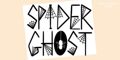 Spider Ghost is a Halloween decorative font. Add it to your Halloween crafts, horror movie posters, t-shirts and anything else that requires a spectacular look.
 - Boogaloo Avenue NF by Nick's Fonts,
$10.00A new take on the perennial Art Deco favorite, Broadway, interpreted by 1930s lettering artist Harold Holland Day, and named after a 1960s R&B song. - Monogramma by Wiescher Design,
$10.40 Monogramma is a set of 676 beautiful and unique Monograms plus some doubles. There is one monogram for each possible letter-combination! For easy use I packed the monograms in 13 packets. One for two starting letter each. So if for example you look for the monogram "GW", you must choose the packet "Monogramma-GH" -- the G-combinations under the uppercase letters. You now have to type a capital "W" and Bingo you have the combination GW! Some letter-combinations have doubles, just check the numbers 0 to 9 if there is anything to be found. If you buy the whole set of monograms you get the basic font free of charge! Your long-distance (this was a lot of work) font-designer Gert Wiescher
 - Ohanlon by Fontdation,
$18.00 Introducing our new release: Ohanlon. Ohanlon is a bold display sans with a subtle hint of reverse-contrast personality which will gives dramatic feel to your design. Packed with lots of stylistic alternate characters to let you play with various letter combinations. Go wild and experimental by combining the sans with the block or script-ish alternate letters to elevate your design game, or you can even go formal with the standard letters. Oh and also, the slanted/faux-italic version is available too. Suits best for logotype/branding, packaging design, and many other designs that need a direct punch to the face. Ohanlon is a versatile font, whether you'll go vintage or modern, this font will got your needs properly covered.
 - Naive by S&C Type,
$8.00 Naïve is a serif handwritten font designed by Fanny Coulez and Julien Saurin in Paris. Our goal was to draw a font with finely irregular lines that give a human and whimsical feeling. The three weights of this subtle Parisian hand-drawn font can be enhanced with two alternates fancy glyphs for each letter, the “Fantaisies”, to improve your designs and bring a more poetic and unusual feeling. We hope you will enjoy our work :) You could follow us on our Instagram: instagram.com/sc.type Merci beaucoup! Note: This font is part of our Naïve superfamily that contains lot of variations: Line, Inline, Serif, Sans Serif, and a special Art Deco one. Just click on our foundry name to see them all!
 - Agilo Handwriting Pro by SoftMaker,
$15.99 Digitized handwriting fonts are a perfect way to give documents the “very special touch”. Invitations look simply better when handwritten than when printed in bland Arial or Times New Roman. Short handwritten notes look authentic and appealing. There are numerous occasions where handwritten text makes a better impression. Agilo Handwriting Pro is an upright, medium weight handwriting font with a simplified, slightly sloped print (non-connecting) style that mimics true handwriting closely. Use Agilo Handwriting Pro to create stunningly beautiful designs easily. This typeface comes with many pre-made ligatures and alternative characters for sophisticated typography – all easily accessible as OpenType features. A “random” feature even allows for automated random switching between variations of the same character, resulting in type that looks authentically handwritten.
 - MartiniThai Neue Slab V2 by Deltatype,
$39.00 Award winning 2017 font from Demark (Thailand) and G-Mark (Japan) in Graphic Design, MartiniThai Neue Slab is now available with better taste. Deltatype created a better version of MartiniThai Neue Slab V2: refined for better outline, we fine-tuned all outlines for better letterforms. Proportion were adjusted for better consistent. Metrics got new values for increased readability. Kerning, fine-tuned kerning pair for better spacing between the letters. MartiniThai Neue Slab V2 comes in six weights: Thin, Light, Regular, Bold, Extra Bold, Black. Thai Language is included in this package. MartiniThai Neue Slab is a unique slab serif in Thai Script that creates a sense of timeless and contemporary feel and is used by a media provider and nationwide in Thailand.
 - Mencken Std by Typofonderie,
$59.00 An American Scotch remixed in 27 fonts Mencken has twenty seven styles, divided into three widths, three optical sizes, romans and italics. Generally, optical size typeface families belong to a same common construction. It falls into the same category of type classification, while presenting different x-heights or contrasts. Mencken is unique because it is designed according to different axis and optical sizes. Firstly, Mencken Text is a low-contrast transitional typeface, designed on an oblique axis, asserting horizontal with featuring open counters. Its capitals follow Didots to better harmonize the rest of the family. On the other side of the spectrum, Mencken Head (and narrow variations) is designed on a vertical axis, high contrast, in a contemporary Didot style. The Mencken is therefore a typeface answering to different sorts of uses, whose design is different according to its uses: from oblique axis in small size to vertical axis in large sizes. Vertical proportions (x-height, capitals height, etc.) were calibrated to be compatible with many Typofonderie typeface families. Lucie Lacava and I followed the idea launched by Matthew Carter few years ago for some of his typefaces intended for publications. From Baltimore Sun’s project to Typofonderie’s Mencken It is a bespoke typeface for American newspaper The Baltimore Sun started at the end of 2004 which marks the beginning of this project. The story started with a simple email exchange with Lucie Lacava then in charge of redesigning the American East Coast newspaper. As usual, she was looking for new typeface options in order to distinguish the redesign that she had started. At the time of its implementation, a survey of the newspaper’s readers has revealed that its previous typeface, drawn in the mid-1990s, was unsatisfactory. The Mencken was well received, some reader responses was particularly enjoyable: “It’s easier to read with the new type even though the type is designed by a French.” Why it is called Mencken? The name Mencken is a tribute to H. L. Mencken’s journalistic contributions to The Sun. According to the London Daily Mail, Mencken ventured beyond the typewriter into the world of typography. Because he felt Americans did not recognize irony when they read it, he proposed the creation of a special typeface to be called Ironics, with the text slanting in the opposite direction from italic types, to indicate the author’s humour. Affirming his irreverence, the Mencken typeface does not offer these typographic gadgets. Henry Louis Mencken (1880 — 1956) was an American journalist, satirist, cultural critic and scholar of American English. Known as the “Sage of Baltimore”, he is regarded as one of the most influential American writers and prose stylists of the first half of the twentieth century. He commented widely on the social scene, literature, music, prominent politicians and contemporary movements. Creative Review Type Annual 2006 Tokyo TDC 2018
 - Leather by Canada Type,
$24.95 Over the past few years, every designer has seen the surprising outbreak of blackletter types in marketing campaigns for major sports clothing manufacturers, a few phone companies, soft drink makers, and more recently on entertainment and music products. In such campaigns, blackletter type combined with photos of usual daily activity simply adds a level of strength and mystique to things we see and do on a regular basis. But we couldn't help noticing that the typography was very odd in such campaigns, where the type overpowers all the other design elements. This is because almost all blackletter fonts ever made express too much strength and time-stamp themselves in a definite manner, thereby eliminating themselves as possible type choices for a variety of common contemporary design approaches, such as minimal, geometric, modular, etc. So extending the idea of using blackletter in modern design was a bit of a wild goose chase for us. But we finally found the face that completes the equation no other blackletter could fit into: Leather is a digitization and major expansion of Imre Reiner's forgotten but excellent 1933 Gotika design, which was very much ahead of its time. In its own time this design saw very little use because it caused problems to printers, where the thin serifs and inner bars were too fragile and broke off too easily when used in metal. But now, more than seventy years later, it seems like it was made for current technologies, and it is nothing short of being the perfect candidate for using blackletter in grid-based settings. Leather has three features usually not found in other blackletter fonts: - Grid-based geometric strokes and curves: In the early 1930s, blackletter design had already begun interacting back with the modern sans serif it birthed at the turn of the century. This design is one of the very few manifestations of such interaction. - Fragile, Boboni-like serifs, sprout from mostly expected places in the minuscules, but are sprinkled very aesthetically on some of the majuscules. The overall result is magnificently modern. - The usual complexity of blackletter uppercase's inner bars is rendered simple, geometric and very visually appealing. The contrast between the inner bars and thick outer strokes creates a surprising circuitry-like effect on some of the letters (D, O, Q), wonderfully plays with the idea of fragile balances on some others (M, N and P), and boldly introduces new concepts on others (B, F, K, L, R). Our research seems to suggest that the original numerals used with this design in the 1930s were adopted from a previous Imre Reiner typeface. They didn't really fit with the idea of this font, so we created brand new numerals for Leather. We also expanded the character set to cover all Western Latin-based languages, and scattered plenty of alternates and ligatures throughout the map. The name, Leather, was derived from a humorous attempt at naming a font. Initially we wanted to call it Black Leather (blackletter...blackleather), but the closer we came to finishing it, the more respect we developed for its attempt to introduce a plausible convergence between two entirely different type categories. Sadly for the art, this idea of convergence didn't go much further back then, due to technological limitations and the eventual war a few years later. We're hoping this revival would encourage people to look at blackletter under a new light in these modern times of multiple design influences.
 - Clawmark by Putracetol,
$24.00 Clawmark - Strong Brush Font.The modern and powerful hand painted font you've been looking for. Each character is carefully crafted until the result is perfect. A lot of detail is preserved when characters are digitized, so uppercase looks fantastic up close Clawmark combines attractive curves with a fresh urban edge; delivering a stylish script which is guaranteed to add an eye-catching appeal to your story books, illustrations, comic books, t-shirts, posters, greeting cards, logos, branding, stickers, svg, crafting and all for display purposes. The alternative characters were divided into several Open Type features such as Swash, Stylistic Sets, Stylistic Alternates, Contextual Alternates, and Ligature. The Open Type features can be accessed by using Open Type savvy programs such as Adobe Illustrator, Adobe InDesign, Adobe Photoshop Corel Draw X version, And Microsoft Word. This font is also support multi language.
 - Billiboldy by Gie Studio,
$10.00 Are you planning to do an amazing piece of work to make lots of people smile happily while taking your hat off every time? If so, this is the right time to give your work a little touch with a sincere and elegant writing. Introducing Billiboldy- A New Bold Script Font Billiboldy is a cursive and thick lettered handwritten bold script font, crafted to give your headlines and logotype projects a stylish touch. This font reads as strong, dynamic and can add tons of nostalgic character to your designs. This font includes Multilingual Options to make your branding globally acceptable. Features: - Ligatures - Stylistic Sets - Multilingual Support - PUA Encoded - Numerals and Punctuation - Special underscore character 7 style - Special doodles for front and back of letters or sentences Thank you for your visit and downloading premium fonts from Gie Studio
 - Grandiose by Ahmad Jamaludin,
$13.00 Say hello to New Stylish Script, Grandiose! This font combines stylish letter shapes with contemporary twist. It's the perfect fit for all luxury projects, such as elegant logos, printed quotes, lovely wedding invitation cards, social media headers, product packaging and a lot more! It includes full set of elegant uppercase and lowercase letters, multilingual symbols, numerals, punctuation. The font has smooth wet ink texture, so would be perfect for all types of printing techniques+you can do embroidery, laser cut, gold foil etc. What's Included? - Grandiose OTF - More than 100 of glyphs - Ligatures - Works on PC & Mac - Simple Installations - Accessible in the Adobe Illustrator, Adobe Photoshop, Adobe InDesign, even work on Microsoft Word. - PUA Encoded Characters - Fully accessible without additional design software. - Multilingual Support Let me know if you have any other questions. Thanks and have a wonderful day, dharmas
 - Networkand Family by yasireknc,
$14.00 Description This is Networkand Family. World's best graffiti and non-graffiti marker-styled font ever. Networkand marker font family, carefully selected from hundreds of letters. Signature-styled Networkand Script perfectly fits next to the Networkand Font. Besides all this, the Networkand Swashes Font is designed to customize your designs to another level. You can read Medium article here. FEATURES: Original: Networkand Fonts and swashes created for your special designs. You can turn your dreams into reality and customize them. Unique Creation: An unprecedented experience a creation that no one has ever had before and will uncover your awareness. Create your Brand: Unlike a standard font to create a new brand concept. Be different. Be different in life. Your own. Create your own mark: That’s the most special part of this font. A brand new identity for your personal signatures.
 - Pomidorko_2.0 by Chikhiro,
$15.00 Introducing Pomidorko 2.0, the highly anticipated sequel to the beloved font Pomidorko that has captured the hearts of countless users. This enhanced version has now evolved into a commercial release, offering even more versatility and charm. Designed with a delightful and effortless aesthetic, Pomidorko 2.0 is a perfect choice for children's products, culinary ventures, and book illustrations. Its playful and endearing character adds a touch of whimsy to any design. With both Cyrillic and Latin variations included, this font ensures seamless communication across diverse languages and markets. Multilingual support is included for Western European languages. Don’t forget to test your characters in the font previewer below before purchasing. The Pomidorko 2.0 font also includes Open-type features to make it even more versatile. Unlock the enchanting possibilities of Pomidorko 2.0 and infuse your projects with a dash of sweetness and joy.
