10,000 search results
(0.081 seconds)
- Nixed by Gatype,
$14.00 Nixed is a cool and daring display font. Add it to your posters, headlines, banners, or anything that requires strong and modern typography.
 - Retrology by Letterhend,
$15.00 So classic, so retro... it's Retrology! Introducing, Retrology. This monoline typeface will bring you to the good ol' days with its classic touch!
 - Happy-Go-Lucky by Jelloween,
$-The purpose of Happy-Go-Lucky is to bring joy to the world. These cheerful little dingbats will brighten your day right up! - Concave Extended by Solotype,
$19.95Many foundries had versions of Concave ‹ wide, narrow, extra condensed, some with lowercase, some without. A good general utility style for Victorian typography. - HU Makingfilm by Heummdesign,
$15.00 HU Makingfilm gives a solid feeling of a full module, and it is a font that adds softness by rolling the angled part.
 - LD Eleanor Rae by Illustration Ink,
$3.00Use elegant LD Eleanor Rae to add formal or shabby chic accents to your scrapbook layouts, handmade greeting cards and other creative projects. - Gathenbury by Viswell,
$14.00 Gathenbury is a playful and fancy script font with a serious vibe. Use it to add an authentic charm to any design project!
 - Anything Okay by Aldedesign,
$13.00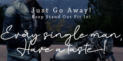 Anything Okay is a simple, yet classy signature typeface. It includes beautiful swashes, that will add an organic feel to any design project.
 - Laudiea by Nissa Nana,
$19.00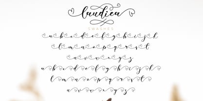 Laudiea is a beautiful script font with a classy, elegant, and modern look. It will add a handwritten touch to any design project!
 - Zamaica by WNGSTD,
$5.00 Zamaica is a thin and modern display font. Add it to your most creative ideas and notice how it makes them come alive!
 - Mango Gothic by BA Graphics,
$45.00A new high contrast gothic; works great for many different applications. This font will add a nice elegant touch to all your designs. - Basilica by Monotype,
$29.99Basilica is a calligraphic typeface that will add style and grace to short copy. Use the Basilica font for poetry, menus and stationery. - Azote by Thomas Jockin,
$30.00 One line, two lines, three lines. Inspired by the 1968 Mexican Olympics, Azote is a multiline typeface family that adds lines for weight.
 - Yankee Ghosts BB by Blambot,
$20.00Designed as the main header text for the online, interactive, horror novel, DEAD ENDS. Based on historical documents of colonial-era New England. - Cicero Series by Alphabet Agency,
$15.00 Cicero Series is a bold decorative serif display font that exudes power, strength, magnificence, prestige. Add this grandiose piece to your font collection.
 - Lambola by ARToni,
$12.00 Lambola is a casual and smooth handwritten font with a playful vibe. Us it to add a personal touch to any design idea!
 - Sagittarius by Hoefler & Co.,
$51.99 A typeface with lightly-worn futurism, Sagittarius is equally at home among the beauty and wellness aisles, or the coils of the warp core. The Sagittarius typeface was designed by Jonathan Hoefler in 2021. A decorative adaptation of Hoefler’s Peristyle typeface (2017), Sagittarius’s rounded corners and streamlined shapes recall the digital aesthetic of the first alphabets designed for machine reading, a style that survives as a cheeky Space Age invocation of futurism. Sagittarius was created for The Historical Dictionary of Science Fiction, where it first appeared in 2021. From the desk of the designer: Typeface designers spend a lot of time chasing down strange valences. We try to figure out what’s producing that whiff of Art Deco, or that vaguely militaristic air, or what’s making a once solemn typeface suddenly feel tongue-in-cheek. If we can identify the source of these qualities, we can cultivate them, and change the direction of the design; more often, we just extinguish them without mercy. Sometimes, we get the chance to follow a third path, which is how we arrived at Sagittarius. During the development of Peristyle, our family of compact, high-contrast sans serifs, I often found myself unwittingly humming space-age pop songs. Nothing about Peristyle’s chic and elegant letterforms suggested the deadpan romp of “The Planet Plan” by United Future Organization, let alone “Music To Watch Space Girls By” from the ill-advised (but delicious) Leonard Nimoy Presents Mr. Spock’s Music from Outer Space, but there they were. Something in the fonts was provoking an afterimage of the otherworldly, as if the typeface was sliding in and out of a parallel universe of high-tech spycraft and low-tech brawls with rubber-masked aliens. It might have had something to do with a new eyeglass prescription. But I liked the effect, and started thinking about creating an alternate, space-age version of the typeface, one with a little more funk, and a lot more fun. I wondered if softer edges, a measured dose of seventies retrofuturism, and some proper draftsmanship might produce a typeface not only suitable for sci-fi potboilers, but for more serious projects, too: why not a line of skin care products, a fitness system, a high-end digital camera, or a music festival? I put a pin in the idea, wondering if there’d ever be a project that called for equal parts sobriety and fantasy. And almost immediately, exactly such a project appeared. The Historical Dictionary of Science Fiction Jesse Sheidlower is a lexicographer, a former Editor at Large for the Oxford English Dictionary, and a longtime friend. He’s someone who takes equal pleasure in the words ‘usufructuary’ and ‘megaboss,’ and therefore a welcome collaborator for the typeface designer whose love of the Flemish baroque is matched by a fondness for alphabets made of logs. Jesse was preparing to launch The Historical Dictionary of Science Fiction, a comprehensive online resource dedicated to the terminology of the genre, whose combination of scholarship and joy was a perfect fit for the typeface I imagined. For linguists, there’d be well-researched citations to explain how the hitherto uninvented ‘force field’ and ‘warp speed’ came to enter the lexicon. For science fiction fans, there’d be definitive (and sometimes surprising) histories of the argot of Stars both Trek and Wars. And for everyone, there’d be the pleasure of discovering science fiction’s less enduring contributions, from ‘saucerman’ to ‘braintape,’ each ripe for a comeback. A moderated, crowdsourced project, the dictionary is now online and growing every day. You’ll find it dressed in three font families from H&Co: Whitney ScreenSmart for its text, Decimal for its navigational icons, and Sagittarius for its headlines — with some of the font’s more fantastical alternate characters turned on. The New Typeface Sagittarius is a typeface whose rounded corners and streamlined forms give it a romantically scientific voice. In the interest of versatility, its letterforms make only oblique references to specific technologies, helping the typeface remain open to interpretation. But for projects that need the full-throated voice of science fiction, a few sets of digital accessories are included, which designers can introduce at their own discretion. There are alternate letters with futuristic pedigrees, from the barless A popularized by Danne & Blackburn’s 1975 ‘worm’ logo for NASA, to a disconnected K recalling the 1968 RCA logo by Lippincott & Margulies. A collection of digitally-inspired symbols are included for decorative use, from the evocative MICR symbols of electronic banking, to the obligatory barcodes that forever haunt human–machine interactions. More widely applicable are the font’s arrows and manicules, and the automatic substitutions that resolve thirty-four awkward combinations of letters with streamlined ligatures. About the Name Sagittarius is one of thirteen constellations of the zodiac, and home to some of astronomy’s most inspiring discoveries. In 1977, a powerful radio signal originating in the Sagittarius constellation was considered by many to be the most compelling recorded evidence of extraterrestrial life. Thanks to an astronomer’s enthusiastically penned comment, the 72-second transmission became known as the Wow! signal, and it galvanized support for one of science’s most affecting projects, the Search for Extraterrestrial Intelligence (SETI). More recently, Sagittarius has been identified as the location of a staggering celestial discovery: a supermassive black hole, some 44 million kilometers in diameter, in the Galactic Center of the Milky Way. <
 - RePublic by Suitcase Type Foundry,
$75.00In 1955 the Czech State Department of Culture, which was then in charge of all the publishing houses, organised a competition amongst printing houses and generally all book businesses for the design of a newspaper typeface. The motivation for this contest was obvious: the situation in the printing presses was appalling, with very little quality fonts existing and financial resources being too scarce to permit the purchase of type abroad. The conditions to be met by the typeface were strictly defined, and far more constrained than the ones applied to regular typefaces designed for books. A number of parameters needed to be considered, including the pressure of the printing presses and the quality of the thin newspaper ink that would have smothered any delicate strokes. Rough drafts of type designs for the competition were submitted by Vratislav Hejzl, Stanislav Marso, Frantisek Novak, Frantisek Panek, Jiri Petr, Jindrich Posekany, and the team of Stanislav Duda, Karel Misek and Josef Tyfa. The committee published its comments and corrections of the designs, and asked the designers to draw the final drafts. The winner was unambiguous — the members of the committee unanimously agreed to award Stanislav Marso’s design the first prize. His typeface was cast by Grafotechna (a state-owned enterprise) for setting with line-composing machines and also in larger sizes for hand-setting. Regular, bold, and bold condensed cuts were produced, and the face was named Public. In 2003 we decided to digitise the typeface. Drawings of the regular and italic cuts at the size of approximatively 3,5 cicero (43 pt) were used as templates for scanning. Those originals covered the complete set of caps except for the U, the lowercase, numerals, and sloped ampersand. The bold and condensed bold cuts were found in an original specimen book of the Rude Pravo newspaper printing press. These specimens included a dot, acute, colon, semicolon, hyphens, exclamation and question marks, asterisk, parentheses, square brackets, cross, section sign, and ampersand. After the regular cut was drafted, we began to modify it. All the uppercase letters were fine-tuned, the crossbar of the A was raised, E, F, and H were narrowed, L and R were significantly broadened, and the angle of the leg and arm of the K were adjusted. The vertex of the M now rests on the baseline, making the glyph broader. The apex of the N is narrower, resulting in a more regular glyph. The tail of Q was made more decorative; the uppercase S lost its implied serifs. The lowercase ascenders and descenders were slightly extended. Corrections on the lower case a were more significant, its waist being lowered in order to improve its colour and light. The top of the f was redrawn, the loop of lowercase g now has a squarer character. The diagonals of the lowercase k were harmonised with the uppercase K. The t has a more open and longer terminal, and the tail of the y matches its overall construction. Numerals are generally better proportioned. Italics have been thoroughly redrawn, and in general their slope is lessened by approximatively 2–3 degrees. The italic upper case is more consistent with the regular cut. Unlike the original, the tail of the K is not curved, and the Z is not calligraphic. The italic lower case is even further removed from the original. This concerns specifically the bottom finials of the c and e, the top of the f, the descender of the j, the serif of the k, a heavier ear on the r, a more open t, a broader v and w, a different x, and, again, a non-calligraphic z. Originally the bold cut conformed even more to the superellipse shape than the regular one, since all the glyphs had to be fitted to the same width. We have redrawn the bold cut to provide a better match with the regular. This means its shapes have become generally broader, also noticeably darker. Medium and Semibold weights were also interpolated, with a colour similar to the original bold cut. The condensed variants’ width is 85 percent of the original. The design of the Bold Condensed weights was optimised for the setting of headlines, while the lighter ones are suited for normal condensed settings. All the OpenType fonts include small caps, numerals, fractions, ligatures, and expert glyphs, conforming to the Suitcase Standard set. Over half a century of consistent quality ensures perfect legibility even in adverse printing conditions and on poor quality paper. RePublic is an exquisite newspaper and magazine type, which is equally well suited as a contemporary book face. - Today - Unknown license

- CrEAtOR CamPotype by Campotype,
$15.00 So far the Creator Campotype standard version known in the form of free font (published on several websites by license: free for personal use). The font takes the basic form of modern typography, but some user feedback consider it in the medieval look. Whatever it is, the inspiration of the font was originally set off from the logotype of internal student magazine where the designer had studied in the late 80s. Creator Campotype is a pure display font. This fonts do not have faces lowercase, but all caps. Nevertheless forms of different characters can be accessed by pressing the uppercase and lowercase on the keyboard. Maximum usage can be made by combining them as necessary. Some forms of characters were made more stylistic such as slash and backslash which “out of” the conventional form. In addition, the circle effects on several glyphs were created by default (as found on the free version) so that the glyph was enough to generated with the keyboard access as usual. Information for those who have access to the free version, there are significant changes in this version (2001) as described in the file “creator ct pdf” (gallery)
 - FF Cocon by FontFont,
$65.99 FF Cocon’s designer, Evert Bloemsma (1958—2005) described it as a “serious typeface”. Despite first impressions, the description holds up well. Since its 2001 release, FF Cocon has been used in an astoundingly wide variety of design applications. At large sizes, FF Cocon works as a display face, with beautiful detailing. And at small sizes, it remains surprisingly readable. The lowercase letters a, b, d, g, h, m, n, p, q, r and u, were drawn without spurs, as Bloemsma made an attempt to erase every trace of handwriting; even “normal,” neutral sans serif typefaces still retain elements in their letterforms like this. Bloemsma wanted none of it. Although a difficult starting point for a typeface, this proved successful. Bloemsma’s design is a family of rounded yet rather asymmetrical forms with details reminiscent of brush-strokes, but that were not made with a brush in hand. In spite of its claim to seriousness, FF Cocon is a family of seductive, voluptuous styles. The original FF Cocon had two widths—normal and condensed. Later, a more compact Extra Condensed version was introduced, as well as italics.
 - Galeiya by Craft Supply Co,
$20.00 Introducing Galeiya – Cute Script Font Adorable Playfulness Step into the enchanting world of Galeiya – Cute Script Font, where adorable playfulness takes center stage. This font is the embodiment of girly charm and fun. Joyful Whimsy Galeiya’s joyful whimsy adds a delightful and whimsical touch to your projects, making it the perfect choice for a wide range of creative endeavors. Versatile Delight Beyond its cute appearance, this font is exceptionally versatile. It effortlessly adapts to various design contexts, from invitations to branding, infusing each project with a joyful spirit. Expressive Typography Galeiya is more than just cute; it’s incredibly expressive. Its lovely script style injects character and a sense of fun into your content, ensuring it leaves a memorable impression. In Conclusion In summary, Galeiya – Cute Script Font is the font that seamlessly combines girly charm with a sense of playfulness. Its versatility and expressive nature ensure your content is not only cute but also highly engaging. Whether it’s invitations, branding, or an array of creative projects, Galeiya brings a unique, expressive touch that appeals to a broad audience, leaving behind a lasting and delightful impression.
 - Standing Flower by Din Studio,
$25.00 A must have item for your design, here's the Standing Flower. Standing Flower is a handcrafted script font combined with a refined sans serif font which suit your needs. Together, these complementary fonts portray elegant and modern vibes. The script font has natural feel to it, thanks to the handwritten letters not always connecting-much like when someone is written in cursive for a while and adds their unique spin to it. Besides that, the sans serif brings a flare of modern and sense of elegance. The organic feel of this font duo is enhanced by the amazing features provided. Easy to work with and pleasant to look at what else can you possibly need? Features: Ligatures Stylistic Sets Multilingual Supports PUA Encoded Numerals and Punctuation It works perfectly for for many design projects, such as poster, logo, book cover, branding, heading, printed product, merchandise, quotes, social media campaign, etc. Learn more about how to use it by seeing the font preview. Thank you for purchasing our fonts. Please don’t hesitate to contact us, if you have any further question or issues. We’re happy to help. Happy Designing.
 - Sodra by Harvester Type,
$20.00 Sodra is a wide-accented antiqua with sharp serifs and hints of futuristic forms. This typeface emerged from a passage in the Manifesto del Futurismo by Filippo Tommaso Marinetti. One short word was the inspiration and the guidance for the creation of this font. An attempt to create something unique and distinctive, an attempt to add a bit of futurism to something historical. The special aesthetics and expressiveness the type conveys will make you look closely at each letter and draw attention to your design. The font has been in development for a long time and painstaking work has been done on it. Large language support, about 470 characters and almost 4,000 kerning pairs. Hinting and testing the font itself in business and in a wide variety of applications. The uses of the type are very wide. Whether it's a branding, logo, identity or merch, a headline or product design. The nature of typeface is not limited to something rough and gloomy, on the contrary, it all depends on how you look at it. I've shown you my point of view, you in turn will see yours!
 - Serifora by VP Creative Shop,
$15.00 Serifora is a versatile and elegant typeface that offers serif, sans serif, narrow, and script versions, along with italics. With support for 87 languages, it caters to a wide range of design needs. Its classic serifs, modern sans serif, condensed narrow style, and artistic script variant provide options for various design styles and projects. Serifora's italic versions add emphasis and visual interest. It is a go-to choice for both print and digital media, ensuring clear communication and captivating typography. Language Support : Afrikaans, Albanian, Asu, Basque, Bemba, Bena, Breton, Chiga, Colognian, Cornish, Czech, Danish, Dutch, Embu, English, Estonian, Faroese, Filipino, Finnish, French, Friulian, Galician, Ganda, German, Gusi,i Hungarian, Indonesian, Irish, Italian, Jola-Fonyi, Kabuverdianu, Kalenjin, Kamba, Kikuyu, Kinyarwanda, Latvian, Lithuanian, Lower Sorbian, Luo, Luxembourgish, Luyia, Machame, Makhuwa-Meetto, Makonde, Malagasy, Maltese, Manx, Meru, Morisyen, North Ndebele, Norwegian, Bokmål, Norwegian, Nynorsk, Nyankole, Oromo, Polish, Portuguese, Quechua, Romanian, Romansh, Rombo, Rundi, Rwa, Samburu, Sango, Sangu, Scottish, Gaelic, Sena, Shambala, Shona, Slovak, Soga, Somali, Spanish, Swahili, Swedish, Swiss, German, Taita, Teso, Turkish, Upper, Sorbian, Uzbek (Latin), Volapük, Vunjo, Walser, Welsh, Western Frisian, Zulu Mock ups and backgrounds used are not included. Thank you! Enjoy!
 - Nomenclatur by Aronetiv,
$9.99 The font was created under the influence of German tabular inscriptions. Especially, DIN font influenced on Nomenclatur graphic. It adds clarity and conciseness in the font. Nomenclatur is intended for use in architectural and design topics. It is also intended for a set of instructions and manuals. The font has the aesthetics of the Bauhaus and other constructivist movements. Characters of font are designed with high intelligibility, which makes it well readable in a small size. The lowercase letter "l" has a tail, so as not to confuse it with the capital letter "I", which has serifs. It avoids confusion in words like "Illinois". The font is well suited for the design of signs and navigation texts. A wide selection of styles allows you to design complex typography. The font family includes 15 styles. The font family has a variable font with two axes of weight and width. The font contains a set of alternative characters that will allow you to create different moods. The font contains Western European Latin and standard Cyrillic. The font has more than 3,600 kerning pairs configured. The font contains beautiful ampersand.
 - Cheltenham Pro by SoftMaker,
$15.99 Where most typefaces are designed by just one individual, quite a few people have been involved in perfecting Cheltenham over the times. In 1896, the architect Bertram Grosvenor Goodhue created the initial design for Ingalls Kimball at the Cheltenham Press. Just a few years later, Morris Fuller Benton devised a full family of Cheltenhams for ATF. This is the basis of the design we have today. In 1975, Tony Stan revived this classic typeface and did what was customary at the time: increase the x-height and make the Cheltenham family more regular. SoftMaker updated the design yet again in 2012. The result is Cheltenham Pro, a typeface that is exceptionally readable and holds up even in adverse printing conditions. SoftMaker’s Cheltenham Pro typeface family contains OpenType layout tables for sophisticated typography. It also comes with a huge character set that covers not only Western European languages, but also includes Central European, Baltic, Croatian, Slovene, Romanian, and Turkish characters. Case-sensitive punctuation signs for all-caps titles are included as well as many fractions, an extensive set of ligatures, and separate sets of tabular and proportional digits.
 - Perfora by In-House International,
$15.00 Perfora is the typographic antidote to our relentlessly anxious and uncertain times. On one hand, Perfora is heavy, monospaced and brick-like. It feels secure, permanent, reliable. On the other, Perfora is extra variable—stretching taller or growing wider as needed—so all your words can fit perfectly together. And this seeming contradiction is the sweet spot we’ve all been missing: sturdy but not rigid. Named for its punch-hole shaped counters and eyes, Perfora is a flexible powerhouse that’s easy to use, stack, and click into any shape. Use it to assemble everything from dynamic logos to posters and festival lineups, from seamlessly responsive titles to instantly recognizable product lines. Perfora features two uppercase styles—rounded and angular—punctuation, numbers, latin diacritics, and stylistic alternates for a subset of characters. It also includes 19 ornamental glyphs to compose with flair and add some rhythm to your copy. It’s available (and recommended) as a variable type (.ttf) for designers using compatible platforms. It’s also available in opentype format (.otf) as a set of 25 static fonts, spanning 5 widths and 5 heights. Perfora was created by In-House International, designed by Alexander Wright and developed by Rodrigo Fuenzalida.
 - TessieOddsNends by Ingrimayne Type,
$9.00 A tessellation is a shape that can be used to completely fill the plane—simple examples are isosceles triangles, squares, and hexagons. Tessellation patterns are eye-catching and visually appealing, which is the reason that they have long been popular in a variety of decorative situations. These Tessie fonts have two family members, a solid style that must have different colors when used and an outline style. They can be used separately or they can be used in layers with the outline style on top of the solid style. For rows to align properly, leading must be the same as point size. To see how patterns can be constructed, see the “Samples” file here. TessieOddsNEnds contains shapes that did not fit into the other Tessie fonts: TessieStandingBirds, TessieFlyingBirds, TessieMoreBirds, TessieXtraBirds, TessieSpinners, TessiePuzzlePieces, TessieAnimals, TessieBugs, TessieMiscellaneous, and TessieMoreStuff. (Earlier tessellation fonts from IngrimayneType, the TessieDingies fonts, lack a black or filled version so cannot do colored patterns. The addition of a solid style that must be colored makes these new fonts a bit more difficult to use but offers far greater possibilities in getting visually interesting results.)
 - Blorp by Missy Meyer,
$12.00 I had a totally different name assigned to this font at first. Then, while drifting off to sleep one night during the creation process, my sleepy brain said, "You know, BLORP would be a great name to go with these letter shapes." Normally when I have those half-asleep ideas and look at them in the morning, they make no sense. But I decided to make a sample image for BLORP, and it turns out I really like it! So ... BLORP it is! This font is extensively edited for super-smooth lines and curves, so it'll cut like butter in your Cricut or Silhouette machine. Though it's also super cute for print projects, logos, branding, or anything else you want to use it for! It has a funky mix of letter sizes and heights, and two sets of uppercase letters, so you can mix everything together JuSt LikE tHIs, and it'll still look great! BLORP includes over 300 extended Latin characters for language support, including, but not limited to: Catalan, Czech, Danish, Esperanto, Estonian, Finnish, French, Gaelic, German, Icelandic, Irish, Italian, Latvian, Lithuanian, Norwegian, Polish, Portuguese, Romanian, Serbian (Latin), Slovak, Slovenian, Spanish, Swedish, Turkish, Welsh, and more!
 - Seconda Round by Durotype,
$49.00 Seconda Round is a contemporary, legible, and versatile typeface. It is the round companion of Seconda. Unlike Seconda Soft, which has moderate rounding — the edges of Seconda Round’s characters are fully rounded. The Seconda Round family has been enriched by a collection of Outline and Shadow fonts, each with its own Fill font. Combine an Outline or Shadow font with its Fill font in an application that uses layers, to create a two-color version of the Outline or Shadow font. Seconda Round has 32 styles, extensive language support, eight different kinds of figures, sophisticated OpenType features — so it’s ready for advanced typographic projects. For text and display use. The Outline, Shadow, and Fill fonts are not suitable for small size texts. The Fill fonts are only to be used in combination with their Outline or Shadow font. Seconda Round can be combined with any other member of the Seconda superfamily, extending the wealth of design options the Seconda superfamily offers. Seconda Round is well suited for graphic design, editorial design, and corporate identity design. Seconda Round’s Outline and Shadow fonts will add flair to any design project. For more information about Seconda Round, download the PDF Specimen Manual.
 - Poipoi by Dharma Type,
$14.99 Extraordinary impact and visual conspicuousness. Poipoi is a super 3D sans family for posters, logos and all display. The basic idea is not a brand new. The Stacking type system has been used since before wood type age. As you imagined, colored wood type(woodcut), many other engravings and contemporary printer machine print many colors separately with different printing plates for each color. Poipoi uses the same system for 3d effect. Please use Photoshop or Illustrator, or your favorite graphic design apps that can handle layers. Layers are the printing plates of wood type. You should be able to change text color for each layer. Poipoi "Standard" style is the base of this font family. You can add effects by stacking Highlight and shadow layers. Stacked layers in different color make the text in 3D. Instruction 1. Type your text as you like. 2. Set font-name "Poipoi" and font-style "Standard" 3. Set color of "Standard" layer. 4. Duplicate the "Standard" layer twice (One for Highlight, one for Shadow). 4'. The layer order should be Highlight, Standard, and Shadow from top to bottom. 5. Set font-style and color of "Highlight" and "Shadow" layers. 6. Adjust tracking if you need. (Please use same tracking value for all 3 layers.) For further detail, https://www.dropbox.com/s/xymis7dh5hwxn9q/Poipoi.pdf Poipoi Standard, Highlighted, and shadowed style can be used solely. Rounded terminals add soft, cute, and casual impressions to your design. Spec: Over 400 glyphs! Basic Latin ✓ Western Europe ✓ Central Europe ✓ South Eastern Europe ✓ Mac Roman ✓ Windows 1252 ✓ Adobe Latin 1 ✓ Adobe Latin 2 ✓ Adobe Latin 3 ✓ Almost all Latins are covered.
 - Maree by Ashton,
$5.00 If you want to write something sincere and genuine but not too formal then this is the font for you. It is based on real handwriting, not some artificial calligraphy made to be either too haphazard or spiky or have loads of elegant flourishes but an ordinary person's writing, and designed to look as natural and as close to the original lettering as possible. Like any person's writing it is individual and distinctive, but so easy going on the eye those differences sit comfortably with you. It is friendly and open with easy to read glyphs both as lowercase and uppercase. The letters are relatively wide with clearly shaped distinct outlines. This font may be ideal for projects where you expect a wide readership with different reading abilities from young to old. When you are using this font a slightly bigger point size usually gives a better result so for a standard letter or similar you should size up to 15 points or more. Maree has been individually crafted to the smallest detail. To create a realistic handwriting font that looks relatively simple but works in a wide variety of languages requires a complexity and attention to detail most fonts will never require. This font in any ordinary business environment would never have been made, the effort required to make it too great, the length of time too long. There have been no shortcuts in this font, no automatic scanning or tracing, no automatic generation, no class kerning. Not only is each glyph individual but the width of letters, the height, the accents and the positions of the accents are all different. Even the line weight of the letters is designed to have natural variation but yet similar enough that the font appears as though it were written effortlessly in the same pen. And in order to keep the spacing consistent even though the letters have different widths, heights, lengths of descenders and so on, there are a vast number of kerning pairs, letter to letter, number to number, letter to number... All kerning has been individually assessed with an eye to proportionality taking in character shape, size and weight. For instance if you write a telephone number the numbers all sit close together but if you write a number before a letter such as in a UK post code or before a unit of measurement an extra little bit of space has been added which makes the number more distinct and therefore readable. That space is so natural to the eye that you don’t even know it is there. However even in the spacing allowance has been made for the fact it can’t be too perfect because when you write by hand the spacing is inconsistent. There have to be some letters which are too close or far apart otherwise the font would look artificial. For similar reasons if you are going to print out this font for a letter, etc, check the print version before you make any letter spacing changes because with the zoom functions in modern applications that uneven spacing and lettering can seem more pronounced than it actually is. When this font is printed out you will find it is surprisingly neat. This font is what it is, simple clear handwriting. You will not go wow. But if you want something unique and different and looks good on the page you won’t be disappointed. This font is not a work of art but it is a work of love. This font has a soul. How many fonts can you say that about?
 - Tomato by Canada Type,
$22.95Tomato is the digitization and quite elaborate expansion of an early 1970s Franklin Photolettering film type called Viola Flare. This typeface is an obvious child of funk, the audio-visual revolution that swept America and put an end to the art nouveau period we now associate with the hippy era. Funk is of course little more than jazz with a chorus and an emphatic beat. Nevertheless, it became the definition of cool in the 1970s, thanks to blaxploitation movies with excellent soundtracks like Shaft and Superfly. Funk began as a commercial audio experience, then later expanded its signature to cover everything, from design to fashion to the later birth of disco, which is really a further simplification of funk. Funk had very strong and unique typographical elements, particularly a kind of titling with an essentially western, wooden core that suddenly changed and flared in unexpected areas until a very individual brand was achieved. Everything that can be tacked on to the alphabet was used towards that individuality. Things like curls, swirls, swashes, ligatures were always plentiful in funk, sometimes giving the titling a specific gender, sometimes bulging, sometimes speeding, sometimes fading in the distance, sometimes doing nothing but crazily aligning with other design elements, but the result was always a fascinating creature that seemed to invariably want to dance and have fun. Tomato was built in exactly that spirit. The original film type certainly had enough swashes and curls to be an unmistakable funk font in itself, but our further expansion of it cements it and makes it the definite font for the genre. With as many as 12 different possibilities for some letters, the designer's choices for a titling set in Tomato are virtually limitless. The Postscript and True Type versions of Tomato come in five fonts, including two fonts for alternates, one font for ligatures, and one font for swashes. These are split into two affordable packages. The entire family package is also available at an even more affordable price, and includes complimentary Cyrillic, Greek, Turkish, and Central European versions of Tomato. A Tomato Pro OpenType version is also available. It is a single font that includes over 650 characters, glued together with extensive programming for convenience of use in OpenType-friendly applications, where you can watch the letters morph and dance as you push the buttons and change the options of your OT palette. Now you know which font will come to mind when someone says the word "funky". - Zephyrelli by Funk King,
$5.00 Zephyrelli is a sleek and sophisticated dot font.
 - Sprinkle by Funk King,
$10.00 Sprinkle is a fun, little dot script font.
 - Carousel by Funk King,
$10.00 Carousel is a fun and buoyant dot font.
 - Music To My Eyes by Comicraft,
$19.00 This singsong font is Chock Full o’Notes to help semibreviate your lettering with melodic minims, quarter notes and quavers! NOTE, however that we cannot take responsibility for any arrangement that my seem out of tune to the trained eye.
 - Esfand by Naghi Naghachian,
$98.00 Esfand is a modern Sans Serif font family in three weights, Light, Medium and Bold.The Esfand innovation is a contribution to the modernisation of Arabic typography; gives the Arabic font letters real typographic arrangement and provides for more typographic flexibility. Esfand supports Arabic, Persian, and Urdu and includes proportional and tabular numerals for the supported languages. The Esfand Font family is available in Three weights; Light, Medium and Bold. Its intuitive design arrangement fulfills the following needs: - It is precisely crafted for use in electronic and print media. Esfand is not based on any pre-digital typefaces and it is not a revival. Rather, its forms were created with today’s ever-changing technology in mind. - Esfand is suitable for multiple applications, and gives the widest potential for acceptability. - It is extremely legible not only in its small sizes, but also when the type is filtered or skewed, e.g., in Photoshop or Illustrator. Esfand's simplified forms may be artificially oblique with InDesign or Illustrator, without any degradation of its quality for the effected text. - Esfand is an eye-catching and classy typographic image that was developed for multiple languages use and writing conventions. - Esfand uses the very highest degree of geometric clarity along with the necessary amount of calligraphic references. The Esfand typeface is of a high vibration that is finely balance between calligraphic tradition and the contemporary sans serif aesthetic commonly seen in Latin typography.
 - Magent by Craft Supply Co,
$20.00 Introducing Magent – Display Typeface A Fusion of Style Magent sets itself apart as a striking Display Typeface that seamlessly merges the timeless elegance of serifs with the contemporary allure of sans serifs. This extraordinary fusion not only shatters monotony but also injects a vibrant energy into your designs. Fun and Playful Typography Magent exudes an unmistakable aura of fun and playfulness. It’s the font to choose when you want to infuse your projects with a touch of whimsy and character. The result is content that not only stands out but also leaves a lasting and memorable impression. Endless Creative Versatility An outstanding attribute of Magent is its sheer versatility. This font effortlessly adapts to a multitude of design contexts, spanning from posters to branding and beyond. Its adaptability makes it a true chameleon in the world of creativity. Memorable and Engaging Magent’s dynamic blend of serif and sans serif elements guarantees that your content remains not only memorable but also engaging. It captivates your audience and leaves them with a vivid and enduring impression, ensuring they keep coming back for more. In Conclusion In summary, Magent – Display Typeface is a font that defies conventions. It’s a design masterpiece that harmoniously combines aesthetics with a playful spirit. Whether it’s branding, posters, or an array of creative projects, Magent is a one-of-a-kind font that captivates your audience and infuses your content with vibrancy and charm.
