10,000 search results
(0.025 seconds)
- Esprit Chanson by Deeezy,
$14.00 Trendy, bold & modern style serif font for your fancy projects. Elegant, fashion and classic style on Esprit Chanson font will be great for any branding project. Lot of alternates and ligatures will help you to create unique and original logo design or website header! Enjoy :) Multilingual support Lot of alternate characters Lot of ligatures Web fonts Great for modern branding projects!
 - Bellingham by Deeezy,
$14.00 Trendy, bold & modern style serif font for your fancy projects. Elegant, fashion and classic style on Bellingham font will be great for any branding project. Lot of alternates and ligatures will help you to create unique and original logo design or website header! Enjoy :) Multilingual support Lot of alternate characters Lot of ligatures Web font Great for modern branding projects!
 - Markwen by Deeezy,
$14.00 Trendy, bold, elegant, artistic & modern style serif font for your fancy projects. Elegant, fashion and decorative style on Markwen font will be great for any branding project. Lot of alternates and ligatures will help you to create unique and original logo design or website header! Enjoy :) Multilingual support Lot of alternate characters Lot of ligatures Web font Great for modern branding projects!
 - HandVetica - 100% free

- Butter - Unknown license

- Arsenale Blue - 100% free

- Bullpen by Typodermic,
$11.95 The Bullpen font is not for the faint-hearted. It embodies the spirit of ruggedness and durability with its mechanical curves and harsh serifs. This audaciously sturdy typeface is not afraid to make a bold statement, and neither should you. When you need to convey authority and unapologetic confidence, Bullpen is the font you can rely on. Its seven weights and italics provide a range of options for emphasis and clarity, while the unique 3D style adds a touch of depth and dimension to your message. Whether you’re creating marketing materials, branding assets, or any other type of communication, Bullpen will help you stand out from the crowd. With its bold presence and unmistakable style, this font demands attention and respect. So, if you’re ready to make a statement and leave a lasting impression, choose Bullpen and let its toughness do the talking. Most Latin-based European writing systems are supported, including the following languages. Afaan Oromo, Afar, Afrikaans, Albanian, Alsatian, Aromanian, Aymara, Bashkir (Latin), Basque, Belarusian (Latin), Bemba, Bikol, Bosnian, Breton, Cape Verdean, Creole, Catalan, Cebuano, Chamorro, Chavacano, Chichewa, Crimean Tatar (Latin), Croatian, Czech, Danish, Dawan, Dholuo, Dutch, English, Estonian, Faroese, Fijian, Filipino, Finnish, French, Frisian, Friulian, Gagauz (Latin), Galician, Ganda, Genoese, German, Greenlandic, Guadeloupean Creole, Haitian Creole, Hawaiian, Hiligaynon, Hungarian, Icelandic, Ilocano, Indonesian, Irish, Italian, Jamaican, Kaqchikel, Karakalpak (Latin), Kashubian, Kikongo, Kinyarwanda, Kirundi, Kurdish (Latin), Latvian, Lithuanian, Lombard, Low Saxon, Luxembourgish, Maasai, Makhuwa, Malay, Maltese, Māori, Moldovan, Montenegrin, Ndebele, Neapolitan, Norwegian, Novial, Occitan, Ossetian (Latin), Papiamento, Piedmontese, Polish, Portuguese, Quechua, Rarotongan, Romanian, Romansh, Sami, Sango, Saramaccan, Sardinian, Scottish Gaelic, Serbian (Latin), Shona, Sicilian, Silesian, Slovak, Slovenian, Somali, Sorbian, Sotho, Spanish, Swahili, Swazi, Swedish, Tagalog, Tahitian, Tetum, Tongan, Tshiluba, Tsonga, Tswana, Tumbuka, Turkish, Turkmen (Latin), Tuvaluan, Uzbek (Latin), Venetian, Vepsian, Võro, Walloon, Waray-Waray, Wayuu, Welsh, Wolof, Xhosa, Yapese, Zapotec Zulu and Zuni.
 - TE Mona Tharwat Emara by Tharwat Emara,
$35.00 TE Mona Tharwat Emara," a masterpiece of Arabic calligraphy crafted by the renowned Egyptian calligrapher, Tharwat Emara. This exquisite Ruqaa font seamlessly blends tradition with innovation, offering a timeless elegance that captures the essence of Arabic script. Tharwat Emara, a distinguished figure in the world of calligraphy, has lent his artistic prowess to create a font that is not merely a collection of characters but an embodiment of cultural richness. Each stroke of the pen reflects the heritage of Egyptian calligraphy, echoing the historical echoes of an ancient civilization. "TE Mona Tharwat Emara" stands as a testament to Emara's dedication to perfection. The font's graceful curves and meticulously designed letterforms pay homage to the classical Ruqaa style, while subtle contemporary touches infuse it with a modern flair. It is a harmonious blend of tradition and innovation, making it an ideal choice for projects that demand sophistication and cultural resonance. Designed with precision and passion, this font is not just a typographic tool; it's a work of art that brings the beauty of Arabic calligraphy to the forefront. Each character is a brushstroke of inspiration, contributing to a seamless flow that captures the eye and mesmerizes the reader. Whether you are working on a branding project, publication, or artistic endeavor, "TE Mona Tharwat Emara" adds a touch of timeless class. Embrace the elegance of Arabic script with this font, where every detail reflects the expertise of a master calligrapher. As you embark on your creative journey, let "TE Mona Tharwat Emara" be your muse. Elevate your designs, captivate your audience, and embrace the heritage of Arabic calligraphy with this exceptional font. Embrace the legacy, embrace the art – TE Mona Tharwat Emara awaits, a font that transcends time and tradition
 - PG Gothique by Paulo Goode,
$30.00 This is my addition to a long line of traditional gothic typefaces. As you can probably tell, PG Gothique is inspired by classics such as Trade Gothic, News Gothic, Franklin Gothic, Alternate Gothic, and Gothic Gothic. Well, maybe not the last one... But Paulo, we have all those already, why would we want to add PG Gothique to our collection? This typeface has many subtle design nuances that differentiates itself from its historical influences. Also, this is possibly the most comprehensive Latin gothic font family released to date. It has 99 fonts that cover pretty much every style you could ever need, and if you do require more, this family is available as a single variable font that covers all the weights and widths in between. PG Gothique is designed to handle a multitude of applications, from branding projects, to titles, body text, user interfaces, and film poster credits. This type family has a style that will suit the purpose. There are 99 fonts in this family, ranging from Thin to Ultra weights across six widths in both roman and italic*. Activate Stylistic Set 1 and you will get the alternate slab serif-style capital “I” that offers improved legibility when placed adjacent to a lowercase “l”. PG Gothique has an extensive character set that covers every Latin European language. If you would prefer PG Gothique as a single variable font, please choose PG Gothique Variable. Test drive PG Gothique today – both the Regular and Italic fonts are offered as a free download. See full details and hi-res examples at https://paulogoode.com/pg-gothique Key features: 9 Weights 6 Widths 99 Fonts Small Caps Old Style Figures European Language Support (Latin) 600+ Glyphs per font *Compressed weights do not include italics.
 - Otoboke by Typodermic,
$11.95 Far out, fellow psychonauts, have you checked out the trippy typeface called Otoboke? Let me tell you, this font is not from this world—it’s straight from the cosmos! With its mind-bending letter pair thingamajigs, even repeating letters are otherworldly. Take a closer look at Otoboke, and you’ll notice the fur texture—it’s like the letters are alive and ready to party! But where did this font’s tripped-out, letterforms come from, you ask? Well, they were inspired by none other than Louis Minott’s 1965 classic, Davida, channeling the vibes, and taking it to a whole new level. So, if you’re ready to take your graphic design to a whole new dimension, look no further than Otoboke. This typeface is not for the faint of heart—it’s for the true freakazoids. Most Latin-based European writing systems are supported, including the following languages. Afaan Oromo, Afar, Afrikaans, Albanian, Alsatian, Aromanian, Aymara, Bashkir (Latin), Basque, Belarusian (Latin), Bemba, Bikol, Bosnian, Breton, Cape Verdean, Creole, Catalan, Cebuano, Chamorro, Chavacano, Chichewa, Crimean Tatar (Latin), Croatian, Czech, Danish, Dawan, Dholuo, Dutch, English, Estonian, Faroese, Fijian, Filipino, Finnish, French, Frisian, Friulian, Gagauz (Latin), Galician, Ganda, Genoese, German, Greenlandic, Guadeloupean Creole, Haitian Creole, Hawaiian, Hiligaynon, Hungarian, Icelandic, Ilocano, Indonesian, Irish, Italian, Jamaican, Kaqchikel, Karakalpak (Latin), Kashubian, Kikongo, Kinyarwanda, Kirundi, Kurdish (Latin), Latvian, Lithuanian, Lombard, Low Saxon, Luxembourgish, Maasai, Makhuwa, Malay, Maltese, Māori, Moldovan, Montenegrin, Ndebele, Neapolitan, Norwegian, Novial, Occitan, Ossetian (Latin), Papiamento, Piedmontese, Polish, Portuguese, Quechua, Rarotongan, Romanian, Romansh, Sami, Sango, Saramaccan, Sardinian, Scottish Gaelic, Serbian (Latin), Shona, Sicilian, Silesian, Slovak, Slovenian, Somali, Sorbian, Sotho, Spanish, Swahili, Swazi, Swedish, Tagalog, Tahitian, Tetum, Tongan, Tshiluba, Tsonga, Tswana, Tumbuka, Turkish, Turkmen (Latin), Tuvaluan, Uzbek (Latin), Venetian, Vepsian, Võro, Walloon, Waray-Waray, Wayuu, Welsh, Wolof, Xhosa, Yapese, Zapotec Zulu and Zuni.
 - Haboro Serif by insigne,
$- The polls are in. Now here by customer request--Haboro Serif, the newest edition of the Haboro Hyperfamily. The Haboro fonts are an outstanding upstart success from the first part of 2016. Following the release of the popular Haboro, Haboro Sans and Haboro Slab have both been welcomed additions to the family, too. Now, Haboro Serif continues to build on the base of these related designs. Serif maintains the unique, script-like terminals of the original. These terminals, along with the optimized stroke weight of this face, make it useful for text settings. Prefer standard serifs? These are also available as OpenType alternates within the font, giving you a wider variety of options without compromising its effectiveness in the same text settings.. Haboro Serif works with many other members of the Haboro family as well. Try the original Haboro for your headlines, and pair your Serif text with Haboro Sans for a balanced design that appeals to the reader. Add Serif to your box today, and try this all-around “Renaissance man” of a typeface for a touch of practical elegance on your next job.
 - Ma Braille by Echopraxium,
$5.00 The "Ma" in "Ma Braille" is used as a minimalist way to say "Negative Space". "Ma" in japanese arts is an "esthetical usage of emptiness". Thus this font explicits the negative space around visible braille dots in each glyph. A. Font user guide a.1. Lowercase glyphs { A..Z } In these glyphs, dots are represented as "black squares" while the negative space is displayed as 1 or 2 white filled polygons. a.2. Uppercase glyphs { a..z } In these glyphs, dots are represented as "white squares" while the negative space is displayed as 1 or 2 black filled polygons. a.3. Digits: they are just the same than a..j, but the "North US version" is also provided in ascii codes 0xE0..0xE4 (1..5) and 0xE7..0xEB (6..0). a.5. "Dashed Border": a.5.1. "Black dashed" border glyphs; { £, ¥, µ, Â, Ä, Ê, Ë, Î, Ï, Ô } a.5.2. "White dashed" border glyphs; { Ö, Õ, °, ô, ö, î, ï, û, u, õ } B. Posters Poster 1: "Font Logo" version 1, it displays "Ma Braille" text surrounded by the "black dashed border" glyphs. Poster 2: "Font Logo" version 2, it displays "MA" glyphs in big size and smaller "Braille" glyphs within "M" and within "A" as well. Poster 3: the classical pangram to test a font "The Quick Brown Fox jumps over the Lazy dog". Poster 4: Article 1 of the Human Rights: All human beings are born free and equal in dignity and rights. They are endowed with reason and conscience and should act towards one another in a spirit of brotherhood. Poster 5: the "Glyph set" (Border glyphs not included) with A..Z, a..z, digits and special characters.
 - Lyra by Canada Type,
$39.95 Lyra is an Italian Renaissance script that might have developed if metal type had not broken the evolution of broad pen calligraphy. It lies in the area between the humanist bookhand and the chancery cursive, combining the fullness and articulation of the Roman letters with a moderate italic slant and condensation. A steep pen-angle allows use of a broader pen relative to the x-height, giving the letters more contrast with light verticals and heavy curves. Lyra embodies the Renaissance spirit of refining technical advances of the late middle ages with reintroduction of ancient classical principles. Based on the moving penstroke with constantly changing pen-angle, it brings the vitality of handwriting to the ordered legibility of type. Lyra is a formal italic, too slow for copying books. By eliminating the element of speed, digital technology opens up a new level of calligraphy, bringing it into the sphere of typography as would naturally have happened if metalworkers had not controlled the process. If classical Western traditions are respected, digital calligraphy has the potential to recapture the work of the past and restart its stalled evolution. There is of course no substitute for the charm of actual writing, with each letter made for its space; but the tradeoff is for the formal harmony of classical calligraphy as every curve resonates in tune with every other. This three-weight font family marks Philip Bouwsma's much-requested return from a three year hiatus. It also reminds us of his solid vision in regards to how calligraphy, typography and technology can interact to produce digital beauty and vesatility. Each of the three Lyra fonts contains almost three character sets in a single file. Aside from the usual wealth of alternates normally built into Bouwsma's work, Lyra offers two unique features for the user who appreciates the availability of handy solutions to subtle design space issues: At least three (and as many as six) length variations on ascending and descending forms, and 65 snap-on swashes which can be attached to either end of the majuscules or minuscules. The series also offers 24 dividers and ornaments built into each weight, and a stand-alone font containing 90 stars/snowflakes/flowers, symmetric contstructs for building frames or separators, masking, watermarking, or just good old psychedelia.
 - Six Minutes by Rawblind Basetype,
$9.99 It’s quick, it’s dirty, it’s tasty! Add a casual, informal feel to anything. Here is SixMinutes and it’s surprisingly complete.
 - American West by FontMesa,
$20.00 Inspired by an old document from the New York and Western Railroad, American West brings the olden days to mind.
 - Antika by Letterara,
$12.00 Antika is a beautiful modern script font featuring flowing letters. It will add a romantic touch to any crafting project!
 - Storybook Initials NF by Nick's Fonts,
$10.00 This collection of decorative initials culled from specimen books of the late 1800s will add nostalgic charm to any project.
 - Czaristane by Typotheticals,
$5.00 A rather light humorous font that can be used for many purposes. Updated in 2022 to add further bold versions
 - DB Floridity by Illustration Ink,
$3.00DB Floridity is just plain adorable and the frilly lace theme adds a nice touch to your digital scrapbooking projects. - Qilgabe by Letterena Studios,
$17.00 Qilgabe is a modern and stylish serif font. Add it confidently to your projects and you will love the results!
 - Gruyere by Atlantic Fonts,
$26.00 Gruyère is rich with character and always in good taste. Earthy and assertive, Gruyère adds distinctive flavor to every occasion.
 - Desttina by Awanstudio,
$18.00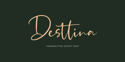 Desttina is a beautiful handwritten font with an amazing feel. It will add a smart charm to any design project!
 - Hedon Display by Tour De Force,
$25.00 Hedon Display, nothing to hide!
 - Iwan Stencil by Linotype,
$40.99 Iwan Stencil is a new revival of an old display typeface. Based on type originally designed by Jan Tschichold in 1929, the style was revived by Klaus Sutter in 2008. The letterforms in this peculiar design are very high contrast; all of the thin bits are much thinner than the thick parts. They have a modern, upright axis. All in all, the creation has a bit of a Bodoni-gone-crazy touch. The thin elements are the unique part of the design that binds this face together. They almost naturally fade away in the stencil gaps (or pylons), making you wonder if you are really looking at a stencil face at all. These thins contribute greatly to the typeface's overall serif-style, making the design at least a semi serif typeface, if not a full serif one. The lowercase n, for instance, has no serifs of its own, but many of the other letters have clear ones, or serif-like terminals. A serif stencil face is a peculiar variety, especially in this day and age, but in the past they were much more common, if not the norm, The Iwan Stencil typeface has only one weight. Naturally, this is just for display. Use Iwan Stencil to cut real stencils, or only to create the effect of stenciled type in your design work. Ivan Stencil includes all of the characters that you have come to expect in a font. Just because this design was originally made in 1929 does not mean that is has a 1929 character set. Instead, it includes a 21st century, with extended European language support Jan Tschichold, who we have to thank for today's Iwan Stencil inspiration, was a man of many faces. A trained calligrapher who went on to codify the New Typography, would go on to become a teacher, a classical book designer, and the creator of the Sabon typeface. Like all young designers, he was occasionally in need of money. Before his emigration from Germany in 1933, he took on many kinds of commissions. In the late 1920s, a time full of waves of economic turmoil within Germany and across the world, he began designing a typefaces for different European companies, mostly display things like this. For a time during the mid-1920s, Jan Tschichold went by the name Iwan" "
 - Minuet by Canada Type,
$24.95 Minuet, an informal script with crossover deco elements giving it an unmistakable 1940s flavor, is a revival and expansion of the Rondo family, the last typeface drawn by Stefan Schlesinger before his death. This family was initially supposed to be a typeface based on the strong, flowing script Schlesinger liked to use in the ads he designed, particularly the ones he did for Van Houten’s cocoa products. But for technical reasons the Lettergieterij Amsterdam mandated the face to be made from unattached letters, rather than the original connected script. Schlesinger and Dooijes finished the lowercase and the first drawings of the uppercase just before Schlesinger was sent to a prison camp in 1942. Dooijes completed the design on his own, and drew the bold according to Schlesigner’s instructions. The typeface family was finished in February of 1944, and Schlesinger was killed in October of that same year. Though he did see and approve the final proofs, he never actually saw his letters in use. It took almost four more years for the Lettergieterij Amsterdam to produce the fonts. The typeface was officially announced in November of 1948, and immediately became a bestseller. By 1966, according to a memo from the foundry, the typeface had become “almost too popular”. This digital version of Schlesigner’s and Dooijes’s work greatly expands on the metal fonts. Both weights include a complete set of lowercase alternates — based on Schlesinger’s own drawings, as well as alternative variations for some of the capitals, a few ligatures, and extended language support covering Western, Eastern and Central European languages, plus Baltic, Celtic/Welsh, Esperanto, Maltese and Turkish. Minuet is available in all popular formats. The OpenType version, Minuet Pro, takes advantage of internal font programming to combine the main and alternate fonts into a single file per weight, making all alternates and ligatures automatically available at the push of a button in OpenType supporting programs.
 - Ouido by Hanken Design Co.,
$30.00 The Ouido typeface has tastefully narrow characters with enough default spacing for comfortable reading at small sizes. Equipped with features like letter-spaced small caps and conservatively drawn italics for emphasizing words that maintain the reading speed—providing the reader a pleasant overall experience. Ouido (pronounced as “widow”) is derived from the Portuguese word OUVIR which means to hear or to listen. Ouido refers to the ability to play a song on any musical instrument after listening to it a couple of times and without reading the notes. The Ouido typeface is a modernized nostalgia for music enthusiasts, a whimsical revamp of the classic serif font. It bears resemblance with printed classical music scores, characterized by each letter’s rounded strokes like how one drew clefs with passion. Each dot is a twin of the quarter note minus the stem, so weaving sentences together could feel like composing a melody. Inspired by the astounding phenomenon of absolute pitch, the visual appeal of this typeface may hone your imaginative ability to embellish your creation without needing a reference.
 - Risotto Script by Estudio Calderon,
$69.00 Risotto Script is a sexy font designed by Felipe Calderón, it represents the texture, sound, smell and flavor of food that come in those interesting packages with different concepts. This font makes you want to eat it because it is designed with a unique texture like a lot of vegetables, it has flourishes that suggest herbs and country roots. Calligraphy with folded pen and food packaging were two of the inspirations to develop this project that will work well wherever it is applied. Risotto Script Pro has 672 glyphs that have the purpose of covering a lot of writing options with different results, by applying OpenType programming as: - Standard ligatures - Stylistics alternatives - Contextual alternates - Discretionary ligatures - Swashes - Terminal forms - Stylistic Set 1, 2, 3 and 4 - Initials (it includes leaves in some endings) NOTE: The X height is generous, in order to design signs to 8 and low size. You`d better get the “extras” for a more complete experience. Most of the Standard ligatures include Stylistics alternatives with detailed endings Multiple language options.
 - FF Signa Slab by FontFont,
$72.99 FF Signa is a typically Danish typeface, rooted in architectural lettering rather than book typography. Originally designed for signage—hence the name—FF Signa is now a typographic family with three widths. All weights include italics, small caps, and several styles of figures. Because of the quality of this “vernacular-lettering-into-typeface” conversion, FF Signa received a Danish Design Prize in 2002. FF Signa is radically different from most sans serif text typefaces that were published during the 1990s. It neither belongs in the “humanist sans” category, nor is it on the list of typefaces based on 19th-century grotesques. Its concise letterforms and a minimum of detail produce clear and harmonious word images. Yet its proportions are classical, and the underlying geometry has been subtly adjusted in order to create letterforms which are at once interesting, harmonious, and contemporary. These features make FF Signa pleasant for reading, even at very small sizes. The typeface has developed into a versatile family, with Condensed, Extended, and Correspondence versions. Later on Signa Serif, Stencil variants and a Signa Slab family added even more versatility. The resulting FF Signa type system may be used for corporate identities, brochures, magazines, communication, books, and on-screen publications.
 - Just Square by Linotype,
$29.99Zoran Kostik began designing the Just Square font family in 1999, based on a logo that his son, an art student, had designed. The design project grew until Kostic had designed eight weights, for both the Latin and the Cyrillic writing systems. Just Square is a very geometric and constricted face best used in experimental designs (i.e., logos, web sites, flyers, and expressive headlines). - Torrid Tango JNL by Jeff Levine,
$29.00 1920s-era sheet music for "Tangos Pour Manon" from Brussels, Belgium had the title hand lettered in an unusual style. The alphabet was square, had serifs and the thick-and-thin stroke weights that were more popular in the upcoming Art Deco years of the 1930s and 1940s. This became the working model for Torrid Tango JNL, which is available in both regular and oblique versions.
 - SP Isis by Remote Inc,
$39.00They say the Nile has many secrets and she was the most sacred of them all. Isis. I met her in a small tavern outside of Edfu, hidden like a jewel between Luxor and Aswan. I had journeyed to Egypt to study the mating habits of homosexual hippos. I had no idea it was the journey that would teach me the true nature of love. - Calendar Blocks JNL by Jeff Levine,
$29.00Calendar Blocks JNL was inspired by old-fashioned wood type used to assemble calendar pages in the days of letterpress printing. The A-Z keystrokes contain the dates 1-26. The lower case a-z keystrokes have the remaining dates 27-31, along with the split dates 23/30 and 24/31 and blank boxes. The days of the week are located on the 1-7 keys. - Brillianissa by Letterara,
$14.00 Brillianissa is an enchanting handwritten font. This versatile script font has a wide spectrum of applications ranging from greeting cards, logos to headlines and is guaranteed to add a romantic or casual feel to your next project. Add it confidently to your projects, and you will love the results. This font is PUA encoded which means you can access all the beautiful glyphs and swashes with ease!
 - Pagoda by Studio K,
$45.00 This display font has an oriental character reminiscent of brush stroke calligraphy and all things Japanese. My original working title for this font was ‘Spanner’, because the lower case ‘c’, with which the design began, looked rather like the head of a spanner. I originally had in mind something more mechanical, but as it evolved and developed the font itself obviously had other ideas!
 - Deco Banner JNL by Jeff Levine,
$29.00 Deco Banner JNL is composed of reverse lettering on a black background with Art Deco end caps. To create a banner, first type the plus sign for the left end cap, then your text. To add a space between words, use the bar on the shift position of the backslash key then continue on. To add the right end cap, type the equal sign.
 - Bittersoni by Letterara,
$14.00 Bittersoni is an enchanting handwritten font. This versatile script font has a wide spectrum of applications ranging from greeting cards, logos to headlines and is guaranteed to add a romantic or casual feel to your next project. Add it confidently to your projects, and you will love the results. This font is PUA encoded which means you can access all the beautiful glyphs and swashes with ease!
 - Holiday Doodles Too by Outside the Line,
$19.00 If you liked Holiday Doodles you will love Holiday Doodles Too as it is more of the same. 42 icons to decorate your year. Birthdays, babies, Summer, weddings, presents, St. Pat’s Day, 4th of July, Valentine’s Day, Fall, Christmas, Hanukkah and more. This font is a great clip art addition to the Doodles font family from Outside the Line. For best results use in larger point sizes.
 - Sunday Popice by Nathatype,
$29.00 Sunday Popice is a delightful display font that brings a dose of cuteness and whimsy to your designs. With its rounded shapes and high contrast, this typeface exudes a unique charm that is perfect for adding a touch of playfulness to any project. Designed with love and attention to detail, Sunday Popice captures the essence of childlike joy and innocence. Each character is carefully crafted with rounded edges, creating a friendly and approachable appearance. The high contrast between thick and thin strokes adds a dynamic and lively quality to the font, making it truly stand out. This font's rounded and soft shapes evoke a sense of warmth and coziness, reminiscent of a Sunday afternoon spent in the company of loved ones. Because of the unique style, for the best readability use this font at large text sizes. Enjoy the available features here. Features: Multilingual Supports PUA Encoded Numerals and Punctuations Sunday Popice fits in children's books, product packaging, greeting cards, headlines, logos, and any design project that requires a touch of whimsical elegance. Find out more ways to use this font by taking a look at the font preview. Thanks for purchasing our fonts. Hopefully, you have a great time using our font. Feel free to contact us anytime for further information or when you have trouble with the font. Thanks a lot and happy designing.
 - Biloner by Nathatype,
$29.00 Biloner is a font in simple, clean sans serif base forms. Its letters have no ornaments and serifs making them look modern and simple. The firm, straight letter shapes look strong and evident. This font shows enlarged capital letters to create a brave, prominent look enabling it to be the center design and to make an explicit message. Despite its original sans serif font base form, Biloner adds detailed brush touches to the letters to give extra rough textures on the letter lines. The brush scratches are on the edge or certain parts of the letters adding dimensions and attractive visuals. Fortunately, this font is applicable for any text sizes thanks to its great legibility, and you may also enjoy the available features here.) Features: Ligatures Multilingual Supports PUA Encoded Numerals and Punctuations Biloner’s flexibility enables it to adapt to any design styles, either the modern and contemporary, or brave and creative ones. It surely fits for any design contexts such as titles, posters, book covers, and brandings. Find out more ways to use this font by taking a look at the font preview. Thanks for purchasing our fonts. Hopefully, you have a great time using our font. Feel free to contact us anytime for further information or when you have trouble with the font. Thanks a lot and happy designing.
 - Sticky Shoes by Bogstav,
$15.00 Sticky Shoes was inspired by a sign at a local flea market. The artist behind the sign obviously didn’t care much about painting the letters “in the right way” - leaving a slobby and uneven impression. And what is wrong with that? Nothing, if you ask me. I tried my best to capture the charm and innocence behind that sign in Sticky Shoes. I even made the paint version go outside the outline in the Regular version! I added 6 different versions of each letter, and they automatically changes as you type. That goes for all 4 versions, and they even mix very nicely!


