10,000 search results
(0.017 seconds)
- Criss Cross by Hanoded,
$15.00 Criss Cross is a scratchy, scribbly, rough-n-tough kinda font. The idea comes from the many notes I wrote in my horrible handwriting. When I want to stress things, it sort of looks like Criss Cross. So... Now you can write notes and stress things too! And guess what? It comes with a bunch of alternates, so enjoy!
 - CA Fourty Open by Cape Arcona Type Foundry,
$29.00 CA Fourty Open is another take on the idea of a double-line font. It reminds us of neon-sings, but lifts the 50s aesthetics to a contemporary level. Although it’s an all-caps font, upper and lower cases differ a little bit. The upper cases are more open. CA Forty Open has a full Central European letterset.
 - Gromvies by ahweproject,
$10.00 Gromvies feels playfully nostalgic and delivers an incredible vintage retro aesthetic. Inspired by unique retro themes, this fun typeface is suitable for any vintage theme concept, Illustration posters, stickers, fun graphics, and more. Masterfully designed to become a true favorite, this font has the potential to bring each of your creative ideas to the highest level!
 - SusiScript by Ingrimayne Type,
$9.00 SusiScript is an friendly, informal typeface family with three weights, each with an oblique style. The idea for SusiScript came from a girl named Suzi who wrote her "e"s in a peculiar way. The typeface does not replicate her handwriting, which was very hard to read; it merely drew inspiration from several of her letters.
 - Insomniac by Hanoded,
$15.00 Insomniac is a tall, narrow, handwritten typeface. A little rough, a little shaky, a little uneven. The idea for this font came to me in the middle of the night - hence the name. Insomnia is an all caps font, but upper and lower case differ and glyphs can be freely interchanged. Comes with a diacritics dream team.
 - AT Move Tremelo by André Toet Design,
$39.95 TREMELO a typeface based on a logotype (Microtel). We designed it as a complete capital alphabet. The original idea for the logotype font came from the products the firm produced. They provided the parts that go into hearing-aids. We thought the type should have some visual tremor in it. Concept/Art Direction/Design: André Toet © 2017
 - Violetail by Balpirick,
$15.00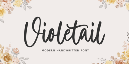 Violetail is a Modern Handwritten Font. Violetail Modern is an elegant and dainty handwritten font that features sweet and delicate swashes. This original look will appeal to a wide range of crafty ideas, from letterheads and titles, to stationery. Violetail also multilingual support. Enjoy the font, feel free to comment or feedback, send me PM or email. Thank you!
 - Hunter Rising by Arendxstudio,
$15.00 Hunter Rising - Brush Font a relaxed and flowing handwritten script font. Incredibly versatile, this font fits a wide pool of designs, elevating them to the highest levels. Add this font to your favorite creative ideas and notice how it makes them come alive! Feature A-Z Character Set Numerals & Punctuations (OpenType Standard) Stylistic Alternates Swash Multilingual Ligatures
 - Master by Jure Kožuh,
$29.00 Master of the World was included on the front page of a novel in several parts, The Count of Monte Christo (mid 20th century). Typeface characters show design guidelines of the pre-war era (2nd world war). The idea of development origins from a wish to evolve traditional forms of typefaces which were used in Slovenia.
 - Lautren by Azzam Ridhamalik,
$16.00 Introducing Lautren, a new delightful bold script with reversed contrast typeface. The Ideas of this fonts came from funny summer vibes mood which is made more neater and smoother. Lautren created with a tons of opentype features like contextual alternates, stylistic sets, ligatures, and swashes at the ending of the letters. A fun typeface to play with!
 - Alphard by ErlosDesign,
$19.00 Alphard - Handwritten Font by erlosDESIGN Alphard is a delicate, elegant and flowing handwritten font. It has beautiful and well balanced characters and as a result, it matches a wide pool of designs. Alphard features a varying baseline, smooth lines, gorgeous glyphs and stunning alternates. Add it to your most creative ideas and notice how it makes them come alive!
 - Brighting Lovelyta by Letterena Studios,
$9.00 Brighting Lovelyta is a magical script font carefully created with a touch of elegance. Whether you’re looking for fonts for Instagram or calligraphy scripts for DIY projects, this font will turn any creative idea into a true piece of art! This font is PUA encoded which means you can access all of the glyphs and swashes with ease!
 - Hwaiting Sans by Konstantine Studio,
$20.00 Inspired by the emerging Korean culture that grabbing the worldwide actuation in so many realms of the industry. To bridge the vibes and to make it easier to consume, we found the gap to fill with simple things in life that are useful for it, and yes, it’s a new day it’s a new font. So without any further ado, please welcome Hwaiting Sans. 2/3 series of Korean vibes typefaces. It’s a sans-serif font with bold and strong vibes to catch up with today’s graphic design trends. Crafted with deep research about Korean traditional letters, shaped up with the approach of universal Latin letters. This is the second drop of 3 series from the Hwaiting family. So stay tuned for the upcoming release.
 - Decora Two by Naghi Naghachian,
$82.00 “Innovation” best describes Naghi Naghashian’s new Decora Two font. It is a “Liaison amoureuse” between the Sans Serif typeface and English manuscript style. Decora Two is the second of a series of typeface that enables graphic arts professionals the flexibility to use modern initials. It enables, moreover, the use of this typeface for decorative headlines and is a boon for manipulations of both vector-based and pixel-based graphic programs. Typographers worldwide, whose alphabets derive from the Roman one, depend on such innovations in order to meet increased demands of modern communication. This typeface enriches the possibilities for typographical design, which in turn increases the delight in such design. It gives me great pleasure to present this series of new typefaces to my creative colleagues worldwide!
 - Costa Std by Typofonderie,
$59.00 A mediterranean style sanserif in 4 styles The original idea of Costa was to create a contemporary mediterranean typeface style. Costa is a synthesis of the purity, as found on Greek capitals, and softness, found in Renaissance scripts. First thing was the design concept that take its roots on the Chancery script. Such writing style appeared during Italian Renaissance. Later few typefaces have been developed from such cursive models. Today most serifed typeface italic take their roots on such triangular structure we can find on gylphs like the n, p, or d. The Costa capitals remains close to pure sanserif models when the lowercases features an ending serif on many letters like the a, n, d, etc. This ending serif being more like a minimal brush effect, creating a visual contrast and referencing the exoticness of the typeface. Knowing that the Costa typeface family began life in the 90s as a bespoke typeface for Costa Crociere, an Italian cruise company — it suddenly makes sense and explains well why Jean François Porchez focused so much on Italian Chancery mixed to a certain exotism. The curvy-pointed terminals of the Costa n can obviously get find on other glyphs, such as the ending of the e, c and some capitals. So, the sanserif looks more soft and appealing, without to be to pudgy or spineless. The general effect, when set for text, remains a sanserif, even not like Rotis Semiserif. Costa is definitly not a classical typeface, or serif typeface which convey past, tradition, historicism as Garamond does beautifully. Because of the Costa crocieres original needs, Costa typeface was designed to be appropriate for any uses. Anytime you’re looking for good mood, qualitative effects, informal tone, cool atmosphere without to be unconvential or blowzy, Costa will convey to your design the required chic and nice atmosphere, from large headlines sizes, brands, to small text sizes. It’s a legible typeface, never boring. A style without neutrality which doesn’t fit comfortably into any typeface classification! Does it proves the novelty of its design and guarantees as well as its originality? Its up to you to be convinced. Barcelona trip Originally not planned, this need appeared because of a trip to Barcelona at the time of the project, where Jean François was giving a lecture. He wanted to pay an homage to that invitation to create something special. So, he designed during his flight some variations of the Spanish Ch, following ideas developed by the Argentinian type designer Rubén Fontana for his typeface called Fontana ND (published by the Barcelona foundry Bauer). Then, he presented during his lecture variations and asked to the audience which design fit the best to their language. They selected the design you can find in the fonts today. Read more about pairing Costa Type Directors Club 2000 Typographica: Our Favourite Typefaces 2004
 - Aloha Magazine by Nirmana Visual,
$15.00 Aloha Magazine Unique& playful sans serif serif family with 9 Weights Aloha Magazine offers beautiful typographic harmony for a diversity of design projects, including logos & branding, social media posts, advertisements & product designs.
 - Gord Qucik by Nirmana Visual,
$22.00 Gord Quick Unique & Playful sans serif serif family with 9 Weights Gord Quick offers beautiful typographic harmony for a diversity of design projects, including logos & branding, social media posts, advertisements & product designs.
 - Mobern Fashion by Nirmana Visual,
$22.00 Mobern Fashion Unique& playful sans serif serif family with 5 Weights Mobern Fashion offers beautiful typographic harmony for a diversity of design projects, including logos & branding, social media posts, advertisements & product designs.
 - Paperboy by Ayca Atalay,
$14.00 Paperboy is a hand drawn serif with a whimsical look. With its playful attitude, Paperboy takes out the seriousness that comes with serif fonts, even though it follows the same typographic principles.
 - Cormac by Typedepot,
$19.00 Cormac is a humanist typeface characterized with it's large x-height and slightly flared stems. The word that best describes our ideas in the beginning of the project is "simple" - the idea behind it was to strip the letter forms of everything unnecessary, and yet keep the typeface interesting. The typeface is friendly without being too cheezy thanks to its humanistic character, flared ascenders and stems reminding of its calligraphic origin. The proportions are closer to the traditional old style typefaces. Cormac is open and readable typeface coming in 7 weights plus their matching 'true' italics - from Extra Thin to Bold. The family comes with Cyrillic support, great range of numerals, fractions, ligatures, alternates and a lot of special characters making Cormac a great solution for greate range of design work - branding, editorial, web, wayfinding, etc.
 - Jim Lee by Comicraft,
$39.00 When Jim Lee sent us pages of his latest project, DIVINE RIGHT, we knew we had to do something special for him. Something Unique. We knew we had to create a whole new look for his book. We spent weeks holed up in our Colorado mountain retreat, meditating on the true nature of leading and kerning, sketching out ideas and rejecting all but the best of the best. As the dreaded deadline doom rapidly approached, we suddenly knew we had the answer: A line of 'Celebrity' fonts -- digitally remastered lettering based on handwriting samples of the many Artists and Creators we all know and love. Of course, our first font would have to be...the SAMMY DAVIS Jr font! But Jim didn't like that idea and made us create a font based on his handwriting instead. You're no fun, Jim.
 - PODIUM Sharp by Borutta Group,
$29.00 PODIUM Sharp is Extended version of DUDU typeface designed in 2012. After many years I’ve decided to rebuild and develop this typeface by adding new masters and weights. Finally PODIUM Sharp consist of 234 styles: from ultra compressed hairline to extra expanded heavy. Main purpose of this project was idea to make hybrid between different modular and geometric woodtypes that I found in old polish specimens: Rex, Blok, Bacarat etc. Thanks to big range of different styles, PODIUM will be perfect choice for visual identities, posters and display usage. For better comfort of using PODIUM I’ve prepared new idea of styles naming based on Frutigres’s Universe and Climbing evaluation. First digit means width and the second weights of style. (So for example style 1.1 is ultra compressed hairline, 6.5 is something like regular and 9.13 is ultra expanded heavy.
 - Radilen Aveline by Dora Typefoundry,
$18.00 Introducing a fancy serif font with italics. Radilen Aveline is a series of elegant serif fonts that give traditional design elements a modern feel with their clean lines, smooth curves and sharp details making them suitable for a variety of your design projects making them ideal for titles, headlines, editorial designs, monograms, branding, logos, poster designs, and more. The regular Radilen Aveline has 47 Ligatures and 28 Alternatives. WHAT'S INCLUDED: Radilen Aveline Regular Radilen Aveline Italic We highly recommend using a program that supports OpenType features and Glyphs panels like Adobe apps and Corel Draw, so you can see and access all Glyph variations. This type of family has become the work of true love, making it as easy and fun as possible.I really hope you enjoy it! Thank you Enjoy the font and go get creative :)
 - Ardin by Parker Creative,
$18.00 Meet Ardin, a wedge serif that merges letter characteristics of traditional serifs with textures and styles found almost exclusively in modern sans-serif typefaces. The result is a bold design that feels distinctly classic, powerful, and handcrafted. With Ardin, you can make your projects (logos, product sheets, marketing materials, business cards, websites, etc.) look sophisticated while feeling both approachable and fresh.
 - Askja by SG Type,
$19.00 Askja – A modern, decorative serif typeface with creative ligatures, larger upper serifs and multilingual support. This decorative font features numerous creative non-standard ligatures incl. nested or overlapping caps. Due to its large selection of ligatures, Askja is a very versatile typeface, covering a wide range of project types. Combine this font with sans serif typefaces for a modern aesthetic.
 - Pluot by Bunny Dojo,
$23.00 Designed for an age of increased nuance and inclusivity, Pluot defies conventional classification. With an upper half inspired by sans-serif tendencies and a serif-influenced lower half, Pluot is a geometric semi-serif (or semi-sans). It is, at once, fresh and exciting, while also completely at home in any setting. Pluot is your elegant workhorse for a new era.
 - Lemon And Sage by Ayca Atalay,
$16.00 Lemon And Sage | A Hand Lettered Display Serif Lemon And Sage is a charming hand lettered display serif with a high x-height. The condensed letterforms preserve the organic hand drawn look while still adhering to legible serif letterforms. Lemon And Sage works exceptionally well as a display font and is still legible and neat in smaller sizes thanks to its x-height.
 - Maple Lane by Okaycat,
$29.00 Maple Lane is a refined traditional serif font composed by the Okaycat design team, Natsuko Hayashida & Luke Turvey, in 2014. Bold letterforms contrast with fine seriffed detail at Maple Lane to offer style excellence with fancy embellishment options. This nicely balanced serif is designed to mix and match with the more relaxed and casual version of Maple Lane,
 - WerkSerif by Wilton Foundry,
$19.00 We created a serif version of our popular "Werk" Sans Serif that will greatly enhance the Work family of fonts. Like “Werk” Sans Serif, “WerkSerif” is a sturdy, well-tuned font that is a true “werkhorse” with plenty of character without being overbearing. “WerkSerif”is an ideal choice for corporate branding offering a complete typographic solution with the sans and serif range of fonts — also a prime choice for distinctive and dynamic logotype use. “WerkSerif” comes in a range of offerings from Light to Regular, to bold and Black with matching Italics.
 - ITC Bailey Sans by ITC,
$39.00ITC Bailey Sans is the first typeface family created by Kevin Bailey, a graphic designer in Dallas, Texas. He was once looking for an understated block serif for a design project and could find nothing suitable. Bailey began working on his own serif face but then found that the basics of his new design worked well as a sans serif and continued on that track. ITC Bailey Sans font is available in four weights: book, book italic, bold and bold italic and even has a companion serif display font, ITC Baily Quad Bold. - Sygma by MJType,
$15.00 Sygma Display Typeface Serif, an elegant and sophisticated serif font. This font is designed to add a touch of class and refinement to any project and is sure to make a lasting impression on any audience. With its clean lines and refined details, Sygma Display Typeface Serif is the perfect choice for professional design projects, including branding, poster, and specific advertise. Whether you’re a designer, marketer, or just looking to add a touch of elegance to your personal projects, I hope Sygma Display Typeface Serif is an excellent choice.
 - Gradiyla by Ahmad Type,
$12.00 Gradiyla is a luxurious display serif font with unique character by combining geometric shapes with organic curvy details. It is a unique typeface for your individual personality. Inspired by old-style serif and contemporary serif fonts. The extreme contrast between thick and thin strokes gives a harmonic and stylish look. Elegant and sensuality didone serif enhanced by ligatures. Perfect for a wide range of uses. From greeting cards to magazines, wedding invitations, logos to websites, etc. This font is PUA encoded which means you can access all of the amazing glyphs and ligatures with ease!
 - Bandera Text by AndrijType,
$21.00 This serif typeface is a real workhorse. It is a modern tool for text design: extremely legible and well shaped. Bandera Text has six weights with original italics. It catches attention in headlines of posters and magazines or makes reading comfortable in plain texts. Don't forget to try Medium and Medium Italic faces for free. Bandera Text works well with Bandera (slab serif), Osnova (sans serif) and Bandera Display (contrast serif) fonts. Bandera is Spanish for ‘flag’. And Bandera is a symbol of Ukrainian fighting for freedom for many years.
 - Bandera Text Cyrillic by AndrijType,
$21.00 This serif typeface is a real workhorse. It is a modern tool for text design: extremely legible and well shaped. Bandera Text Cyrillic has six weights with original italics. It catches attention in headlines of posters and magazines or makes reading comfortable in plain texts. Don't forget try Medium and Medium Italic faces for free. Bandera Text Cyrillic works well with Bandera Cyrillic (slab serif), Osnova Cyrillic (sans serif) and Bandera Display Cyrillic (contrast serif) fonts. Bandera is Spanish for ‘flag’. And Bandera is a symbol of Ukrainian fighting for freedom for many years.
 - Kyhota by Ingrimayne Type,
$14.95 The six typefaces of the Kyhota group all have an “Old West” look to them. KyhotaOne has very thick slab serifs compared to KyhotaTwo. KyhotaBarbed is more condensed than either and has little barbs on the verticals, something that was a feature of a number of nineteenth century typefaces in this style. KyhotaFezdaz is condensed, without barbs, and with the slab serifs replaced with a flare serif. KyhotaBigBottom and KyhotaBigTop play with the weighting of the serifs, with one (either top or bottom) very thin and the other very thick.
 - Kimberlie Display by Attract Studio,
$23.00 Kimberlie is a luxurious display serif font with unique character by combining geometric shapes with organic curvy details. It is a unique typeface for your individual personality. Inspired by old-style serif and contemporary serif fonts. The extreme contrast between thick and thin strokes gives a harmonic and stylish look. Elegant and sensuality didone serif enhanced by ligatures, alternates and swashes. Kimberlie features OpenType with 1025+ glyphs, 210 Stylistic Alternates, 486 Ligatures. Perfect for a wide range of uses. From greeting cards to magazines, wedding invitations, logos to website etc.
 - Blank Page by Ergibi Studio,
$21.00 Blank Page Font Duo, these fonts are of two types serif and script. Display Serif inspired by famous logo, This typeface has been made carefully to make sure its premium quality and luxury feel. The ligatures on serif makes this typeface unique and stands out rather than the regular serif font, perfectly for headlines, wedding, social media, logos, posters, packaging, T-shirts,coffee shops, restaurants, magazine’s headers, signs or gift/post cards,cafe’s and weddings or any type of advertising purpose. if you have any questions, don’t hesitate to contact us Ergibi Studio
 - Rhythm by Positype,
$42.00 I hate the idea of revivals. I have publicly said I choose not to do revivals because they make me uncomfortable. This is as close as I have been to crossing my own line. To be direct, Rhythm is based on the ATF typeface, Ratio (I just recently learned the foundry of origin). I came across this typeface from a printed specimen years ago when I was in school and held onto it. It was unique and I loved how well integrated the inline worked within both the flourish and serif of the glyphs—it was old, but not, reminiscent, but fresh. My specimen was limited in the glyph offering (it was c. 1930ish) and I realized a lot would need to be done to ‘finish’ it and bring it to contemporary expectations. I didn't want to do ‘retro’ and tried to avoid the visual trappings associated with it. What I did want to do is interpret what I had in the specimen and reinterpret it digitally, refining its construction and extending its typographic equity along the way. The ‘One’ and ‘Two’ (and their matching ‘Solids’) styles diverge providing various elaborations that coordinate well between rigid bracketed serifs and compact tails. I further expanded the glyph offering to include a full diacritic set, old style numerals, fractions, stylistic alternates, swashes, titling alternates and controlled flourishes that adhere to the efficient framework of the script. And yes, I refer to it as a ‘script’ because calling it a ‘cutesy serif’ seems wrong :) I hope this is seen less as a slavish revival and more as a championing of a really unique typeface. The Original Typeface was Adastra, designed by Herbert Thannhaeuser for the Foundry D. Stempel AG in Frankfurt, Germany.
 - FS Kim by Fontsmith,
$80.00 Unconventional beauty FS Kim is bold and intriguing – exuberant and unmissable, but playing a supporting role when needed. This typeface shines brightest as a display font, and is perfect for applications across fashion, theatre, cultural projects and pretty much any brand that wants to make a statement. While FS Kim is dramatic, it’s incredibly versatile, too, and works to showcase content in a stylish, striking way. This font makes you look, and makes you curious – perfect for brands and publishers that relish unconventional beauty. A playful text version While FS Kim’s text version is more constrained than the display, the strength and playfulness remain. Modifications for the text version include larger x-heights, longer ascenders and descenders, wider proportions and spacing, longer and more defined serifs and a lower contrast. “The overall idea is that it’s not an optical size,” Radoeva explains. Text and display maintain a strong connection that mean they can be used together. A display with a twist The calligraphic starting point helped to create familiar forms, while a contemporary display feel is achieved through short wedge serifs, with bold touches added through the font’s exaggerated forms and details. FS Kim’s narrow proportions, short ascenders and descenders, and tighter spacing make the font suitably compact for display use. The overall aesthetic feels bold and sharp, but closer inspection reveals that all the corners are softened. Decorative inlines In an unusual twist, FS Kim’s display version was first drawn using a broad-nib pen to create familiar forms and elegance while still breaking from serif traditions and making it all about standout character. There are also two additional styles, based on the Regular and Black with inlines – in uppercase, figures and symbols. The inline brings an extra option for an even stronger, more decorative display use.
 - FS Kim Variable by Fontsmith,
$349.99Unconventional beauty FS Kim is bold and intriguing – exuberant and unmissable, but playing a supporting role when needed. This typeface shines brightest as a display font, and is perfect for applications across fashion, theatre, cultural projects and pretty much any brand that wants to make a statement. While FS Kim is dramatic, it’s incredibly versatile, too, and works to showcase content in a stylish, striking way. This font makes you look, and makes you curious – perfect for brands and publishers that relish unconventional beauty. A playful text version While FS Kim’s text version is more constrained than the display, the strength and playfulness remain. Modifications for the text version include larger x-heights, longer ascenders and descenders, wider proportions and spacing, longer and more defined serifs and a lower contrast. “The overall idea is that it’s not an optical size,” Radoeva explains. Text and display maintain a strong connection that mean they can be used together. A display with a twist The calligraphic starting point helped to create familiar forms, while a contemporary display feel is achieved through short wedge serifs, with bold touches added through the font’s exaggerated forms and details. FS Kim’s narrow proportions, short ascenders and descenders, and tighter spacing make the font suitably compact for display use. The overall aesthetic feels bold and sharp, but closer inspection reveals that all the corners are softened. Decorative inlines In an unusual twist, FS Kim’s display version was first drawn using a broad-nib pen to create familiar forms and elegance while still breaking from serif traditions and making it all about standout character. There are also two additional styles, based on the Regular and Black with inlines – in uppercase, figures and symbols. The inline brings an extra option for an even stronger, more decorative display use.