10,000 search results
(0.025 seconds)
- Jelly Boots by Awan Senja,
$14.00 Jelly Boots is a cute display font, carefully created to become a true favorite. Its casual charm makes it appear wonderfully down-to-earth, readable and, ultimately, incredibly versatile. This versatility will appeal to a wide range of crafty ideas, from letterheads and titles, to stationery.
 - Linotype Albawing by Linotype,
$29.99Linotype Albawing is the text type that is derived from the original idea for Linotype Albatross. The sketches were done with Fontographer 3.5 using the simplified outlines of Linotype Albatross. Linotype Albawing is an agile, lively and elegant font and well-suited for headlines, posters and advertisements. - Moon Rays by Epiclinez,
$18.00 Moon Rays is a bold and playful display font, suitable for all children's designs, product packaging, stationary art, apparel designs, and more fun and creative ideas! So what's included: Basic Latin A-Z & a-z. Numbers, symbols, and punctuations Multilingual Support. Accented Characters : ÀÁÂÃÄÅÆÇÈÉÊËÌÍÎÏÑÒÓÔÕÖØŒŠÙÚÛÜŸÝŽàáâãäåæçèéêëìíîïñòóôõöøœšùúûüýÿžß Thank You.
 - Biosphere by Fype Co,
$16.00 Biosphere is inspired by industrial style typeface that's will give look a modern and technical industrial display font. That will take any design idea to the next level, covering a wide range of project types such as poster design, book covers, prints, headlines, id cards, packaging, branding.
 - Oxford Press by Set Sail Studios,
$17.99 Recreate authentic letterpress typography with Oxford Press, a set of chunky uppercase Serif & Sans fonts designed using real vintage metal letterpress blocks sourced from old printing companies. The Serif & Sans fonts each have two variations, 'Clean' and 'Rough'—with the latter having real, highly detailed hand-made letterpress textures applied to each letter. Each letter of the 'Rough' fonts also has an alternate texture, which can be accessed simply by switching between upper and lowercase characters. The 'Rough' fonts can make a striking impact as bold header text for posters, adverts, prints and packaging, whereas the 'Clean' versions are more suited for smaller accompanying text, cleaner designs or for applying your own textures and styles. Language Support • English, French, Italian, Spanish, Portuguese, German, Swedish, Norwegian, Danish, Dutch, Finnish, Indonesian, Malay, Hungarian, Polish, Croatian, Turkish, Romanian, Czech, Latvian, Lithuanian, Slovak, Slovenian.
 - Gothiks Round Condensed by Blackletra,
$50.00 Gothiks Round Condensed is the rounded version of Gothiks Condensed. It is a 6-weight display sanserif influenced by Texturas. The rhythm and verticality of Texturas can be easily identified on the letters with diagonal strokes like A N M K k V v W w X x Y y Z z: here they are all vertical. This kind of morphology was chosen because it accepts condensation in a very natural way, giving to this sans-serif a very unique personality. It has an extensive character set—with extensive language support—and many OpenType features like fractions, small capitals and different figure sets. Default figures align with lowercase. The typeface’s name refers to the plural of the word Gothic, which in turn can refer to both san-serifs or Blackletter, depending on geographic location. Use it BIG!
 - Stage Invader by Hanoded,
$16.00 There was a big climate protest in Amsterdam a couple of days ago. During Greta’s speech, a man jumped onto the stage and grabbed her microphone, because he didn’t approve of what she was saying. Some English media referred to him as ‘the stage invader’, which I really liked. Long story short: I made a ‘protest-ish’ font, using cheap black finger paint from the local store and a brush from my kids. The result is a rather unique font called Stage Invader. And yes, you can use it for your protest signs too!
 - ITC Coventry by ITC,
$29.99ITC Coventry is the work of American designer Brian Sooy. ITC Coventry is what type would look like if you left a gothic font out in the rain. IF you look close, you'll see the roots of a handsome sans serif font buried under a layer of grime and rust, basically." The low-budget student flyers that Sooy saw in the Coventry section of Cleveland Heights, Ohio, inspired him to design this font and the result is a typeface which looks as though it has been faxed or photocopied many times. "While it looks very irregular in text, it's very carefully spaced to give that effect," says Sooy. ITC Coventry was designed to work just as well in text as in headlines or even on billboards." - GF Vienna heavy - Unknown license

- Bronco Valley by Variatype,
$12.00 Bronco Valley is designed with vintage style or you can say “American Rodeo” for classic look branding, logotype, poster design, t-shirt design, and much more.
 - Entendre Rough by Wordshape,
$30.00 Entendre Rough defies the conventions of most distressed typefaces, as it is an actual text typeface family. Sure, you can use it for your big display type, but you can also use it for body text. Entendre Rough is a stately, commanding and handsome distressed sans serif typeface family that pulls reference from Trajan capitals, the history of English calligraphy, and a variety of other sources to summon a sense of warmth, consideration, trust and authority. Entendre Rough spans 22 weights and styles including Regular and Condensed versions. The large x-height and refined characteristics of the family lend the family a sober and sophisticated appearance that is suitable for both print design and on-screen use. Entendre Rough includes Central and Eastern European language support as well as Western European language support, including Greek and Cyrillic. Entendre Rough’s generous x-height and medium-length ascenders and descenders offer pronounced readability, making the family useful for text typesetting both in print and on screen. Within, humanist elements are tempered with monumental construction, making the heavier weights go-tos for display design work. All of the Entendre Rough family of typefaces feature Western, Eastern and Central European language support alongside nuanced Greek and Cyrillic. Entendre Rough pairs well with our non-distressed Entendre family and our rounded sans serif family Elpy, sharing similar proportions and spacing.
 - Paralucent by Device,
$39.00 Paralucent is versatile all-purpose modern sans. Available in seven weights, from Thin to Heavy, and in two widths each with corresponding italics, it avoids some of the more eccentric calligraphic quirks of Akzidenz or Helvetica or the cool precision of Univers for an elegant, functional, yet warm design. There are two additions to the core 28-weight family: a three-weight stencil set, and a four weight text family. The text weights have been adjusted for use at small point sizes, and feature more open character shapes, looser inter-letter spacing for improved readability, and lining numerals for use in listings and tables. Several core ideas inform Paralucent’s design. Prime attention has given to the negative space between characters, giving a more even “colour”, especially in text. For example, the J, L and T have shorter arms than comparable sans typefaces, while the M and W are wider. The A has a lower bar, opening up the interior counter. An unusually high lower-case x-height again helps to give a more even colour and improve legibility. Care has been taken to rationalise repeated elements like the tails on lower-case letters, or the Q and the “ear” of the g. Typographic design solutions that are consistent across all these features add more stylistic cohesion. ‘Ink traps’ are exaggerated incisions used to open up a letter's narrower internal angles, which can become clogged with ink, especially in small point sizes. Now largely redundant due to the high quality of modern print, they are still sometimes used as a stylistic quirk or design feature. Now that digital fonts are often reversed or outlined, or enlarged to enormous sizes, these can also lead to unexpected or obtrusive results. Paralucent takes these inevitable digital manipulations into account, and adds optical corrections without resort to ink traps. The family has been picked up by many UK and US publishers, featuring heavily in magazines like Loaded, Heat and TV Quick, as well as high-end coffee-table photography books and gallery websites. A perennial Device bestseller.
 - Tech Tools by DNC,
$25.00An attempt to insert a hammer into a work will require that such hammer be drawn, scanned, resized and inserted -- a laborious work. With TechTools such drawing, scanning, resizing to fit is a thing of the past. Technical Tools can now be inserted directly into any application. - Brogi by Factory738,
$15.00 Brogi is a stylish sans serif font designed specifically for logo and brand designs. Brogi exuded a sense of boldness and sophistication despite his menacing styles. Ligature fonts can be used for almost any purpose you can imagine. 10 Weights (Light, Regular, Medium, Bold and Black) 2 Styles (Regular & Italic) Basic Latin A-Z and a-z Numerals & Punctuation Stylistic Ligatures Multilingual Support for ä ö ü Ä Ö Ü ... Free updates and feature additions Thanks for looking, and I hope you enjoy it.
 - Examors by Kulokale,
$15.00 Examors is an ultimate sports display font, and with a style that is very different from the others. This font comes in four styles, Regular, Outline, Oblique and Oblique Outline Version. Examors is well-suited for posters, social media, headlines, magazine titles, clothing, large print formats - and wherever you want to be seen. Inspired by the style of design that is currently popular, and this is the answer to all the needs of every idea that you will pour in this modern era. We highly recommend using a program that supports OpenType features and Glyphs panels such as Adobe Illustrator, Adobe Photoshop CC, Adobe InDesign, or CorelDraw, so you can see and access all Glyph variations. This font is encoded with Unicode PUA, which allows full access to all additional characters without having special design software. Mac users can use Font Book, and Windows users can use Character Map to view and copy one of the extra characters to paste into your favorite text editor / application. Thank You.
 - Bustor Rhikan by Kulokale,
$22.00 Bustor Rhikan is a stylish, clean, and linear slab serif font, with style that is very different from the others. This font comes in two styles, Regular and Oblique Version. Bustor Rhikan is well-suited for posters, social media, headlines, magazine titles, clothing, large print formats - and wherever you want to be seen. Inspired by the style of design that is currently popular, and this is the answer to all the needs of every idea that you will pour in this modern era. We highly recommend using a program that supports OpenType features and Glyphs panels such as Adobe Illustrator, Adobe Photoshop CC, Adobe InDesign, or CorelDraw, so you can see and access all Glyph variations. This font is encoded with Unicode PUA, which allows full access to all additional characters without having special design software. Mac users can use Font Book, and Windows users can use Character Map to view and copy one of the extra characters to paste into your favorite text editor / application. Thank You.
 - Olarwe by Ardyanatypes,
$15.00 A modern and elegant look of a sans serif tagline. This font comes with nine levels of thickness, from light to black, according to your needs. It pairs well with san serif and modern script as pictured or stands alone as a representative header and brand for an elegant look. Olarwe is equipped with a professional modern character font that can present an elegant and attractive identity for your company for business use, such as business cards, name tags, and uniforms as brand elevation. This modern Olarwe typeface is suitable for embossing as letter nameplates or even sprinkling them in your office with elegant-looking cutting stickers. This elegant Olarwe-type shape also looks excellent for book covers or magazine articles. You can see all the available characters in the screenshot above, and you can try the modern & elegant Olarwe now for any design issues. Olarwe is also multilingual, making it easy to work with for any country and language use. It also comes with Ligatures and alternative stylistics to make your designs more attractive.
 - Azbuka by Monotype,
$29.99 The Azbuka™ typeface family has its roots in a fairly pedestrian source. “The idea came in part from an old sign in London that read ‘SPRINKLER STOP VALVE’,” says Dave Farey, designer of the typeface. Like all good sign spotters, Farey took a photograph of the sign and filed it away for possible use in a lettering or typeface design project. In Prague a number of years later, the street signs reminded Farey of the London signage - and his camera came out again. Comparing the two back in his studio, he realized that the signs from London and Prague were not as similar as he initially thought. However, they were enough alike to serve as the foundation for a no-frills, 21st century sans serif typeface family. “I wanted to draw a wide range of weights, italic and condensed designs all in one go,” recalls Farey, “rather than add on to the family later.” His goal was to create a family that could be used for text and display copy, with sufficient weights to provide a broad typographic palette. Indeed, the completed design, created in collaboration with fellow type designer Richard Dawson, consists of twenty typefaces in eight weights ranging from extra light to extra black. The five mid-range designs have complementary italics. Seven condensed designs round out the family. Azbuka’s lighter weights perform remarkably well in blocks of text composition. “They’re clean and legible - and perhaps a little boring,” says Farey, “but they are perfect for copy with a down-to-earth, yet contemporary flavor.” The heavier weights are equally well suited for a variety of display uses. The designs are authoritative but not overbearing and will readily make a strong statement without calling attention to themselves. The condensed weights of Azbuka are ideal for those instances where you have a lot to say - and not much room to say it. The name Azbuka? It’s Russian for “alphabet.” And what more appropriate name could there be for this utilitarian, industrial-strength type family than alphabet? The Azbuka family is available as a suite of OpenType Pro fonts. Graphic communicators can now work with this versatile design while taking advantage of OpenType’s capabilities. The Azbuka Pro fonts also offer an extended character set that supports most Central European and many Eastern European languages
 - Colorful Candy by Putracetol,
$22.00 Colorful Candy is funny hand letering font make from hand lettering ideas in typeface. Each one works perfectly in conjunction with the others so you can mix and match them until your hearts content! The possibilities really are endless and all styles are useful for so many different designs - have fun using it! Colorful Candy a super fun and playful hand-lettered bold typeface. It is perfect for story books, illustrations, comic books, t-shirts, posters, greeting cards, logos, branding, stickers, svg, crafting and all for display purposes. The alternative characters were divided into several Open Type features such as Swash, Stylistic Sets, Stylistic Alternates, Contextual Alternates, and Ligature. The Open Type features can be accessed by using Open Type savvy programs such as Adobe Illustrator, Adobe InDesign, Adobe Photoshop Corel Draw X version, And Microsoft Word. This font is also support multi language.
 - Campeche by Latinotype,
$29.00 Campeche is an expressive yet functional typeface family. Seeking to express its beauty, it twists the conventions of classic typography when necessary. Campeche finds its inspiration in the grotesque typefaces of the late 19th century coupled with a typical Latin American playful sense that gives it a modern freshness. The initial form arises from the idea of expanding Seriguela, evolving along the way, becoming its own system with a unique personality. Campeche is designed for today's requirements. It is available in two styles and three widths, from condensed to extended, with 9 weights each, totaling 54 fonts, in addition to the variable version. Campeche is a comprehensive typographic system that provides versatility for almost any use. It can be used for packaging, editorial, branding... etc. The mix of widths and between the normal and display versions can generate complex graphic parts or systems with different levels of hierarchy, without losing unity.
 - ABC Basisschrift by Elsner+Flake,
$35.00 During the last ten years of his life, Hans Eduard Meier (dec. July 17, 2014), together with Max Schläpfer, developed an innovative concept of a new Swiss Schulschrift (handwriting script for schools) called ABC Basisschrift®. His life’s work is crowned by the fact that now, since the fall of 2014, and beginning in Lucerne, this new didactic will replace the old Schnürlischrift in Switzerland. In contrast with the Schnürlischrift, the idea is to guide a child in three steps to learning a personal handwriting. ABC Schule 1 is for the first grade, ABC 2 starts to introduce the first connections and ABC 4 Ligaturen is designed with many ligatures to serve as a good example for handwriting. ABC Schule is also available with ruling and for visually impaired students.This version of the Basisschrift®, available from here, is the original version by Hans Meier.
 - Kaligawe by Locomotype,
$19.00 Introducing Kaligawe, the perfect font for designers looking to make a bold statement with their work. This display sans font boasts a unique blend of mediaeval and sans-serif characteristics that will give your designs a distinct edge. With nine weights available, from Thin to Black, you'll have plenty of options to choose from when it comes to creating eye-catching posters, attention-grabbing headlines, captivating movie titles, and stylish packaging. What sets Kaligawe apart from other fonts is its ability to combine old-world charm with modern style. Its mediaeval touches provide a classic, timeless feel, while its strong sans-serif characteristics give it a contemporary edge. The result is a font that can be used for a wide range of design projects, whether you're creating something with a vintage vibe or a more modern look.
 - Acto by DSType,
$40.00 Acto is a type system designed as the sans serif counterpart of the previous released Acta. Both type families were designed in 2010 for the redesign of the Chilean newspaper La Tercera, but unlike some of our previous fonts (i.e., Leitura) Acto doesn't exactly match Acta in terms of structure, so they can live on their own. Acto is our first sans where the uppercase has the same height as the ascenders, so we decided to avoid common problems like the confusion between the I and the l, by drawing a curved l. We kept that spirit by removing the spurs on the b, g and q, resulting on a more warm typeface than Prelo, for instance. In the end it's a very powerful sans family, with eleven weights with matching italics, for editorial and corporate design.
 - Brinar by Hackberry Font Foundry,
$24.95 I've been working on a usable sans serif for body copy since the mid-1990s (though I certainly did not know it at the time). This one works well. It started life back in the mists of time as a scan of an old German font by Carl Fahrenwaldt. It was developed fully as a synergized serif with strong traditional roots and released as Bergsland Pro. Now it finally makes it to where I was headed all along as a sans text font. This is a well modulated humanist, sans serif font family with many OpenType features and over 600 characters: Caps, lower case, small caps, ligatures, swashes, small cap figures, old style figures, numerators, denominators, accents characters, ordinal numbers, and so on. It is designed for text use in body copy. But it also works very well for elegantly stylized display.
 - Above Ground by Larin Type Co,
$14.00 Above Ground this is a handwritten brush font for a wide range of design ideas. It is perfect for creating posters, flyers, integrating blogs, banners, designing social pages, designing T-shirts, magazines, book covers, packaging and much more. This fonts is easy to use and has OpenType features.
 - Fortune by Aestherica Studio,
$9.00 Fortune is a cute and simple handwritten font. This font will look great on any design idea. It will add a cute and romantic touch to any of your projects, This font is also specially made for those who need a beautiful and refreshing look for their designs!
 - Framistat by Comicraft,
$39.00Face Front, True Believers, here comes another Spectacular Smash Hit from the Comicraft House of Ideas! A worthy companion to our Monster Mash and Doohickey Masterworks, Framistat is an All-New, Truly Titanic Typeface designed to dutifully display cover copy as demanded by Collector's Item Classic comic book tradition! - Rotham Industria by Greater Albion Typefounders,
$18.00 Rotham Industrial. Stylised lettering for industrial flavoured projects. Imagine, if you will letters shaped from metal tube, or perhaps from a solid rod, or perhaps made from brass handrails? You get the idea. A stylised and fun typeface for those occasions where you want to suggest an engineering influence.
 - Romantis Scene by Lemonthe,
$15.00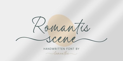 Romantis Scene is a beautiful and flowing script font with a modern style. This gentle font will look gorgeous on a variety of design ideas. It is perfect for many different projects such as logos & branding, invitation, stationery, wedding designs, signature, product designs, labels, photography, and much more!
 - Trick or Bite by Sipanji21,
$16.00 Trick or Bite is an incredibly unique horror display font, with bite and spider webs in any characters. Add this font to your favorite Halloween themed ideas and notice how it makes them come alive. Trick or bite is perfect for posters, packaging, banners, advertising, apparel, and more.
 - Exotic Necklace by Balpirick,
$15.00 Exotic Necklace is a Beautiful Handdrawn Font. Exotic Necklace is a thin and elegant handwritten font. Use it to make your ideas even more realistic and create spectacular designs! Exotic Necklace also multilingual support. Enjoy the font, feel free to comment or feedback, send me PM or email.
 - Daphne Script by Ludwig Type,
$89.00 This gentle script, designed by writing master Georg Salden, is full of grace and vitality. The richness of ideas appear particularly in the curved capital characters. Lower case letters have curved elements primarily at the ascender and descender parts. Daphne Script contains numerous alternate characters and other OpenType features.
 - Tomarik by Inhouse Type,
$21.53 Tomarik is a vibrant hand-drawn type collection and a playful addition to any creative depository. Assembled with the "pick-and-mix" idea in mind, it offers a great variety of flavour and zest. Tomarik features nine distinctive weights and includes OpenType features such as fractions, inferiors and superiors.
 - The Camping by Fox7,
$12.00 The Camping is an elegant and stylish vintage slab serif font. This typeface is perfect for elegant and vintage logos, book or movie title designs, fashion brands, magazines, clothes, lettering, quotes, etc. Add this font to your favorite creative ideas and notice how it makes them come alive!
 - Bughats by Lemonthe,
$15.00 Bughats is a relaxed and flowing script font with a modern style. This gentle font will look gorgeous on a variety of design ideas. Suitable for any projects such as logos, branding projects, product packaging, mugs, quotes, posters, shopping bags, t-shirts, book covers, labels, photography, watermark, and more.
 - Prestigious by Fype Co,
$16.00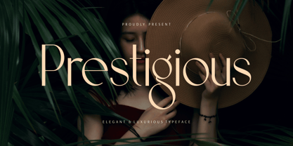 Prestigious is a luxury and elegant display font. That is both classically elegant and modern. Create beautiful wedding invitations, use it as an elegant solution for your next magazine layout, branding, social media, product design, stationery and advertising. It will elevate any design idea with its timeless class.
 - The Centurion by Creativework Studio,
$18.00 The Centurion is a gothic blackletter. It feels classic and artistic. Add this beautiful font to each of your creative ideas and notice how it makes them stand out! The Centurion is perfect for Band logos & branding, product designs, label, product, movie, book tittle, product packaging, t’shirt design
 - Between by Monotype,
$40.99 Akira Kobayashi’s Between™ typeface comes in three main states. While different from each other, they all offer human-centered design to ensure that copy set in them is affable and approachable. An added benefit is the ability to transition “between” font designs, choosing different styles – or even individual characters – to create hierarchy, contrast or emphasis. Kobayashi designed the Between typeface in response to the current popularity of rounded, humanist sans serif designs over the cool grotesques of the 20th century. Between 1 melds industrial and humanist sans ethics. Between 2 represents a sans version of Kobayashi’s Cosmiqua® typeface, striking a balance between crisp and legible, organic and friendly. Between 3 is a freestyle sans with an uplifting sprightly mien. Between has 48 styles; each has eight weights of roman with its own italic counterpart. The family offers a large set of alternative glyphs and OpenType® features. A full interactive type specimen can be viewed here: http://www.monotype.com/fonts/between/ Featured in: Best Fonts for Logos
 - Preto Semi OT Std by DizajnDesign,
$- Preto Semi is an experiment. It is an attempt to create a readable type for text point sizes (other than sans-serif and serif). Preto Semi is not a Sans with added serifs or Serif with serifs removed. The use of the serifs is redefined and used for other purpose(s). The serifs became the extension of the stroke, they help to solve the spacing problem of sans-serif types and they use the primary function of serifs – keeping the eye on the baseline and emphasize the horizontal rhythm of the lines of text. Preto Semi is intended for magazines and editorial design, as other members of Preto family. Preto is an extensive type family, which explores the function of serifs on readability and legibility. Preto consist of three subfamilies: Sans, Semi and Serif. Preto is designed for multilingual typesetting. All of the subfamilies have equal gray value but different texture which can be use to differentiate languages. Preto sub-families have two text weights and two bold styles (Regular -> Bold, Medium -> Black). Every weight has a companion Italic style as well.
 - Preto Semi by DizajnDesign,
$24.00 Preto Semi is an experiment. It is an attempt to create a readable type for text point sizes (other than sans-serif and serif). Preto Semi is not a Sans with added serifs or Serif with serifs removed. The use of the serifs is redefined and used for other purpose(s). The serifs became the extension of the stroke, they help to solve the spacing problem of sans-serif types and they use the primary function of serifs – keeping the eye on the baseline and emphasize the horizontal rhythm of the lines of text. Preto Semi is intended for magazines and editorial design, as other members of Preto family. Preto is an extensive type family, which explores the function of serifs on readability and legibility. Preto consist of three subfamilies: Sans, Semi and Serif. Preto is designed for multilingual typesetting. All of the subfamilies have equal gray value but different texture which can be use to differentiate languages. Preto sub-families have two text weights and two bold styles (Regular -> Bold, Medium -> Black). Every weight has a companion Italic style as well.
