10,000 search results
(0.038 seconds)
- Benang Merah by San Studio,
$15.00 Benang Merah is designed by Zainul Faozi, the idea concept is from a thread, each letter is connected that is the uniqueness of this font. You can use this font for your poster design, heading, social media, lettering design, and more. This font can be paired well with serif fonts.
 - Paramount by Aestherica Studio,
$12.00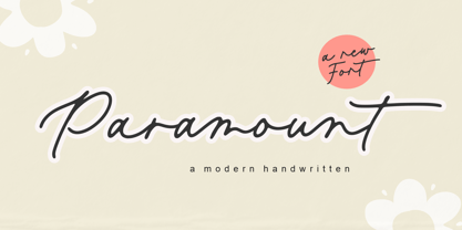 Introducing the new Fun Handwritten Font by Aestherica Studio. Proudly Present, Paramount Paramount is perfect for product packaging, branding project, megazine, social media, wedding, or just used to express words above the background. Paramount also multilingual support. Enjoy the font, feel free to comment or feedback, send me PM or email.
 - Socotra by Kaidosan,
$16.00 Socotra is a modern grotesk with a cool appearance, consisting of a modern and unique style. with a very versatile style and is perfect for a great resource for designers to explore, beautiful eye-catching artwork, interesting social media posts and much more that goes well with this socotra font
 - La Obrige by Hishand Studio,
$15.00 La Obrige is serif font that inspired from the beauty, aesthetic, elegant and Paris. It is really good for water mark, logotype, advertisement, social media posts, product packaging, and more. complete with ligatures regular italic icon kerning multilingual support Shampoo mock up from https://www.graphicsfuel.com/2018/09/dispenser-bottle-psd-mockup/
 - Pink Blue by Rometheme,
$25.00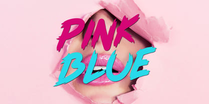 Pink Blue is a modern handdrawn font, this font looks elegant, classy, readable, stylish, catchy and easy to use. Pink Blue Font is the best choice for your professional design projects, including : quotes, album cover, business card, logo, branding, magazines, social media, advertisements, product designs, and many other design project.
 - Sadi Slab by Koray Özbey,
$19.00 Sadi Slab is designed to be used on small scales like book texts, newspapers, magazines etc. Also its large counters make the font suitable for digital screens. The anatomy of the typeface gives a formal appearance which is a more fitting choice for subjects like law, finance, medical science etc.
 - Bondjlo by Muksal Creatives,
$13.00 Bondjlo is font a vintange serif, and Bondjlo features unique and modern serif look and feel.is a fancy and modern serif font will elevate a wide variety of projects, from logos and stationery to magazine covers and social media posts. This typeface will take your designs to the next level!
 - Displatter by Sronstudio,
$15.00 Displatter is a natural hand-brushed font, this font is perfect for logo, invitation, stationery, wedding designs, social media posts, advertisements, product packaging, product designs, label, photography, watermark, special events or anything. Displatter comes with full set of uppercase and lowercase letters, multilingual symbols, numerals, punctuation and ligatures. Thank You, Sronstudio
 - Aromi by Atom,
$15.00 Aromi is a modern and cool script font with amazing swashes. Use it to turn any design project into a standout! Just perfect for those who love to create whimsical collages, e-newsletters, web banners and quotes to skyrocket on social media, especially Pinterest! Have a great day! Thank you :)
 - Midspicy by Allouse Studio,
$16.00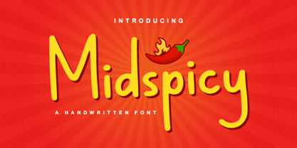 Midspicy A Handwritten Font. It is perfect for any titles, logo, product packaging, branding project, magazine, social media, wedding, or just used to express words above the background. Midspicy also come with Multi-Lingual Support. Enjoy the font, feel free to comment or feedback, send me PM or email. Thank You!
 - Vanny Orewa by Kaidosan,
$18.00 Vanny Orewa is a cool display font with 900 glyphs in it, consisting of a modern and unique style with elegant alternates and leagues. Fall in love with its incredibly versatile style and use it to create beautiful wedding invitations, beautiful stationary art, eye-catching social media posts, and more
 - Mystica by Aestherica Studio,
$12.00 Introducing the new Fun Handwritten Font by Aestherica Studio. Proudly Present, Mystica Mystica is perfect for product packaging, branding project, megazine, social media, wedding, or just used to express words above the background. Mystica also multilingual support. Enjoy the font, feel free to comment or feedback, send me PM or email.
 - Polar Press by Attype Studio,
$14.00 Polar Press is a vintage all caps font with 2 styles: clean and rough, and includes 22 ligatures. Polar Press is a strong font and is perfect for branding, logos, invitations, stationery, social media posts, product packaging, merchandise, blog design, game titles, retro style design, Book/Cover Titles and more.
 - Agave Azul by Fat Hamster,
$25.00 Agave Azul - Hand made old typewriter font Agave Azul Artisan font is perfect for tequila & mezcal label and packaging design, social media quotes, logo & branding design, apparel design, whiskey, beer label and packaging design, heading, scrapbooking, calendars, book covers. Don't forget to use bonus logos, marks and labels for your designs.
 - Playcute by Patria Ari,
$15.00 Introducing, Playcute - a fun kids display typeface with solid shapes but still fun. With uppercase and lowercase option, you can play different glyph shapes to get the best combination. With this font, you can use it for book and magazine cover, social media, headline, logo, digital products, and more. Thank You!
 - Jaosamnak by Jipatype,
$17.00Introducing Jaosamnak, an exquisite typeface that inspiration from Chinese brush calligraphy. With its graceful curves, fluid lines, and simplify, Jaosamnak brings a timeless elegance to your designs. This typeface is tailored for versatility, making it perfect for various applications such as text headlines, sub-headlines, packaging, posters, and other print media. - Realistic Theory by Figuree Studio,
$18.00 Introducing Realistic Theory! Realistic Theory! is strong hand-drawn brush font that combines attractive curves with a fresh urban edge; delivering a stylish brush font that is guaranteed to add an eye-catching appeal to your logo designs, brand imagery, handwritten quotes, product packaging, merchandise, social media post, or website font.
 - Avoiste Laverta by Ilhamtaro,
$19.00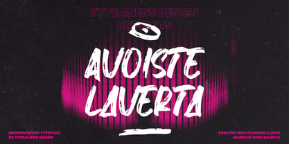 AVOISTE LAVERTA is a display font with a brush texture. Modern in nature suitable for social media design and branding. This font is allcaps font. To enable the OpenType Stylistic alternates, you need a program that supports OpenType features such as Adobe Illustrator CS, Adobe Indesign & CorelDraw X6-X7. Cheers!
 - Jingle Binder by Balpirick,
$15.00 Jingle Binder is a Modern Handwritten Bold Font. Jingle Binder is perfect for product packaging, branding project, magazine, social media, wedding, or just used to express words above the background. Jingle Binder also multilingual support. Enjoy the font, feel free to comment or feedback, send me PM or email. Thank you!
 - Uncle Hours by Adante Creative,
$23.00 Introducing by Adante.Creative Proudly Present, Uncle Hours Uncle Hours is A Bold Display Typeface Font Uncle Hours is perfect for product packaging, branding project, megazine, social media, wedding, or just used to express words above the background. Enjoy the font, feel free to comment or feedback, send me PM or email.
 - Southen by Garisman Studio,
$20.00 SOUTHEN combines attractive curves with a fresh urban edge; delivering a stylish script which is guaranteed to add an eye-catching appeal to your logo designs, brand imagery, handwritten quotes, product packaging, merchandise & social media posts Advantages: - Simple installation - Works for PC and MAC - Multilingual Support - Extra Swashes - Detailed dry brush
 - Oyscake by Allouse Studio,
$16.00 Proudly Present, Oyscake a Handwritten Font. Oyscake is perfect for any titles, logo, product packaging, branding project, megazine, social media, wedding, or just used to express words above the background. Oyscake also come with Multi-Lingual Support. Enjoy the font, feel free to comment or feedback, send me PM or email.
 - Waston by Burnoth Design Co.,
$19.00 Waston is a beautiful and inspiring set of classical typography glyphs based on a minimal and simplistic approach to elegance Waston is a classic serif font made for headlines, titles, and is well-suited for advertising, fashion mood board, branding, logotypes, packaging, titles, editorial design and modern and social media.
 - Forsty Candy by Balpirick,
$15.00 Forsty Candy is a Fun Display Hand-brushed Font. Forsty Candy is perfect for product packaging, branding project, megazine, social media, wedding, or just used to express words above the background. Forsty Candy support multilingual. Enjoy the font, feel free to comment or feedback, send me PM or email. Thank you!
 - Arno by Adobe,
$35.00Named after the Florentine river which runs through the heart of the Italian Renaissance, Arno draws on the warmth and readability of early humanist typefaces of the 15th and 16th centuries. While inspired by the past, Arno is distinctly contemporary in both appearance and function. Designed by Adobe Principal Designer Robert Slimbach, Arno is a meticulously-crafted face in the tradition of early Venetian and Aldine book typefaces. Embodying themes Slimbach has explored in typefaces such as Minion and Brioso, Arno represents a distillation of his design ideals and a refinement of his craft. As a multi-featured OpenType family, with the most extensive Latin-based glyph complement Adobe has yet offered, Arno offers extensive pan-European language support, including Cyrillic and polytonic Greek. The family also offers such typographic niceties as five optical size ranges, extensive swash italic sets, and small capitals for all covered languages. - Superfont by CozyFonts,
$20.00 Superfont type family, created by Tom Nikosey, California Typographic Designer/Illustrator is based on his design and illustration for the title art for the 1984 movie Supergirl. 'I've always felt someday I would design a complete font with variations, including Euro Glyphs and dingbats and numbers based on that logo and letters'. Cozyfonts Foundry is the manifestation of a career-long desire to create fonts in 2011 with his release of Aladdin Bold font family. Superfont is the 22nd font family release. Superfont has a 1960s superhero feel and movement. The entire font family is italic by style. There's a hint of Retro-Moderne in it's overall look. The 1960s ushered in the supersonic era in travel and technology with the jetset look in fashion, product design, fabric design, and type design. Superfont is Cozyfont's take on that era with the innocent future-forward attitude in it's glyph's personality.
 - ITC Goudy Sans by ITC,
$29.99 Frederic W. Goudy designed three weights of this friendly-looking sans serif font from 1922-1929 for Lanston Monotype in the United States. Goudy was attempting to impart freedom and personality to the sans serif form at a time when geometric sans serifs, such as Futura, were gaining rapid world-wide popularity. To achieve this challenging goal, he looked to lapidary inscriptions and manuscript writing for inspiration. He included elements such as slight swellings of terminal strokes, slab serifs on a few of the caps, alternate uncial forms, and a few swash strokes. The result is uniquely Goudy: charming, instinctive, and just right for adding warmth to magazine or advertising layouts. The design staff at ITC updated and filled out the family for a total of eight styles in ITC Goudy Sans. ITC Goudy Sans® font field guide including best practices, font pairings and alternatives.
 - ABC Basisschrift by Elsner+Flake,
$35.00 During the last ten years of his life, Hans Eduard Meier (dec. July 17, 2014), together with Max Schläpfer, developed an innovative concept of a new Swiss Schulschrift (handwriting script for schools) called ABC Basisschrift®. His life’s work is crowned by the fact that now, since the fall of 2014, and beginning in Lucerne, this new didactic will replace the old Schnürlischrift in Switzerland. In contrast with the Schnürlischrift, the idea is to guide a child in three steps to learning a personal handwriting. ABC Schule 1 is for the first grade, ABC 2 starts to introduce the first connections and ABC 4 Ligaturen is designed with many ligatures to serve as a good example for handwriting. ABC Schule is also available with ruling and for visually impaired students.This version of the Basisschrift®, available from here, is the original version by Hans Meier.
 - Excritura by Linotype,
$29.99Excritura is the third typeface created by the Spanish designer Alex Camacho. The robust personality of this original calligraphy-derived italic font will undoubtedly also win you over.Organic shapes determine the character of Excritura, a calligraphic typeface by Alex Camacho. The font has been modelled on the work of the Spanish Architect Antoni Gaudí and was inspired by his love of natural forms and craftsmanship. This is perhaps unsurprising in view of the fact that Camacho grew up in Barcelona, home to much of Gaudí’s creative oeuvre. Organic shapes determine the character of Excritura, a calligraphic typeface by Alex Camacho. The font has been modelled on the work of the Spanish Architect Antoni Gaudí and was inspired by his love of natural forms and craftsmanship. This is perhaps unsurprising in view of the fact that Camacho grew up in Barcelona, home to much of Gaudí’s creative oeuvre. - Gauche Display - Personal use only

- Orthotopes Oblique - Personal use only

- Orthotopes - Personal use only

- Bona Nova by Borutta Group,
$- ☞ Bona Nova is a collective revival project of Bona typeface designed in 1971 by the author of polish banknotes Andrzej Heidrich. Besides giving the project a digital font form the aim was to expand the base character set: preparation of small caps, designing the alternative glyphs and multiple opentype features. Working together with the author we designed two new text versions: regular and bold – to give the family a form of a classic script triad. ☞ It is accompanied by three title versions and three contour styles under the name of Bona Sforza. All styles contains over 1200 glyphs. ☞ Bona Nova is an unprecedented typographic adventure for our team. We hope that our work will allow the cultural heritage of Bona and the work of Andrzeja Heidricha to gain new followers and fans. This project connected three generations of graphic designers who graduated the same school – the Academy of Fine Arts in Warsaw. ☞ Bona Nova isn’t only a typeface. We have also prepared a book about the project (including an interview with Andrzej Heidrich, my text about the digitalisation and a font specimen). The Bona Nova release party was a big exhibition (over 1000 guests). I’ve invited 26 graphic designers to prepare their own initials of Bona Nova – they were presented as posters on exhibition too. LINKS Bona Nova WEB Bona Nova FP Bona-Nova-(FREE-FONT) Bona Nova Book BONA NOVA IN THE MEDIA Typeroom Typography Guru Slanted Designalley Stgu Typografie Info Wikipedia Bona Nova is a non-profit project, all founds that we raise we reinvest to develop the Bona Nova project (new styles, Cyrillic & Greek, extend character set).
 - Mr Palker by Letterhead Studio-YG,
$35.00 A slab serif Mr Palker and grotesque Mr Palkerson build one superfamily together. These are blank types. In a way even the display ones. Typefaces for newspapers, announcements, cheap advertising and police posters. Mr Palker and Mr Palkerson will turn every language into a fence. And due to six types of faces one can choose what material should the fence be made from — from Thin steel rods to the Black stone blocks. In their simplest appearance Mrs P&P are intended for the solid blank composition in victorian or industrial style. They are quite decent, a bit old-fashioned slab serif and grotesque with closed aperture. All my types have layers. Walker and Palkerson also do. Besides the standard set of symbols, they have 4 add-ons. 1. Alternate glyphs, including unicase ones. 2. Ligatures with A letter. 3. Extra tall small caps. 4. Two-storey ligatures. All this options are intended for the complex composition. The additional letters are rather eccentric as their main function here is to imitate the victorian oddities. Imitate, parody, just not repeat. There are lower-case As and Es in the set in height of small caps and uppercases. They can turn every writing into the unicase. The lower-case A (as well as uppercase and small caps version of it) has deliberately by my taste grown a ludicrous tail. To compensate it I’ve built all the possible ligatures - ад, ал, ая. There are 35 of this ligatures all together. Take a closer look at the Russian letters D, L, K, Ya from the main set as well as their alternates. The additional glyphs are one more comic than the other — on purpose to imitate (not to repeat!) the victorian set. This sets have lowercase numbers. And small caps numbers as well. What a modern typeface without them. They also have an У-letter with a generously curvy tail. As if before the WWI. The Latin of course has alternates as well. It has letters to make the perfect French sound more like the russian provincial version of it. The tails of Js and Ts can be made a little bit more open — or a little bit closed. My favorite feature here, an invention of a kind - extra tall small caps. It allows to compose logos with the small caped uppercases directly from the keyboard. The small caps of this typefaces are usually much taller than the customary ones. This is the kind of small caps that Palker and Palkerson have. More to that, the strokes’ weight and the letters width are corresponded to the uppercases. Just a ready set for making a logo a la 1913 style. With a unicase, one has to mind! One more trick with the tall small caps is a possibility to make them work like lower uppercases. Their height is just in between of lower- and uppercases. Isn’t it great to have an additional set of uppercase working ponies in stock for the case of emergency. And finally — the trademark of Palkers family, two-storey ligatures. They are made in the height of uppercases and turn every writing into an ornament or a puzzle of a kind, while at the same time making them much shorter. Each face has 90 of them. Mainly those are twins: CC, BB, DD and so on. ll this things are for the unhasty compositing, even for lettering. Which means that for the things which are not there you always should have Command+Option+O and some patience. Also — among the two storey ligatures one also can find some belvedere villas. All my types are glasses from the one kaleidoscope. The P&Ps family was preliminary part of the victorian set, which already has 1 Cents and Clarendorf - optionally one can add Costro, Gordoni, Handy, Guardy, Surplus, Red Ring, Red Square, Babaev to the list. And also Sklad, Odessa, Dreamland, Romb, Platinum - here, at Letterhead’s, every second one is victorian. All together our typefaces can allow one to set advertisement of any kind, even the trickiest one, and compose everything, from the coffee place’s menu to the antiquarian magazine.
 - Mr Palkerson by Letterhead Studio-YG,
$35.00 A grotesque Mr Palkerson and slab serif Mr Palker build one superfamily together. These are blank types. In a way even the display ones. Typefaces for newspapers, announcements, cheap advertising and police posters. Mr Palker and Mr Palkerson will turn every language into a fence. And due to six types of faces one can choose what material should the fence be made from — from Thin steel rods to the Black stone blocks. In their simplest appearance Mrs P&P are intended for the solid blank composition in victorian or industrial style. They are quite decent, a bit old-fashioned slab serif and grotesque with closed aperture. All my types have layers. Walker and Palkerson also do. Besides the standard set of symbols, they have 4 add-ons. 1. Alternate glyphs, including unicase ones. 2. Ligatures with A letter. 3. Extra tall small caps. 4. Two-storey ligatures. All this options are intended for the complex composition. The additional letters are rather eccentric as their main function here is to imitate the victorian oddities. Imitate, parody, just not repeat. There are lower-case As and Es in the set in height of small caps and uppercases. They can turn every writing into the unicase. The lower-case A (as well as uppercase and small caps version of it) has deliberately by my taste grown a ludicrous tail. To compensate it I’ve built all the possible ligatures - ад, ал, ая. There are 35 of this ligatures all together. Take a closer look at the Russian letters D, L, K, Ya from the main set as well as their alternates. The additional glyphs are one more comic than the other — on purpose to imitate (not to repeat!) the victorian set. This sets have lowercase numbers. And small caps numbers as well. What a modern typeface without them. They also have an У-letter with a generously curvy tail. As if before the WWI. The Latin of course has alternates as well. It has letters to make the perfect French sound more like the russian provincial version of it. The tails of Js and Ts can be made a little bit more open — or a little bit closed. My favorite feature here, an invention of a kind - extra tall small caps. It allows to compose logos with the small caped uppercases directly from the keyboard. The small caps of this typefaces are usually much taller than the customary ones. This is the kind of small caps that Palker and Palkerson have. More to that, the strokes’ weight and the letters width are corresponded to the uppercases. Just a ready set for making a logo a la 1913 style. With a unicase, one has to mind! One more trick with the tall small caps is a possibility to make them work like lower uppercases. Their height is just in between of lower- and uppercases. Isn’t it great to have an additional set of uppercase working ponies in stock for the case of emergency. And finally — the trademark of Palkerson family, two-storey ligatures. They are made in the height of uppercases and turn every writing into an ornament or a puzzle of a kind, while at the same time making them much shorter. Each face has 90 of them. Mainly those are twins: CC, BB, DD and so on. ll this things are for the unhasty compositing, even for lettering. Which means that for the things which are not there you always should have Command+Option+O and some patience. Also — among the two storey ligatures one also can find some belvedere villas. All my types are glasses from the one kaleidoscope. The P&Ps family was preliminary part of the victorian set, which already has 21 Cents and Clarendorf - optionally one can add Costro, Gordoni, Handy, Guardy, Surplus, Red Ring, Red Square, Babaev to the list. And also Sklad, Odessa, Dreamland, Romb, Platinum - here, at Letterhead’s, every second one is victorian. All together our typefaces can allow one to set advertisement of any kind, even the trickiest one, and compose everything, from the coffee place’s menu to the antiquarian magazine.
 - ViabellaT H Pro by Elsner+Flake,
$40.00 The script version of the typeface Viabella introduces us to the calligraphic side of the Berlin type designer and typographer Karl-Heinz Lange. The sketches for this script typeface, which resulted from the close cooperation with Veronika Elsner and Günther Flake, found their roots in sketch drawings which Karl-Heinz Lange had already drawn in the 1980’s. For the Viabella design, Karl-Heinz Lange drew the basic letterforms of the Black and Regular cuts with a brush. He then re-worked the drawings and transferred them on to tracing paper. The design studio Elsner+Flake in Hamburg cut these typeface extensions and later digitized them manually with the help of the IKARUS Sustem. With the Regular cut as a basis, Elsner+Flake extended the family with the Light version and interpolated and re-worked the Medium weight. The completion of the family was taken over by the type designer Björn Gogalla who had done the same kind of work on Rotola, a design which Karl-Heinz Lange had also created for Elsner+Flake. While Viabella was originally conceived as a headline typeface, its lighter weights can certainly be used for shorter text applications. The Black version creates powerful headlines with highly effective accents. With the help of swashes, which are available for all weights, the user can lighten up longer texts and add special character to titles. In contrast to pure headline fonts, Viabella has been enriched by an extensive complement of special characters. In addition to the Europa-Plus character set which allows setting type in over 70 latin-based languages, the user will find multiple versions of numerals as well as oldstyle figures, tabular and proportional lining figures, diagonal fractions, and a complete set of superior and inferior figures and fractions (60%). With such a rich character set, Viabella is not only ideal for many different uses in the areas of newspaper, magazine and advertising but it will surely be chosen for the design of greeting cards, invitations and other design projects within the privat sphere.
 - Pontifica by Scriptorium,
$18.00Pontifica is based on ‘protogothic’ calligraphy, a style developed at the monastery of St. Gall in the 12th century to replace Carolingian minuscule with a more efficient and compact system of lettering. Ultimately it became the progenitor of the gothic lettering styles of the late Medieval period. Also available to go with this font is a special swash version with a very different style, but compatible overall appearance. - Leaders by Mans Greback,
$59.00 Leaders is a decorative blackletter typeface. Created by Måns Grebäck during 2020, this medieval style lettering can be used for modern contexts that require a touch of flourishing, as well as any middle age art or festive occation. OpenType functions such as ligatures and alternates are present in the typeface. It contains numbers and all symbols and punctuation you'll ever need. The font also has support for European, Latin-based languages.
 - Angars Runes by Mans Greback,
$59.00 Angars Runes is a Middle Age style rune typeface. With engraved letterforms and gothic curves, this font is the perfect addition to a medieval project. The font was drawn and created by Måns Grebäck in 2019. Use the symbols plus + period . multiply × colon : for decorative separators. Angars Runes contains all characters you will ever need, as well as numerals and alternate letters. This is a font with multilingual support.
 - Al Baratheon by Aluyeah Studio,
$125.00 Hello Aluyeaholics! Be the King or Queen of your project with Baratheon. This display font is inspired by Medieval Knights and crafted with attention to detail. Feel like a Lord or Lady and show your inner King or Queen with Baratheon. Coming with 200+ stunning and super easy to use alternates and ligatures with quick access. To get results like the preview just type B.2a.7r.ath.17eo.2n.14


