10,000 search results
(0.013 seconds)
- Maiers Nr 21 Pro by Ingo,
$42.00 A handwritten ”font for technicians“ from ca. 1900. Very geometrical, rigid forms borrowed from the typical characteristics of Jugendstil / Art Nouveau. This script is found in a magazine from the Otto Maier publishing house, Ravensburg, which was issued sometime in the years shortly before WWI. The magazine is entitled ”Schriften-Sammlung für Techniker: Verkleinerte Schriften der wichtigsten Alphabete“ (Collection of scripts for technical specialists: reduced scripts of the most significant alphabets) and published by Karl O. Maier. The original copy, produced by means of a galvanized plate, is just 7 centimeters wide. It served as the model for technical professions in which, at that time, the captions of drawings were still done by hand. The characters have been scanned, digitized and greatly magnified. Special attention was given to ensure the ”uneven“ edges, typical of handwritten script, remained effectively noticeable even in the digitized form. As a result, this ”technical“ font retains a handmade touch. Especially worthy of note are the Jugendstil forms characteristic at the turn of the19th century. In comparison, many alleged ”ultramodern“ font types of today suddenly look quite old-fashioned. Maier’s Nr. 21 Pro is suitable for all European languages. It includes ”Latin Extended-A,“ for Central and Eastern Europe incl. Turkish, and even Cyrillic and Greek, too. The font includes several stylistic alternates as well as a number of ligatures.
 - FS Irwin by Fontsmith,
$80.00 New York vibes FS Irwin was born in New York while Senior Designer, Fernando Mello, was studying an intensive 5 week typeface design course at the Cooper Union. His brief was to design a perfectly clear typeface that could communicate well, without loud or overtly mannered design features. Fernando was influenced by the subway font in New York: ‘It is very in your face and clear, always in bold. It doesn’t shout much but at the same time is very present and unique. The design is completely different but it was this spirit I wanted to capture for FS Irwin.’ And the vibe of the city: ‘In a similar way to London, New York is so mixed and so cosmopolitan. I was amazed by the different styles and identities I saw there, and tried to encapsulate this essence to create something new, relevant and very now.’ Incisive quality Rather than focusing on quirks or distinctive characteristics, the key to FS Irwin is the quality of its design and spirit of simplicity. The design, proportions and details are usable and authentic and it is suitable for countless situations, without running the risk of being instantaneously noticeable. Families like this can be used on nearly anything, from more playful designs to serious corporate IDs. ‘Extensively tested and precisely drawn text-oriented typefaces are what I enjoy designing the most. There is a beauty and a different approach, a different way of making them interesting, sellable and usable rather than adding flicks or unexpected details.’ Inscriptions and calligraphy FS Irwin’s origin lies in Fernando’s studies in inscriptional lettering and writing-calligraphic exercises at the Cooper Union. Mello started the process by digitising his explorations and adapting them into a more workable sans serif structure. The traditional forms of writing which gave the basis to Latin type as we know it today were the perfect place to start. This influence can be seen in the proportion of the capitals and in slight writing-calligraphic details in the lowercase, such as the slightly angled, chiselled spurs and their open terminals.
 - Soho Gothic by Monotype,
$29.99 “There is just something magical about type design,” says Sebastian Lester. “If you draw a successful typeface it can travel the world, taking a part of you with it.” If this is true, his Soho® Gothic family has taken him far and wide. Understated, modern and exceptionally versatile, the family has been put to good use in just about every application imaginable. A good choice for virtually any type of project, The Soho Gothic family performs equally well as the backbone of a global brand as it would in an edgy fashion magazine. Versatile, extensive, customizable, and multilingual – the Soho Gothic typeface family has it all.With the same proportions as Soho, its slab serif cousin, Soho Gothic ranges across seven weights, from a willowy hairline to a brawny ultra – each with a complementary italic.Lester took care to ensure that the Soho and Soho Gothic designs work in perfect harmony. According to him, “The typefaces were developed alongside each other so that I could consider every aspect of each design and be certain that they would be absolutely compatible.”Soho Gothic is a more understated and more subtle design than Soho. Features that give the design its distinctive tone are the flat, crisp apexes of the diagonal characters like the A and V, and the marked horizontal stress in the a, g and s. “I wanted the family as a whole to radiate effortless modernity,” recalls Lester, “to be a master communicator that works in all conditions and at all sizes.” A collection of alternate and “semi-slab” characters were also part of Lester’s plan. “I like to develop alternate characters for all my type designs,” he says. “I believe they give graphic designers greater flexibility and make a typeface more valuable.” Soho Gothic is available as OpenType® Pro fonts that have an extended character set which supports most Central European and many Eastern European languages. If you’re looking to complete your designs, consider pairing it with Bembo® Book,Joanna® Nova,Neue Frutiger®,PMN Caecilia®,or ITC Stone® Serif.
 - "Zamolxis I" is a distinctive font that captures the essence of ancient mystique and modernity in its design. This unique typeface is named after Zamolxis, who is often regarded as a god or a revered...
- DeLouisville - 100% free

- Albertina by Monotype,
$29.99Albertina was a typeface ahead of its time. It was in the early 1960s when designer Chris Brand, an accomplished calligrapher, aspired to draw a typeface based on the principles of calligraphy. Unfortunately, typesetting machines of that era put many restrictions on designers. Characters had to be drawn within a very coarse grid, which also defined their spacing. Technological limitations meant that italic designs often had to share the same character widths as the romans. Designers were forced to draw italic faces much wider and with more open spacing than what would be typical in calligraphic lettering or hand-set type. Not surprisingly, production of the first Albertina fonts went very slowly. Brand would submit his character drawings, and the Monotype Drawing Office would modify them to be compatible with the company's typesetting equipment. The new drawings would then be sent back to Brand for approval or rework. Most were reworked. The process took so long, in fact, that by the time the face was completed it was once again out of phase with the times: instead of being released as metal type for the Monotype composing machines it had been tailored for, Albertina debuted as phototype fonts for the Monophoto typesetter. The design's first use was for a catalog of the work of Stanley Morison, exhibited at the Albertina Library in Brussels in 1966. Sales of the design were not remarkable. With the advent of digital type technology, Albertina's story took a far happier turn. Frank E. Blokland, of the Dutch Type Library, used Brand's original, uncompromised drawings as the foundation of a digital revival. The Monophoto version had taken a considerable battering from the limitations of Monotype's unit system," recalls Blokland, "but there was no need for me to incorporate these restrictions in the digital version." With the full backing of Monotype and original designer Brand looking over Blokland's shoulder, a new design for Albertina emerged, displaying all the grace and verve of Brand's original drawings. The basic family drawn by Brand also grew into three weights, each with an italic complement and a suite of small caps and old style figures." - "I Still Know" stands out as a font that carries with it an aura of mystery and a distinct personality that seems to whisper secrets from the depths of its characters. Imagine each letter crafted wit...
- Avante Go - Personal use only

- Avante Return - Unknown license

- Green Dinosaur - Unknown license

- Meyola by Stripes Studio,
$20.00 Hi, Introducing the latest styles Meyola with the kind of modern hand scratches, I hope you are interested in this font, if you want to use for your work this font can be used easily and simply because there are a lot of features in it to contain a complete set of letters lower and uppercase letters, assorted punctuation, numbers, and multilingual support. font also contains several ligatures and alternate style Stylistic.
 - Hexenhammer by Hanoded,
$15.00 The ‘Hammer of Witches’, ‘Malleus Maleficarum’ or ‘Hexenhammer’ in German is the best know and most important treatise on witchcraft. It was composed by Heinrich Kramer in 1487. I thought it was a rather apt name for my latest fairytale font! Hexenhammer is a rough, handwritten typeface with an attitude. It can be used for book covers, posters and even spells. Comes with a bunch of end ligatures and a pandemonium of diacritics.
 - Shardie Brush by Stripes Studio,
$20.00 Hi, Introducing the latest styles Shardie Brush with the kind of modern hand scratches, I hope you are interested in this font, if you want to use for your work this font can be used easily and simply because there are a lot of features in it to contain a complete set of letters lower and uppercase letters, assorted punctuation, numbers, and multilingual support. font also contains several ligatures and alternate style Stylistic.
 - Homeward Bound by Hanoded,
$15.00 Homeward Bound is a fat, grungy slab serif font - all handmade and inspired by a well known 1934 font. Together with sidekick Homeward Bound II, this baby will lighten up your day, bring you your newspaper and do your dishes to boot. Well, that may not be an accurate description of Homeward Bound’s abilities, but I am sure it will make your work stand out, giving it that ‘handmade eroded vintage’ look.
 - Raventame by Viaction Type.Co,
$16.00 Raventame font with original handwriting brush style, looks very natural and beautiful. It is suitable for boutique brand, photography, magazine, quote, business card, logo, poster and many more. Script is equipped with multilingual support and PUA Encoded. This font is equipped with the Raventame Swash version which is very easy to combine with the Raventame font. Very many swash options with a variety of original hand strokes. I hope you enjoy and thank you.
 - Abigail Script by Roland Hüse Design,
$15.00 Abigail Script is a handwritten, monoline cursive font. All the uppercase letters has stylistic alternates and some lowercase letters as well, ligatures and positional forms. Also have a few ornaments in place of numbers 1-9 best fit under words up to 5-6 characters long. See the gallery for preview. It contains Eastern and Western European accented characters. I hope you like this font, good luck with your project and let the creativity flow!
 - Dreadnought by Hanoded,
$15.00 With Dreadnought I go back to my roots: one of my very first fonts was a scary brush typeface called Face Your Fears - a very popular typeface with horror lovers, thrill seekers and gangsta rappers. Dreadnought was created using a stiff brush and some very high quality paint on textured paper. The result is a lively, scary and very legible font. Use it for your movie, book or album: you won't be disappointed!
 - Alberta Script by Factory738,
$15.00 Alberta Signature Script is ideal for branding projects, logos, wedding designs, social media posts, advertisements, product packaging, product designs, label, photography, watermark, invitation, stationery, and any other project that requires a handwritten touch. Alberta Signature Script (Regular, Caps, and Tails) Basic Latin A-Z and a-z Numerals & Punctuation Stylistic Alternates Multilingual Support for ä ö ü Ä Ö Ü … Free updates and feature additions Thanks for looking, and I hope you enjoy it.
 - Merfidost Brush by Stripes Studio,
$20.00 Hi, Introducing the latest styles Merfidost Brush Font Duo with the kind of modern hand scratches, I hope you are interested in this font, if you want to use for your work this font can be used easily and simply because there are a lot of features in it to contain a complete set of letters lower and uppercase letters, assorted punctuation, numbers, and multilingual support. font also contains several ligatures and alternate style Stylistic.
 - Celtia Script by Stripes Studio,
$20.00 Hi, Introducing the latest styles Celtia Script with the kind of modern hand scratches, I hope you are interested in this font, if you want to use for your work this font can be used easily and simply because there are a lot of features in it to contain a complete set of letters lower and uppercase letters, assorted punctuation, numbers, and multilingual support. font also contains several ligatures and alternate style Stylistic.
 - Spoiler by PizzaDude.dk,
$16.00 Now here's a font that won't spoil anything! It's my ALL CAPS brush font with slightly uneven and quirky lines. Just enough to make font look lively and fresh, but not overdoing it. Every letter has 7 different versions, which automatically cycles as you type - and I have added an extra SMALL CAPS for each letter. Exchange every letter here and there with SMALL CAPS, and you will get an even more authentic result!
 - Bitumen by Hanoded,
$12.00 Bitumen is a sticky, black, and highly viscous liquid form of petroleum. When I created this font, it reminded me a bit of asphalt, hence the name. Bitumen is a handmade font based on Schmallfette Grotesk by Walter Haettenschweiler and Haettenschweiler font. The font was made with a Japanese brush pen, hence the bold lines. Bitumen comes in two styles: the regular, fat display font and a lighter version - both with italics.
 - Calamity Wayne by explogos,
$24.99 Calamity Wayne is a reverse-contrast slab serif, inspired by the ‘wild west’ French Clarendons (aka Italians or Egyptians) of the late-1800s. Despite the idiosyncrasies that make it ideal for display and headline uses, it is also surprisingly legible in text settings. Calamity Wayne supports Latin, Cyrillic and Greek, and is available in OTF and TTF formats. Acknowledgement: I am very grateful to David Jonathan Ross (https://djr.com) for his support and encouragement.
 - Hesster Mofet by JOEBOB graphics,
$20.00 Hesster Mofet is what I got after writing with an old and weathered calligraphic marker on textured paper. The characters were smoothened for a clean result, but since the original sketches had such a nice rough, edgy feel to them, they were also made into a complete font set. A couple of ligatures and a Hannibal Lecter reference were thrown in the mix as well. You can get both versions at a discount.
 - Strong Brush by Stripes Studio,
$20.00 Hi, Introducing the latest styles Strong Brush with the kind of modern hand scratches, I hope you are interested in this font, if you want to use for your work this font can be used easily and simply because there are a lot of features in it to contain a complete set of letters lower and uppercase letters, assorted punctuation, numbers, and multilingual support. font also contains several ligatures and alternate style Stylistic.
 - Bloemgracht by Hanoded,
$15.00 In the old Amsterdam neighborhood of 'De Jordaan', you will find a canal called Bloemgracht (Flower Canal). For many years, a coffee store called Schildmeijer could be found here. Their paper coffee bags and advertisements sported a hand made font which I have tried to recreate and the result is Bloemgracht typeface. It is an all caps art deco font, quite angular, but very legible and distinct. Bloemgracht comes with extensive language support.
 - Gmbh Sans by EchadType,
$9.99 GMBH SANS The architectural sans-serif in sharp junctions silhouette. Designed as a display typeface for headline sizes. Typeface maintains it's unique identity even in all lowercase letters due to 21 degrees slanted stems (vertical strokes of letters). Variable typefaces provides subtle gradation of 6 weights. Each weight retains the same character width (except character i and l). Typeface supports: Latin characters with diacritical marks; Cyrillic characters (Ukrainian, Russian); Hebrew; Contains additional monetary symbols (₿Ξ₴₹₪)
 - Anstolina by Stripes Studio,
$20.00 Hi, Introducing the latest styles Anstolina with the kind of modern hand scratches, I hope you are interested in this font, if you want to use for your work this font can be used easily and simply because there are a lot of features in it to contain a complete set of letters lower and uppercase letters, assorted punctuation, numbers, and multilingual support. font also contains several ligatures and alternate style Stylistic.
 - Winter Story by Stripes Studio,
$20.00 Hi, Introducing the latest styles Winter Story with the kind of modern hand scratches, I hope you are interested in this font, if you want to use for your work this font can be used easily and simply because there are a lot of features in it to contain a complete set of letters lower and uppercase letters, assorted punctuation, numbers, and multilingual support. font also contains several ligatures and alternate style Stylistic.
 - Young Style by Stripes Studio,
$20.00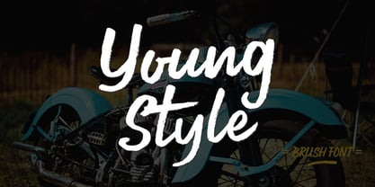 Hi, Introducing the latest styles Young Style with the kind of modern hand scratches, I hope you are interested in this font, if you want to use for your work this font can be used easily and simply because there are a lot of features in it to contain a complete set of letters lower and uppercase letters, assorted punctuation, numbers, and multilingual support. font also contains several ligatures and alternate style Stylistic.
 - Freaky Frog BF by Bomparte's Fonts,
$14.95A revival of sorts, Freaky Frog BF is modeled after an 1887 design from Central Type Foundry, called Grimaldi. Much warmth and charm have been instilled into the original design through among other means, reworked contours and serifs. Contours are smoothened, liberated from its roughness, while serifs have become somewhat concave. Verticals and horizontals appear to "swell" owed in part to flared shapes. The overall effect, I believe, is one of pure typographic endearment. - Notica Serif by HansCo,
$15.00 Notica Serif Font is a classy display serif font with unique look that is perfect for multipurpose projects. I made Notica Serif Font inspired by the concept of romantic vibes and made it into a modern yet luxury style. This font is also looks elegant and will fit well in any design and very recommended for logo, crafts, posters, books, branding, quotes, print templates, packaging, invitations, product labels, advertising, wedding project and more. Enjoy!
 - Angelina Script by Din Studio,
$25.00 Introducing Angelina Script - Beautiful Handwritten. It's made with a naturally handwritten and modern style. Angelina font best use for wedding, branding, logotype and quotes. This includes both a Regular version and a Dots version. How to access alternate glyphs? you can see it on this link ( http://goo.gl/1vy2fv) I hope this font can meet your design needs. Fell free to contact me in message or direct email donis4design@gmail.com. Happy Design :) Thank You, Donis
 - Glory Mathilda by Atharuah Studios,
$16.00 Introducing Glory Mathilda! An energetic brush stroke fonts. With two sets of all-caps letters, Glory Mathilda can support your creativity on your logo design, brand imagery, quotes, merchandise, product packaging, music projects, social media posts, etc. Glory Mathilda also has ten swashes that you can access in each alternative letter A-J. That's it! I hope you enjoy it. You can also say hello to me on Instagram: https://www.instagram.com/atharuah_ Thank You!
 - Molika by Khaiuns,
$13.00 ay hello to "molika" :) molika has two types of fonts namely sans serif and handwritten, both have a firm character and also elegant-lettered font - perfect for casual type in greeting cards, illustrations, quotes, quaint branding, book covers, social media posts, packaging and so much more :) The duo fonts consist of all uppercase letters and remain elegant for your project. I hope you have a blast using Molika. Thanks for use this font ~ Khaiuns
 - Palestra by Larin Type Co,
$12.00 Palestra - a modern sans serif font in four style : Regular, Italic, Bold and Bold italic. In this font, I can see many alternatives for the lowercase and most common ligatures that fit perfectly with this font style. This font can look more classic without serifs and more expressive with alternative substitutes, try to play with them and you will get the uniqueness in your project. All characters in this font are PUA-encoded.
 - Numpty by Hanoded,
$15.00 Numpty is a word of Scottish origin and means ‘someone who, by speech or action, demonstrates a lack of knowledge’. I use this word quite often (as this world, unfortunately, seems to be full of numpties). And guess what? Now you know what it means, you can use it too! Hooray! Numpty is a fat, rounded display font. A little uneven, a little weird, but with enough panache to make your designs stand out.
 - High Jumps by Arendxstudio,
$13.00 High Jumps - A Graffiti Display Font is a free style font that has the characteristics of street art that shows freedom and is filled with unique characters Features : • Character Set A-Z • Numerals & Punctuations (OpenType Standard) • Accents (Multilingual characters) • Ligature • Alternate There it is! I really hope you enjoy it - comments & likes are always welcome and accepted. More importantly, don't hesitate to send a message if you have a problem or question.
 - Gitter Neormis by HansCo,
$15.00 Gitter Neormis Font is a classy display serif font with unique look that is perfect for multipurpose projects. I made Gitter Neormis Font inspired by the concept of romantic vibes and made it into a modern yet luxury style. This font is also looks elegant and will fit well in any design and very recommended for logo, crafts, posters, books, branding, quotes, print templates, packaging, invitations, product labels, advertising, wedding project and more. Enjoy!
 - Same Old Joke by Bogstav,
$15.00 Same Old Joke is a happy and handmade font. Use it for anything that needs a hand lettered expression. Works well with prints, cards, packaging or perhaps even a poster of your favourite chocolate! Each version of the font is full of personality, and was carefully handdrawn to keep both the legibility and the handmade feeling. I put in ligatures to substitute the most common letter repeating - to make it look even more handmade!


