10,000 search results
(0.017 seconds)
- Fnord by Monotype,
$23.99 Fnord is a contemporary humanist serif typeface, it is ideally suited for display purposes, titling, headline copy and branding. The family has been designed to be highly versatile, containing a total of 23 fonts. Each font features discretionary ligatures, swash alternates and true small caps. The overall design is clean and simple with a little bit of rebelliousness thrown in for good measure – Fnord does not conform to the traditional serif blueprint. Fnord’s design has been strongly influenced by the complex, thought-provoking and mischievous works of authors Robert Anton Wilson and Robert Shea from the 1970s. I was re-reading their work while sketching the initial letterforms and realised that some of the proportions and angles were coinciding with some themes that run through the books – particularly the numbers 5, 17, 23, 40 and 93, which are key to this font family’s spacing and geometry. I found it both very interesting and enjoyable to play with a specific theme and purpose for creating this typeface. I am sure you will enjoy working with it in your own design projects. Key features: • 5 Weights in 4 Styles – Roman, Italic, Condensed and Extended • 3 Additional Display Styles in 1 Weight – Engraved, Inline and Woodcut • Small Caps, Alternates, Swashes and Discretionary Ligatures • Full European character set • 680 glyphs per font.
 - Pacioli by MADType,
$29.00 This font is based on an alphabet published by Luca Pacioli in his 1509 mathematical treatise De divina proportione. In this book, Pacioli describes how to build the Roman alphabet geometrically using lines, squares and circles. Pacioli was not the first or the last man in his era to describe the building of letters mathematically. Felice Feliciano did this before Pacioli, and Albrecht Dürer further developed these forms years after. According to Pacioli, the thick strokes should be 1/9th of the height, and the thin strokes should have 1/2 the weight of the thick strokes. I felt that this beautiful alphabet needed to be restored to its full geometric glory and set out to construct an accurate replica using Pacioli's instructions. Included in the font you'll find the letters that have the grid overlay and also the letters without the grid. The letters J, W, U, and Z were not included in the book, so I have created my own versions of these characters that fit into Pacioli's grid. Pacioli shows two different Os in the book, so I have included the second O as well as a second J, Q, and Z as OpenType stylistic alternates. Also included in the font are border patterns and a fleuron taken from the cover of the book.
 - Kubrick by Quadrat,
$25.00 Kubrick is an experiment in extremes. The Light font is very tall and slender, the Black font is very massive, and Kubrick's slender counters push some of its glyphs to the edge of recognition. The thin counters and negative spaces also give text set in Kubrick a definite visual sparkle, especially in all-uppercase settings. Because of its extreme letterforms, Kubrick is recommended only for large display use. The default letterspacing is set fairly wide to keep text legible. Kubrick was a double-experiment. One part of it was to see how heavy and massive a typeface I could make while still keeping it legible. The other part was to develop a Multiple Master font. Multiple Master fonts were a format developed by Adobe that allowed the user to change things like the weight and width of a typeface. Monollith started as just such a Multiple Master typeface, but when Adobe discontinued the Multiple Master format, I stopped work on the typeface. Later I decided to continue work on it, but as five separate font weights: Light, Medium, Bold, ExtraBold and Black. Very rectilinear letterforms with extremely narrow counters and negative spaces. The five fonts go from very thin and condensed to very heavy and extended. Use in large display settings where unornamented high visual impact is desired.
 - Lubaline by Lián Types,
$39.00 Who haven't heard the phrase that ‘any past time was better’?. Although I sometimes find this phrase a little too pessimistic (because I try to think that the best is yet to come), it may be true regarding my passion, typography. I'm too young (29) unfortunately, and this means I did not have the pleasure of being contemporary with maybe the man who has influenced my work the most (1). The man that showed that letters are more than just letters to be read. Herb Lubalin (1918-1981), also called sometimes as ‘the rule basher’ (2), smashed the taboos and sacred rules of type design and gave it personality. He rejected the functionalist philosophy of europeans in favor of an eclectic and exuberant style. To him, letters were not merely vessels of form, they were objects of meaning. (3). Nowadays, when looking at his portfolio, who dares to deny that the term ‘typography’ and ‘beauty’ may go hand-in-hand without any problem? Ed Benguiat, one of Herb’s partners, still likes making jokes with the phrase “screw legibility, type should be beautiful” and what I understand of this is not to forget the rules, but to know and break them carefully. In an era of pure eclecticism, we, the lovers of flourishes and swashes, can't do nothing but admire all the legacy that Lubalin, this wonderful type-guru, left. My font Lubaline read as “the line of Lubalin” is my humble tribute to him. Those who know his work, may see the influences easily like in his ‘Beards’ (1976) and ‘The Sound of Music’ (1965) posters; the art-deco forms in many of his amazing logos and practically in all his creations where letters seem to be alive just like you and me. I really hope that the future finds me still learning more and more about type-design and letterforms, and like him, always willing to make innovations in my field: Because letters are not just letters to be read. NOTES (1) These are some of my fonts in which some of Lubalin’s influences can be seen (in order of creation): Reina, Aire, Erotica, String, Beatle, Heroe, Selfie, Model, Seventies, and many others that are still in progress. (2) (3) Steven Heller. Herb Lubalin: Rule Basher. U&lc (1998) http://www.printmag.com/imprint/my-favorite-lubalin/
 - Klothilde by Fontroll,
$20.00 Klothilde is a handwriting font which came to life in one of my doodling sessions (I must admit I still doodle with pen and paper). The idea was to create a font which resembles writing with a quill on paper with exaggerated ball terminals. Sometimes there is too much ink which makes the letters fat and the strokes uneven. The paper soaks the ink resulting in blurred line crossings. The form gets blurry. On the other hand, when the quill runs out of ink the stroke gets thinner looking like the light version of Klothilde. In order to emulate the different looks, I created six fonts with a common skeleton but different appearance which can be altered seamlessly by using the Variable Fonts technology (e.g. in latest Adobe apps or CorelDRAW Graphics Suite) along the Weight and Blurred sliders. But even without, Klothilde can be used even in longer copy. Use it from 18 pt upwards, flush left with tight leading and intersecting ascenders and descenders. Due to extensive manual kerning, it gives your text an even colour. To my knowledge, Klothilde is one of the first script Variable fonts in different weights. No, Klothilde’s letters are not connecting. But I added a whole bunch of connecting ligatures which are simply activated by the ligature feature of your app. Even Microsoft Word can do that. Thus Klothilde comes to life, as it should be expected from a handwriting font. In order to add to variety there are additional glyphs for some critical initial and standalone letters. Repeating letter combinations like nn, mm or rr are avoided by replacing the second letter by an alternative form. All features are activated by the standard ligature feature. Ligatures are available for most European languages, some even in Cyrillic (some special Serbo-Croat letters included and accessible through localization or Style Set 08 features). Romanian comma-accent characters and ligatures are accessible through the OpenType locl feature. For the topping on the cake, I added an alternate ampersand (stylistic set 1) and asterisk (ss04), an alternate Cyrillic b (ss02) and t (ss03), a few fleurons, arrows and a skull (OpenType feature ornm), fractions (frac feature), circled numbers (ss06) and an interrobang (ss07) which result in exactly 900 glyphs in each of the six fonts. There should be enough to play with. Should you be missing a special character, do give me a hint.
 - Blue Typewriter by Ana's Fonts,
$16.00 Blue Typewriter is a bold typewriter font and scans pack (with graphics, text, paper) sampled from old documents, for an authentic vintage look. Use this set in any designs that needs a vintage touch: in long or short texts, in digital collages, branding and packaging, social media posts, logotypes, etc. Included in this product: Blue Typewriter font with variations: underlined, dashed, crossed-out and dashed underline, in SVG and vector versions (with the vector versions created separately, so that the two versions include subtle differences)
 - Allisha Croft by Maulana Creative,
$11.00 Allisha Croft is a beautiful feminine script font, With a high contrast stroke clean and fun characters. It has Opentype features of ligatures, makes it a perfect choice for branding and digital designs. Use this font for logos, social media, websites, blogs, instagram, social media, business cards, branding, and more! Allisha Croft font support multilingual more than 100+ language. and good pair for your secondary text font with sans or serif. Make a stunning work with Allisha Croft beautiful feminine script font. Cheers, MaulanaCreative
 - Typek by Agnieszka Ewa Olszewska,
$25.00 Typek is a sans serif typeface for the lovers of minimal design and great curves. Typek outlines' professional shapes are perfect for large display usage.. Perfect for branding, posters, web and publications. The idea is to treat the letters' stroke create absorbing and interlaced shape. The design of small interfering in letters' construction makes Typek unique. Typek contains uppercase, diacritics and digits. The Typek Family is in two versions: Regular and Outline. Outline version can be an interesting addition and decoration for the Regular version.
 - Henman by ParaType,
$30.00 Based on the late 1970s artwork by outstanding Armenian type designer Henrik Mnatsakanyan (1923-2001). That was the only design created by Mnatsakanyan for Latin and Cyrillic. Digital version with adding the missing characters was designed for ParaType in 2003 by Manvel Shmavonyan. The font name Henman proposed by Mnatsakanyan is formed of the first three letters from the each designer's name: HENrik and MANvel. Some fractured elements make the face informal and a little bit funny. For use in text, advertising and display matter.
 - Rip TAPE by TypoGraphicDesign,
$19.00 CONCEPT/CHARACTERISTICS The handmade, dirty and yet modern character of the font was designed with analog tape on paper and later digitized. The motto is sticky, wrinkled and rough APPLICATION AREA The dirty, rough and fancy font „rip TAPE“ would look good at display size for poster, flyer, comics and graphic novel lettering and logos. Headlines in magazines or websites, packaging, music covers or webbanner etc. TECHNICAL SPECIFICATIONS Headline Font | Display Font | Grunge/DIY Font „rip TAPE“ OpenType Font with & 78 glyphs & 2 styles (regular, fixed).
 - Tondu by The Northern Block,
$37.95 Tondu is a straightforward display typeface inspired by film posters of the early 1900s. Strong upright forms combined with smooth curved details create a clear and bold font ideal for apparel, billboards, books and posters. Tondu is now available as version 2.0 (2021); the remastered version meets higher technical standards that modern-day users demand. Included in the font are over 490 characters, in one heavyweight style. Opentype features consist of digital numerals, lining figures, fractions and language support covering Western, South and Central Europe.
 - Sales Convention JNL by Jeff Levine,
$29.00 In its heyday, the Starlight Room of the Waldorf-Astoria in New York City quite frequently printed lunch and dinner menus for not only their rotating bill of fare, but also for special events held there. The 1937 Electrolux (Eastern) Appreciation Banquet has its own menu cover, and the lettering was in a simple, yet Art-Deco influenced condensed block design with squared features. This simple and quirky typeface has been digitally redrawn as Sales Convention JNL, and is available in both regular and oblique versions.
 - Facsimile by Linotype,
$29.99Linotype Facsimile is part of the Take Type Library, which features the winners of Linotype’s International Digital Type Design Contest. Designed by J. Luigs and S. Wicker, the forms were constructed for electronic readers, just as the OCR fonts were. The increasing use of computers accompanied the growing number of fonts suitable for electronic reading. The standard has long been set, but designers are always creating new interpretations and new symbols. Typefaces like Facsimile are here to stay and personify the Zeitgeist of the late 20th century. - Witchfinder by Die Typonauten,
$19.00 This font family is the first collection of almost all pictograms, signs and letters that refers to the topic of White Magic, witches and witch hunt. There are plenty of witch symbols, astrology signs, woodcuts and witch letters. The cryptic symbols are explained in an extra style. In addition to the symbols the scripts contain both: a digitized original manuscript from the ending 18th century and a modified newer script version. Bringing the light of the Enlightenment to the dark ages of suspicion, chasing and unjustness!
 - Quinn Display Typeface by FoxType,
$50.00 Introducing Quinn Display new generation Typeface created for building brand identity. Quinn Typeface created with the vision of to attract the audience to your brand . The finest details of this typeface are methodically and mathematically created. Quinn is created with all the tasks of a corporate font and also for the usage in a variety of projects, including branding, logos, titles, headlines, servers, posters, screens, display, digital ads, and everything else. We are putting a lot of effort on this font as a long-term project.
 - Fred by E-phemera,
$20.00The Fred family is based on the casual hand lettering of Fred G. Cooper: cover artist, cartoonist, and letterer for Life magazine in the 1920s and '30s. His relaxed style captures the flavor of the Roaring Twenties, and the digital font was developed for use in the credits and title cards for a 1920s-style silent movie, The Call of Cthulhu. In an effort to keep the hand-lettered look, the OpenType font has numerous discretionary ligatures and contextual alternates, along with fleurons and ornaments. - MFC Deco Diamond Monogram by Monogram Fonts Co.,
$19.00 MFC Deco Diamond Monogram finds its historical influence in a vintage monogram transfer sheet of unknown origin. We've digitally recreated it, adding missing characters to fill out the character set, and programming in functionality to make customization a snap. MFC Deco Diamond Monogram is capable of creating two or three letter monograms, either free-floating or surrounded by a selection of different frames. If you are looking for a diamond format monogram with deco influence, then you've found yourself your mark maker in MFC Deco Diamond Monogram.
 - Aleut by Peliken,
$14.00 Tribal Aleut OTF color font. Native Historic font, traditional ethnic characters in style of customs and traditions of national culture. You can use this font for design logos, quotes prints on t-shirts and other. OpenType-SVG Font was designed with Fontself Maker in Illustrator CC. Contains only uppercase letters and digits. WARNING Color fonts are pretty new technology - they currently show up in Photoshop CC 2017+, Illustrator CC 2018 and some Mac apps. Learn more about color font support on third-party apps here: https://www.colorfonts.wtf/
 - Intervogue by Miller Type Foundry,
$25.99 Released by Intertype in the 1930’s, Vogue was a geometric sans serif rival to Futura and Kabel. Vogue had many unique quirks such as its distinctive G, that striking Q with a vertical tail, and many others. Almost ninety years later there has been no decent digital revival of this wonderful typeface... until now. Intervogue brings this classic to life in the modern age. Seven weights complete with true obliques and an alternate cut give Intervogue the versatility to be a true workhorse.
 - Belkin Display Typeface by FoxType,
$12.00 Belkin Display new generation Typeface. Belkin Dispaly Typeface created with the vision of attract the audience to your brand . The finest details of this typeface are methodically and mathematically created. Belkin is created with all the tasks of a corporate font and also for the usage in a variety of projects, including branding product, logos, titles, headlines, servers, posters, screens, display, digital ads, and everything else. We are putting a lot of effort on this font as a long-term project. 6 Weights Included.
 - Kodiak by Borges Lettering,
$45.00 Kodiak was designed by 40+ year sign painting veteran, Brian Grant, and is loosely based on the works of many great sign painting masters. Brian and Charles Borges de Oliveira teamed up to bring this beautiful sign painters classic to the digital age. Kodiak retains the warmth of a hand lettered font without being stiff and mechanical. Great for period style lettering to modern day logos. With over 160 alternates and 10 ornaments you are bound to find the right look for your next design!
 - Golden Ticket by E-phemera,
$12.00Golden Ticket is a digitization of hand-drawn poster lettering by Otto Heim from 1925. The regular style is meant to be used on its own, but the other three styles are meant to be used one on top of another in three different colors to create a 3D effect. For best results, put the base style on the bottom, with the fill style directly on top of that in a different color, and the highlight style directly on top of that in a third color. - Desert Sands JNL by Jeff Levine,
$29.00 The February 19, 1923 issue of The Film Daily contained an ad for Mack Sennett's new Ben Turpin comedy entitled "The Shriek of Araby". No doubt this was a spoof of the popular Rudolph Valentino film "The Sheik". The ad tries to emulate Mideastern or Arabic typography via a standard Western alphabet. It somewhat captures the flavor, but its free-form hand lettering comes off as more of a novelty-type style. This is now available digitally as Desert Sands JNL in both regular and oblique versions.
 - Amer by Linotype,
$187.99Amer was originally designed for dry transfer and redrawn and digitized by Adrian Williams. Amer is a modern Arabic headline face, which includes Latin glyphs from Kabel Book, allowing users to set text in both most Western European and Arabic languages without switching between fonts. Amer includes the Basic Latin character set and the Arabic character set, which supports Arabic, Persian, and Urdu. The font also includes tabular and proportional Arabic, Persian, and Urdu numerals, as well as a set of tabular European (Latin) numerals. - Architectural Lettering by Outside the Line,
$19.00 This font is for architects everywhere. This all cap font was created for use with CAD programs. It gives the handlettered look of old to computer generated blueprints. Architectural Lettering Bold is the heavier weight for Architectural Lettering. This additional weight makes a best selling font even more versatile. It has all the international currency symbols. Architectural Lettering Regular was redesigned in 2006 to include the same. It can be found in the book “Indie Fonts 3, a Compendium of Digital Type from Independent Foundries”.
 - Bryce Pro by SoftMaker,
$15.99 While most script typefaces are slanted, Bryce is an upright script. Bryce can be used everywhere where an informal, handwritten style is desired, for example in signage and on posters. SoftMaker’s Bryce Pro typeface comes with a huge character set that covers not only Western European languages, but also includes Central European, Baltic, Croatian, Slovene, Romanian, and Turkish characters. Case-sensitive punctuation signs for all-caps titles are included as well as many fractions, an extensive set of ligatures, and separate sets of tabular and proportional digits.
 - Inoxida by Sudtipos,
$59.00 Inoxida is Oxida's softer and more graceful sister. While Oxida has become quite the common sighting on the packaging of vegetables and organic foods, Inoxida now comes to fit the bill for food packaging that can benefit from more sophisticated script lettering. Inoxida is not just a softening of Oxida’s slightly rough edges. It is a complete reworking of the way its letters were constructed, and the introduction of a smoother size relationship between uppercase and lowercase. Designed by Koziupa and digitized by Ale Paul.
 - Byngve by Linotype,
$29.99Inspired by calligraphic styles from 15th century Italy, master Swedish typographer Bo Berndal designed the Byngve font family. With four styles-Regular, Italic, Bold, and Bold Italic-Byngve proudly shows its process: Berndal wrote out the entire family by hand before digitizing it and converting its beauty into a typeface. Byngve is most suited for advertising uses, and for greeting cards. The name Byngve comes from Bo Berndal's two Christian names: Bo Yngve. He just put the two names together and it formed Byngve"." - New Car Tag JNL by Jeff Levine,
$29.00 Around 2018 or 2019, the State of Florida introduced new letter and number characters on its auto plates. Inspired by this change, Jeff Levine Fonts offers up a digital version of this lettering named New Car Tag JNL, which is available in both regular and oblique versions (for those who want a more sporty look). Some people prefer a rounded 'zero' to differentiate between the regular zero and the letter 'O'. You can find this alternate character located on both the solid bar and broken bar glyphs.
 - Flipante by Resistenza,
$39.00 Our condensed to extended font is perfect for multiple uses, from branding to packaging designs. Its extendable and variable design makes it great for all kinds of projects. Its tubular shapes, ink traps and juicy curves make it both aesthetic and functional. Its condensation also allows a great flexibility, allowing you to adapt it to any project's need. Its versatility also makes it great for both print and digital projects. With this font's easy to use features, your designs will look good on any project or medium.
 - Intervogue Soft by Miller Type Foundry,
$25.99 Released by Intertype in the 1930’s, Vogue, was a geometric sans serif rival to Futura and Kabel. Vogue had many unique quirks like its distinct G, that striking Q with a vertical tail, and many others. Almost ninety years later there has been no decent digital revival of this wonderful typeface... until now. Intervogue Soft brings this classic to life in the modern age. Seven weights complete with true obliques and an alternate cut give Intervogue Soft the versatility to be a true workhorse.
 - Contacta by Linotype,
$29.00Linotype Contacta is part of the Take Type Library, which features winners of Linotype’s International Digital Type Design Contest. Ralf Weissmantel designed this font to display no stroke contrast at all. Instead of using conventional letter forms, Contacta is a more designed-oriented font, with some characters recognizable only in context, not necessarily at first glance. The technical, unconventional forms look almost like a maze, especially when set together. This font is not suitable for text but makes a unique impression in logos and headlines. - MFC Triangulus Monogram by Monogram Fonts Co.,
$69.00 The inspiration source for Triangulus Monogram is a vintage publication called “Bibliotheque D.M.C: Alphabets et Monogrammes 2nd Series”. Found in that specimen book, is an alternative to the traditionally seen diamond monogram style. A triangular form, this monogram style is now digitally recreated and revived for modern use in Triangulus Monogram, with two letter monograms and a selection of additional frame styles for a final classy touch! Download and view the MFC Triangulus Monogram Guidebook if you would like to learn a little more.
 - Papillon Woodcuts by Celebrity Fontz,
$24.99 Papillon Woodcuts is a digital revival of an ornate alphabet by French engraver Jean Michel Papillon dating back to 1760, when engraving was very fashionable in France. Each letter is displayed with a different themed background, such as a ship at sea; a fancy table topped with a bounty of fruits; flying birds; a parasol with flowers; playful cherubs; rich textured drapes and tapestries; and many more. These woodcut initials are especially beautiful when used at the beginning of a paragraph as in olden texts.
 - Chandler Pro by SoftMaker,
$15.99 SoftMaker’s Chandler Pro is a flamboyant brush script face. Originally designed with a certain far-Eastern touch in mind, it is great for casual typopgraphy. Chandler Pro contains OpenType layout tables for sophisticated typography. It also comes with a huge character set that covers not only Western European languages, but also includes Central European, Baltic, Croatian, Slovene, Romanian, and Turkish characters. Case-sensitive punctuation signs for all-caps titles are included as well as many fractions, and separate sets of tabular and proportional digits.
 - Tapa by Eurotypo,
$18.00 Tapa is a classical old roman typeface family which has been cut with sharp serif; Its stems, proportions, serif and elegant angles, may induce into a new view of the "Old roman faces" by our contemporary digital age. The kerning pairs were carefully controlled to ensure a good readability and nice page tone contrast. The Tapa font family is completed with true italics (without compression). And enriched with a full set of OpenType features containing ligatures, discretional ligatures, old style numerals and swashed letters.
 - Brush Script by Linotype,
$29.99Brush Script is a lively font with brush-written characteristics, designed by Robert E. Smith in 1942 for American Type Founders. Brush Script continues to be a favorite, despite competition from other similar typefaces of the period and more modern looking scripts digitized in recent years. Perhaps that's because Brush Script is peppy, informal, and unabashedly confident. The letterforms are casual, yet look as if they have been written quickly. Today, Brush Script is used for advertisements and sales materials, especially for luxury and consumer products. - Pen Elegant JNL by Jeff Levine,
$29.00 A 1918 lettering instruction book by William Hugh Gordon presented a number of lettering styles that were geared toward sign and show card painters along with tips and tricks regarding the correct construction of such signs for maximum effect. One pen lettered Roman alphabet with a beautiful set of numerals has been recreated digitally as Pen Elegant JNL, which is available in both regular and oblique versions. To note, Gordon was the co-inventor of the Speedball lettering pen with Ross F. George in 1915.
 - Energia by profonts,
$41.99 Energia Pro is yet another new, charming and whimsical profonts script typeface designed by Ralph M. Unger. Its design is based on Arno Drescher’s Energos from 1932, but Unger completely redesigned the typeface, extended and completed the character set and digitally remastered the font. Energia Pro is a joining handwritten-like script well suited for comics, book titles, and the like. Standard at profonts, Energia Pro contains a large set of manually created ligatures and glyph variants to make it a perfect OpenType Pro connecting script.
 - Goldshift by Maulana Creative,
$10.00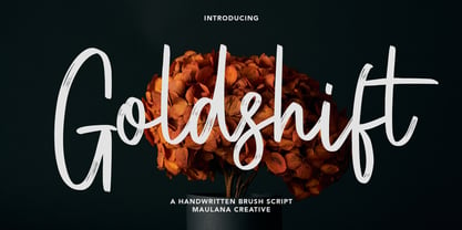 Goldshift is a modern handwritten brush script font, With a rough brush stroke and fun characters. It has Opentype features of ligatures and extra swash, makes it a perfect choice for branding and digital designs. Use this font for logos, social media, websites, blogs, instagram, social media, business cards, branding, and more! Goldshift font support multilingual more than 100+ language. and good pair for your secondary text font with sans or serif. Make a stunning work with Goldshift handwritten brush script font. Cheers, MaulanaCreative