5,707 search results
(0.01 seconds)
- Jungle to jungle by Aminmario Studio,
$20.00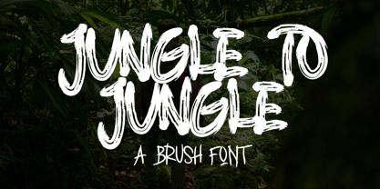 This is a supercharged font, with natural brush, quick strokes and sharp details. Perfect for challenging jobs, titles, movie,logos, apparel, t-shirts, hoodies, quotes, product packaging, or anything that needs a typographic turbo-boost and a typographic unique style. Thanks for checking out this font. I hope you enjoy it!
 - Seasonal Drift by Hanoded,
$15.00 Seasonal Drift is a brush font that I made using one of my father in law's Chinese brushes and ink. For some reason this font reminded me of the ocean, like waves and currents and driftwood. Seasonal Drift comes with a healthy dose of language support and some cool discretionary ligatures.
 - Highlander by Aminmario Studio,
$30.00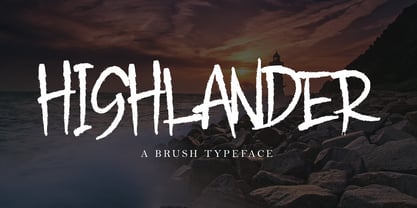 This is a supercharged font, with natural brush, quick strokes and sharp details. Perfect for challenging jobs, titles, movie,logos, apparel, t-shirts, hoodies, quotes, product packaging, or anything that needs a typographic turbo-boost and a typographic unique style. Thanks for checking out this font. I hope you enjoy it!
 - King Kong by Aminmario Studio,
$20.00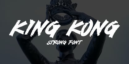 This is a supercharged font, with natural brush, quick strokes and sharp details. Perfect for challenging jobs, titles, movie,logos, apparel, t-shirts, hoodies, quotes, product packaging, or anything that needs a typographic turbo-boost and a typographic unique style. Thanks for checking out this font. I hope you enjoy it!
 - Kokomo by Hanoded,
$20.00 Kokomo is a beautiful handmade contoured font - which was drawn with an old-fashioned steel pen and Chinese ink. The open, shadowed letters are great for posters and ads. Kokomo comes with extensive language support and has an alternative lower case a, for those who don't like the one I used.
 - Undercover by Aminmario Studio,
$20.00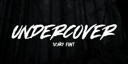 This is a supercharged font, with natural brush, quick strokes and sharp details. Perfect for challenging jobs, titles, movie,logos, apparel, t-shirts, hoodies, quotes, product packaging, or anything that needs a typographic turbo-boost and a typographic unique style. Thanks for checking out this font. I hope you enjoy it!
 - Egypt Rose by Octopi,
$8.00 Slab Serif fonts are also sometimes referred to as ‘Egyptian’, hence the Egypt in the name. This lovely and complex font is based on old woodcut fonts. The upper case only font is brilliant for striking headlines. This OpenType font has support for CE languages and I hope you like it.
 - Mastrin by Aminmario Studio,
$20.00 This is a supercharged font, with natural brush, quick strokes and sharp details. Perfect for challenging jobs, titles, movie,logos, apparel, t-shirts, hoodies, quotes, product packaging, or anything that needs a typographic turbo-boost and a typographic unique style. Thanks for checking out this font. I hope you enjoy it!
 - Outline Sans JNL by Jeff Levine,
$29.00 The cover of the 1939 sheet music for "I Wonder Who's Kissing Her Now" has the title set in an outline sans - or is in an inline? With almost equal space and line weights, it can be either! Outline Sans JNL in available digitally in both regular and oblique versions.
 - Monitero by Aminmario Studio,
$20.00 This is a supercharged font, with natural brush, quick strokes and sharp details. Perfect for challenging jobs, titles, movie,logos, apparel, t-shirts, hoodies, quotes, product packaging, or anything that needs a typographic turbo-boost and a typographic unique style. Thanks for checking out this font. I hope you enjoy it!
 - Acadami by Hackberry Font Foundry,
$24.95 Acadami is an experiment toward what will hopefully be my masterwork (probably named Hackberry). It's also the font used as I get used to FontLab 5. The serifs are stronger and sharper. It's modified with the feel of my memory of Century Schoolbook (without ever looking at CB for a reference.
 - Dangerline by Aminmario Studio,
$50.00 This is a supercharged font, with natural brush, quick strokes and sharp details. Perfect for challenging jobs, titles, movie,logos, apparel, t-shirts, hoodies, quotes, product packaging, or anything that needs a typographic turbo-boost and a typographic unique style. Thanks for checking out this font. I hope you enjoy it!
 - Iron Ranger by Aminmario Studio,
$30.00 This is a supercharged font, with natural brush, quick strokes and sharp details. Perfect for challenging jobs, titles, movie,logos, apparel, t-shirts, hoodies, quotes, product packaging, or anything that needs a typographic turbo-boost and a typographic unique style. Thanks for checking out this font. I hope you enjoy it!
 - Drakalligro Slab by G3 Typefaces,
$2.70 This variation of "Drakalligro" is its best look, the slab serifs in its characters give a good look and make this font something special. I added short slab serifs taking into account that the font is thick. Half slab serifs and some variations in their position are the special feature.
 - Wilhelm Klingspor Schrift by Alter Littera,
$25.00 A comprehensive and faithful rendition of one of the finest metal typefaces of the 20th century. Rudolf Koch designed Wilhelm Klingspor Schrift (initially conceived as “Missal Schrift”, and later referred to also as “Wilhelm Klingspor Gotisch”) between 1919 and 1925 for the Gebr. Klingspor Type Foundry in Offenbach am Main. It is an impressive textura typeface, being sharp, elegant, spiky, sensitive and noble at the same time. Some of its most notable features have to do with the delicate decorations, the thin but subtly swelling lines that parallel or bridge strokes in the capitals, the hairline endings that terminate each stroke in both the capitals and the lowercase letters, the subtle joining of hairlines to thicker strokes, and the tension of some of the transitional curves. Koch’s original design included two sets of capitals (normal and condensed); alternates for a, d, e, r, s and z, plus long s; short and long flourished finial forms for f and t; thirty-five ligatures; and eighteen decorative pieces (Zierstücke). All of these features, plus several additional ones for modern use (including the usual standard characters for typesetting in modern Western languages, additional alternates and ligatures, plus carefully coded Opentype features), have been thoroughly implemented to the highest and most lively level of detail in the present font, in the hope that the past greatness of Wilhelm Klingspor Schrift will finally step into the modern OpenType realm. The main sources used during the font design process were several pages from a specimen book issued by the Gebr. Klingspor Type Foundry in 1927. Other sources were as follows: Bain, P., and Shaw, P. (Eds.) (1998), Blackletter: Type and National Identity, New York: Princeton Architectural Press (p. 43); Hendlmeier, W. (1994), Kunstwerke der Schrift, Hannover: Bund für Deutsche Schrift und Sprache (pp. 56-7); Kapr, A. (1983), Schriftkunst, Dresden: VEB Verlag der Kunst (p. 453); Kapr, A. (1993), Fraktur - Form und Geschichte der gebrochenen Schriften, Mainz: Verlag Hermann Schmidt (pp. 124-5); and Klingspor, K. (1949), Über Schönheit von Schrift und Druck, Frankfurt am Main: Georg Kurt Schauer (pp. 136-7). Some public and private comments by renowned designer and design historian Paul Shaw have also influenced both the design and the description of the present font. Specimen, detailed character map, OpenType features, and font samples available at Alter Littera’s The Oldtype “Wilhelm Klingspor Schrift” Font Page.
 - Breaking Bread by Missy Meyer,
$12.00 This font came to be when I was creating a cake topper mockup (see the promo images) and didn't have a thick script font that I liked for it. So I got to work writing out some fun chunky cursive letters that could top a cake! The concept of breaking bread is an old one, often meaning two parties working together. In the Breaking Bread font, I've combined that heavy connecting script with a hand-lettered sans-serif uppercase set. It works in all lowercase, all uppercase, and title case with equal ease! I've also included a number of alternates and ligatures, so you can have a truly hand-written look when double-letter words show up, plus a few extra characters and swashes to add some pizzazz to your work. It's great for crafting a mug or t-shirt, creating a logo, or making product packaging! And all of those alternates are PUA-encoded, so they're easy to access in any character map. Breaking Bread also comes with over 300 extended Latin characters for language support, including but not limited to: Catalan, Czech, Danish, Esperanto, Estonian, Finnish, French, Gaelic, German, Icelandic, Irish, Italian, Latvian, Lithuanian, Norwegian, Polish, Portuguese, Romanian, Serbian (Latin), Slovak, Slovenian, Spanish, Swedish, Turkish, Welsh, and more!
 - Scholz Secession by HiH,
$8.00 We named this font Scholz Secession. Fin-de-siecle Vienna, Austria is the source of this Jugendstil design from Schriftgiesserei Eduard Scholz. The original release was under the name Reklameschrift Secession. Most of the curve strokes look like commas to me. The letters are as soft and plump as the comforter on the bed I slept on in a Salzburg B&B many years ago. I was traveling with a college buddy and our next stop was Vienna. There a kind, young student named Hanna and her boyfriend took us under their wing. One of the places Hanna proudly showed us was Otto Wagner’s Majolika Haus, built in 1898, and only about 8 blocks from Secession Hall. Hanna explained to us that the style was called Jugendstil and represented Art Nouveau as interpreted within the framework of their culture. I even took a picture. After all, memories are part of who we are. Figures are old-style for text use. This font would not be my first choice for a spread sheet. Included are German ligatures ch (alt-0123) & ck (125), two period ornaments (135, 175) and lower case o and u with Hungarian long umlaut (215, 247)). A very likeable and easy-to-use font.
 - Promenade by Jen Wagner Co.,
$17.00 Introducing Promenade – a calligraphic serif that started on paper with a flat nib pen (see the 6th image), and blossomed into a full serif with italics. At its core, this font is just... beautiful. It's elegant, it's crisp, it's delicate, but can still hold its own. As I was creating the graphics, I just couldn't get over the flow of the letters – especially the italic. It's got class, but also isn't afraid to rock a pair of Doc Marten's. Funny enough, Jen from Tonic (they make beautiful websites) saw a preview of this font and said, "I'd take that font to prom." Which of course spurred a conversation about how this font would take a Mercedes G-Series instead of a limo, and wear Doc Marten's instead of heels, but still wear the most gorgeous dress, and that is 100% Promenade (and inspo for the name – thanks, Jen!). I've also been loving combining the regular and italic, especially for logos (see the "Friendfolk" logo) One thing to note about Promenade is the letter spacing. It was spaced for clean reading and intentional balance, so I recommend setting the spacing a little tighter if you want to create the display look found in many of the logo mockups(around -20 to -40 should do!).
 - Kingthings Trypewriter Pro by CheapProFonts,
$10.00 I have made this font properly monospaced (all characters are the same width) as that is how an old typewriter worked. In addition to correcting and expanding the character set, of course. Keving King says: "Kingthings Trypewriter is a deconstructed typewriter face. I have always loved decayed fonts, this is the first of mine - and yes, I know there are lots of these around - this one is MINE". ALL fonts from CheapProFonts have very extensive language support: They contain some unusual diacritic letters (some of which are contained in the Latin Extended-B Unicode block) supporting: Cornish, Filipino (Tagalog), Guarani, Luxembourgian, Malagasy, Romanian, Ulithian and Welsh. They also contain all glyphs in the Latin Extended-A Unicode block (which among others cover the Central European and Baltic areas) supporting: Afrikaans, Belarusian (Lacinka), Bosnian, Catalan, Chichewa, Croatian, Czech, Dutch, Esperanto, Greenlandic, Hungarian, Kashubian, Kurdish (Kurmanji), Latvian, Lithuanian, Maltese, Maori, Polish, Saami (Inari), Saami (North), Serbian (latin), Slovak(ian), Slovene, Sorbian (Lower), Sorbian (Upper), Turkish and Turkmen. And they of course contain all the usual "western" glyphs supporting: Albanian, Basque, Breton, Chamorro, Danish, Estonian, Faroese, Finnish, French, Frisian, Galican, German, Icelandic, Indonesian, Irish (Gaelic), Italian, Northern Sotho, Norwegian, Occitan, Portuguese, Rhaeto-Romance, Sami (Lule), Sami (South), Scots (Gaelic), Spanish, Swedish, Tswana, Walloon and Yapese.
 - Colonial Press by Simeon out West,
$25.00 Colonial Press is a font based on serif typefaces designed by William Caslon I (1692-1766) and various revivals thereof. Caslon is cited to be the first original typeface of English origin, but some type historians point out the close similarity of Caslon's design to the Dutch Fell types, presumed to be the work of Dutch punchcutter Dirck Voskens. Colonial Press harkens to the look and feel of newspapers in Colonial North America around the mid 1700s without the rough edges commonly associated with colonial printing and many reconstructions. The rough quality of the American typeface is believed to be the result of oxidation from the exposure to seawater during the long voyage from England to the Americas. Colonial Press is a heavy font that retains some of the handcut quality of these fonts while smoothing out the irregularities that make many of these fonts so visually distracting at larger point sizes. For the italic version of this font, I chose to emulate the more ornate letterforms that I have encountered, giving the italic characters a more ornamental feel. Colonial Press comes with full punctuation and a 362 glyph character set for most Western European-based Latin alphabet languages. It is a font that is designed both for normal typing and for larger, decorative display.
 - ITC Tabula by ITC,
$29.99 ITC Tabula is meant to be read. The design grew out of a study to create a font to set film subtitles. According to Julien Janiszewski, the face's Paris-based designer, “I set parameters for the design whereby the letters had to be able to hold up at very small sizes when set on film and yet must be able to be enlarged 2000 times to be read on a theatre screen.” The subtitle font was not completed, but several months later Janiszewski revisited the design and made a discovery. “I realized that the constraints I had established for the subtitling font was not that far from those people could have in creating typographic signage. Many time this calls for a font that can be used easily in very large sizes for headlines on highway billboards and quite small for text copy.” Work proceeded for two more years before Janiszewski was satisfied with the results. The final design is a somewhat squared sans serif family of four weighs with corresponding italics. Janiszewski also wanted to create what he calls a “sensitive sans-one that is not restricted to geometric shapes but has a subtle calligraphic, foundation.” ITC Tabula is not only easy to read, it is also a distinctive and handsome design.
 - Fontoddler by CozyFonts,
$20.00 Fontoddler Font Family, This font was created with the personality, in mind, of my two-and-a-half-year-old granddaughter Chloe Bella. I believe strongly that fonts have personalities that’s why we refer to their members as ‘characters’ or to be more accurate, ‘glyphs’. This font is playful, bold, colorful in form and design, a bit irregular, a bit informal, a bit irreverent, a bit humorous, a bit sassy, and a bit independent just like my little one. When used in color Fontoddler sings. She’ll be writing and creating visual words in just the nick of time. At 2 she started recognizing many colors and identifying people, places, animals, and objects and now she’s recognizing letters. I can’t wait for her to understand that this font was designed and named after her. Fontoddler currently exists in 3 styles, Medium, Heavy, and Heavy Outline. Naturally Heavy and Heavy Outline are congruous, ie. They are fitting together. I hope you enjoy and use this 24th font family from Cozyfonts Foundry. It will fit well with greeting cards, signage, birthday parties, holiday occasions, invites, stationary, headlines, logos, posters, cartoons, animation titles, movie titles and even sports events and sports logos. Have fun with this one. Tom Nikosey
 - Mildred by Burghal Design,
$29.00Remember when a coyote was a light-boned rangy member of the canine family and not the name (spelled C-A-O-T-I) of your neighbor's four year old daughter? When a cricket was a leaping, chirping insect and not the name (spelled K-R-I-Q-U-I-T-T-E) of your purple-haired, pierced-tongued waitress? When Madison and Austin were cities, when brie was a variety of cheese, when radon and alar were hazardous substances and NOT FIRST NAMES? Burghal Design remembers the good old days, when people were not named Whisper, Zandren, Skylar or Dakota but were called Eleanor, Arthur, Edward and Irene. In the spirit of these classic monikers, we give you Mildred, a script font family for proud and simple folk: the down to earth Mildred Plain, hearty Mildred Stout, the barely-there Mildred Scrawn,and the barfly Mildred Cocktail. There's also the slightly more formal (but still all-purpose) Mildred Fancy, bolder Mildred Strong, and the wisp of Mildred Mild. Rounding out the family is Mildred Ornaments, a collection of symbols that can be used for snowflakes, for bullets, or just for fun. Mildred: just an old-fashioned, hard working font. - Ultras Liberi - Unknown license

- Dearest - Unknown license

- Royal Pain - Unknown license

- Fiery Art by Hatftype,
$15.00 A graffiti display font with free style font that has the characteristics of street art that shows freedom and is filled with unique characters. Feature : * Symbol * Number * Punctuation * Multilingual support * Support in Mac and Windows OS * Support in design application (photoshop, illustrator, and more) * Upper Case I really hope you enjoy it.
 - Frelline Script by Soft Creative,
$14.00 Frelline looks beautiful on wedding invitations, thank you cards, quotes, greeting cards, logos, business cards and more. Perfect for use in ink or watercolors. Including beginning and end letters, alternative support and many languages. I made this font very carefully so that each letter looked very unique and had various beautiful alternatives.
 - Flimsy by Bogstav,
$17.00 Flimsy is 100% handmade, but digitally remastered. I removed some blobs here and there, but kept enough of the original handmade line in order to make the Flimsy stand out as an organic and powerful ALL CAPS font! I've also added 5 slightly different versions of each letter, along with multilingual support!
 - Office Squeeze by Hanoded,
$15.00 Office Squeeze was made with a Japanese brush pen. I kind of like the fact that, despite its roughness, Office Squeeze still maintains a very neat appearance. Office Squeeze can be used for just about anything, but product packaging, logos and posters spring to mind. Comes with a generous square footage of diacritics.
 - Nouveau Dreams JNL by Jeff Levine,
$29.00 The 1910 sheet music for “In All My Dreams I Dream of You” had the title hand lettered in an eclectic sans serif that typified the free form Art Nouveau movement of the time. The lettering was recreated digitally as Nouveau Dreams JNL, and is available in both regular and oblique versions.
 - Milan Midnight by Hatftype,
$15.00 A graffiti display font with free style font that has the characteristics of street art that shows freedom and is filled with unique characters. Feature : * Symbol * Number * Punctuation * Multilingual support * Support in Mac and Windows OS * Support in design applications (photoshop, illustrator, and more) - All Caps I really hope you enjoy it.
 - Amellia by Haksen,
$12.00 Hello Font lovers, I just released my new font with the name "Amellia" "Amellia" is one of beauty script font with many alternate fonts. WHAT YOU GET? - Amellia otf with many alternates. As You can see in the preview. You will make many of version in every letters. Thanks for visited. Happy Designs
 - Fleurons Three by Wiescher Design,
$39.50 Fleurons are embellishments and here is my third and so far nicest round. I found some old ones in London and made them more modern ones. These go very well with my scripts Nadine and Ellida and a lot of my other scripts!!! Yours once more in a beautiful mood, Gert Wiescher
 - Gurgle Jock by Bogstav,
$14.00 urgle Jock is actually two fonts in one: The Regular version is a classic handmade sans and the Outline version is…well, an outlined version of the Regular - however, I made it a bit off-grid and hasty scribbled looking. The two versions works well as they are and even greater together!
 - Unytour Display by NicolassFonts,
$25.00 Unytour Display is a modern sans-serif font family of 36 fonts. It includes nine weights with italics from Extra Light to Heavy. Each weight includes alternatives (A,G,I,R,a,l) and OpenType features. Unytour Display features excellent legibility for print, as it does for reproduction on TV screens and more.
 - Ramadesh by Typotheticals,
$5.00Lightly playful, this font had a lot of influences in its design. I liked the look of this style in three fonts and decided to create my own version. This is it. Included is a version called Italic, but it is not a true Italic, just a variation in some lower case letters. - Ashtanga by Hanoded,
$15.00 Ashtanga was named after a type of yoga. In Sanskrit it means "eight-limbed", which I find quite appropriate, give the amount of swirls and curls. The font is 'all-caps', but the upper and lower case glyphs differ completely. They are, of course, fully interchangeable. Ashtanga comes with multi language support.
 - Aristide by Jonahfonts,
$29.95 There are many fonts inspired by Toulouse-Lautrec. I felt this one was needed and tried to get that loose brush-stroke appearance typical of Toulouse’s style of his famous French Cabaret posters. Aristide Bruant a dancer and comedian made famous by Lautrec’s posters can now be further immortalized with this font.
 - Embossanova by Emboss,
$29.00 Embossanova was initially sketched to be a monospaced typeface but quickly took on a life of its own. It developed serifs and numerous arcs and stroke weights. I wanted it to retain a pre computer/unmathematical feel so there is a slight variation on curved characters and their relationship to the X height.


