5,707 search results
(0.011 seconds)
- PF Bodoni Script Pro by Parachute,
$79.00 Always intrigued by Bodoni's original work, I was set out—back in 2000—to examine his work and study Manuale Tipografico, one of the greatest specimen books ever printed. Issued in 1818 at Parma, Italy by Bodoni's widow, the two-volume work shows an impressive array of 142 roman alphabets and some foreign ones such as Greek and Cyrillic. After a careful examination of all characters, I decided to create a typeface based on the distinct script capitals presented in the book. Matching lowercase italics were later selected and designed to complete the series. Since my intention was not to create simply a digital version of Bodoni's work, this typeface was designed with connected characters and capitals with extra calligraphic elements. The result was released in 2002 and published in our award-winning catalog/book IDEA/Trendsetting Typography vol.1. Later in 2005 we revived a large number of ornaments and borders (credit goes to designer George Lygas). All this work was left behind till recently when it was revisited to create a complete 'Pro' family. Several new uppercase and lowercase glyphs were designed in order to create a distinct typeface, which is based on Bodoni but yet it stands out on its own. The new version also takes care of conflicts between neigbouring letters, something that was not included in the first version. Bodoni Script Pro is a 3-weight superfamily. It supports 10 special opentype features including 'contextual alternates' as well as support for both Latin and Greek. Each font comes with 725 glyphs including a large number of alternates as well as 144 ornaments. Furthermore, when you purchase the whole package you get a bonus font which contains 120 frame parts. These parts, when put together, create some truly amazing borders. -Panos Vassiliou
 - Aerolite Pro by CheapProFonts,
$10.00 The history of Aerolite, from Jan Paul: "The Aerolite fonts are essentially stripped down versions of a complex outline typeface I designed for the first Midnight Oil album in 1978, affectionately known as "The Blue Meanie". Many years later I saw the font "powderworks" and asked Brian Kent if he would be interested in digitizing Aerolite. Brian is a font (!) of knowledge and was of invaluable help by getting Aerolite to where it is today. Special care was taken in keeping the distinct character while as Aerolite Regular also providing a legible, thouroughly kerned body type which can be used in all sizes for large volume text." For the Pro version the kerning has been tweaked further, and the character set completed and expanded - and the alternate uppercase A (also with accents) is available as OpenType stylistic alternates. It is now ready for your next international science or sci-fi project. ALL fonts from CheapProFonts have very extensive language support: They contain some unusual diacritic letters (some of which are contained in the Latin Extended-B Unicode block) supporting: Cornish, Filipino (Tagalog), Guarani, Luxembourgian, Malagasy, Romanian, Ulithian and Welsh. They also contain all glyphs in the Latin Extended-A Unicode block (which among others cover the Central European and Baltic areas) supporting: Afrikaans, Belarusian (Lacinka), Bosnian, Catalan, Chichewa, Croatian, Czech, Dutch, Esperanto, Greenlandic, Hungarian, Kashubian, Kurdish (Kurmanji), Latvian, Lithuanian, Maltese, Maori, Polish, Saami (Inari), Saami (North), Serbian (latin), Slovak(ian), Slovene, Sorbian (Lower), Sorbian (Upper), Turkish and Turkmen. And they of course contain all the usual "western" glyphs supporting: Albanian, Basque, Breton, Chamorro, Danish, Estonian, Faroese, Finnish, French, Frisian, Galican, German, Icelandic, Indonesian, Irish (Gaelic), Italian, Northern Sotho, Norwegian, Occitan, Portuguese, Rhaeto-Romance, Sami (Lule), Sami (South), Scots (Gaelic), Spanish, Swedish, Tswana, Walloon and Yapese.
 - Salvador by Homelessfonts,
$49.00 Homelessfonts is an initiative by the Arrels foundation to support, raise awareness and bring some dignity to the life of homeless people in Barcelona Spain. Each of the fonts was carefully digitized from the handwriting of different homeless people who agreed to participate in this initiative. A biography/story of each homeless person captures their story, to help raise awareness and bring some dignity to the life of homeless people. Monotype is pleased to donate all revenue from the sales of Homelessfonts to the Arrels foundation in support of their mission to provide the homeless people in Barcelona with a path to independence with accommodations, food, social and health care. Salvador was born in a small village in the province of Seville, Spain where he lived until 2002. During many years he worked in restaurants, construction, and in the fields, until he decided to go try his luck in Palma de Mallorca. There he worked in hotels and in construction, until the economic crisis erupted and he was left without work or benefits of any kind and he began to live in the street: “The street has few good things, but it teaches you to be more selfless, to share with others what you have, even if it isn’t much.” In 2006, a friend encouraged him to come along to Barcelona and bought his plane ticket. Once there, things did not go much better and he had to continue living in the street. A year ago he left behind that life and now he explains his experience in guided tours to school groups: “I like it because I see that many of them are interested and they ask questions. It is good that they learn.”
 - Celtic Monograms by Kaer,
$24.00 Here is my next Celtic Monograms font family. I used a lot of authentic knots and curves to imitate Insular art style. The term derives from insula, the Latin term for “island” in this period Britain and Ireland shared a largely common style different from that of the rest of Europe. I've drawn sketches set, manually vectorized it and assemble the font family. In an attempt to replicate the intricate patterns found in Celtic art, I endeavored to create a design that embodied the essence of true Celtic knot work. The interweaving lines, which were prominent motifs in Celtic art prior to the arrival of Christian influence around 450, served as the foundation for my creation. Over time, these designs seamlessly integrated into early Christian manuscripts and artwork, incorporating depictions of various elements from everyday life, including animals, plants, and even human figures. In the beginning, the patterns were intricate interwoven cords, called plaits. This particular style is often linked to the Celtic regions, but it was also widely embraced in England and spread throughout Europe through the efforts of Irish and Northumbrian monks. The utilization of the Celtic knot as a tattoo design gained popularity during the 1970s and 1980s in the United States. Consequently, it has proven to be a highly advantageous font choice for various applications such as posters, banners, and sportswear. You can also create a vintage color shift effect. Please note, you should use graphic applications such as Adobe Illustrator or Photoshop, but not Microsoft Word. All you need is put Two or Three lines style initial on the top of Back style. I’m happy to present you the Rough, Two lines, Three lines, and Back styles for your design. You’ll get uppercase and numbers set. Thank you!
 - Cabrito Sans by insigne,
$24.99 It's time to kick off your shoes and feel the "sans" between your toes. Like Cabrito Inverto , its stress-reversing cousin, the new Cabrito Sans serves up something nice and cool in the heat of the project. A quick recap: the original Cabrito is an insigne Design slab serif produced for the kid's book The Clothes Letters Wear. It's been pretty well-received--even more than I expected. I promised to grow the family with a free-standing inverted style that could pair well with Cabrito. (See Cabrito Inverto.) Now, I'm rounding out the family with this well-crafted sans. And so now, Sans is where it's at. Strip away the serifs of Cabrito, and you have a laid back, rounded sans serif alternative served up over easy. This handwriting-inspired creation--like its relatives--is definitely not uptight about its forms (though not afraid to show them off a little). Cabrito Sans' whole pack of alternates is accessible in any OpenType-enabled program. This kiddo consists of a workforce of alternates, swashes, and alternate titling caps to give the font a little extra sweetener to its flavor. Also bundled are swash alternates, old style figures, and compact caps. Check out the interactive PDF brochure to test out each these options. This font family members also consists of the glyphs for 72 various languages. Cabrito Inverto and Cabrito do pair nicely with Cabrito Sans (in case you doubted). Use Sans--or all three of these amigos--to express friendliness on just about anything: food, candy, toys, cars (if you're feeling bold). Don't wait, though. Purchase Cabrito Sans today, and bring a one-of-a-kind look to whatever your computer's next design party is.
 - Ah, Urban Brigade, the font that struts down the street of typography like it owns the place. Imagine, if you will, a graffiti artist and a highly disciplined calligrapher had a love child; Urban Bri...
- Evita by ITC,
$29.99Gérard Mariscalchi is a self-made designer. Born in Southern France of a Spanish mother and an Italian father, he has worked as a mechanic, salesman, pilot, college teacher – even a poet (with poetry being the worst-paying of these professions, he reports.) “Throughout all this, the backbone of my career has always been design,” Mariscalchi says. “I’ve been drawing since I was five, but it wasn’t until I was twenty-four that I learned that my hobby could also help me earn a living.” It was about this same time that Mariscalchi fell in love with type. He studied the designs of masters like Excoffon, Usherwood and Frutiger, as well as the work of calligraphers and type designers such as Plantin, Cochin and Dürer. With such an eclectic background, it’s no surprise that Mariscalchi’s typeface designs are inspired by many sources. Baylac and Evita reflect the style of the art nouveau and art deco periods, while Marnie was created as an homage to the great Lithuanian calligrapher Villu Toots. However, the touch of French elegance and distinction Mariscalchi brings to his work is all his own. Baylac Who says thirteen is an unlucky number? Three capitals and ten lowercase letters from a poster by L. Baylac, a relatively obscure Art Nouveau designer, served as the foundation for this typeface. The finished design has lush curves that give the face drama without diminishing its versatility. On the practical side, Baylac’s condensed proportions make it perfect for those situations where there’s a lot to say and not much room in which to say it Evita Mariscalchi based the design of Evita on hand lettering he found in a restaurant menu, and considers this typeface one of his most difficult design challenges. “The main problem was to render the big weight difference between the thin and the thick strokes without creating printing problems at small point sizes,” he says. Unlike most scripts, Evita is upright, with the design characteristics of a serif typeface. Mariscalchi named the face for a close friend. The end result is a charming design that is light, airy, and slightly sassy. Marnie Based on Art Nouveau calligraphic lettering, Marnie is elegant, inviting, and absolutely charming. Mariscalchi paid special attention to letter shapes and proportions to guarantee high levels of character legibility. He also kept weight transition in character strokes to modest levels, enabling the face to be used at relatively small sizes – an unusual asset for a formal script. Marnie’s capital letters are expansive designs with flowing swash strokes that wrap affectionately around adjoining lowercase letters. The design easily captures the spontaneous qualities of hand-rendered brush lettering. - Baylac by ITC,
$29.99Gérard Mariscalchi is a self-made designer. Born in Southern France of a Spanish mother and an Italian father, he has worked as a mechanic, salesman, pilot, college teacher – even a poet (with poetry being the worst-paying of these professions, he reports.) “Throughout all this, the backbone of my career has always been design,” Mariscalchi says. “I’ve been drawing since I was five, but it wasn’t until I was twenty-four that I learned that my hobby could also help me earn a living.” It was about this same time that Mariscalchi fell in love with type. He studied the designs of masters like Excoffon, Usherwood and Frutiger, as well as the work of calligraphers and type designers such as Plantin, Cochin and Dürer. With such an eclectic background, it’s no surprise that Mariscalchi’s typeface designs are inspired by many sources. Baylac and Evita reflect the style of the art nouveau and art deco periods, while Marnie was created as an homage to the great Lithuanian calligrapher Villu Toots. However, the touch of French elegance and distinction Mariscalchi brings to his work is all his own. Baylac Who says thirteen is an unlucky number? Three capitals and ten lowercase letters from a poster by L. Baylac, a relatively obscure Art Nouveau designer, served as the foundation for this typeface. The finished design has lush curves that give the face drama without diminishing its versatility. On the practical side, Baylac’s condensed proportions make it perfect for those situations where there’s a lot to say and not much room in which to say it Evita Mariscalchi based the design of Evita on hand lettering he found in a restaurant menu, and considers this typeface one of his most difficult design challenges. “The main problem was to render the big weight difference between the thin and the thick strokes without creating printing problems at small point sizes,” he says. Unlike most scripts, Evita is upright, with the design characteristics of a serif typeface. Mariscalchi named the face for a close friend. The end result is a charming design that is light, airy, and slightly sassy. Marnie Based on Art Nouveau calligraphic lettering, Marnie is elegant, inviting, and absolutely charming. Mariscalchi paid special attention to letter shapes and proportions to guarantee high levels of character legibility. He also kept weight transition in character strokes to modest levels, enabling the face to be used at relatively small sizes – an unusual asset for a formal script. Marnie’s capital letters are expansive designs with flowing swash strokes that wrap affectionately around adjoining lowercase letters. The design easily captures the spontaneous qualities of hand-rendered brush lettering. - Irrlicht by Aarhaus,
$30.00 Irrlicht is based on C. H. Kleukens’ 1923 typeface Judith Type . Whilst Dunkle Irrlicht is a fairly faithful rendition and extension of Kleukens’ typeface, the Licht style was initially added as a stand-alone stencil version; yet, the two styles work perfectly together – for different nuances, for emphasis or simply stacked/layered. Irrlicht is equipped with upper- and lowercase ligatures, contextual and stylistic alternates, fractions, superior and inferior figures, extended language support and a few extra goodies. Additional information – How Irrlicht came to life Christian Heinrich Kleukens cut his Judith Type in 1923, at the peak of German expressionism, exclusively for publications with the Ernst-Ludwig-Press, such as a limited series of biblical prints – the first being the Book of Judith , hence the original’s name. I stumbled upon this typeface a couple of years ago in a nice little 1930 booklet of the Gutenberg-Gesellschaft and was struck by its forceful darkness on paper and its seemingly simple, crude letterforms. The lack of a long-ſ in the final version of Judith Type – quite unusual for a German typeface of that time – adds to this feel of crudeness and spontaneity*. Judith Type seemed to me like a semi-blackletter cousin of Rudolf Koch’s typeface Neuland (cast in the same year). Besides its apparent affinity with expressionism, it reflects a lot of that deeply spiritual craftsmanship of the era – much like Neuland. A few months later, when I was working on a stencil project and looking for a typeface that could be cut into thin wooden plates easily, I remembered those dark, sharp letters that seemed to be lacking any curves at all. After enlarging a few letters and tracing them by hand, the whole set was redrawn digitally, using only straight lines. As for spacing, the goal was to keep the letters tight but to avoid touching characters – without ironing out all the original’s tension and rhythm. Deliberate kerning, subtle contextual alternates and ligatures help to deal with critical glyph combinations. Two additional versions were developed: a stencil version with open counters and, in reference to a popular style of the 1920s and inspired by dry, cracked wood, an inline version. These two additional styles were later merged into one font – Lichte** Irrlicht was born. — AARHAUS * Consequently, the original typeface’s German eszett is simply a ligature of the “round s” and standard z . In some of his publications, Kleukens dispenses with using eszett altogether and sets double s instead. Irrlicht , however, does feature a more common eszett (ß); the original, among other more faithful letter forms, can be accessed via the stylistic sets feature ** licht – literally bright – being the German term for inline typefaces – not to be confused with leicht ( light )
 - Marnie by ITC,
$29.99Gérard Mariscalchi is a self-made designer. Born in Southern France of a Spanish mother and an Italian father, he has worked as a mechanic, salesman, pilot, college teacher – even a poet (with poetry being the worst-paying of these professions, he reports.) “Throughout all this, the backbone of my career has always been design,” Mariscalchi says. “I’ve been drawing since I was five, but it wasn’t until I was twenty-four that I learned that my hobby could also help me earn a living.” It was about this same time that Mariscalchi fell in love with type. He studied the designs of masters like Excoffon, Usherwood and Frutiger, as well as the work of calligraphers and type designers such as Plantin, Cochin and Dürer. With such an eclectic background, it’s no surprise that Mariscalchi’s typeface designs are inspired by many sources. Baylac and Evita reflect the style of the art nouveau and art deco periods, while Marnie was created as an homage to the great Lithuanian calligrapher Villu Toots. However, the touch of French elegance and distinction Mariscalchi brings to his work is all his own. Baylac Who says thirteen is an unlucky number? Three capitals and ten lowercase letters from a poster by L. Baylac, a relatively obscure Art Nouveau designer, served as the foundation for this typeface. The finished design has lush curves that give the face drama without diminishing its versatility. On the practical side, Baylac’s condensed proportions make it perfect for those situations where there’s a lot to say and not much room in which to say it Evita Mariscalchi based the design of Evita on hand lettering he found in a restaurant menu, and considers this typeface one of his most difficult design challenges. “The main problem was to render the big weight difference between the thin and the thick strokes without creating printing problems at small point sizes,” he says. Unlike most scripts, Evita is upright, with the design characteristics of a serif typeface. Mariscalchi named the face for a close friend. The end result is a charming design that is light, airy, and slightly sassy. Marnie Based on Art Nouveau calligraphic lettering, Marnie is elegant, inviting, and absolutely charming. Mariscalchi paid special attention to letter shapes and proportions to guarantee high levels of character legibility. He also kept weight transition in character strokes to modest levels, enabling the face to be used at relatively small sizes – an unusual asset for a formal script. Marnie’s capital letters are expansive designs with flowing swash strokes that wrap affectionately around adjoining lowercase letters. The design easily captures the spontaneous qualities of hand-rendered brush lettering. - Gundrada ML by HiH,
$12.00 Gundrada ML was inspired by the lettering on the tomb of Gundrada de Warenne. She was buried at Southover Church at Lewes, Sussex, in the south of England in 1085. The Latin inscription on her tomb, STIRPS GUNDRADA DUCUM, meaning “Gundrada, descendant of the Duke” may have led to the speculation that she was the daughter of William, Duke of Normandy and bastard son of Robert the Devil of Normandy and Arletta, daughter of a tanner in Falaise. In 1066 William defeated Harold at the Battle of Hastings and was crowned William I of England. More commonly known as William the Conquerer, he commissioned a string of forts around the kingdom and charged trusted Norman Barons to control the contentious Anglo-Saxon population. William de Warenne, husband of Gundrada, was one of these Barons. There has also been the suggestion that Gundrada may have been the daughter of William’s wife, Matilda of Flanders, by a previous marriage. According to the Dictionary of National Biography (Oxford University Press, Oxford, England 1921-22), both of these contentions are in dispute. Searching the past of a thousand years ago is like wandering in a heavy fog: facts are only dimly in view. Regardless, I know that I found these letterforms immediately engaging in their simplicity. Unadorned and unsophisticated, they have a direct honesty that rests well in the company of humanistic sans serifs like Franklin Gothic or Gill Sans, appealing to a contemporary sensibility. The lettering on the tomb is in upper case only. Although Gundrada does not sound Norman French to me, her husband certainly and her father probably were Norman French. Nonetheless, the man that carved her tombstone was probably Anglo-Saxon, like most of the people. For that reason, we are quite comfortable with a fairly generic lower case from an Anglo-Saxon document of the time. The time was a time of transition, of contending language influences. This font reflects some of that tension. Features 1. Multi-Lingual Font with 389 glyphs and 698 Kerning Pairs. 2. OpenType GSUB layout features: onum, dlig, liga, salt & hist. 3. Tabular Figures and Alternate Old-Style Figures. 4. Alternate Ruled Caps (line above and below, matching to brackets). 5. Central Europe, Western Europe, Turkish and Baltic Code Pages. 6. Additional accents for Cornish and Old Gaelic. 7. Stylistic alternates A, E, y and #. 8. Ligatures ST, Th, fi and fl. 9. Historic alternate longs. The zip package includes two versions of the font at no extra charge. There is an OTF version which is in Open PS (Post Script Type 1) format and a TTF version which is in Open TT (True Type)format. Use whichever works best for your applications.
 - Squalo by Letritas,
$30.00 Squalo, the genesis The idea of this project called Squalo popped into my mind while I was working with excitement on some sketches. I was chasing after a strong typographical character, something that for me has to be crystallized in form which is always legible and functional. The concept The concept of Squalo arises from the observation of an athlete’s body: you notice that even if most are lean, they are also strong, cut and chiselled. The sport they play molds and modify their bodies. Just think, for instance, on a professional swimmer: during the competition every single muscle, tendon, tissue, cell is working to swim faster. Every single part is there to give strength and speed like in a “squalo” (shark in italian). Not as an eel, nor as a mermaid, nor as a hake. Just like a shark. If you take a quick look, you will notice that the width of the typeface is slightly more condensed than that of a standard sans serif. We designed Squalo this way specifically to assist and strengthen your concepts through stylized typography. We designed the joins and terminals (tip ends) of the characters A, V, W, Z, v, w, z, to create a feeling of “tension”, reinforcing the concept of shark, danger, caution, as well explicit, intentional movement. Pure strength. We wanted to recall the exact moment of the start of the 100 meters race: when the sprinter initially spreads all of his powerful energy. The italic version, starting with the former two typographical concepts of width and tension, emphasizes them. First of all, we compressed the characters 10 percent more, and slanted it 10 degrees to the right. With this movement I intended to convey the gorgeous feeling of tension in power and rapidity. The typeface has 9 weights, from “hair” to “black”, and two versions, “regular” and “italic”. All 18 fonts include small caps, unicase, tabular and oldstyle numbers, numerators and denominators, and much more. Squalo is an ideal typeface that I recommend for use in marketing campaigns, design of packaging, magazines, branding for tv programs, films, book texts, editorial, publications, logos, corporate projects, web texts, and graphic design in motion. Squalo supports the following languages: Abenaki, Afaan Oromo, Afar, Afrikaans, Albanian, Alsatian, Amis, Anuta, Aragonese, Aranese, Aromanian, Arrernte, Arvanitic (Latin), Asturian, Atayal, Aymara, Bashkir (Latin), Basque, Bemba, Bikol, Bislama, Bosnian, Breton, Cape Verdean Creole, Catalan, Cebuano, Chamorro, Chavacano, Chichewa, Chickasaw, Cimbrian, Cofán, Corsican Creek,Crimean Tatar (Latin),Croatian, Czech, Dawan, Delaware, Dholuo, Drehu, Dutch, English, Estonian, Faroese, Fijian Filipino, Finnish, Folkspraak, French, Frisian, Friulian, Gagauz (Latin), Galician, Ganda, Genoese, German, Gikuyu, Gooniyandi, Greenlandic (Kalaallisut)Guadeloupean, Creole, Gwich’in, Haitian, Creole, Hän, Hawaiian, Hiligaynon, Hopi, Hotcąk (Latin), Hungarian, Icelandic, Ido, IgboI, locano, Indonesian, Interglossa, Interlingua, Irish, Istro-Romanian, Italian, Jamaican, Javanese (Latin), Jèrriais, Kala Lagaw Ya, Kapampangan (Latin), Kaqchikel, Karakalpak (Latin), Karelian (Latin), Kashubian, Kikongo, Kinyarwanda, Kiribati, Kirundi, Klingon, Ladin, Latin, Latino sine Flexione, Latvian, Lithuanian, Lojban, Lombard, Low Saxon, Luxembourgish, Maasai, Makhuwa, Malay, Maltese, Manx, Māori, Marquesan, Megleno-Romanian, Meriam Mir, Mirandese, Mohawk, Moldovan, Montagnais, Montenegrin, Murrinh-Patha, Nagamese Creole, Ndebele, Neapolitan, Ngiyambaa, Niuean, Noongar, Norwegian, Novial, Occidental, Occitan, Old Icelandic, Old Norse, Oshiwambo, Ossetian (Latin), Palauan, Papiamento, Piedmontese, Polish, Portuguese, Potawatomi, Q’eqchi’, Quechua, Rarotongan, Romanian, Romansh, Rotokas, Sami (Inari Sami), Sami (Lule Sami), Sami (Northern Sami), Sami (Southern Sami), Samoan, Sango, Saramaccan, Sardinian, Scottish Gaelic, Serbian (Latin), Seri, Seychellois Creole, Shawnee, Shona, Sicilian, Silesian, Slovak, Slovenian, Slovio (Latin), Somali, Sorbian (Lower Sorbian), Sorbian (Upper Sorbian), Sotho (Northern), Sotho (Southern), Spanish, Sranan, Sundanese (Latin), Swahili, Swazi, Swedish, Tagalog, Tahitian, Tetum, Tok Pisin, Tokelauan, Tongan, Tshiluba, Tsonga, Tswana, Tumbuka, Turkish, Turkmen (Latin), Tuvaluan, Tzotzil, Uzbek (Latin), Venetian, Vepsian, Volapük, Võro, Wallisian, Walloon, Waray-Waray, Warlpiri, Wayuu, Welsh, Wik-Mungkan, Wiradjuri, Wolof, Xavante, Xhosa, Yapese, Yindjibarndi, Zapotec, Zulu, Zuni
 - Vrindals Script by Pointlab,
$15.00 Vrindals Script is inspired by a retro style and combination with hand lettering style. It is made with personality in every single curve. I hope this will inspire you and your work. It can be perfectly paired with a marker font, and contains a super handy set of bonus swashes. It is ideal for logos, handwritten quotes, product packaging, header, poster, merchandise, social media & greeting cards. PUA Encoding and multi-language support included. To enable the OpenType stylistic alternates, you need a program that supports OpenType features such as Adobe Illustrator CS, Adobe Indesign & CorelDraw X6-X7. There are additional ways to access alternates, using Character Map (Windows), Nexus Font (Windows), Font Book (Mac) or a software program such as PopChar (for Windows and Mac). If you have any question, don't hesitate to contact me by email pointline23@gmail.com :)
 - Boxy Code by Just My Type,
$15.00In the late 60’s, one of the best art publications in the country was Motive magazine, published (amazingly) by the United Methodist Church. Filled to the brim with poetry, essays, line drawing and woodcuts, it also featured some cutting-edge typography. Boxy/Code is based upon my memories of woodcut typography from that great magazine. Since Boxy/Code ’s lowercase consists of the uppercase’s negative spaces, it’s easy to combine the two with Layer Styles in Photoshop in order to achieve the effect I used in one poster above. It also works great if you use a well-known text as a background. This new version is totally redrawn and features all the Latin-accented letters. Uppercase consists of black capitals in boxes; lowercase features the negative spaces of those boxed capitals. Uppercase and lowercase line up exactly for 2-color effects. - Medina by Hatftype,
$15.00 Medina - Cute Valentine Display Font is a font with distinctive handwritten characters perfect for branding projects, logos, wedding designs, media posts, advertisements, product packaging, product designs, labels, photography, watermarks, invitations, stationery, and any project who need handwritten dishes. Features : • Character Set A-Z • Numerals & Punctuations (OpenType Standard) • Accents (Multilingual characters) • Ligature. Multilingual Support : Afrikaans, Albanian, Asu, Basque, Bemba, Bena, Catalan, Chiga, Cornish, Danish, English, Estonian, Faroese, Filipino, Finnish, French, Friulian, Galician, German, Gusii, Icelandic, Indonesian, Irish, Italian, Kabuverdianu, Kalenjin, Kinyarwanda, Low German, Luo, Luxembourgish, Luyia, Machame, Makhuwa-Meetto, Makonde, Malagasy, Malay, Manx, Morisyen, North Ndebele, Norwegian Bokmål, Norwegian Nynorsk, Nyankole, Oromo, Portuguese, Romansh, Rombo, Rundi, Rwa, Samburu, Sango, Sangu, Scottish Gaelic, Sena, Shambala, Shona, Soga, Somali, Spanish, Swahili, Swedish, Swiss German, Taita, Teso, Vunjo, Zulu. There it is. I really hope you enjoy it. Comments & likes are always welcome and accepted.
 - Liliane Classe by Brenners Template,
$25.00 This is a challenge for elegant but radical typography layouts. Standard styles include classic and sophisticated serifs, while italic styles are designed with more adventurous handwritten touches. This serif font family included a total of 14 styles, including 7 weights and separately created italics. It can be the best choice for a unique and meaningful logo and branding design, and it will maintain a refined sense of unity. You need to understand OpenType Features to use these fonts well. Please check first whether the your apps plan to use supports these OpenType Features. Thanks. OpenType Features Discretionary Ligatures : ac, ad, ai, ak, ar, ay, az, ce, ci, ck, co, de, do, dr, er, ft, he, ho, ng, ro, se, sp, te, to, tr Standard Ligatures : fi, fl Alternates : a, d, h, i, k, n, u, z Oldstyle Figures Tabular Figures Fractions
 - Getho Semi Sans by deFharo,
$12.00 Getho is a Semi Sans family of geometric construction with 6 weights plus the italic versions all include small letters, the symbol of Bitcoin and other monetary symbols. It is an exclusive typography with neo-grotesque modulations and maximum readability in any size. The typeface has alternative letters and numbers, small caps and advanced OpenType functions. The complete Pack includes versions of the Variable Fonts type. The drawn of the vectors is meticulous to obtain smooth curves of elegant aspect to which also contributes the subtle rounding of the corners, the thicker versions have of traps of ink in the knots of the unions to be able to use them in small sizes. The Metric and the Kerning of all the versions I have reviewed individually to obtain a fluent reading in any type of text and size.
 - Randelany by Kartiny Type,
$12.00 Randelany Script is one of the Elegant script fonts that comes with a very beautiful character change, a kind of classic copper decorative script with a modern touch, designed with high detail to present an elegant style. Randelany Script is interesting because the typeface is pleasing to the eye, clean, feminine, sensual, glamorous, simple and very easy to read, because of the many luxurious letter connections. I also offer a number of decent stylistic alternatives for some of the letters. The classic style is very suitable to be applied in various formal forms such as invitations, labels, restaurant menus, logos, fashion, make up, stationery, novels, magazines, books, greeting / wedding cards, packaging, labels or all kinds of advertising purposes. . . If you need help or have any questions, let me know. I'm happy to help. Thanks & Happy Designing.
 - Paradox Runa by Dawnland,
$13.00 Paradox Runa is based on the futhark, norse elder runes. “Missing” characters has been replaced with either other “real” runes, or “new” ones have been “invented” so that the font hold all characters for the latin alphabet (A-Z + swedish Å Ä & Ö) + “Numbers” 0-9. I do not claim that this rune alphabet is totally authentic nor correct! All upper and lower-case letters are the same except for the letter S. “Ligatures” have been created for the th, ng and eo sounds. These are accessed by writing TH, NG and EO (in upper case letters). Space is automatically replaced by a ‘colon’ (':') - if you want a “real” space, write an underscore! (open type version of the font and open type compatible layout application required). Paradox Runa goes perfect with the font Paradox X (regular yet enigmatic hand drawn latin letters)!
 - Pinafore by Up Up Creative,
$10.00 Introducing Pinafore Complete, a broad, brush-style display font in four styles. Pinafore comes with upright and oblique styles as well as paper cut versions of each. It includes 363 glyphs such as small caps (see note below for more on this), multilingual support (including multiple currency symbols), an awesome ampersand, math symbols, and more. A note about small caps: There are TWO ways to access the small caps in this font family. For OpenType-savvy programs such as Adobe Illustrator and Adobe InDesign, these can be accessed from within the main font files using the character panel or the glyphs panel. For programs that do not access these OpenType features, I have also included small-caps-specific font files. In these files, the regular caps are accessed by typing capital letters and the small caps are accessed by typing lowercase letters.
 - Zt Sigata by Khaiuns,
$15.00 Zt. Sigata is an experiment where combining the two font styles into one, namely sans serif and serif, maybe this sounds very strange, don't worry this has been designed with very deep consideration with the serif style superti water droplets in the foliage that present coolness in every word and simple style sans serif with softness on each side, So when combined the two will be an extraordinarily beautiful design invention. Zt. Sigata comes with 6 styles (Regular/ italic, Kozi / italic, Rame / italic) that from each style have their own uniqueness, so it further expands your design experiment, and is great for poster design, packaging, logos, films and thanks to the uniqueness of each style may look good either in magazines or kompanye branding effectively. I hope you have a blast using zt.Sigata Thanks for use this font ~ Khaiuns X zelowtype
 - Astire Klarish by Dora Typefoundry,
$20.00 Introducing, Astire Klarish is a new retro serif with all clean and soft lines, tight curves, a combination of regular and italic versions adding to the appeal and trendy elegant look! This serif typeface that looks amazing in both large and small settings is perfect for your design needs yet still clean and elegant to apply to a variety of other formal forms such as invitations, labels, logos, magazines, books, greeting/wedding cards, packaging. , fashion, make up, stationery, novel, label or any kind of advertising purposes. WHAT YOU GET : Astire Klarish Regular (Open type) Astire Klarish Italic (Open type) Astire Klarish Bold (Open type) Astire Klarish Bold Italic (Open type) This type of family has become the work of true love, making it as easy and fun as possible. I really hope you enjoy it! Thank you.
 - Ongunkan Irk Bitig Viking by Runic World Tamgacı,
$99.00 This is the Viking font that I developed based on the letters in the Irk Bitig book, which is written with the brush line of the old Turkish runic alphabet, the information below. It was interesting work. Irk Bitig or Irq Bitig (Old Turkic: 𐰃𐰺𐰴 𐰋𐰃𐱅𐰃𐰏), known as the Book of Omens or Book of Divination in English, is a 9th-century manuscript book on divination that was discovered in the "Library Cave" of the Mogao Caves in Dunhuang, China, by Aurel Stein in 1907, and is now in the collection of the British Library in London, England. The book is written in Old Turkic using the Old Turkic script (also known as "Orkhon" or "Turkic runes"); it is the only known complete manuscript text written in the Old Turkic script. It is also an important source for early Turkic mythology.
 - Particela by Putracetol,
$20.00 Particela - Display Font. Particela is a display style font. The classic, fun and groovy impression is very visible. But in Particela I combine several variations such as the ligature. Particela is inspired by vintage albums and posters from 1960s music bands. It makes this font even more unique and different. Particela is also great for any kind of display purpose from album, cover,poster, label, tshirt, apparel, signage, quote, logo, greeting card,logotype and many more. Particela is also support multi language. The alternative characters were divided into several Open Type features such as Swash, Stylistic Sets, Stylistic Alternates, Contextual Alternates, and Ligature. The Open Type features can be accessed by using Open Type savvy programs such as Adobe Illustrator, Adobe InDesign, Adobe Photoshop Corel Draw X version, And Microsoft Word. This font is also support multi language.
 - Angels Love by Hatftype,
$15.00 Angels Love - Cute Playful Font is a font with distinctive handwritten characters perfect for branding projects, logos, wedding designs, media posts, advertisements, product packaging, product designs, labels, photography, watermarks, invitations, stationery, and any project who need handwritten dishes. Features : • Character Set A-Z • Numerals & Punctuations (OpenType Standard) • Accents (Multilingual characters) • Ligature. Multilingual Support : Afrikaans, Albanian, Asu, Basque, Bemba, Bena, Catalan, Chiga, Cornish, Danish, English, Estonian, Faroese, Filipino, Finnish, French, Friulian, Galician, German, Gusii, Icelandic, Indonesian, Irish, Italian, Kabuverdianu, Kalenjin, Kinyarwanda, Low German, Luo, Luxembourgish, Luyia, Machame, Makhuwa-Meetto, Makonde, Malagasy, Malay, Manx, Morisyen, North Ndebele, Norwegian Bokmål, Norwegian Nynorsk, Nyankole, Oromo, Portuguese, Romansh, Rombo, Rundi, Rwa, Samburu, Sango, Sangu, Scottish Gaelic, Sena, Shambala, Shona, Soga, Somali, Spanish, Swahili, Swedish, Swiss German, Taita, Teso, Vunjo, Zulu. There it is. I really hope you enjoy it. Comments & likes are always welcome and accepted.
 - Pipeline by URW Type Foundry,
$39.99 Pipeline is a futuristic and technical looking typeface. But as the name suggest it’s also earthly, (literally). Deep down underneath villages, city’s everywhere and even oceans there’s a network of pipelines. Providing us all sorts of supplies, like water and oil. Sewers wash fluid waste away. They are never to be looked upon as pretty or beautiful but purely functional. The soil peeled off and looked upon from above, a greater industrial infrastructure is revealed, cluttered like spaghetti, complex as the maze of corridors of termite colonies. I present two pipelines to you; one naked and one dressed. This typeface is very suitable for graphic, logo and poster design. It is quadratic shaped with round curves. It is modern and classic at the same time. It could be appealing for young, technical, digital, inventive and urban (sub) culture (at any age).
 - Porkshop by Chank,
$99.00 Porkshop is a font of retro vintage flavor with a hefty dose of immigrant-influenced naive typography. It's fundamentally inspired by an old-but-still-prominent "Pork Shop" sign in Manhattan. I like to think that this font was made by a signmaker's apprentice who didn't yet have a grasp on the subtleties of elegant letterforms, but put his gusto into perfectly sharp serifs. While pointy little serifs are cool, the real shine of this font comes from the imaginative combination of uppercase and lowercase shapes. This unique mixture in the lowercase reminds me of an indeterminate European accent in the big city. Big and strong and easy to understand. Best rendered in 3-foot tall metal type, Porkshop works well in print and on screens, too. The Bolds and Italics are brand new in 2011.
 - Antoine Drop Caps by Kaer,
$19.00 These initials set I collected from “Tristan of the Round Table”, published approximately in 1513, by Antoine Verard. Antoine drop caps font family has Regular, Light and Colored styles. It's all you need to precisely imitate medieval style text. Use this font as a decorative element at the beginning of a paragraph or section, other part of the paragraph should be in regular black letter font. You’ll get Drop Caps & Numbers set. --- *You can use color fonts in PS CC 2017+, AI CC 2018+, ID CC 2019+, macOS 10.14 Mojave+ * *Please note that the Canva & Corel & Affinity doesn't support color fonts!* *Please download this test file with only A letter ( https://www.dropbox.com/s/lpzmdikw0ewxozx/AntoineDropCaps-Test.otf?dl=0 ) to check your app & system.* --- Please feel free to request any help you need: kaer.pro@gmail.com Best, Roman.
 - Junius by Eurotypo,
$34.00 Are you looking for a new casual and organic script font? Please take a look at Junius! The Junius font is the perfect combination of sleek and casual that is best used in OpenType compatible software. This font contain 797 glyphs, equipped with plenty of OpenType features. Upper case letters can alternate between at least two different forms. Lowercase letters have at least six more options to avoid repetition. These effects include initial and final forms of lowercase letters. In addition, there is a set of 65 ornaments designed to support the font (accessing the ornaments through the Glyph palette). Some of these ornaments were specially designed to be combined with the letters for a "more calligraphic" effect. Junius font can be the option used to create titles, logos and posters for brand and packaging purposes. I hope you enjoy it.
 - The Ballpoint by Aminmario Studio,
$50.00 The Ballpoint font was created to look as close to a natural handwritten script as possible by including lowercase alternates, lowercase swash, ligature and underlines. Mix and match lowercase regular with several lowercase alternatives to get your new ligature. Perfect for any awesome projects that need hand writing taste. With built in Opentype features, this script comes to life as if you were writing it yourself. It's highly recommended to use it in opentype capable software - there are plenty out there nowadays as technology catches up with design ... Other than Photoshop, Illustrator and Indesign, many standard simple programs now come with Opentype capabilities - even the most basic ones such as Apple's Text Edit, Pages, Keynote, iBooks Author, etc. Even Word has found ways to incorporate it. Thanks for checking out this font. I hope you enjoy it! AminMario
 - Hearthstone by Arendxstudio,
$5.00 Hearthstone - Signature Font is a classy signature script with a natural & stylish flow. This collection of scripts is perfect for personal branding. this works well for many applications. Everything from personal branding & wedding invitations to advertising could benefit from this collection of signature fonts Features : • Character Set A-Z • Numerals & Punctuations (OpenType Standard) • Accents (Multilingual characters) • Ligature • Alternate • Swash Multilingual Support : Afrikaans, Albanian, Asu, Basque, Bemba, Bena, Catalan, Chiga, Cornish, Danish, English, Estonian, Faroese, Filipino, Finnish, French, Friulian, Galician, German, Gusii, Icelandic, Indonesian, Irish, Italian, Kabuverdianu, Kalenjin, Kinyarwanda, Low German, Luo, Luxembourgish, Luyia, Machame, Makhuwa-Meetto, Makonde, Malagasy, Malay, Manx, Morisyen, North Ndebele, Norwegian Bokmål, Norwegian Nynorsk, Nyankole, Oromo, Portuguese, Romansh, Rombo, Rundi, Rwa, Samburu, Sango, Sangu, Scottish Gaelic, Sena, Shambala, Shona, Soga, Somali, Spanish, Swahili, Swedish, Swiss German, Taita, Teso, Vunjo, Zulu There it is! I really hope you enjoy it !
 - Xunga by Huy!Fonts,
$17.00 Xunga is a cheerful display typeface. My goal was to design a font able to fit any layout with boldness and playfulness, mixing a sign painter taste in the uppercase and some of my crappy calligraphic reverse contrast explorations with the flat brush for the lowercase. I designed several of widths to fit the page, and though about a different way of expanding the family shifting the horizontal stress axis to move the letter weight in different heights, making a 15 fonts family, suitable for making bold layouts. Xunga has an extended character set for European languages as well as Vietnamese, and shows all its potential with OpenType-savvy applications. Every font includes ligatures, catchwords in discretional ligatures, contextual alternates to avoid conflictive glyph pairs and localized forms to avoid problems with several glyphs and languages.
 - Smoothy Casual by Hatftype,
$15.00 Smoothy Casual - Playful Display Font is a font with distinctive handwritten characters perfect for branding projects, logos, wedding designs, media posts, advertisements, product packaging, product designs, labels, photography, watermarks, invitations, stationery, and any project who need handwritten dishes. Features : • Character Set A-Z • Numerals & Punctuations (OpenType Standard) • Accents (Multilingual characters) • Ligature. Multilingual Support : Afrikaans, Albanian, Asu, Basque, Bemba, Bena, Catalan, Chiga, Cornish, Danish, English, Estonian, Faroese, Filipino, Finnish, French, Friulian, Galician, German, Gusii, Icelandic, Indonesian, Irish, Italian, Kabuverdianu, Kalenjin, Kinyarwanda, Low German, Luo, Luxembourgish, Luyia, Machame, Makhuwa-Meetto, Makonde, Malagasy, Malay, Manx, Morisyen, North Ndebele, Norwegian Bokmål, Norwegian Nynorsk, Nyankole, Oromo, Portuguese, Romansh, Rombo, Rundi, Rwa, Samburu, Sango, Sangu, Scottish Gaelic, Sena, Shambala, Shona, Soga, Somali, Spanish, Swahili, Swedish, Swiss German, Taita, Teso, Vunjo, Zulu. There it is. I really hope you enjoy it. Comments & likes are always welcome and accepted.
 - Gathes by thirtype,
$25.00 Gathes is vintage pop script with layered style, Since a few years I try to exploration of script with layered system. and this my third script layered from my collection font. Gathes is basic from 5 styles layered type. Base layer is regular, add an shine, extrude, extrude detail, and shadow to create a dimensional look. Several styles can be mix and matched together or can be used alone and/or in layered. The Script font have a opentype feature such a stylistic set, ligature, swash ornament. For additional we add a serif version in this family, so that it can be combined with script fonts. Gathes works great in any graphics app that allow to create a layered type and good to create the logo, badge, poster, heading, magazine, advertising design purpose and more. Features: - Opentype features - Ligatures - Alternates - PUA Encoded - Multilanguange
 - Quick Funny by Hatftype,
$15.00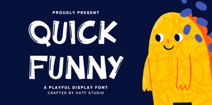 Quick Funny - Playful Display Font is a font with distinctive handwritten characters perfect for branding projects, logos, wedding designs, media posts, advertisements, product packaging, product designs, labels, photography, watermarks, invitations, stationery, and any project who need handwritten dishes. Features : • Character Set A-Z • Numerals & Punctuations (OpenType Standard) • Accents (Multilingual characters) • Ligature. Multilingual Support : Afrikaans, Albanian, Asu, Basque, Bemba, Bena, Catalan, Chiga, Cornish, Danish, English, Estonian, Faroese, Filipino, Finnish, French, Friulian, Galician, German, Gusii, Icelandic, Indonesian, Irish, Italian, Kabuverdianu, Kalenjin, Kinyarwanda, Low German, Luo, Luxembourgish, Luyia, Machame, Makhuwa-Meetto, Makonde, Malagasy, Malay, Manx, Morisyen, North Ndebele, Norwegian Bokmål, Norwegian Nynorsk, Nyankole, Oromo, Portuguese, Romansh, Rombo, Rundi, Rwa, Samburu, Sango, Sangu, Scottish Gaelic, Sena, Shambala, Shona, Soga, Somali, Spanish, Swahili, Swedish, Swiss German, Taita, Teso, Vunjo, Zulu. There it is. I really hope you enjoy it. Comments & likes are always welcome and accepted.
 - Eirene Sans by Tomtype,
$4.90 Eirene Sans is a sans serif type family inspired by grotesque typefaces with some humanistic characteristics. Simple, modern, and functional are the principal features of this type family; the uppercase glyphs present a sophisticated personality. There are 5 weights available and matching italics. It is a bit more condensed than normal width and the difference between thin and thick stems and the unique terminals make the type family have this humanistic personality. It has rounded forms in some letterforms and special characters (i, j, ., :, etc.), humanistic terminals, and very thin ink traps. Eirene Sans is perfect for digital and non-digital designs; it can be used in magazine titles, logo designs, packaging designs, and web designs. Features: 5 weights and matching italics Opentype features Arrow set Stylistic alternates (ft) Stylistic changes in italics Fractions Subscripts Inferior and superior numbers Language support (Latin extended)
 - Gatha by Khaiuns,
$15.00 Gatha is a fun font duo that includes signature scripts and elegant, soft sans that grab 4 styles – it's fit and ready to go together for your next design! Gatha includes a complete set of beautiful upper and lowercase letters, numbers, a wide variety of punctuation marks, ligatures, and super pretty prefixes as well as a final sweep thus providing a realistic handwriting style. These typefaces are versatile and can be used successfully in Magazines, Posters, Branding, Websites, etc. Fonts include multilingual support. Please message me if you're unsure of any language support. Ligatures • Are also available for several lowercase characters (double-letters which flow more naturally). These are only accessible via software with opentype capability or a glyphs panel, e.g. Photoshop/Illustrator. I hope you have a blast using Gatha. Thanks for use this font ~ Khaiuns X zelowtype
 - White Stork by Almazova Dolzhenko,
$12.00 White Stork is a handwritten font family which contains two versions Serif and Sans. So you can combine them to get a more interesting design. The font has simple shapes so it will be versatile to use. It will look great for logotypes, quotes, greeting cards, prints, branding design and much more. Hand-drawn font White Stork contains 2 sets of uppercase (serif and sans), 2 sets of lowercase (serif and sans), alternate set of lowercase letters for serif font, ligatures for double f and t letters. Multilingual support is included. Features: Uppercase & Lowercase Serif Uppercase & Lowercase Sans Alternate set of Lowercase Serif Numerals & Punctuation Ligatures (watch preview) Multilingual support Serif and Sans I hope this font will help you to create you unique design. If you have any question, feel free to contact me! Thanks! Lena (instagram @almaz_dolzhe)
 - The Lucky by Masinong Studio,
$12.00 The Lucky combines a retro and hand-lettering style. I'm made it with a personal touch in every single curve. I hope this can inspiration to your work. It pairs perfectly with other fonts and contains a handy set of bonus swashes. It is ideal for logos, handwritten quotes, product packaging, headers, posters, merchandise, social media and greeting cards. Features: Basic Latin A-Z and a-z Numbers Symbols Stylistic Set Ligature PUA Encode Multilanguage Support To enable the OpenType Stylistic alternates, you need a program that supports OpenType features such as Adobe Illustrator CS, Adobe Indesign & CorelDraw X6-X7. There are additional ways to access alternates, using Character Map (Windows), Nexus Font (Windows), Font Book (Mac) or a software program such as PopChar (for Windows and Mac). If you have any question, don't hesitate to contact me by email masinong.studio@gmail.com :)
 - Alpha Jimmy by Hatftype,
$15.00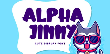 Alpha Jimmy - Cute Display Font is a font with distinctive handwritten characters perfect for branding projects, logos, wedding designs, media posts, advertisements, product packaging, product designs, labels, photography, watermarks, invitations, stationery, and any project who need handwritten dishes. Features : • Character Set A-Z • Numerals & Punctuations (OpenType Standard) • Accents (Multilingual characters) • Ligature. Multilingual Support : Afrikaans, Albanian, Asu, Basque, Bemba, Bena, Catalan, Chiga, Cornish, Danish, English, Estonian, Faroese, Filipino, Finnish, French, Friulian, Galician, German, Gusii, Icelandic, Indonesian, Irish, Italian, Kabuverdianu, Kalenjin, Kinyarwanda, Low German, Luo, Luxembourgish, Luyia, Machame, Makhuwa-Meetto, Makonde, Malagasy, Malay, Manx, Morisyen, North Ndebele, Norwegian Bokmål, Norwegian Nynorsk, Nyankole, Oromo, Portuguese, Romansh, Rombo, Rundi, Rwa, Samburu, Sango, Sangu, Scottish Gaelic, Sena, Shambala, Shona, Soga, Somali, Spanish, Swahili, Swedish, Swiss German, Taita, Teso, Vunjo, Zulu. There it is. I really hope you enjoy it. Comments & likes are always welcome and accepted.