6,865 search results
(0.019 seconds)
- ITC Tickle by ITC,
$29.99When Patricia Lillie was growing up, she thought the coolest thing in the world would be finding her own name listed in a library catalog. The fantasy came true in 1986 when her first children's book was published. Five more followed. The thrill of seeing her work on library shelves hasn't abated, but today, Lillie is just as likely to see one of her typefaces on the cover of a book. She has created several display faces and image fonts. My first typeface designs were based on lettering I'd done while working for a library, doing graphics work for the children's section," she explains. "I currently do a lot of web design, but type is my favorite thing." The Tickles (ITC Tickle and ITC Tickle Too) are Lillie's first ITC typeface releases. "I was playing around with a Sharpie marker one day and liked the way the letters looked," she recalls. "I started redoing the letters from scratch in Fontographer to see what developed, and liked those letters too." ITC Tickle is a bi-form font (with both cap and lowercase letters of the same size) that clearly breaks a typographic rule or two. ITC Tickle Too has the same basic lettershapes, but they've grown clusters of stipples that give a three-dimensional quality to the design. The result is a friendly, offbeat display family that's guaranteed to add a giggle to your work." - Compasso by Plau,
$30.00 The idea that mathematical precision and the supposed "purity" of geometric forms are part of the discourse of us graphic designers is not new. Studying typography for some time now and learning about all the small alterations and adjustments that this geometry undergoes to better adapt to the imperfect human eye, I found myself with a new way of seeing things. Compasso is, in a way, a result of my growth as a designer. Established and recognized fonts like Futura, Avenir, and their predecessors (including Tempo - published by the Ludlow foundry in the early 20th century) informed the result of Compasso at some level. Others opened my mind to possibilities. Mallory, Azo Sans, the font designed for Audi by Bold Monday, and many other contemporary sans-serif fonts that left me speechless are also responsible for details present in this font. From the first sketch, the family grew on both sides, gaining condensed and extended counterparts. From there - and from a brilliant insight from designer Nicole Rauen - I learned that Compasso was not about geometry. Compasso is about rhythm. It's about the rhythmic movement that provides a foundation, supports, and also makes you dance and swing. My musical taste is too eclectic, I can go from classical to funk in less than two songs on Spotify. Compasso is also eclectic. It's a font to take your project anywhere, a record to listen to on any occasion.
 - Edison by HiH,
$12.00 Edison, is it Victorian or is it Art Nouveau? While this typeface may be found in Petzendorfer’s Treasury of Art Nouveau Alphabets, I believe the decorative spirals are more Victorian than “New Art.” To me, they looked tacked on, rather than organic -- with the industrial mechanics of a coiled spring, rather than the tendrils of a growing plant as the philosophical wellspring. Originally released by ATF in 1894 as Houghton, this typeface was re-released shortly thereafter by Bauer and Berthold in Germany as EDISON. Please do not make the mistake of thinking the font we offer here is no better than freeware fonts in cheap rip-off collections. This font has a set 218 characters and represents many hours manipulating the bezier curves to produce acceptable results. Available freeware fonts are often little more than raw scans with little accuracy of letterform. The muddy line intersections are a dead give-away. Frequently all you get is the alphabet itself. No numbers, no punctuation and don't even think about diacriticals. The font we offer represents a tremendous value. Considering the hours of work involved, I have no business charging so little. I could make better money cooking hamburgers or bagging groceries. But we want very much to encourage you to purchase and enjoy these fascinating historical typefaces and are making it as easy as possible for you to do so. So please encourage us and order Edison today.
 - Vernaccia by Eurotypo,
$32.00 Last year I went to visit a friend in Tuscany. One day he took me to meet his neighbor, a nice old man; Mr. Giulio. After giving us a tour of his small vineyard, he insisted us to try his production: a delicious Vernaccia! When his wife left the bottle containing the gold liquid on the table, I fell in love with the label: it was handwritten by herself, as if to highlight the "homemade" feature. As a tribute to this beautiful and hardworking couple, I asked permission to be inspired to make a typeface ... and here goes! The family Font Vernaccia... Vernaccia is a type family of four fonts: Regular, Bold, Condensed and Condensed Italic. Is a modern and casual calligraphy family font. As an exclusively Open Type release, with 759 glyphs and 45 ornaments, it has several special alternatives for all letters with lots of possibility and an infinity of combinations. Most of the ornaments can be used alone, but really were especially designed to combine with the different glyphs. There are plenty of options to allow you to create something unique and special: standard and discretionary ligatures, several swashes and stylistics alternates for each letter, catchwords, tails that can be added to the beginning or end of each letter, ornaments, and much more. These lovely fonts have already an extended character set to support Western European languages. Vernaccia was made to make your project more beautiful and attractive! Have fun with it!
 - Monterey Popsicle NF Pro by CheapProFonts,
$10.00 A faux script font typical of classic american branding. I have totally reworked all the letterforms: they started with a “notch” and ended flat - I have removed the “notch” and rounded off the ending stroke, so now you can actually start words with the lowercase letters. I have also improved the spacing (especially after the capitals), and of course added all the “foreign” glyphs. A classic is reborn! Nick Curtis says: "Just another “somewhere from the thirties to the fifties” kinda script, named kinda after a sixties rock festival." ALL fonts from CheapProFonts have very extensive language support: They contain some unusual diacritic letters (some of which are contained in the Latin Extended-B Unicode block) supporting: Cornish, Filipino (Tagalog), Guarani, Luxembourgian, Malagasy, Romanian, Ulithian and Welsh. They also contain all glyphs in the Latin Extended-A Unicode block (which among others cover the Central European and Baltic areas) supporting: Afrikaans, Belarusian (Lacinka), Bosnian, Catalan, Chichewa, Croatian, Czech, Dutch, Esperanto, Greenlandic, Hungarian, Kashubian, Kurdish (Kurmanji), Latvian, Lithuanian, Maltese, Maori, Polish, Saami (Inari), Saami (North), Serbian (latin), Slovak(ian), Slovene, Sorbian (Lower), Sorbian (Upper), Turkish and Turkmen. And they of course contain all the usual “western” glyphs supporting: Albanian, Basque, Breton, Chamorro, Danish, Estonian, Faroese, Finnish, French, Frisian, Galican, German, Icelandic, Indonesian, Irish (Gaelic), Italian, Northern Sotho, Norwegian, Occitan, Portuguese, Rhaeto-Romance, Sami (Lule), Sami (South), Scots (Gaelic), Spanish, Swedish, Tswana, Walloon and Yapese.
 - Bitsumishi Pro v2 by CheapProFonts,
$10.00 A squarish uppercase font perfect for logos and short eye-catching headings. The lowercase contains some alternate letterforms - more specifically: uppercase have closed forms (I made a new A D and R), and lowercase have some open alternatives (new B E F P and T in addition to the A D and R). I noticed the two width version of the H and made similar normal and wide versions of J and L. Then I added lots of missing glyphs and all the diacritic letters, of course - and finally the family has been expanded to 7 weights AND corresponding Italics! Enjoy! ALL fonts from CheapProFonts have very extensive language support: They contain some unusual diacritic letters (some of which are contained in the Latin Extended-B Unicode block) supporting: Cornish, Filipino (Tagalog), Guarani, Luxembourgian, Malagasy, Romanian, Ulithian and Welsh. They also contain all glyphs in the Latin Extended-A Unicode block (which among others cover the Central European and Baltic areas) supporting: Afrikaans, Belarusian (Lacinka), Bosnian, Catalan, Chichewa, Croatian, Czech, Dutch, Esperanto, Greenlandic, Hungarian, Kashubian, Kurdish (Kurmanji), Latvian, Lithuanian, Maltese, Maori, Polish, Saami (Inari), Saami (North), Serbian (latin), Slovak(ian), Slovene, Sorbian (Lower), Sorbian (Upper), Turkish and Turkmen. And they of course contain all the usual "western" glyphs supporting: Albanian, Basque, Breton, Chamorro, Danish, Estonian, Faroese, Finnish, French, Frisian, Galican, German, Icelandic, Indonesian, Irish (Gaelic), Italian, Northern Sotho, Norwegian, Occitan, Portuguese, Rhaeto-Romance, Sami (Lule), Sami (South), Scots (Gaelic), Spanish, Swedish, Tswana, Walloon and Yapese.
 - Kontext Dot by Elster Fonts,
$20.00 Imagine a font that is easier to read the smaller it is – or the further away the text is. There are already many rasterised fonts, I wanted to take it to the extreme and use as few dots as possible. The result is a typeface that lives up to its name. Each individual circle makes no sense on its own; individual letters are only recognisable in the context of all associated circles, individual letters are most likely to be recognised in the context of whole words. Attached to a building wall, text would be readable from a great distance and become increasingly difficult to decipher the closer you get to the building. Placed on the ground or on a large flat roof, text would only be readable from a higher building, an aeroplane or - depending on the size - in Google Earth. Kontext has old style figures, superscript numerals, case-sensitive questiondown and exclamdown and an alternative ampersand, 390 glyphs at all. Use the same value for font size and line spacing to keep the lines in the grid, or change the line spacing in 10% steps. Change the spacing in 100-unit increments to keep the grid. The numbers in the family- and style-names refer to the (ca.) grey value of the respective background and the font itself. Kontext Dot 00-33 has e.g. a white background (0%) and 33% grey value. Kontext Dot 66-33 has a 66% background and 33% grey value. »Positive« styles (first number smaller than the second number) have kerning, »negative« styles (first number bigger than the second number) can have none.
 - Mono Spec Stencil by Halbfett,
$30.00 Mono-Spec Stencil is a monospaced family of sans-serif type. At least in default settings, all characters across the typeface share a common width, which is immediately noticeable for its condensed nature. Mono-Spec Stencil is a sibling of a non-stencil family, simply named Mono-Spec. Characters in each are just as wide, allowing Mono-Spec Stencil to be used together with Mono-Spec, as a secondary typeface. As a typeface whose characters are stencil-shaped, this design channels the spirit of resistance and street culture. When you look at the family, remember that it ships in two different formats. Depending on your preference, you can install the typeface as a single Variable Font or use the family’s five static OpenType font files instead. Those weights run from Light through Bold. While the static-format fonts offer a good intermediary-step selection, users who install the Variable Font have vastly greater control over their text’s stroke width. The Mono-Spec Stencil Variable Font’s weight axis allows users to differentiate between almost 1,000 possible font weights. That enables you to fine-tune your text’s exact appearance on-screen or in print. Whatever format you choose, the Mono-Spec Stencil fonts are equipped with several OpenType features. The most striking of these can be activated via a Stylistic Set. That will replace several letters – like “B”, “E”, “F”, “H”, and “I” with double-width alternates. Those alternates take up as much space as two characters placed next to each other otherwise word. The effect of Mono-Spec Stencil’s double-width alternates is striking, and their use strikes a strong chord in any display typography applying them.
 - Monotalic by Kostic,
$30.00 Monotalic was created as a fun experiment, exploring better solutions for the monospaced type design. Most monospaced (fixed-width) typefaces have the same main design problem regarding the lowercase – filling the empty space around l, f, i, j and r. That usually brings the addition of slab serifs to those narrow characters, causing many monospaced fonts to look and feel alike. Monotalic solves that problem by adopting the handwritten (or cursive) form for those problematic characters, which allows them to be defined in more strokes, thus getting a better distribution of form in that fixed-width space. On the other hand, cursive writing usually lacks the legibility of a Roman (Regular upright) style, so Monotalic was created to be a hybrid, taking the best of both worlds. Monospaced fonts today are mostly used for coding. Modern code editors use colored text in order to differentiate between different kinds of code. So, in that environment there’s actually no need for traditional text styling by adding Italics, Bold or other styles, because the code lines are overstated as it is. That is why Monotalic focuses on one style only, in three widths and four weights. The weights allow users to choose the perfect contrast of text on screen, depending on their monitor resolution and background color in the editor. Movie scripts are almost exclusively set in 12pt Courier. It became the industry standard because when set in the specific “screenplay format" it helps with the breakdown of the schedule and budgeting process of the film production. Although it looks completely different, text set in Monotalic (Normal width) will take the same amount of space as Courier.
 - Carlton by ITC,
$29.99Carlton is based on a typeface designed by Prof. F. H. Ehmcke. In 1908, Ehmcke released his Ehmcke-Antiqua design through the Flinsch typefoundry in Germany. Ehmcke-Antiqua was later distributed by the Bauer typefoundry in Frankfurt am Main. The Caslon Letter Foundry in England discovered the design and released their own typeface based upon the model, which they named Carlton. Carlton entered the Stephenson Blake program after they acquired the Caslon Letter Foundry in the late 1930s. As hot and cold metal typesetting became outdated technologies, Carlton and Ehmcke-Antiqua fell out of general use. In the 1990s, Letraset revived this classic design, distributing it under its English name, Carlton. Carlton's clean and generous capitals, as well as its understated yet detailed lower case, have found popularity again in recent years. The elegance of Carlton is best used for displays with large letter and word spacing. Carlton shows all of the hallmarks of a delicate serif typeface design; its forms capture a distinct moment that was common within Central European type design during the first third of the 20th Century. Carlton is similar to several other expressive typefaces from the early 1900s, including Bernhard Modern, Koch Antiqua, Locarno, and Nicolas Cochin." - South Wind by Ivan Rosenberg,
$16.00 South Wind Font is a handlettered font with 107 ligatures, lot of alternate characters and multilingual support. Is ideal for blog website, instagram, branding, invitations, business cards, weddings and many more. Ligatures list: ab ae al am an ar as at ax ay bb bl cc ch cl ct dd ee ef el en ep er es et ff ft gh ia ic ie il in it iu kt ll of ok ol om on oo op ot ov rr sh sl sm ss st th ts tt Af Ap As Be Dl Em Es Et Eu Ft If Is It Kt Ml Mr Ms Mt Ph Pl Pt Se Sh Sl St Us outh all alt arr ass can cus ell esl etl ett ill obl old oll oth out sim ted South Wind font also include multilingual support for Western and Central Europe. South Wind Font is a set of 542 glyphs, Upper and Lowercase characters with 107 ligatures, numerals, lot of punctuation glyphs, 3 alternates for each lowercase character and 2 alternates for each uppercase character. For access to Stylistic Alternates is required software with glyphs panel like Photoshop, llustrator, Inkscape etc. No special software is required to use Ligatures.
 - Zenoa by Brenners Template,
$19.00 Zenoa Display Serif Font Family - They are sharp and sensitive, but connected-oriented. That's why they're designed by incorporating hook glyphs into an elegant serif style. Somewhat high contrast between vertical and horizontal, they reveal the strong individuality of each glyph, so you can create creative layouts. The meticulous design stands out so that readability and individuality can be expressed in harmony. And, these are the special excellences of this font family: Stylish Alternates and Ligatures where calligraphic subtlety is artistically connected. These OpenType features are decorative pleasures of using this font family more functionally. Please check first if the app you are using supports these features. They are easy to use in Adobe apps such as Photoshop and Illustrator. Alternates : A, B, C, D, E, F, G, H, J, K, L, M, N, P, Q, R, S, T, U, V, W, X, Y. Standard Ligatures : ff, fi, fl Discretionary ligatures : Am, Ba, Ca, Ch, De, En, Fr, Ge, Ha, In, Lo, Mi, No, Pa, Ro, Sa, Th, Va, Wo, Yo, an, bi, ck, de, ee, gn, ha,ie, lo, mo, no, oo, pr, ro, ss, st, te, um, ve, we, yo. Supported Languages: Western Europe, Central/Eastern Europe, Baltic, Turkish, Romanian
 - Schnorr Gestreckt by HiH,
$12.00 Peter Schnorr was a German artist/illustrator of Art Nouveau period (called Jugendstil in Germany and Austria). He was quite adept at calligraphy and did a variety of commercial work, including business signs. He designed at least four different alphabets and collaborated with Bruce Rogers on advertising work and title page designs for books. One of their clients was the publishing house of Houghton Mifflin. I have not been able to discover anything else about him, but I suspect he might be the grandson of the Bavarian artist Jules Schnorr von Carolsfeld, who was once commissioned to do a mural by Ludwig II of Bavaria (whose famous castle was copied by Disneyland). Schnorr did not give individual names to his fonts. Where there is no historical name, we like to follow the tradition initiated by Bauer and name fonts after their designer, with a descriptive adjective in the designer’s native language. Gestreckt is German for stretched or elongated. An interesting deign detail of this typeface is the cross bar of the “T” --it is NOT symetrical. The right hand side extends only 88% as far as the left hand side (a ratio of 9:8). I presume this was done for a more pleasing letter fit. Today Schnorr’s design is frequently offered under the name “Ambrosia.” However. close inspection will usually reveal that the serifs have been treated differently. I believe our font has a greater fidelity to the original design. Please also compare the design of the various auxiliary characters to those in other fonts. Often they are either borrowed from an inappropriate font of a different period or are missing altogether. We make every effort to design characters that are in keeping with the overall design and spirit of the typeface. For example, see the superscript Registered Trademark symbol (0174) and the Double s (0223). I think both are quite successful. Schnorr Gestreckt ML represents a major extension of the original release. In addition to the standard 1252 Western Europe Code Page with character slots up to decimal position 255, there are glyphs for the 1250 Central Europe, the 1252 Turkish and the 1257 Baltic Code Pages. There are also two alternate letter forms, one ornament and seven ligatures with Unicode codepoints (Private Use Area) and OpenType aalt, ornm & liga GSUB layout features. There are a total of 318 glyphs and 351 kerning pairs. Please note that some older applications may only be able to access the Western Europe character set (approximately 221 glyphs). This release also incorporates a redesign of several glyphs: the comma, quotes, acute accent, and grave accent.
 - Bajazzo by Schriftlabor,
$39.00 Bajazzo is a multi-weight and multi-width humanist sans-serif typeface. Inspired by old wood-type specimens, its timeless and unapologetic design lends itself for posters just as much as it does for text. Its extensive range of styles, widths, and weights make it fit for use in practically any application.
 - Bajazzo Rounded by Schriftlabor,
$39.00 Bajazzo is a multi-weight and multi-width humanist sans-serif typeface. Inspired by old wood-type specimens, its timeless and unapologetic design lends itself for posters just as much as it does for text. Its extensive range of styles, widths, and weights make it fit for use in practically any application.
 - Bajazzo Variable by Schriftlabor,
$899.00 Bajazzo is a multi-weight and multi-width humanist sans-serif typeface. Inspired by old wood-type specimens, its timeless and unapologetic design lends itself for posters just as much as it does for text. Its extensive range of styles, widths, and weights make it fit for use in practically any application.
 - Tabita BT by Bitstream,
$50.99The creation of designer Boris Mahovac, Tabita is a fun, freeform display typeface. The whimsical swirls and marks within the characters impart a childlike playfulness. There are many great glyphs in this typeface that lend themselves to expressive phrasing. The lowercase “q”, is especially animated! The extended glyph set supports Central Europe. - Linotype Sallwey Script by Linotype,
$29.99Linotype Sallwey Script was designed by Friedrich K. Sallwey in 1980. This typeface has a handwritten character due in part to its slight lean to the right. Sallwey Script is both lively and harmonious and lends texts a private, personal touch. Sallwey Script is best suited to middle length texts and headlines. - Dream Cake by Typadelic,
$14.95 While I was developing this font, my mother kept feeding me something she calls "Dream Cake". This indescribably delicious confection fueled my inspiration (there's nothing like a constant sugar-high to keep you going!) and the result is this cute little font. Dream Cake is casual in nature and as with all of my fonts, you'll find some quirky little twists to make your type projects interesting.
 - Impulsa by Just Font You,
$16.00 Impulsa is a very impulsive handwritten font. It is finished with digital touch but still keep holding on to the honest of the handwriting feeling. I believe messages with personalized handwriting vibes always deliver deeper feelings to anybody. Impulsa is an all-caps font. You can play with the uppercase and lowercase mix to get the different vibes of every letters so it looks seamlessly handwritten.
 - Brockroom by Arendxstudio,
$15.00 Blackamoor - Minimalist Script Font with sharp and beautiful letters that create fonts that are modern, trendy and elegant. Came with opentype features such stylistic alternates, stylistic sets & ligatures good for logotype, poster, badge, book cover, tshirt design, packaging and any more. Features : • Character Set A-Z • Numerals & Punctuations (OpenType Standard) • Accents (Multilingual characters) • Ligature • Alternate There it is! I really hope you enjoy it
 - Aegipti 7 by 2D Typo,
$28.00 Aegypti 7 is a digital revival of Font No.7 or Egyptian Narrow - a Soviet display face cast for hand composition. I settled on the 12pt version as a basis for my digital version, as larger sizes added too much contrast to an otherwise quite orderly slab serif. The Soviet Font No.7 itself was based on an older Semi-Egyptian narrow cut before the revolution.
 - Weekend Date JNL by Jeff Levine,
$29.00 Sheet music from 1910 with another one of those ridiculous thirteen word titles (“I Love My Steady but I’m Crazy for My “Once-in-a-While’”) had the lengthy verbiage hand lettered in a bold serif typeface with slightly spurred serifs. This has been recreated in a digital typeface with a much shorter name: Weekend Date JNL, which is available in both regular and oblique versions.
 - Fathir Script by Abo Daniel,
$15.00 Fathir is made with a true real handwritten style. The font comes with three style of titling and ending swash. It is very easy to access the swash characters even if you don't use pro software. The sample images show you the possibilities. Fathir is perfect for branding, quotes, logo, invitation, packaging, business card, and more. I hope you love this lovely font. Regards, Abo Daniel
 - Melons by Abo Daniel,
$17.00 introducing MELONS - display sans serif - MELONS is a cute and playful sans-serif font. It is great for t-shirt designs, books, magazines, branding, packaging, logos, quotes, mugs, tote bag designs, cards, banners, social media, and anything about your projects. The ligatures make it look so awesome. Features: All Uppercase Characters Numeral Multilingual Support Punctuation Ligatures PUA encoded I hope you love it. regards, Abo Daniel Studio
 - Lamiran by RagamKata,
$14.00 Lamiran is a Distorted Wavy Font . You're not going to write a novel with this font, I will tell you that but... if you want something seriously psychedelic thats part art and part font, then this is the font for you. Using it sparingly to mix and match with a clean sans serif or go all out for a good time. Thanks, Have a wonderful Day. Ragamkata
 - Ultimate Star by Hatftype,
$15.00 Is a comic display font with distinctive handwritten characters perfect for branding projects, logos, wedding designs, media posts, advertisements, product packaging, product designs, labels, photography, watermarks, invitations, stationery, and any project who need handwritten dishes. Features : Uppercase & Lowercase Multilingual support Number Symbol Punctuation Support in Mac and Windows OS Support in design application (photoshop, illustrator, and more) There it is. I really hope you enjoy it.
 - Authority by Juncreative,
$15.00 Authority i a script elegant font, handwrittien perfect for your projects. It has lots of alternate characters that you can find in the glyphs panel. This font is suited for branding projects, as well as packaging. FEATURES Alternate Characters Uppercase and Lowercase letters Numbering and Punctuations Multilingual Support Works on PC or Mac Simple Installation Support Adobe Illustrator, Adobe Photoshop, Adobe InDesign, also works on Microsoft Word
 - Angry&Hungry by Haksen,
$12.00 Hello Everybody, I just want to introduce my new twin cute fonts in one. These are "Angry & Hungry". As the preview images, This font comes with funny, cute taste. These fonts can be used in everything your requirement. What's include : - Angry & Hungry otf - Angry &Hungry Shadow otf - Angry & Hungry Script otf - Angry & Hungry Script Shadow otf If any question, please contact me. Happy Designs, Haksen
 - Attentively by Arendxstudio,
$15.00 Attentively- Minimalist Script Font with sharp and beautiful letters that create fonts that are modern, trendy and elegant. Came with opentype features such stylistic alternates, stylistic sets & ligatures good for logotype, poster, badge, book cover, tshirt design, packaging and any more. Features : • Character Set A-Z • Numerals & Punctuations (OpenType Standard) • Accents (Multilingual characters) • Ligature • Alternate There it is! I really hope you enjoy it
 - Tobu by Hanoded,
$15.00 Tobu means 'to jump' in Japanese. I came across a haiku by Matsuo Bashô wich reads: The old pond… a frog jumps in… the sound of water (Furu ike ya… kawazu tobikomu… mizu no oto). The font is named Tobu because of its jumpy character: it doesn't have a real baseline, which makes it playful and fun to use. Tobu comes with a pond full of diacritics.
 - Summer Glasses by Arendxstudio,
$15.00 Summer Glasses - Cool Handwritten with sharp and beautiful letters that create fonts that are modern, trendy and elegant. Came with opentype features such stylistic alternates, stylistic sets & ligatures good for logotype, poster, badge, book cover, tshirt design, packaging and any more. Features : • Character Set A-Z • Numerals & Punctuations (OpenType Standard) • Accents (Multilingual characters) • Ligature • Alternate There it is! I really hope you enjoy it
 - Blues Malone by Subectype,
$17.00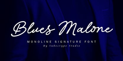 Blues Malone is a monoline signature font with an elegant style. It has good readability and is perfect for logos, invitations, wedding, signatures, Branding, clothing, headline, and much more! Blues Malone comes with ending swash alternate which will make your design more beautiful and elegant. I hope you enjoy this font. If you have any questions please don't hesitate to drop me a message :) Thank You, Subectype
 - Conestoga by FontMesa,
$20.00 Conestoga was a challenge that I took on which was to take a logo from an old antique vegetable crate label and create a complete font based on its design. The original logo was curved on a path and was caps only. The new letters were drawn straight and a matching lowercase was created to turn this old custom logo into a working font.
 - Zappaloosa by Bogstav,
$18.00 Zappaloosa is a wordplay, and the name came to me while listening to the radio while making this font. At a point I must have misheard something, but the name Zappaloosa popped up in my mind. The letters of Zappaloosa are playful and easy to use for serious or more loose use. I've added 3 different versions of each lowercase letter and multilingual support
 - EFCO Brookshire by Ephemera Fonts,
$45.00 Brookshire was inspired by the lettering seen on the Almanac ephemera paper when I visited the flea market in France. The result is a lovely piece of neo-Victorian fun that brings back the joy of 19th-century shop signs and flamboyant design ethos. Brookshire is ideal for poster work and signage, or anywhere that you want to bring back the joy of high Victorian design ethos.
 - Kiti Cuties by Dikas Studio,
$15.00 Hi, i want to introduce my newest font Kiti Cuties. Kiti Cuties is a playful sans serif font, Kiti Cuties is a allcaps font with 4 variations letter in lowercase e,h,o,u that makes your design looks more cheerfull. Kiti cuties is made to help you create a kids and fun theme design such as birthday card, baby shower card, greeting card and many more.
 - Rugsnatcher by PizzaDude.dk,
$20.00 Step into the future with this retro computer video game font! Get that 80'ies feeling with shoot 'em up games and mazes full of deadly robots - just waiting to zap you with their lazers! Rugsnatcher comes with a sci-fi loadful of ligatures, that curl and swirl ... right into outer space! Play around with UPPERCASE and lowercase to change how the letters play!
 - Thick Fun by PizzaDude.dk,
$17.00 This is not a brush font! This is an imitation of brushstrokes, done by pen. But I guess you've already noticed that - the brushstrokes are way too obvious, to have been made by brush. Although being a "fake", the letters leaves you with quite a good impression. Letters were inspired by an old horror movie poster, but is very useful for something less terrifying!
 - Comic Crunch by Hatftype,
$15.00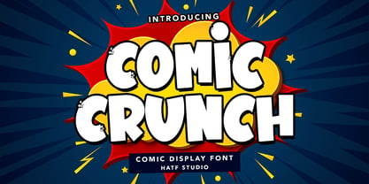 Is a comic display font with distinctive handwritten characters perfect for branding projects, logos, wedding designs, media posts, advertisements, product packaging, product designs, labels, photography, watermarks, invitations, stationery, and any project who need handwritten dishes. Features : 1. Uppercase & Lowercase 2. Multilingual support 3. Number 4. Symbol 5. Punctuation 6. Support in Mac and Windows OS 7. Support in design application I really hope you enjoy it.