10,000 search results
(0.015 seconds)
- Fonteys Pro by Fando Fonts,
$5.00 FonteysPRO is the new and improve version of the Fonteys font family by Fernando Fuentes and the Eysner award nominated Albert Monteys. It is an informal font family designed to letter comics. With a unique handwritting style is also perfect when you need an informal typography. FonteysPRO has a lot of variants for each letter to enhance the handwriting feeling. It’s feels like actual hand lettering. And, if were not enough, the Fonteys supports almost all latin languages, cylliric, greek, and even vietnamese. Its early version Fonteys, available at "pay what you want" in the designer webpage, has became in a success in the Indie Comic scene from Spain. Now with the PRO version FonteysPRO will surely become in one of the most used comic books typographies in the world. (In our modest opinion, of course)
 - AF LED7Seg 1 by Fortune Fonts Ltd.,
$15.00 * For when you need the most realistic looking electronic display. * See User Manuals Main advantages: - Spacing between characters does not change when entering a decimal point or colon between them. - Custom characters can be produced by selecting any combination of segments to be displayed. Low cost electronic displays have a fixed number of segments that can be turned on or off to represent different symbols. A digital watch would be the most common example. Fonts typically available for depicting electronic displays are often in the artistic style of these common LED or LCD displays. They provide the look-and-feel, but fall short when technical accuracy is required. Failure to represent an accurate and consistent representation of the real thing can be a cringe-worthy experience for the product design and marketing team, or even the hobbyist for that matter. To solve this problem, Fortune Fonts has released a range of fonts that accurately depict the displays typically found on low cost electronic devices: watches, answering machines, car stereos, alarm clocks, microwaves and toys. These fonts come with numbers, letters and symbols predefined. However, they also allow you to create your own segment combinations for the custom symbols you need. When producing manuals, marketing material and user interfaces, accuracy is an all-or-nothing concept. Instructions in the user manual describe how to turn these fonts into realistic displays according to your own design, in the manner of the images above. If you cannot see a license option for your specific application, such a license may be purchased from here. By purchasing and/or using and/or distributing the font, the buyer, user and distributor (including Monotype Imaging Inc. & Monotype Imaging Hong Kong) agrees to (1) indemnify and hold harmless the font foundry and neither the font foundry nor distributor is responsible to the buyer or user or any other party for any consequential, incidental, special, punitive or other damages of any kind resulting from the use of the deliverables including, but not limited to, loss of revenues, profits, goodwill, savings or expected savings, due to; including, but not limited to, failure of the deliverables to perform it’s described function, or the deliverable’s infringement of patents, copyrights, trademarks, design rights, contract claims, trade secrets, or other proprietary rights of the foundry, distributor, buyer or other parties, (2) not use the fonts to assist in design of, or be incorporated into, non-software displays.
 - Affair by Sudtipos,
$99.00 Type designers are crazy people. Not crazy in the sense that they think we are Napoleon, but in the sense that the sky can be falling, wars tearing the world apart, disasters splitting the very ground we walk on, plagues circling continents to pick victims randomly, yet we will still perform our ever optimistic task of making some little spot of the world more appealing to the human eye. We ought to be proud of ourselves, I believe. Optimism is hard to come by these days. Regardless of our own personal reasons for doing what we do, the very thing we do is in itself an act of optimism and belief in the inherent beauty that exists within humanity. As recently as ten years ago, I wouldn't have been able to choose the amazing obscure profession I now have, wouldn't have been able to be humbled by the history that falls into my hands and slides in front of my eyes every day, wouldn't have been able to live and work across previously impenetrable cultural lines as I do now, and wouldn't have been able to raise my glass of Malbeck wine to toast every type designer who was before me, is with me, and will be after me. As recently as ten years ago, I wouldn't have been able to mean these words as I wrote them: It’s a small world. Yes, it is a small world, and a wonderfully complex one too. With so much information drowning our senses by the minute, it has become difficult to find clear meaning in almost anything. Something throughout the day is bound to make us feel even smaller in this small world. Most of us find comfort in a routine. Some of us find extended families. But in the end we are all Eleanor Rigbys, lonely on the inside and waiting for a miracle to come. If a miracle can make the world small, another one can perhaps give us meaning. And sometimes a miracle happens for a split second, then gets buried until a crazy type designer finds it. I was on my honeymoon in New York City when I first stumbled upon the letters that eventually started this Affair. A simple, content tourist walking down the streets formerly unknown to me except through pop music and film references. Browsing the shops of the city that made Bob Dylan, Lou Reed, and a thousand other artists. Trying to chase away the tourist mentality, wondering what it would be like to actually live in the city of a billion tiny lights. Tourists don't go to libraries in foreign cities. So I walked into one. Two hours later I wasn't in New York anymore. I wasn't anywhere substantial. I was the crazy type designer at the apex of insanity. La La Land, alphabet heaven, curves and twirls and loops and swashes, ribbons and bows and naked letters. I'm probably not the very first person on this planet to be seduced into starting an Affair while on his honeymoon, but it is something to tease my better half about once in a while. To this day I can't decide if I actually found the worn book, or if the book itself called for me. Its spine was nothing special, sitting on a shelf, tightly flanked by similar spines on either side. Yet it was the only one I picked off that shelf. And I looked at only one page in it before walking to the photocopier and cheating it with an Argentine coin, since I didn't have the American quarter it wanted. That was the beginning. I am now writing this after the Affair is over. And it was an Affair to remember, to pull a phrase. Right now, long after I have drawn and digitized and tested this alphabet, and long after I saw what some of this generation’s type designers saw in it, I have the luxury to speculate on what Affair really is, what made me begin and finish it, what cultural expressions it has, and so on. But in all honesty it wasn't like that. Much like in my Ministry Script experience, I was a driven man, a lover walking the ledge, an infatuated student following the instructions of his teacher while seeing her as a perfect angel. I am not exaggerating when I say that the letters themselves told me how to extend them. I was exploited by an alphabet, and it felt great. Unlike my experience with Ministry Script, where the objective was to push the technology to its limits, this Affair felt like the most natural and casual sequence of processions in the world – my hand following the grid, the grid following what my hand had already done – a circle of creation contained in one square computer cell, then doing it all over again. By contrast, it was the lousiest feeling in the world when I finally reached the conclusion that the Affair was done. What would I do now? Would any commitment I make from now on constitute a betrayal of these past precious months? I'm largely over all that now, of course. I like to think I'm a better man now because of the experience. Affair is an enormous, intricately calligraphic OpenType font based on a 9x9 photocopy of a page from a 1950s lettering book. In any calligraphic font, the global parameters for developing the characters are usually quite volatile and hard to pin down, but in this case it was particularly difficult because the photocopy was too gray and the letters were of different sizes, very intertwined and scan-impossible. So finishing the first few characters in order to establish the global rhythm was quite a long process, after which the work became a unique soothing, numbing routine by which I will always remember this Affair. The result of all the work, at least to the eyes of this crazy designer, is 1950s American lettering with a very Argentine wrapper. My Affair is infused with the spirit of filete, dulce de leche, yerba mate, and Carlos Gardel. Upon finishing the font I was fortunate enough that a few of my colleagues, great type designers and probably much saner than I am, agreed to show me how they envision my Affair in action. The beauty they showed me makes me feel small and yearn for the world to be even smaller now – at least small enough so that my international colleagues and I can meet and exchange stories over a good parrilla. These people, whose kindness is very deserving of my gratitude, and whose beautiful art is very deserving of your appreciation, are in no particular order: Corey Holms, Mariano Lopez Hiriart, Xavier Dupré, Alejandro Ros, Rebecca Alaccari, Laura Meseguer, Neil Summerour, Eduardo Manso, and the Doma group. You can see how they envisioned using Affair in the section of this booklet entitled A Foreign Affair. The rest of this booklet contains all the obligatory technical details that should come with a font this massive. I hope this Affair can bring you as much peace and satisfaction as it brought me, and I hope it can help your imagination soar like mine did when I was doing my duty for beauty.
 - Xpress by Wiescher Design,
$12.00 »XPress« is a very distinct, expressive, typical new Sans. »XPress« is my new Sans-Serif that impresses – especially in small sizes – with its outstanding readability. Seven precisely calibrated weights from »Thin« to »Heavy« and its corresponding italics make this font-family universally usable. »XPress« got its bearings from the fabulous American »Gothic« fonts of the twenties of last century. Modern, present day elements, high lowercase letters and infinitesimal elegant slight curves in start- and end strokes make the font family not only great for body copy, but also very useful in advertising. »XPress« ist eine individuelle, expressive, typische neue Sans. »XPress« ist meine neue Serifenlose die – speziell in kleinen Schriftgraden – durch aussergewöhnliche Lesbarkeit auffällt. Sieben präzise aufeinander abgestimmte Schnitte von »Thin« bis »Heavy« und dazu passende Kursive machen die Schriftfamilie vielseitig einsatzfähig. »XPress« orientiert sich bewusst an den grossen amerikanischen Groteskschriften der zwanziger Jahre des letzten Jahrhunderts. Durch moderne Formelemente, große Mittellängen und unendlich leichte, elegante An- und Abstriche ist die Schrift jedoch nicht nur als Textschrift, sondern auch im gesamten Bereich der Werbung vielseitig einsetzbar.
 - Semilla by Sudtipos,
$79.00 I spend a lot of time following two obsessions: packaging and hand lettering. Alongside a few other minor obsessions, those two have been my major ones for so many years now, I've finally reached the point where I can actually claim them as “obsessions” without getting a dramatic reaction from the little voice in the back of my head. When you spend so much time researching and studying a subject, you become very focused, directionally and objectively. But of course some of the research material you run into turns out to be tangential to whatever your focus happens to be at the time, so you absorb what you can from it, then shelf it — like the celebrity bobblehead that amused you for a while, but is now an almost invisible ornament eating dust and feathers somewhere in your environment. And just like the bobblehead may fall off the shelf one day to remind you of its existence, some of my lettering research material unveiled itself in my head one day for no particular reason. Hand lettering is now mostly perceived as an American art. Someone with my historical knowledge about lettering may be snooty enough to go as far as pointing out the British origins of almost everything American, including lettering — but for the most part, the contemporary perspective associates great lettering with America. The same perspective also associates blackletter, gothics and sans serifs with Germany. So you can imagine my simultaneous surprise and impatience when, in my research for one of my American lettering-based fonts, I ran into a German lettering book from 1953, by an artist called Bentele. It was no use for me because it didn't propel my focus at that particular time, but a few months ago I was marveling at what we take for granted — the sky is blue, blackletter is German, lettering is American — and found myself flipping through the pages of that book again. The lettering in that book is upbeat and casual sign making stuff, but it has a slightly strange and youthful experimentation at its heart. I suppose I find it strange because it deviates a lot from the American stuff I'm used to working with for so long now. To make a long story short, what’s inside that German book served as the semilla, which is Spanish for seed, for the typeface you see all over these pages. With Semilla, my normal routine went out the window. My life for a while was all Bezier all the time. No special analog or digital brushes or pens were used in drawing these forms. They're the product of a true Bezier process, all starting with a point creating a curve to another point, which draws a curve to another point, and so on. It’s a very time-consuming process, but at the end I am satisfied that it can get to pretty much the same results easier and more traditional methods accomplish. And as usual with my fonts, the OpenType is plenty and a lot of fun. Experimenting with substitution and automation is still a great pleasure for me. It is the OpenType that always saves me from the seemingly endless work hours every type designer must inevitably have to face at one point in his career. The artful photos used in this booklet are by French photographer and designer Stéphane Giner. He is very deserving of your patronage, so please keep an eye out for his marvelous work. I hope you like Semilla and enjoy using it. I have a feeling that it marks a transition to a more curious and flexible period in my career, but only time will tell.
 - Future Imperfect by K-Type,
$20.00 In the 1970s I was anxious and distressed about the future. I was right. In 1975 Future Imperfect was submitted to, and rejected by, Letraset. I wish I’d kept the rejection slip.
 - Wakefield by Galapagos,
$39.00A gentle breeze caressed his face as his body took on the easy posture of a dancer on break. Flickering sparklets of light sprinkled the glass-smooth surface of the aqua liquid on which he floated. His mind wandered; he was only days away from his scheduled departure date. This day was no different from a hundred other days he had spent melded to his windsurfer, skittering along the breadth of the modest lake, soaking up the sun's rays and forgetting about the entire rest of the world. Lake Quannapowitt, and the town of Wakefield, Massachusetts, were familiar to Steve, a long-time resident of the picturesque New England town. This is where he grew up; this is where he married and lived for many years; and this is the place he was preparing to leave, not one week hence. Not generally prone to nostalgia, it was in just such a state he nonetheless found himself once Zephyrus retreated, as was his custom, periodically, while patrolling the resplendent lake. Steve was going to miss the lake, and he was going to miss the town. How many hours of how many days had he spent exactly like this, standing on his motionless board, waiting for his sail to fill, and staring at the lake's shores, its tiny beach, the town Common with its carefully maintained greenery, and equally well-tended gazebo, the Center church - its spire shadow piercing the water's edge, like a scissor-cut the better to begin a full-fabric tear? Yes, he was going to miss this place - this town which all of a sudden had become a place out of time, just as he was about to become a person out of place. Once this idea struck him, he couldn't shake it. He was transported back in time four score years, now watching his ancestors walk along the shore. Nothing in view belied this belief - not the church's century old architecture, not the gazebo frozen in time, nor the timeless sands of the beach, nor the unchanging Common. Everything belonged exactly where it was, and where it always would be. This, he decided, was how he would remember his hometown. And this is when it occurred to Steve to design a typeface that would evoke these images and musings - a typeface with an old-fashioned look, reflected in high crossbars, an x-height small in size relative to its uppercase, and an intangible quality reminiscent of small-town quaintness. Wakefield, the typeface, was born on Lake Quannapowitt in the town for which it was named, shortly before Steve moved away. It is at once a tribute to his birthplace and a keepsake. - Walken by Typodermic,
$11.95 You want a typeface that’s gonna command attention? You want a typeface that’s gonna make your message scream out, “Hey, look at me!”? Then you need Walken. This slab serif is built like a brick house, with sturdy letterforms and robust serifs that mean business. And don’t think you’re gonna get some plain vanilla lettering here. Oh no. Walken’s got some tricks up its sleeve. We’re talking custom letter pairs, baby. OpenType ligatures that’ll swap out some letter combinations and create a unique, unpredictable look. You’ll get a mix of stencil and non-stencil characters that’s gonna give your message a personality all its own. Now, if you’re not satisfied with just one tough look, Walken’s got you covered. We’ve got three, count ’em, three forceful options: Clean, Crisp, and Hard. So whether you’re aiming for a sleek, professional image or a rough-and-tumble vibe, we’ve got you covered. So what are you waiting for? You want a typeface that’s gonna make you stand out from the crowd? You want Walken. But be warned: this typeface means business. Most Latin-based European writing systems are supported, including the following languages. Afaan Oromo, Afar, Afrikaans, Albanian, Alsatian, Aromanian, Aymara, Bashkir (Latin), Basque, Belarusian (Latin), Bemba, Bikol, Bosnian, Breton, Cape Verdean, Creole, Catalan, Cebuano, Chamorro, Chavacano, Chichewa, Crimean Tatar (Latin), Croatian, Czech, Danish, Dawan, Dholuo, Dutch, English, Estonian, Faroese, Fijian, Filipino, Finnish, French, Frisian, Friulian, Gagauz (Latin), Galician, Ganda, Genoese, German, Greenlandic, Guadeloupean Creole, Haitian Creole, Hawaiian, Hiligaynon, Hungarian, Icelandic, Ilocano, Indonesian, Irish, Italian, Jamaican, Kaqchikel, Karakalpak (Latin), Kashubian, Kikongo, Kinyarwanda, Kirundi, Kurdish (Latin), Latvian, Lithuanian, Lombard, Low Saxon, Luxembourgish, Maasai, Makhuwa, Malay, Maltese, Māori, Moldovan, Montenegrin, Ndebele, Neapolitan, Norwegian, Novial, Occitan, Ossetian (Latin), Papiamento, Piedmontese, Polish, Portuguese, Quechua, Rarotongan, Romanian, Romansh, Sami, Sango, Saramaccan, Sardinian, Scottish Gaelic, Serbian (Latin), Shona, Sicilian, Silesian, Slovak, Slovenian, Somali, Sorbian, Sotho, Spanish, Swahili, Swazi, Swedish, Tagalog, Tahitian, Tetum, Tongan, Tshiluba, Tsonga, Tswana, Tumbuka, Turkish, Turkmen (Latin), Tuvaluan, Uzbek (Latin), Venetian, Vepsian, Võro, Walloon, Waray-Waray, Wayuu, Welsh, Wolof, Xhosa, Yapese, Zapotec Zulu and Zuni.
 - J. Scott Campbell Lower by Comicraft,
$39.00 Lower-case lettering is so-called because the characters that we know as lower-case were once kept in the bottom, shallow drawers of a type compositor's typecase. Not a lot of people know that, and we suspect superstar artist and FAIRYTALE FANTASIES Calendar creator, J Scott Campbell doesn't either because even though we looked high and low, in every single one of his drawers, we still could not find a single example of Scott EVER writing in lower case, but we begged him, we pleaded with him and, eventually we HYPNOTIZED him, and here's the font you'll find in J. SCOTT TIME CAPSULE from Image Comics! You're welcome. See the families related to J Scott Campbell Lower: J Scott Campbell & J Scott Campbell Sketchbook.
 - Satron by Aah Yes,
$3.95A reminder of the days of flower power, Satron is quite a bit different, slightly hippy and slightly grungy. Although it is not in any way an attempt to emulate the fonts used in that era, it evokes the mood of the time. There's two different shapes making up each character, with a grungy black one in front of a hippy white one. The combined effect however is quite novel and modern. There's also a jumbled version with the letters rotated and whacked around, in case you want it funky-flavored. There's all the main characters plus lots of extra accented letters as well. The package contains both OTF and TTF versions - install either OTF or TTF, not both versions on the same machine. - Asrog Genos by Product Type,
$19.00 Welcome to the future with Asrog Genos, a futuristic technology font that designs each letter with a modern, sophisticated touch. Every character in Asrog Genos exudes a future feel, giving the appearance of cutting-edge technology. Asrog Genos brings elements of technology into your designs, creating a font that is not only eye-catching but also embraces the essence of innovation. Asrog Genos is an ideal choice for projects that require a touch of futuristic technology. Whether you are designing user interfaces, technology promotional materials, or other futuristic design elements, this font brings an unmatched modern aura. Do not miss this opportunity! Get the Asrog Genos Futuristic Technology Font now and let each character be a portal to your design future. **Uppercase
 - NAKED - Personal use only

- Knock Type by sugargliderz,
$20.00 KnockType is based on the concept of braille notation in Japanese. It does not support braille notation in other languages. KnockType is not necessarily aimed at facilitating “braille transcription”. It is designed so that someone who understands the grammar of “braille transcription” can instantly transliterate into braille text that was previously transcribed to kana characters, etc. In addition, it allows ink characters to be converted to braille using OpenType features. It is recommended for use in applications that are compatible with OpenType features. If they are not compatible, KnockType is “simply a kana font”. To be a little more specific, it is assumed that KnockType will be used in Adobe’s InDesign and Illustrator applications. If you don't have them, you will not get satisfactory results. Four types of font are available. There are “hasBox&Line”, “hasnotBox&Line”, and the reversed font of each. When displayed on a convex surface, the assumption is that they will be used mainly for printing applications. When displayed on a concave surface, the assumption is that they will be used mainly for writing on braille boards, etc. By printing, you can get a rough idea of the dot positions. It is more effective to match them to the grid size of the braille board.
 - Initial - Unknown license

- Antimony Blue - Unknown license

- MOO! - Personal use only

- TMBFont - Unknown license

- Missale Lunea by astype,
$36.00 Missale Lunea is a calligraphic uncial typeface with a female note. The font offers lots of stylistic alternates, signs, zodiacs & symbols. OpenType features: stylistic alternates signs, zodiac & symbols, proportional, medieval numerals, Roman numerals numerators, denominators and fractions
 - Talsmann NF by Nick's Fonts,
$10.00 Plain and simple, here's a faithful reproduction of the Advocate font for IBM Selectric typewriters from the 1960s. Both versions support the Latin 1252, Central European 1250, Turkish 1254 and Baltic 1257 codepages.
 - Happy Laundry by PizzaDude.dk,
$17.00 Happy Laundry is my laid back happy kids font. Smooth and yet rough here and there. I'd say that Happy Laundry would suit your birthday invitations, posters, packaging and other products perfectly! Enjoy! :)
 - Thuressia Script by Picatype,
$12.00 Thuressia Script is casual and pretty with lots of swashes. It can used for various purposes. such as logos, product packaging, wedding invitations, branding, headlines, signage, labels, signature, book covers, posters, quotes and more. Thuressia Script features OpenType stylistic alternates, ligatures and International support for most Western Languages is included. To enable the OpenType Stylistic alternates, you need a program that supports OpenType features such as Adobe Illustrator CS, Adobe Indesign & CorelDraw X6-X7, Microsoft Word 2010 or later versions. How to access all alternative characters using Adobe Illustrator: https://www.youtube.com/watch?v=XzwjMkbB-wQ Thuressia Script is coded with PUA Unicode, which allows full access to all the extra characters without having special designing software. Mac users can use Font Book , and Windows users can use Character Map to view and copy any of the extra characters to paste into your favourite text editor/app. How to access all alternative characters, using Windows Character Map with Photoshop: https://www.youtube.com/watch?v=Go9vacoYmBw If you need help or have any questions, please let me know. I'm happy to help!
 - Witch Hazel by Missy Meyer,
$16.00 Witch Hazel has been quite a while in the making; a fun font with slightly flared serifs, lots of ligatures and alternates, and over 1150 glyphs! This font is great for holiday designs, from Valentine's Day to Halloween to Christmas! It also bridges modern and vintage styling, so you can use it for fairy tales and pirates, or for your company's branding and logo! I just couldn't stop adding more and more to this font. Witch Hazel includes: - The usual A-Z, a-z, 0-9, and tons of punctuation; - Greek uppercase letters; - Cyrillic uppercase letters; - Over 430 extended Latin characters; - Small caps; - Decorative alternates for all letters (some letters have up to 8 alternates!); - Numbers and uppercase letters with pointy spurs; - Numbers and uppercase letters with rounded spurs; - 40 two-letter ligatures! All characters are OpenType coded and PUA-encoded, so they can be accessed by all design programs. And I'm including a PDF with the full character list; you can use it for reference, or you can copy/paste directly from the PDF into your project!
 - Xkanz by Xuveki,
$10.00 XKANZ is a futuristic, robotic, variable display font geared towards cyberpunk poster text, cover text, and futuristic UI. It can easily shine as both as header and body. Wide glyphs, high weight and corner contrast, and "connectors" that bridge the gap between the stems, it's this mix of elements that give XKANZ its unique look. The purchase includes two static styles, regular and oblique, and a variable font file with a interpolatable 0-12 degree slant axis. Extensive multilingual support covering most latin characters 4 stylistic sets that include alternates for the D, I, R, and E glyphs, along with symbol/punctuation alternates such as the parenthesis, brackets, and more. Possible updates include condensed versions. The updates will be free and available to everyone who has already purchases XKANZ. This one was a wild and weird journey. It took A LOT of iteration to get to this end product. I'm proud to share it. Enjoy All questions, requests, or inquiries can be sent to abe.xuveki@gmail.com or DM'd to Xuveki on Instagram (https://www.instagram.com/xuveki)
 - Price Didone by Eclectotype,
$25.00 PUBLIC SERVICE ANNOUNCEMENT: Price Didone has inspired a full alphabetic font - Mastadoni, so if you're after more than numerals, head over there! Price Didone is a font with a singular purpose: The setting of elegant, stylish price tags. As such it is non-alphabetic, featuring instead numerals, a large array of currency symbols, and a smattering of typographic niceties such as quotes, brackets, pilcrow, daggers and a very curvaceous ampersand. Certain currency symbols that are not independent glyphs (Q, Ft, kr etc.) are included as their constituent letters, some of which also have automatic ligatures for that little something extra. There are currency symbols included which have not (yet) been accepted to unicode, such as the Russian Ruble and Bitcoin symbols. For ease of access, these can be typed using the standard ligatures feature. See features below for the full list. Features: Automatic Fractions - with fractions feature engaged, arbitrary fractions are a doddle. Stylistic Sets: SS01 - an alternate look for 4 SS02 - a double stroked dollar symbol SS03- the # sign becomes a stylish numero Stylistic Alternates - for software that doesn't support stylistic sets, the above three features are grouped into the one SALT feature. Standard Ligatures - certain typed combinations automatically change to different glyphs: B|| = Bitcoin symbol P- = Russian Ruble RM = Malaysian Rimgit symbol Rp = Indonesian Rupiah Rs = Rupees Ft = Hungarian Forint kr = Kroner symbol % off;%off;%ff = Special percent off ligature Discretionary Ligatures - this feature sets decimal prices like $5.95 with the numerals after the period smaller and raised from the baseline, underlined by a nice swoosh. It also shrinks the dollar, sterling, and Euro symbols for a more authentic look. While intended for one sole purpose, Price Didone could nevertheless be quite versatile. Quote marks and typographic symbols can be used for decoration. Everybody loves a nice ampersand and this is one I'm really proud of. Or you might just want some pretty numbers for your house, or sports jersey, or just to stand out a little from the rest of your text. Whatever use you may have in mind, go for it. And do let me know if your currency symbol isn't included, and I'll quickly add it to the glyph set in future versions.
 - Intramural JL - 100% free

- Spoiler by PizzaDude.dk,
$16.00 Now here's a font that won't spoil anything! It's my ALL CAPS brush font with slightly uneven and quirky lines. Just enough to make font look lively and fresh, but not overdoing it. Every letter has 7 different versions, which automatically cycles as you type - and I have added an extra SMALL CAPS for each letter. Exchange every letter here and there with SMALL CAPS, and you will get an even more authentic result!
 - Yume by Thinkdust,
$10.00Yume is a fun loving font with a cruel streak that can sometimes turn laughter into daggers. This wicked personality can lead to some aggressive turns of phrase, but when it’s not being mean, Yume can use its strength and sense of humour to do a lot of good. Either way, Yume is sure to have a big impact on your audience, shocking them into paying attention through crisp, sharp lines and chunky, bold characters. - Ad Words by Outside the Line,
$19.00 Just in time for the sale season. Ad Words is a font of words you would use if you did retail ads. Some words in script, some print, some bold, some not. Plus 2 starbursts. Enlarge the starbursts and then reverse one of the words out of it… like Now! Win! or Free! Other Outside the Line fonts work with this one, check out Architectural Lettering Regular and Bold, Plz Print or Plz Script.
 - Tactical by Positype,
$25.00 Tactical is nothing more than a testosterone-laced typeface. Rigid, mechanical and unforgiving. Originally conceived in 2007 while I was working through the early sketches of Ginza, Tactical features hard 45-degree angles and the presence of a curve for curve’s sake is just not there. Complimenting the original is a Stencil variant (inspired by the military, marathon video game, explosion-influenced name) and matching Obliques—altogether creating a sharply coordinating family.
 - ZenoPotion AOE by Astigmatic,
$19.95ZenoPotion is a geometric styled typeface influenced by alien stories and nostalgia. It carries a techno look with a regular lined top and dipped thick bottom throughout, highly readble, though not best for large bodies of text. Use the alien technology, let ZenoPotion be the type for your designs and stories. From the far reaches of space, another lifeform sent a message, now you can use their typestyle to convey your own! - Typograph Pro by Aleksandar Aleksandrov,
$19.00 Note: The 'Pro' in the name of this font should not be interpreted as having OpenType features. It has none. What was the inspiration for designing the font? Inspired from the basic shapes like circle, cube and triangle. Closer to basics means more useful in various projects. What are its main characteristics and features? Clean graphic shapes. Usage recommendations: Graphic design, Motion design, 3D, Posters, Magazine covers, Outdoor. See Typograph Pro in action:http://www.amateurmedia.net/typographpro/
 - Nouveau Semi Stencil JNL by Jeff Levine,
$29.00 The cover on the sheet music for the 1922 song "If She Comes from Dixie" had the title hand-lettered in an Art Nouveau style with a semi-stencil effect. It's now available as Nouveau Semi Stencil JNL in both regular and oblique versions. The typeface is not considered a "pure" stencil because many of the letters were made solid; lacking the classic stencil "breaks" at key points found in more traditional stencil designs.
 - Branch by Peliken,
$15.00 Branch font with Cyrillic support is perfect for branding, Slavic motives, Russian menu design and many more Font includes a full set of gorgeous uppercase and lowercase letters, numbers, a large selection of punctuation. You can use this font for design logos, quotes prints on t-shirts and other. Ethnic serif font. Authentic slavic stylized alphabet bold symbols. Creative minimal latin character set. Please NOTE - Mock ups and photo are NOT included.
 - Athena Signature by Viswell,
$18.00 Athena Signature is an authentic and stylish script font. Not too thin and not too thick, balanced and varied, this font was designed to enhance the beauty of your projects.
 - Good Romance by Good Java Studio,
$20.00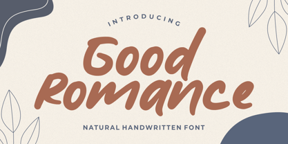 Good Romance - Natural Handwritten font is a natural & modern handwritten font. I'ts Perfect for logo, invitation, stationery, wedding designs, social media posts, advertisements, product packaging, product designs, label, photography, watermark, special events or anything.
 - Letter Gothic M by URW Type Foundry,
$35.99Letter Gothic was designed for IBM between 1956 and 1962 for use on the Selectric typewriter. Letter Gothic is a monospaced, sans serif face that can be useful for technical documentation and tabular work. - Letter Gothic L by URW Type Foundry,
$89.99 Letter Gothic was designed for IBM between 1956 and 1962 for use on the Selectric typewriter. Letter Gothic is a monospaced, sans serif face that can be useful for technical documentation and tabular work.
 - P22 Music by P22 Type Foundry,
$39.95 P22 Music Pro is a unique font system that allows the user to compose music with text editing and page layout programs capable of OpenType features and contextual substitutions. The OpenType features speed up the composing process by adding chords, contextual accidentals (sharps and flats), contextual key signatures and time signatures. P22 Music Pro covers a wide range of symbols and notation used in traditional western music composition. P22 Music Pro requires an application that uses OpenType features and is capable of contextual substitutions, such as Adobe InDesign or Illustrator. P22 Music is the companion, non-pro font included with P22 Music Pro and also sold separately. P22 Music also contains music symbols and notation and is suited for layout and text edit applications such as Microsoft Word that do not support Pro OpenType features. Unlike the P22 Music Pro font, the music symbols in the non-pro font are not tied to the staff lines, making them more useful for general design purposes. Staff lines are included as a separate character.
 - VVDS Hickory Dickory by Vintage Voyage Design Supply,
$15.00 Glad to introducing you Hickory Dickory - a stylish serif with an eighties mood. I really love this old advertising from those magazines. It was a new era of minimalism in photography and typographic design. The playful, stylish and modern. This font will fit perfectly not only this type of design - you may use the alternates characters and get a really playful typography at your project. Hickory Dickory has a lot of alternates, some letters have them up to 17. More than 620 glyphs total! Also, there is a true italic for perfect pairing. Normal & True Italic A lot of stylistic alternates 620+ Glyphs total Decimal and fraction figures
 - P22 Slogan by IHOF,
$24.95 P22 Slogan is a non-connecting script font that captures the essence of the lettering used in 1950s European advertising. Bold strokes of this brush-drawn face make this design a great choice for both retro design and contemporary work. The font is based on the 1957 design Slogan by Aldo Novarese for the Italian Nebiolo Type Foundry. At the time of its original release, it was touted for "striking publicity work". This new digitization accurately reproduces the outlines of the original not found in previous digital versions of this design. P22 Slogan is a non-Pro Opentype font that includes Central European characters.


