10,000 search results
(0.024 seconds)
- ITC Weidemann by ITC,
$29.99 The Weidemann typeface's original name was Biblica, which was designed for the collaborative publication of a Bible by the German Catholic and Protestant Churches. The mass of text which the face was intended to set required that the design allow many characters to fit onto one line without rendering the words illegible. Thus, narrow spacing does not compromise the legibility or the elegance of Weidemann.
 - Victory Speech Lower by Comicraft,
$49.00 Speak quietly but carry a big stick' as President Theodore Roosevelt once said... so, with so much heated rhetoric in the air this -- let's face it, EVERY -- Election season, we felt that it was important to put together a more dignified and sedate lower case edition of our popular Victory Speech font. Bad Hair and Big Sticks not included. See related font: Victory Speech
 - Arabec by Canden Meutuah,
$25.00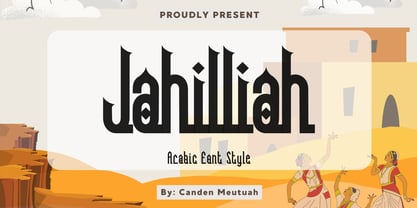 this is a simple and elegant Slab serif font full of modern style. This font is very suitable for you to use for many purposes such as branding, logos, wedding designs, social media posts, advertising, product packaging, product design, labels, photography, watermarks, invitations, stationery, and any project. This font is complete in many other languages. you will not be disappointed with the results. thank you
 - Adis Ababa by Simeon out West,
$20.00 Adis Ababa is a font based on an ancient Ge'ez script. The Ge'ez alphabet is the written language of the ancient ancestors of the Ethiopian and Eritrean nation. It is not a Latin or Greek based alphabet and I have striven in this font to present a readable Latin alphabet that visually reminds me of some of the examples of the writing that I have seen.
 - Rustika by Linotype,
$40.99Rustika is a rather rough Oldstyle typeface. The roughness is seen in larger points only. In smaller points it is not easy to see that I tried to imitate characters cut with a chisel. The characters themselves follow otherwise totally the classic models. The name, in this spelling taken from Esperanto, refers to the rustic nature of the characters. Rustika was released in 1995. - ITC Zapf Book by ITC,
$29.99 Zapf Book font is the work of German designer Hermann Zapf, a blend of the characteristics of Walbaum, Melior and the contrasting weights of Bodoni. It is a typical Zapf font, distinction without eccentricity and superb sensitivity and letterfit, and clearly demonstrates his concern that an alphabet work not just as a collection of single letters, but also have a sense of unity in itself.
 - Agharti by That That Creative,
$15.00 Agharti is a bold condensed display font perfect for headlines with a punch. The lowercase glyphs reach as high as the capitals so even if you are not typing in all caps you will have a solid impactful block of text. These extra tall lowercase letters will be sure to catch attention from any viewer and add some playful delight to any design project.
 - Hello Headline by DearType,
$29.00 Hello Headline is a bold and friendly typeface designed specifically (believe it or not) for headlines. All of the letters are chunky and rounded, which is probably the reason why they are visible from afar. And I mean, really, really afar. The overall feel of the typeface is meant to be very casual and affable, so it is great for businesses that are fun, outgoing and sincere.
 - Samsara by W Type Foundry,
$15.00 Samsara is a cursive typeface inspired by calligraphy tools. Its shapes and gestures convey an organic-modern style which generates the texture of a brush tip. Samsara not only has a great versatility, but also is suitably to create short texts such as branding and short messages. It comes with OpenType features, stylistic sets, special ligatures, and swashes, which were designed specially to let your imagination fly.
 - Blue Jay Way NF by Nick's Fonts,
$10.00Modern Caps—and lowercase, too—was how Ross George described the pattern for this typeface in his Speedball Text Book. Not surprisingly, the design was used on the Beatles' original Magical Mystery Tour album, which suggested the current name. Art Deco meets Psychedelia! Both versions include the complete Unicode Latin 1252, Central European 1250 and Turkish 1254 character sets, with localization for Moldovan and Romanian. - Funny Nature by URW Type Foundry,
$39.99 Funny Nature is not a typeface but a collection of small, comic-like symbols. Lüdicke used to work often for a supplier of gardening equipment etc. He had to come up with new, original and vivid ideas for the design of catalogues and ads. He designed Funny Nature, a wonderful collection of illustrations. Can you hear the humming and buzzuing, can you smell the flowers?
 - Lekker by Susan Brand Design,
$5.00 "Lekker" is an Afrikaans word, that does not quite have an English equal. I can sum it up with the following mixture of words: yummy, nice, fun, joy. That is what this typeface encapsulates. A fun, playful, informal and easy-to-read font with a few script ligatures. Lekker includes multilingual support for All Western Europe languages, as well as Afrikaan (of course). xx Susan
 - HU Malrang KR by Heummdesign,
$50.00 'HU Malrang KR' is a font that gives a round and soft feel to its tightly packed modules. This font has a variable function, allowing users to fine-tune the thickness they want. (Available only in Adobe programs.) Six basic weights are provided so that they can be used even in programs that do not apply the variable function. This fonts contain Hangul, Korean.
 - Oaken Bucket NF by Nick's Fonts,
$10.00A Victorian face named Oakwood provided the pattern for this decorative little number, with its swirls and curls guaranteed to delight boys and girls, saints and churls, and dogs and squirrels…well, maybe not the last pair, but you get the idea. All versions of this font include the Unicode 1250 Central European character set in addition to the standard Unicode 1252 Latin set. - Acaraje by Latinotype,
$39.00 Acarajé is a grotesque font that stands out thanks to its versatility. Its personality blossoms through its particular modulation, which grows with weights; making it a rather jovial typeface that does not abandon the characteristics of more classic grotesques. With two styles available: normal and italic, and a variety of 7 weights that range from "Black" to "Regular", this font offers incredible flexibility for your designs.
 - Tenby Stencil by Paragraph,
$21.00 Tenby Stencil is a geometric display typeface with broken contours. Unlike real stencil fonts, the gaps are not functional but decorative. They have a consistent size and angular similarity, giving headlines or logos a unique dramatic effect. Designed for use at larger sizes for logotypes, short titles or headings, it contains common ligatures and old-style numerals, and supports Western plus Nordic, Eastern European and Turkish languages.
 - Montello by Hanoded,
$15.00 Montello started out as an Illustrator exercise (a skill I am still learning). I made a couple of glyphs for fun, then realised it would make a nice font. The result is Montello. Montello is a classic connected script font, very neat and (in my humble opinion) not an eye-sore either. Montello comes with a whole bunch of ligatures for letters that just won’t connect nicely.
 - GL Benicassim by Fontbilisi,
$30.00 GL Benicassim is a very condensed and practical font. It is only caps font, but it contains latin and cyrillic characters, as well as all kind of accents to be compatible with many languages. It will give to your designs a fancy and fashionable touch and it is specially practical when the space you have is not too big, since it is really condensed.
 - P22 Amelia Jayne by IHOF,
$39.95Amelia Jayne is Ted Staunton's updated revision and expansion of his own Amelia decorative cap font. Amelia Jayne started as a Roman font to accompany the Amelia initials but has taken on a new life as a Pro Roman font with small caps and several variations of new matching initial companion fonts. (The initials are not included in the pro font but come bundled with the set.) - Sensory Overload by Hanoded,
$15.00 Whenever I create a font using a Chinese brush and ink, it almost always comes out scary-looking. Sensory Overload is not like that: it is quite a neat and tidy font, even if it is a little rough around the edges. Sensory Overload is an all caps typeface and would be ideally suited for book covers, headlines, packaging and posters. Comes with an overload of diacritics.
 - Stagnan by ArimaType,
$15.00 Stagnan is a font with a subtle blend of passion and calculation. each glyph is made with great care in order to get results that do not disappoint. This gives the designer various options for typesetting A variable version is included with the full family, allowing maximum flexibility and control for the designer over the wide range of expression capabilities of the Stagnan superfamily.
 - ParaCaps by Paragraph,
$12.00 This decorative, headline or logotype geometric font consists entirely of uppercase letters. The glyphs of uppercase are rounder than their lowercase counterparts, allowing playful interaction within words, contrasting round and square shapes. The font is an extension of the Paragraph fonts family, however the capitals of ParaCap and lower case glyphs of Paragraph are not designed to be used together. That said, you are welcome to try :)
 - Southima by Motokiwo,
$15.00 Southima modern script font has something cool to deliver your words with a cute and sweet feeling. It's not complex typeface with many OpenType features, Southima only has a little ligature. Southima is simple and casual signature font, but Southima has a soul and I believe it will give a soul to your project for various purpose such as weddings, posters, magazines, novels, and more.
 - Terzo by Wilton Foundry,
$29.00 Terzo uses three lines in the main stem of the capitals resulting in an interesting display of script capitals. Flourishes are uniquely positioned and are deliberately minimalist in order to feature the three part stem capitals. Lowercase characters are also strong enough not to be dominated by the capitals. The overall result is a well balanced and refreshing script that will serve many purposes!
 - Raspberry Sherbet by Hanoded,
$15.00 I have actually never had a sherbet. When I made this font family, I wish I had one, as it was a whopping 38 degrees (Celsius, not Fahrenheit…) outside. Raspberry Sherbet is a cute little font family, consisting of a rounded fat kids font and an inline version. Comes with all the bells & whistles, plus a super duper cooling effect when you use it!
 - Rosalina by Supfonts,
$15.00 Hello, friends. Here's my new experiment. This font breaks the boundaries even more. Rosalina combines all these qualities: simple and clear, looks at ease. It is perfect for signatures or design, wedding invites and cards, where you do not need a strict style :) Test it out below to see how it could look for your next project! Check out my blog: https://www.instagram.com/zloillev pinterest.com/dmitriychirkov7 Enjoy
 - Pittsburgh by Greater Albion Typefounders,
$18.00 Pittsburgh is the latest (as at August 2011) in a range of inter-war American inspired commercial faces, and takes its place alongside the popular Bettendorff and the Spargo family. These shaded stab-serif capitals speak of the heyday of heavy manufacture and engineering and bring a gritty feel of the 20s and 30s to any project. Why not indulge in a little heavy engineering today?
 - Amateur Stencil JNL by Jeff Levine,
$29.00With all of the stencil fonts created by Jeff Levine from various vintage sources, you would think everything had already been covered. Not so. Along comes Amateur Stencil JNL. Modeled from a child's stencil set from the late 1950's or early 1960's, it vaguely resembles Futura, but its irregular widths and semi-stencil appearance sets it off greatly from that classic typeface. - Gojogia by Canden Meutuah,
$25.00 this is a simple and elegant Slab serif font full of modern style. This font is very suitable for you to use for many purposes such as branding, logos, wedding designs, social media posts, advertising, product packaging, product design, labels, photography, watermarks, invitations, stationery, and any project. This font is complete in many other languages. you will not be disappointed with the results. thank you
 - Algoria by Sealoung,
$15.00 Algoria is a functional sans serif that includes open character openings, a uniform distribution of white and black, and excellent readability. The general neutrality of the font patterns is not without elegance, and all the details of the typeface are crafted with mathematical precision and love. Typographic designs are developed for the widest possible range of tasks that any quality corporate font must accomplish.
 - Steel Stencil JNL by Jeff Levine,
$29.00 A group of unique metal plates with stencil initials cut into them was spotted while browsing through online auctions for source material. What made these items even more interesting was how some of the stencil letters had been sectionally divided - not vertically or horizontally as in most stencils, but lines cut at angles. This is the basis for Steel Stencil JNL and Steel Stencil Oblique JNL.
 - ITC Kristen by ITC,
$29.99ITC Kristen is the work of American designer George Ryan. He describes it as not your average text or display font." The inspiration for the design came from the handwritten menu at a neighborhood restaurant. With time, the forms moved away from the originals and towards something more like a child's scrawl. The result is singularly unique. ITC Kristen remains legible without losing any charm. - Folio by Linotype,
$29.99Folio was designed by Konrad F. Bauer and Walter Baum and appeared with the Bauer font foundry (Bauersche Gießerei) in 1957. The designers based their ideas on Helvetica but Folio did not turn out to pose the competition they had hoped. The font has the same applications as Helvetica and is an extremely legible font. Folio is particularly good for text and has an objective, neutral character. - TT Marxiana by TypeType,
$59.00 TT Marxiana useful links: Specimen | History of creation | Graphic presentation | Customization options Please note! If you need OTF versions of the fonts, just email us at commercial@typetype.org About TT Marxiana: TT Marxiana is a project to reconstruct a set of pre-revolutionary fonts that were used in the layout of the "Niva" magazine, published by the St. Petersburg publishing house A.F. Marx. In our project, we decided to focus on a specific set of fonts that were used in the preparation and printing of the "Niva" magazine in 1887, namely its Antiqua and Italic, Grotesque and Elzevir. As part of the TT Marxiana project, we sought to adhere to strict historicity and maintain maximum proximity to the paper source. We tried to avoid any “modernization” of fonts, unless of course we consider this to be kerning work, the introduction of OpenType features and creation of manual hinting. As a result, with the TT Marxiana font family, a modern designer gets a full-fledged and functional set of different fonts, which allows using modern methods and using modern software to create, for example, a magazine in a design typical of the late 19th century. The TT Marxiana project started in the late summer of 2018 and from the very beginning went beyond the traditional projects of TypeType because of the importance of preserving the historical identity. Since up to this point, we had never before reconstructed the font from historical paper sources and with such a level of elaboration and attention to detail, it took us two years to implement this project. You can read more about all stages of the project in our blog, and here we will briefly talk about the result. As it turned out, drawing a font following the scanned pages of a century-old magazine is a very difficult task. In fact, such a font reconstruction very much resembles archaeological excavations or solving a complex cipher, and all these efforts are needed only in order to finally understand what steps need to be taken so that the resulting font is not just an antiqua, but the specific and accurate antiqua from "Niva" magazine. In addition, due to the specifics of printing, same characters in the old magazine setting looked completely different, which greatly complicated the task. In one place, there was less ink than needed, and the letter in the reference was not well-printed and thin, in some other place there was more ink and the letter had flooded. An important task was to preserve and convey this feeling of typographic printing, but at the same time it was important to identify the common logic and character of the dot gains so that the font would form a harmonious, single, but at the same time lively picture. Since the "Niva" magazine was historically published in Russian, the magazine had no shortage of references for the reconstruction of Cyrillic characters, but there were not many Latin letters in the magazine at all. In addition, the paper source lacked a part of punctuation, diacritics, there were no currency signs nor ligatures at all—we developed all these characters based on font catalogs of the 19–20 centuries, trying to reflect characteristic details from the main character composition to the max. So, for example, the Germandbls character, which is not in the original "Niva" set, we first found in one of the font catalogs, but still significantly redesigned it. We decided that in such a voluminous project, only graphic similarities with the original source are not enough and we came up with a feature that can be used to exchange modern Russian spelling for pre-revolutionary spelling. When this feature is turned on, yat and yer appear in the necessary places (i, ѣ, b, ѳ and ѵ), the endings of the words change, and so appears a complete sensation of the historical text. This feature works in all fonts of the TT Marxiana font family. TT Marxiana Antiqua is a scotch style serif, the drawing of which carefully preserved some of the artifacts obtained by printing, namely dot gain, a slight deformation of the letters and other visual nuances. TT Marxiana Antiqua has an interesting stylistic set that imitates the old setting and in which some of the signs are made with deliberate sticking or roughness. Using this set will provide an opportunity to further simulate the setting of that great time. TT Marxiana Grotesque is a rather thick and bold old grotesk. Its drawing also maximally preserved the defects obtained during printing and characteristic of its paper reference. In addition to pre-revolutionary spelling, TT Marxiana Grotesque has a decorative set with an inversion. This is a set of uppercase characters, numbers and punctuation, which allows you to type inverse headers, i.e. print white on black. As a result of using this set, you get the text against black bars—this way of displaying was very characteristic for print advertising at the turn of the century. In addition, about 30 decorative indicator stubs were drawn for this set: arrows, hands, clubs, etc. TT Marxiana Elzevir is a title or header font and is a compilation of monastic Elzevir that were actively used in the "Niva" magazine for all its prints. Unlike the antiqua, TT Marxiana Elzevir has sharper forms, and the influence of deformations from typographic printing is not as noticeable in the forms of its signs. This is primarily due to the specifics of its drawing and the fact that it was usually used as a heading font and was printed in large sizes. The height of the lowercase and uppercase characters of Elsevier is the same as the heights of the antiqua, but the font is more contrasting and lighter, it has a lot of white and, unlike the antiqua and the grotesque, there are a lot of sharp corners. An exclusive feature of the TT Marxiana Elzevir is an alternative set of uppercase characters with swash. • TT Marxiana Antiqua consist of 625 glyphs each and and it has 23 OpenType features, such as: aalt, ccmp, locl, subs, sinf, sups, numr, dnom, frac, ordn, lnum, pnum, tnum, onum, salt, calt, liga, ss01, ss02, ss03, ss04, ss05, case. • TT Marxiana Antiqua Italic consist of 586 glyphs each and and it has 22 OpenType features, such as: aalt, ccmp, locl, subs, sinf, sups, numr, dnom, frac, ordn, lnum, pnum, tnum, onum, salt, calt, liga, ss01, ss02, ss03, ss04, case. • TT Marxiana Grotesque consists of 708 glyphs and it has 22 OT features, such as: aalt, ccmp, locl, subs, sinf, sups, numr, dnom, frac, ordn, lnum, pnum, tnum, onum, salt, calt, liga, ss01, ss02, ss03, ss04, case. • TT Marxiana Elzevir consists of 780 glyphs and it has 21 OT features, such as: aalt, ccmp, locl, ordn, frac, tnum, onum, lnum, pnum, calt, ss01, ss02, ss03, ss04, ss05, ss06, salt, c2sc, smcp, case, liga. FOLLOW US: Instagram | Facebook | Website TT Marxiana language support: Acehnese, Afar, Albanian, Alsatian, Aragonese, Asu, Aymara, Banjar, Basque, Belarusian (cyr), Bemba, Bena, Betawi, Bislama, Boholano, Bosnian (cyr), Breton, Bulgarian (cyr), Catalan, Cebuano, Chamorro, Chiga, Cornish, Corsican, Cree, Danish, Dutch, Embu, English, Erzya, Estonian, Faroese, Fijian, Filipino, Finnish, French, Friulian, Gaelic, Galician, German, Gusii, Haitian Creole, Hiri Motu, Hungarian, Icelandic, Ilocano, Indonesian, Interlingua, Irish, Italian, Javanese, Judaeo-Spanish, Kabuverdianu, Kalenjin, Karachay-Balkar (cyr), Kashubian, Khasi, Khvarshi, Kinyarwanda, Kirundi, Kongo, Kumyk, Ladin, Leonese, Luganda, Luo, Luxembourgish, Luyia, Macedonian, Machame, Makhuwa-Meetto, Makonde, Malagasy, Malay, Manx, Mauritian Creole, Minangkabau, Montenegrin (cyr), Mordvin-moksha, Morisyen, Nauruan, Ndebele, Nias, Nogai, Norwegian, Nyankole, Occitan, Oromo, Palauan, Polish, Portuguese, Rheto-Romance, Rohingya, Romansh, Rombo, Rundi, Russian, Rusyn, Rwa, Samburu, Sango, Sangu, Scots, Sena, Serbian (cyr), Seychellois Creole, Shambala, Shona, Soga, Somali, Sotho, Spanish, Sundanese, Swahili, Swazi, Swedish, Swiss German, Tagalog, Taita, Tetum, Tok Pisin, Tsonga, Tswana, Ukrainian, Uyghur, Valencian, Volapük, Võro, Vunjo, Walloon, Xhosa, Zulu.
 - Amoretti by IKIIKOWRK,
$17.00 Proudly Present Amoretti - Handwriting Type, created by ikiiko. Amoretti is an expressionist handwritten typeface whose ethereal and flowing strokes perfectly reflect the soul of a poet's work. The erratic twists and turns give the appearance of an authentic, passionate, and emotional handwritten message. This font have a different iterations of each character were made to accentuate the font's organic appearance and to convey a sense of spontaneity and randomness. This typeface is perfect for an nature design, feminine layout, wedding & invitation, book cover, and also good for quotes, or simply as a stylish text overlay to any background image. What's included : Uppercase & Lowercase Number & Punctuation Alternates & Ligature Multilingual Support Works on PC & Mac
 - Single Bound by Comicraft,
$19.00 Placed in a hastily designed spaceship and launched toward Earth, SINGLE BOUND was found by a passing motorist who was astounded by this font's feats of strength and agility! As this collection of tall and handsome characters matures, you will discover more of its abilities and perhaps use them for the benefit of all mankind. Even in its secret identity, SINGLE BOUND can lift many times its own body weight and leap great distances, much like its alter ego, UP UP AND AWAY! Single Bound includes weights from Light to Heavy, with clean ("modern") and worn ("vintage") versions, support for Western & Central Europe and Vietnamese, and an available Variable Font for precise control of weight & italic.
 - Barbra by Nurrontype,
$17.00 Barbra is a display font family with unique letterforms and harmonization. It's bold, brutalist, gorgeus and emotional. While I developed Barbra, my mom passed away. It's broken my heart. So I tried to represent my mixed feeling in Barbra with the expressive curve in each letterform. Up and down, right to the left. The uppercase will make your headline stand out, fresh, and organic, even when you use it for your next logo project. While the lowercase is designed to make a harmonization when you put in words or sentences. FEATURES — Total glyph set: 246 — 4 Families (Regular, Italic, SemiCondensed Regular, Semicondensed Italic) — OpenType Features: — Lowercase — Uppercase — Ligatures — Numbers — Symbols — Diacritics — Stylistic Alternates
 - Gilway by Art Grootfontein,
$20.00 Gilway is a playful, rounded display with tons of personality. This versatile typeface is inspired by the earliest examples of rounded types from the 19th century, such as Caslon Rounded (1836) and Schmale Runde Grotesk (1885). Gilway has a distinctive hand-lettered feel because of its subtle variances, which make it powerful and impactful yet incredibly friendly. Layered options allow you to combine the various styles, and a unique Opentype feature makes your letters dance! To take full advantage of Gilway's features, please download this one-sheet pdf file. Please take a look at this video demo to see Gilway family in action ! Gilway’s design is suited for a wide range of uses, including headlines, displays, packaging and logotypes.
 - Chieezy Burger by Arterfak Project,
$15.00 Say hello to Chieezy Burger! Yes, this font is tasty, created especially for food branding and food advertising. Inspired by visualization of tasty burgers, crunchy chips, and cheerful emotion of the people who enjoy foods, drawn become the playful alphabet, with natural strokes. Chieezy Burger is available in 4 styles: Regular, Distressed, Outline, and Shadow. You can make a playful typographic design without losing a delicious impression from the whole design. You can use the font individually or combine them as well. This layered font is also complete with OpenType features and multilingual support. PUA Encoded, so you can access the special characters without special application. Thank you for visiting, stay healthy!
 - Mitta Githa by Jinan Studio,
$20.00 "Mitta Githa" is more than just a font, it's a vehicle for expressing love and style in your designs. With its carefully crafted letters, alternates, and romantic style, it empowers you to infuse your projects with a touch of elegance and heartfelt emotion. Whether you're planning a Wedding, crafting a Valentine's Day surprise, or adding a loving touch to your design project, "Mitta Githa" will be your faithful companion in delivering messages of love and style. Features A set of uppercase and lowercase glyphs Number, symbol, and punctuation Multilingual Support Alternates and ligatures Heart Connecting So easy to use Heart Connecting Access by keyboard Key plus ' + ' to feature Heart Connecting 1 Key equal ' = ' to feature Heart Connecting 2