10,000 search results
(0.043 seconds)
- Bromrose Sands Signature by Rillatype,
$15.00 Bromrose Sands Signature is a lovely signature font that comes with LOTS of ligatures that makes this font look natural. Bromrose Sands is perfect for quotes, logos, branding, magazines, wedding invitation, packaging, stationary, or any advertising purpose. To access the underline just type _+(number 1-8). Example: woodland_1 woodland_2 etc.
 - Stylized Deco JNL by Jeff Levine,
$29.00 In their book "Lettering of Today" by W. Ben and Ed C. Hunt, an Art Deco "thick and thin" alphabet with some stylized characters (which leaned a lot toward a calligraphic style) stood out from the rest. This is now available as Stylized Deco JNL, in both regular and oblique versions.
 - New Victoria by Gartype Studio,
$10.00 A modern blackletter typeface, designed by combining an old english style & modern style. It can be used for textbook, display text, headlines, logotype, and more. Within support by multilingual glyphs (characters), & lot of punctuations to support many people around the world with their unique languange and accent. Thank you very much.
 - Carbonara by Hanoded,
$20.00 Carbonara. Nope, it's not the pasta sauce, but a nice, grungy typewriter font, made using a pre-war typewriter, some oil and a stack of old-fashioned carbon paper sheets. You can use it to give your designs some oomph. Comes with a whole bunch of contextual and stylistic alternates.
 - Frakturus by MAC Rhino Fonts,
$49.00 A modern fraktur briefly based on the typeface Deutschmeister originally designed by Berthold Wolpe in 1934. With a lot of blackness and playful style it is well suited for posters, signage on windows or a book cover. Only one wight for now, but it may be expanded in the future.
 - Phantaztik by PintassilgoPrints,
$27.00 Phantaztik is a bold and groovy font packed with stylish interlocks, uncommon alternates, extended language coverage, and clever OpenType programming. Full of cheer and optimism, it's a fantastic option for packaging projects, book covers, game titles, apparel, and many more creative applications. Feel-good designs just got easier, check it out!
 - Bithead by Comicraft,
$19.00 INFO DUMP: Get jacked into cyberspace direct feed, no buffer with this hotwired font by John 'Son of a Glitch' Roshell. Initial upload to Ghost Rider 2099 was prematurely aborted, but not before the downramp pusbag Ozymandias pirated a jagged beta version and assaulted the Uncanny X-Men during 'Onslaught.'
 - Karmilla by Akufadhl,
$25.00 Karmilla is a Didone upright script styled typeface. Strong contrast between thick and thin lines. Presenting a luxurious and Feminine character and creating more elegant, classical design. With a wide range of Latin based language support and a lot of features such as Swash, Stylistic Set, Small Caps and more.
 - Ahimsa by Satori TF,
$12.00 Ahimsa is a dynamic humanist sans serif family. It comes in 6 weights with matching italics. It contains a lot of contrast in the connection to the stems in order to give it a more dynamic feel, and also has low descenders and a large x-height and great legibility.
 - Farao by Storm Type Foundry,
$21.00Originally designed in 1998 as a 3-font family, updated in 2016 by new italics, small caps and many OpenType functions, resulting in a set of highly visible poster typefaces. If a text is set in a good Egyptienne, we can observe a kind of sparkle in the lines. Slab-serifs are cheerful typefaces, possibly due to the fact that they developed simultaneously with Grotesque typefaces. The design principle originating from the first half of the 19th century does not have such firm and long-established roots as for example, the Venetian Roman typefaces, hence it’s much more prone to a “decline”. We know of Egyptiennes with uneven color, with letters falling backwards (this often happens in the case of “S”), and especially with slightly bizarre modeling of details. In the course of time, however, it was realized that such things could be quite pleasant and tempting. After a century and a half, we find that such Egyptiennes could refresh uniform computer typography. The forms of many twisted letters resemble the gestures of a juggler: others, rectangularly static ones, reflect the profile of a rail or a steel girder – things which, in their times, were new and were observed by the first creators of Egyptiennes. These typefaces are ideal for circus posters and programs for theatre performances, just as for printing on cement sacks. - Interrupt Display Pro by T4 Foundry,
$21.00Torbjörn Olsson's Interrupt is a salty dog of a sanserif, harboring memories of freighters unloading their cargo in a run-down port. Interrupt works great for signs, and looks just fine painted on the side of a wooden crate or stencilled on an old tarpaulin. Interrupt is recommended for use over 36 points. You have run out of packing crates and would like to use it on paper? Sure, Interrupt can add its sturdy sailor's gait to any medium... just don't set any novel in Interrupt. Not even Melville. Interrupt is an OpenType typeface for both PC and Mac. - Fromes Industrial by Jehansyah,
$10.00 fromes industrial this is a natural but very charming font design, elegant impression and does not leave a clear and firm concept into it, this design too, can create a neat impression to be used as a wall decoration or your poster design project, very suitable for all types of designs, and several other printed works, such as posters, book thumbnails, films, magazines, and many more, there are several alternate letters that you can use and combine into them, and are supported by PUA Encode which means you can easily access all flying machines, include : numeric punctuation alternate latin Thank You Very Much
 - Gatsby Modern by Nicky Laatz,
$15.00 Gatsby Modern Serif takes its cues from the "Roaring Twenties" , an era when breaking from the norm was the order of the day, when femininity took on a charming 'boyishness', and a time when anyone who’s anyone, needed to be bold and ever so slightly, or even not so slightly, eccentric. Perfect at any size - Gatsby Modern does well from large eye-catching headlines , to large paragraphs of small text. Great for modern branding, posters, logos, social media projects, headers, advertising and so much more. Gatsby Modern is available in two weights, regular and a heavier set bold to suit your project needs.
 - Laout Beauty by Twinletter,
$15.00 Laout Beauty playful font is incredibly adaptable in its use for all ages and genders, and it is always acceptable, not to mention the pleasant impression that occurs when you use it, causing your project to immediately capture a lot of attention. Let us wait, let alone utilize this font in your specific project, to capture the hearts of your customers, because this font offers all of your visitors a fun and familiar sensation. This font is perfect for games, sporting events, branding, banners, posters, movie titles, book titles, quotes, logotypes, and more. Start using our fonts for your amazing projects.
 - Zebbadee - Unknown license

- Mandalay - Unknown license

- Polias by Esintype,
$23.00 Polias is an all-caps uniwidth typeface inspired by an ancient inscription carved on a monoblock stone in hybrid characters — between no-contrast linear sans to low-contrast flared serif. The inspiring inscription is the dedication by Alexander the Great, discovered in the Temple of Athena Polias in the ancient Ionian city of Priene. Stanley Morison mentioned this inscription in one of his lectures: “The distinctive feature of this inscription consists of a consistent thickening towards the ends of perpendiculars and horizontals.” … “We have not the right to say that the serif was invented for Alexander the Great's inscription, only that this is its first datable appearance.” The letter proportions are almost identical to the original, but the stroke features have been reinterpreted and characterized. Serif-like nodes at the end of the strokes are subtle extensions that serve to accentuate rather than break its monoline elegance. With an analogy, they are not flowers, but like blooming buds. Polias is a flared sans typeface which is closer to sans-serif forms on the spectrum between sans and serif. It’s especially light looking by design to convey rather thin and white typographic color of its original monumental look. It comes in eight weights and a variable font, scaled from Thin to Bold. It is multiplexed, so the weights do not affect text lengths. Light weights are closely based on the actual carving of the inscription. Thicker weights can be used on smaller typesettings to compensate for the weight difference of larger letters’ strokes, and to keeping the monoline appearance of the entire text block intact. This method can be used for any purpose, such as setting a hierarchy between the lines or to justify their lengths. Some of the original letterforms have been preserved and stylistic alternatives such as Ionic four-bar Sigma, dotted Theta, palm Y are provided as open type feature. Some of the other ancient forms, such as the three-bar Sigma (S), the pointed U, were also added for both the Greek and Latin scripts. Polias is preferable for big type settings such as logos and headlines as a modern representation of perennial classical forms. Its a fine fit for product branding, movie posters, book covers, packaging materials, and more, which require an epic look to attracting attention with a distinctive elegance. Polias can be considered for distinctiveness wherever Roman Capitals work. As a noun, Polias is one of the epithets of Athena / Minerva, and in this case referring to her role as the protector of the city of Priene. Polias is one of the seven typeface designs in Esintype's ancient scripts of Anatolia project, Tituli Anatolian series.
 - Polias Varia by Esintype,
$140.00 Polias Varia is an all-caps uniwidth variable weight typeface inspired by an ancient inscription carved on a monoblock stone in hybrid characters — between no-contrast linear sans to low-contrast flared serif. The inspiring inscription is the dedication by Alexander the Great, discovered in the Temple of Athena Polias in the ancient Ionian city of Priene. Stanley Morison mentioned this inscription in one of his lectures: “The distinctive feature of this inscription consists of a consistent thickening towards the ends of perpendiculars and horizontals.” … “We have not the right to say that the serif was invented for Alexander the Great’s inscription, only that this is its first datable appearance.” In Polias Varia, the letter proportions are almost identical to the original, but the stroke features have been reinterpreted and characterized. Serif-like nodes at the end of the strokes are subtle extensions that serve to accentuate rather than break its monoline elegance. With an analogy, they are not flowers, but like blooming buds. Polias Varia is a flared sans typeface which is closer to sans-serif forms on the spectrum between sans and serif. It’s especially light looking by design to convey rather thin and white typographic color of its original monumental look. It comes in eight weights and a variable font, scaled from Thin to Bold. It is multiplexed, so the weights do not affect text lengths. Light weights are closely based on the actual carving of the inscription. Thicker weights can be used on smaller typesettings to compensate for the weight difference of larger letters’ strokes, and to keeping the monoline appearance of the entire text block intact. This method can be used for any purpose, such as setting a hierarchy between the lines or to justify their lengths. Some of the original letterforms have been preserved and stylistic alternatives such as Ionic four-bar Sigma, dotted Theta, palm Y are provided as open type feature. Some of the other ancient forms, such as the three-bar Sigma (S), the pointed U, were also added for both the Greek and Latin scripts. Polias Varia is preferable for big type settings such as logos and headlines as a modern representation of perennial classical forms. Its a fine fit for product branding, movie posters, book covers, packaging materials, and more, which require an epic look to attracting attention with a distinctive elegance. Polias Varia can be considered for distinctiveness wherever Roman Capitals work. As a noun, Polias is one of the epithets of Athena / Minerva, and in this case referring to her role as the protector of the city of Priene. Polias (family) is one of the seven typeface designs in Esintype’s ancient scripts of Anatolia project, Tituli Anatolian series.
 - Quendel by URW Type Foundry,
$39.99 Quendel has been expanded to become Quendel Happy Family. Apart from the new Bold weight for easy distinction and emphasis, there are now four other very exciting variants, rendering different writing tools and writing materials. The basic form of Quendel was written with a Japanese bamboo tip and therefore embodies a form letter of natural flow. The new versions show other features that provide the feel of written scripts. While the styles Wood and Crayon include some alternate characters, Q Marking Pen and Q Fingertip, due to their apparently more complex enacted forms, do not need additional alternates without looking stiff or boring. The wood relief of Quendel Wood was created by a freehand wood relief drawn with oiled chalk. Quendel Marking Pen seems to be written with a felt-tip pen soon depleted. At the same time it is also reminiscent of the blooming effect, which we know from photography. The name of Quendel Fingertip suggests what can be seen - someone seems to have written with the finger in a grainy material. One would like to try it himself. The effect of broken lines which can be gained by writing with chalk as reflected in Quendel Crayon. Almost like parched sandy soil, the writing material seems to crumble.
 - Bartosh by jpFonts,
$19.90 Bartosh is the American short form for Bartholomew. Although I chose this font name because of its sound and its short conciseness, I also liked the fact that Bartholomew had been one of the 12 apostles who had worked in India and Iran and the idea that his spirit could be the inspiration for my work.Bartosh was designed for display on the screen: the large x-height and the clear, open shapes facilitate readability. As a result, it develops a strong expression of character and makes it ideal for headings or highlighting individual text passages – it is ideal for captions of any kind. In each of the six weights, it unfolds its own and special charm. The extra-bold version is particularly noteworthy because fonts in this stroke width are rare and it is precisely these extreme bolds that give them a special graphic appeal.For all fonts there are matching italics in a well-developed set of 677 characters. In addition, it is possible to change the digits and currency characters from proportional to tabular or OldStyle via the OpenType feature, and small caps are also available in all fonts.
 - Ongunkan Cypriot Linear C Sylla by Runic World Tamgacı,
$100.00 This font is an adaptation of the cyprus syllabic script to a Latin-based font. I tried to assign as many correct letters as possible, but there were too many characters so I had to fit them. Please review the alphabet table of Cypriot syllabic to use the Font. To see all the characters, you can see all the characters and add them to the text by selecting this font from the add character section on the word page. Cypriot syllabary The Cypriot syllabary was used in Cyprus from about 1500 and 300 BC and is thought to have developed from the Linear A. The earliest known inscriptions from between 1500 and 1200 BC are in an unknown language called 'Eteo-Cypriot', or 'True Cypriot', and the script in which they are written is called Cypro-Minoan. From around 1200 BC Cyprus began to be colonised by Mycenaean, Minoan and possibly Cretan Greek settlers, and they probably adapted the existing script to write their own language - the oldest known inscription in Greek dates from the 11th century BC. Cypriot Greek had much in common with Greek dialects of Arcadia and Pamphylia, which corresponds to the province of Antalya in Turkey.
 - The Philosopher Script by Colllab Studio,
$19.00 "Hi there, thank you for passing by. Colllab Studio is here. We crafted best collection of typefaces in a variety of styles to keep you covered for any project that comes your way! The Philosopher Script is a different take on what a monoline script should be. It’s not like anything else out there and it works in any context The conciseness of The Philosopher Script makes it well-suited not just for those seeking a new direction in design, but also for anyone producing art, looking to add their own style. Professional design and smoothed curves that are inherently better than a standard font. It comes with a vast array of ligatures, alternates, and many other helpful glyphs not found in any other typeface A Million Thanks Colllab Studio www.colllabstudio.com
 - Keep Calm by K-Type,
$20.00 Keep Calm is a family of fonts developed from the now famous World War 2 poster that was designed in 1939 but never issued, then rediscovered in 2000. As well as the original Keep Calm font, the medium weight of the poster, new weights are now available – Keep Calm Book (regular weight), Heavy and Light – and each weight comes with a complimentary italic. Version 2.0 (2017) is a comprehensive update which consists of numerous refinements and improvements across all weights. The family now contains a full complement of Latin Extended-A characters, Welsh diacritics and Irish dotted consonants. The four italics have been optically corrected with revised, ‘true italic’ forms of a and f. The crown motif from the top of the Keep Calm poster is located at the plus minus ± and section § keystrokes (Alt 0177 and Alt 0167 on Windows). The lowercase g follows the Gill/Johnston eyeglass model, but also included is an alternative, single-story g at the Alt G keystroke (Alt 0169 on a Windows keyboard), the normal location of the copyright symbol which has been relocated elsewhere in the fonts. An alternative lowercase t, without the curved wedge cutaway, is provided at the Alt T (dagger) keystroke (Alt 0134 on Windows). When I first saw the Keep Calm and Carry On poster, I wrongly assumed the letters to be Gill Sans. Recent research at the National Archive by Dr. Bex Lewis of Manchester Metropolitan University has revealed that the original poster was hand drawn by the illustrator and painter, Ernest Wallcousins. The Gill Sans influence is apparent, in the R particularly, the M’s perfectly pointed vertex is redolent of Johnston’s Underground, and the most anomalous character, the C, resembles the ‘basic lettering’ of engineers that provided the vernacular sources for the Gotham typeface. Developing the Keep Calm typeface has been an exercise in extrapolation; an intriguing challenge to build a whole, high quality font family based on the twelve available capitals of the Keep Calm poster, and on similar lettering from the other two posters in the original series. This has required the creation of new lowercase letters that are believably 1939; that maintain the influence of Gill and Johnston while also hinting at the functional imperative of a wartime drawing office. Wallcousins’s lettering balanced intuitive human qualities and the pure pleasure of drawing elegant contemporary characters, against an underlying geometry of ruled lines, perfect circles, 45° terminals, and a requirement for no-nonsense clarity.
 - TA Film Fiction Semi X by Tural Alisoy,
$25.00 Film Fiction Semi Expanded has been updated and will now beautify your designs under the name TA Film Fiction Semi-X. We've already updated and revitalized TA Film Fiction Semi-X to ensure it perfectly matches your evolving creative vision. The inclusion of tabular figures, old-style figures and alternative glyphs expands your design palette and allows you to adapt the font to your unique style. TA Film Fiction Semi-X has been updated experience the appeal – this can be your font of choice to enhance your brand identity, cinematic efforts and editorial design. This brilliant typeface is not just a typographic tool, but a creative catalyst for headlines, logos, web elements, signage, posters and fashion apparel, packaging. TA Film Fiction Semi-X does not follow trends, it defines them, imbuing each project with a true modern essence. Embrace the possibilities with 9 different styles, each boasting a large set of 758 glyphs. Discover OpenType features: Access All Alternates, Case-Sensitive Forms, Glyph Composition / Decomposition, Denominators, Fractions, Kerning, Standard Ligatures, Lining Figures, Localized Forms, Mark Positioning, Mark to Mark Positioning, Numerators, Oldstyle Figures, Ordinals, Proportional Figures, Stylistic Alternates, Scientific Inferiors, Stylistic Set 1, Stylistic Set 2, Stylistic Set 3, Stylistic Set 4, Stylistic Set 5, Stylistic Set 6, Stylistic Set 7, Subscript, Superscript, Tabular Figures TA Film Fiction Semi-X supports Khinalyg (Xınalıq) alphabet Test your alphabet, explore the nuances and witness the transformation. And if you're at any creative crossroads, I'm here for you. If you want to customize TA Film Fiction Semi-X, need font files or have any other questions, please reach out to me at t@taft.work. TA Film Fiction Semi-X be the cornerstone of your creative journey. Elevate your designs, embrace innovation and redefine possibilities with TA Film Fiction Semi-X, where each character tells a story. Questions? Contact us at t@taft.work Instagram @taft.work or @tural_a Visit us https://taft.work/
 - Stahlbetontrger - Personal use only

- Dearest Outline - Unknown license

- Dearest Open - Unknown license

- Kelphyn by Creative17studio,
$11.00 Hello, now I tell you. its time for "Kelphyn". Yes you heard right. Kelphyn is a serif font family that allows you to try out new, innovative designs that suit your taste. Created to support all forms of design, art and ideas. especially for modern magazine designs, website layouts and supporting branding layouts. Grab it fast here Free updates
 - La Arista by Kaer,
$19.00 ‘La Arista Del Sol’ it's the mountains climbing route. I've created this font family to transfer adventure and romantic mood. I believe La Arista is very useful in printing and for web. * Regular, italic and pattern styles * Uppercase and lowercase * Numbers * Ligatures * Punctuation * Multilingual support Please feel free to request to add characters you need: kaer.pro@gmail.com
 - Bommer Slab by dooType,
$15.00 Bommer project started in January of 2014 and I am happy to announce the first family - Bommer Slab - is now ready for release. This family includes 14 weights - being seven uprights and seven italics. This font has a strong personality, that makes it perfect for use in headline sizes but means it also works gracefully within text blocks.
 - Fleurons Initials by Wiescher Design,
$39.50Fleurons Initials is a set of elegantly decorated blocked initials, reminiscent of old Jazz and Circus Posters. I have added one set of flat underlays and one of blocked underlays, so you can easily add a little colorful touch here and there. Easy because those underlays have the the same spacing! Have fun. Your elegant designer, Gert Wiescher - Swordtail by Type Innovations,
$39.00 A friend bought me a Chinese calligraphic brush set in a beautifully decorated box. I started to letter the alphabet on parchment, in my own hand, using quick strokes and found the resulting script had an interesting energy to it. After further refinement in my font application software 'Swordtail' was born. A great free-hand script.
 - Eyeballs by Bitstream,
$29.99Eyeballs was designed at Bitstream by designer David Robbins. Its beginnings can be found in Bitstream’s Old Dreadful No. 7, where Mr. Robbins first conceived the capital I. He was later asked by Bitstream to develop the entire character set. The result is a humorous meld of cartoon and typography. A word of caution: Watch how you use it! - Masko by Areatype,
$23.00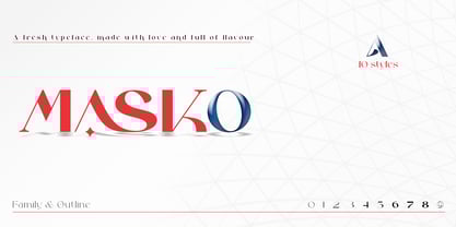 Masko is a very versatile font.perfect for magazine images, to wedding invitations, to branding, poster design, and more. Files included: Masko Family Masko Outline Numerals & Punctuation Stylistic Alternates & Ligatures PUA Encoded Characters Thanks so much for looking, I really hope you enjoy it and please don't hesitate to drop me a message if you have any issues or queries :)
 - Lisa Bella by Wiescher Design,
$39.50 Lisa is an elegant script family in the tradition of early Italian type designers like Bodoni. I added counter strokes and floral embellishments to the font. Lisa comes in three variations: the beautiful Lisa Bella, the flowery Lisa Fiore and the extra swinging Lisa Piu (which means more in Italian). Enjoy! Your elegant script designer Gert Wiescher
 - The City Burn by Alien,
$40.00 The City Burn, formerly called "The city burn night after night and we spray-paint the walls", was especially designed for Mad Skills Mag issue#3 Urban Flavour. It needed to be street, and urban, so I made a stencil font. It’s used by Fox5 tv for the rant TV show, the website infected.com, Fried chillies TV, and others!
 - Quitgan Script by FallenGraphic,
$16.00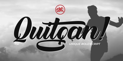 Introducing Quitgan, an amazing handwritten font . This font will make your design more beautiful and powerful. Quitgan is suitable for any design like branding, quotes and much more. I hope you enjoy it. Quitgan is multi-lingual, PUA encoded and contains Numerals and Punctuations (OpenType Standard) and many alternates. Thanks for visiting and downloading my font.
 - Mercato VF by Borutta Group,
$79.00 MERCATO is a headline family of typefaces inspired by hand-painted price tags. The idea for this family was born a few years ago in South America. I wanted to create a typeface that is written, expressive and organic on the one hand, and thrown into a geometric frame on the other. Co-designers: Karol Mularczyk & Małgorzata Bartosik.
 - Hello Alexandria by DLetters Studio,
$32.00 Hello Alexandria is a modern handwritten font, the name of this font taken from a city in Egypt (Alexandria). USE Hello Alexandria works great in branding, logos, Quotes, headlines, high fashion, Landing Page and Magazine. FEATURES Ligatures, Stylistic Alternates, Numbers & Punctuation / Extensive Language Support Thanks for checking out Hello Alexandria. I really hope you enjoy using it!
 - Angekia by Cocodesign,
$12.00 Angekia a groovy fonts, including Regular. This font is casual and beautiful . It can be used for various purposes. such as logos, product packaging, wedding invitations, branding, headlines, signage, labels, signatures, book covers, posters, quotes, and many more. If you need help or have questions, please let me know. I am happy to help :) Thank you & Congratulations on Designing


