8,396 search results
(0.014 seconds)
- Alright, let me paint a picture for you about Brock Script by Dieter Steffmann. Imagine a world where the elegance and panache of the past are captured in the curves and flourishes of a font. This is...
- Sterling Script by Canada Type,
$54.95 Sterling Script was initially meant to a be digitization/reinterpretation of a copperplate script widely used during what effectively became the last decade of metal type: Stephenson Blake's Youthline, from 1952. The years from 1945 to 1960 saw a heightened demand for copperplate faces, due to post-war market optimism, as well as the banking and insurance industries booming like never before, which triggered the need for design elements that express formal elegance and luxury. The name Sterling Script is a tip of our hat to England, the Stephenson Blake foundry's country of origin. It is also a historical hint about copperplate scripts having been used mainly for banking and bonds in the 19th century. Originally we just wanted to resurrect a gorgeous metal type from the ashes of forgotten history. But after the main font was done we saw that the original s really needed an alternate. We made one. But we felt sorry for the original s and didn't want to see it dropped from use altogether, so we saved it by building a set of ligatures that solve the minor connection problem with the s at large sizes. Before the completion of the ligatures, a few different alternates were also drawn, and we were faced by the fact that the single font we set out to do was now a much larger set than we anticipated. While thinking about how to split up our unexpected bundle of large characters, we drew a few more alternates and some swashes. This abundance "problem" reached a certain point where there was no looking back, so we just decided to go all the way with this font. We added many more alternates, swashes, ligatures, and two full sets of each beginning and ending lowercase letter. The result is over 750 characters of sheer elegance. Sterling Script has many features that set it above and beyond other copperplate scripts: - It has 2 beginning and 2 ending alternates for every single lowercase character. The beginning and ending variants on the vowels are also available in accented form in the appropriate cells of the character map. - Sterling Script is the ultimate elegant font choice for luxury design. Very elegant, but not too soft. Its strong and confident shapes convey a message that is real, comforting and assuring. - One of the eventual purposes of expanding Sterling Script this extensively was to create a script that finds the middle ground between formal and informal without compromising either trait, a script where the degree of formality can be gauged, tweaked, cranked up or toned down depending on the layout's needs. Aside from beginnings and endings, there are multiple variations for the majority of the basic characters. This is a formal script on steroids, where twirls and swashes can be set to come out unexpectedly from any place in the word, which is great for reducing the inherent rigidity of words set in copperplate scripts and "humanizing" them whenever needed. This is especially useful for wedding, postcard and invitation design, where not every viewer of the collateral material has something to do with banking or insurance. - With such an extensive character set, a designer can easily set a word or a sentence in 10 or more different ways, and choose the perfect one for the task at hand. This is particularly useful for work where details are of utmost importance, like logos, slogans, or elegant engravings that consist of one to three words. Let those swashes and twirls intertwine for maximum elegance. The Sterling Script complete package consists of 7 fonts: Sterling Script, Alternates, Beginnings, Endings, Swashes, Swash Alternates, and Ligatures. Sterling Script is available in five different purchase options and price ranges. But with such a massive offering of variation, the Sterling Script complete package is definitely the most value-laden set in its class. Once you use Sterling Script, you will never want to go back to other copperplates.
 - Thanks for creating this font. Is there a way to customize a job description? I am not seeing any job titles for the audio department and need to add that to a poster. I'm also thinking there may be ...
- Evita by ITC,
$29.99Gérard Mariscalchi is a self-made designer. Born in Southern France of a Spanish mother and an Italian father, he has worked as a mechanic, salesman, pilot, college teacher – even a poet (with poetry being the worst-paying of these professions, he reports.) “Throughout all this, the backbone of my career has always been design,” Mariscalchi says. “I’ve been drawing since I was five, but it wasn’t until I was twenty-four that I learned that my hobby could also help me earn a living.” It was about this same time that Mariscalchi fell in love with type. He studied the designs of masters like Excoffon, Usherwood and Frutiger, as well as the work of calligraphers and type designers such as Plantin, Cochin and Dürer. With such an eclectic background, it’s no surprise that Mariscalchi’s typeface designs are inspired by many sources. Baylac and Evita reflect the style of the art nouveau and art deco periods, while Marnie was created as an homage to the great Lithuanian calligrapher Villu Toots. However, the touch of French elegance and distinction Mariscalchi brings to his work is all his own. Baylac Who says thirteen is an unlucky number? Three capitals and ten lowercase letters from a poster by L. Baylac, a relatively obscure Art Nouveau designer, served as the foundation for this typeface. The finished design has lush curves that give the face drama without diminishing its versatility. On the practical side, Baylac’s condensed proportions make it perfect for those situations where there’s a lot to say and not much room in which to say it Evita Mariscalchi based the design of Evita on hand lettering he found in a restaurant menu, and considers this typeface one of his most difficult design challenges. “The main problem was to render the big weight difference between the thin and the thick strokes without creating printing problems at small point sizes,” he says. Unlike most scripts, Evita is upright, with the design characteristics of a serif typeface. Mariscalchi named the face for a close friend. The end result is a charming design that is light, airy, and slightly sassy. Marnie Based on Art Nouveau calligraphic lettering, Marnie is elegant, inviting, and absolutely charming. Mariscalchi paid special attention to letter shapes and proportions to guarantee high levels of character legibility. He also kept weight transition in character strokes to modest levels, enabling the face to be used at relatively small sizes – an unusual asset for a formal script. Marnie’s capital letters are expansive designs with flowing swash strokes that wrap affectionately around adjoining lowercase letters. The design easily captures the spontaneous qualities of hand-rendered brush lettering. - Baylac by ITC,
$29.99Gérard Mariscalchi is a self-made designer. Born in Southern France of a Spanish mother and an Italian father, he has worked as a mechanic, salesman, pilot, college teacher – even a poet (with poetry being the worst-paying of these professions, he reports.) “Throughout all this, the backbone of my career has always been design,” Mariscalchi says. “I’ve been drawing since I was five, but it wasn’t until I was twenty-four that I learned that my hobby could also help me earn a living.” It was about this same time that Mariscalchi fell in love with type. He studied the designs of masters like Excoffon, Usherwood and Frutiger, as well as the work of calligraphers and type designers such as Plantin, Cochin and Dürer. With such an eclectic background, it’s no surprise that Mariscalchi’s typeface designs are inspired by many sources. Baylac and Evita reflect the style of the art nouveau and art deco periods, while Marnie was created as an homage to the great Lithuanian calligrapher Villu Toots. However, the touch of French elegance and distinction Mariscalchi brings to his work is all his own. Baylac Who says thirteen is an unlucky number? Three capitals and ten lowercase letters from a poster by L. Baylac, a relatively obscure Art Nouveau designer, served as the foundation for this typeface. The finished design has lush curves that give the face drama without diminishing its versatility. On the practical side, Baylac’s condensed proportions make it perfect for those situations where there’s a lot to say and not much room in which to say it Evita Mariscalchi based the design of Evita on hand lettering he found in a restaurant menu, and considers this typeface one of his most difficult design challenges. “The main problem was to render the big weight difference between the thin and the thick strokes without creating printing problems at small point sizes,” he says. Unlike most scripts, Evita is upright, with the design characteristics of a serif typeface. Mariscalchi named the face for a close friend. The end result is a charming design that is light, airy, and slightly sassy. Marnie Based on Art Nouveau calligraphic lettering, Marnie is elegant, inviting, and absolutely charming. Mariscalchi paid special attention to letter shapes and proportions to guarantee high levels of character legibility. He also kept weight transition in character strokes to modest levels, enabling the face to be used at relatively small sizes – an unusual asset for a formal script. Marnie’s capital letters are expansive designs with flowing swash strokes that wrap affectionately around adjoining lowercase letters. The design easily captures the spontaneous qualities of hand-rendered brush lettering. - Irrlicht by Aarhaus,
$30.00 Irrlicht is based on C. H. Kleukens’ 1923 typeface Judith Type . Whilst Dunkle Irrlicht is a fairly faithful rendition and extension of Kleukens’ typeface, the Licht style was initially added as a stand-alone stencil version; yet, the two styles work perfectly together – for different nuances, for emphasis or simply stacked/layered. Irrlicht is equipped with upper- and lowercase ligatures, contextual and stylistic alternates, fractions, superior and inferior figures, extended language support and a few extra goodies. Additional information – How Irrlicht came to life Christian Heinrich Kleukens cut his Judith Type in 1923, at the peak of German expressionism, exclusively for publications with the Ernst-Ludwig-Press, such as a limited series of biblical prints – the first being the Book of Judith , hence the original’s name. I stumbled upon this typeface a couple of years ago in a nice little 1930 booklet of the Gutenberg-Gesellschaft and was struck by its forceful darkness on paper and its seemingly simple, crude letterforms. The lack of a long-ſ in the final version of Judith Type – quite unusual for a German typeface of that time – adds to this feel of crudeness and spontaneity*. Judith Type seemed to me like a semi-blackletter cousin of Rudolf Koch’s typeface Neuland (cast in the same year). Besides its apparent affinity with expressionism, it reflects a lot of that deeply spiritual craftsmanship of the era – much like Neuland. A few months later, when I was working on a stencil project and looking for a typeface that could be cut into thin wooden plates easily, I remembered those dark, sharp letters that seemed to be lacking any curves at all. After enlarging a few letters and tracing them by hand, the whole set was redrawn digitally, using only straight lines. As for spacing, the goal was to keep the letters tight but to avoid touching characters – without ironing out all the original’s tension and rhythm. Deliberate kerning, subtle contextual alternates and ligatures help to deal with critical glyph combinations. Two additional versions were developed: a stencil version with open counters and, in reference to a popular style of the 1920s and inspired by dry, cracked wood, an inline version. These two additional styles were later merged into one font – Lichte** Irrlicht was born. — AARHAUS * Consequently, the original typeface’s German eszett is simply a ligature of the “round s” and standard z . In some of his publications, Kleukens dispenses with using eszett altogether and sets double s instead. Irrlicht , however, does feature a more common eszett (ß); the original, among other more faithful letter forms, can be accessed via the stylistic sets feature ** licht – literally bright – being the German term for inline typefaces – not to be confused with leicht ( light )
 - Marnie by ITC,
$29.99Gérard Mariscalchi is a self-made designer. Born in Southern France of a Spanish mother and an Italian father, he has worked as a mechanic, salesman, pilot, college teacher – even a poet (with poetry being the worst-paying of these professions, he reports.) “Throughout all this, the backbone of my career has always been design,” Mariscalchi says. “I’ve been drawing since I was five, but it wasn’t until I was twenty-four that I learned that my hobby could also help me earn a living.” It was about this same time that Mariscalchi fell in love with type. He studied the designs of masters like Excoffon, Usherwood and Frutiger, as well as the work of calligraphers and type designers such as Plantin, Cochin and Dürer. With such an eclectic background, it’s no surprise that Mariscalchi’s typeface designs are inspired by many sources. Baylac and Evita reflect the style of the art nouveau and art deco periods, while Marnie was created as an homage to the great Lithuanian calligrapher Villu Toots. However, the touch of French elegance and distinction Mariscalchi brings to his work is all his own. Baylac Who says thirteen is an unlucky number? Three capitals and ten lowercase letters from a poster by L. Baylac, a relatively obscure Art Nouveau designer, served as the foundation for this typeface. The finished design has lush curves that give the face drama without diminishing its versatility. On the practical side, Baylac’s condensed proportions make it perfect for those situations where there’s a lot to say and not much room in which to say it Evita Mariscalchi based the design of Evita on hand lettering he found in a restaurant menu, and considers this typeface one of his most difficult design challenges. “The main problem was to render the big weight difference between the thin and the thick strokes without creating printing problems at small point sizes,” he says. Unlike most scripts, Evita is upright, with the design characteristics of a serif typeface. Mariscalchi named the face for a close friend. The end result is a charming design that is light, airy, and slightly sassy. Marnie Based on Art Nouveau calligraphic lettering, Marnie is elegant, inviting, and absolutely charming. Mariscalchi paid special attention to letter shapes and proportions to guarantee high levels of character legibility. He also kept weight transition in character strokes to modest levels, enabling the face to be used at relatively small sizes – an unusual asset for a formal script. Marnie’s capital letters are expansive designs with flowing swash strokes that wrap affectionately around adjoining lowercase letters. The design easily captures the spontaneous qualities of hand-rendered brush lettering. - Gundrada ML by HiH,
$12.00 Gundrada ML was inspired by the lettering on the tomb of Gundrada de Warenne. She was buried at Southover Church at Lewes, Sussex, in the south of England in 1085. The Latin inscription on her tomb, STIRPS GUNDRADA DUCUM, meaning “Gundrada, descendant of the Duke” may have led to the speculation that she was the daughter of William, Duke of Normandy and bastard son of Robert the Devil of Normandy and Arletta, daughter of a tanner in Falaise. In 1066 William defeated Harold at the Battle of Hastings and was crowned William I of England. More commonly known as William the Conquerer, he commissioned a string of forts around the kingdom and charged trusted Norman Barons to control the contentious Anglo-Saxon population. William de Warenne, husband of Gundrada, was one of these Barons. There has also been the suggestion that Gundrada may have been the daughter of William’s wife, Matilda of Flanders, by a previous marriage. According to the Dictionary of National Biography (Oxford University Press, Oxford, England 1921-22), both of these contentions are in dispute. Searching the past of a thousand years ago is like wandering in a heavy fog: facts are only dimly in view. Regardless, I know that I found these letterforms immediately engaging in their simplicity. Unadorned and unsophisticated, they have a direct honesty that rests well in the company of humanistic sans serifs like Franklin Gothic or Gill Sans, appealing to a contemporary sensibility. The lettering on the tomb is in upper case only. Although Gundrada does not sound Norman French to me, her husband certainly and her father probably were Norman French. Nonetheless, the man that carved her tombstone was probably Anglo-Saxon, like most of the people. For that reason, we are quite comfortable with a fairly generic lower case from an Anglo-Saxon document of the time. The time was a time of transition, of contending language influences. This font reflects some of that tension. Features 1. Multi-Lingual Font with 389 glyphs and 698 Kerning Pairs. 2. OpenType GSUB layout features: onum, dlig, liga, salt & hist. 3. Tabular Figures and Alternate Old-Style Figures. 4. Alternate Ruled Caps (line above and below, matching to brackets). 5. Central Europe, Western Europe, Turkish and Baltic Code Pages. 6. Additional accents for Cornish and Old Gaelic. 7. Stylistic alternates A, E, y and #. 8. Ligatures ST, Th, fi and fl. 9. Historic alternate longs. The zip package includes two versions of the font at no extra charge. There is an OTF version which is in Open PS (Post Script Type 1) format and a TTF version which is in Open TT (True Type)format. Use whichever works best for your applications.
 - Hawkes by Kimmy Design,
$15.00 Hawkes is an extensive handmade typeface family that comes with a bundle of weights, widths and styles, all designed to work cohesively. Here is a breakdown of the Hawkes family. Hawkes Sans: The primary subfamily is a sans-serif typeface that includes nine fonts: three weights (light, medium and bold) and three widths (narrow, regular and wide). Within this set are an array of stylistic features; including small capitals, character style alternatives, discretionary ligatures and contextual alternatives. See details below for more information on OpenType Features. Hawkes Variable Width Sans: The secondary subfamily is the same base sans-serif fonts but combined in variating widths. Essentially, it takes all three widths of each weight and randomly mixes them together. This creates a funky and creative alternative to the more traditional sans-serif set. The variations are for the uppercase, lowercase, small capitals, ligatures and numbers. Hawkes Script: The last subfamily is the script typeface. It’s a quirky script with variations of its own, including ligatures, swashes and contextual alternatives (again, see below for further details.) The script font works great as a complimentary style to the sans-serif, or on it’s own. FEATURES Alright, let’s get into all the extra goodies this typeface has to offer. Small Capitals: Small caps are short capital letters designed to blend with lowercase text. These aren’t just capital letters just scaled down but designed to fit with the weight of both the lowercase and capitals. With Hawkes, small caps can either sit on the baseline (in line with the base of the capital and lowercase) or to be lifted to match the height of the capital letters by applying the discretionary ligature setting in the OpenType panel. These small capitals have a dot underlining them that sit along the baseline. The feature offers a unique display affect that is great for logos, titles and other headline needs. Discretionary Ligatures: A discretionary ligature is more decorative and unique combination than a standard ligature and can be applied at the users discretion (as the name indicates.) The specific styling for these ligatures varies for different fonts. With Hawkes, they are used as an all capital styling feature, or to lift the small capitals to align with the height of the capitals. In the former setting, both lowercase and uppercase letters are first changed to all capitals, then a specialized set of letter combinations are transitioned so small characters are positioned within a main capital letter. These combinations only happen with main characters that include an applicable stem, such as C F K L R T Y. Some of these combinations include two or three characters. When Small Caps is turned ‘on’, this feature will lift the small caps to the height of the capital letter. For more information, please check out the user guide! Stylistic Alternatives: Stylistic alternates are a secondary form of a character, often used to enhance the look or style of a font. For Hawkes, these alternatives provide a slightly more handmade feel. A - the capital and small capital A will lose its pointed apex and become rounded. Think of it more as an upside-down U than an up-side-down V ;-) Oo, G, Ss, Cc- these characters’ topmost terminal becomes a loop. The O is applied automatically, the G S and C need to be turn on individually. Titling Alternatives: This feature does sort of the opposite of what it intends. Instead of being used for titling purposes, this feature makes the text look better in paragraph text settings. Kk Rr h n m - curved terminals on the are straightened e - the counter stroke also gets straightened from a more looping motion y - the shape of y is changed from a rounded character to a sharper apex (think more like a ‘v’ than ‘u’) Contextual Alternatives: Contextual alternates are glyphs designed to work within context of other adjacent glyphs. With Hawkes Sans, there are three slightly different variations per character. The feature rotates the application of each variation. This helps with organic authenticity, so if you have two e’s next to each other, they won’t look identical (reflecting the natural variations in handwriting and lettering.) With Hawkes Variable width fonts, I have created a contextual pattern that randomizes the widths of each character. So, when the feature is turned ‘on’ in the OpenType panel, the widths would alternate in a pattern such as: Narrow, Wide, Regular, Narrow, Regular Wide, Narrow, etc. It happens automatically so the user doesn’t have to think or worry about getting a random seed. With Hawkes Script, contextual alternates allow strokes to connect properly from one character to the next while maintaining a believable, natural flow. Connecting strokes are present for two letters next to each other but are replaced by a shorter stroke when located at the end of a word or sentence. Some characters have in-strokes when located at the start of a word. When a character is preceded by a capital letter that doesn’t connect, it too needs an in-stroke or altered spacing. This feature is complicated and messy, but luckily you don’t really have to think about it! I’ve done all the coding so all you have to do is turn ‘on’ the feature in the OpenType panel and you are off to the races! I’m just letting you know what’s happening behind the scenes. Swashes: These are just for Hawkes Script and provide tail swashes to the start and ends of letters. There are three different options. You can pick the basic option by turning ‘on’ the swash feature in the OpenType panel, or you can pick using the Glyph panel. Stylistic Sets: This feature work in new versions of Illustrator CC and InDesign CC. You can pick specific styling sets instead of turning on an entire feature. For example, let’s say you want to have a loopy S, but not a loopy C or O, you can just turn on the S in the Style Set. It also helps create the little drop box that pops up when you hover over a character, showing you the alternates associated with that character. This makes it easy to pick and choose specific styles you want in a word or headline. ---------- And there it is folks! That’s all the basic info on Hawkes, I know it’s been a lot and I appreciate you hanging on. If you are like me and need more of a visual reference to accessing all these goodies, I’ve made a user guide to help navigate Hawkes and everything it has to offer. Altogether this extensive family boasts 14 total fonts in a wide array of styles, weights and widths, making it a great addition to any handmade type collection. Enjoy!
 - Ah, Urban Brigade, the font that struts down the street of typography like it owns the place. Imagine, if you will, a graffiti artist and a highly disciplined calligrapher had a love child; Urban Bri...
- Alright, let's dive into the font HoMicIDE EFfeCt. Just from the name, you can tell this isn't your average, everyday font. It suggests a vibe that's edgy, perhaps a bit dark, yet undeniably eye-catc...
- Ah, Bou College, the font that decided it was time to put its varsity jacket on and strut through the halls of typographical academia with a sporty swagger. Picture this: the letters, muscular and fi...
- Imagine a world where letters decide to throw a grand costume ball, dressing up in their medieval finest, complete with flourishes, curls, and an air of aristocratic elegance. The font GloucesterInit...
- Telephoto by Typodermic,
$11.95 In the world of graphic design, the right typeface can make or break a project. It’s not just about choosing a font that’s legible, but one that speaks to the essence of your brand or message. If you’re looking for a typeface that embodies classic charm and warmth, then look no further than Telephoto. Telephoto is a sans-serif typeface that harkens back to the twentieth century when analog was king. Its gentle, analog feel sets it apart from other typefaces on the market. When you use Telephoto, you’ll notice that it has a smooth personality that immediately injects classic ambience into your projects. But what really sets Telephoto apart are the subtle letter pair ligatures. These ligatures are a true testament to the attention to detail that went into creating this typeface. They break up the monotony of plainly repeating letters, creating a soft and organic feel that’s hard to find in today’s digital world. OpenType-savvy programs are where Telephoto truly shines, so make sure to turn off your application’s “standard ligatures” function to fully appreciate this effect. Telephoto is perfect for photographers, designers, and anyone who wants to bring a soft, analog feel to their work. Its delicate rendering is truly one-of-a-kind and adds a level of sophistication to any project. So why settle for a run-of-the-mill typeface when you can use Telephoto to make your work stand out? Give it a try and see the difference it can make. Most Latin-based European writing systems are supported, including the following languages. Afaan Oromo, Afar, Afrikaans, Albanian, Alsatian, Aromanian, Aymara, Bashkir (Latin), Basque, Belarusian (Latin), Bemba, Bikol, Bosnian, Breton, Cape Verdean, Creole, Catalan, Cebuano, Chamorro, Chavacano, Chichewa, Crimean Tatar (Latin), Croatian, Czech, Danish, Dawan, Dholuo, Dutch, English, Estonian, Faroese, Fijian, Filipino, Finnish, French, Frisian, Friulian, Gagauz (Latin), Galician, Ganda, Genoese, German, Greenlandic, Guadeloupean Creole, Haitian Creole, Hawaiian, Hiligaynon, Hungarian, Icelandic, Ilocano, Indonesian, Irish, Italian, Jamaican, Kaqchikel, Karakalpak (Latin), Kashubian, Kikongo, Kinyarwanda, Kirundi, Kurdish (Latin), Latvian, Lithuanian, Lombard, Low Saxon, Luxembourgish, Maasai, Makhuwa, Malay, Maltese, Māori, Moldovan, Montenegrin, Ndebele, Neapolitan, Norwegian, Novial, Occitan, Ossetian (Latin), Papiamento, Piedmontese, Polish, Portuguese, Quechua, Rarotongan, Romanian, Romansh, Sami, Sango, Saramaccan, Sardinian, Scottish Gaelic, Serbian (Latin), Shona, Sicilian, Silesian, Slovak, Slovenian, Somali, Sorbian, Sotho, Spanish, Swahili, Swazi, Swedish, Tagalog, Tahitian, Tetum, Tongan, Tshiluba, Tsonga, Tswana, Tumbuka, Turkish, Turkmen (Latin), Tuvaluan, Uzbek (Latin), Venetian, Vepsian, Võro, Walloon, Waray-Waray, Wayuu, Welsh, Wolof, Xhosa, Yapese, Zapotec Zulu and Zuni.
 - Vrindals Script by Pointlab,
$15.00 Vrindals Script is inspired by a retro style and combination with hand lettering style. It is made with personality in every single curve. I hope this will inspire you and your work. It can be perfectly paired with a marker font, and contains a super handy set of bonus swashes. It is ideal for logos, handwritten quotes, product packaging, header, poster, merchandise, social media & greeting cards. PUA Encoding and multi-language support included. To enable the OpenType stylistic alternates, you need a program that supports OpenType features such as Adobe Illustrator CS, Adobe Indesign & CorelDraw X6-X7. There are additional ways to access alternates, using Character Map (Windows), Nexus Font (Windows), Font Book (Mac) or a software program such as PopChar (for Windows and Mac). If you have any question, don't hesitate to contact me by email pointline23@gmail.com :)
 - Boxy Code by Just My Type,
$15.00In the late 60’s, one of the best art publications in the country was Motive magazine, published (amazingly) by the United Methodist Church. Filled to the brim with poetry, essays, line drawing and woodcuts, it also featured some cutting-edge typography. Boxy/Code is based upon my memories of woodcut typography from that great magazine. Since Boxy/Code ’s lowercase consists of the uppercase’s negative spaces, it’s easy to combine the two with Layer Styles in Photoshop in order to achieve the effect I used in one poster above. It also works great if you use a well-known text as a background. This new version is totally redrawn and features all the Latin-accented letters. Uppercase consists of black capitals in boxes; lowercase features the negative spaces of those boxed capitals. Uppercase and lowercase line up exactly for 2-color effects. - Medina by Hatftype,
$15.00 Medina - Cute Valentine Display Font is a font with distinctive handwritten characters perfect for branding projects, logos, wedding designs, media posts, advertisements, product packaging, product designs, labels, photography, watermarks, invitations, stationery, and any project who need handwritten dishes. Features : • Character Set A-Z • Numerals & Punctuations (OpenType Standard) • Accents (Multilingual characters) • Ligature. Multilingual Support : Afrikaans, Albanian, Asu, Basque, Bemba, Bena, Catalan, Chiga, Cornish, Danish, English, Estonian, Faroese, Filipino, Finnish, French, Friulian, Galician, German, Gusii, Icelandic, Indonesian, Irish, Italian, Kabuverdianu, Kalenjin, Kinyarwanda, Low German, Luo, Luxembourgish, Luyia, Machame, Makhuwa-Meetto, Makonde, Malagasy, Malay, Manx, Morisyen, North Ndebele, Norwegian Bokmål, Norwegian Nynorsk, Nyankole, Oromo, Portuguese, Romansh, Rombo, Rundi, Rwa, Samburu, Sango, Sangu, Scottish Gaelic, Sena, Shambala, Shona, Soga, Somali, Spanish, Swahili, Swedish, Swiss German, Taita, Teso, Vunjo, Zulu. There it is. I really hope you enjoy it. Comments & likes are always welcome and accepted.
 - Liliane Classe by Brenners Template,
$25.00 This is a challenge for elegant but radical typography layouts. Standard styles include classic and sophisticated serifs, while italic styles are designed with more adventurous handwritten touches. This serif font family included a total of 14 styles, including 7 weights and separately created italics. It can be the best choice for a unique and meaningful logo and branding design, and it will maintain a refined sense of unity. You need to understand OpenType Features to use these fonts well. Please check first whether the your apps plan to use supports these OpenType Features. Thanks. OpenType Features Discretionary Ligatures : ac, ad, ai, ak, ar, ay, az, ce, ci, ck, co, de, do, dr, er, ft, he, ho, ng, ro, se, sp, te, to, tr Standard Ligatures : fi, fl Alternates : a, d, h, i, k, n, u, z Oldstyle Figures Tabular Figures Fractions
 - Getho Semi Sans by deFharo,
$12.00 Getho is a Semi Sans family of geometric construction with 6 weights plus the italic versions all include small letters, the symbol of Bitcoin and other monetary symbols. It is an exclusive typography with neo-grotesque modulations and maximum readability in any size. The typeface has alternative letters and numbers, small caps and advanced OpenType functions. The complete Pack includes versions of the Variable Fonts type. The drawn of the vectors is meticulous to obtain smooth curves of elegant aspect to which also contributes the subtle rounding of the corners, the thicker versions have of traps of ink in the knots of the unions to be able to use them in small sizes. The Metric and the Kerning of all the versions I have reviewed individually to obtain a fluent reading in any type of text and size.
 - Randelany by Kartiny Type,
$12.00 Randelany Script is one of the Elegant script fonts that comes with a very beautiful character change, a kind of classic copper decorative script with a modern touch, designed with high detail to present an elegant style. Randelany Script is interesting because the typeface is pleasing to the eye, clean, feminine, sensual, glamorous, simple and very easy to read, because of the many luxurious letter connections. I also offer a number of decent stylistic alternatives for some of the letters. The classic style is very suitable to be applied in various formal forms such as invitations, labels, restaurant menus, logos, fashion, make up, stationery, novels, magazines, books, greeting / wedding cards, packaging, labels or all kinds of advertising purposes. . . If you need help or have any questions, let me know. I'm happy to help. Thanks & Happy Designing.
 - Pinafore by Up Up Creative,
$10.00 Introducing Pinafore Complete, a broad, brush-style display font in four styles. Pinafore comes with upright and oblique styles as well as paper cut versions of each. It includes 363 glyphs such as small caps (see note below for more on this), multilingual support (including multiple currency symbols), an awesome ampersand, math symbols, and more. A note about small caps: There are TWO ways to access the small caps in this font family. For OpenType-savvy programs such as Adobe Illustrator and Adobe InDesign, these can be accessed from within the main font files using the character panel or the glyphs panel. For programs that do not access these OpenType features, I have also included small-caps-specific font files. In these files, the regular caps are accessed by typing capital letters and the small caps are accessed by typing lowercase letters.
 - Zt Sigata by Khaiuns,
$15.00 Zt. Sigata is an experiment where combining the two font styles into one, namely sans serif and serif, maybe this sounds very strange, don't worry this has been designed with very deep consideration with the serif style superti water droplets in the foliage that present coolness in every word and simple style sans serif with softness on each side, So when combined the two will be an extraordinarily beautiful design invention. Zt. Sigata comes with 6 styles (Regular/ italic, Kozi / italic, Rame / italic) that from each style have their own uniqueness, so it further expands your design experiment, and is great for poster design, packaging, logos, films and thanks to the uniqueness of each style may look good either in magazines or kompanye branding effectively. I hope you have a blast using zt.Sigata Thanks for use this font ~ Khaiuns X zelowtype
 - Astire Klarish by Dora Typefoundry,
$20.00 Introducing, Astire Klarish is a new retro serif with all clean and soft lines, tight curves, a combination of regular and italic versions adding to the appeal and trendy elegant look! This serif typeface that looks amazing in both large and small settings is perfect for your design needs yet still clean and elegant to apply to a variety of other formal forms such as invitations, labels, logos, magazines, books, greeting/wedding cards, packaging. , fashion, make up, stationery, novel, label or any kind of advertising purposes. WHAT YOU GET : Astire Klarish Regular (Open type) Astire Klarish Italic (Open type) Astire Klarish Bold (Open type) Astire Klarish Bold Italic (Open type) This type of family has become the work of true love, making it as easy and fun as possible. I really hope you enjoy it! Thank you.
 - Ongunkan Irk Bitig Viking by Runic World Tamgacı,
$99.00 This is the Viking font that I developed based on the letters in the Irk Bitig book, which is written with the brush line of the old Turkish runic alphabet, the information below. It was interesting work. Irk Bitig or Irq Bitig (Old Turkic: 𐰃𐰺𐰴 𐰋𐰃𐱅𐰃𐰏), known as the Book of Omens or Book of Divination in English, is a 9th-century manuscript book on divination that was discovered in the "Library Cave" of the Mogao Caves in Dunhuang, China, by Aurel Stein in 1907, and is now in the collection of the British Library in London, England. The book is written in Old Turkic using the Old Turkic script (also known as "Orkhon" or "Turkic runes"); it is the only known complete manuscript text written in the Old Turkic script. It is also an important source for early Turkic mythology.
 - Particela by Putracetol,
$20.00 Particela - Display Font. Particela is a display style font. The classic, fun and groovy impression is very visible. But in Particela I combine several variations such as the ligature. Particela is inspired by vintage albums and posters from 1960s music bands. It makes this font even more unique and different. Particela is also great for any kind of display purpose from album, cover,poster, label, tshirt, apparel, signage, quote, logo, greeting card,logotype and many more. Particela is also support multi language. The alternative characters were divided into several Open Type features such as Swash, Stylistic Sets, Stylistic Alternates, Contextual Alternates, and Ligature. The Open Type features can be accessed by using Open Type savvy programs such as Adobe Illustrator, Adobe InDesign, Adobe Photoshop Corel Draw X version, And Microsoft Word. This font is also support multi language.
 - Angels Love by Hatftype,
$15.00 Angels Love - Cute Playful Font is a font with distinctive handwritten characters perfect for branding projects, logos, wedding designs, media posts, advertisements, product packaging, product designs, labels, photography, watermarks, invitations, stationery, and any project who need handwritten dishes. Features : • Character Set A-Z • Numerals & Punctuations (OpenType Standard) • Accents (Multilingual characters) • Ligature. Multilingual Support : Afrikaans, Albanian, Asu, Basque, Bemba, Bena, Catalan, Chiga, Cornish, Danish, English, Estonian, Faroese, Filipino, Finnish, French, Friulian, Galician, German, Gusii, Icelandic, Indonesian, Irish, Italian, Kabuverdianu, Kalenjin, Kinyarwanda, Low German, Luo, Luxembourgish, Luyia, Machame, Makhuwa-Meetto, Makonde, Malagasy, Malay, Manx, Morisyen, North Ndebele, Norwegian Bokmål, Norwegian Nynorsk, Nyankole, Oromo, Portuguese, Romansh, Rombo, Rundi, Rwa, Samburu, Sango, Sangu, Scottish Gaelic, Sena, Shambala, Shona, Soga, Somali, Spanish, Swahili, Swedish, Swiss German, Taita, Teso, Vunjo, Zulu. There it is. I really hope you enjoy it. Comments & likes are always welcome and accepted.
 - Porkshop by Chank,
$99.00 Porkshop is a font of retro vintage flavor with a hefty dose of immigrant-influenced naive typography. It's fundamentally inspired by an old-but-still-prominent "Pork Shop" sign in Manhattan. I like to think that this font was made by a signmaker's apprentice who didn't yet have a grasp on the subtleties of elegant letterforms, but put his gusto into perfectly sharp serifs. While pointy little serifs are cool, the real shine of this font comes from the imaginative combination of uppercase and lowercase shapes. This unique mixture in the lowercase reminds me of an indeterminate European accent in the big city. Big and strong and easy to understand. Best rendered in 3-foot tall metal type, Porkshop works well in print and on screens, too. The Bolds and Italics are brand new in 2011.
 - Carrolin Script by Zane Studio,
$12.00 Carrolin Script is a new modern script font with an irregular base line, making it look trendy and feminine. Carrollina script looks beautiful in wedding invitations, thank you cards, quotes, greeting cards, logos, business cards, and more. Including beginning and end letters, alternatives and support for many languages. To enable the OpenType Stylistic alternative, you need a program that supports OpenType features such as Adobe Illustrator CS, Adobe Indesign & CorelDraw X6-X7, Microsoft Word 2010 or newer versions. There are additional ways to access alternatives / swashes, using Character Maps (Windows), Nexus Fonts (Windows), Font Books (Mac) or software programs such as PopChar (for Windows and Mac). How to access all alternative characters: https: //www.youtube.com/watch? v = Go9vacoYmBwhttps: //www.youtube.com/watch? v = XzwjMkbB-wQhttps: //www.yo If you need help or have questions, let me know. I am happy to help. Thank you.
 - Antoine Drop Caps by Kaer,
$19.00 These initials set I collected from “Tristan of the Round Table”, published approximately in 1513, by Antoine Verard. Antoine drop caps font family has Regular, Light and Colored styles. It's all you need to precisely imitate medieval style text. Use this font as a decorative element at the beginning of a paragraph or section, other part of the paragraph should be in regular black letter font. You’ll get Drop Caps & Numbers set. --- *You can use color fonts in PS CC 2017+, AI CC 2018+, ID CC 2019+, macOS 10.14 Mojave+ * *Please note that the Canva & Corel & Affinity doesn't support color fonts!* *Please download this test file with only A letter ( https://www.dropbox.com/s/lpzmdikw0ewxozx/AntoineDropCaps-Test.otf?dl=0 ) to check your app & system.* --- Please feel free to request any help you need: kaer.pro@gmail.com Best, Roman.
 - Junius by Eurotypo,
$34.00 Are you looking for a new casual and organic script font? Please take a look at Junius! The Junius font is the perfect combination of sleek and casual that is best used in OpenType compatible software. This font contain 797 glyphs, equipped with plenty of OpenType features. Upper case letters can alternate between at least two different forms. Lowercase letters have at least six more options to avoid repetition. These effects include initial and final forms of lowercase letters. In addition, there is a set of 65 ornaments designed to support the font (accessing the ornaments through the Glyph palette). Some of these ornaments were specially designed to be combined with the letters for a "more calligraphic" effect. Junius font can be the option used to create titles, logos and posters for brand and packaging purposes. I hope you enjoy it.
 - The Ballpoint by Aminmario Studio,
$50.00 The Ballpoint font was created to look as close to a natural handwritten script as possible by including lowercase alternates, lowercase swash, ligature and underlines. Mix and match lowercase regular with several lowercase alternatives to get your new ligature. Perfect for any awesome projects that need hand writing taste. With built in Opentype features, this script comes to life as if you were writing it yourself. It's highly recommended to use it in opentype capable software - there are plenty out there nowadays as technology catches up with design ... Other than Photoshop, Illustrator and Indesign, many standard simple programs now come with Opentype capabilities - even the most basic ones such as Apple's Text Edit, Pages, Keynote, iBooks Author, etc. Even Word has found ways to incorporate it. Thanks for checking out this font. I hope you enjoy it! AminMario
 - Hearthstone by Arendxstudio,
$5.00 Hearthstone - Signature Font is a classy signature script with a natural & stylish flow. This collection of scripts is perfect for personal branding. this works well for many applications. Everything from personal branding & wedding invitations to advertising could benefit from this collection of signature fonts Features : • Character Set A-Z • Numerals & Punctuations (OpenType Standard) • Accents (Multilingual characters) • Ligature • Alternate • Swash Multilingual Support : Afrikaans, Albanian, Asu, Basque, Bemba, Bena, Catalan, Chiga, Cornish, Danish, English, Estonian, Faroese, Filipino, Finnish, French, Friulian, Galician, German, Gusii, Icelandic, Indonesian, Irish, Italian, Kabuverdianu, Kalenjin, Kinyarwanda, Low German, Luo, Luxembourgish, Luyia, Machame, Makhuwa-Meetto, Makonde, Malagasy, Malay, Manx, Morisyen, North Ndebele, Norwegian Bokmål, Norwegian Nynorsk, Nyankole, Oromo, Portuguese, Romansh, Rombo, Rundi, Rwa, Samburu, Sango, Sangu, Scottish Gaelic, Sena, Shambala, Shona, Soga, Somali, Spanish, Swahili, Swedish, Swiss German, Taita, Teso, Vunjo, Zulu There it is! I really hope you enjoy it !
 - Xunga by Huy!Fonts,
$17.00 Xunga is a cheerful display typeface. My goal was to design a font able to fit any layout with boldness and playfulness, mixing a sign painter taste in the uppercase and some of my crappy calligraphic reverse contrast explorations with the flat brush for the lowercase. I designed several of widths to fit the page, and though about a different way of expanding the family shifting the horizontal stress axis to move the letter weight in different heights, making a 15 fonts family, suitable for making bold layouts. Xunga has an extended character set for European languages as well as Vietnamese, and shows all its potential with OpenType-savvy applications. Every font includes ligatures, catchwords in discretional ligatures, contextual alternates to avoid conflictive glyph pairs and localized forms to avoid problems with several glyphs and languages.
 - Smoothy Casual by Hatftype,
$15.00 Smoothy Casual - Playful Display Font is a font with distinctive handwritten characters perfect for branding projects, logos, wedding designs, media posts, advertisements, product packaging, product designs, labels, photography, watermarks, invitations, stationery, and any project who need handwritten dishes. Features : • Character Set A-Z • Numerals & Punctuations (OpenType Standard) • Accents (Multilingual characters) • Ligature. Multilingual Support : Afrikaans, Albanian, Asu, Basque, Bemba, Bena, Catalan, Chiga, Cornish, Danish, English, Estonian, Faroese, Filipino, Finnish, French, Friulian, Galician, German, Gusii, Icelandic, Indonesian, Irish, Italian, Kabuverdianu, Kalenjin, Kinyarwanda, Low German, Luo, Luxembourgish, Luyia, Machame, Makhuwa-Meetto, Makonde, Malagasy, Malay, Manx, Morisyen, North Ndebele, Norwegian Bokmål, Norwegian Nynorsk, Nyankole, Oromo, Portuguese, Romansh, Rombo, Rundi, Rwa, Samburu, Sango, Sangu, Scottish Gaelic, Sena, Shambala, Shona, Soga, Somali, Spanish, Swahili, Swedish, Swiss German, Taita, Teso, Vunjo, Zulu. There it is. I really hope you enjoy it. Comments & likes are always welcome and accepted.
 - Gathes by thirtype,
$25.00 Gathes is vintage pop script with layered style, Since a few years I try to exploration of script with layered system. and this my third script layered from my collection font. Gathes is basic from 5 styles layered type. Base layer is regular, add an shine, extrude, extrude detail, and shadow to create a dimensional look. Several styles can be mix and matched together or can be used alone and/or in layered. The Script font have a opentype feature such a stylistic set, ligature, swash ornament. For additional we add a serif version in this family, so that it can be combined with script fonts. Gathes works great in any graphics app that allow to create a layered type and good to create the logo, badge, poster, heading, magazine, advertising design purpose and more. Features: - Opentype features - Ligatures - Alternates - PUA Encoded - Multilanguange
 - Quick Funny by Hatftype,
$15.00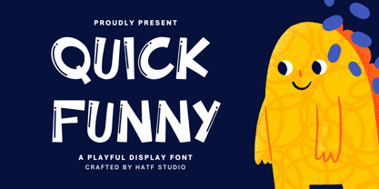 Quick Funny - Playful Display Font is a font with distinctive handwritten characters perfect for branding projects, logos, wedding designs, media posts, advertisements, product packaging, product designs, labels, photography, watermarks, invitations, stationery, and any project who need handwritten dishes. Features : • Character Set A-Z • Numerals & Punctuations (OpenType Standard) • Accents (Multilingual characters) • Ligature. Multilingual Support : Afrikaans, Albanian, Asu, Basque, Bemba, Bena, Catalan, Chiga, Cornish, Danish, English, Estonian, Faroese, Filipino, Finnish, French, Friulian, Galician, German, Gusii, Icelandic, Indonesian, Irish, Italian, Kabuverdianu, Kalenjin, Kinyarwanda, Low German, Luo, Luxembourgish, Luyia, Machame, Makhuwa-Meetto, Makonde, Malagasy, Malay, Manx, Morisyen, North Ndebele, Norwegian Bokmål, Norwegian Nynorsk, Nyankole, Oromo, Portuguese, Romansh, Rombo, Rundi, Rwa, Samburu, Sango, Sangu, Scottish Gaelic, Sena, Shambala, Shona, Soga, Somali, Spanish, Swahili, Swedish, Swiss German, Taita, Teso, Vunjo, Zulu. There it is. I really hope you enjoy it. Comments & likes are always welcome and accepted.
 - Eirene Sans by Tomtype,
$4.90 Eirene Sans is a sans serif type family inspired by grotesque typefaces with some humanistic characteristics. Simple, modern, and functional are the principal features of this type family; the uppercase glyphs present a sophisticated personality. There are 5 weights available and matching italics. It is a bit more condensed than normal width and the difference between thin and thick stems and the unique terminals make the type family have this humanistic personality. It has rounded forms in some letterforms and special characters (i, j, ., :, etc.), humanistic terminals, and very thin ink traps. Eirene Sans is perfect for digital and non-digital designs; it can be used in magazine titles, logo designs, packaging designs, and web designs. Features: 5 weights and matching italics Opentype features Arrow set Stylistic alternates (ft) Stylistic changes in italics Fractions Subscripts Inferior and superior numbers Language support (Latin extended)
 - Gatha by Khaiuns,
$15.00 Gatha is a fun font duo that includes signature scripts and elegant, soft sans that grab 4 styles – it's fit and ready to go together for your next design! Gatha includes a complete set of beautiful upper and lowercase letters, numbers, a wide variety of punctuation marks, ligatures, and super pretty prefixes as well as a final sweep thus providing a realistic handwriting style. These typefaces are versatile and can be used successfully in Magazines, Posters, Branding, Websites, etc. Fonts include multilingual support. Please message me if you're unsure of any language support. Ligatures • Are also available for several lowercase characters (double-letters which flow more naturally). These are only accessible via software with opentype capability or a glyphs panel, e.g. Photoshop/Illustrator. I hope you have a blast using Gatha. Thanks for use this font ~ Khaiuns X zelowtype
 - White Stork by Almazova Dolzhenko,
$12.00 White Stork is a handwritten font family which contains two versions Serif and Sans. So you can combine them to get a more interesting design. The font has simple shapes so it will be versatile to use. It will look great for logotypes, quotes, greeting cards, prints, branding design and much more. Hand-drawn font White Stork contains 2 sets of uppercase (serif and sans), 2 sets of lowercase (serif and sans), alternate set of lowercase letters for serif font, ligatures for double f and t letters. Multilingual support is included. Features: Uppercase & Lowercase Serif Uppercase & Lowercase Sans Alternate set of Lowercase Serif Numerals & Punctuation Ligatures (watch preview) Multilingual support Serif and Sans I hope this font will help you to create you unique design. If you have any question, feel free to contact me! Thanks! Lena (instagram @almaz_dolzhe)
 - The Lucky by Masinong Studio,
$12.00 The Lucky combines a retro and hand-lettering style. I'm made it with a personal touch in every single curve. I hope this can inspiration to your work. It pairs perfectly with other fonts and contains a handy set of bonus swashes. It is ideal for logos, handwritten quotes, product packaging, headers, posters, merchandise, social media and greeting cards. Features: Basic Latin A-Z and a-z Numbers Symbols Stylistic Set Ligature PUA Encode Multilanguage Support To enable the OpenType Stylistic alternates, you need a program that supports OpenType features such as Adobe Illustrator CS, Adobe Indesign & CorelDraw X6-X7. There are additional ways to access alternates, using Character Map (Windows), Nexus Font (Windows), Font Book (Mac) or a software program such as PopChar (for Windows and Mac). If you have any question, don't hesitate to contact me by email masinong.studio@gmail.com :)