10,000 search results
(0.021 seconds)
- Hungry Chalk by Storictype,
$9.00 HungryChalk Still with a chalk concepts, This is good for projects like a menuboards it's specially designed cafe or restaurant ,background photoboots wedding, t-shirt, posters,etc and a touch of vector pack theme dessert, that allows you to mix and match pairs of ornaments to fit your design . Above the description of this font, I hope you're satisfied with what I have created. Thank You
 - Lubaline by Lián Types,
$39.00 Who haven't heard the phrase that ‘any past time was better’?. Although I sometimes find this phrase a little too pessimistic (because I try to think that the best is yet to come), it may be true regarding my passion, typography. I'm too young (29) unfortunately, and this means I did not have the pleasure of being contemporary with maybe the man who has influenced my work the most (1). The man that showed that letters are more than just letters to be read. Herb Lubalin (1918-1981), also called sometimes as ‘the rule basher’ (2), smashed the taboos and sacred rules of type design and gave it personality. He rejected the functionalist philosophy of europeans in favor of an eclectic and exuberant style. To him, letters were not merely vessels of form, they were objects of meaning. (3). Nowadays, when looking at his portfolio, who dares to deny that the term ‘typography’ and ‘beauty’ may go hand-in-hand without any problem? Ed Benguiat, one of Herb’s partners, still likes making jokes with the phrase “screw legibility, type should be beautiful” and what I understand of this is not to forget the rules, but to know and break them carefully. In an era of pure eclecticism, we, the lovers of flourishes and swashes, can't do nothing but admire all the legacy that Lubalin, this wonderful type-guru, left. My font Lubaline read as “the line of Lubalin” is my humble tribute to him. Those who know his work, may see the influences easily like in his ‘Beards’ (1976) and ‘The Sound of Music’ (1965) posters; the art-deco forms in many of his amazing logos and practically in all his creations where letters seem to be alive just like you and me. I really hope that the future finds me still learning more and more about type-design and letterforms, and like him, always willing to make innovations in my field: Because letters are not just letters to be read. NOTES (1) These are some of my fonts in which some of Lubalin’s influences can be seen (in order of creation): Reina, Aire, Erotica, String, Beatle, Heroe, Selfie, Model, Seventies, and many others that are still in progress. (2) (3) Steven Heller. Herb Lubalin: Rule Basher. U&lc (1998) http://www.printmag.com/imprint/my-favorite-lubalin/
 - Siabella Script by Dora Typefoundry,
$15.00 Introducing the charming Modern Siabella Script type of calligraphy inspired by love and joy! Siabella Script with various start and end swash, I hope you are interested in beautiful and aesthetic fonts to perfect your extraordinary project. This font can be used easily and simply because there are many features on in it to contain a complete set of lowercase and uppercase letters, various kinds punctuation marks, numbers, and multilingual support. The font also contains several binders and Stylistic Sets alternative styles for those of you who have software which is able to work OpenType (Photoshop / Illustrator / InDesign). Siabella Script is suitable for the market design developed today, this font has a model trendy, natural and soft, with this font you can use opportunities at every moment from one extraordinary way to highlight the celebration your best party, because this font will be a support for the purposes such as wedding invitations, parties, graduations, birthdays, meetings, and more Please send a message if you have questions. Thank you !
 - Margot by Eclectotype,
$36.00 Like a lovechild of American Typewriter and Cooper Black, typewritten in melted chocolate, this is Margot. A bold single weight display typeface in roman and italic styles, Margot is boisterous but cuddly; warm but impactful. Margot comes fully loaded with a bunch of esoteric dingbats (grouped in the ornament feature), four figure styles (proportional- and tabular- lining, and proportional- and tabular- oldstyle), a spattering of swash capitals (K, Q and R), stylistic alternates and one discretionary gi ligature in the Roman. Stylistic alternates are split into stylistic sets thus: SS01 - alternate forms for ampersand and asterisk, and # changes to an attractive numero symbol. SS02 - in the Roman, a and g change to single storey versions; in the italic, the ae digraph changes to a less ambiguous double storey version. SS03 - the lining figure 3 gets changed to its alternate form. SS04 - the lining figure 4 gets changed to its alternate form. Margot is perfect for friendly headlines, logos, T-shirts (I love New York, perhaps?), food packaging and videogame apps. Margot gets its name from my equally boisterous and cuddly cat. Enjoy!
 - Mavitya by Dora Typefoundry,
$19.00 Mavitya is a serif font with a classic but modern style with smooth curves and beautiful binding, consisting of regular and condensed versions with four types. allowing for a very sophisticated and contemporary approach to typography and the unique look of the font it also features ligatures and multi-language support. This font is made perfect for application especially on logos, and many other formal forms Mavitya provides a distinct, creative and expressive message for your branding, advertising, packaging, headlines, magazines, websites and other large projects. Feature: - 4 Font Weights — Regular, Condensed - Numbers & Symbols - Supported Languages - Alternatives and Ligatures - PUA coded What's included: - Mavitya Regular + Oblique - Mavitya Condensed + Oblique We strongly recommend using programs that support OpenType features and Glyphs panels such as Adobe and Corel Draw applications, so you can view and access all Glyph variations. Families like this have become a true labor of love, making it as easy and enjoyable as possible. I really hope you enjoy it! Thank you Enjoy the font and be creative :)
 - Averica by Letteralle,
$23.00 Introducing my latest creation, Averica! a playful and friendly display font that is sure to add a touch of personality to any project. Averica is handmade with love and attention to detail, ensuring that each character is unique and full of charm. Whether you're looking to create eye-catching headlines, playful graphics, or fun social media posts, title, branding, merchandise, ads, poster, Averica is the perfect choice. With its bold and distinctive style, it will help your message stand out and capture the attention of your audience. Crafted with precision and care, Averica boasts smooth curves, clean lines, and just the right amount of quirkiness. It's playful and approachable, yet still maintains a professional feel, making it ideal for a variety of projects. So why settle for a bland and boring font, when you can add a touch of fun and personality to your work with carefully fashioned display font? Try it out today and see the difference it can make! Any Questions? Just Ask! I hope you enjoy! Thank You. Letteralle Studios
 - Kit Cloudkicker by Anastasia Kuznetsova,
$19.00 I present to you the universal everyday font 'Kit Cloudkicker'!! This font is very versatile and can be used in various styles of projects where a fast relaxed handwritten font is required. Filled with fun and energetic brush strokes, this font will undoubtedly add a touch of playfulness to your text - perfect for greeting cards, branding, merchandise, invitations and handmade quotes! The 'Kit Cloudkicker' font is so easy to use and create completely unique, hand-made words every time. It looks so great!! Font Features A-Z; a-z character set; 1 language (English); numbers and punctuation marks, symbols. A font containing uppercase and lowercase letters, numbers, and a wide range of punctuation marks. Fonts can be opened and used in any software that can read standard fonts, even in MS Word. No special software is required, and to get started. It is recommended to use it in Adobe Illustrator or Adobe Photoshop Made with love and magic ♡ Thanks for checking it out, and feel free to drop me a message if you had any queries! ~ Anastasia
 - Brigast by suhadidesign,
$17.00 Brigast modern retro typeface Hi Ladies and Gentlemen! According to the market demand for fonts that tend to be more modern, then I decided to make a serif font that is in your view. The Brigast font is a serif font with very beautiful and popular alternates, comes with a modern style hoping to become a market favorite. We keep this font looking elegant, classy, easy to read, stylish, attractive and easy to use. Brigast Font is a great choice for magazines, wedding invitations, retro designs, newspapers, books, brand names, branding, branding, quotes, album covers, and other projects. The Brigast font is here to take the quality of your designs to a higher level. Brigast Font is my thirtieth Font created in 2023 The Brigast font style will make you love designing and taking advantage of the cool design results for this font. Continue to follow us for updates on making further fonts :) Font Features: • Standard uppercase and lowercase letters • Stylistic alternate • Stylistic ligatures • Multilingual Support • Numeral and punctuation
 - Island Life by Wing's Art Studio,
$24.00 Island Life is a font inspired by the loose, wavy style of the type associated with 1970s surf culture. Often found on lo-fi surf movie posters, t-shirts, and decals, it’s an aesthetic that promotes a laid-back, summer-loving style. With a zen “be like water” approach, this font has no straight edges. Behaving like letters inside a Lava Lamp, each individual character blends into a harmonious whole; perfect for groovy titles, logos and headers. The Island Life font features unique uppercase and lowercase characters, along with numerals, punctuation and language support, symbols and lots of custom ligatures for a truly hand-made look. All ligatures function automatically and can be turned on/off using the opentype features built into your software of choice. It’s the perfect font for the summer season and works great across posters, logos, t-shirts, menus and more. I recommend first laying out your text and then experimenting with warp, wave and bulge effects for some excellent results. Check out the visuals to see it in action. Enjoy!
 - Scion by Type Innovations,
$39.00 ‘Scion’ is an original design by Alex Kaczun. The inspiration for the typeface came from the Toyota SCION logo, which bears its name. In Alex’s own words, "I loved the simplicity, proportions and hi-tech look of the logo and decided to create an entire new design series based on its unique look". The fonts come in five flavors: thin, light, regular, bold and black. All the font weights were designed systematically on tabular widths so that the user can make adjustments to overall type color without changing the line length. In addition, Alex Kaczun has provided us with several alternate glyph substitions to further enhance the overall appeal of this contemporary new design. The large Pro font character set, which supports most Central European and many Eastern European languages, makes this typeface series ideally suited for display copy as well as text composition. In the near future, Alex plans to include a narrow, compressed and ultra expanded, along with true-drawn italic variations to further expand the possibilities of this great new display series.
 - Ogre by Australian Type Foundry,
$30.00A funky, lively display font originally designed for a tourism publication. - Nerfect•Cola by Nerfect,
$15.00Nerfect•Cola was created for all you soda lovers out there. - Spotted Fever - Unknown license

- Cyceon Pro by DBSV,
$90.00 Fluted pillars… As for the name of "Cyceon", it is a "juice-drink" that they made in ancient Greece...! In this font the straight lines are not vertical but inclined like something from the Doric columns!!! There are two versions of letters. In the first version, it is of a normal character, while in the second version I have mixed some capitals with lower case letters. I have given them the acronym Msc "miscellaneous". I tried in this way to give another version of the small capitals and I think they show a different view from the purely small capitals… And in this family, the “Strap”/“Strap Msc”/“StrapIt”/ and “Strap MscIt” with “Solid”/“Solid Msc”/“SolidIt”/ and “Solid MscIt” engage in the same way like… “Layered font families” as the previous series. This series is composed and includes twenty-four fonts with 642-658 glyphs each, with true italics and supports Latin, Greek and Cyrillic.
 - Mercedes1937 by scarab13,
$9.00 There is an interesting story about this vintage professional Mercedes typewriter I’ve used to make this font. My grandfather, who was a Yugoslavian partisan during the WWII captured it from a Wehrmacht command building during an attack, and he kept it in a perfect shape for so many years. After I inherited it, I wanted to share it’s uniqueness (as well as it’s story). I’ve intentionally kept it in it’s original condition - I haven’t replaced the ribbon that was some 34 years old (or more) before sampling the font, and it turned out really nice. One more important thing - I have used ONLY it’s original set of characters (Latin with some Balkan-based letters). With it’s untouched originality and uniqueness it fits to our modern culture perfectly. There are no compromises here - there are no popular @,#,$ and other characters you would expect in a font. You will get EXACTLY what’s on this genuine “Mercedes” typewriter with so much soul.
 - Wave by Jennifer Delaney Designs,
$23.00 WAVE is characterized by curved lines and intricate details. Each character was individually made in Illustrator and Type Tool using my original illustrations. Wave is a decorative font best used for titles or short bursts of texts in large point settings. The typeface is based on the uppercase letterforms, but I have also created lowercase letters, numbers, and glyphs. The motion lines used in the making of Wave mirror an art deco-style. Inspired by an illustration of a large wave, I was fascinated that by using only lines and solid colors we as artists can depict the translucency and ever-changing movement of waves. I began by delicately sketching out all of the letters using graph paper and micron pens. My work always begins with traditional media. I'm an illustrator, freelance artist, and graphic designer from Chicago, IL. I studied at Texas Christian University, and received my Bachelors of Arts in Graphic Design from Columbia College Chicago. Visit www.jennyddesigns.com for more! :)
 - Utroligt by Hanoded,
$15.00 I am (trying to) learn Danish using an app on my phone. The grammar and vocabulary are not that difficult, as the Danish language is very close to the Dutch language. The pronunciation, however, is quite tricky. Words look simple when written down, but when pronounced, they sound very different. Take ‘pige’ (‘girl’) - it reads ‘pee-guh’, right? Well, it is pronounced ‘pee-uh’. Or how about ‘brød’ (meaning bread)? If you keep in mind that the o-slash is pronounced as the ‘i’ in bird - almost like ‘uh’, it should be br-uh-d, right? Wrong again. It is pronounced br-uh-l. Aaargghh! I will succeed, hopefully! Utroligt is a Danish word meaning ‘incredible’. It is a nice, uncomplicated all caps font. I made it with a cheap rollerball pen and some nice French paper. Comes with double letter ligatures and all the diacritics you’d like - including the danish ones.
 - Ginza Narrow by Positype,
$22.00 Here's what I said about the original Ginza: Sometimes you get an idea stuck in your head and the only way to get rid of that demon is to put something down on paper. A year later the doodles became a skeleton, and then the skeleton had a body, then the body had a name, then the name got a personality. What was left was a clean set of fonts that encompass a very simple skeleton with a lot of visual appeal. And now with Ginza Narrow: Once Ginza was released, I immediately wanted to commit the time to create a narrower version—if for nothing else but to add additional versatility to the skeleton, but my schedule just would not allow it until a client recently asked me to. There was no need to ask twice as I had already started and then shelved the initial builds. I also had the opportunity to expand the localization of the fonts by adding Cyrillic.
 - Aodaliya by Type Associates,
$30.00 As a practicing graphic designer there have been numerous occasions when I have needed a font that didn’t exist. More often than not the style I was looking for was described as an extra-condensed sans-serif with a contemporary look that was available in a variety of weights. Small caps would be useful, so would a range of numeral styles. And matching italics too, of course. The proportions would consider viewing on hand-held devices, cell phones, remote controllers. And not forgetting that the font would be used in situations which required stacking the lines close. So the overshoots needed to be eliminated – the exaggeration of extremities that are intended to avoid round characters appearing smaller than their more squarish counterparts, often colliding when linespacing is tight. As I refined the design, I tested it on several works-in-progress providing a valuable testing ground and proving popular with my clients.
 - Plastic Fantastic by Hanoded,
$15.00 I have just returned from a trip to Malaysia, Java and Bali with my family: my wife had some family business there, so we turned it into a holiday. The last time I visited these places was 26 years ago and I knew things would have changed, but I wasn’t prepared for the ugly truth. Malaysia’s interior has been converted into one big oil palm plantation, Java is choked in plastic and Bali is one endless string of concrete hotels, restaurants and cheap tattoo parlours. Plastic Fantastic is not an ode to the many uses of plastic. It is a wake up call: we really need to stop using disposable plastic! You can start by implementing the Plastic Fantastic font family in your durable water bottle designs, the compostable bag holding your organic potato crisps or that big ole sign advertising your local food truck event. Or whatever it is you want to create. ;-)
 - Streetbrush by Robert Arnow,
$21.99 When I was in high school, I would wreck my notebooks with multiple layers of graffiti tags, which would start in the margins, and then creep in to cover the entire page. I developed a sensibility towards a very fast, expressive use of my hand, which later easily and naturally translated into brush. I used this style typographically on several projects throughout the years, and even turned it into a signature illustration style. Recently, by repeating letters hundreds of times each with brush on paper, this ad-hoc brush style became Streetbrush. The style is characterized by a unique blend of urban grafitti meets Asian calligraphy. The font is best used for large titling or signage, as it is extremely detailed and really captures the feeling of a brush pulling ink across a textured surface. That said, the font will also work well for body copy, and includes most basic symbols. The font has some ligatures, mainly for legibility.
 - Armature Neue by fontBoy,
$15.00 Armature Neue is an extension and clarification of the original Armature family released in 1997. We made the distribution of weights more even, and added italics extra light and black weights. Originally consisting of four fonts, Armature Neue has twelve: six weights with accompanying italics. Although conceived as a display face, a number of alternate characters are included that can be used to regularize the type for text setting. Armature is one result of my interest in typefaces that are constructed, rather than drawn. Although it is basically a monoline design, there are subtle details throughout that compensate for a monoline’s evenness. As with all fontBoy fonts, there are dingbats hidden away in the dark recesses of the keyboard. When I first started designing this face in 1992, I called it Dino-I thought I would name all my fonts after famous pets-so the dingbats for Armature are dinosaurs. Designed by Bob Aufuldish with editing and production by Psy/Ops.
 - Proper by Scholtz Fonts,
$17.00Proper was based on handwritten characters (of my own) that I scanned and then digitally touched up. I kept the digital editing to a minimum so as to preserve the freshness of the original. I did, however, want to convey a sense of propriety and regularity and so my original handwriting was done with quite a lot of control. I kept the size of the lower case characters quite large and this makes the font very readable, even at quite small point sizes. Proper may be used when you need clean, legible text, with a natural look, e.g.: -- magazines aimed at the natural health market -- "natural look" fashion pages -- "natural look" decor pages -- natural food products -- natural beauty products -- children's books -- packaging for children's toys, games etc. -- educational material -- comics Proper contains a full character set with all upper and lower case characters, numerals, symbols, accented characters and it has been carefully spaced and kerned. - Halogen Slab by Positype,
$29.00 When I released Halogen, I asked ‘Who doesn't want or need an expansive contemporary extended sans that has a sense of style and swagger… what if it had a lowercase, small caps and various numeral options… how could you say no?’ Go, click on the Halogen link and read on, if you're interested. Halogen was well-received, so I decided to take it further with Halogen Slab (the name kinda tips you off as to what kind of typeface it is, don't ya think?). As always, I prefer not to take short cuts and provide an anemic offering of glyphs — a modern typeface offered today must provide more than just the basics and this one does — lowercase, smallcaps, old style numerals, tabular forms, stylistic and titling alternates, fractions, case-sensitive features, and even an alternate uppercase ordinal set is included. Now go make cool print and digital things with it, and share them with me.
 - Weekend Plans JNL by Jeff Levine,
$29.00 A piece of vintage British sheet music from 1941 entitled “That Lovely Week-End” featured the song’s name in a bold Art Deco sans serif with rounded edges. This lettering design is now the digital type face Weekend Plans JNL, which is available in both regular and oblique versions.
 - High Society NF by Nick's Fonts,
$10.00 Blandford Press strikes again, with a delightful, delicious, de-lovely offering from their 1946 tome, Lettering for the Commercial Artist. The editor, A. H. Hunter, called this one simply "The Elegant Alphabet" and cautioned that it, "being neither quick nor easy, needs to be used with discrimination." Or not...
 - Scurvy Dog by Hanoded,
$15.00 Aye, me lovelies, this be Scurvy Dog, a grand font! The letters were etched into a dead man's chest with a blunt rapier, pickled in brine and covered in spew. Ye could be using this crafty penmanship for yer logs or writing yer dear ol' mothers a letter.
 - Andovine by Stringlabs Creative Studio,
$25.00 Andovine is a strong and powerful display font with a vintage feel. Fall in love with its raw authenticity. Andovine is a handbrush font with authentic style. This font is made with a brush pen with very careful techniques, so the results are charismatic and have enchanting characteristics.
 - Shivanya by Arkrist Letter,
$14.00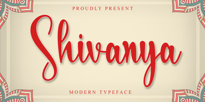 Shivanya is a lovely and delicate script font that exudes elegance and class. This font was particularly crafted for those who need a beautiful and refreshing look to their designs. Shivanya is PUA encoded which means you can access all of the amazing glyphs and ligatures with ease!
 - Blusty by Craft Supply Co,
$15.00 Blusty Font Duo is an handwritten script font based on the expression of real handwriting, lets you transform type into an exciting and beautiful piece of work. The irregular, hand-lettered look adds a real human touch to things and comes along with a lot of loving details.
 - Jastin Septia by Letter Muray,
$17.00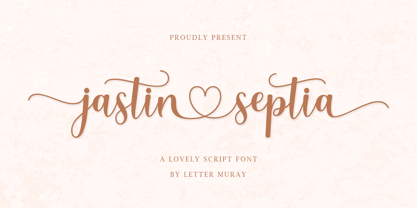 Jastin Septia feels equally charming and elegant. It looks lovely on wedding invitations, thank you cards, quotes, greeting cards, logos, business cards, and every other design which needs a handwritten touch. This font is PUA encoded which means you can access all of the glyphs and swashes with ease!
 - Chinthya by Namara Creative Studio,
$12.00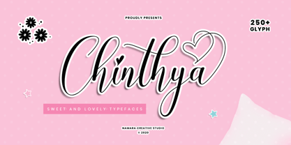 Chinthya is sweet and lovely calligraphy fonts in cute and beautiful elegant styles. decorative characters and handlettering effect make this font looks so naturally. Included OpenType features : alternates, ligatures and multilingual support. perfect for many designs, from wedding invation, greeting card, social media quotes, branding, logo, and many more.
 - Beautica by Balpirick,
$15.00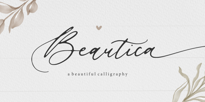 Beautica is a Beautiful Calligraphy Font. Beautica is a flowing handwritten font, described by an elegant touch, perfect for your favorite projects. Fall in love with its incredibly distinct and timeless style and use it to create spectacular designs! Beautica also multilingual support. Enjoy the font. Thank you!
 - Joyce Kitchen by Abo Daniel,
$16.00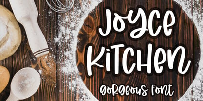 introducing JOYCE KITCHEN - gorgeous quirk font - It is great for branding, packaging, logo, quotes, t-shirt design, card, banner, and anything your craft project. Uppercase and lowercase characters match each other. What's included? - Uppercase - Lowercase - Numeral & Punctuations - Multilingual - Ligatures - PUA encoded Hope you love it. regards, Abo Daniel Studio
 - Mabelle by Letterara,
$12.00 Mabelle is a romantic and festive handwritten font with a beautiful love. It is ideal for holiday-themed greeting cards, Christmas, weddings, and any crafting project that requires a romantic touch. This font is PUA encoded which means you can access all of the glyphs and swashes with ease!
 - Dotoria Slant by Gassstype,
$19.00 Hello Everyone, Introduce our new collection Dotoria is a Handwritten Brush font with comical type. Crafted manually with love and passion, This font is great for your next creative project such as logos, printed quotes, invitations, cards, product packaging, headers, Logotype, Letterhead, Poster, Label, Game project and etc.
 - Rosyidun by Twinletter,
$15.00 Rosyidun is an authentic and geometric Arabic display font. Its capital letters and forms are rotated, creating a visually stunning display for captions, posters, or headlines. You’ll fall in love with the beautiful and ornate patterns of the Arabic Display font. The perfect addition to any design project.
 - Debelly by Tour De Force,
$25.00 Debelly is catchy fat typeface, with lovely geometric shapes. Inspired with contrast strokes, with square joins, Debelly gives an impression of retro style combined with contemporary trends. It is designed specially for packaging, posters, logotypes or headlines, even it can be pretty handfull in smaller sizes. Contains 375 glyphs.
 - Marsha by Trim Studio,
$12.00 Marsha is a cheerful font that gives your design happiness and love. This font is perfect for showing your affection. If you have any questions or problems, feel free to send us a private message, and please rate us if you like :) Hope you enjoy the font! Thank you
 - Virgiluna by Stringlabs Creative Studio,
$25.00 Virgiluna is a sweet, soft hand-lettered script font. The playful rounded characters make it the perfect font for creating amazing designs. Fall in love with its authentic feel and use it to create gorgeous wedding invitations, beautiful stationary art, eye-catching social media posts, and cute greeting cards.
